10,000 search results
(0.05 seconds)
- Taylor Hand by Mans Greback,
$59.00 Taylor Hand is an elegant signature font. Drawn by hand and created to be a typeface for chic and modern work in a classy setting. Use { } [ ] < > anywhere in a word where you want a swash. Example: Tay[lor The font comes in two styles, Upright and Italic, and also includes a Swash style for decorative additions to your lettering. It is completed with a full alternate alphabet and a big set of ligatures, which together give the handwriting genuine dynamics and a natural flow. It has extensive lingual support, covering all European Latin scripts. The font contains all characters you'll ever need, including all punctuation and numbers.
 - Noodlerz by CozyFonts,
$25.00 Noodlerz is the 3rd font designed for Cozy Fonts Foundry. It is the second 'handwriting style' type fonts designed to have a very casual but organized voice in it's coloring when set in text. You might say Noodlerz is a cross between a sharpie & a vintage typewriter alphabet font. Noodlerz, and it's partner Noodlerz Italic, give off a humorous personality with a flair of sarcasm and cartoon flavor. Great for captions, grocery lists, Dear John letters, recipes, and of course greeting cards. Advertising headlines and supportive body-copy text marry well in various point sizes. 'Hoping this font finds your voice!' Noodlerz from CozyFonts Foundry.
 - QR by T-26,
$29.00QRc is based on a 2-D, space-saving optical code widely used in Japan. The code was originally intended for use in factories but quickly crossed into the consumer sector. With an enabled handset, a QR code -- which can appear on an ad, postcard, or almost anywhere else -- can be instantly interpreted to reveal its underlying message. QR contains 219 images. You can use the QRc font to accurately encode the letters you type, or just use it to create fields of lovely, semi-random pixel texture! The counterpart font, QR Type, is also a celebration of entropic pixelation, but the formations are alphabetic and human-readable. - AT Move Decoupe by André Toet Design,
$39.95 Découpé Based on a French children’s play from 1906. In a car boot sale André Toet found a funny looking box containing a lot of cut out cardboard figures, in fact it looked a bit like a geometric puzzle! He played around a bit and succeeded to create a workable typeface with it ! The interesting thing about this particular font is, that in fact it’s organized chaos. The 26 letters of the alphabet are a mix between caps and lowercases, so within one word caps and lowercases will be used next to each other. It’s a very useful font for different projects. Concept/Art Direction/Design: André Toet © 2017
 - RyuGothic by StudioJASO,
$42.00 RyuGothic Family is a humanistic interpretation of the Hangul Gothic style. It delivers messages in a soft, calm tone that does not overpower. The narrow counter design of consonants in Hangul and the narrow counter of the Latin lowercase letters are connected to create a sense of structural unity between the two sets of characters. This enables you to read long lines and works well in a variety of media and situations. Each font includes: 2,350 Hangul syllables, the smallest unit for expressing modern Korean; Latin Basic; punctuation; symbols for Korean codepage. Cyrillic, Greek, and Kana alphabets were excluded. The punctuation is designed in the preferred location for Korean typesetting.
 - Bickley Script by ITC,
$29.00Bickley Script was designed by Alan Meeks in 1986 and is based on the handwriting forms popular at the end of the 19th century. The flowery capitals contrast beautifully with the delicate and reserved lower case letters, fit perfectly together and enhance the handwritten character of the font. Bickley Script looks as though it were written with a fine tipped pen and has an elegant, nostalgic charm. The font is best for headlines as well as short to middle length texts and should be set in point sizes of 14 or larger, and Bickley Script's capitals can also be used as initials with other alphabets. - Octopuss by ITC,
$29.99Octopuss is an energetic titling typeface designed in 1970 by Colin Brignall for Letraset dry transfer sheets. Brignall expanded the basic alphabet with an outline variation with a shadow, which makes the typeface look three dimensional, almost like it is floating. Octopuss font displays the unmistakable signs of the typefaces of the 1970s, as do Countdown and Harlow, also designed by Brignall. The circular strokes of the capitals that drop well under the base line are striking and unique. Because of the small white spaces of its lower case letters, the rounded, robust Octopuss is meant exclusively as a headline font and should be set in large point sizes. - Plywood by Canada Type,
$24.95 Plywood is based on a long lost American film classic: Franklin Typefounders's Barker Flare from the early 1970s. Plywood is a surprisingly effective mix between the rigid confidence of nineteenth century wood types and the smooth feminine curves of twentieth century art nouveau ideas. With many variations on almost every letter in the alphabet, it's a versatile typeface that can make itself timelessly at home in multiple design environments, with motifs ranging from the strong and western to the crafty and artsy. Plywood's very expanded character set comes in all popular font formats, including a Pro version that takes advantage of OpenType's many character alternating features in supporting programs.
 - Mistral by URW Type Foundry,
$89.99 Named after the strong cold winds on Southern France, the Mistral font family is another original creation displaying the panache of the French graphic artist Roger Excoffon. Mistral is an informal script in which all letters link up in vigorous strokes. First issued in 1953, its brush-like stems look spontaneous and fresh. The descenders are fairly long and the whole alphabet has a distinctive and unforgettable effect on the page. Mistral is a good complement to sans serif typefaces. Mistral is a trademark of Heidelberger Druckmaschinen AG, which may be registered in certain jurisdictions, exclusively licensed through Linotype Library GmbH, a wholly owned subsidiary of Heidelberger Druckmaschinen AG.
 - Lisboa by Vanarchiv,
$35.00 This humanist sans-serif typeface was exhaustively designed, full-featured typeface family that reveals its character and distinctiveness in complex text. It features a large complement of ligatures, lining and old-style figures, expert characters, dingbats (arrows, brackets, and symbols for both Regular weights). In the original Lisboa Pro the forms of the letters are humanist, with hooked headterminals, the characters contains medium contrast with a left-angled stress on the strokes. After ten years from the first version publication, this new version (0.2) is available with Latin (Western, Central Europe) and Cyrillic alphabets. It was selected by Our Favorite Fonts of 2005 (Typographica).
 - Coo Coo by chicken,
$23.00 So I made five rather odd characters for a logo for a friend… Then I thought I'd fill a couple of spare hours expanding it to a single alphabet… And some considerable time later I ended up with a whole font with full punctuation, a bunch of alternates, pretty broad international support and some OpenType features to keep things varied… There are elements of Art Deco, Art Nouveau, Lego, circuit boards and Ceefax, Memphis lamps and lab clamps, hieroglyphs, googly eyes and who knows what else… Intricate, insane, highly irregular, but somehow it hangs together… Throw down a few letters nice and big when the fancy takes you…
 - Linotype Schachtelhalm by Linotype,
$29.99Linotype Schachtelhalm is part of the Take Type Library, chosen from the entries of the Linotype-sponsored International Digital Type Design Contests of 1994 and 1997. The inspiration of German designer Ilka Kwiatkowski is not hard to figure out and the font carries the German name of the plant which was its model. The alphabet consists exclusively of capital letters with clear geometric basic forms. The font is meant for headlines in point sizes of 18 and larger. The details which make Linotype Schachtelhalm unique and true to its inspiration are however best seen in large point sizes, such as on posters, and Schachtelhalm is best combined with neutral fonts. - Touch Tone by Jeff Kahn,
$29.00 Touch Tone introduces a condensed lowercase and oblique italics to the uppercase font inspired by the "Dr. Strangelove" movie titles – designed by Pablo Ferro. Touch Tone's naive hand-drawn strokes rely on a quirky variable width-brush. They are looser, more textured, tactile, more informal, with quirky nervous lines. A family of four fonts: it includes two weights, light and medium, and both with roman and italics. All the fonts include the same patterns and ornaments. However, many of the “medium” font weight ornaments are beefed up to visually match. Touch Tone utilizes OpenType features. It imitates handcrafted lettering by including 2 glyphs for each U&lc letter (4 sets) – all kerned with care. This medley avoids a repetitious appearance so each sentence looks original and hand-drawn. The uppercase includes two widths – extra condensed and extended. Add whimsy and eccentricity by mixing the extra condensed caps with extended caps and the lowercase alphabet. Use the Contextual Alternates, or Stylistic Alternates features panel, or select the alternates in the Glyphs palette. Touch Tone includes oldstyle numerals, a variety of retro patterns, dingbats, speech bubbles, icons, banners, graphic arrows and ornaments. Each font includes 403 glyphs. Suitable for display or text and many European alphabets. Purchase both weights, roman and oblique italics to emphasize words. Touch Tone combines cool graphics and patterns with OpenType. Generously apply Touch Tone for added warmth and a "Rat Pack" groovin' message.
 - Pucky by Just My Type,
$25.00 When teaching font-making at the Art Institute of Tucson, I give my students plenty of lab time to come up with design ideas. I designed Pucky while one class created their fonts. It came about through an idea for a capital A: sort of a triangle with two round sides and a crossbar formed by a circle falling out. (You can see it here.) In drawing that, I hit upon the idea of making the tops of the alphabet sharp and square and the bottoms rounded. (See the whole alphabet here.) Pucky suggests both circus and psychedelia. Hmmmm, does anybody have an “in” at Cirque du Soleil?
 - Banco by ITC,
$29.00Banco was the first typeface work of French designer Roger Excoffon and was released in 1952. The strong forms look as though they were rolled out of sheet metal and feature upright, tapering strokes. The slight slant, the varying heights of stroke ends, and the relationships between line and curve give Banco font its sense of liveliness and dynamism. Excoffon did not design a matching lower case alphabet for his capitals, but this was accomplished later by Phill Grimshaw, who also designed the light weight. He deliberately 'underdesigned' the lower case forms, producing a more reserved alphabet based on the design ideas of the original. - Severe by Gerald Gallo,
$20.00 Severe is a clean, contemporary, condensed, geometric font family. There are 2 fonts in the Severe family, Severe Lower Case and Severe Small Caps. The small caps versions has small caps in place of the lower case alphabet. The lower case and small caps versions have the same uppercase alphabet, numbers, punctuation, symbols and miscellaneous characters. In addition to the cap height numbers there are small cap height numbers in each. The Severe fonts are ideal for headlines, titles, branding, small blocks of text or wherever a fresh, contemporary, condensed font is desirable. Severe Lower Case and Severe Small Caps are sold only as a set priced at $20.
 - Ongunkan Northern Arabian Scrip by Runic World Tamgacı,
$49.99 The Ancient North Arabian scripts Ancient North Arabian is the name given to a group of scripts belonging to the South Semitic script family, which also includes the Ancient South Arabian alphabets (musnad and zabūr) and the vocalized alphabets used in Ethiopia for Geʿez, Amharic, etc. The Ancient North Arabian scripts were used both in the oases (Dadanitic, Dumaitic, Taymanitic,) and by the nomads (Hismaic, Safaitic, Thamudic B, C, D, and possibly Southern Thamudic). There are tens of thousands of inscriptions and graffiti in these scripts which were used in the period roughly between the sixth century BC and the fourth century AD. See the descriptions of the individual scripts below
 - TA Fabricans by Tural Alisoy,
$25.00 TA Fabricans graphic presentation at Behance TA Fabricans font is based on Film Fiction Semi Expanded font. The font also supports the Hebrew alphabet. The Display version comes only in the Latin alphabet. I tried to prepare the font carefully. I specifically searched for the Hebrew alphabet. I benefited from my Israeli colleagues. I believe that my font will be successful. Please check and if you have any additional requests or complaints, please write to me. t@taft.work TA Fabricans works great for branding, magazines, headers, logos, TV, UI, web, badge, packaging, headlines, posters, t-shirt/apparel etc. TA Fabricans offers you options to explore a whole host of applications and gives a real modern feel to any project. Family overview: 36 fonts, 9 weights (from Thin to ExtraBlack) + Condensed, Expanded, Display Latin, Hebrew Display font without Hebrew Multilingual 4 free font Localized Forms with NLD, PLK OpenType Features: Localized Forms Contextual Alternates Tabular Figures Subscript Scientific inferiors Superscript (Superiors) Numerators Case Sensitive Forms Standard and Discretionary Ligatures Stylistic Alternates Kern Ordinals
 - Prangs by Sudtipos,
$59.00 The late-19th-century Prussian-American printer and publisher Louis Prang, the “father of the American Christmas card”, was well-known for his efforts to improve art education in the United States. He published many instructional books and even founded a training school for art teachers. One of the books he published included a series of alphabets for sign painters, lithographers, illuminators, architects and civil engineers. There was nothing truly original there — in the book’s preface, Prang says that the alphabets were “based on foreign forms and adapted for American taste”. The one alphabet that caught my attention in that book was one simply called “Italic”. It’s a high- contrast modern, a Didone really, but with an interesting little twist: the lowercase is almost entirely connected, which makes for an interesting mix of modern typography and classic calligraphy. That stuff is right up my alley now. Whenever my eyes happen on a modern, it’s easy, even almost impulsive for me to envision swashes coming out of serifs and terminals. The caps melt and the minuscules dance with them. And so I brought my vision to life. Prangs is an italic set of three weights, each containing more than 1400 glyphs with plenty of OpenType features and Latin language support. This set celebrates the convergence of three centuries of fancy display alphabets. These fonts should work wherever moderns are used to elevate and scripts are used to appeal — namely today’s branding, packaging and glossy publications.
 - Neue Frutiger by Linotype,
$71.99 The original Frutiger typeface was designed in the early 1970s by Adrian Frutiger and his studio for the way finding system of the Roissy Charles de Gaulle airport in Paris. Soon after the airport was opened, a huge demand for the typeface arose from companies wanting to employ it in other signage systems, as well as in printed matter. The Frutiger typeface came out as part of the Linotype library in 1977. Epitomizing functionality and clarity both in signage and as a bread-and-butter typeface in print, Frutiger became a modern classic. Neue Frutiger® is the 2009 version of the Frutiger typeface family. It was revised and improved by Akira Kobayashi in close collaboration with Adrian Frutiger. While Frutiger Next, the 1999 revision, introduced a new concept (including a larger x-height, a more pronounced ascender height, narrower letter-spacing and, most notably, an italic with calligraphic traits), Neue Frutiger returns to the original 1977 design. The result is a well-balanced range of 10 finely-graded weights. Despite the various changes, the ‘New Frutiger’ still fits perfectly with Frutiger and serves to harmoniously enhance the styles already in existence. Neue Frutiger Variable are font files which are featuring two axis and have a preset instance from UltraLight to ExtraBlack and Condensed to Extended. Featured in: Best Fonts for Resumes, Best Fonts for Websites, Best Fonts for PowerPoints, Best Fonts for Tattoos
 - The "Tribal Times" font, crafted by the renowned artist Tattoo Woo, stands as a unique and captivating typeface that beautifully bridges the gap between traditional tribal art and contemporary design...
- ITC Ellipse Script by Typorium,
$30.00 The Typorium presents a new optimized and enriched version of ITC Ellipse which first appeared in 1996 in the International Typeface Corporation typeface library. ITC Ellipse Script is a complementary typeface to ITC Ellipse Neo, designed a very legible handwriting style. ITC Ellipse Script is both modern and classic. Modern in the unusual shape based on the geometric ellipse form. And classic in the structure of some letters like the lower cases c, e, g, o, s. These letters alone could come from a traditional typeface, but they fit perfectly with the atypical rest of the alphabet giving it a present-day and traditional mix. Furthermore, the ellipse shape fits naturally in the italic styles, giving the font an organic and fluid feeling. ITC Ellipse Script offers OpenType features such as alternate characters for upper and lower case, and an extended accented character set to support many languages. Five weights have been created for each style to offer a wide range of graphic possibilities in a tidy digital footprint. Designer: Jean-Renaud Cuaz Publisher: Typorium MyFonts debut: Nov 1, 2020 Le Typorium présente une nouvelle version optimisée et enrichie d'ITC Ellipse qui est apparue pour la première fois en 1996 dans la bibliothèque de caractères de l'International Typeface Corporation. ITC Ellipse Script est une police complémentaire à ITC Ellipse Neo, conçue dans un style d'écriture très lisible. ITC Ellipse Script est à la fois moderne et classique. Moderne dans le dessin inhabituel basé sur la forme géométrique de l’ellipse. Et classique dans la structure de certaines lettres comme les minuscules c, e, g, o, s. Ces lettres pourraient provenir d'une police de caractères traditionnelle, mais elles s'intègrent parfaitement avec le reste de l'alphabet plus insolite en lui donnant un mélange de modernité et de tradition. De plus, la forme de l'ellipse s'intègre naturellement dans les styles italiques, donnant à la police une sensation organique et fluide. ITC Ellipse Script offre des fonctionnalités OpenType telles que des caractères alternatifs pour les capitales et les bas de casse, et un jeu de caractères accentués étendu pour prendre en charge de nombreuses langues. Cinq graisses ont été créés pour chaque style afin d'offrir un large éventail de possibilités graphiques pour une empreinte numérique rigoureuse.
 - 1514 Paris Verand by GLC,
$20.00 This set of initial decorated letters was inspired by a font in use in the beginning of 1500s in Paris. Exactly, we have used the set that Barthélémy Verand employed for the printing of Triumphus translatez de langage Tuscan en François, (from “Triumph” of Petrarque) in the year 1514. Some letters, lacked, have been reconstructed to propose a complete alphabet. It appears that the printer used some letters to replace others, as V, turned over to make a A, or D to make a Q. The original font’s letters were drawn in white on a black background only, but it was tempting to propose a negative version in black on white. It is used as variously as web-site titles, posters and flyers design, publishing texts looking like ancient ones, or greeting cards, all various sorts of presentations, as a very decorative, elegant and luxurious additional font. This font supports strong enlargements remaining very smart and fine. It’s original medieval hight is about one inch equivalent to about four lines of characters. This font may be used with all blackletter fonts, but works particularly well with 1543 Humane Jenson, 1557 Italic and 1742 Civilite, without any anachronism.
 - ITC Kahana by ITC,
$29.99As if gliding in on the tide, ITC Kahana floats across the page with the pulse and sway of the sacred Hawaiian hula dance. The original drawings for this display typeface were created while designer Teri Kahan lived in the Aloha State, and its bold verticals symbolically convey the power and strength of the Polynesian people. Kahan has spent most of her life working with letters. She discovered Speedball lettering pens in her teens, opened a design studio that specialized in the lettering and calligraphic arts while in her early twenties, and grew her business in California and Hawaii. Today, she embraces new design challenges and digital technology, but letters are still at the core of her work. In ITC Kahana, Kahan created a design that is both distinctive and versatile. Menus, posters, display headlines, packaging and brochures fall easily within this typeface's range. And the word “kahana” is more than just a namesake: in Hawaiian, “kaha” means “to mark, draw, place, turn or surf,” and “na” means “belonging to.” ITC Kahana also includes an enchanting decorated alphabet in the lowercase position that expands this typeface's usefulness to the designer. - Chamfer Serif JNL by Jeff Levine,
$29.00 A set of vintage wood type printing blocks yielded the alphabet which was to become Chamfer Serif JNL. With its heavy vertical serifs and interesting character shapes, the design is unique when compared to the more familiar wood type offerings of the past.
 - Festa by Green Type,
$37.00 Festa is a multilingual handwritten type family. Includes Latin, Cyrillic and base Greek alphabets. Also Festa supports the following OpenType features: ligatures, swashes and stylistic alternates (These features are available only for the Festa fonts. Festa Brush fonts don't support these features).
 - Ongunkan Atlantis Hollow by Runic World Tamgacı,
$40.00 Atlantis: The Lost Empire is a 2001 I made the alphabet prepared for Atlantis Lost Empire, the first feature-length animated movie of Walt Disney in 2000 years, in 2 versions in accordance with the original. It is suitable for today's use.
 - SK Reykjavik by Salih Kizilkaya,
$12.99 SK Reykjavik is a modern geometric font family with sans serif and slab serif characters. Supports all typographic elements you will need in Latin, Cyrillic, Greek, Turkish and Baltic alphabets. It contains 32 fonts and 26,208 glyphs and offers full support for ligatures.
 - Moon Phases by Fascination Workshop,
$10.00 Moon Phases documents the phases of the moon over time. Great for animation, signs, greeting cards, posters, etc. The phases of the moon follow the alphabetical order. Upper and lower case characters are the same. For a character map, see the gallery.
 - Hello Wishes by Good Java Studio,
$22.00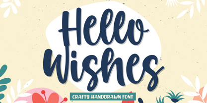 Produly Present Hello Wishes a Crafty Font Hello Wishes a Crafty Font make from handlettering ideas in typeface. This font includes full of Alphabetical glyphs, Numerals, and punctuation. This is so perfect for invitations, monograms, wedding, fashion, branding, label, handlettering or logotype.
 - Top Kick NF by Nick's Fonts,
$10.00Schriftatlas: Alphabete von A bis Z strikes again with this dazzling display of geometry at play, originally named Concentra. Best used at larger sizes for maximum impact. Both versions contain the complete Latin 1252, Central European 1250 and Turkish 1254 character sets. - Modern Times by Tural Alisoy,
$20.00 Modern Times font has been updated. To use the new version, go here. Modern Times font. 996 glyph, 100+ Languages Set. Multilingual support: Latin basic, Latin Extended, Cyrillic, Greek, Georgian, Central Europe, Turkish, Baltic, Romanian, Euro, West European diacritics Please test your alphabet
 - Almost Heaven NF by Nick's Fonts,
$10.00This charming little number is based on a rubber-stamp alphabet set, sold in the early 1900s under the name "Perfection", which suits it well. Both versions of this font include the complete Unicode 1252 Latin and Unicode 1250 Central European character sets. - Hello Mono One by Good Java Studio,
$18.00 Introducing Hello Mono with Layered Inline Hello Mono is a playfully display font make from handdrawn ideas in typeface. This font includes full of Alphabetical glyphs, Numerals, and punctuation. This is so perfect for invitations, monograms, wedding, fashion, branding, label, handdrawn or logotype.
 - Braille Alpha by Deniart Systems,
$10.00 This font can be used as a play'n learn tool to teach the meaning of these modern day communication symbols. Each alphabetical character can be printed with or without the corresponding roman symbols. NOTE: comes with an interpretation guide in pdf format.
 - AngloAngkor by Parquillian Design,
$39.00 AngloAngkor is a display face of Western characters inspired by the elegant “round script” style of the Khmer alphabet of Cambodia. It is the first of a projected series inspired by some of the beautiful lesser-known native scripts of Southeast Asia.
 - No Liming by chicken,
$17.00 A chunky, laid-back typeface inspired by a hand-painted notice on the doors of a mechanic's workshop in Plymouth, Tobago. Two different mostly-uppercase alphabets in one font help to keep things loose. 'Liming'? hanging out, drinking rum, shooting the breeze...
 - Semaphore by Deniart Systems,
$10.00 This font can be used as a play'n learn tool to teach the meaning of these modern day communication symbols. Each alphabetical character can be printed with or without the corresponding roman symbols. NOTE: comes with an interpretation guide in pdf format.
 - Omnia by Linotype,
$29.00Omnia is a single alphabet font based on the uncial hand. The humanist letterforms of the Omnia font make it a good choice to use for personal messages. Omnia™ is a trademark of Linotype GmbH and may be registered in certain jurisdictions. - Prymityv by Malgorzata Bartosik,
$29.00 Prymityv is inspired by brutalist architecture from the Eastern Bloc. It's heavy and massive, perfect for display purposes. Prymityv contains Latin and Cyrillic alphabet, Latin with Western, Central and South Eastern European diacritics, Cyrillic with Russian, Bulgarian, Serbian and Macedonian and Ukrainian diacritics.