1,263 search results
(0.023 seconds)
- Rooling Candy by Yumna Type,
$16.00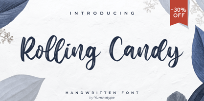 Rolling Candy is a beautiful handwritten font with a natural and unique design will make your project more beautiful. The font is suitable for your branding project, printing, logos dan wedding. Features: Beautiful Ligatures Multilingual Support PUA encoded Numeral and Punctuation by Yumnatype
 - Eckhardt Speedletter JNL by Jeff Levine,
$29.00Eckhardt Speedletter JNL was named in honor of Al Eckhardt (1929-2005), a talented sign painter and good friend of font designer Jeff Levine. The font was inspired by hand lettering on a reproduction of a 1950s rock and roll show poster. - Barth by Remedy667,
$18.00 If you’re in need of some serious typography, stop scrolling. Barth. Yoooou heard that right. Designed with a love for horror movies and 90s Nickelodeon nostalgia, Barth is the best font. Get serious about your design work, get Barth. It’s burgery. Looking for a horror font that is as fun and nostalgic as it is eye-catching? Barth. Yoooou heard that right. This retro font is sure to get your viewers hooked on your work with its bold style and innocent yet spooky lettering. It’s perfect for posters, books, movies, even restaurant signage and beyond. Features Doubles Elimination gives you a more natural look. Stands out and get noticed…. be heard. Includes a Remedy667 Font Catalog PDF, all your favorite fonts in one handy catalog. Additional Information Some fonts may require special graphic design software to access OpenType features. Examples of these programs are Adobe Illustrator, Adobe Photoshop, Adobe Indesign, and Corel Draw. Feedback is always welcome. If there is anything missing from our typefaces that you would like to see, or if there are any issues that occur when using them. Please don’t hesitate to contact us or email me at nick@remedy667.com and let us know.
 - Jannson Map by RM&WD,
$35.00 For best results, use of OpenType features is strongly recommend. This font is inspired by Johannes Janssonius, well know as Jan Janszoon o Jan Janssonius (Arnhem, 1588 – Amsterdam, 1664), was a Dutch cartographer, publisher and engraver. Married to Hondius's daughter. He was the author of many masterpieces of cartography of the 1700s like Willem Blaeu and Hondius, famous maps with heavy use of decorations in the letterig to fill the spaces of oceans, seas, lakes and scrolls. Now you can easily recreate not just ancient maps without effort, but you can use this font creatively, to make unique, modern logos, product names, fresh packaging, hip fashion outfits, refined labels, signs, coordinated images ... Hundreds of alternatives to choose from and maybe to combine with other fonts in an original way. One extra font with 27 castles in Janszoon style are also usefull for map, of course, but also for many different creative artworks. Warning: Jannson Map having oversized swashes compared to the normal standards cannot be used with Windows Word because Word does not give the possibility to manage the line spacing professionally. Jannson Map works great with applications like Illustrator, In Design, quark Xpress, mac Text etc ...
 - Pre Code Movies JNL by Jeff Levine,
$29.00 The hand lettered credits from the 1931 melodrama “Safe in Hell” inspired the typeface Pre Code Movies JNL, which is available in both regular and oblique versions. The design is strongly influenced by the popular Art Deco style of thick-and-thin characters and also features rounded corners. The font’s name comes from the early era of talking pictures and the short period before the establishment of the Hays Office in 1934 when Hollywood did not self-censor itself. Many then-taboo topics were exploited on film until Will Hays cracked down on such productions. To read more about Pre-Code Hollywood, visit the Wikipedia link: https://en.wikipedia.org/wiki/Pre-Code_Hollywood
 - Rockabilly Romance by Wing's Art Studio,
$16.00 Rockabilly Romance - A 1950s Rock ’n’ Roll Inspired Retro Script Font Rockabilly Romance is a rebellious script font from Wingsart Studio inspired by 1950s Americana. It’s designed to evoke the feel of bustling retro diners, drive-in movies and a Rock ’n’ Roll attitude. It features fast curves with a hand-made free-flowing style, plus an alternative version with added lipstick gloss. Standard features include unique uppercase and lowercase characters, punctuation, language support and numerals. It also includes underlines and lots of special ligatures and alternative characters to experiment with. The Rockabilly Romance font is particularly suited to bold displays such as menu headers, posters, movie titles and album covers. Check out the visuals for more usage ideas.
 - Yayazout JNL by Jeff Levine,
$29.00Yayazout JNL is the Rock and Roll equivalent of Jeff Levine's other "Love Generation" font, Positive Vibe JNL. This typeface emulates the innovative and outrageous styles of the late 60s-early 70s design period where the message was the music and the music was the message... - Gambino by Monotype,
$15.99 Childlike, sure; utterly affable, yes, but ultimately actually very cool. Yup, that’s Gambino. This chalky, super textured, semi connected script is a kooky playground pal and a grown-up technically savvy typeface all rolled into one. Upright yet tumbling, these simple, crayon-like letterforms are a delight.
 - Medieval Borders by Aah Yes,
$5.00 This is a large group of typefaces inspired by those borders and patterns you see going across documents from the Middle Ages and Medieval times, eventually becoming this collection of fonts where you can scroll various repeating patterns across a page, for example. You can get a repeating pattern that scrolls seamlessly by repeating the same letter. The default text displaying on the web-page is bbbbbbbb, for example. There's over 2 dozen basic styles, and each style has 52 designs within it, using the characters Upper Case A - Z and lower case a - z, with the lower case being the negative/reverse colour of the Upper Case version, it will be the corresponding design just reverse coloured and with an edging strip. There's also a space - but nothing else. The styles in these fonts usually have groups of six characters (A to F, G to L, M to R, S to X), and where the second group is a variation on the first - usually thicker lines - and the third grouping is another variation on that, usually thicker lines again, making the first 24 letters. (Sometimes there's three groups of eight characters). The pattern within a group normally starts off plain then gets busier as it progresses - such as there'd be a more complex pattern of circles and diamonds as you go through the letters. Then the letters Y & Z are somewhat different to the rest. There's four versions starting with Z, and they're a little bit different, and they're grouped in fives - getting bolder as you progress through the letters, but with similar patterns within each group of 5, and that makes the first 25 characters. The letter Z character is extra busy. Again, lower case is the reverse colour of the Upper Case. Mostly you can get patterns and borders that combine seamlessly by using letters within the same group of 6 or 8 (like maybe abdcedcb). There are a few occasions when that doesn't work out, because there may be circles or diamonds at the sides of the letters that don't match up with another letter that has a different pattern at the side. But you can create a pattern with the exact level of complexity you want perfectly easily. You can see examples of this in the poster images. Neighbouring letters without embellishments at the sides of the letters will usually fit together. Have fun with it, that's what it's there for. aah yes fonts
 - Disruptor's Script by Piñata,
$15.00 Disruptor's Script is the alter ego of our previous project Gentlemen's Script. Unlike the Gentlemen's Script, the new font is an elegant rebel and defies traditions. The font is painted with a brush pen, which is especially noticeable in the characteristic shabbiness and different thicknesses of the strokes. While the Gentlemen's Script is an embodiment of a classic costume, dress shoes and an expensive watch, Disruptor's Script is a fashionable suit, sneakers, an iWatch and a tattoo that peeks from under the shirt. The font retained the incline, speed and overall sense of dynamics inherent in Gentlemen's Script, but got a bit more chaotic and unpredictable. This is especially noticeable in the newly added shabbiness, elongated extenders, a large number of contextual alternates and different ligatures. For some high-frequency letters (10 for the Latin alphabet and 10 for the Cyrillic alphabet), we painted alternative versions that are substituted in the word instead of the standard characters when following our preceding certain groups of letters. In addition, in the Disruptor's Script you can find functional ligatures, including some of the frequently occurring two- and three-letter combinations. All these solutions dilute the monotonous line of the set, add a bit of unpredictability to the font and a touch of chaos to inscriptions. To fully enjoy usage of the font, we recommend that you always keep the features contextual alternates (calt) and standard ligatures (liga) turned on. If you do not have access to applications that support OpenType features, it does not matter—even without these features you can use and enjoy our font!
 - DIN Next by Monotype,
$56.99 DIN has always been the typeface you root for—the one you wanted to use but just couldn’t bring yourself to because it was limited in its range of weights and widths, rendering it less useful than it could be. The century-old design has proven to be timeless, but modern use cases demanded an update, which resulted in DIN Next—a versatile sans serif family that will never go out of style. This classic design turned modern must-have includes seven weights that range from light to black, each of which has a complementary italic and condensed counterpart. The family also included four rounded designs, stretching the original concept’s range and core usability. DIN Next also boasts a suite of small capitals, old style figures, subscript, superscript and several alternate characters. A quintessential 20th-century design, its predecessor DIN was based on geometric shapes and was intended for use on traffic signs and technical documentation. Akira Kobayashi’s update made slight changes to the design, rounding the formerly squared-off corner angles to humanize the family. Rooted in over 100-years of history, it’s safe to say that there will always be a demand for the DIN design, and thanks to DIN Next, now it’s as usable as it is desired. Wondering what will pair with it perfectly? Check out Agmena™, Bembo® Book, Cardamon™, Joanna® Nova, FF Quadraat® and Quitador™. Featured in: Best Fonts for Logos, Best Fonts for Websites, Best Fonts for Tattoos
 - Dominant Type by Hanoded,
$15.00 We’re in a lockdown of sorts (again) and things are pretty … uhm … boring at the moment. No going out for a coffee, no school (so the kids are at home), no meeting with friends… The new reality kinda sucks if I say so myself. Besides that, it turns out that we have a new dominant type of Covid in Holland.. wait, Dominant Type! Ahh, great name for my latest font! Dominant Type is a handmade all caps font. It comes with extensive language support (including Vietnamese) and 2 sets of alternate glyphs for that bit of ‘random awesomeness’!
 - Breadcrumbs by Hanoded,
$15.00 Every morning, after the kids have gone to school, I vacuum the floor and remove about half a kilo of breadcrumbs… No, not really have a kilo, but any given bird could probably survive on the leftovers. When it was time to name this font, Breadcrumbs was all I could think of! Breadcrumbs and children seem to go together well, as they are featured in Hansel & Gretel and Hop-o'-My-Thumb. Breadcrumbs font is a happy, sloppy fairytale font, which you can use for your book covers, your party posters and maybe crumbly bread packaging. But that is entirely up to you.
 - Cosmic Sans by Zachary Mazur,
$15.00 Cosmic Sans was my first font ever created for a school project. The class I made this font for was my Advanced Typography and was a semester project. I really couldn't think of a title for this font, until one of my good friends said, "Why don't you name it Cosmic Sans?" I searched the internet for any other fonts with that name, and sure enough there wasn't. Thus the name stuck. This font is more or less a display font, thus every secondary character was not created. I hope you enjoy this font and much as I have while creating it!
 - Module by Sébastien Truchet,
$40.00 Sébastien Truchet designed a modular typographic system during his last year in the School of Fine Arts of Besançon. The system is made of a unique grid and 6 modules which are the components to build several typefaces. The most radical is the "2-2". The last one is the "10-12".This is the "2-3". The goal is to use a grid made of 2 modules in width and three in height. This version is the most pertinent minimalist typeface which keeps plasticity and legibility. There is a character set of capitals tied to the origin of the project
 - Mouse Memoirs Pro by Stiggy & Sands,
$29.00 Our Mouse Memoirs Pro was inspired by vintage Mickey Mouse, Beagle Boys, and Uncle Scrooge comic books put out by Walt Disney in the 50's and 60's. It nods to the Disney aesthetic with an all-around fun personality and truly animated look. The chipper letterforms engage the audience, while the SmallCaps and extensive figure sets expand the scope of use. Opentype features include: - SmallCaps. - Full set of Inferiors and Superiors for limitless fractions. - Tabular, Proportional, and Oldstyle figure sets (along with SmallCaps versions of the figures). - Stylistic Alternates for Caps to SmallCaps conversion.
 - Mrs White by Hipopotam Studio,
$40.00 We designed Mrs White for our next book for children. We needed a clean script that would give a feeling of a primary school handwriting. Mrs White is filled with ligatures and contextual alternates which gives her very smooth line of text. Scripts shouldn't be used without lowercase letters so we added a small caps for headlines and acronyms. Check out the manual for more information on how to use Mrs White. Polish language use latin characters but we would like our Eastern neighbors to be able to enjoy Mrs White so we added cyrillic alphabet (script and caps).
 - Stone Orbit by Olivetype,
$18.00 Introducing Stone Orbit – a very cool font for those looking to make a bold statement. This rough tough brush font is sure to give your project an edge! It's carefree and packed with attitude. Its unique letter forms create an interesting texture that stands out from other fonts, making it ideal for posters and logos. It's versatile enough to fit any style — whether it's grunge, urban, or old school! Stone Orbit font includes : Basic Latin Uppercase and Lowercase Numbers, symbols, and punctuations Multilingual Support. Fully accessible without additional design software Simple Installations works on PC & Mac Thank You and Happy Designing!
 - Medina Gothic by Design is Culture,
$39.00 Medina Gothic is a three-weight sans serif inspired by Latin American moderne. It was designed in response to the 2002, Altos de Chavon design conference in The Dominican Republic, which celebrated utilitarian driven gestures in graphic design. "There’s a rigor to Medina Gothic that takes care of all sorts of tenets of a hard-working, highly legible, objective font. But at the same time, it’s human. All the curved terminals and open counter forms make for a sort of kindness. For all the discipline, it doesn’t sacrifice its friendliness." – William Morrisey, Professor of Typography, Parsons The New School for Design.
 - Marones by Arterfak Project,
$18.00 Complete your vintage style with Marones font! Marones is a serif font with inky effect and spurs on the letterforms. Inspired by old school garage and vintage logo, Marones visualize a quite strong look so that's perfect for any display such as packaging, bottle, headline, logo, apparel, posters, stickers, craft projects and more! Marones is an all-caps font equipped with a Stylistic set and multilingual support that you can mix and match the letters to ease your design project. Fonts featured : Uppercase Smallcaps Numbers Symbols Punctuation Stylistic alternates Stylistic set 01-04 Thank you for watching! Ramz
 - Craft Roman by Baseline Fonts,
$24.00From scrapbooking to intensive graphic design applications, Craft Roman is a wonderful choice for charming and lighthearted communications. Craft Roman is based on Speedball and signpainter books from the 1920s and 30s, and reminiscient of the style of some of the lettering accompanying Mary Engelbreit artwork. Craft Roman is perfect for capturing the feel of vintage posters and retro stylings dating back to simpler times or handworked arts & crafts projects- even elementary school and childhood art. Extended character sets and intensive kerning provide foreign language support for many regions, plus bonus glyphs for quick stylistic flair. - FF Berlage Burcht by FontFont,
$58.99 FF Berlage started as a research project about the typography of the prominent Dutch architect Hendrik Pieter Berlage (1856 1935). Donald Beekman based the design on a great number of sources, but mainly lettering found in two of Berlage s most quintessential buildings, the Amsterdam Commodities Exchange building (called Beurs van Berlage), and the ANDB building for the Amsterdam diamond cutters union (called De Burcht). Berlage is considered the father of modern architecture in The Netherlands due to his revolutionary theories on architecture and design, that would greatly influence many Dutch architect groups, like the Amsterdam School and De Stijl.
 - OTC New York by OTC,
$39.00 OTC New York is a geometric sans serif font family with support for Latin, Cyrillic and Greek. The display font comes in 18 styles, 9 weights (including italics) and as a variable font which supports two axis variability: weight and italic. It’s ideal for branding, logos, headlines, editorial design, packaging, web and television use. The font family is inspired by the Bauhaus school with its simplified geometric form, balanced layout, harmonious geometric shapes that are simple but strong. OpenType features contain stylistic alternates (for A, a, e & g); old style figures; fraction figures; subscript, superscript, numerator and denominator figure position and tabular figures.
 - Sweetest by Supersemarletter,
$11.00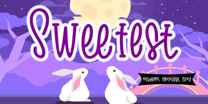 Sweetest is a cute and friendly handwritten font. It embodies playfulness and authenticity and is the perfect choice for any children activity or school project. Provide Ligatures with special character make the design letters looks incredible. Honestly it works perfectly for headlines, logos, posters, packaging, T-shirt and much more. Font Features : . Regular Version . Character set A-Z in Uppercase and Lowercase . Ligatures in lowercase and special . Numerals and Punctuation . Accented Characters . Multiple Languange Supported Recomended to use in Adobe Illustrator or Adobe Photoshop with opentype feature. If you have any questions, just send me a message and I'm glad to help.
 - EmBauhaus by Emboss,
$25.00 EmBauhaus is a display typeface, geometric in style, inspired by the face named after the world changing Bauhaus School. To aid readability I rethought the original typeface and closed all of the voids cut out of the strokes. We also modified the upper case to make it a more traditional design. An example of this is the upper case L, where a 90 degree angle was added. This typeface was designed to be used judiciously in a layout, to draw focus to words and headlines, using stark angles, radii and geometry to create visual rhythm and gestalt.
 - Propisi by ParaType,
$25.00The typeface was designed at ParaType (ParaGraph) in 1997 by Manvel Shmavonyan for Russian primary school sample writing schoolbooks. The typeface is based on script fonts presented in the book 'Rodnoy Mir' by. L.I.Tikunova. The first version of the font included just letters of Russian alphabet and basic set of figures and signs. The second version with extended set of alphabetic letterforms was developed in 2004 by Gennady Fridman. Current third version that covers full Cyrillic and Western code pages was prepared by Gennady Fridman and released in 2009. Medium style also was added by him in 2009. - Authority by RetroSupply Co.,
$19.00 Inspired by public fonts in New York in the 1970s. Authority pays tribute to the almost unnoticed but powerful effect type have on our lives. From waiting on a cold morning to catch the 307 to Morton West High School, to the rain and snow worn stencil on a postal box. Public typography is a part of the little spaces in your lives where life actually happens. Government designed fonts were chosen to communicate authority and help grease the gears of the day-to-day grind. Authority beckons back to these days with it's mildly condensed feel, squared corners and weight presence.
 - Timernis by Aga Silva,
$19.99 Timernis is humanist multilingual contrast sans serif available in eight weights from thin to black. All caps have this super elegant, classic proportions old school look and is based on 1940 stone engraving commemorative plaque. The engraving itself boasted sophisticated clean look and was a joy to look at. All caps: Would suit display usage such as: signage, titles, headers, engravings, high end packaging. Do try putting space between the letters in your selected word for suave and chic feel. Expanded round shapes are prevalent in lowercase, which is legible in small sizes and pleasant to the eye.
 - Talent Stencil by Jeff Levine,
$29.00 Stencils have played a number of roles over the years, from decorative patterns to military markings; from labeling shipping containers to a student’s school project. One unusual application of a stencil alphabet was some metal letters spotted for sale at an online auction site. These antique letters were used for promoting the current show on a theater marquee just as plastic ones are used nowadays. Following the auction images as a guide, the Roman stencil font from those marquee letters is now preserved digitally as Talent Stencil JNL; which is available in both regular and oblique versions.
 - Albertson by Arterfak Project,
$16.00 Albertson is strong retro font. Made with vintage references like an old school automotive, signage, cowboy, lumberjack, woodwork, and DIY handicraft. The modern western font that you can apply for your classic design such as the logo, logotype, label, packaging, signage, and more! Albertson is an all-caps font with a strong design, equipped with 4 sets of alternates characters that you can mix and match to get the more solid typographic looks! Also complete with multilingual, packed in total 350+ glyphs. Fonts featured : Uppercase Smallcaps Numbers & Punctuation Stylistic set 01-04 Accented characters Thank you for your support!
 - Kallifa by Keristyper Studio,
$14.00 Introducing Kallifa script font is classy calligraphy inspired by old-school classic vintage handwritten. This font is good for logo design, Social media, Movie Titles, Books Titles, short text even long text letters, and good for your secondary text font with the script, sans, or serif. Featured: Standard Uppercase & Lowercase Numeral & Punctuation Multilingual : ä ö ü Ä Ö Ü ß ¿ ¡ Alternate & Ligature PUA encoded We recommend programs that support the OpenType feature and the Glyphs panel such as Adobe applications or Corel Draw. so you can use all the variations of the glyphs. Hope you enjoy our fonts!
 - Teenage Tropics by Teenage Foundry,
$19.00 Teenage Tropics is a vintage typeface display font that exudes a unique blend of retro style and tropical vibes. This font is designed to capture the essence of the 1950s and 1960s, with its bold and playful letterforms that are reminiscent of old-school signages and advertisements. The characters have an artistic touch, featuring curved lines and ornate flourishes that add a sense of whimsy and nostalgia. Teenage Tropics is perfect for projects that aim to evoke a sense of fun, adventure, and a retro aesthetic, such as retro-themed designs, vintage-inspired logos, posters, and packaging.
 - Rogmans by Letterhend,
$19.00 Rogmans is a display font which looks great for modern theme but still has classy feel. Very suitable for for headline, logotype, apparel, invitation, branding, packaging, advertising etc with old school / vintage as well as modern theme. It comes in uppercase, lowercase, punctuations, symbols & numerals, stylistic set alternate, ligatures, etc also support multilingual and already PUA encoded. Features : - uppercase and lowercase - numbers and punctuation - multilingual - alternates and ligatures - PUA encoded We highly recommend using a program that supports OpenType features and Glyphs panels like many of Adobe apps and Corel Draw, so you can see and access all Glyph variations.
 - FF Berlage Beurs by FontFont,
$58.99 FF Berlage started as a research project about the typography of the prominent Dutch architect Hendrik Pieter Berlage (1856 1935). Donald Beekman based the design on a great number of sources, but mainly lettering found in two of Berlage s most quintessential buildings, the Amsterdam Commodities Exchange building (called Beurs van Berlage), and the ANDB building for the Amsterdam diamond cutters union (called De Burcht). Berlage is considered the father of modern architecture in The Netherlands due to his revolutionary theories on architecture and design, that would greatly influence many Dutch architect groups, like the Amsterdam School and De Stijl.
 - Alkeno by Keristyper Studio,
$14.00 Alkeno is a rounded bold display font with an elegant old-school look. This font is good for logo design, Social media, Movie Titles, Books Titles, short text even long text letters, and good for your secondary text font with the script, sans, or serif. Featured: Standard Uppercase & Lowercase Numeral & Punctuation Multilingual : ä ö ü Ä Ö Ü ß ¿ ¡ Alternate & Ligature PUA encoded We recommend programs that support the OpenType feature and the Glyphs panel such as Adobe applications or Corel Draw. so you can use all the variations of the glyphs. Hope you enjoy our fonts!
 - Dear Penpal Script by Giaimefontz,
$6.00 This is a fully connected script font, not calligraphic, but entirely designed to follow handwritten cursive ligatures rules as teached in schools. In order to correctly visualize it, you have to enable OpenType features (Contextual Alternates, Discretionary Ligatures, Standard Ligatues and Kerning). Trying to write All Capitals will generate Block Letters writings, since cursive style doesn't allow more than the first uppercase per word, however this font is not meant to be a Block Letters font. Using specific type combinations will generate special glyphs. All of these features are intended to reproduce a classic schoolboy or schoolgirl notebook.
 - Mildistance by Letterhend,
$17.00 Introducing, Mildistance Script - an old and classic style script font. The look of the font will give you nostalgic feel, very suitable for old school theme design and the other various formal forms such as invitations, labels, logos, magazines, books, greeting / wedding cards, packaging, fashion, make up, stationery, novels, labels or any type of advertising purpose. Features : uppercase & lowercase numbers and punctuation multilingual alternates and ligatures swashes PUA encoded We highly recommend using a program that supports OpenType features and Glyphs panels like many of Adobe apps and Corel Draw, so you can see and access all Glyph variations.
 - Gibbons Gazette by Comicraft,
$39.00HOLD THE FRONT PAGE! STOP THE PRESSES! We have a new Headline for our Cover Story! DAVE GIBBONS is all over the tabloids, the trades AND the quality papers today. Yes, it's the opening of the WATCHMEN movie, but we have a much BIGGER story; the REAL scoop -- and we're announcing it in 72 point type... yes, there's a new addition to the Dave Gibbons family, and our editorial staff have the baby's name and our paparazzi have the pictures! Dave's new little sprog is called... GAZETTE. Man, that kid is gonna get teased at school, Dave. - Wayfinding Sans Symbols by FDI,
$29.00 Placing pictograms as single vector images makes designing signage a time-consuming task. But with Wayfinding Sans Symbols and its built-in OpenType intelligence using pictograms becomes as easy as typing words. With Wayfinding Sans Symbols you don’t need to scroll through endless glyph palettes to look for one symbol among hundreds of symbols. Just active ligatures and type in the mnemonic codes like #wheelchair, #parking, #toilet and so on. An overview of these codes can be found in the type specimen PDF. Each pictogram is available in 4 different versions and you can easily assign an additional background color or turn the symbol into a prohibition sign. Wayfinding Sans Symbols has a full coverage of the Unicode range “Transport & Map symbols” and a lot of additional signs that are missing in the typical wayfinding symbol sets. Beside the pictograms, Wayfinding Sans Symbols also has a huge set of arrows for every possible situation and you can easily switch between the different sets using OpenType feature controls. The enclosed letters and figures make it easy to set transport line numbers, room & storey numbers and much more. Wayfinding Sans Symbols is the perfect addition to Ralf Herrmann’s signage typeface Wayfinding Sans Pro, but it can also be used with any other typeface.
 - JulesLove - Unknown license

