7,245 search results
(0.057 seconds)
- Vivala Re by Johannes Hoffmann,
$15.00 The design of Vivala Re highlights a powerful contrast between thin curved lines and straight stems. The inline style is not limited to the inside of the strokes but is actively incorporated into the design. This font is well suited for all headlines in posters, book design, magazines, brochures and web design.
 - Hunters Think by Lettersiro,
$8,990.00 Hunters Think is modern bold script font. Made carefully to get the best curves and unique form that never exist before. Hunters Think is Suitable for any graphic designs such as branding materials, t-shirt, print, business cards, logo, poster, t-shirt, photography, quotes .etc. this font special for big company only
 - Calliform by Lemonthe,
$12.00 Calliform is a modern script calligraphy font with an elegant classical touch, featuring sharp strokes and carefully designed curves. Equipped with 70 decorative alternate characters, it is a suitable choice for various design projects such as logos, branding, greeting cards, wedding designs, printing, advertising, packaging, wall decoration, titles, web design, and more.
 - Belora Vintage by Mainelli,
$17.00 Introducing Belora Vintage, a bold serif font with soft, bold edges and curves giving it a groovy 70s feel. Belora Vintage has separate lowercase and uppercase letters, as well as numbers, punctuation, and multilingual letters. With alternates and ligatures it's perfect for fancy retro-style logos, or bold header text and much more.
 - Jilkyway by PizzaDude.dk,
$20.00Jilkyway is a truly weird font. Here and there you might spot some sanity in the weird font curves. But as you type, your text becomes more and more weird! The font is also suitable for text written in ALL CAPS! You will need to use OpenType supporting applications to use the autoligatures. - Moon Time by Supfonts,
$17.00 This modern calligraphy monoline script has been attentively written with gentle curves to produce a font that's completely distinctive and original. It contains a full set of lower & uppercase letters, a large range of punctuation, numerals, and multilingual support. Perfect for adding an elegant and unique touch to your lettering projects and branding.
 - Backslash by Silverdav,
$16.00 Backslash is a new display serif typeface with nicely balanced curves, tons of alternative characters, ornaments, multilingual support and unique ligatures. Its wide range of stylistic alternates allows for versatile design options and works perfectly for headlines, logos, posters, packaging, T-shirts, postcards, bold magazine imagery, wedding invitations, branding and so much more.
 - Risa by K-Type,
$20.00 Risa is an easygoing sans serif for display and text. With a dash of deco and a soupçon of sixties, gentle curves grace diagonal strokes bestowing a sensual tenderness that is further enhanced by subtle soft cornering throughout and a swollen fullness at the baseline, bottom-heaviness that helps make Risa highly legible.
 - Measly by Amarlettering,
$15.00 Measly Script is a delicate and elegant script font with a modern and sophisticated appearance. Its thin letterforms feature fluid strokes and subtle curves, creating a graceful and refined feel. The font is perfect for designs that require a sense of elegance and sophistication, such as wedding invitations, branding, or editorial design.
 - Mahgony by Multype Studio,
$23.00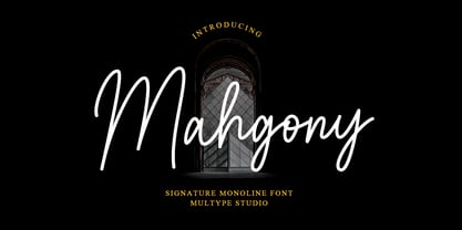 Mahgony is a signature monoline script font with unique and elegant curves. Features : uppercase, lowercase, symbol, number, ligature, and also support multi language. Mahgony is perfect for photography, watermark, social media posts, advertisements, logos & branding, invitation, product designs, label, stationery, wedding designs, product packaging, special events or anything that need handwriting taste.
 - Bellasia Hawainis by Inermedia Studio,
$15.00 Introducing the beautiful and delicate handmade Bellasia Hawainis Font. Fonts designed for your design and business needs. It has beautiful and charming letters with more than 150 characters. Subtle curves will make your business stand out even more in the market. A few Glyph and Swash will add a punch to your masterpiece.
 - Regan by The Northern Block,
$19.30 A finely crafted sans serif typeface with an uncomplicated appearance. Soft curves are mixed with minimal angles to create a readable font ideally suited for identity, editorial and online uses. Details include 10 weights with italics, 540 characters, 5 variations of numerals, small caps, stylistic alternatives, manually edited kerning and Opentype features.
 - Caliny by Marc Lohner,
$21.00 This cheerful font family combines cuteness and fun, making it a great choice for any kid’s app, book, toy, packaging, movie, theme park and so much more. Caliny’s curves are drawn with care and love. It covers more than 200 languages and has some advanced typographic features, like case sensitive forms to offer.
 - P22 Spiggie Pro by IHOF,
$24.95 Spiggie is a sans-serif, whose name came to me on a Shetland beach. The beach traces a tight curve between the shoreline and the sea paralleled in the fonts controlled yet smooth character. The design language reaches back to the art deco period and the 1920s, yet retains a distinct modern flavor.
 - Sundae by SparkyType,
$25.00Sundae is a brush script drawn with a naïve hand-made twist. The flow of curves, contrast in stroke and variations in letter heights add a human touch while the consistency in design allows for semi-extended setting. Sundae is best suited for large, confident headings where a personal impact is desired. - Bigotedly by Ali Hamidi,
$12.00 Bigotedly is a casual script and handwritten font. Bigotedly have a chic and simple curves to add charm impression for your design. This Font is perfect for many design needs such as merch, branding, T-shirts, fashion logo, cosmetic, signature logo, wedding invitation, book covers, social media posts, websites, events, and many more.
 - Begova by Mevstory Studio,
$40.00 Introducing BegovaStylish Classic Serif. Begova is a classic and stylis display serif with rich stylistic alternates, best used as a display for headings, logos, branding, magazines, product packaging and invitations. Begova equipped with Ligature and many Alternates and come with clean lines and smooth curves give any project an extra touch of class.
 - 210 Jamak by Design210, Korean Fonts,
$300.00 It is a font designed in a balanced manner by optimizing the width and spacing of letters to make use of readability. Serif was treated as a curve to emphasize a soft and comfortable feeling. The serifs of the letters gave a distinct impression and gave it a natural look by adding inclination.
 - Hollens by Supfonts,
$17.00 This modern calligraphy script has been attentively written, with gentle curves to produce a font thats completely distinctive and original. It contains a full set of lower & uppercase letters, a large range of punctuation, numerals, and multilingual support. Perfect for adding a elegant and unique touch to your lettering projects and branding
 - AT Lagermont by Amera Type,
$20.00 Lagermont is inspired by console games, labels and print media from the 19th century. With a strong and bold serif font style comes with an elegant, where every curve is made very gracefully and gently. It will be a perfect choice for graphic design, clothing, books, logos and many other visual displays
 - Bismika by SimpleType Studios,
$15.00 Exquisite and elegant, our Script Font showcases the artistry of beautiful calligraphy. With its flowing curves, delicate strokes, and stylish flourishes, this font adds a touch of sophistication to your designs. Perfect for wedding invitations, branding materials, and refined projects that demand a timeless charm. Elevate your typography with our captivating Script Font.
 - Groovy Boss by Eu Iturria Morante,
$36.00 Groovy Boss is a decorative type, inspired by the playful aesthetics from the 60s and 70s. Groovy and Boss were words used in those decades to refer to something as cool or trendy. Great for titles or short phrases, the curves and psychedelic forms of each letter will contribute to creating amazing compositions.
 - Sigmathin by Typebae,
$15.00 Sigmathin is a graceful and refined script font designed to resemble a handwritten signature. Its smooth curves and delicate strokes give it an elegant and sophisticated appearance. This font exudes a sense of style and professionalism, making it an excellent choice for projects that require a personal touch or a touch of class.
 - Angele by Angele Kamp,
$24.00 Angele is an elegant serif font with stylish curves. This beautiful serif is timeless and can not be missed in your font collection. This font collection will give your design projects that instant touch of class. Once you download this collection you will be able to start designing straight away. Have fun creating!
 - Centaurea by JBFoundry,
$18.00 The Centaurea typeface family is based on a didone with curved serifs. The Original style is legible and adapted to small sizes. The Sketch, Outline and Plain styles allow originality and creativity. Twenty stylistic sets allow the mixture of styles while keeping kerning steady. Overlapping allows the creation of unusual and original effects.
 - Moon Swing by IKIIKOWRK,
$17.00 Proudly present Moon Swing - Futuristic Type, created by ikiiko. Moon Swing is a thin-minimalist style typography that embodies both modernism and futurism. The simplicity and clean forms combined with the decorative curves convey a futuristic aspect that represents the future. The sans-serif styling and the font's light strokes and gentle curves give this font a clean and elegant look. The corners of the letterforms are rounded to provide a precise geometric feel, making it perfect for applications where a contemporary look is required. This typeface is perfect for an elegant logo, branding, fashion brand, luxury brand, layout magazine, beauty product, packaging product, quotes, or simply as a stylish text overlay to any background image. What's Included? Uppercase & Lowercase Numbers & Punctuation Ligature (Bonus) Multilingual Support Works on PC & Mac
 - Hando Soft by Eko Bimantara,
$24.00 Hando Soft is a variant of Hando neo grotesk sans family. Each letter on Hando Soft has curve strokes end, which gives a soft and more ease-looking letterforms. Hando offers a wide range of usage possibilities. It's low x-height and variety of light size options make it a good choice for reading, it's tenuous white spaces in the counter letterforms make it legible enough to be recognized remotely. It's curved tensions on the circular letterforms gave a futuristic impression. It's sleek and simple strokes make it perfect for a broad range design purposes. Hando consists of 10 styles from Hairline to Black with each matching oblique. Contains more than 440 glyphs that support a broad latin language. Also some Opentype features e.g. stylistic alternates, variation of figures, e.t.c
 - ZT Klotin by Khaiuns,
$14.00 ZT Klotin is a serif display font characterized by a strong, Classic vibe, with straps, special alternate glyphs, and soft Curves. Perfect for branding, weddings, social media, product design, stationery, and advertising. ZT Klotin is flexible enough to add these classic elements to almost any project requiring a special class touch. ZT Klotin features over 178 unique ligature and alternatives, ZT Klotin is crafted to be Soft and interwoven to create a stunning display of its subtle hypnotic curves, making it the perfect choice for impactful editorial layouts and bold Bold creations. FEATURE — 644 Glyphs — Uppercase & lowercase letters, numbers — Old-style figure — 40 Discretionary Ligatures & Standard Ligatures, — 178 Alternatives (Uppercase & Lowercase) — Symbols, punctuation marks I hope you have fun using ZT Klotin Thanks for using this font ~ Khaiuns X zelowtype
 - Leather by Canada Type,
$24.95 Over the past few years, every designer has seen the surprising outbreak of blackletter types in marketing campaigns for major sports clothing manufacturers, a few phone companies, soft drink makers, and more recently on entertainment and music products. In such campaigns, blackletter type combined with photos of usual daily activity simply adds a level of strength and mystique to things we see and do on a regular basis. But we couldn't help noticing that the typography was very odd in such campaigns, where the type overpowers all the other design elements. This is because almost all blackletter fonts ever made express too much strength and time-stamp themselves in a definite manner, thereby eliminating themselves as possible type choices for a variety of common contemporary design approaches, such as minimal, geometric, modular, etc. So extending the idea of using blackletter in modern design was a bit of a wild goose chase for us. But we finally found the face that completes the equation no other blackletter could fit into: Leather is a digitization and major expansion of Imre Reiner's forgotten but excellent 1933 Gotika design, which was very much ahead of its time. In its own time this design saw very little use because it caused problems to printers, where the thin serifs and inner bars were too fragile and broke off too easily when used in metal. But now, more than seventy years later, it seems like it was made for current technologies, and it is nothing short of being the perfect candidate for using blackletter in grid-based settings. Leather has three features usually not found in other blackletter fonts: - Grid-based geometric strokes and curves: In the early 1930s, blackletter design had already begun interacting back with the modern sans serif it birthed at the turn of the century. This design is one of the very few manifestations of such interaction. - Fragile, Boboni-like serifs, sprout from mostly expected places in the minuscules, but are sprinkled very aesthetically on some of the majuscules. The overall result is magnificently modern. - The usual complexity of blackletter uppercase's inner bars is rendered simple, geometric and very visually appealing. The contrast between the inner bars and thick outer strokes creates a surprising circuitry-like effect on some of the letters (D, O, Q), wonderfully plays with the idea of fragile balances on some others (M, N and P), and boldly introduces new concepts on others (B, F, K, L, R). Our research seems to suggest that the original numerals used with this design in the 1930s were adopted from a previous Imre Reiner typeface. They didn't really fit with the idea of this font, so we created brand new numerals for Leather. We also expanded the character set to cover all Western Latin-based languages, and scattered plenty of alternates and ligatures throughout the map. The name, Leather, was derived from a humorous attempt at naming a font. Initially we wanted to call it Black Leather (blackletter...blackleather), but the closer we came to finishing it, the more respect we developed for its attempt to introduce a plausible convergence between two entirely different type categories. Sadly for the art, this idea of convergence didn't go much further back then, due to technological limitations and the eventual war a few years later. We're hoping this revival would encourage people to look at blackletter under a new light in these modern times of multiple design influences.
 - Classic Grotesque by Monotype,
$40.99 Classic Grotesque by Rod McDonald: a traditional font with a modern face. The growing popularity of grotesque typefaces meant that many new sans serif analogues were published in the early 20th century. Setting machines were not compatible with each other but all foundries wanted to offer up-to-date fonts, and as a result numerous different typeface families appeared that seem almost identical at first glance and yet go their separate ways with regard to details. One of the first fonts created with automatic typesetting in mind was Monotype Grotesque®. Although this typeface that was designed and published by Frank Hinman Pierpont in 1926 has since been digitalised, it has never achieved the status of other grotesque fonts of this period. But Monotype Grotesque was always one of designer Rod McDonald’s favourites, and he was overjoyed when he finally got the go-ahead from Monotype in 2008 to update this “hidden treasure”. The design process lasted four years, with regular interruptions due to the need to complete projects for other clients. In retrospect, McDonald admits that he had no idea at the beginning of just how challenging and complex a task it would be to create Classic Grotesque™. It took him considerable time before he found the right approach. In his initial drafts, he tried to develop Monotype Grotesque only to find that the result was almost identical with Arial®, a typeface that is also derived in many respects from Monotype Grotesque. It was only when he went back a stage, and incorporated elements of Bauer Font’s Venus™ and Ideal Grotesk by the Julius Klinkhardt foundry into the design process, that he found the way forward. Both these typefaces had served as the original inspiration for Monotype Grotesque. The name says it all: Classic Grotesque has all the attributes of the early grotesque fonts of the 20th century: The slightly artificial nature gives the characters a formal appearance. There are very few and only minor variations in line width. The tittles of the ‘i’ and ‘j’, the umlaut diacritic and other diacritic marks are rectangular. Interestingly, it is among the uppercase letters that certain variations from the standard pattern can be found, and it is these that enliven the typeface. Hence the horizontal bars of the “E”, “F” and “L” have bevelled terminals. The chamfered terminal of the bow of the “J” has a particular flamboyance, while the slightly curved descender of the “Q” provides for additional dynamism. The character alternatives available through the OpenType option provide the designer with a wealth of opportunities. These include a closed “a”, a double-counter “g” and an “e” in which the transverse bar deviates slightly from the horizontal. The seven different weights also extend the scope of uses of Classic Grotesque. These range from the delicate Light to the super thick Extrabold. There are genuine italic versions of each weight; these are not only slightly narrower than their counterparts, but also have variant shapes. The “a” is closed, the “f” has a semi-descender while the “e” is rounded. Its neutral appearance and excellent features mean that Classic Grotesque is suitable for use in nearly all imaginable applications. Even during the design phase, McDonald used his new font to set books and in promotional projects. However, he would be pleased to learn of possible applications that he himself has not yet considered. Classic Grotesque, which has its own individual character despite its neutral and restrained appearance, is the ideal partner for your print and web project.
 - Garden Collection by Cultivated Mind,
$25.00 Introducing the Garden Collection. A new Garden Grown font family by Cultivated Mind Type. This hand-painted collection includes four scripts, two caps fonts, plant art, extras art and free words. Garden Grown Pro scripts includes 260 alternates and 46 ligatures. Ligatures are programmed to pop up when specific letter pairs are typed. Try the alternates and ligatures together to give your designs a realistic hand-painted look. The all caps fonts and basic scripts do not include alternates or ligatures. Use the free words font for keyword and hashtag ideas. Garden Grown works great for cookbook covers, product design, packaging design, restaurant marketing, magazines and film.
 - Van Dijck by Monotype,
$29.99 The seventeenth century Dutch old faces have a distinct character of their own, and were the source for eighteenth century English type designs, such as Caslon. Christoffel van Dijck was one of the great Dutch typefounders, although this face, which bears his name, may not have been cut by him, it is nevertheless representative of the best designs from that period. The Van Dijck italic, for which original punches survive, is almost certainly the work of van Dijck. Drawn at Monotype under the supervision of Jan van Krimpen. The Van Dijck font is a graceful typeface, best used for setting books, quality magazines and articles.
 - Trypillya 2D by 2D Typo,
$36.00 This ornamental font is the interpretation of ornaments of Trypillya culture. Trypillya culture, or Cucuteni-Trypillya is an archaeological culture of neolithic times. Its name derives from the name of the village of Trypillya nearby Kyiv. This culture experienced its culmination between 5500 and 2750 BC. The Trypillians lived in the territories between the Carpathian Mountains and the Dniper River of the modern Ukraine, Moldova and Romania. Many interesting ceramics decorated with original geometric ornaments survived to amaze us. Its heritage is still a little unknown to the public and therefore the patterns that are reproduced in this font have no analogues in the digital format.
 - Martin Luther by Harald Geisler,
$59.00 ❧ Useful links: Luther’s Manuscripts at the UNESCO Memory of the World at Google Arts and Culture Martin Luther font on Kickstarter (with Film about the creation) Each letter of the Martin Luther font is strictly based on original samples found in Martin Luther’s 500 year old handwritten manuscripts. Letters that occur more often for example vowels have two or more different versions stored in the font. (➶ Figure 4) These alternative forms are exchanged automatically by the font as you type, and create a vivid look that comes close to actual handwriting. The font avoids that two identical letters are placed next to each other like, for example the two “o” in the word “look”. ➸ What Historic Sources is the Font based on? Two historic documents were used to base the font on. The notes Luther took before giving his speech in Worms in 1521 and a 6 page letter he wrote immediately after to Emperor Charles V., summarising his speech (➶ Figure 2). Both documents have been added to the UNESCO “Memory of the World” and can be seen at the Google Arts and Culture website. ➸ The Creation of a Handwriting Font The creation of a handwriting font is very different from the creation of a regular font. Harald Geisler has specialised in recreating handwriting in preceding projects with Albert Einstein’s, Sigmund Freud’s and his own handwriting. His experience working with Archives and Museums has gone into this project. First Geisler analyses the movement in the writing to understand how each letter is drawn. This involves partially learning how to write like a person. In this process not the outlines of the sample are reproduced but the original movement path of the handwriting (➶ Figure 3). In a second step width and contrast is added to reproduce Martin Luther’s characteristic impetus and the writing tools used at the time. (Link: Youtube Playlist showcasing the creation of individual letters) How about signs that can’t be found in archives? Some Glyphs can not be found in 500 year old manuscripts, for example the @-sign. Towards the end of the creation one collects a profund amount of details about how a writer moves on paper and addresses certain tasks moving the pen. Keeping this knowledge in mind an improvisation can be based on similar letter forms. For example the @ sign is based on of the movement of a lowercase a and parenthesis. ➸ Features of the Martin Luther font ❶ Extensive Documentation of the creation of the font, including high quality reproduction of the used manuscripts. ❷ Additional texts from Historian Dr. Henning Jürgens and Palaeographer (and Luther handwriting expert) Prof. Ulrich Bubenheimer ❸ Alternating Letters - in handwriting every word looks a bit different. To avoid that two identical letterforms are placed next to each other (for example in the word look) the font actively changes between different versions of letters as you type. ❹ Ligatures - characteristic writing forms when two letters are combined (for example “ct”) (➶ Figure 5) ❺ Terminal Letterforms - renders a special letterform when letter is at the end of a word. (➶ Figure 8) ❻ ‘’’Initial and Medial Letterforms''' - some letterforms are different when placed in the beginning or middle of a word, for example the lowercase s. ❼ Luther Rose - is a seal Luther used to authorise his correspondence. Today it is a widely recognized symbol for Luther. When you enter the numbers of Luthers year of birth and death 14831546 using the Martin Luther PRO font, it will render a stylised version of the Luther Rose. (➶ Figure 7) ❽ Historic letter-forms - letter-forms that are specific to medieval writing around 1500. For example the long-s or h with a loop at the bottom. (➶ Figure 6) ⚑ Multi language support - see the technical information tab for a full list of supported languages. (➶ Figure 11) ➸ The different Styles explained ❋ Martin Luther PRO - this includes all features listed above and is geared towards writing texts that are more readable today. It features alternating letters to create a natural handwriting look as well as two stylistic sets accessible through the OpenType menu. Historic forms are available through the glyph picker. ❋ Martin Luther Historic - this font creates a historically correct reproduction (i.e. with long-s) of Luther’s medieval latin handwriting. It features alternating letters to create a natural handwriting look as well as two stylistic sets accessible through the OpenType menu. ❋ Martin Luther Expert-1 - Dedicated access to the first set of letters only. ❋ Martin Luther Expert-2 - Dedicated access to the second set of letters only. ❈❈❈ Family Pack - recieve all fonts at a discounted price. ❈❈❈ ➸ Kickstarter The creation and development of the Martin Luther font was financed by 500 supporters on ➸Kickstarter.
 - Toverheks by Hanoded,
$15.00 A Toverheks in Dutch means 'witch' - well, actually it means 'magic witch' (it doesn't translate well). The reason for this kind of weird name is the nature of the font: it reminded me of a book of spells - the kind witches use. Toverheks is a didone-ish style font with some jagged edges and curly curls. It would be ideal for books (about witches, say) or posters or even postcards! Toverheks will leave you spellbound and bewitched. Comes with a kettle full of diacritics.
 - Lasta by Tour De Force,
$25.00 Lasta is small serif font family with simple elegant shapes, refreshing Italics and poetic endings. Containing 2 weights and 2 italics, with lower x-height which brings more air (empty space, white space...) into paragraphs making text more graceful and legible. Thin serifs bring small touch of dynamic into letter forms, just enough to bring specific tone to paragraph. Beside being mainly imagined as fully text family, Lasta is suitable titles or decorative typography as well for, especially the Italics with fancy curvy endings.
 - Polli Sans by Will Albin-Clark,
$- Polli Sans is a sans serif geometric font, designed with both proportional and fixed-width styles in mind. Polli is great for large scale display purposes and small scale copy. The proportional’s curvy form makes it super useful for title type, and the detailed technical fixed-width sub-family is perfect for any informative body of text. Polli is designed as an homage to common type practices of the early 21st centric corporate America. Borrowing from friendly styles you’ve seen before but with contemporary challenging elements.
 - HS Almaha by Hiba Studio,
$50.00 HS Almaha is a modern OpenType Arabic Typeface. It combines the features of linear Naskh and modern Kufi. Segments of its letters are curvy and sharp. They are refinement more readable and present in extended texts in magazines, newspapers, books and other publications. This typeface supports Arabic, Persian, Urdu and Kurdish languages and it contains four weights; light, regular, medium and bold which can add to the library of Arabic fonts contemporary models that meet with the purposes of various designs for all tastes.
 - Spade by Canada Type,
$29.95 It’s big. It’s very big. Spade is a double whammy of pure slab footprint, sharp and soft, cowboy and cowgirl, country and western, shot and chaser, settlement and new frontier. It’s also quite modern in many aspects, not the least of which are the many curvy alternates included, and the smooth flow of the biform shapes when used with the main caps. Clocking in at over 670 characters per font, Spade comes loaded with very comprehensive Latin-based language support and OpenType features up to the hilt.
 - Rusticform by Maulana Creative,
$14.00 Rusticform is a curvy signature script font, with light mono-line stroke, slanted and fun character. It has Opentype features ligatures of character and alternate lowercase option, To give you an extra creative work. Rusticform signature font support multilingual more than 100+ language. This font is good for logo design, Social media, Movie Titles, Books Titles, a short text even a long text letter and good for your secondary text font with sans or serif. Make a stunning work with Rusticform font. Cheers, MaulanaCreative