6,336 search results
(0.028 seconds)
- Deutschmeister by RMU,
$25.00 This crisp and constructed Ludwig Wagner, Leipzig, blackletter font in textura style had been originally designed by Berthold Wolpe. Freshly redrawn and redesigned, it adds now to the treasure trove of historic typefaces. This font contains a bunch of useful ligatures, and it is recommended to activate Discretionary Ligatures too. By typing 'N', 'o' and period plus activating Ordinals you get an oldstyle numbersign. As usual in my blackletter fonts, the # key is occupied by the 'round' s.
 - Cool Cat Jim NF by Nick's Fonts,
$10.00A handlettered headline in the January 1953 issue of Park East magazine by wacko album artist Jim Flora provided the inspiration for this exercise in extreme lettering. Check out the [brackets] and the bullet point... like, endsville, daddy-o. Due to the complexity of this typeface, the font has no math operators. The Postscript and Truetype versions contain a complete Latin language character set (Unicode 1252); in addition, the Opentype version supports Unicode 1250 (Central European) languages as well. - Ziro by Wilton Foundry,
$29.00Ziro expresses itself boldly and spontaneously. It consists of two different sets of capitals to help create natural handwriting effect. The letter "I" is treated like a lowercase "I" and the letter "O" has a dot in the center. The lowercase variation does not have a dot in the center for those less adventurous applications. Ziro is loose and raw in larger sizes and therefore has many useful applications that may include restaurant logos, menus, boutiques, packaging, etc. - Gaufre de Bruxelles by TypeAddiction,
$10.80 TypeAddiction presents “Gaufre de Bruxelles”, a playful handmade uppercase font. Lowercase letters have filled letters (A, B, D, O etc) and the uppercase letters have unfilled letters. "Gaufre de Bruxelles" means a Brussels waffle in English. The Brussels waffle is a rectangular-shaped waffle and is a Belgian culinary speciality. The characters of the font were inspired by the waffle dough and more specifically the shape that the dough takes when it is poured into the waffle iron.
 - Tropicollo by OzType.,
$16.00 Tropicollo is a handwritten mono weight cursive font. Its super clean and tidy design will turn any idea into a true standout end result! Works great applied to logos, prints, quotes, magazine headers, clothing, advertisements, product designs, labels, and much more!
 - Azebra by Okaycat,
$29.95 Azebra is an elegant connected letter cursive script arriving with a family of detailed & artistic styles. Azebra features diagonal hatched texture, in extruded & shadow variations. Azebra is extended, containing West European diacritics & ligatures, making it suitable for multilingual environments & publications.
 - PlainPensle by Ingrimayne Type,
$14.95 As its name suggests, PlainPensle is a handwriting font that emulates printing and writing with a pencil or ballpoint pen. The plain and bold styles have hand printing that is ordinary and nondescript. The italics and bolditalics contain simple handwritten cursive.
 - Sunday Monday by Hanoded,
$15.00 Sunday Monday font is a cursive, handwritten typeface. It has been crafted using India ink and an old steel pen. I have added some splatter and stain, to give it a 'grungy' look. Sunday Monday comes with kerning and all diacritics.
 - Just Realize by Kimberly Geswein,
$5.00 This messy, natural handwriting font is a mix of cursive and print. It seems that the busier my life is, the messier my handwriting gets- and this is based on my real-life scribbled notes to myself and shopping lists.
 - Meylinda by Tlatous Type,
$19.00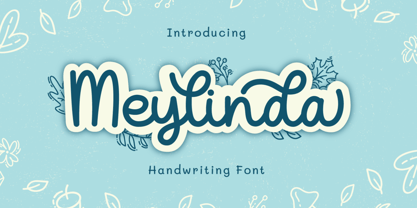 Introducing Meylinda Font by Tlatoustype Meylinda is a Modern Cursive Handwritten Script Font. Meylinda is perfect for book cover, product packaging, branding project, megazine, social media, wedding, or just used to express words above the background.This font also multilingual support.
 - Lawson by Okaycat,
$29.50 Okaycat Font Foundry proudly presents "Lawson"! A retro classic style font, perhaps futuristic, containing European accents. Beautifully connected cursive with high legibility and style for your design, great for print and publication. See the new textured version Lawson Vintage please.
 - vtks alcalina - 100% free

- Romance Fatal Goth Premium - Personal use only

- VTC-TribalThreeFree - Personal use only

- Olho de Boi - Personal use only

- LT Fillet Medium - 100% free

- Durazno de Chile by Ocha Puyaber,
$10.00 Durazno de Chile are cursive fonts based on Chilean school script. It can be written in Aymara, Mapuche and Rapa Nui from Chile. It can also be written in Dutch, Maltese, and other languages. This font family is cute. The style is wide and rounded. It has wide and open loops. The strokes are drawn with a round cap tool, with no contrast. It is cursive and connected. The form is upright because upright is the Chilean script standard. It is easy to read in Chile. Parts A have capitals with high starts. Parts B have capitals with low starts. Parts F are Final forms.
 - Ecliptica BT by Bitstream,
$50.99Ecliptica is an extended family of five very condensed typefaces in a single bold weight. The creation of Australian designer Robert Bell. Ecliptica has a Sans, a Semi-Serif, a Serif and a single Cursive that can be used with any of the other three styles. As an added bonus, Robert also designed a modern Blackletter companion. The Ecliptica family is an unusual layout of styles and all work equally well with one another. The OpenType versions of the Ecliptica fonts support an extended Latin character set that includes a full array of fractions as well as additional ligatures. The Sans and Cursive fonts contain some cap and lowercase alternates. - Minotaur by CastleType,
$59.00 Minotaur is an original monoline design based on an Oscan (http://en.wikipedia.org/wiki/Oscan_language ) votive inscription from the second century B.C.E. The letterforms immediately caught my eye in the wonderful book, Lettering by Hermann Degering, and I decided to create a typeface based on them with only enough compromises to make it usable as a modern alphabet. Not quite as straightforward as I had hoped. For example, the Oscan language (the predominant language in the Italian peninsula before the ascendance of Latin), has no letter "O", so the distinctive curve of the "D" was used as the model for the rounded letters "C" and "G" and more subtly for "O" and "Q"; this shape is also echoed in the original design of "B", "P" and "R". Also, the Oscan letterforms for A, K, L, M, N, S, and U are rather quaint, so I've included modern forms as alternates. Minotaur offers the best of both worlds: Just as the mythical Minotaur is half man and half bull, the font Minotaur is half modern and half ancient. Thanks to OpenType features (stylistic sets), you can easily switch from ancient letterforms to modern (if you have an OpenType-savvy application such as Adobe InDesign) for Latin, Greek, and Cyrillic alphabets. Minotaur supports all modern European languages, including Modern (monotonic) Greek and those that use the Cyrillic alphabet. And, yes, it supports Oscan, both right-facing and left-facing. Minotaur includes 3 OpenType Stylistic Sets: 1 - converts ancient (default) letterforms (A, K, L, M, N, S, and U) to modern alternates; 2 - converts Latin letterforms to equivalent left-facing (standard) Oscan letterforms; 3 - converts Latin letterforms to equivalent right-facing Oscan letterforms.
 - Aspen by Ludwig Type,
$39.00 Aspen is a refreshing and resilient typeface for text of any kind. Functional but not faceless, Aspen derives a very distinctive character from an unusual pedigree. It is loosely influenced by early American and European grotesques, but with more warmth and improved legibility. And where these historical models were rigid and bulky, Aspen’s curves have a gentle sway that makes for very comfortable reading. Relatively generous ascenders and descenders allow the typeface to feel spacious even when set with tight leading. These amiable qualities are matched with a lively italic based on cursive writing. The family consists of nine weights, and is intended for both text and display usage. Visit this minisite to see Aspen in action.
 - Zaenudin by Mightyfire,
$15.00 Characterized by flowing curves, intricate ligatures, and graceful strokes, Zaenudin - the Arabic decorative fonts are a testament to the inherent beauty of the written language. Each letter is meticulously crafted to harmonize with its counterparts, creating a seamless and harmonious visual experience. The script's cursive nature adds a sense of fluidity, allowing the eye to effortlessly traverse the characters in a rhythmic dance. Whether used in print or digital media, Zaenudin possess a unique ability to evoke a sense of identity, connecting the viewer to the rich history and diverse cultures of the Arabic-speaking world. We're proud and honored if Zaenudin can be the part of your special projects. Thank you :)
 - Crumpled Parchment by Celebrity Fontz,
$19.99This original typeface appears to be lifted straight from an old crumpled piece of parchment or from a pirate map. An absolute must-have for Halloween, children's publications, pirate-themed texts, and any writing that needs to convey a haunting feel. These tattered letters conjure up spirits and spooks of buccaneers, swashbucklers, and conquistadores from centuries past. - Melt by Flavortype,
$24.00 Introducing "Melt," a captivating and versatile font that seamlessly blends boldness with soft, rounded curves, exuding an irresistible charm. This font is a harmonious fusion of cursive elegance, bold confidence, and modern trends, making it perfect for eye-catching headlines that demand attention. The Melt font family is thoughtfully crafted with three distinct selection font files, ensuring a range of creative possibilities: Melt Italic (Full Features): The italic variation of Melt boasts full features, providing a dynamic and playful touch to your designs. With its stylish slant and graceful curves, Melt Italic is ideal for adding a touch of sophistication to headlines, posters, and other creative projects. Melt Swashes: Elevate your designs with the Melt Swashes font file, where uppercase letters are replaced with delightful swashes. These swashes add a whimsical and artistic flair to your text, creating a unique and expressive visual impact. Perfect for adding a touch of creativity to logos, branding, and more. Melt Swashes Alt: For those seeking alternative swashes for uppercase letters, Melt Swashes Alt offers a distinct set of alternative swash designs. This variation provides even more versatility and customization options, allowing you to tailor your typography to suit the specific aesthetic of your project. Whether you're designing for a trendy website, playful branding, or vibrant marketing materials, Melt's bold, cursive, and rounded style, coupled with its three font file options, ensures that you have the perfect tool to make a lasting impression. Embrace the charm of Melt and let your headlines stand out with a delightful blend of modernity and cuteness.
 - Belle Allure by JBFoundry,
$10.00 Belle Allure is a font for schools. It is based on the continuity of movement and simple paths which let a fast and easy cursive writing. It respects the French habits and leans on a wide character set and on the OpenType properties.
 - Alright by K-Type,
$20.00 Alright is a cursive font is based on the handwriting alphabets used in education, but with modern short ascenders and descenders. Most of the lowercase letters and half of the capitals join up smartly. A useful teaching alphabet and surprisingly stylish too.
 - Triplett by Monotype,
$40.99The capitals of the Triplett font bare a strong resemblance to Roman inscriptions, while the lowercase alphabet has been drawn with a rounded hand, inspired by the cursive uncial handwriting. Serifs are very small, giving a clean modern look to texts and headings. - Gaby Pro by RMU,
$35.00 Inspired by the 1947 Weber font Gabriele, Gaby Pro is a freshly designed versatile and everyday cursive font that can be used for a wide range of printed products and for web design as well. The font was carefully extended for multilingual use.
 - AJ Quadrata by Adam Jagosz,
$25.00 Once, Blackletter was a calligraphy style. Full of ligatures, with letters bumping into each other to create an unapologetic picket-fence pattern. Some even claimed that the regularity improved legibility! But then Blackletter was cast into metal, and only a handful of established ligatures survived, while most interletter connections were disentangled. Everyone since followed suit, and hundreds of years later, digital Blackletter fonts were modelled mostly on the metal fonts that prevailed rather than the original handwriting. Up until now! AJ Quadrata is an authentic revival of the textura quadrata hand, and its major inspiration is a 15th-century Latin manuscript of the Bible from Zwolle, the Netherlands. The typeface is delivered in two flavors. The default cut is a modern take on textura quadrata that can be useful for today and tomorrow. The standard ligatures feature employs nearly all letters. The tittle of i retains its original, hasty squiggle form (except for the Turkish localization). Discretionary ligatures include medieval ligatures da, de, do, pa, pe, po (and their mixed-case counterparts!). Stylistic sets allow to use historic letter variants such as long s and rotunda r, closed-counter a, and alternate capitals. AJ Quadrata Medieval is perfect for setting Latin. Default forms of capital F, H and O are swapped with the alternates. The squiggles above i only appear for disamibiguation nearby m, n or u, as in original manuscripts. Discretionary ligatures and historic variants are promoted to the standard ligatures feature to make room in the discretionary ligatures feature for a variety of scribal abbreviations. Dedicated stylistic sets include medieval punctuation and justification alternates — glyphs with elongated terminals used for lengthening lines that end up too short. The Rubrum styles can be layered and colored to create the illuminated effect on the capital letters. Besides a faithful rendition of extended Latin including Vietnamese, numerous synthetic additions are included: polytonic Greek, Armenian, and Cyrillic (with Bulgarian and Serbian/Macedonian localizations). Both flavors of the typeface can be considered a starting point that can be further customized using OpenType features, including Stylistic Sets (some features differ between AJ Quadrata and AJ Quadrata Medieval): ss01 Alt E ss02 Descending F / Roman F ss03 Uncial H / Roman H ss04 Angular O / Round O ss05 Contextual closed-counter a ss06 Diamond-dot i j / Always dotted i, j ss07 Contextual rotunda r / No r rotunda ss08 Contextual long s / No long s ss09 Dotless y ss10 Serbian Cyrillic ss11 Alt Cyrillic de ss12 Alt Cyrillic zhe ss13 Alt Cyrillic sha ss14-ss17 [reserved for future use] ss18 Scribal punctuation ss19 Alt linking hyphen ss20 Justification alternates
 - Silentgraph by Din Studio,
$29.00 Silentgraph is a script font made from handwriting in lovely designs to make your designs prominent. Every stroke expresses beauty and cursive styles of which letters are interconnected. Details of each letter show curvy wipes and high contrasts on its edges. Use this font for big-sized texts to be legible. Features: Stylistic Sets Multilingual Supports PUA Encoded Numerals and Punctuations Silentgraph fits for various design projects, such as posters, banners, logos, magazine covers, quotes, headings, printed products, invitations, name cards, merchandise, social media, etc. Find out more ways to use this font by taking a look at the font preview. Thanks for purchasing our fonts. Hopefully, you have a great experience using our font. Feel free to contact us for further information when you have a problem using the font. Thank you. Happy designing.
 - Jean Paul Fraktur by RMU,
$25.00A typographic treasure, originated at the end of the 18th and the beginning of the 19th century, had been brought back to life. With its charming touch it makes a wonderful font for poems, bookcovers, reprints and other historically relevant projects. To get access to all ligatures, it is recommended to activate both Standard and Discretionary Ligatures; the round s you find on the # key, and typing the combination N-o-period and activating the OT feature Ordinals gets you the numero sign. - Maritime Champion Stencil by Kyle Wayne Benson,
$6.00 Make no mistake, Maritime Champion is not simply seaworthy. This peacoat grubbing, all hands on decking, accordion serenading font is not for the faint of heart. He’s all caps all the time. Even the lightest of his six weights is enough to anchor a Man-o-War in any Caribbean maelstrom. This stencil set includes four weights to accompany the existing four shoreline styles and six regular weights. It’s an all caps family that includes lots of language options and opentype fractions.
 - Maritime Champion by Kyle Wayne Benson,
$8.00 Make no mistake, Maritime Champion is not simply seaworthy. This peacoat-grubbing, all-hands-on-decking, accordion-serenading font is not for the faint of heart. He’s all caps all the time. Even the lightest of his six weights is enough to anchor a man-o-war in any Caribbean maelstrom. This 10-font family includes six weights and a Shoreline style that comes in four weights. It’s an all-caps family that includes lots of language options and OpenType fractions.
 - TG Yane by Weishan Gao,
$39.00 The font design of TG Yane is inspired by my service design for a coffee brand, taking the coffee logo as the design origin. I supplemented the remaining letters, making the font suitable for applications in the catering, cosmetics, luxury goods, and other industries. The lines are soft and very creative. The entire character set is designed with the capital letter "O" as a circular element, ensuring a unified design language. I look forward to seeing it applied to your brand.
 - Silent Reaction by Tattoo Woo is a font that captures the essence of expression without the need for loud proclamations. Crafted with the creative flair commonly associated with Tattoo Woo's unique s...
- As a creation of Tattoo Woo, the Quasari font is an exquisite display of the artistic finesse and bold creativity that defines the designer's portfolio. It is imbued with a sense of fluid motion and ...
- Rockyeah by Majestype,
$19.00 Rockyeah is 3 style fonts: brush, serif and sans serif who have strong personalities and work very well in many design projects. - Rockyeah Brush made with fine brush pen with the fastest stroke movement. Comes with over 300 glyphs that will give you a vast possibility to play with each character. - Rockyeah Serif is an interpretation of Rockyeah brush. A serif font that focuses on legible, elegant and unique. With light and bold stroke combination this serif will give a modern-classic vibes on your design project. - Rockyeah Sans a geometric sans serif that focuses on legible, clean and useful for any project. This sans is an interpretation of Rockyeah Serif with the same caps height and bold stroke. This font is suitable for poster, tattoo, tees graphic, headline and etc :) Just play and rock it!
 - Letterhythm by Letterhythm Studio,
$30.00 Letterhythm is a modern, contemporary handcrafted blackletter typeface made with experienced by the hand of Dhiya Roslan. The style was influenced by Old School Blackletter Calligraphy Script culture, Fraktur style, and with an extra touch of urban street attitude of Calligraffiti (Calligraphy+Graffiti). The letterform took years of practices to finally made it into digital format. Letterhythm is a very flexible font for almost anything from merchandise, logo, branding, artwork, title, sub-title, body text, tattoo arts, apparels to infinity and beyond. Letterhyhm is a timeless typeface that suits and fit perfectly in any timeframe or style you want. It comes with Multilingual Support for most Latin alphabet's languages derived with 3 unique font styles that made a total of 220 glyphs each style to complete the typeface including ligatures, alternates and all necessary symbols & punctuations.
 - Samba by Linotype,
$29.99The Samba family was inspired by the lettering art of J. Carlos, a Brazilian illustrator during the early 20th century. Turned into a workable series of fonts by the contemporary Brazilian designers Tony and Caio de Marco, Samba is especially recommended for use in logos, flyers, posters, and tattoos! This family offers the user a chance to mix three different styles of lettering into one coherent design, which can be very useful in solving certain design problems. While the regular Samba face is made up of mono-line letters, the style of Samba bold offers much more of a thick to thin contrast. The Samba Expert set displays lavish swash endings, which were inspired by Brazilian metal work. The Samba family was one of the winners selected during the 2003 International Type Design Contest, sponsored by Linotype GmbH. - Komet Pro by Jan Fromm,
$65.00 Komet is a sturdy typeface with a calm and upright feel. Although it derives inspiration from classical English sans-serifs, it’s not too closely related to that model. Komet, instead, feels rather more lively and contemporary. Its compact spacing, low stroke contrast and heavy dots and accents give it an almost monolinear quality. The diagonals are slightly curved and the counters of the round letters such as b, o and q are generously wide. The muted, understated middle weights are built for extended body copy, while Komet’s thin and dark weights look brisk and assertive and make for subtly expressive headlines. Komet is an ideal choice for editorial design, branding and corporate design. The Komet Pro family comes in eight weights with matching italics, from Thin to Black. Each font contains around 850 glyphs, including a rich repertoire of OpenType features. Small caps, ligatures, ten different figure sets with matching currency symbols, stylistic alternates and arrows make Komet Pro a comprehensive toolkit for ambitious typography.
 - Komet by Jan Fromm,
$45.00 Komet is a sturdy typeface with a calm and upright feel. Although it derives inspiration from classical English sans-serifs, it’s not too closely related to that model. Komet, instead, feels rather more lively and contemporary. Its compact spacing, low stroke contrast and heavy dots and accents give it an almost monolinear quality. The diagonals are slightly curved and the counters of the round letters such as b, o and q are generously wide. The muted, understated middle weights are built for extended body copy, while Komet’s thin and dark weights look brisk and assertive and make for subtly expressive headlines. Komet is an ideal choice for editorial design, branding and corporate design. The Komet family comes in eight weights with matching italics, from Thin to Black. The glyph set of each font contains around 520 glyphs and provides good everyday support for most Latin-based languages. For a wider range of advanced OpenType features, Komet Pro is also available.


