10,000 search results
(0.074 seconds)
- Railway Depot JNL by Jeff Levine,
$29.00 A bold spur serif design found within the pages of the 1934 French lettering instruction book “L'Art du Tracé Rationnel de la Lettre” provided the inspiration for Railway Depot JNL, which is available in both regular and oblique versions.
 - Rockinstead by PintassilgoPrints,
$35.00 Rockinstead counts 1, 2, 3, 4, 5, 6, 7, 8... Eight variations per letter, plus alternates for numbers and even for punctuation marks! It is equipped with some clever OpenType programming to make substitutions on-the-fly: the Contextual Alternates feature, with the help of a very careful kerning table, takes care of cycling the alternates in an amazing random-like way, impressively mimicking a true handwritten text. The Discretionary Ligatures feature manages the substitution of handy cursive catchwords, adding that charming twist. To put it more bluntly, this font AUTOMATICALLY alters your typing so that it substitutes glyph variations while you do nothing but type away! No need to use PopChar here to do the substitutions manually, the font itself takes care of that for you. This typeface was originally painted on paper, drawing inspiration from Ralph Steadman’s seminal lettering style. On a first glance it may look quite wild - and it proudly is, indeed. But look again: it is stylishly wild, it is strong, unpredictable, full of attitude and good energy. This multifaceted font will certainly strike its way for free-spirited design applications. Just please be warned: it’s seriously addictive!
 - Subito - Personal use only

- GALLAECIA - Unknown license

- Helvetica Now by Monotype,
$42.99 Every single glyph of Helvetica has been redrawn and redesigned for this expansive new edition – which preserves the typeface's Swiss mantra of clarity, simplicity and neutrality, while updating it for the demands of contemporary design and branding. Helvetica Now comprises 96 fonts, consisting of three distinct optical sizes: Micro, Text and Display, all in two widths. Each one has been carefully tailored to the demands of its size. The larger Display versions are drawn to show off the subtlety of Helvetica and spaced with headlines in mind, while the Text sizes focus on legibility, using robust strokes and comfortably loose spaces. The Micro sizes address an issue Helvetica has long faced – that of being 'micro type challenged'. In the past, the typeface struggled to be legible at tiny sizes because of its compactness and closed apertures. Helvetica Now's Micro designs are simplified and exaggerated to maintain the impression of Helvetica in tiny type, and their spacing is loose, providing remarkable legibility at microscopic sizes and in low-res environments. There's also an extensive set of alternates, which allow designers the opportunity to experiment with and adapt Helvetica's tone of voice. This includes a hooked version of the lowercase l (addressing a common complaint that the capital I and lowercase l are indistinguishable) as well as a rounded G, and a straight-legged R, a single storey a and a lowercase u without a trailing serif. In the past, designers had to nudge, trim and contort the design to create stylish display-type lockups with Helvetica. Helvetica Now Display was designed and spaced with those modifications in mind—saving effort and providing more consistent (and more stylish) results. “Helvetica is the gold standard,' says Monotype Type Director Charles Nix. “To use it is to claim that you are the ultimate expression of whatever your brand aspires to be. Its blankness is its power.” Helvetica Now User Guide PDF. Featured in: Best Fonts for Resumes, Best Fonts for Websites, Best Fonts for PowerPoints
 - MondoRedondo - Unknown license

- Paleos by Scriptorium,
$12.00For Halloween season, we thought we'd better trundle out a nice, crude prehistoric font to meet the growing need. Paleos features many different versions of almost every character so you can give it the natural variety of lettering hand-carved by a troglodyte. - Blorp by Missy Meyer,
$12.00 I had a totally different name assigned to this font at first. Then, while drifting off to sleep one night during the creation process, my sleepy brain said, "You know, BLORP would be a great name to go with these letter shapes." Normally when I have those half-asleep ideas and look at them in the morning, they make no sense. But I decided to make a sample image for BLORP, and it turns out I really like it! So ... BLORP it is! This font is extensively edited for super-smooth lines and curves, so it'll cut like butter in your Cricut or Silhouette machine. Though it's also super cute for print projects, logos, branding, or anything else you want to use it for! It has a funky mix of letter sizes and heights, and two sets of uppercase letters, so you can mix everything together JuSt LikE tHIs, and it'll still look great! BLORP includes over 300 extended Latin characters for language support, including, but not limited to: Catalan, Czech, Danish, Esperanto, Estonian, Finnish, French, Gaelic, German, Icelandic, Irish, Italian, Latvian, Lithuanian, Norwegian, Polish, Portuguese, Romanian, Serbian (Latin), Slovak, Slovenian, Spanish, Swedish, Turkish, Welsh, and more!
 - Jackipur by HGB fonts,
$20.00 The motivation for Jackipur was: to achieve more openness and thus more clarity. That's why I created more clarity in the structure of the letters in order to avoid formal ambiguities that arise especially with small degrees. I found it important to open up the round letters so that they are straight and horizontal along the center and baselines so that the eye can connect the letters directly and quickly. A simple font, but neither plain nor without elegance.
 - ITC Atelier Sans by ITC,
$29.99ITC Atelier Sans began as one of Curtis's renovations. His goal was to create a monoline design with Art Deco “sensibilities,” but without the geometric precision and relatively small x-height of faces like Futura or Kabel. Gentle curves and suggestions of serifs create a crisp, clean and open face that is at once sleek, sensuous and still affable. Available as a two-weight family with complementary italics, ITC Atelier Sans is another successful and usable revival from Nick Curtis. - Sirkle by Invasi Studio,
$19.00 Sirkle is a semi-serif typeface for display, constructed with sharp and curvy characters. All Letters are handcrafted and made to fit each other perfectly without exception, with a modern and edgy style that gives them a unique look. Sirkle comes with ligatures, alternates, and supports 60+ Latin-based languages. The Sirkle is ideal for logotype, signage, posters, packaging, and much more! Features: Uppercase & Lowercase Numerals & Punctuation Alternates and Ligatures Multilanguage Supports 60+ Latin based languages
 - Neo Phalanx by Zenmurai,
$18.00 Neo Phalanx is a rectangular, circular & curvy modern display sans inspired by Ancient Greek mass military formation. The difficulty of make this font is balancing rounded corner & sharp edge. There are letters like "M W A H R N K S Z" provides a unique personality in the title display. Numbering and punctuations also designed in unique styles to deliver different visual language. This font is suited for variety of applications from poster to branding, advertising, digital.
 - Fortunelimes by Maulana Creative,
$13.00 Fortunelimes is curvy casual script font, with felt-tip stroke, slant and fun character. It has Opentype features ligatures of character, To give you an extra creative work. Fortunelimes script font support multilingual more than 100+ language. This font is good for logo design, Social media, Movie Titles, Books Titles, a short text even a long text letter and good for your secondary text font with sans or serif. Make a stunning work with Fortunelimes font. Cheers, MaulanaCreative
 - Cliquelly by Maulana Creative,
$12.00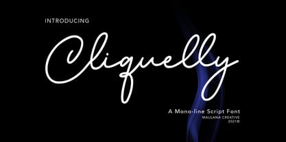 Cliquelly is a curvy script font, with a clean mono-line stroke, slanted and fun character. It has Opentype features ligatures of character, To give you an extra creative work. Cliquelly font support multilingual more than 100+ language. This font is good for logo design, Social media, Movie Titles, Books Titles, a short text even a long text letter and good for your secondary text font with sans or serif. Make a stunning work with Cliquelly font. Cheers, MaulanaCreative
 - Trocadero Pro by RMU,
$35.00 In 1927 Albert Auspurg cut Trocadero for the Trennert foundry in Hamburg. This new version is not a mere digitalization, but many letterforms were altered and updated, and missing links in the complete alphabet had been drawn afresh. Out came a beautiful cursive font with a certain charm of its own which covers beside the West European languages also those of Central Europe and Turkish.
 - Foundry Origin by The Foundry,
$90.00 Foundry Origin has an elemental quality hinting at its ‘Egyptian’ roots. Developed out of the desire to create a serif typeface with a difference, Foundry Origin's elegant design and versatile family of weights, with lyrical cursive italic, generous x-height and classical proportions, make it ideal for editorial and information design. A quiet design with a big presence, tipped to become a modern classic.
 - Didgeree Doodle NF by Nick's Fonts,
$10.00The pattern for this delightful little font was originally released as Bernhard Heavy Antique Cursive by the Bauersche Geißerei of Frankfurt am Main and designed, of course, by Lucien Bernhard. Dippy, trippy, under the radar and over the top. The Postscript and Truetype versions contain a complete Latin language character set (Unicode 1252); in addition, the Opentype version supports Unicode 1250 (Central European) languages as well. - LC Merkén by Compañía Tipográfica de Chile,
$30.00 Merkén is a typeface inspired in the Slab Serif fonts designed by Vincent Figgins in the early 20th century: his famous designs; Antique and Egiziano, were the main references when developing this project. The typeface is perfect for headlines, medium length texts, branding and advertising. His original set is strong and spicy but it also has an alternative set which is cursive and kind.
 - Kyrenia by Talavera,
$60.00 Calligraphic font born from mixing chancery cursive strokes with some copperplate gestures. Kyrenia is the italic counterpart of Agony TTW. You can combine Kyrenia’s four different styles to create the illusion of handmade, along with a lot of ligatures and some alternate endings. This four styles are Quill (the basic one), Broad (taller and stiffer), Swash (ornamental and romantic) and Monster (a hypnotic strange blend).
 - Samsara by W Type Foundry,
$15.00 Samsara is a cursive typeface inspired by calligraphy tools. Its shapes and gestures convey an organic-modern style which generates the texture of a brush tip. Samsara not only has a great versatility, but also is suitably to create short texts such as branding and short messages. It comes with OpenType features, stylistic sets, special ligatures, and swashes, which were designed specially to let your imagination fly.
 - Cardamon by Linotype,
$50.99 “My goal in creating the Cardamon family,” says Brigitte Schuster of her first design, “was to make an unobtrusive serif typeface which, at the same time, has a determined and straightforward demeanor.” “I wanted to design a typeface with sharp edges and corners,” explains Schuster. “I was influenced by the angularities in Vojtěch Preissig‘s “Antiqua” and “Cursive” in addition to Oldřich Menhart‘s “Menhart” typeface.”
 - Ottocento by Eurotypo,
$39.00 Ottocento is an elegant chancery cursive, derived from XIXth century Italian calligraphy. Slightly inclined and with a fast and marked ductus, this font is well balanced between thick and thin strokes and shows marked ascendings and descendings. Ottocento is rich in stylistic variations with its elaborated upper cases, and stylistically different in traits and different ligatures are considered to make the most of the many OpenType features.
 - Catchfire by Alan Smithee Studio,
$10.00 Warm and human, yet reliable and precise. Catchfire blends humanist proportions and geometric features. The result is a sans serif typeface with strong personality traits, but that can fulfil everyday needs. It is very legible due to its open counters. It boasts a large character-set, OpenType features, circled numbers, wide range of weights, cursive italics : everything needed to become your new companion for years to come!
 - ND Laterne by NeueDeutsche,
$20.00 Introducing ND Laterne: a font that masterfully blends the timeless essence of tradition with the sleek aesthetics of modernity. At a first glance, its uppercase letters exude a comforting familiarity, yet upon closer inspection, its lowercase characters unveil a captivating and singular personality. Delicately embracing curves and meticulously sculpted forms, ND Laterne beckons for attention, instilling a profound sense of assurance and empowerment.
 - Jeames by Kyle Wayne Benson,
$6.00 Jeames brings familiarity to the often detached feeling extended serif genre. The curved, heavy, joints let the letters bounce along while the proportions and contrast keep your eyes grounded. This mid century inspired family of three weights is intended for large titles and display. The set includes language support, opentype fractions, and other fun glyphs. You can learn more about its development here.
 - Quiky by Scratch Design,
$10.00 Introducing our Quiky! A playful, hand lettered font. It has smooth lines, a heavy weight, sweet curves and a lot of character that you can name it. Quiky suits for your design such as invitation design, stationery, branding, blog design, advertising design, card, art quote, home decor, book title, special events and more. This font also includes Latin Characters for language support.
 - Avocado Sans by ArtyType,
$29.00 This ‘pear-shaped’ typeface literally defines its original design inspiration in the first capital letter. The clean-cut lines and uniquely curved letterforms, combined with a thoughtful mix of squared & rounded terminals, all help make Avocado Sans such a stylish and legible font, very easy on the eye. Available in two practical weights, Light & Regular, each offering alternate style options.
 - ITC Caribbean by ITC,
$29.99ITC Caribbean is the work of California designer Jill Bell, earthy yet exotic. In her typeface experiment, Bell combined unusual angles and curves to produce tall, thin letters whose stroke style completes the suggestion of palm trees which this typeface brings to mind. The typeface contains capitals and small caps. The natural look of ITC Caribbean lends any work a human touch. - Oakes Grotesk by Studio Few,
$12.00 Oakes Grotesk is a more corporate take on the Oakes typeface. It explores a set of brand new metrics that allow it to be more legible in body text as well as headings. The letter 'g' has been tweaked to become double-story as well as the refinement of other characters. This is all whilst maintaining the subtle curves of the Oakes typeface.
 - Barrage by RagamKata,
$14.00 Barrage Display Font Barrage presents a modern take on typeface design, merging cheerful boldness with artistic touches. Each letter is meticulously shaped, striking a balance between confidence and elegance. The box-like lines provide a sturdy foundation, while the subtle curves add a delightful creative flair. With its lively boldness and delicate lines, Barrage conveys courage and a positive personality.
 - Vincente by Dharma Type,
$19.99 Vincente is a contemporary but Didone-look serif with condensed proportion. Inspired by vintage iron works and antique botanical pictorial book. Very simple and orthodox letter forms with some charming accent such as can be seen in "y". Sophisticated curves but they have human warmth as if they are hand-crafted. Consists of six weights and supporting almost all latin languages.
 - Raeling by Volcano Type,
$19.00Raeling is a display font inspired by a visit to Luxembourg, capturing shadows falling intricately from park railings appearing as broken-script lettering. A mixture of manmade / natural, traditional / new, ugly / beautiful reflecting the paradox and contradictions of the city. A single curve and stroke developed into a grid block from which characters emerged and broke free of their barriers and conformity. - ABSD Elena Verlin by Abesede Studio,
$18.00 It has a lovely, refined appearance. This letter displays an unique and curving style. The gorgeous and elegant Elena Verlin Font is perfect for any project you are working on. This font is ideal for use on invitations for weddings, birthdays, anniversaries, and other special events. Because it can be applied on logos and products, it's also ideal for branding.
 - Beach Please by Resistenza,
$39.00 Beach Please - Is a suite of handwritten fonts designed with pointed brush and watercolors. Beach Please Script is a relaxed and tender brush font, inspired by sign painting. The aim was to give a fun and fresh twist, exaggerating some curves and punctuation signs. There are also many alternates and swashes included accessible through opentype. Beach Please Caps & Wide have a bizarre look because of the reversed contrast on some letters, this particularity gives to the font a total new expression perfect for catchy headlines. Beach Please Wide works better when you need to use it in smaller sizes. It is full of ligatures to give to your text a realistic handwritten feeling. Beach Please works very will with our font family 'Aperó' We also present in this font family a slanted version for each font. To complete the Suite a set of tropical and fruity icons is also available. These sketchy vintage illustrations are perfect to create beautiful letterings and graphic layouts. Enjoy it! More about Opentype Features: https://bit.ly/opentype-rsz
 - Tsanger Yun Hei SC by Tsanger,
$198.00 Tsanger Yunhei was designed and published by Tsanger. Tsanger Yunhei contains 8 styles and family package options. The designer has made unique treatment on the shape and structure of the pen, based on the Chinese calligraphy style and writing, which makes it easier to identify under the same size of the font and group reading effect better. Tsanger Yunhei is more in line with the aesthetic habits of Chinese characters getting the reading an easy task. This font adopts GB 2312—1980 standard, with a total of 6763 Chinese characters, matching Latin letters, Greek letters, Hiragana, Katakana, Russian Cyrillic letters, etc.
 - Olivia Sans by Stabenfonts,
$45.00 The rounded Sans with edges. Olivia Sans got curves on the outlines and edges on the inlines. So it can be very legible and space efficient at the same time: the curves keep the distinctions between the letters, the corners keep the influences from broadnibbed pens with a subtle horizontal stress for great legibility. Olivia has personality without being obtrusive. Three weights (light, regular, bold) are equipped with real italics, SmallCaps, different sets of figures, accents for almost every latin script, arrows, symbols. A fourth weight (black) comes without italics or SmallCaps, but all the other features. Olivia: with or without.
 - Olivia Serif by Stabenfonts,
$45.00 The rounded Serif with edges. Olivia Serif got curves on the outlines and edges on the inlines. So it can be very legible and space efficient at the same time: the curves keep the distinctions between the letters, the corners keep the influences from broadnibbed pens with a subtle horizontal stress for great legibility. Olivia has personality without being obtrusive. Three weights (light, regular, bold) are equipped with real italics, SmallCaps, different sets of figures, accents for almost every latin script, arrows, symbols. A fourth weight (black) comes without italics or SmallCaps, but all the other features. Olivia: with or without.
 - MartiniThai Neue Slab V2 by Deltatype,
$39.00 Award winning 2017 font from Demark (Thailand) and G-Mark (Japan) in Graphic Design, MartiniThai Neue Slab is now available with better taste. Deltatype created a better version of MartiniThai Neue Slab V2: refined for better outline, we fine-tuned all outlines for better letterforms. Proportion were adjusted for better consistent. Metrics got new values for increased readability. Kerning, fine-tuned kerning pair for better spacing between the letters. MartiniThai Neue Slab V2 comes in six weights: Thin, Light, Regular, Bold, Extra Bold, Black. Thai Language is included in this package. MartiniThai Neue Slab is a unique slab serif in Thai Script that creates a sense of timeless and contemporary feel and is used by a media provider and nationwide in Thailand.
 - Bakery Script by Sudtipos,
$49.00 Bakery Script is the Argentine duo's nod to the high spirits of the 1970s. Angel Koziupa used his ever popular wild brush to draw the outline version, and Alejandro Paul refined it, expanded it, then extrapolated the solid version. While the outline version makes the letters seem like they're growing out of each other's shadows, the solid version presents a wilder version of the casual dancing letters Koziupa's brush has entertained us with during recent years. Sharp in places, perfectly curved in others, and with many letter alternates and ligatures included within the fonts, Bakery Script would be at home in packaging design, outdoors and adventure literature, and everywhere a display design needs that sharp but friendly touch to reach its goal.
 - Tenement JNL by Jeff Levine,
$29.00 A 1916 book entitled “Lettering” by Thomas Woods Stevens features a number of hand lettered alphabets; some plain, others unique. One of the more novel examples was designed by Harry Lawrence Gage and featured letters and numbers with a crude, wavy style described in the book as “adapted to wood block and linoleum cutting”. To keep the design as close to the original as possible, the image from the book page was auto-traced, with each character given just enough of a clean-up as to retain its own quirkiness while smoothing out any jagged lines and fixing some curves. From there, other necessary characters were created for the digital font, and the end result is Tenement JNL, which is available in both regular and oblique versions.


