10,000 search results
(0.091 seconds)
- Hollens by Supfonts,
$17.00 This modern calligraphy script has been attentively written, with gentle curves to produce a font thats completely distinctive and original. It contains a full set of lower & uppercase letters, a large range of punctuation, numerals, and multilingual support. Perfect for adding a elegant and unique touch to your lettering projects and branding
 - Love Bubble by Mazkicibe,
$10.00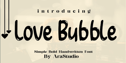 Love Bubble Font is a handwritten and modern font that combines a sweet touch and beautiful curves in every letter. using a touch of soft body curves so that it is pleasing to the eye Love Bubble Font is great for: Wedding invitations, Birthday invitations, fashion magazines, logos, signatures and is great for watermark photography.
 - TwoSeven by Mazkicibe,
$11.00 TwoSeven Font is Sans Serif and modern font combined with a sweet touch and beautifully curved each letter. using a touch of soft curves so that it is pleasing to the eye Twoseven Font Spirit is great for: Wedding invitations, fashion magazines, logos, signatures, and suitable for watermark photography. Features: -Uppercase, -Lowercase, -Numeral, -Punctuation,
 - Briasantika by Brithos Type,
$11.00 Briasantika is a cursive and natural handwritten font. It looks beautiful on a variety of designs requiring a personalized style, such as wedding invitations, thank you cards, posters, flyer, greeting cards, logos and so on.
 - Blacksign by Creativework Studio,
$18.00 Blacksign is a cursive brushed handwritten font, featuring a lovely style. No matter the topic, this font will be an incredible asset to your fonts’ library, as it has the potential to elevate any creation.
 - Chiara Script by Greater Albion Typefounders,
$14.95 Chiara Script has a very simple origin. It's a highly stylized interpretation of Greater Albion's chief designer's handwriting! It combines legibility and cursive characters in a distinctive blend and includes a range of OpenType features.
 - Script Love by Okaycat,
$29.95 Script Love is a connected cursive script appearing as hand written in three weights: fine pen, pen & marker. Script Love features extended characters, containing West European diacritics & ligatures, making it suitable for international environments & publications.
 - Alire by Gittype,
$20.00 Alire is a cursive font and inspired from the famous retro typography design. It includes a total of 518 glyphs and includes several OpenType Features such as: Stylistic Alternates, Swashes, Ligatures, Contextual and Stylistic Set.
 - Tropical Tourist JNL by Jeff Levine,
$29.00 A 1934 advertisement for the Roney Plaza Hotel at 23rd Street and Collins Avenue on Miami Beach yielded the inspiration for Tropical Tourist JNL. While this wonderful example of Art Deco lettering survived, sadly the original Roney was torn down around 1969 and replaced with a modern apartment house/condos bearing the same name.
 - Art Valentine by Yoga Letter,
$13.00 Art Valentine is a very pretty and unique font, with curves in the subtle letters and swashes and ligatures that are very pretty and elegant. The use of tails on letters is very simple and easy so that consumers can easily use decorations on letters. This font is perfect for your Valentine's Day and various other jobs such as weddings, invitations, logos, branding, banners, posters, social media, and more.
 - Funkadelity by PizzaDude.dk,
$18.00 Funkadelity is a funky breed between 60ies poster typography and 80ies grafitti. Maybe even inspired a bit by comic book lettering! Funkadelity wants to burn off the dance floor and show off the fancy dance moves - at the same time, it want to show off the smooth and clean lines of the letters. Originally handdrawn, but I digitally remastered every single letter, leaving the curves smooth and clean!
 - Stile by FSdesign-Salmina,
$39.00 Are you looking for a true cursive sans serif? Stile is a true cursive with moderate inclination. Its cursive character has mainly to do with writing-speed. Therefore it may serve also as copy font and not only for emphasizing purposes. Stile has a good readability and is really flexible and universally applicable. Stile is a sans serif and renounces to an excessive use of ligatures and other explicit calligraphic shapes in order to ensure a contemporary style and a homogenous text color. The whole font family consists of 8 weights (from ultrathin to black) and offers a wide range of Western and Eastern European special characters, typographical ligatures, uppercase, oldstyle and fraction figures. In addition Stile features a very complete and specifically tailored range of numberings and arrows. Bring a personal style into the artwork, with Stile. Download a free trial version of Stile with a reduced character set. Check it out!
 - Zimple by Ingrimayne Type,
$9.95 Zimple is a very simple blackletter face with few if any curves. The Zimple Extrude Overlay font is spaced so that it can be layered with Zimple Shadow to produce bicolored lettering.
 - Neue Aachen by ITC,
$40.99 Impressed by the quality of the Aachen typeface that was originally designed for Letraset in 1969 and extended to include Aachen Medium in 1977, Jim Wasco of Monotype Imaging has extended this robust display design to create an entire family. Derived from the serif-accented Egyptienne fonts dating to the early 20th century, Aachen has serifs that are very solid but considerably shorter than those of its precursor. The incorporated geometrical elements, such as right angles and straight lines, provide the slender letters of Aachen with a slightly technological, stencil-like quality. Despite this, the effect of Aachen is by no means static; its dynamism means that this typeface, originally designed for use in headlines, has come to be used with particular frequency in sport- and fitness-related contexts. Jim Wasco, for many years a type designer at Monotype Imaging, recognized the potential of Aachen and decided to extend the typeface to create an entire typeface family. He appropriated the existing Aachen Bold in unchanged form and first created the less heavy cuts, Thin and Regular. Wasco admits that he found designing the forms for Thin a particular challenge. It took him several attempts before he was able to achieve consistency within the glyphs for Thin and, at the same time, retain sufficient affinity with the original Aachen Bold. But he finally managed to adapt the short serifs and the condensed and slightly geometrical quality of the letters to the needs of Thin. The weights Light, Book, Medium and Semibold were generated by means of interpolation. Supplemented by Extralight and Extrabold, the new Neue Aachen can now boast a total of nine different weights. Wasco initially relied on his predilection for genuine cursives in his designs for the Italic cuts. But it became apparent with these first trial runs that the soft curves of cursives did not suit Aachen and led to the loss of too much of its original character. Wasco thus decided to compromise by using both inclined and cursive letters. Neue Aachen Italic is somewhat narrower than its upright counterparts; the lower case 'a' has a closed form while the 'f' has been given a descender, but the letters have otherwise not been given additional adornments. The range of glyphs available for Neue Aachen has been significantly extended, so that the typeface can now be used to set texts not only in Western but also Central European languages. Wasco has also added a double-counter lowercase 'g' while relying on the availability of alternative letters in the format sets for the enhancement of the legibility of Neue Aachen when used to set texts. The seven new weights and completely new Italic variants have enormously increased the potential applications of Aachen and the range of creative options for the designer. While the Bold weights have proved their worth as display fonts, the new Book and Regular cuts are ideal for setting text. And the subtlety of Ultra Light will provide your projects with a quite unique flair. The new possibilities and opportunities in terms of design and applications that Neue Aachen offers you are not restricted to print production; you can also create internet pages thanks to its availability as a web font.
 - Nyata by Marsnev,
$14.80 Nyata™ — Clearly Visible, No Matter What. I love London for its finest visual branding, especially its Johnston typeface spreading all over the city. It inspired me to create this new font family: Nyata™. Nyata means clearly visible in Indonesian. The typeface is designed to be clean, unique, and legible. It is a great combination for any display requiring high legibility, such as city’s way finder. Long ascenders help some characters more obvious. You will never confuse wether it is an h or an n. Moreover, I tried to create all the letters are distinguishable. Of course, no time for people to doubt between Uppercase “I” and lowercase “l” when seeing a way finder. Last but not least, it is equipped with tons of OpenType features such as slashed zero to help the words more obvious, or stylistic sets if you don’t fancy the serifed uppercase I. Nyata™ is also delivered in Variable Font format. Enjoy all the styles and everything in between in one variable font only sized less than 150kb.
 - Parabrite by Okaycat,
$19.50Parabrite arrives as a vision of the future. The future is brite - Parabrite - this is unavoidable now. The composition of Parabrite is found to be based on a set of technical behaviors defined from a set of four sub-glyphs and their interactions, similar to the make up of our D.N.A. (A,C,G,T). Likewise, Parabrite's block matrix is composed of four units (S,L,I,C). These units are only allowed to group together according to predefined set of mathematical rules, and affect each other symbiotically. The smallcase letters stand five feathers high, while the capitals add an extra two feathers width. Parabrite is extended, containing the full West European diacritics & a full set of ligatures, making it suitable for multilingual environments & publications. Use Parabrite when you dream of a future world. Since Parabrite is adapted to be quickly read by a wide assortment of electronic scanners, legibility to humans suffers a little, although robots report it is much easier on the eyes. They are happy to read it for you too, if you are having trouble. - Saturday Champagne by Roland Hüse Design,
$18.00 SATURDAY CHAMPAGNE is a monoline modern calligraphy script. Perfect for titles, headings and logotypes for blogs, ads, quote prints, home decor, book title, invitation, birthday, custom product, lifestyle imagery (like quotes and stuff). This font is written by the amazing hand letterer and fellow artist of mine, Leah Chong, and is a collaboration project. The character set contains Western and Eastern European accents and extra characters, symbols and the following open type features: Ligatures: ff ll oo rr th tt ty Finals: b c d l g p y z Instagram: @leahdesign @rolandhusedesign https://leahdesign.sg https://rolandhuse.com Awesome background image for main poster by Simon Buchou from Unsplash https://unsplash.com/@simon_buchou Background mock ups for Girls Night Out and White Sea Cosmetics are from graphicburger.com http://graphicburger.com The Quote "Reality aligns with your mindset" is my favorite and is from Matt Lopez from the Lambo Goal podcast, picture is taken and photoshopped by me. Thank you I hope you like this font & good luck with your project! Roland
 - Yasmine Mutlaq by Arabetics,
$29.00 The Yasmine Mutlaq type family follows the guidelines of the Mutamathil Mutlaq type style. It has one glyph per basic Arabic Unicode character or letter. Each glyph is completely symmetrical around its vertical axis to facilitate bi-directional ordering. This family does not include any required ligatures and does not use glyph substitutions or forming but it does use marks positioning. Text strings composed using types of this family are non-cursive with stand-alone isolated glyphs. Yasmine Mutlaq employs four x-height values, two above and two below the x-axis. Its design uses curves with equally distributed weight. This family includes both Arabic and Arabic-Indic numerals, all required diacritic marks, in addition to all standard English keyboard punctuations and major currency symbols. It is available in regular styles. Also included is an additional font, Yasmine Mutlaq bidi that encodes same glyphs as symbols to facilitate user input from left to right using a Latin keyboard. The fonts in this family support the following scripts: Arabic, Persian, Urdu, Pashtu, Kurdish, Baluchi, Kashmiri, Kazakh, Sindhi, Uyghur, Turkic, and all extended Arabic scripts.
 - Haritta by IbeyDesign,
$17.00 Haritta Handwritten Script Font is a cursive, paint-brushed script font, featuring characters that seem to dance along the baseline. Add this font to your most creative ideas, and notice how it makes them stand out.
 - Canadia by BonjourType,
$15.00 Canadia is a cursive and lovely handwritten font. This versatile script font has a wide spectrum of applications ranging from greeting cards to headlines and is guaranteed to add a romantic feel to your next project.
 - Kylo Sans by The Northern Block,
$29.95 Kylo Sans is a carefully blended typeface, one-part humanist, one-part grotesque and a small dose of geometric. It takes the essence of three distinct forms to create a unique, readable typeface with an exact and understated personality. Additionally, the design process includes a hand-eye adjustment to three master weights, giving a greater range of usability across text layouts. Kylo Sans remastered to version 2.0 for improved OpenType features and usability. Details include six weights and italics, over 700 characters with alternative lowercase Q, a, g, l and y. Open type features include six variations of numerals, small caps, ligatures, and language support covering Western, South and Central Europe.
 - Songlines by Fine Fonts,
$29.00 Songlines is based upon a pen-drawn script drawn by Michael Harvey to illustrate a poem by Johannes Thurman. The expressive and rough-edged letterforms of Songlines do not have any lowercase characters. Instead, alternative uppercase characters occupy their positions. By using a mixture of upper-case and lowercase characters, text can be given a very lively and vigorous character. For example, the two versions of L are designed to overlap and interact whichever way round they are used. The augmented Songlines Plus version, has many alternative characters and ligatures added together with Opentype features to enable their automatic substitution where the application in which they are used permits.
 - Competition by sportsfonts,
$15.00 Competition is a state of the art sports typeface. A large width range, slant angles from –12 to 12, and an adjustable inline make it extremely versatile. It’s devided into 5 subfamilies, from the sizes S, M, L & XL with decreasing inline weights to Solid without an inline at all. (By the way: S doesn’t mean it doesn’t look good in large sizes!) Choose from 105 predefined styles, or 1 variable font with axes for width, slant and inline weight (which is included in the family package). Competition embraces the Latin S character set and therefore supports 400+ Latin-based languages. Go for Gold!
 - Right Female by Haksen,
$14.00 Right Female is an elegant bold script with natural texture. I designed it with my own hand-writting style. I really hope you will enjoy it so much when using this font. I love using this one with layer masks in Photoshop, really look natural written. Right Female Script includes over couple ligatures to make everything look totally hand-done. What's Included: - OTF files - Ligatures in script - Numbers + Punctuation - Non-English support - Swashes If you are interested in more fonts of mine: https://creativemarket.com/Haksen/3908083-Attention-l-Combine-with-Extra-Bonus Please contact me if anything question, I'm glad to help :) Happy Designing, Haksen
 - Neue Frutiger by Linotype,
$71.99 The original Frutiger typeface was designed in the early 1970s by Adrian Frutiger and his studio for the way finding system of the Roissy Charles de Gaulle airport in Paris. Soon after the airport was opened, a huge demand for the typeface arose from companies wanting to employ it in other signage systems, as well as in printed matter. The Frutiger typeface came out as part of the Linotype library in 1977. Epitomizing functionality and clarity both in signage and as a bread-and-butter typeface in print, Frutiger became a modern classic. Neue Frutiger® is the 2009 version of the Frutiger typeface family. It was revised and improved by Akira Kobayashi in close collaboration with Adrian Frutiger. While Frutiger Next, the 1999 revision, introduced a new concept (including a larger x-height, a more pronounced ascender height, narrower letter-spacing and, most notably, an italic with calligraphic traits), Neue Frutiger returns to the original 1977 design. The result is a well-balanced range of 10 finely-graded weights. Despite the various changes, the ‘New Frutiger’ still fits perfectly with Frutiger and serves to harmoniously enhance the styles already in existence. Neue Frutiger Variable are font files which are featuring two axis and have a preset instance from UltraLight to ExtraBlack and Condensed to Extended. Featured in: Best Fonts for Resumes, Best Fonts for Websites, Best Fonts for PowerPoints, Best Fonts for Tattoos
 - Rutherford by Device,
$39.00 Rutherford is clear, robust and authoritative, and reads well at small text sizes while also having the required heft for larger headlines. A wide range of weights makes it a versatile choice for magazines, branding, brochures and advertising. A slightly condensed obround serif with squared stroke terminals. The t, j and f curve around to harmonize with the terminals on the a and g, as does the tail of the Q. The italic incorporates cursive forms on the ends of the lower right and upper left strokes, and uses a single-story a. Includes full European Latin support and alternate designs for the Q and g in all weights.
 - Arabetics Symphony by Arabetics,
$59.00 Arabetics Symphony is a Sans Serif Latin typeface with a comprehensive support for the Arabetic scripts, including Quranic texts. It is designed with a uniform glyph thickness and weight throughout, using a combination of simplified and clear open lines and curves and plenty of spikes and visual hints to compensate for the missing Latin serifs or traditional cursive Arabic calligraphic influence. This type family is suitable for both text and display applications. Additional Latin spacing is added to match an overall open-looking Arabic and is further maintained by a careful implementation of a typical Latin font kerning process. The design of this font family, including metrics and dimensions, was intended to make its Latin harmonize with other Arabetics foundry fonts. Arabetics Symphony fully supports MS 1252 Western and 1256 Arabic code pages, in addition to all the transliteration characters required by the ALA-LC Romanization tables. Users can either select an accented character directly or form it by keying the desired combining diacritic mark following an unaccented character. For Arabic, it fully supports Unicode 6.1, and the latest Arabic Supplement and Extended-A Unicode blocks. The Arabic design of this font family follows the Mutamathil Taqlidi design style with connected glyphs, emphasizing vertical strokes to bring added harmony, and utilizing slightly varying x-heights to match that found in Latin. The Mutamathil Taqlidi type style uses one glyph for every basic Arabic Unicode character or letter, as defined by the Unicode Standards, and one additional final form glyph, for each freely-connecting letter of the Arabic cursive text. Arabetics Symphony includes the required Lam-Alif ligatures in addition to all vowel diacritic ligatures. Soft-vowel diacritic marks (harakat) are selectively positioned with most of them appearing on similar high and low levels—top left corner—, to clearly distinguish them from the letters. Tatweel is a zero-width glyph. Keying the “tatweel” key (shft-j) before Alif-Lam-Lam-Ha will display the Allah ligature. Arabetics Symphony includes both Arabic and Arabic-Indic numerals, in addition to generous number of punctuation and mathematical symbols. Available in both OpenType and TrueType formats, it includes two weights, regular and bold, each has normal, Italic, and left-slanted styles.
 - Soft Serve by Sentinel Type,
$24.90Looking like happy frosting on a cupcake at a twiddle bug party, this bouncy food entry from Canadian designer Haley Fiege turns the original Jellybrush type into organic happiness you can spread on pancakes, ice-cream, sorbets, sauces and condements, oh peanut butter! Yeah, all kinds of sandwich fillings. Anything really. What else? People who own rubber factories. Anybody in the food business, like green grocers or your local bakery. Thrift stores. Falling somewhere between cushions and cat food, this flexible and inviting letter mixes simplicity with organic character and humor for a wide range of uses. Soft Serve’s compact cursive forms and bouncy friendliness draw on artbrush scripts and the typo-italic model of Renaissance Vatican scribe Ludovico Arrighi. A versatile workhorse ideal for: * Dairy & beverage * Sweets & soft drink * Five minute food & sauces * Pet food & accessories * Bathroom & kitchen * Cushions, pillows, rubber & swimming pool, etc. - First Prize by Letterhead Studio-VG,
$45.00 First Prize typeface has simple shapes. It is a narrow, heavy sans serif typeface with geometrical logic and quite predictable constructions of characters. The idea behind it was to combine constructed structure of the skeleton and some calligraphic ideas, swashes and cursiveness. At the moment First Prize typeface consists of three narrow styles: bold, upright italic and italic. Cursive weights have beautiful ending swashes and initials. There are few alternative shapes for A&N. As a Display typeface First Prize will work very well with any other typefaces for the good of any project in print or online.
 - FS Olivia Paneuropean by Fontsmith,
$90.00Antwerp On a visit to Belgium and the Netherlands while still an MA student at Reading University, Eleni Beveratou made some important discoveries. First, there was the letter ‘g’ from the Didot family seen at Plantin Moretus Museum in Antwerp, which seemed “almost like a mistake”. Then there were strange details such as the serifs on the “l”, “h”, “k”, “b” and “d” in Egmont Cursive and other typefaces by Sjoerk Hendrik de Roos, found in volumes of poetry she picked up from a chaotic bookshop in Amsterdam. These were characters that stood out from the text but seemed to blend harmoniously with the rest of the letters. “And there it was, the spark. I decided to design a typeface that would capture the details of the process of writing.” A guiding hand Eleni shared her initial thoughts with Phil Garnham and Jason Smith. They liked what they saw in her tentative first sketches, and gave her the chance to develop her ideas further. Phil, in particular, provided valuable input as FS Olivia took shape. Eleni’s main influence – the handwritten – would give the font its character. “When creating a typeface,” says Eleni, “it’s fair to say that it reflects some of the designer’s personality. And that’s certainly the case with FS Olivia. “Although technology is part of my everyday life. I am a great admirer of traditional graphic design where you can touch and feel paper and ink.” Irregular “What I particularly like,” says Eleni, “is that a printed item can develop its own personality sometimes as a result of imperfections in the print. “FS Olivia has some of these characteristics as it’s inspired by handwriting, and yet it also includes some very modern features.” Feminine and fascinating, FS Olivia captures the expressive twists and turns of (the poet’s?) pen on paper, with low junctions, deep top serifs and semi-rounded edges. Round outstrokes contrast with the rough corners of the instroke, while strong diagonals and inclined serifs create a richly textured pattern. Polytonic It’s only fitting that there should be a version of this poetic font for one of the birthplaces of poetry and song. Eleni, who hails from Athens, developed an extensive range of glyphs that could be used for the Greek language, in both modern and ancient texts. For the latter, there is a version of Olivia for displaying polytonic Greek (a system that utilises a range of accents and “breathings”), which brings the 21st century technology of OpenType to the presentation of poetic texts from Ancient Greece. Just think what Homer could have done with that. - FS Olivia by Fontsmith,
$70.00 Antwerp On a visit to Belgium and the Netherlands while still an MA student at Reading University, Eleni Beveratou made some important discoveries. First, there was the letter ‘g’ from the Didot family seen at Plantin Moretus Museum in Antwerp, which seemed “almost like a mistake”. Then there were strange details such as the serifs on the “l”, “h”, “k”, “b” and “d” in Egmont Cursive and other typefaces by Sjoerk Hendrik de Roos, found in volumes of poetry she picked up from a chaotic bookshop in Amsterdam. These were characters that stood out from the text but seemed to blend harmoniously with the rest of the letters. “And there it was, the spark. I decided to design a typeface that would capture the details of the process of writing.” A guiding hand Eleni shared her initial thoughts with Phil Garnham and Jason Smith. They liked what they saw in her tentative first sketches, and gave her the chance to develop her ideas further. Phil, in particular, provided valuable input as FS Olivia took shape. Eleni’s main influence – the handwritten – would give the font its character. “When creating a typeface,” says Eleni, “it’s fair to say that it reflects some of the designer’s personality. And that’s certainly the case with FS Olivia. “Although technology is part of my everyday life. I am a great admirer of traditional graphic design where you can touch and feel paper and ink.” Irregular “What I particularly like,” says Eleni, “is that a printed item can develop its own personality sometimes as a result of imperfections in the print. “FS Olivia has some of these characteristics as it’s inspired by handwriting, and yet it also includes some very modern features.” Feminine and fascinating, FS Olivia captures the expressive twists and turns of (the poet’s?) pen on paper, with low junctions, deep top serifs and semi-rounded edges. Round outstrokes contrast with the rough corners of the instroke, while strong diagonals and inclined serifs create a richly textured pattern. Polytonic It’s only fitting that there should be a version of this poetic font for one of the birthplaces of poetry and song. Eleni, who hails from Athens, developed an extensive range of glyphs that could be used for the Greek language, in both modern and ancient texts. For the latter, there is a version of Olivia for displaying polytonic Greek (a system that utilises a range of accents and “breathings”), which brings the 21st century technology of OpenType to the presentation of poetic texts from Ancient Greece. Just think what Homer could have done with that.
 - As a creation of Tattoo Woo, the Quasari font is an exquisite display of the artistic finesse and bold creativity that defines the designer's portfolio. It is imbued with a sense of fluid motion and ...
- Monolina by Petra Docekalova,
$29.99 Monolina is a contemporary monolinear script that is based on the contrast between classical (beautiful) calligraphy and quickly jotted manuscript (sketches). As all styles are based on the single stroke of a round nib pen, the letter is rounded. The typeface features two sets of capital and curly uppercase letters, swash characters and alternative lowercase letters, which combine well in three styles. The font also features swash figures and decimal figures for writing years and summer sales. Accent marks for all languages using Latin letters, currency symbols and punctuation marks are included. The typeface comes across as fresh as is particularly effective at headline point sizes.
 - JH Mabel by JH Fonts,
$40.00 JH Mabel is a modern cursive typeface; it has three weights: light, medium and bold. It is a smart type and consists of extra characters to simulate real handwriting. Typical use: branding, greeting cards, long runing text.
 - Brouillard by Hanoded,
$15.00 Brouillard means ‘fog’ in French. I like the ‘oui’ letter combination and I was looking for a name for this font that contained those letters. I found Brouillard and presto: a new font was born! Brouillard font was handmade with a Japanese pen. It is an elegant, curvy and quite stylish font with a bit of a roughness to it - just enough to catch your attention. All three styles come with a load of diacritics.
 - Ecolier - Unknown license

- Rocket Queen by Ferry Ardana Putra,
$19.00 Unleash your inner street artist with Rocket Queen! The definitive font for urban self-expression. Inspired by the bold strokes of tagging graffiti markers found on city walls, this font encapsulates the raw energy of the streets. Its uppercase and lowercase characters ensure versatility, while support for foreign languages guarantees global appeal. Graffiti artists worldwide adore its iconic rounded tip marker style for its unique and entertaining aesthetics. Rocket Queen's "Urban Tags" font is more than just a typeface; it's an urban art form. Designed with a nod to the vibrant world of graffiti scenes, this font embodies the spirit of tagging graffiti markers, creating a gritty, authentic experience. With full support for foreign languages and both uppercase and lowercase characters, Rocket Queen empowers your creativity. Its iconic rounded tip marker style, favored by graffiti artists globally, offers a unique and entertaining touch to your designs. Plus, it's enriched with street graffiti ornaments for that added urban flair. Rocket Queen is more than a font; it's the language of rebellion and urban creativity. Drawing inspiration from the bustling streets and tagging graffiti markers, this font captures the raw spirit of street art. Its iconic rounded tip marker style, beloved by graffiti artists worldwide, sets your designs apart with a unique and captivating aesthetic. Supporting foreign languages and featuring a complete set of uppercase and lowercase characters, Rocket Queen is your canvas for bold, edgy statements. Step into the world of street art with Rocket Queen, a font that embodies the raw spirit of urban graffiti. Inspired by the legendary rounded tip marker style, this font captures the essence of tagging in the streets. Its captivating, one-of-a-kind design is favored by graffiti artists across the globe. With support for foreign languages and a full set of uppercase and lowercase characters, Rocket Queen is the ultimate choice for artists who want their work to resonate with the vibrant, rebellious energy of the graffiti scene. And, don't forget to explore the collection of street graffiti ornaments to take your designs to the next level! "Rocket Queen" font is perfect for a wide range of creative and artistic applications. Here are some ideal uses for this unique and edgy font: Graffiti Artwork: Use "Rocket Queen" to create authentic graffiti-style artwork on canvas, walls, or digital platforms. Its street-inspired design will add an urban, edgy vibe to your work. Streetwear Brand Logos: Design logos and branding materials for streetwear clothing lines or urban fashion brands. The font's bold and expressive style is a great match for this niche. Event Posters and Flyers: Create eye-catching event posters and flyers for music concerts, art exhibitions, or street festivals. "Rocket Queen" will help your event materials stand out and evoke a gritty, streetwise feel. Album Covers: Design album covers for music genres like hip-hop, rap, punk, or any style that demands a rebellious and energetic look. The font can give your cover artwork an authentic street vibe. Tattoo Lettering: Tattoo artists and enthusiasts can use "Rocket Queen" for lettering in tattoos. Its unique graffiti-inspired characters can create distinct and personalized tattoos. Skateboard Deck Graphics: Use the font to design custom graphics for skateboard decks, reflecting the rebellious and urban culture of skateboarding. Street Art Installations: If you're creating street art installations, "Rocket Queen" can be used for text elements within the artwork, giving it an authentic urban graffiti feel. Urban Magazine Titles: "Rocket Queen" can be an ideal choice for magazine titles and headlines in publications that focus on urban culture, street art, or graffiti. Video Game Titles and Graphics: Design video game titles, logos, or in-game graphics for games with an urban or street culture theme. The font's distinctive style can enhance the game's visual appeal. YouTube Channel Branding: Content creators with a street art or urban lifestyle focus can use "Rocket Queen" for their channel logos, banners, and thumbnails. Product Packaging: For products targeting a youthful, urban audience, the font can be used in product packaging design, making the brand and product look fresh and exciting. Digital and Print Advertisements: Incorporate "Rocket Queen" in advertising campaigns that aim to connect with a young, rebellious, or urban demographic. The "Rocket Queen" font is versatile and can be adapted to a wide range of applications where a bold, streetwise, and artistic look is desired. It's all about bringing an authentic graffiti vibe to your creative projects. ——— Rocket Queen features: A full set of uppercase and lowercase Numbers and punctuation Multilingual language support PUA Encoded Characters OpenType Features Layered Style +345 Total Glyphs +100 Graffiti Swashes and Ornaments included!
 - Spark Sans by Primitive Spark,
$5.00 Spark a revolution for a better future with Spark Sans. Super clean and geometric, this display typeface is ideal for tech, transportation, electronic music, revolutionary products or other disruptive ideas that move us beyond the present. Spark Sans has a relatively high x-height and squared off curves that give it a distinctive look while still maintaining a minimalist aesthetic. The design originated with custom lettering for the Primitive Spark identity, which became the foundation for the bold style. With 260 glyphs, Spark Sans is a great choice for many languages with Latin characters.
 - Casual Nouveau JNL by Jeff Levine,
$29.00 Free-flowing pen lettering of the Art Nouveau period took letter forms into interesting curves and angles. The style was embraced and revived by the 1960s counter-culture in its rock concert posters and record album covers. However, the source for Casual Nouveau JNL is a 1911 piece of sheet music entitled "Back to the Carolina You Love".
 - Kailey Force by Great Lakes Lettering,
$30.00 Kailey Force contains 3 powerful effects for her kissing cousin: Kailey. The Bold (Drop Shadow), the Brave (Distressed), and the Beautiful (Combined). Kailey is a hand lettered, voluptuous typeface that is very special to the Great Lakes Lettering team. This oblique font is inspired by Molly Jacques’ “signature” lettering style, using bold brush strokes, fluid flourishes, and distinctive characters. Kailey has a distinct feminine feel that takes on a bold attitude to match her curves.
