10,000 search results
(0.029 seconds)
- Lady Boss Cyrillic by Ira Dvilyuk,
$18.00 Just a few days ago, it was cold, but today it feels like spring is almost here. With these tender feelings, I want to present you Lady Boss Cyrillic script a delicate, feminine thin modern handwritten font. Lady Boss script font contains the Cyrillic glyphs too. Its hand look style makes it perfect for use in all your design projects be it logos, signatures, labels, packaging design, blog headlines. Also, it will look great in mugs, cards, gorgeous typographic designs, wedding stationery and much more. Lady Boss script contains a full set of uppercase and lowercase letters, - which can be used to create a handwritten look. The Cyrillic part of the font contains the uppercase and lowercase letters and 9 letters with long tails. Also Cyrillic part of the font contains 10 Cyrillic ligatures. Lady Boss _symbols is a font with over 50 unique, hand-drawn illustrations and elements that can help you to make your design unique and matchless. Combine and merge swashes and illustrations to create your own designs and make borders, frames, dividers, logos, and more (just use A-Z and a-z keys in the included Lady Boss symbols font). A different symbol is assigned to each uppercase or lowercase standard character, so you do not need graphics software, just type the letter you need. Multilingual Support for 31 languages: Latin glyphs for Afrikaans, Albanian, Basque, Bosnian, Catalan, Danish, Dutch, English, Estonian, Faroese, Filipino, Finnish, French, Galician, Indonesian, Irish, Italian, Malay, Norwegian Bokmål, Portuguese, Slovenian, Spanish, Swahili, Swedish, Turkish, Welsh, Zulu. And Cyrillic glyphs support for Russian, Belorussian, Bulgarian, and Ukrainian languages.
 - VLNL Melk by VetteLetters,
$29.99 At VetteLetters we like food but we also appreciate our drinks. Yes, of the non-alcoholic kind as well. Like milk. Contrary to what Arnold Schwartzenegger once said, Milk is not just for babies. It contains a whole lot of stuff that is genuinely good for you. Like proteins, carbohydrates, minerals (calcium a.o.) and many vitamins. One time visiting The Hague, Donald DBXL spotted a tile tableau on a brick wall, advertising a dairy factory called ‘De Sierkan’. Yellow sans serif letters on a bright blue background, dating back to the late 19th century, immediately grabbed DBXL’s attention. Especially because the tableau showed both regular and bold letters with some lovely peculiarities here and there. De Sierkan appeared to have been a milk factory solely operating in The Hague from 1879 until 1961. A number of these wall adverts are still to be seen in The Hague streets today. Photos were taken for later reference. Later is now, the lettering has been digitized, missing characters added, and VLNL Melk sees the light of day. VLNL Melk is an all-caps geometric display sans serif family of three weights, Regular, Bold and Black. The basic shape of the letters is a rectangle with rounded corners, leaving a sturdy no-nonsense look and feel. It has a distinct historic aura, but with both feet in this digital day and age. It can equally well be used for the logo of a hipster coffee place, as the cover of a historic novel. Actually, VLNL Melk kan be applied in a wide range of designs like logos, posters, flyers, book covers and magazine headlines.
 - Istanbul Type by Bülent Yüksel,
$19.00 "Istanbul Type" has a modern streak which is the result of a harmonization of width and height especially in the lowercase letters to support legibility. "Istanbul City" has the modernity of the west and the orientalist texture of the east as the city that unites the Asian and European continents. "Istanbul Type" also includes these features. It is a unique character that reflects the spirit of "Istanbul City". Many letter alternatives prepared with care have been created for all letters. You can make dozens of combinations from a word using these alternative letters. "Istanbul Type" is an effective set for creating identities for branding, posters, book covers, headlines, logotypes, restaurants, menu cards, wedding invitations and so on. "Istanbul Type" provides advanced typographical support for Latin-based languages. An extended character set, supporting Central, Western and Eastern European languages, rounds up the family. The designation “Istanbul Type 500 Regular” forms the central point. The first figure of the number describes the stroke thickness: 100 Thin to 900 Bold. "Istanbul Type" 5 weights and italics total 10 types. The family contains a set of 2.200+ characters. Case-Sensitive Forms, Classes and Features, Fractions, Superior, Inferior, Denominator, Numerator, Old Style Figures just one touch easy In all graphic programs. Attention! "Typography Line" is not suitable for use. When using it for special effects, it may be necessary to "Convert / Create Outlines" it first and then "Pathfinder Unite" it. You might have a crush on this typeface :) Do not hesitate to consult me for information about fonts before, during and after purchasing. You can contact me at "buyuksel@hotmail.com". Enjoy using it.
 - Istanbul Type Variable by Bülent Yüksel,
$69.00 "Istanbul Type Variable" has a modern streak which is the result of a harmonization of width and height especially in the lowercase letters to support legibility. "Istanbul City" has the modernity of the west and the orientalist texture of the east as the city that unites the Asian and European continents. "Istanbul Type Variable" also includes these features. It is a unique character that reflects the spirit of "Istanbul City". Many letter alternatives prepared with care have been created for all letters. You can make dozens of combinations from a word using these alternative letters. "Istanbul Type Variable" is an effective set for creating identities for branding, posters, book covers, headlines, logotypes, restaurants, menu cards, wedding invitations and so on. "Istanbul Type Variable" provides advanced typographical support for Latin-based languages. An extended character set, supporting Central, Western and Eastern European languages, rounds up the family. The designation “Istanbul Type Variable 500 Regular” forms the central point. The first figure of the number describes the stroke thickness: 100 Thin to 900 Bold. "Istanbul Type Variable" 5 weights and italics total 10 types. The family contains a set of 2.200+ characters. Case-Sensitive Forms, Classes and Features, Fractions, Superior, Inferior, Denominator, Numerator, Old Style Figures just one touch easy In all graphic programs. Attention! "Typography Line" is not suitable for use. When using it for special effects, it may be necessary to "Convert / Create Outlines" it first and then "Pathfinder Unite" it. You might have a crush on this typeface :) Do not hesitate to consult me for information about fonts before, during and after purchasing. You can contact me at "buyuksel@hotmail.com". Enjoy using it.
 - Moskau Pattern by Letter Edit,
$49.00 The design of the typeface Moskau Grotesk and Moskau Pattern is based on the signage created for the Café Moskau in Berlin by the graphic artist Klaus Wittkugel in the beginning of the 1960s. The Café Moskau, across from the Kino International on Karl-Marx-Allee in Berlin Mitte was one of the prestige edifices of the former DDR (German Democratic Republic). Built in the early 1960s, it advanced over the years and changing social developments to a trademark building of the capital. The lettering display on the roof was created by the graphic artist Klaus Wittkugel (October 17, 1910 – September 19, 1985). He had been Professor at the School for Applied Arts in Berlin, and, in addition to the creation of many posters, book covers and postage stamps, he was responsible for the signage of the Kino International as well as for the complete graphic treatment for the Palace of the Republik. The signage for the Café Moskau with the words »RESTAURANT«, »CAFÉ«, »KONZERT« and »MOCKBA« set in capital letters, becomes the basis for the Moskau Grotesk which was developed by Björn Gogalla in 2013. This face should not be seen as an imitation. A few shortcomings were »fixed«. In favor of maintaining the core characteristics some unique features were, however, not relinquished. Lower case letters and the missing capital letters were designed from scratch. It is not surprising that the plain, unassuming geometrical direction of the basic character style forms a bridge to the architecture of the 1960s. Inspired by the then favored, diverse possibilities inherent in the architectural example and wall reliefs, two complimentary pattern fonts emerged.
 - Cohen by TripleHely,
$16.00 Hello! Let me introduce Cohen – a handwritten font named in memory of the great poet and singer Leonard Cohen. On the day he passed away I did my routine calligraphy practice and wrote a part of his song 'Night Comes On'. You may see this work in presentation pictures, and after time I designed a font based on this calligraphy. Cohen signature font is perfect for logos, branding, web, blog headlines, invitations, magazine and book design, product packaging – or for any text on postcards and on your favorite photos. Cohen includes: a standard set of characters with wide multilingual support: Western-, Central- and Eastern-European, Baltic, Turkish, Latin-type Africans, and Asian (94 languages in total) two additional character sets: lowercase letters with alternates shapes and lowercase letters with a little end-swash - for the position at the end of a word 39 ligatures for double letters and frequent combinations Cohen has a large number of embedded context-dependent auto-replacement features that give the text a natural, handwritten look and correct inharmonious combinations of letters. These features work well in many apps (even simple ones like Notepad/TextEdit), and if you need to customize their application – you could use programs that support OpenType features (for example, Adobe apps or CorelDraw). All these additional glyphs are PUA-encoded, so if your software does not support OpenType — you could access them through Character Map (Windows) or Font Book (Mac). I hope you will like Cohen and create great designs with it! And if you have any questions, feel free to contact me via e-mail: triple.hely@gmail.com
 - Halogen by Positype,
$29.00 Who doesn't want or need an expansive contemporary extended sans that has a sense of style and swagger… what if it had a lowercase, small caps and various numeral options… how could you say no? This was the foundational argument I made for myself when I drew the initial alphabet on my birthday last year (something I do each year, draw a new font, kind of a fun OCD thing). I wanted to see a wide, utilitarian sans that had more to it than just a basic character set and didn't resemble standard geometric models. As I continued sketching, the letterforms were being influenced more by my 'lettering tendencies' than the normal mechanical trappings of drawing flat, wide letters. The letters have retained aspects of letters created by hand — stresses, modulation, naturally ending terminals. Truncation and quick clipping of strokes became antithetical to the letterforms I drew, so I continued this once I brought the design into the computer. I kept it precise and dependable, but made every attempt to keep a conscientiously crafted typeface and not let it devolve into a grid-based drone. As such, it works just as well looking back in time as much as it does assuming a lead role in a sci-fi movie. Halogen does deliver and opts not to take a short cut and provide an anemic offering of glyphs — a modern typeface offered today must provide more than just the basics and this one does — lowercase, smallcaps, old style numerals, tabular forms, stylistic and titling alternates, fractions, case-sensitive features, and even an alternate uppercase ordinal set is included. So go make cool print and digital things with it, now.
 - Moskau Grotesk by Letter Edit,
$39.00 The design of the typeface Moskau Grotesk is based on the signage created for the Café Moskau in Berlin by the graphic artist Klaus Wittkugel in the beginning of the 1960s. The Café Moskau, across from the Kino International on Karl-Marx-Allee in Berlin Mitte was one of the prestige edifices of the former DDR (German Democratic Republic). Built in the early 1960s, it advanced over the years and changing social developments to a trademark building of the capital. The lettering display on the roof was created by the graphic artist Klaus Wittkugel (October 17, 1910 – September 19, 1985). He had been Professor at the School for Applied Arts in Berlin, and, in addition to the creation of many posters, book covers and postage stamps, he was responsible for the signage of the Kino International as well as for the complete graphic treatment for the Palace of the Republik. The signage for the Café Moskau with the words »RESTAURANT«, »CAFÉ«, »KONZERT« and »MOCKBA« set in capital letters, becomes the basis for the Moskau Grotesk which was developed by Björn Gogalla in 2013. This face should not be seen as an imitation. A few shortcomings were »fixed«. In favor of maintaining the core characteristics some unique features were, however, not relinquished. Lower case letters and the missing capital letters were designed from scratch. It is not surprising that the plain, unassuming geometrical direction of the basic character style forms a bridge to the architecture of the 1960s. Inspired by the then favored, diverse possibilities inherent in the architectural example and wall reliefs, two complementary pattern fonts emerged.
 - Winter Glows by Fargun Studio,
$14.00 Thanks for checking out Winter Glows! A fabulously fun yet elegant script font with tons of energy, allowing you to create beautiful hand-made typography in an instant. With extra bouncy curves & loops, Winter Glows is guaranteed to make your text stand out - perfect for logos, printed quotes, invitations, cards, product packaging, headers and whatever your imagination holds. What's really awesome is that Winter Glows comes with a complete set of lowercase alternates, which allows you to create even more authentic custom-feel text. Another great feature is the bonus ornaments font, which allows you to add some really unique and elegant finishing touches to your script text. Winter Glows Family includes 5 font files; Winter Glows • A handwritten script font containing upper & lowercase characters, numerals and a large range of punctuation. Winter Glows Alt 1 • This is a second version Winter Glows, with a completely new set of both lower and uppercase characters. this versions do not contain as many glyphs as the Regular style. If you wanted to avoid letters looking the same each time to recreate a custom-made style, or try a different word shape, simply switch to this font for an additional layout option. Winter Glows Alt 2 • This is a second version Winter Glows, with a completely new set of both lower and uppercase characters. this versions do not contain as many glyphs as the Regular style. If you wanted to avoid letters looking the same each time to recreate a custom-made style, or try a different word shape, simply switch to this font for an additional layout option. Winter Glows Alt 3 • This is a second version Winter Glows, with a completely new set of both lower and uppercase characters. this versions do not contain as many glyphs as the Regular style. If you wanted to avoid letters looking the same each time to recreate a custom-made style, or try a different word shape, simply switch to this font for an additional layout option. Winter Glows Extras • A set of hand-drawn swashes & doodles, the perfect finishing touch to underline your Winter Glows text & doodles for perfect lettering logos. Simply install this as a separate font, select it from your font menu and type any A-Z, a-z & 0-9 character to create a swash & Doodles. Standard Ligatures • Are also available for several lowercase characters (double-letters which flow more naturally). Ligatures will automatically replace the standard letter pairs whenever available, when using any OpenType capable software.
 - Apresia Script by Asritype,
$42.00 Inspired by various shapes such as leaves, flowers, hearts etc., Apresia Script is harmonically crafted. My first intention is only for standard design, but, later added simpler characters for normal(standard) typings. Apresia Script is rich with capital letter variants and ornaments. There are also lowercase variants in lesser numbers. I assume that many or perhaps most people want to have their name or the other of their important designs to be written with some letters that are in various shapes harmoniously. Apresia Script with more then 4000 glyphs support this aim, also support many latin based languages. However, because of many variations, except the standard characters, the full marked capitals are only set in two variants; in ss01 and ss02, which is also some marked lowercases included here. Swash variants (swsh) consist only one variant of every uppercase and lowercase characters, but no marked characters. All the others capital and lowercase variants are put in stlystic alternatives (salt). There are tens of unmarked caps and fewer for unmarked lowercase in salt (see Apresia Script opentype features(1) poster for some). The ornaments can be accessed via opentype ornaments(ornm), using less() characters for easier access. There are also beginning small letter(lowercase) ornaments, end word(lowercase) ornaments and insertion ornaments to make your typing/design more flourish, using ornm via “[“ (bracketleft), “]” (bracketright) and “\” (backslash), respectively. For marks; marks via combining marks and mkmk was set for many characters variants, however, it seem most applications not yet support this features. Alternatively, you can add non standard unicode combining marks via ornaments for the language supported: asterisk “*” list for uppercase marks above letters; ASCIIcircum “^” list for lowercase marks above letters; underscore “_” for uppercase and lowercase marks below the letters; numbersign “#” for slashing characters, horn, caron alternate and reversed comma for g, (see Apresia Script opentype features(2) poster and save it if you download the font). Thus, it is recommended to have the application which are support these opentype features such as: Adobe in Design, Adobe Illustrator, CorelDRAW or others for easier accessing the glyphs. Still, for non supported applications, you can insert these glyphs via Character maps, insert symbols or other similar tools. Apresia Script will go for most typing/design such as invitation, wedding card, greeting card, banners, logos and many others. Use it for whatever you intended to, Apresia script will give an amazing end design, though you are not a designer. As intended to be able to be used by many, this font is set in an affordable price. Thank you very much for downloading this font.
 - Geomatrix by Type Innovations,
$39.00 The font Geomatrix is an original design by Alex Kaczun. It is a dynamic stencil interpretation based on his extremely successful Contax Pro family of geometric sans typefaces. Geomatrix is a contemporary stencil typeface based on generous proportions and clean, crisp lines.The stencil treatment is balanced visually with the stem weight of the font which creates a uniformity and harmony within the design. Geomatrix makes for easy reading and is ideal for long lines of copy. It exudes a strong sense of sophistication for a true stencil design. However, this is no ordinary stencil typeface. That's putting it mildly. Geomatrix is a font on STEROIDS! This unique OpenType font incorporates hundreds of CAPITAL alternate letter forms and glyph substitutions, automatically and on the fly, within InDesign and other Open Type applications. To turn this feature on, just typeset ALL CAPS and go into InDesign's OpenType>Stylistic Sets and select Set 1 from the menu. Turn character kerning from Metrics to Optical, adjust tracking to minus 20-30, and start typing to create some visually interesting letter substitutions and unique word combinations. Geomatrix was specifically designed to take advantage of the OpenType format, allowing the Graphic Designer a unique tool to achieve the desired degree of possible visual typographic effects. And finally, the character sets in Geomatrix have been expanded to include old-style figures and all Eastern European accented glyphs. Strap in and hold on to your seats. A revolution in new font technologies has begun! GEOMATRIX IMPORTANT PLEASE READ HOW TO ACCESS "ALTERNATE" STYLISTIC "SET 1" LETTER FORMS: Geomatrix is a unique OpenType font which incorporates hundreds of CAPITAL alternate letter forms and glyph substitutions, automatically and on the fly, within InDesign and other OpenType applications. To turn this feature on, just typeset ALL CAPS and go into InDesign\'d5s OpenType>Stylistic Sets and select "Set 1" from the menu. Turn character kerning from Metrics to Optical, adjust tracking to minus 20-30, and start typing to create some visually interesting letter substitutions and unique word combinations. This feature "stylistic set 1" can be toggled "on" or "off" anytime, allowing you to go back and forth, or select only the letters that you want to change. Geomatrix was specifically designed to take advantage of the OpenType format, allowing the Graphic Designer a unique tool to achieve the desired degree of possible visual typographic effects. And finally, the character sets in Geomatrix have been expanded to include old-style figures and all Eastern European accented glyphs. Strap in and hold on to your seats. A revolution in new font technologies has begun!
 - Filmstrip BF by Bomparte's Fonts,
$29.00 Imagine words and letters, all caps, cut out of 35mm film. Then imagine Filmstrip BF —a font of film and movie-related catchphrases. They’re all ordered in more or less alphabetical order as seen in a glyph palette, beginning with “A”, which is accessible by typing a number (#) symbol. Numerals zero through nine, however, are mapped to their usual keyboard locations. For a better fit between numbers, be sure to enable the Ligature feature in an OpenType-capable application. All catchwords contained in this font are listed as shown, across the three posters in the slide carousel above. For future reference, you might select and copy all of the glyphs indicated below, paste into your application document, then convert them to Filmstrip BF. This would display all content. #$%&’()*+,./0123456789:;=>?@ABCDEFHIJKLNOPQRSTUVWXYZ[\]^_`abdefghijklmnopqrstuvwxyz{|}~ÄÅÇÉÑÖÜáàâäãåçéèêëíìîïñóòôöõúùûü†°¢£§•ß®©™´¨≠ÆØ∞±≤≥¥∂∑∏πªºæø¿¡¬√≈«»…ÀÃÕŒœ–—“”‘’÷ÿŸ⁄€‹›fifl‡·‚„‰ÂÊÁËÈÍÎÏÌÓÔÒÚÛÙıˆ˜¯˘˙˚¸˝˛ˇÐðŁ¹¼łŠš³¾² When used in a creative way, Filmstrip BF can be successfully incorporated into a variety of projects such as product packaging, logos, posters, signage, headlines and more.
 - Ouido by Hanken Design Co.,
$30.00 The Ouido typeface has tastefully narrow characters with enough default spacing for comfortable reading at small sizes. Equipped with features like letter-spaced small caps and conservatively drawn italics for emphasizing words that maintain the reading speed—providing the reader a pleasant overall experience. Ouido (pronounced as “widow”) is derived from the Portuguese word OUVIR which means to hear or to listen. Ouido refers to the ability to play a song on any musical instrument after listening to it a couple of times and without reading the notes. The Ouido typeface is a modernized nostalgia for music enthusiasts, a whimsical revamp of the classic serif font. It bears resemblance with printed classical music scores, characterized by each letter’s rounded strokes like how one drew clefs with passion. Each dot is a twin of the quarter note minus the stem, so weaving sentences together could feel like composing a melody. Inspired by the astounding phenomenon of absolute pitch, the visual appeal of this typeface may hone your imaginative ability to embellish your creation without needing a reference.
 - Kardinal by Ani Dimitrova,
$30.00 Kardinal is a sans serif humanistic type family. The family has 16 weights, ranging from Thin to Black with extra drawn italics and small caps versions. The Kardinal type family is ideally suites for small text, books and magazines, branding, posters, as well as web and screen design, headlines and more. Kardinal comes in 16 styles with extended language support. All weights contain standard ligatures, proportional figures, tabular figures, old style figure, numerals and arrows, matching currency symbols and fraction. The construction of characters combines clean grotesque style and calligraphic features with humanist fragrance. Out standing for the designs are the small serifs. They are giving the letters movement and freshness, as well as contribute to a better readability in different volume texts and including lots of details that give it a unique personality. The Regular and Medium weights are perfect for body text while the italic give an interesting texture to the text. The range of styles give a good flexibility to this family. The fonts are carefully hinted and perfect for digital use.
 - Ocean Beach by LLW Studio,
$22.00 Ocean Beach is a fun, retro, all-caps Nautical Art Deco headline font. It sports geometric letterforms, perfect circles and highly stylized crossbars with waves on several letters—think the beach, flags rippling in the breeze and Fred and Ginger tap-dancing merrily on the deck of a ship! The inspiration for this font are the many whimsical nautical-themed buildings still to be found dotting the landscapes of America, from South Beach in Miami to hidden gems tucked away in industrial areas of southern California. I was fascinated by some of them when I was growing up, and in doing research on Art Deco styles I found many images of these wonderful buildings sporting portholes, streamlined moderne details and even faux rivets. Ocean Beach is created with a 3-stroke detail, and the complexity of the design will be appreciated better in larger sizes of type (36 pts or larger). Use this font for any application that needs a bold, decorative or Art Deco look; great for signage, magazine layout, illustration, posters and packaging.
 - Neutraface Text by House Industries,
$33.00 Although better known for his residential buildings, Richard Neutra’s commercial projects nevertheless resonate the same holistic ecology—unity with the surrounding landscape and uncompromising functionalism. His attention to detail even extended to the selection of signage for his buildings. It is no wonder that Neutra specified lettering that was open and unobtrusive, the same characteristics which typified his progressive architecture. House Industries brings the same linear geometry to Neutraface without sacrificing an unmistakably warm and human feel. FEATURES AUTOMATIC SMALL CAPS: If you specify “Small Caps”, InDesign and Photoshop will automatically substitute the true small caps charac- ters as well as the corresponding figures and punctuation for any lowercase characters. NEUTRAFACE TEXT ALTERNATES: Neutraface Text contains several stylistic alternate characters. LIGATURES: This feature is on by default. It will substitute a long list of “f” and “t” ligatures. For example, open InDesign or Photoshop and type “ff” or “tt”. Like all good subversives, House Industries hides in plain sight while amplifying the look, feel and style of the world’s most interesting brands, products and people. Based in Delaware, visually influencing the world.
 - Bohemia by Linotype,
$29.99Argentinean designer Eduardo Manso created the Bohemia type family in 2003. Bohemia's cunning and elegant essence shows off refined letters that evoke the Transitional style typefaces like Baskerville, though most Baskerville-like designs tend not to be as curvaceous as Manso's! True to form, Bohemia shines in smaller text sizes, like 9 point and above, while still maintaining a unique character and spirit. Bohemia is a great alternative to better-known text faces. The critics have been raving. Bohemia came to Linotype via its fourth International Type Design Contest (ITDC) [Link] in 2003, where it received one of the three top awards. Under the name Argot, this typeface received a Certificate of Excellence in Type Design from the Type Directors Club of New York in 2004. Bohemia was also selected for inclusion in the 21st International Biennale of Graphic Design 2004 in Brno, Czech Republic, and was later named one of the most relevant works in the Bienal Letras Latinas 2004 exhibition, which traveled through Buenos Aires, San Paolo, Santiago, and Vera Cruz." - Celebrate The Day Pro by CheapProFonts,
$10.00 The freeflowing and quite feminine style of this script appealed to me, but it needed a bit of taming. Quite a few of the letterforms have been normalized - to better accommodate the diacritics. :) All fonts from CheapProFonts have very extensive language support: They contain some unusual diacritic letters (some of which are contained in the Latin Extended-B Unicode block) supporting: Cornish, Filipino (Tagalog), Guarani, Luxembourgian, Malagasy, Romanian, Ulithian and Welsh. They also contain all glyphs in the Latin Extended-A Unicode block (which among others cover the Central European and Baltic areas) supporting: Afrikaans, Belarusian (Lacinka), Bosnian, Catalan, Chichewa, Croatian, Czech, Dutch, Esperanto, Greenlandic, Hungarian, Kashubian, Kurdish (Kurmanji), Latvian, Lithuanian, Maltese, Maori, Polish, Saami (Inari), Saami (North), Serbian (latin), Slovak(ian), Slovene, Sorbian (Lower), Sorbian (Upper), Turkish and Turkmen. And they of course contain all the usual "western" glyphs supporting: Albanian, Basque, Breton, Chamorro, Danish, Estonian, Faroese, Finnish, French, Frisian, Galican, German, Icelandic, Indonesian, Irish (Gaelic), Italian, Northern Sotho, Norwegian, Occitan, Portuguese, Rhaeto-Romance, Sami (Lule), Sami (South), Scots (Gaelic), Spanish, Swedish, Tswana, Walloon and Yapese.
 - Neuer Weltschmerz by Hanoded,
$15.00 About 7 years ago, I released a beautiful (imho) Art Deco inspired font called Weltschmerz. Weltschmerz was an all-caps font and I always wanted to do a lower case version as well. But as things so often go in life, I never found the time and forgot about it. Some time ago, I ‘rediscovered’ my good old Weltschmerz font and remembered that I wanted to create a lower case version. Without further ado: here is Neuer Weltschmerz (‘New Weltschmerz’). I redid the whole font, better kerning, better spacing, better looks… and with a proper lower case! I did keep the original handwritten look intact - because, well, it IS hand made!
 - Print Shop Delights JNL by Jeff Levine,
$29.00 Print Shop Delights JNL is another assortment of vintage letterpress cuts of cartoons, decorations, embellishments, border pieces and attention getters.
 - Magical Mystery Tour Outline Shadow - Unknown license

- Gaumont - Unknown license

- DS Coptic - Unknown license

- The Coastal by Namara Creative Studio,
$12.00 The Coastal is a luxury handwritten script font with natural styles. Includes uppercase and lowercase letters, numerals, punctuations, alternates, ligatures and multilingual support. Perfect for logos, upscale packaging, wedding invitations, websites, typography quotes, photography watermark, magazine or book cover, and any other projects requiring a handwritten typeface with luxurious touch.
 - Favourite by Fidan Fonts,
$18.60 Favourite is a hand-lettered font. Mix it up with uppercase and lowercase and you'll get a different vibes from it. It's works perfectly for headlines, pull quotes, wordmark logos, posters and many more. Latin-based Language Support (You can check your language typing characters in text box below). Happy creating!
 - West Kingdom by Putracetol,
$22.00 West Kingdom is a modern script inspired by streetwear in combination with a hand lettering style. Ideal for logos, badge, label, apparel, club, event, handwritten quotes, product packaging, header, poster, merchandise, social media & greeting cards. West Kingdom has many opentype features like ligature, alternate, swash and also multi language support.
 - Withrose by Sakha Design,
$14.00 Withrose is a romantic and elegant handwritten font. Its distinct and well rounded letters make this font a masterpiece. Fall in love with its incredibly versatile style and use it to create spectacular designs! Withrose is PUA encoded which means you can access all of the glyphs and swashes with ease!
 - Trade Stencil by Jeff Levine,
$29.00 Spotted in an online auction was a set of brass stencils (possibly handmade) of which some of the characters were individually displayed. The interesting placement of where the letters were broken into stencil parts inspired the creation of Trade Stencil JNL, which is available in both regular and oblique versions.
 - Reach Story by Sronstudio,
$18.00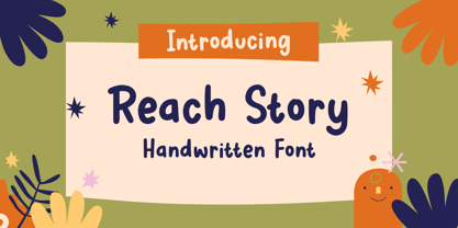 Reach Story is a Handwritten Font, this font Is perfect for product packaging, product designs, label, photography, watermark, special events, or anything. Reach Story comes with uppercase and lowercase letters, multilingual symbols, numerals, punctuation. If you have any questions please don't hesitate to drop me a message :) Thank You, Sronstudio
 - Vintage Rotter by Din Studio,
$29.00 Vintage Rotter is monoline script font. Made for any professional project branding. It is the best for branding, printing, wedding and quotes. Every letter has a unique and beautiful touch. Features: Alternates Standar Ligature PUA Encoded Multilingual Support Numerals and Punctuation Thank you for downloading premium fonts from Din Studio
 - So Unusual JNL by Jeff Levine,
$29.00 The hand lettered credits for the 1942 film comedy “I Married a Witch” were so unusual (with their mix of rounded and flat terminals and varying character shapes) that the only logical name for a digital revival would be So Unusual JNL… which is available in both regular and oblique versions.
 - Dolmengi by Ask Foundry,
$30.00 Introducing [Dolmengi]—a sleek slab serif font with refined edges, balancing solidity and softness. From the elegant 'Thin' to the bold 'Extra Bold,' it offers 8 versatile weights for visual hierarchy. Designed for clarity, Dolmen features generous letter spacing, lowercase figures, and ligatures. Elevate your design with this comprehensive font family!
 - Amarylli Blossom by Balpirick,
$15.00 Amarylli Blossom is a sweet, soft hand-lettered handwritten font. The playful rounded characters make it the perfect font for creating stunning designs. Fall in love with its authentic feel and use it to create gorgeous wedding invitations, beautiful stationary art, eye-catching social media posts, and cute greeting cards.
 - Winter Aythenta by TM Type,
$12.00 Winter Aythenta is a thin lettered and graceful script font. Fall for its ravishing style and use it to create gorgeous wedding invitations, beautiful stationary art, eye-catching social media posts, and much more! This font is PUA encoded which means you can access all glyphs and swashes with ease!
 - Lupa Sans Pro by Melli Diete,
$49.00 The Sans Serif is crafted for complex display typography with friendly extravagance and high readability. Each font has an extended character set and provides latin based languages. The typefaces include ligatures, alternate- & swash letters, various ampersands, smallcaps, fractions, lining-, tabular numbers, superior/inferior figures and other extras. Go with the flow!
 - Charlotte Script by Vástago Studio,
$10.00 A funny Script typeface with a simple construction for to show a dynamic texture playing with the baseline. This letters are inspired on the work of House Induestries mixing a traditional serif with a playful script, like some retrospective alphabets in the vintage ads. Enjoy it, and thanks for buy it!
 - Hongkong Script by Hrz Studio,
$14.00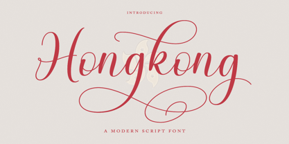 Hongkong Script is a beautiful handwritten font, it is perfect for logos, invitations, stationery, wedding designs, social media posts, advertisements, product packaging, product design, labels, photography, watermarks, special events or anything else. Hongkong Script comes with a full set of uppercase and lowercase letters, lowercase swash, multilingual symbols, numbers, punctuation.
 - Maggies Luck by Gleb Guralnyk,
$15.00 Hello! Introducing a layered display font — Maggie's Luck. It's a vintage style bold typeface with layered feature. Maggie's Luck Font has five "fonts-layers" for more convenient recoloring. This font has a multilingual support (check out a screenshot with available letters and signs). Thank you and wish you a peaceful sky!
 - Kanban by ITC,
$29.99Kanban is the work of British designer Ed Bugg, an all capital, oriental style typeface. Kanban was the word used for shop signs in old Japan and the letter forms mimic the square look of Japanese and Chinese calligraphy. Kanban is the ideal display solution wherever an oriental appearance is needed. - Primitive Icons by Juraj Chrastina,
$14.00 Primitive Icons is a set of 52 simple icons included in a font in place of the letters A-Z and a-z. You can quickly and easily use it in your web design, GUI design, stationery design or any other graphic work. You can download the instruction PDF here.


