1,819 search results
(0.015 seconds)
- FS Meridian by Fontsmith,
$80.00 Timeless imperfection FS Meridian is a rhythmic geometric grotesque which takes inspiration from the precise yet imperfect nature of time. There are 24 hours in a day. 60 minutes in an hour. 60 seconds in a minute. Well, almost. The Earth’s orbit isn’t a perfect circle – and nor is the Earth itself. Each day varies a few dozen seconds and up to 16 minutes each year. Look closer and time is more flexible than we think. Geometry with a twist From a geometric base, FS Meridian’s rounded forms veer and extend, creating unexpected humanistic shapes – while the straight terminals remain reliably rigid. This combination of forms gives this grotesque sans serif a pleasingly dynamic rhythm, every time it’s read. Added quirks The unconventional character of rigid terminals and ink traps are balanced with emphasized extended forms to develop visual differentiation. Designed by Kristina Jandová, the complete family has been carefully crafted with distinguishing marks. Take a look at the cap ‘Q’ which comes with three alternative options. Deliciously loopy FS Meridian has a wide geometric, mono-liner appearance with humanistic elements. Quirky individual touches like the loopy expressive pound sign help the typeface to stand out. Available in five weights, FS Meridian is both timeless and timely, a distinctive font for all screens and surfaces.
 - FS Industrie Variable by Fontsmith,
$279.99Changing nature of work FS Industrie is an extraordinarily versatile new type system, with 70 variants built around five different widths and seven different weights. Type in the future will be increasingly variable, and FS Industrie is specifically designed to address the changing needs of brands. As more of the things we make exist primarily in a digital space, so our need to create type that can adapt within that space grows. It is the spirit of variable design, adaptation and flexibility that drove us to create FS Industrie. A typeface for future work in a future world. FS Industrie is a response to the changing nature of type, for brands that are responding to the changing nature of work. Industrial style Stylistically, FS Industrie feels direct and simple without sacrificing its humanity. It takes inspiration from German fonts of the 1930s, with their roots in manufacturing and signage. A classic sense of functional utility combined with a progressive view of where type is heading. Expressions in width A fundamental challenge with variable type is to ensure that craft and precision is preserved at every interval. Each width and weight is drawn by hand, with subtle variations in terminals and angles as you progress through the system. This ensures each variant can play to its unique strengths, while also pairing perfectly with its siblings. From the closed terminals of the Condensed and the open terminals of the Extended. FS Industrie is a design system that maintains a practical, grounded and robust tone throughout every variable style. Variable nature The 70 styles offer a range of expression. Each width contrasts with the next to clearly define typographic roles in graphic layouts. Every glyph is crafted with adaptability and scalability in mind, creating a pliable design space for the user. The proportions of each letterform flex as weight scales up, stem weights increase as letter width broadens. These subtle design changes create an optically consistent visual impression. - FS Industrie by Fontsmith,
$50.00 Changing nature of work FS Industrie is an extraordinarily versatile new type system, with 70 variants built around five different widths and seven different weights. Type in the future will be increasingly variable, and FS Industrie is specifically designed to address the changing needs of brands. As more of the things we make exist primarily in a digital space, so our need to create type that can adapt within that space grows. It is the spirit of variable design, adaptation and flexibility that drove us to create FS Industrie. A typeface for future work in a future world. FS Industrie is a response to the changing nature of type, for brands that are responding to the changing nature of work. Industrial style Stylistically, FS Industrie feels direct and simple without sacrificing its humanity. It takes inspiration from German fonts of the 1930s, with their roots in manufacturing and signage. A classic sense of functional utility combined with a progressive view of where type is heading. Expressions in width A fundamental challenge with variable type is to ensure that craft and precision is preserved at every interval. Each width and weight is drawn by hand, with subtle variations in terminals and angles as you progress through the system. This ensures each variant can play to its unique strengths, while also pairing perfectly with its siblings. From the closed terminals of the Condensed and the open terminals of the Extended. FS Industrie is a design system that maintains a practical, grounded and robust tone throughout every variable style. Variable nature The 70 styles offer a range of expression. Each width contrasts with the next to clearly define typographic roles in graphic layouts. Every glyph is crafted with adaptability and scalability in mind, creating a pliable design space for the user. The proportions of each letterform flex as weight scales up, stem weights increase as letter width broadens. These subtle design changes create an optically consistent visual impression.
 - FS Split Sans by Fontsmith,
$80.00 Quirky and irregular FS Split is no ordinary typeface. Its irregular proportions make it unique, with round letters appearing wide, and straight letters narrow. Other quirks include its eclectic crossbars – the uppercase ‘A’ has an unusually low bar, while the bar on ‘G’ is particularly long. The uppercase has many interesting features in fact, including large counters, closed terminals on certain letters like ‘J’, and a cap-height that lines up with ascenders. The lowercase also holds surprises – the dots on ‘i’ and ‘j’ are unusually large, and some characters, such as ‘g’, feature double-storey counters. An extreme but stylish italic The italic versions of FS Split Sans and Serif are particularly striking. While similar in style to their upright, Roman versions, they take on a larger-than-usual 18-degree angle, making the forward-slant more dramatic. Although the main purpose of any italic is to help words and phrases stand out, this unique execution helps to make the italic variants of FS Split stylish fonts in their own right – they would work brilliantly on magazine covers, in titles and headlines, pull quotes, and even used commercially in logos and corporate branding. Serif and sans: a split personality FS Split Sans and Serif have their differences but also their similarities, contrasting and complementing each other perfectly. This ‘love hate’ relationship inspired the name of the typeface family, and means the two variants provide a versatile, typographic palette for use in graphics and branding. While its proportions are similar to the sans, the serif has a bigger contrast between its weights of bold, regular and light, bracketed serifs, and different styles of terminals, some being straight and others ball-shaped. FS Split Sans has more subtlety and simplicity, with a smaller weight contrast, less flamboyant terminals, and more consistent counter sizes. The two variants are distinct yet alike, so can be used successfully either in isolation or together.
 - FS Split Serif by Fontsmith,
$80.00 Quirky and irregular FS Split is no ordinary typeface. Its irregular proportions make it unique, with round letters appearing wide, and straight letters narrow. Other quirks include its eclectic crossbars – the uppercase ‘A’ has an unusually low bar, while the bar on ‘G’ is particularly long. The uppercase has many interesting features in fact, including large counters, closed terminals on certain letters like ‘J’, and a cap-height that lines up with ascenders. The lowercase also holds surprises – the dots on ‘i’ and ‘j’ are unusually large, and some characters, such as ‘g’, feature double-storey counters. An extreme but stylish italic The italic versions of FS Split Sans and Serif are particularly striking. While similar in style to their upright, Roman versions, they take on a larger-than-usual 18-degree angle, making the forward-slant more dramatic. Although the main purpose of any italic is to help words and phrases stand out, this unique execution helps to make the italic variants of FS Split stylish fonts in their own right – they would work brilliantly on magazine covers, in titles and headlines, pull quotes, and even used commercially in logos and corporate branding. Serif and sans: a split personality FS Split Sans and Serif have their differences but also their similarities, contrasting and complementing each other perfectly. This ‘love hate’ relationship inspired the name of the typeface family, and means the two variants provide a versatile, typographic palette for use in graphics and branding. While its proportions are similar to the sans, the serif has a bigger contrast between its weights of bold, regular and light, bracketed serifs, and different styles of terminals, some being straight and others ball-shaped. FS Split Sans has more subtlety and simplicity, with a smaller weight contrast, less flamboyant terminals, and more consistent counter sizes. The two variants are distinct yet alike, so can be used successfully either in isolation or together.
 - Awesome Fonta by Meutuwah,
$20.00 Hello Font Lovers... Awesome Fonta is another lovely modern calligraphy typefaces, which is combining the style of classic calligraphy with an modern style. combines from copperplate to contemporary typeface with a dancing baseline, modern and elegant touch. including initial and terminal letters, alternates, and ligatures. Can be used for various purposes.such as headings, logos, wedding invitation, t-shirt, letterhead, signage, lable, news, posters, badges etc. To enable the OpenType Stylistic alternates, you need a program that supports OpenType features such as Adobe Photoshop, Adobe Illustrator, Adobe Indesign, Corel Draw, and More!!! Thank you for your purchase...
 - Alistair Signature by Aktab Studio,
$17.00 Alistair Signature Font is a modern font with more featured and made with hand lettering. Alistair Signature Font have a complete glyphs, this font suitable for wedding invitation, greeting cards, T-Shirt, Logo or any design that you create. comes with a complete set of standard characters, Alternates, Punctuation & have extra ornament for your design and many more. The Features of this fonts is: - UPPERCASE and lowercase - Numeral and punctuation - Stylistic Sets - Stylistic Alternates and Contextual Alternates - International Glyphs support to All Stylistic Sets - Support PUA unicode (specially coded fonts) - Standart Ligatures and Discretionary Ligature - Fractions - Initial and Terminal Forms - Swash - Smallcaps Numeral
 - Mezzotint CF by Connary Fagen,
$25.00 Mezzotint CF is a daring and playful display typeface perfect for logotypes, posters, and editorial use. High-contrast strokes, flared serifs, aqueous connections, and inky terminals give Mezzotint CF its striking and rakish personality. Includes roman and italic sets across a single bold weight, with wide language support, optional ligatures, OpenType alternates, and more. Mezzotint CF pairs well with a contrasting, simple geometric sans-serif like Greycliff CF; for maximum effect, try a large difference in typeface size between the two. All typefaces from Connary Fagen include free updates, including new features, and free technical support.
 - Bulgis by Panatype Studio,
$9.00 Bulgis script font is a monoline script font inspired by retro scripts. Bulgis script font comes in three weights and a Variable Font format is available. It's easy to use and to choose the desired weight for your design. OpenType features makes it more natural and attractive to the needs of designers. Made with care, this font is suitable for digital lettering, logos, t-shirts, print, business cards, branding materials, quotes, nature photography, and more. OpenType Features: Ligatures Terminal Forms ( Contextual Alternates ) Initial Forms ( Contextual Alternates ) Stylistic Set Swashes Language Support for Latin ( Western European, Central European, South Eastern European )
 - Povetarac Didone by Tour De Force,
$25.00 Povetarac Didone font family is part of Povetarac Superfamily together with Povetarac Sans and Povetarac Display. Available in 6 weights with matching italics, Povetarac Didone relays on lively uppercase proportions that took inspiration from vintage typefaces. It is well balanced family, elegant and fully recognizable. One of its characteristics are straight and wide terminals without usual serifs for this kind of typefaces. Playful and harmonic italics are one more uniqueness of Povetarac Didone. They were gently crafted to fulfil they role not just for editorial use, but as display typeface as well. Comes with Fractions and extended Latin character map.
 - Aljameela by Niznaztype,
$18.00 Aljameela is a script typeface that has a rounded corner style with unique, simple and easy characteristics. Aljameela inspired from the shape of building of the Muslim Culture that is dominated by curved and rounded shapes like the pillars and domes of a mosque. Aljameela is very recommended and perfect for graphic designs that use a script typeface. It is like tagline, book cover, book text, posters, signature styles, titles, postmodern designs, web design, logos, branding, advertising, posters, invitations and more. Aljameela is suitable for all modern and classic of graphic designs. You will happy with Aljameela.
 - Andes by Latinotype,
$29.00 Andes, designed by Daniel Hernández, is a display typeface that has neo-humanist characteristics. Its different terminals, among other elements, give it a look of mixed typography. Andes is a typeface with 10 Upright weights, 10 Italics & Condensed version , ranging from Ultra Light to Black, each of the same x-height. This typeface contains additional italic glyphs (a, y, z, g) that help to emphasise text or words. Andes is based on the design of Merced and both of them share several features. This type is well-suited for use in retail, magazines, logotypes, books, etc.
 - Kidyzen by Niznaztype,
$10.00 Kidyzen is a sans handwritten typeface. Inspired from the character of kids writing in their book. Kidyzen have unique style because it like same with typing of children. Kidyzen is perfect for comic, illustration, cartoon, kids design and very suitable for speech bubble text. It have very fun, cute, easy communication, easy reading and unique styles. You can use it for kids t-shirt, cover book, tagline, poster, branding, advertising, wall painting letter and graphic designs that use kids character . Kidyzen have 6 styles, there are regular, italic, bold, bold italic, thin and thin italic. Be enjoy it with my fonts.
 - dT Ampla by dooType,
$35.00 dT Ampla shares many characteristics of the versatile sans typefaces of today: nice range of five weights with matching italics, 40+ supported languages, contemporary upper-to-lowercase proportions and impeccable performance in big and text sizes. However, all these features are designed with distinct shapes and details. Notice the angled terminals – the cut at the end of the strokes – or how the vertical strokes in the italics seem to 'bend' a little, for instance. The sum of these and many more design decisions result in a typeface capable of delivering a strong presence to sites, interfaces, apps, magazines and corporate graphic language.
 - Mollen by Eko Bimantara,
$19.00 Mollen is sans serif font family that designed to be functional. Each glyphs are shaped by geometrical form with specific visual structure: Simple and clean form with low contrast stroke, rounded 'o' in the normal width, mix diagonal and straight cuts on terminals and finials. Low capitals, with flat top and low descenders. With this personality, Mollen meant be fit for modern, contemporary and technological nuance. Mollen consist of 48 font with 8 weight: From Thin to ExtraBold and 3 width: Condensed, Narrow and Normal. With each matching Italics. It also contain 425 glyphs and several opentype features.
 - DT Serifia by Deveze Type,
$29.00 DT Serifia Sans is a modern grotesque with a playful character. The font family contains seven widths and one Variable Font. From extra thin to ultra bold, you will surely appreciate this font. Typography will take on its own mood with it. The vertical terminals give it a sense of sophistication even with all its playfulness. A wide range of weights allows using this typeface in a variety of projects, and a plethora of OpenType features will make your project look outstanding. A wonderful addition to your collection, it is perfect for branding, magazines, web, broadcasting, packaging, apparel prints, prints etc.
 - Cerulya CF by Connary Fagen,
$35.00 Airy and delicate, Cerulya CF is a striking display typeface brimming with movement and grace. A unique semi-serif design with rounded teardrop terminals, Cerulya CF shines brightest at large sizes – perfect for logos, posters, headlines, and more. Includes five weights, roman and italic sets, and a selection of optional ligatures, swashes, and alternates. Cerulya CF pairs well with a contrasting, simple geometric sans-serif like Greycliff CF; for maximum effect, try a large difference in typeface size between the two. All typefaces from Connary Fagen include free updates, including new features, and free technical support.
 - Helmswald Post by Sharkshock,
$125.00 Helmswald Post is a handsome Blackletter that's been years in the making. There's a mix of wispy terminals, flamboyant caps, and the use of negative space to create contrast. Elements from High German, Old English, and many other styles make their way into this gorgeous display font. The result is a medieval looking script with cleaner, more modern feel. In addition to European accents Helmswald Post is equipped with Cyrillic, alternates and ligatures. Old world numerals are present by default but may be substituted by accessing the stylistic sets. Use it for a book cover, web headings, or a restaurant logo.
 - Medina Gothic by Design is Culture,
$39.00 Medina Gothic is a three-weight sans serif inspired by Latin American moderne. It was designed in response to the 2002, Altos de Chavon design conference in The Dominican Republic, which celebrated utilitarian driven gestures in graphic design. "There’s a rigor to Medina Gothic that takes care of all sorts of tenets of a hard-working, highly legible, objective font. But at the same time, it’s human. All the curved terminals and open counter forms make for a sort of kindness. For all the discipline, it doesn’t sacrifice its friendliness." – William Morrisey, Professor of Typography, Parsons The New School for Design.
 - Nietos by Melvastype,
$22.00 Nietos is a geometric sans serif type family of 16 fonts. Nietos is a clean and classy font but still full of character and warmth. It has open apertures to improve the legibility at small sizes. Terminals are angled and the contrast is low. Nietos has double-storey lowercase a to enhance the legibility but there is also one-strorey lowercase a included as a Stylistic Alternate. Nietos OpenType features: Stylistic Alternates for lowercase a and uppercase I, Case Sensitive Forms, Arrows, Circled and Black Circled Figures, Proportional Old Style figures, Tabular Lining figures, Slashed Zero, Fractions, Superscript and Subscript figures.
 - Mohr by Latinotype,
$29.00 Mohr is a neutral, versatile and contemporary font based on some characteristics found in geometric sans-serif typefaces. Mohr’s features, together with its design characteristics, make it suitable for a wide range of applications, from display use to small text. The Mohr family comes in three versions: normal, alt and italic, each with 9 font weights, from Thin to Heavy, resulting in a total of 27 fonts. Mohr also includes initial and terminal swashes in most of the uppercase and lowercase characters. This gives the font a unique personality and provides a greater range of uses such as branding and packaging.
 - Sole Serif by CAST,
$45.00 Sole Serif is a newspaper face with features relating to book typography. Inspiration from Francesco Griffo’s romans was adapted to resist the rough usage typical of newspaper printing without any loss of quality. Sole Serif is available in an extensive range of cuts including extra bold and ultra thin. With its big x-height, short ascenders and a roundish and wide italic for text and titles, it has all the attributes of a newspaper face. Nonetheless, details like the inclined axis, calligraphic terminations, Renaissance proportions and a refined but slightly mannered design, all evoke the book rather than the daily paper.
 - Nipok by Gravitype,
$14.90 Nipok is a single weight display typeface, inspired by the aesthetics of different decades. Rounded terminals and playful intersections from the 60’s and 70’s, joined with straight and compact lines from the 80’s and 90’s. The particular style is given by the alternation of upper and lower case letters, chosen to fill the empty spaces greatly and create harmony. In addition, alternates are included to give you more stylistic options. While by default this font is a semi unicase, the alternative glyphs extend the Ascent and Descent metrics. Multilingual support is available.
 - Aesthetica by Java Pep,
$15.00 Introducing an elegant bouncy font that every strike the shape brings the vibes of beauty, pretty, elegant, and aesthetic. Aesthetica font comes with several of alternates, so you can switch on for the swashes, stylistic alternate, alternate, initial and terminal form (SS01-SS02). This font is perfect for logo font, branding, greeting card, cut files for quote, silhouette font design, monogram font, and etc. The packages and features Aesthetica font PUA encoded Multilingual support for 17 languages If you have any questions about technical support and others, don't hesitate to drop me a message. Have a nice day, stay safe and healthy.
 - Torus by Monotype,
$25.99 Torus is a simple, rounded monoline typeface that has been designed specifically for logo design, headlines and branding purposes. While the default character set is distinctive in its own right, graphic designers will love playing with the numerous alternate glyphs that will help them create unique wordmarks and logo designs. Torus’ simplistic forms and soft terminals make this a lovely, warm typeface perfect for a multitude of typographic applications. Please also consider: Torus Variations (2018) Torus Pro (2021) Key features: 6 weights 49 Alternates (via 2 Stylistic Sets) Full European character set (Latin) 550+ glyphs per font.
 - Andes Italic by Latinotype,
$29.00 Andes, designed by Daniel Hernández, is a display typeface that has neo-humanist characteristics. Its different terminals, among other elements, give it a look of mixed typography. Andes is a typeface with 10 Upright weights, 10 Italics & Condensed version, ranging from Ultra Light to Black, each of the same x-height. This typeface contains additional italic glyphs (a, y, z, g) that help to emphasise text or words. Andes is based on the design of Merced and both of them share several features. This type is well-suited for use in retail, magazines, logotypes, books, etc.
 - Tautier by Sihan Wu,
$25.00 Tautier is a display font based on the specimen of Enge Mediaeval-Antigua, published in 1900 from the Bauer Type Foundry. It is intentionally redrawn to keep its overall narrow proportions. Based on the existing basic alphabets, Tautier is redrawn to appear more classical and friendly, as you can notice in the rounded corners around the beaks, as well as the lachrymal terminals in lowercases. Tautier is a display typeface suitable for large applications, for example, headlines for editorial design, branding, webpages, and environmental design. It currently comes as a single-styled typeface disposed to extend with an italic version.
 - Andes Rounded by Latinotype,
$29.00 Andes Rounded, designed by Daniel Hernández, is a display typeface that has neo-humanist characteristics. Its different terminals, among other elements, give it a look of mixed typography. Andes is a typeface with 10 Upright weights, 10 Italics & Condensed versions, ranging from Ultra Light to Black, each of the same x-height. This typeface contains additional italic glyphs (a, y, z, g) that help to emphasise text or words. Andes is based on the design of Merced and both of them share several features. This type is well-suited for use in retail, magazines, logotypes, books, etc.
 - Dhiome by Maculinc,
$17.00 Maculinc - DHIOME DISPLAY TYPEFACE - The font appearance is made to follow a modern style, as well as a retro feel. It's perfect for a variety of interesting designs for extra fun, such as creating unique words/sentences and is suitable for product designs, posters, trademarks, brochures, taglines, social media and more. ALL LETTERS AND MULTILINGUAL SUPPORT - This font uses all capital letters, but we differentiated it by changing the style slightly between uppercase and lowercase letters. This font is also multilingual supported, to make it easy for you to apply it to all your designs in many supported languages.
 - Quenda by Marc Lohner,
$25.00 Quenda is a small sans-serif family comprising six weights: thin to heavy. Due to its rounded terminals and a slight handwritten look, Quenda has a friendly and warm appearance. Its main purposes are for advertising and branding projects. You will find lots of ligatures and a total of 593 glyphs in each style. With extensive language support, lining-, old-style- and tabular-figures, a slashed zero, self-building fractions, superscript and subscript digits, a set of arrows as well as thousands of kerning pairs, Quenda is ready to contribute to your next design project. Designed by Marc Lohner in 2015.
 - Novaturient by DimitriAna,
$18.00 Novaturient is a modern, brush calligraphy font, designed to give an elegant hand-drawn style at your work. It is suitable for a variety of applications such as stationery design, invitations, logos, labels, packaging design, merchandise products, etc. It supports Central, Eastern, Western European, Baltic, Turkish and Greek languages. The font contains a variety of opentype features in Latin and Greek alphabet: Both, uppercase and lowercase character sets have their stylistic alternates. Standard ligatures, 2 sets of terminals (te01 & te02) and a set of initial letters (in01), will also give your text a custom personal look.
 - Onari Faux by Twinletter,
$15.00 ONARI is a display font with a strong character, similar to the original Japanese letters, and it has a Japanese flair. This typeface is ideal for your project since it will make your work look stylish, understandable, and, most importantly, it will fascinate your audience. Logotypes, food banners, branding, brochure, posters, movie titles, book titles, quotes, and more may all benefit from this font. Of course, using this font in your various design projects will make them excellent and outstanding; many viewers are drawn to the striking and unusual graphic display. Start utilizing this typeface in your projects to make them stand out
 - Mixta Essential by Latinotype,
$20.00 Mixta Essential is a contemporary sans-serif typeface with characteristic and defined features. This font was inspired by the idea of mixing different types of terminals in order to give the font a singular appearance. Its design is composed of diverse styles such as Didone and classic typefaces as well as current font trends. This new essential version of Mixta does not include Cyrillic support, alternate styles or OpenType features. Mixta Essential, with a basic language support, has been adapted for optimal use on macOS and Windows environments. Mixta Essential was specially designed for branding, advertising, Tv and social media.
 - Merel by Inhouse Type,
$33.78 Merel is a modern geometric typeface with humanist attributes. Geometry and logic are at the heart of this 6 weight font family. Humanist touches give it a number of distinctive characteristics, as well as aid legibility. Despite being rational and function driven in its nature, Merel has a soft and gentle touch. It was designed to tackle both print and onscreen challenges of the modern environment. Details include reduced x-height, mild stroke contrast and vertically sheared terminals with cushioned finish across the typeface. Merel features a number of alternative characters, manually edited kerning and Opentype features.
 - Bluesmate by Fontdroe,
$15.00 Bluesmate is a new another modern script font built in 878 glyphs. It has opentype features with PUA encode. of course this is a smart font works with poluler design software like Photoshop, Coreldraw X version, Illustrator, Microsoft Office, ect. This Modern Calligraphic typeface welcomes you to use it for various desing need such as logo, card, wedding invitation, headings, signatures, t-shirt, letterhead, cutting sticker, hot stamping, signage, labels, posters and more. It's craft friendly!!!! OPENTYPE TECHNOLOGY: - Stylistic alternate - Contextual alternates - Standard Ligatures - Discretionary Ligatures - Contextual Ligatures - Initial form - Medial form - Terminal form - Swashes - Numerals - Punctuations
 - Latte by Font Kitchen,
$9.99Cozy up with a warm cup of Latte! This friendly typeface uses the highest quality hand-roasted glyphs blended with some wonderful rounded serifs and ball terminals to create a bold, earthy flavor that can't be beat. Available in 14 robust styles, including true italics, Latte is a great way to give your next project a warm, friendly, and natural feel. You’ll pick up on subtle notes of OpenType features like stylistic alternates (on 41/52 Latin characters+diacritics), fractions, ligatures, oldstyle and lining figures, and more. Latte is the perfect ingredient to bring a kind, peaceful feeling to your next project. - Gramma by CAST,
$45.00 Gramma is a compact sans with big x-height, a robust and balanced typeface that work well both for headlines and main bodies of text. The initial constructions, assembled from a few well-defined geometric modules, were later polished into more organic forms; the letters’ arches are quite squared, and the counters and other internal negative spaces push outward, creating a tension that balances the forms’ compression. Gramma’s most evident characteristic is its “bird-beak” terminals (present in many letters, including the c, e, f, s...) that replicate the unconnected junctures between stem and curve, visible in the a,b,d,g,h.
 - Apotheosis by Pixel Colours,
$26.00 Apotheosis is a chic, clean handwritten font with modern flows. Includes automatic ligatures, stylistic alternates and a beautiful big ending "s" that gives statement to the words. It also includes a small uppercase sans to make the perfect combination. A beautiful font great for branding, labeling, packaging, etc. Opentype Features This font contains opentype features and must be used in a program that supports opentype like Adobe to access the alternates in the Glyphs panel. Includes: Apotheosis: A clean modern script font. Apotheosis Sans: A modern uppercase sans serif perfect for pairing and great for descriptions, taglines, etc. Language support
 - Orlando Smith by Meutuwah,
$20.00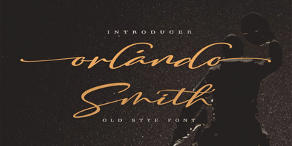 Hello Font Lovers... Orlando Smith is another lovely modern calligraphy typefaces, which is combining the style of classic calligraphy with an modern style. combines from copperplate to contemporary typeface with a dancing baseline, modern and elegant touch. including initial and terminal letters, alternates, and ligatures. Can be used for various purposes.such as headings, logos, wedding invitation, t-shirt, letterhead, signage, lable, news, posters, badges etc. To enable the OpenType Stylistic alternates, you need a program that supports OpenType features such as Adobe Photoshop, Adobe Illustrator, Adobe Indesign, Corel Draw, and More!!! Thank you for your purchase...
 - Vandermark by TypeTrust,
$30.00Vandermark began as a simple daydream of what became the 'n' glyph. I considered the elegant balance of a terminal stroke that would never join its supporting stem. The premise was simple, but further experimentation was required for other parts of the alphabet. Vandermark follows a somewhat flexible array of structural rules and curve arrangements that called for considerable sketching to harmonize. The names I choose for my typefaces have to look decent when set in the signature type. Considering its improvisational development, it was only fitting that the namesake is a jazz musician and fellow Chicagoan, Ken Vandermark.