8,165 search results
(0.012 seconds)
- The White Moon by Just Lett,
$15.00 The White Moon feels equally charming and elegant. This stunning script font is a stylish homage to classic calligraphy. It features a varying baseline, smooth lines, and gorgeous glyphs. Get inspired by its authentic feel and use it to create gorgeous wedding invitations, beautiful stationary art, eye-catching social media posts, and cute greeting cards.
 - Travel Plans JNL by Jeff Levine,
$29.00 A 1930s travel poster from American Airlines had the airline’s name in a classic thick-and-thin Art Deco design of hand lettering. With the addition of angular spurs, some of the characters become semi-serif in nature. This type style is now available as Travel Plans JNL, in both regular and oblique versions.
 - ITC Astro by ITC,
$29.99ITC Astro is the typeface that proves you can get your work done while watching cartoons. “It all started as a series of doodles while I was watching The Jetsons,” recalls Sasa Petricic. “The show's impossibly simplistic vision of the twenty-first century cried out for a font that fit into that world -- a world where everyday objects can carry far more fun and personality than they should.” ITC Astro is the first commercial typeface design from Petricic, whose “day job” is working as a reporter for the Canadian Broadcasting Corporation. Petricic has filed stories from across Canada and around the world for CBC's flagship evening newscast, The National. His reports have also appeared on CNN and BBC Television. Petricic's work as a correspondent and video journalist have taken him to six continents, covering everything from famine and genocide in Africa to the war in Iraq. With such serious matters filling the hours of Petricic's day as a journalist, it's not hard to see why he conceived Astro as a welcome blast of whimsy. “As I began to draw the design,” he says, “I decided that every part of Astro should be a cartoon character unto itself.” Each character has its own baseline shadow (or coaster, or circular antigravity generator, depending on how you look at things). The angular caps dance jauntily, rocking from left to right, while a suite of companion small caps provide backup. The end result is a design quite unlike any other, with surprising charm and versatility. ITC Astro comes in a two-weight family of White and Black. - Galix Mono by Eclectotype,
$25.00 This monospaced version of Galix was commissioned in 2037 by the space exploration company Earth2, as part of a major overhaul of their branding, which had used, since 2021, a generic sans serif (much like every other company). Many specialists in both design and space exploration suggested that this very rebrand started a chain of events that concluded with the invention of time travel in 2041. Contrary to the perceived notion put forward in popular Science Fiction, time travel is only (as of now) possible in the digital realm. It was considered fitting that included among the first files sent back in time should be the Galix Mono typeface, which was remade in OTF format to ensure that it would work with the technology available in 2019. Earth2, for all their insight, did not foresee that the release of the typeface in September of 2019, would lessen the impact of their rebrand. What kind idiots would rebrand a forward looking company with a font that was, by then, almost 18 years old? The subsequent lacklustre response to the redesign didn’t inspire the tidal wave of R&D funding Earth2 had anticipated, and the company went into administration in the summer of 2039, having never invented the time travel which made the release of Galix Mono in 2019 possible. Experts believe that the files sent back in time, although their very sending made it impossible for them to be sent, remained as “time relics” of the future that might have been.
 - Gallos by W Type Foundry,
$25.00 What comes to your mind if I say Architype, Geometric, Gaelic, and Uncial? An impossible combination of features? An unrealistic setup of tastes as weird as your music list? Or some part of a joke told by your favourite comedian? Just chill and stick to the idea that is possible. Gallos combines the conceptual historical elegance of the Uncials with the practical rationalism of the Geometric style. Moreover, this typeface is composed by two sub families: Gallos Uncial and Gallos Architype. The letters “M”, “N”, “W”, “a”, “m”, “n”, “r”, and “w” differ between these two models. The first one is related to both: The Uncial script aspect displaying the leaned “a” with a closed bowl, and the classical geometric style depicting more conventional uppercase and lowercase letters “m” and “n”. The Architype one is inspired by Paul Renner’s Architype model, thus the leaned “a” has an open counter, the “r” is composed by a stem and a dot, and the rest of the mentioned letters were built using square rational features. Both models are connected by classical Uncial features such as the curved stroke “e” and curved shaft “t”, and with Gaelic vibes which can be seen in uppercase and lowercase letters “K” and “X”. Also, the curved descender “g” and “y”, alongside the curved stem “z” connect really well with the rest of the system and provide more uniqueness to the Gallos type family. Without further ado, we say to you: let’s make Uncials popular again!
 - TA Regresso PRO by Tural Alisoy,
$39.00 TA Regresso PRO graphic presentation at Behance TA Regresso PRO font is inspired by Didon and Bodoni fonts. A combination of a little Bodoni and a little Didon elements and a unique style and Text, Display, Subhead and about 80 styles, it is a font that gives the user a choice. TA Regresso font supports Greek, Hebrew, Cyrillic and Latin alphabets. After starting work on the font since February of last year, the font is ready today with constant revisions. Being open to learning, I sought help from experienced designers. I must mention that Yulia Gonina, the founder of Schrifteria Foundry, also helped me a lot to make Regresso good. With her knowledge and advice, the flaws in the font were eliminated. By the way, Viktor Baltus also helped me with his valuable advices. I did some research about the alphabets of the supported languages so that Regresso is good. I paid a lot of attention to the correct design of the letters. I will fix the problems I missed in the next updates of the font. I would be happy if you send me your work when you use my font. I'm very interested in where you use my font. TA Regresso PRO contains 200+ Latin and Cyrillic, Greek, Hebrew languages. TAFT produce retail typefaces, create custom fonts and even do Greek, Hebrew and Cyrillization. Our mission is to create and distribute only carefully drawn, thoroughly tested, and perfectly optimized typefaces which are available to a wide range of customers. If you're looking for a type or logo → t@taft.work
 - Aviano Royale by insigne,
$34.99 Aviano returns to lend its classic line to its newest variation, Aviano Royale--named so because of the rich flow the calligraphic capitals give the established font. The extended lowercase characters give an air of formality to the face as well and bestow on the family a deeper sense of wealth and power. This recent development of a timeless font, part of insigne’s annual tradition of adding to the Aviano family, was elected the clear winner in a poll of insigne design’s social media followers. And is it any wonder why? The long-handed elegance of Royale features graceful script capitals as well as widely tracked and smaller titling capitals, all which make Royale ideal in high-end applications and branding where titling with a taste of gentility is required. Royale’s suite boasts a number of OpenType alternates, most importantly of which are the alternate forms for the capitals. Whereas the default forms of the face are regal, it’s flourishes must be activated through the swash set. For a look more restrained, activate the stylistic alternates. It’s like having three different fonts in one! Additionally, there are baseline lowercase forms. The lowercase forms are 20% smaller in height than Aviano’s lowercase forms, so the families are not interchangeable. However, they can still be used well together. The script capitals could also be used separately as drop capitals and nicely complement any of the other 12 Aviano families. It’s time to look beyond common. For the look of refinement you desire, design with Aviano Royale.
 - Hernández Niu by Latinotype,
$29.00 In the typedesign industry the terms ‘nova’, ‘neue’, ‘next’, ‘new’ are often used to refer to a typeface that has been modified in different ways: redesign, technical readjustments, greater number of characters, etc. At Latinotype we are now starting to use the word ‘niu’ to refer to these kinds of typefaces. Niu is an adaptation of the original word ‘new’, i.e., we have adapted this English word to the phonology and spelling of our own language but keeping the original meaning. Race mixing, diversity, change and adaptation are part of the essence of Latin American culture and, at Latinotype, we are all constantly expressing these elements in everything we do. Latin Power! Hernández Niu was designed by César Araya and Daniel Hernández. The font is based on the design of Hernández Bold: the thickest weight has been adapted to fit small text better. Five new styles have been added, ranging from neutral to more expressive fonts. Hernández Niu is a display slab serif font of thickened serifs, functional expressive ink-traps and true italics. Detailed forms and counterforms allow this typeface to be used in very large sizes. Hernández Niu is well-suited for publishing, small text and headlines. A wide variety of weights make the font a perfect choice for hierarchical type-setting, branding, logotypes, magazines, etc. This font consists of 6 weights, ranging from Extra Light to Heavy, each with matching true italics. Hernández Niu comes with a set of 397 characters, making it possible to use the font in 212 different languages.
 - Green Fairy by Maria Montes,
$39.00 Green Fairy is a chromatic font family highly ornamented for display purposes. Green Fairy’s characters have been specifically designed to accommodate its loops and ornaments following a modern typeface structure. Green Fairy has four chromatic weights: 1. Green Fairy Outline 2. Green Fairy Dots 3. Green Fairy Stencil 4. Green Fairy Full The outline weight has been created as the base or structure for the other weights. You can combine these weights as well as add colours to obtain multiple effects and type styles. Green Fairy has also three combined weights (combos) to simplify your work flow, for these occasions when you only want to use one single colour in your font: 5. Green Fairy Dots Combo 6. Green Fairy Stencil Combo 7. Green Fairy Full Combo GREEN FAIRY ORIGINS The origin of this typeface is the lettering I designed in October 2015 as part of my illustrated cocktail artwork called “Absinthe. La Fée Verte (The Green Fairy)”. Originally, this lettering only featured eight letters “AB·SINTHE” vector drawn in Illustrator. Right after creating the full-colour artwork, I designed a fountain-letterpress print version of it, in collaboration with Ladies of Letters, A.K.A. Carla Hackett and Amy Constable from Saint Gertrude Fine Printing. At the beginning of 2016 –and thanks to the project @36daysoftype– I found the motivation, and most importantly the deadline, to draw the rest of the twenty-six letters of the uppercase alphabet using Illustrator. I started 2017 having my first two calligraphy courses sold out, so I took this amazing opportunity to devote myself to Green Fairy for a few months. In February 2017, I purchased the font software Glyphs and I started to re-draw all twenty-six letters of the uppercase alphabet again. PRODUCTION PROCESS Green Fairy started being one weight, but quickly turned into a layered/chromatic font. Things were going more or less fine till I arrived to the Dots weight: 1) I started drawing squares following a grid; 2) Then, the squares turned into diamonds following the same grid; 3) Then, the grid wasn’t working so well on the round letters so I tried randomising the position of the diamonds but it didn’t work; 4) So I went back to the grid, and this time scaled down the size of the diamonds creating a visual half-tone effect. I spent over four weeks working on the Dots weight and I felt like I was in the middle of a very long tunnel and I couldn’t see the light at the end. I encountered many other problems along the way but by June 2017, I felt I was back on track again. I kept working, tweaking, re-drawing and re-adjusting, and then the diacritics came on board… And then more re-drawing, re-tweaking, re-adjusting and then numbers… And then spacing, symbols, and currencies… And then more spacing, kerning, contextual kerning for triplets… In September 2017 I told myself “that’s it, I’m going to finish it now!” But guess what? More re-tweaking, testing, hinting, testing, rendering, testing… For those of you not familiarized with typeface design, it is extremely time consuming and it requires a lot of hard work, focus and determination. This project could not have been possible without the help of these generous professionals: Jose Manuel Urós, typeface designer based in Barcelona and my teacher twice in the past; Jamie Clarke, freelance letterer and typeface designer who has released a couple of chromatic fonts recently; Troy Leinster, Australian full-time typeface designer living and working in New York City; Noe Blanco, full-time typeface designer and hinting specialist based in Catalonia; And Nicole Phillips, typographer currently relocating from Australia to New Zealand. To all of you: THANK YOU VERY MUCH!
 - Rotis II Sans by Monotype,
$50.99 Developed over several years by the late Otl Aicher and first released in the late 1980s, the Rotis® typeface has become a timeless classic. ROTIS II SANS HISTORY Aicher was a renowned German designer and corporate image consultant. He created the four basic designs of Rotis – sans serif, semi sans, semi seif and serif – within an extended typeface family concept, wherein all designs share a common cap height, lowercase x-height, basic stem weight and general proportions. While each version is part of the large, integrated family, each was also designed to function on its own as a distinctive typestyle. The result is that all members of the Rotis family combine smoothly with each other. Aicher, however, did not design the Rotis family with the weights and proportions normal for more contemporary releases. Rotis Sans Serif, for example, was drawn with just six weights and only two italics. Starting in 2010, Robin Nicholas, senior designer for Monotype Imaging in the UK, and freelance designer Alice Savoie collaborated to bring Rotis Sans Serif up to current standards. The result is Rotis II Sans, a completely new addition to the Rotis family. “We devised our approach together,” recalls Savoie, “deciding which weights to start with, what kind of alterations to make to the original Rotis, etc. I went to work on the typefaces, regularly submitting proofs to Robin. We would then decide in tandem on the next steps to take.” Nicholas elaborates, “We revisited the range of weights and added matching italics so that the new additions to the family offer increased versatility. We optimized the outlines, corrected the weight of several letters and re-examined overall spacing and kerning. In addition to a new set of numerals, with a height similar to the capitals, we also drew case-sensitive punctuation.” ROTIS II SANS USAGE The new Rotis II Sans suite comprises 14 typefaces: seven weights, ranging from extra light to black, each with a companion italic. The designs are available as OpenType® Pro fonts, allowing for automatic insertion of ligatures and fractions. Pro fonts also offer an extended character set supporting most Central European and many Eastern European languages. Aicher’s original Rotis designs were widely used for branding and advertising. With the addition of Rotis II Sans, the family is again poised to become a powerful communicator.
 - DS JugendSC Demo - Unknown license

- Nuovo Deco by Ben Burford Fonts,
$20.00 Following from the continued popularity of the original MB Deco, here is Nuovo Deco, its new and improved big brother. Nuovo Deco comes in three weights, Light, Regular and Bold. A full character set of Caps and lower case letters, alternate characters, plus some very nice Ligatures to give some added art deco style and a much wider scope.
 - Pritude Radiance by Sohel Studio,
$16.00 Pritude Radiance is a Modern elegant branding serif typeface with Unique alternative , multilingual support with perfect kerning. This typeface is perfect for an elegant & luxury logo , classy editorial design, women's magazine, fashion brand , cosmetic brand, fashion promotion , modern advertising design, invitation card, art quote, home decoration , book/cover titles, special events, Tote bag, T-shirt, Advertising and much more.
 - Goddard by Scriptorium,
$12.00Goddard is based on some very unsual lettering by Art Nouveau period calligrapher Samuel Welo. It offers a full normal character set, plus mutliple alternate versions of every lower case character and selected upper case characters as well, plus very fancy over-and-under kerning to produce a really unique look, like nothing we've ever done before. - Giliant by Sohel Studio,
$16.00 Giliant is a Modern elegant serif typeface with Unique alternative , multilingual support with perfect kerning. This typeface is perfect for an elegant & luxury logo , classy editorial design, women's magazine, fashion brand , cosmetic brand, fashion promotion , modern advertising design, invitation card, art quote, home decoration , book/cover titles, special events, Tote bag, T-shirt, Advertising and much more.
 - LTC Spire by Lanston Type Co.,
$24.95 LTC Spire with alternate caps was designed by Lanston’s type director Sol Hess in 1937. Spire Roman was designed without lowercase. But it includes alternate rounded caps which transform this extra condensed “fat face” into more of an art deco titling face. Spire Roman has been used within department store logos, luxury hotel signage, perfumes, etc, etc.
 - Red Ring by Letterhead Studio-YG,
$45.00 Red Ring and Red Square - the super-family of two families of fonts. The super-family includes sanserif Red Ring and geometric font Red Square. Families are synchronized by the number and weight of the typefaces and can be used either separately or together. Together Ring and Square produce a cumulative effect of Art Deco and Constructivism.
 - Villena by Carpiola Studio,
$12.00 Villena is a magical script font carefully created with a touch of elegance. Whether you’re looking for fonts for Instagram or calligraphy scripts for DIY projects, this font will turn any creative idea into a true piece of art! Villena is PUA encoded which means you can access all of the glyphs and swashes with ease!
 - Scottsdale Text NF by Nick's Fonts,
$10.00This elegant semicursive face is based on the works of J. M. Bergling from his 1914 classic Art Alphabets and Lettering. Suitable for announcements, awards and invitations, or for distinctive and unusual drop caps. Both versions of this font contain the Unicode 1252 (Latin) and Unicode 1250 (Central European) character sets, with localization for Romanian and Moldovan. - Novella by FontHaus,
$19.95 Novella has always been one of Fonthaus' more popular period (Art Nouveau) fonts. The style of Novella captures the essence of typography that was popular at the turn of the 20th century (1890-1905). Its curvilinear lines are organic and floral, complimenting the work of Louis Comfort Tiffany, Charles Rennie Mackintosh and Gustav Klimt among others of the time.
 - Rotisserie Menu JNL by Jeff Levine,
$29.00 A 1928 menu for the restaurant “Rotisserie Du Cardinal” had the word “Cardinal” hand lettered in quite an unusual Art Nouveau type design consisting of thick and thin lines using angles to form the letter shapes. This eccentric (yet charming) style of lettering is now available as Rotisserie Menu JNL in both regular and oblique versions.
 - Bagerich by Zealab Fonts Division,
$10.00 Bagerich is font designed by Reza Rasenda & Riska Candra Dewi, with design choices inspired by the Art Nouveau era. Bagerich comes with stylistic, alternates, ligatures and supports multilingual languages. Create unique & beautiful logotype, use it as an elegant solution for your next magazine layout, or choose Bagerich for any graphics that require a sleek look with a elegant flair.
 - Engel Stabenschrift NF by Nick's Fonts,
$10.00This elegant unicase uncial face is based on a work by German type designer Ernst Engel from 1927.This typeface masterfully combines Art Deco sensibilities with medieval letterforms, and is suitable for both text and headline use. Both versions of the font include 1252 Latin and 1250 CE (with localization for Romanian and Moldovan) character sets. - Schoolyard Blues JNL by Jeff Levine,
$29.00 Schoolyard Blues JNL is based on the hand lettered title found on the sheet music for the 1938 song "I Was Late for School". A condensed sans serif with chamfered corners, it reflects the Art Deco influences of the day in some of the letter forms. This type design is available in both regular and oblique versions.
 - Modern Negra by Sohel Studio,
$14.00 Modern Negra is a Modern elegant serif typeface with Unique alternative , multilingual support with perfect kerning. This typeface is perfect for an elegant & luxury logo , classy editorial design, women's magazine, fashion brand , cosmetic brand, fashion promotion , modern advertising design, invitation card, art quote, home decoration , book/cover titles, special events, Tote bag, T-shirt, Advertising and much more.
 - Modeco by Eko Bimantara,
$29.00 Modeco is a merge of modern and art deco styles. Its shown elegance, classy, ??and glamour look as 1920's visual trends, blended with geometrical sans serif in a functionality approach and complete font family styles. Its consist of 9 styles from Thin to Black with each matching oblique. It's contain 400+ glyphs that covered broad latin language.
 - The Pallace by Cititype,
$19.00 The Pallace feels equally charming and elegant. This stunning handwritten font is a stylish homage to modern calligraphy. It features a varying baseline, smooth lines, gorgeous glyphs and stunning alternates. Fall in love with its incredibly versatile style and use it to create gorgeous wedding invitations, beautiful stationary art, eye-catching social media posts, and much more!
 - Allerton by Jeff Levine,
$29.00 Presenting a condensed Art Deco sans serif font with rounded corners and squared inner lines, based on the hand lettered title on the cover of the sheet music for 1944’s “Just A Little Fond Affection”. Allerton JNL is available in both regular and oblique versions, and was named after a neighborhood in the Bronx, New York.
 - Spandau by Hanoded,
$15.00 Spandau is one of the 12 boroughs of Berlin and, if you add Ballet, a New Romantic British band. It is also a very nice all caps art deco font. Not too soft, not too angular, just about right! Some upper case letters differ from their lower case kin. Comes with all the diacritics you'll need.
 - Jungle Drums JNL by Jeff Levine,
$29.00 Jungle Drums JNL is based on the hand-lettered title on the 1929 sheet music of its musical namesake. A bold, free form design with a hint of the Art Deco movement of the coming decades, this casual typeface has the vintage charm to enrich many design projects. Jungle Drums JNL is available in both regular and oblique versions.
 - Deco Diva JNL by Jeff Levine,
$29.00 The title hand lettered onto the 1933 sheet music cover for “Yours is My Heart Alone” represents the classic Art Deco typographic features of unusual character shapes and widths, yet at the same time it projects simplicity in geometric design. This served at the basis for Deco Diva JNL, which is available in both regular and oblique versions.
 - Caesar Pro by RMU,
$35.00 In 1913, Leipzig-based foundry C. F. Ruehl released a hot-metal font called Caesar-Schrift which was cut by the engraver and medalist Georg Schiller (1858-1937). This humanist sans combines successfully traditional classic forms with the flowing lines of the Art Nouveau period. Now revived as Caesar Pro, this font was carefully extended and made multilingual.
 - The Macksen by Kotak Kuning Studio,
$17.00 The Macksen is a new, bold script font which has two styles: Clean and Textured. With those kind of styles, The Macksen will give your designs a vintage and classic look. The Macksen is great for logotype, branding design, logo design, digital lettering arts, t-shirts/apparel, posters, magazines, signs, advertising design, and any vintage design needs.
 - Palm Shine by Jafar07,
$14.00 Palm Shine is a beautiful and versatile font with a retro serif design that can be used in many different ways. Its elegant lines and modern look will make your designs stand out while maintaining a classic, timeless feel. It's also extremely versatile - perfect for logos, boho and groovy designs, and even silhouette art and more.
 - Cruz Script Brush Pro by Cruz Fonts,
$32.00 The three Script fonts: Brush Pro, Ballpoint Pro and Calligraphic Pro were derived from the original Ballpoint design. A custom Brush and Calligraphic texture was added to complete the family and twenty-two clip-art illustrations were created for each style. The 3-font package with illustrations is available in the Buying Choices of any of the three fonts.
 - Happy Teas by Kellina James Designs,
$20.00 Happy Teas is a handwritten script font that was designed to create a sense of joy and fun. It includes upper and lowercase letters, numerals, punctuation, and multilingual support. In addition, there are also special characters, alternates, and ligatures to add more flair to your projects. Great for invitations, headers, packaging, branding, wall art, and more.
 - Ameira by Agny Hasya Studio,
$19.00 Ameira is a modern lettering script font for use in display sizes, created with alternative glyph variations and ligatures. Perfect for your design projects like logos, branding, advertising, product design, stationery, photography, art quotes, wedding designs, fashion designs, and more. Features upper case and lower case characters, numerals and punctuation, has multilingual support, and OpenType features.
 - Boho Breeze by Sohel Studio,
$16.00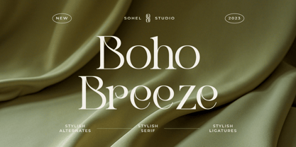 Boho Breeze is a Modern elegant serif typeface with Unique alternative , multilingual support with perfect kerning. This typeface is perfect for an elegant & luxury logo , classy editorial design, women's magazine, fashion brand , cosmetic brand, fashion promotion , modern advertising design, invitation card, art quote, home decoration , book/cover titles, special events, Tote bag, T-shirt, Advertising and much more.
 - Brussels City by Mevstory Studio,
$20.00 Brussels City is Modern Slab Serif Font Brussels City font is perfect for your up coming projects. Such as logo branding, editorial design, stationery design, sport design, blog design, modern advertising design, card invitation, art quote, home decor, book/cover title, special events and any more. That's it! Have fun with Brussels City Serif Font. Thank you! Lettercorner Std
 - Electra by Linotype,
$40.99 Venecian Old Face fonts had a strong influence on typeface design in the 1930s and 1940s in England. Such influence is evident in the font Electra, designed by William A. Dwiggins for Linotype in 1935. Electra combines its classic roots with the Zeitgeist of the 1930s, also displaying characteristics of the Bauhaus and Art Deco styles.
