8,165 search results
(0.009 seconds)
- Calathos by Gassstype,
$25.00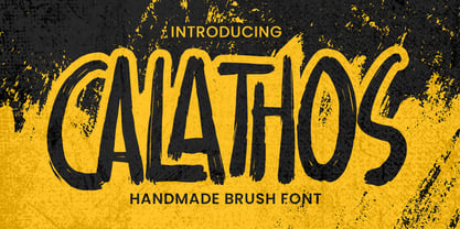 Introducing Calathos– Handmade Brush Font is a Signature Style and classy style, this font is great for your creative projects such as watermark on photography, and perfect for logos & branding, photography, invitation, watermark,advertisements,product designs, stationery, wedding designs,label ,product packaging, special events or anything that need handwritting taste. Calathos a natural handwritten feel. This handmade font will make your design has a beautiful natural touch for each details. It is perfect for any design project as Invitation,logo, book cover, craft or any design purposes. photos, photography overlays, signs, window art, scrapbooking, tags and so much more!
 - PGF Elyss by PeGGO Fonts,
$29.00 Download PGF Elyss specimen Document: https://peggofonts.com/download/PGF-Elyss_(Specimen-2022).pdf In the lapse of one and a half year, what's started as a simple font idea turned into a huge multi style project, that we present to you today. Inspired by Jean Larcher's calligraphic work. This adventure began with a classic Roman set, then we added a Lombardic, an Elegant Script, and finally a Catchwords and Ornaments set. All under the influence of Art Nouveau organic look, that makes PGF Elyss an ideal project for label, header and cover design, it can even handle over than +200 latin based languages.
 - Sultana by Gassstype,
$23.00 Here comes a New font, Introducing Sultana It's Fun Hand Drawn Font is a Natural Style and Authentic classy style, this font is great for your creative projects such as watermark on photography, and perfect for logos & branding, invitation,advertisements,product designs, stationery, special events or anything that need handwritting taste. Sultana is a Hand Drawn feel. This handmade font will make your design has a beautiful natural touch for each details. It is perfect for any design project as Invitation,logo, book cover, craft or any design purposes,photos, photography overlays, signs, window art, scrapbooking, tags and so much more!
 - Nouveau LX Expanded by Vanarchiv,
$31.00 The original design came from Berthold Herold typeface, designed by Hermann Hoffmann during 1913 (Art Nouveau style) in Germany. This project started from flyer printed during 1947 with movable type, the specimen was scanned as a source to development some of the uppercase letterforms. However the most unusual and tricky element from this sample is the leg from the uppercase (R) which is different from the original Herold design, until now I didn’t found where this version originally came from. This expanded version only contain the bold weight, however there are also stencil (Nouveau LX Stencil) and condensed version (Nouveau LX) available.
 - Sign Painter by House Industries,
$33.00 For decades, the handletterer’s craft has been indispensable to the advertising and design trades. As prevailing tastes changed and new technologies emerged, commercial art saw the fateful demise of this lost skill. Now, House Industries is proud to offer the Sign Painter font kit, a collection of six timeless display typefaces along with an assortment of eye-catching advertising type treatments in font format. Like all good subversives, House Industries hides in plain sight while amplifying the look, feel and style of the world’s most interesting brands, products and people. Based in Delaware, visually influencing the world.
 - Nouveau LX by Vanarchiv,
$27.00 The original design came from Berthold Herold typeface, designed by Hermann Hoffmann during 1913 (Art Nouveau style) in Germany. This project started from flyer printed during 1947 with movable type, the specimen was scanned as a source to development some of the uppercase letterforms. However the most unusual and tricky element from this sample is the leg from the uppercase (R) which is different from the original Herold design, until now I didn’t found where this version originally came from. This font family only contain the bold weight, but there are also a stencil and expanded versions available.
 - DXAngelus Mediaval by DXTypefoundry,
$45.00 The font DXAngelusMediaval was developed on the basis of the Angelus Mediaval font, which was issued by Russian type foundry from the beginning of the 20th century (type foundry of G. Bertgold, St. Petersburg and Moscow, before 1904). Probably, the font is a reworking of the DeVinne font (1892 (?), Designer Nicholas J. Werner) of the American Central Type Foundry. For the reconstruction, we used examples of font prints: Cyrillic from the catalog "Art Fonts", 1929, Latin part - Chicago font, from the catalog "La Fonderie Typographique Francaise" (FTF) 1924. In addition, in the font are available Digits of the old style and ligature.
 - Quincy by Wiescher Design,
$12.00 »QUINCY« started as an art project. I was stitching roughly cutout letters together on a piece of wooden board, but I didn’t like the result! So I ended up with a font in three cutout styles. I thought it was so unusual and really beautifully ugly, that I finished it, adding flashes here and there. Now I am offering this absolutely unusual font as a packet of three for you to enjoy. Have at least as much fun working with it as I had designing the packet. The font is great for packaging or posters, or whatever comes to your imaginations.
 - Go Home JNL by Jeff Levine,
$29.00 Sheet music for another one of those songs from the early part of the 20th Century with a wonderfully wordy hand lettered title was the model for the Art Nouveau flavored Go Home JNL, which is available in both regular and oblique versions. 1908's "I Used to be Afraid to Go Home in the Dark (Now I'm Afraid to Go at All)" is comprised of eighteen words. It may have been a mouthful to request from the local sheet music shop, but the lettering on its cover made it a great candidate for preserving as a digital typeface.
 - Hagemann JNL by Jeff Levine,
$29.00 One of the most enduring type styles of the Art Deco era is Huxley Vertical. Its clean lines and stylish appeal have transcended changing times and tastes. Many typefaces have been inspired by the original, including the model used to create this font. The design was found in the book "Lettering and Alphabets", first published in 1946 by J. Albert Cavanagh. By re-drawing it from scratch, the missing numerals, punctuation, special characters and accents were added. Hagemann JNL and its oblique version are named in honor of one of Jeff Levine's friends within the type design community -- Michael Hagemann of Font Mesa.
 - Thirteenth Classmate by Gassstype,
$22.00 Introducing Thirteenth Classmate – Handmade Brush Font is a Authentic Natural and classy style, this font is great for your creative projects such as watermark on photography, and perfect for logos & branding, photography, invitation, watermark,advertisements,product designs, stationery, wedding designs,label ,product packaging, special events or anything that need handwritting taste. Thirteenth Classmate a natural handwritten feel. This handmade font will make your design has a beautiful natural touch for each details. It is perfect for any design project as Invitation,logo, book cover, craft or any design purposes.photos, photography overlays, signs, window art, scrapbooking, tags and so much more!
 - Jugendstil Flowers by Intellecta Design,
$19.90Jugendstil Flowers are a collection of dingbats fonts with ornaments, leitmotivs and fleurons, free inspired in the visual style from the golden age of the Art-Nouveau graphic movement. A beautiful work with and organic forms and sensibility with the taste of the vegetal world, by Chyrllene K, who brings you a extra gift : Buying the three fonts (family pack) you get a special free bonus: the Victorian Advertising EPS PACK with ten amazing artworks (in eps) inspired in the Victorian ages magazine advertisings (see the banners). See all the glyphs from Jugendstil Flowers in the pdf brochure at the gallery section. - Nouveau Years JNL by Jeff Levine,
$29.00 Sheet music at the beginning of the 20th Century reflects both the musical and artistic tastes of the times in often colorful ways. It seemed to be a favorite thing amongst songwriters of that era to come up with very wordy song titles. The cover of the sheet music for 1907’s “Every Little Bit Added to What You’ve Got Makes Just A Little Bit More” checks in at fourteen words, but the hand lettered title (done in an Art Nouveau style) made it worthy of transposition into a digital type face. Nouveau Years JNL is available in both regular and oblique versions.
 - MMC Grafik by MMC-TypEngine,
$37.00 Modular Matrix «Calligraffiti» Robotic Letterform Typeface! New Edition. Redesigned with Obliques and OT Features! This Typeface was inspired by Graffiti Calligraphic Broad Markers and Underground Lettering Technic and Style, grid based by squares perpendiculars and Diagonals… Is Part of a juxtaposed “Type-Game” based on inversions and rotations… Type cool legible digital manuscript Aesthetics body text, scripts, lyrics, articles; Plus, Create Fancy Display’s Branding designs, Packaging, Publishing, Advertisement, Posters, Art Support, Motion, Games, tastes good to text on everything! Experiment Automatic and Responsive OpenType Features, like Fractions, Ordinals, Nominators, Denominators, Scientific Inferiors, Numerators, Localized forms and Kerning. Previous Released by MMC-Typo* 2020. Post Released by MMC-TypEngine 2022. Tip 1: Combine styles into infinite possibilities of Digital Monochromatic or Color Typesetting, by ‘central pasting’ or you may dislocate layers for improvisations! TIP 2: *BLIND BLOCKS ‘FREE-STYLES’ Use Block «Free Styles» 1 & 2 also to add 3D, change 3D directions by switching Block 1 to Block 2, that way you can Zig-Zag words and lines. *Also shift the block layer up to bottom limit, it makes the 3D direction turn upside down. *All Styles have 917 Glyphs. Follow the Groove!! & Power to The Pixel!! Greetings !! André, MMC-TypEngine.
 - Studio Neon by LLW Studio,
$22.00 Studio Neon is an all-caps display font constructed with three rounded-end strokes; the lowercase set is included as a repeat of the uppercase to make setting type just that little bit easier. It’s a modern rendition of neon sign lettering, with a decidedly art deco pedigree, and is intended for use in larger sizes of type, upwards of 36 pt. It’s perfect for a design that wants to imitate neon — use Photoshop layer effects to light it up! I originally started this font with only a few letters, since I could not find a neon-style font made with 3 strokes that looked modern. (Once I started, I found out why. It's a LOT of work!) Most traditional neon fonts include a “bent tube” element in the design; however, not all modern neon signage is constructed with the tubes bent. I also wanted to design a fun font that would have more life than just as an imitation of signage — something to inspire designers who love the geometry of art-deco type. So I made all the corners consistent, with no references to bent tubes. Use this font for any application that needs a bold and decorative look. Studio Neon should work well for sign production and even vinyl cut applications at larger sizes.
 - IRR3V3RSIBL3 - Unknown license

- Sabre by Alias,
$60.00 I generally refer to our typefaces as ‘graphic’ rather than typographic. By that I mean their starting points are usually ways of constructing shapes and systems of shapes. As with other Alias typefaces, Sabre has stone and wood cut letterforms as a starting point. What is interesting about lettercutting is the connection between shape and material. These beautifully crafted letterforms have a particular sharpness which reflects, of course, how they were made. The idea of constructing letters from a kit of parts we first explored in early fonts Elephant and Factory. These are different in that they were very much grid-based, with a geometric structure. For Sabre I also had Fred Smeijers’ stencil construction drawings in mind. These show how a set of components can be the basis for a crafted, elegant typeface. Sabre is quite a loose interpretation of this idea. Sabre’s graphic shape means it works well at large sizes, with a dramatic, angular impact. Its aim is to be typographic enough to function for blocks of small-size text too.
 - Insecurity - Unknown license

- Eclectic Pixel Web by Altered Ego,
$45.00Eclectic PixelWeb is a collection of three sizes of popular web icons in the pixel aesthetic. With 80+ icons designed for creating e-commerce, navigation, and interface designs. Use it as a starting point in your favorite vector program, or use the icons as is - they are optimized for sizes at 20 point and will work in Flash and other web graphics programs. Shopping carts, directional arrows, buttons galore! It's like a pinata in font format, surprises for everyone! This font includes: a new and search buttons, home, security, email, search, and a host of other icons and images to make designing your next website a breeze!. Available in Mac and PC formats, in TrueType, PostScript and OpenType formats. - Urbanregent by Kenn Munk,
$26.00The font is largely undesigned, but is bound together by a thick connected band which forms the word-blocks. At the same time, parts of Urbanregent are very designed, glyphs have been re-designed to reflect changes in the way we speak and write. The exclamation mark is louder and more manic, because people tend to write two or three exclamation marks after each other anyway. The full stop is more stopping and the hyphen kicks you on to the next word. Kenn Munk's fonts are generally hard to use - Urbanregent is no exception, but a tip would be to start each word with a capital letter. Because Every Word Is Important. - Distillery by Sudtipos,
$39.00 The Distillery Set is a collection of 5 fonts: Display, Strong, Script, Caps, and Icons. The fonts' influences are in lettering from different eras and styles. They reflect forms from the Arts & Crafts movement, the Roman majuscules, artistic printing, traditional tattoo lettering, sing painting and showcards from the early XX century and some typography trends started from 1970s America and being used today like chalkboard art or handmade labels in packaging. This is collection of fonts that strongly hints of the spontaneous ways of pencil on paper, the dynamic rebellion and simultaneous imperfection and elegance of DIY. This set contains a wide range of characters, including alternates, ligatures, variations on ascenders and descenders, initials and terminals, icons and ornaments, providing endless application possibilities. The different fonts can be used individually, but of course it is their combination in use that creates the magic. The Distillery Set was designed by young talent Carolina Marando. Alejandro Paul produced and expanded the digital work.
 - I SEE SPIRALS - Unknown license

- Zyncho by Emboss,
$14.00 Inspired by fortune tellers and tarot cards.
 - Cafe Society JNL by Jeff Levine,
$29.00 Vintage sheet music was initially a partial inspiration for what started out as a simple retro typeface, but the basic hand-lettered design from the Art Deco era lent itself to some further experimentation. Geometric shapes were added to the original monoline letters and numerals and the end result was a marvelous display face called Cafe Society JNL. During the 1930s, "Cafe Society" was popular slang for the financially privileged during the Great Depression who dined at fine cafes while others who were able to eat out did so at diners and cafeterias. Available along with Cafe Society JNL is the original version, Cafe Society Monoline JNL.
 - Spencer by The Northern Block,
$30.99 Spencer is a calligraphic semi-serif type family that has been carefully designed to provide easily distinguishable letterforms that are practical in use, as well as aesthetically appealing. It's natural and organic forms comes from a deep consideration of the efficiency of the visible word and provides the typeface with a distinct and unique voice. Named after Herbert Spencer, an educator and researcher of legibility at the Royal College of Art in the sixties and seventies, and influenced by other early typographers and legibility researchers, such as Walter Tracy and John Harris. Spencer was designed as part of a legibility study by Sofie Beier and Kevin Larson.
 - Mojodelic by Mysterylab,
$21.00 Looking for a font with that certain... umm... special mojo? Mojodelic might just be the niche font that you need to create that unique statement — one that really pops off the page. While this typeface certainly grooves with the 1960s – 1970s vintage psychedelic and pop art look, it's also a perfect fit with retro 1990s party-way-too-hard youth culture graphics. With its ultra-bold reverse-contrast design and whimsical little curlies, this one's got equal parts silliness and swagger. Try it on skateboard graphics, retro message t-shirts, apparel logos, beverage labeling, candy packaging, teen/tweener marketing, greeting cards... you name it. Enjoy.
 - Neo Afrique Pro by Tondi Republk,
$17.00 Neo Afrique sans a neo-futuristic typeface with a modern decorative twist. This typeface design came out of further development and refinement on an original typeface that i created some time ago, Durango Sans. True in nature to it's predecessor, Neo Afrique was also born out of this desire to fuse two different aesthetics, the geometric Neo-Futuristic aesthetic, fused with flourishing decorative forms from Art Nouveau and the later Lubalinesque aesthetics. This typeface will form part of a larger body of work that is meant to be an exploration of Afrikan neo-futurism, using the immense power of visual-linguistic narratives to catalyse new cultural movement and perception.
 - Yagi by Ably Creative,
$25.00 Yagi is a serif typeface that contrasts with old-fashioned proportions creating a more defined texture than your usual sans-serif, and Yagi is elegant enough for fashion, art, and luxury; yet sincere enough for serious business. And at 2 styles, ready for complex typographic demands. When we started this project, we wanted to try drawing modern serifs with accurately verified shapes and detailed elaboration of each character, making your text look great both on paper and on screen. Yagi creates unique and organic characters, with different sets of styles, you can change the feel of your designs from more organic to more standard. Let your designs fly!
 - Bejita by Twinletter,
$15.00 Do you require a distinctive and eye-catching font for your company’s logo, social media posts, or other purposes? You’ll love the Bejita San Serif font family. It has been designed to assist and make it simple for you to create stunning graphic design projects of any kind: logos, posters, signs, packaging, font art, and so on, with 18 different styles to choose from. of course, your various design projects will be perfect and extraordinary if you use this font because this font is equipped with a font family, both for titles and subtitles and sentence text, start using our fonts for your extraordinary projects.
 - Rocka by Gassstype,
$25.00 Here comes a New font, Introducing ROCKA It's Bad Hand Drawn Font is a Natural Brush Style and Authentic classy style, this font is great for your creative projects such as watermark on photography, and perfect for logos & branding, invitation,advertisements,product designs, stationery, wedding designs,label ,product packaging, special events or anything that need handwritting taste. ROCKA is a natural Hand Drawn feel. It is perfect for any design project as Invitation,logo, book cover, craft or any design purposes,photos, photography overlays, signs, window art, scrapbooking, tags and so much more! It is perfect for any design project as Invitation,logo, book cover, craft or any design purposes.
 - Rages by Gassstype,
$23.00 Here comes a New font,Introducing Rages It's A Rough Brush Font is a Strong Style and classy style, this font is great for your creative projects such as watermark on photography, and perfect for logos & branding, invitation,advertisements,product designs, stationery, wedding designs,label ,product packaging, special events or anything that need handwritting taste. Rages a natural Hand Drawn feel. This handmade font will make your design has a beautiful natural touch for each details. It is perfect for any design project as Invitation,logo, book cover, craft or any design purposes,photos, photography overlays, signs, window art, scrapbooking, tags and so much more!
 - Bulbis by Azzam Ridhamalik,
$10.00 Introducing Bulbis, the latest addition to our font collection. This unique bubble font is inspired by graffiti and street art, infused with a modern layout that is sure to stand out. The font also incorporates a mix of y2k culture and streetwear visuals, which are currently trending in design identities. With its eye-catching appearance, Bulbis captures attention right from the start, drawing the viewer in to explore its fun and dynamic features. The font is versatile and can be used for a variety of design projects, from logos and branding to social media graphics and more. Give your designs a fresh and modern edge with Bulbis font today!
 - Judgemental Guys by Gassstype,
$23.00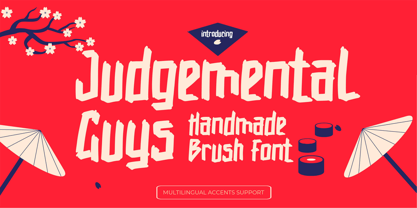 Hello Everyone,introduce our new product Judgemental Guys - Handmade Brush Font is a Signature Style and classy style, this font is great for your creative projects such as watermark on photography, and perfect for logos & branding, photography, invitation, watermark,advertisements,product designs, stationery, wedding designs,label ,product packaging, special events or anything that need handwritting taste. Judgemental Guys a natural handwritten feel. This handmade font will make your design has a beautiful natural touch for each details. It is perfect for any design project as Invitation,logo, book cover, craft or any design purposes,photos, photography overlays, signs, window art, scrapbooking, tags and so much more!
 - Virna by FSD,
$60.00In September, 2003 I was contacted by MTV for the restyling of mtv.it I started from the beginning to work on a radical simplification of its visual elements, to achieve a better usability. It didn't take me so much to realize the basic design I attempted would have called for a notable reduction of the rich imagery distinguishing MTV's visual identity. As a visual aid to help me in this process I designed Virna, a headline "op-art" inspired face with the ability to create both vertical and horizontal ligatures between single words among two text lines, with the same ease of linking letters in handwriting or a linked script typeface. - Nouveau LX Stencil by Vanarchiv,
$31.00 The original design came from Berthold Herold typeface, designed by Hermann Hoffmann during 1913 (Art Nouveau style) in Germany. This project started from flyer printed during 1947 with movable type, the specimen was scanned as a source to development some of the uppercase letterforms. However the most unusual and tricky element from this sample is the leg from the uppercase (R) which is different from the original Herold design, until now I didn’t found where this version originally came from. This stencil typeface only contain the bold weight, but there are also available other versions without stencil cuts, like Nouveau LX and Nouveau LX Expanded.
 - Bernhard Signature by Jonahfonts,
$40.00I started to work at the Bernhard Studio in 1952 to 1959 in New York. I helped with some type designs and many other projects, this two tiered signature was added on all of Bernhard’s art that was produced in the past and in his later years. In the 50’s I thought Bernhard’s Gothic face was quite a bit outdated but as you may know it has become one of todays most used faces. His signature is based on his Bernhard Gothic Font. With todays computer technology I have digitized the caps and added lower case glyphs with lower ascenders and other slight changes. - Shanghai - Unknown license

- Tattoo - Unknown license

- Capires by Craft Supply Co,
$20.00 Capires - Art Deco Font is a captivating fusion of two iconic art movements, Art Deco and Art Nouveau, blended into a contemporary typeface that pays homage to the rich artistic heritage of both styles. This font beautifully combines the geometric precision of Art Deco with the intricate, organic motifs of Art Nouveau, resulting in a harmonious masterpiece of design. Capires is the perfect choice for projects that demand a unique and mesmerizing synthesis of these two influential art movements. Whether you're working on branding, packaging, or editorial design, Capires brings a sense of timeless elegance and artistic richness to your work. With Capires, your designs seamlessly bridge the gap between past and present, making it an exceptional choice for projects that seek to capture the essence of both Art Deco's geometric refinement and Art Nouveau's flowing, ornamental beauty. This font transforms your creations into an elegant and visually captivating experience, where tradition meets modernity in a harmonious embrace.
 - Ghosttown BC - Personal use only


