10,000 search results
(0.019 seconds)
- Radios in Motion Hard - Unknown license

- First Blind 2 - Unknown license

- Hurry Up - Unknown license

- Rina - Unknown license

- Axaxax - Unknown license

- Cuomotype - Unknown license

- Delta Hey Max Nine - Unknown license

- Stupefaction - Unknown license

- Stereofidelic - 100% free

- Braeside Outline - Unknown license

- Lesser Concern - Unknown license

- Capacitor - Unknown license

- Librada Pro by Typehead Studio,
$12.00 Librada Pro is a Sans-serif style font.librada pro font has 9 variants of style weight, ranging from Thin, Regular, Bolt, Outline Style and Texture Style. Each variation has 2 types of styles Regular and italic. Librada Pro Font is suitable for any design needs, invitation design, branding, Cover Book design, advertising design, Art Quote, Home decor, Book Title, special events, birthday, custom mug, pillow, t-shirts, any handwriting signature style needs and more. Librada Pro Font supports the following languages : Albanian, Basque, Breton, Chamorro, Dutch, English, Finnish, Frisian, Galician, German, Italian, Malagasy, Portuguese, Spanish, Swedish. Thank you for your watching! Hope you Like it and you're having fun with Librada Pro ! Happy creating! Thanks. Typehead Studio
 - ZT Floogn by Khaiuns,
$14.00 The new ZT Floogn font family, designed by Khaiuns and published by Zelowtype, is a modern, dense sans-serif style with a rounded look. This font is characterized by its balanced proportions, uniform stroke width, and subtle variations in type forms, giving it a distinctive look at all weights. Due to the narrow shape of the ZT Floogn typeface, it is best applied to headlines and poster-sized typography, resulting in designs with a fresh, friendly personality. ZT Floogn has 8 weights, one of them is commercial-free, and each style has a unique alternative font. I hope you have fun using ZT Floogn. Thanks for using this font ~ Zelowtype X Khaiuns
 - Holly Journey by Letterhend,
$15.00 Holly Journey is a display handwritten font with many ligatures. The strokes make this font outstanding and looks great for title. A typeface with fun and playful looks that perfectly made to be applied especially in storybook children or child theme which is need a standout font, and the other various formal forms such as invitations, labels, logos, magazines, books, greeting / wedding cards, packaging, fashion, make up, stationery, novels, labels or any type of advertising purpose. Features : numbers and punctuation multilingual alternates / swashes and ligatures PUA encoded We highly recommend using a program that supports OpenType features and Glyphs panels like many of Adobe apps and Corel Draw, so you can see and access all Glyph variations.
 - Apnea by The Type Fetish,
$25.00 Apnea is a layerable type family consisting of fifty weights. It is an all caps font with a few lowercase alternatives (a, e, i, m, n, t, w, and y) thrown in for a more casual feel. The base letterforms are inspired by a painted sign I found in the garage of an old house I moved into years ago. All the hand-drawn elements were done directly in FontLab to keep them loose and playful without getting distorted or grungy. At its core Apnea consists of eight base weights (Base, Drop Shadow, Halftone, Inline Fill, Outline, Outline 3D, Shading and Shadow) that when combined, can make up the rest of the family. Have fun, experiment and play!
 - Dip Pen JNL by Jeff Levine,
$29.00 Answer Songs have been around for [probably] just as long as there have been songs. 1917's "If I Catch the Guy Who Wrote Poor Butterfly" was the answer to the 1916 hit "Poor Butterfly" [by Raymond Hubbell and John Golden], which in turn was inspired by the Puccini opera "Madame Butterfly". "Poor Butterfly" was so popular that this "answer" tune had as part of its lyrics "That melody haunts me in my sleep; it seems to creep." Nonetheless, the sheet music for William Jerome and Arthur Green's comic lament had the title hand lettered with an oval nib lettering pen and is now availably as a digital type face called Dip Pen JNL.
 - Granity by Nathatype,
$25.00 Do you to make your branding spark? Are you dreaming of creating headings that stand out and inspire creativity, imagination, modernity, and endless fun? Looking for an elegant and stylish font? We've got what you want. Granity- A SansSerif Font Granity is a sans serif font that very suitable for market designs being developed today, this font has a trendy, natural and soft style. You can take advantage of every moment. The great way to highlight your design or project. So beautiful on invitation like greeting cards, logos, fashion, lookbook, marketing promotions. branding materials, business cards, quotes, posters, and more. Features: Ligatures Stylistic Set PUA Encoded Numerals and Punctuation Thank you for downloading premium fonts from Natha Sudio
 - Birly by Orenari,
$18.00 A few nights ago, I was dreaming about making a cute font that the children in the city would love. I only remember some characters of the font but I thought that it was a sign to make a new font. So, here it is, Birly. A new font and I think its cute yet playful for your fun projects. Birly was made with all my heart, I love it, and I hope you like it too. Birly has 2 styles, the regular and solid. You can choose, these all in the package! Please take a look and enjoy the preview pictures of Birly. I made it seriously, so you can see how is Birly looks on some projects.
 - Turesco by Letterhend,
$17.00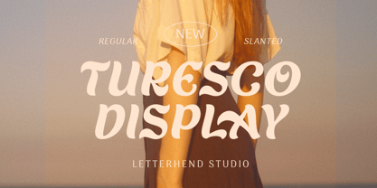 Turesco Display is a display typeface with unique letterform. It looks great to be used for modern and minimalistic yet still playful and fun theme. This font perfectly made to be applied especially in logo, and the other various formal forms such as invitations, labels, logos, magazines, books, greeting / wedding cards, packaging, fashion, make up, stationery, novels, labels or any type of advertising purpose. Features : uppercase & lowercase numbers and punctuation multilingual alternates & ligatures PUA encoded We highly recommend using a program that supports OpenType features and Glyphs panels like many of Adobe apps and Corel Draw, so you can see and access all Glyph variations. How to access opentype feature : letterhend.com/tutorials/using-opentype-feature-in-any-software/
 - The Roman Historia by Mega Type,
$20.00 The Roman Historia is a stylish serif font that will make your design projects stand out and be stylish! The Roman Historia is crafted with care to ensure premium quality and a luxurious feel. Ligatures and alternatives make this typeface unique and stand out from typical serif fonts. The Roman Historia is perfect for branding, logo designs, headlines, titles, magazines, name card, labels, product packaging, book titles, movie titles, fashions magazines or any other type of design. Contains full set: -The Roman Historia Regular and Condensed -Uppercase -Lowercase -Alternative -Ligatures -PUA encoded -Punctuation -Number -Multilingual support. Have fun using The Roman Historia!! Feel free to follow, like and share. Thank you very much for checking my store!
 - Thick by Good Java Studio,
$15.00 Thick is the perfect font for all your fun designs and also for Halloween decorations. The main font file is equipped with ordinary characters, as well as more than 350 glyphs to support most Latin-based languages. Everything is made with the same brush, and everything is the same size as Thick, so you can be sure they will work well together! It is suitable for you to use in making t-shirt design, quote, label, packaging, logo type, or long writing. Because we have compiled kerning and matrices that are tailored to your needs. Thick feature: - More than 350+ glyphs - Fully coded PUA for full access to all characters - 19 languages support
 - Happy Pink by Letterhend,
$15.00 Sweet, simple and personal with a touch of fun- Happy Pink is freshly and natural brush lettering, perfect for eye-catching branding. The bold stroke make this font looks stands out, very suitable to be applied especially to packaging, birtday card or invitations, labels, logos, magazines, books, greeting / wedding cards, fashion, make up, stationery, novels, labels or any type of advertising purpose. Features : uppercase & lowercase numbers and punctuation multilingual alternates & ligatures PUA encoded We highly recommend using a program that supports OpenType features and Glyphs panels like many of Adobe apps and Corel Draw, so you can see and access all Glyph variations. How to access opentype feature : letterhend.com/tutorials/using-opentype-feature-in-any-software/
 - Lemonilla by Raditya Type,
$14.00 Lemonilla | Quirky Display Font Lemonilla a bold, quirky display font with a fun, trendy street style vibe. From posters designs to t-shirts and packaging, Lemonilla will give your designs that alternative minimal look and make your creative work look supercharged. Lemonilla was hand-drawn, making its outlines somewhat irregular and quirky. It has an almost hand-lettered look; the characters jump around the baseline giving it a charming but urban look and feel. The modern bold sans serif typeface has a host of alternatives and ligatures included. Combine its bold shapes to give your work a more unique, hipster attitude. Easily create professional cool type lockups that look like hand lettering.
 - Mars Model by Kustomtype,
$25.00 Mars Model is a font that's originated from a concept for a rock band. With its 5 fun styles, Mars Model gives your graphic work a futuristic look that is reminiscent of the warm look and touch of Arts & Crafts. This style of type is instantly associated with advertising and design for high-end products. Mars Model is an entirely hand-drawn font, perfectly vectorized and meticulously digitized for quality and readability. Also, the font can be used for a refined vintage feeling or an industrial and futuristic atmosphere. Mars Model is great for display, logos, branding, packaging, advertising, food, sports, titles, film, TV, and much more. Doesn't that sound perfect to you?
 - Periplus by PintassilgoPrints,
$26.00 I got rhythm, I got music, I got my swirls, who could ask for anything more? Periplus is quite an eccentric type, full of twists and nice oddities here and there. It is an all-caps font with 2 variations for each letter and number, stored at upper- and lower-case slots. For added amusement, every letter got not 1 or 2, but 4 swash variations. One can be reached through the OpenType swash feature: just select the letter and hit the swash button. The other ones you will access through a glyphs palette. All of them are neatly organized with the 'access all alternates' feature. The font is yet equipped with some stylistic alternates and ornaments. Have fun!
 - Fizgiger by insigne,
$11.95Fizgiger is a chance to kick back and take break from designing some of insigne's more serious typefaces, like the sans serif Aberlyth. It is an extension of the ideas of Blue Goblet, but includes more frills and a more pronounced vertical stress. The name Fizgiger is derived from the English word Fizgig, which is defined as a flirty girl. Fizgiger is a fun and uplifting script that works for whenever you need a playful and exciting script. As always, Fizgiger comes with a wide range of OpenType features, including small caps, a full complement of artistic alternates (it's like getting another font free!) and old style figures to add a touch of class. - Kazuwa by Scratch Design,
$9.00 It introduces a cute display font "Kazuwa". This font is complete with all punctuation and multi-languages support. Kazuwa also has a unique casual shape and looks like a natural kid handwritten, so this font will be perfect when applied to the fun concept design. This font will be useful for posters, name cards, books, comics, presentations, or packaging designs. Enjoy this font, it also supports multi-languages. In some features like stylistic alternates, we put some cute illustrations to make your design more cheerful. Features: Stylistic Alternates & Ligatures Numerals & Punctuation Accented characters Multiple Languages Supported HOW TO ACCESS ALTERNATE CHARACTERS Open glyphs panel: In Adobe Photoshop go to Window - glyphs In Adobe Illustrator go to Type - glyphs
 - The Pinesicle Stock by Letterhend,
$17.00 Introducing, Pinesicle Stock - A display typeface font with horror theme but fun and playful at the same time. This font has unique looks very suitable for horror, thriller and spooky theme design. Comes with two style, regular and bloody. This font also perfectly made to be applied especially in logo, and the other various formal forms such as invitations, labels, logos, magazines, books, novels, labels or any type of advertising purpose. Features : two styles, regular & bloody version uppercase and lowercase numbers and punctuation multilingual PUA encoded We highly recommend using a program that supports OpenType features and Glyphs panels like many of Adobe apps and Corel Draw, so you can see and access all Glyph variations.
 - In the whimsical world of typography, where letters are not just letters but characters bursting with personality, the font Misirlou Day by Ray Larabie performs a vibrant hula dance, beckoning the su...
- Telefonica - Personal use only

- Pargrid by Linotype,
$29.99Pargrid is a grid-based typographic experiment from the young Swiss designer Michael Parson. In the Pargrid family, which contains three separate weights, Parson has created an intriguing system of small circles-similar to LED's or light bulbs-that live separately on a grid, creating unique letterforms. In small sizes, these circles blend together to create seemingly fluid lines, giving Pargrid's letters a wide, rectangular appearance. In larger sizes, the letterforms transform themselves into objects d'art-virtual and ordered communities populated by various points. Fantastic in both display settings as well as short strings of text, Pargrid may offer the exact look that your next project is looking for. Pargrid and nine other constructed type designs from Parson are included in Take Type 5 collection, from Linotype GmbH." - Linotype Funny Bones by Linotype,
$29.00Linotype Funny Bones is part of the Take Type Library, chosen from the contestants of the International Digital Type Design Contests of 1994 and 1997. The font was designed by the German artist Ingo Preuss and is available in two weights, one and two. Linotype Funny Bones one consists of two different alphabets containing only capital letters and offers a variety of interesting combinations. Weight two and one set of capitals of weight one are somewhat light and delicate, while the other set of capitals of weight one are of a strongly constructed nature, which makes for a good contrast. The carefully constructed details of the font detract from its legibility, but Linotype Funny Bones is perfect for short texts and headlines in point sizes larger than 12. - Linotype Scrap by Linotype,
$29.00Linotype Scrap is part of the Take Type Library, chosen from the entries of the Linotype-sponsored International Digital Type Design Contests of 1994 and 1997. The font is available in two weights and was designed by German artist Ingo Preuss. It is as though the forms of the basic weight were cut with scissors out of pieces of paper. There are no inner contours, only the outer silhouettes. The capital letters which make up Scrap Bonus are set on black rectangular backgrounds and are white and framed with a white contour. This weight includes a number of different pictograms which were also not spared the scissors. The decorative Linotype Scrap embodies the comic style of the 1990s and is meant exclusively for headlines of points sizes 18 and larger. - Raclette by Linotype,
$29.99Raclette grills are an ingenious Swiss invention. This tabletop grill is used to cook raclette cheese, a unique sort of cheese produced by the happy cows of Valais. Swiss designer Michael Parson created a typeface in 2002 that speaks endearingly to his hearty homeland tradition - endearingly enough, he named it Raclette. Raclette most likely started out as a bold, condensed sans serif. But then, just as one pulls little trays off of a raclette grill, Parsons quickly removed many rectilinear bits from the edges of each letter. Text set in Raclette looks like an old brick wall, or perhaps like a raclette party for several hundred people, that ended an hour ago! Raclette is one of ten of Michael Parson's experiments in type design featured in the Take Type 5 collection from Linotype GmbH." - F2F OCRAlexczyk by Linotype,
$29.99The Face2Face (F2F) series was inspired by the sound of 1990s music, personal computers, and new font creation software. For years, Alexander Branczyk and his friends formed a unique type design collective, which churned out a substantial amount of fresh, new fonts, none of which complied with the traditional rules of typography. Many of these typefaces were used to create layouts for the leading German techno magazine of the 1990s, Frontpage. The typeface F2F OCRAlexczyk is one of the Face2Face fonts in Linotype's Take Type Library. It is based on the popular computer font OCR A, which was developed by the American National Standards Institute in 1966 as a system of letters that both humans and machines could easily read. Alexander Branczyk made a more 1990s/techno version, which later became this font. - Autentico realistic handwriting by Redy Studio,
$19.00 Beautiful and sexy handwriting types. You will love the look of this font. Autentico font was inspired by modern calligraphy, but with a more crushed look, making it perfect for wedding invites, greeting cards, or logos. Use the upper case letters to add elegance to images or give your design some style. We included a full set of lower and upper case letters, numbers, punctuation marks, and 93 ligatures to take your design to the next level. Authentico features: A full set of upper & lowercase characters Numbers & punctuation 93 Gorgeous ligatures Alternates in lowercase Multilingual symbols PUA Encoded Characters – Fully accessible without additional design software. Feel free to give me a message if you have a problem or question. Thank you so much for taking the time to look at one of our products.
 - Mowaq by Ixipcalli,
$27.00 Mowaq es una tipografía limpia, abstracta, moderna, minimalista y de trazos sencillos pero elegantes. Sus cuatro pesos hacen un juego visual de degradados muy marcados. La tipografía Mowaq fue inspirada a partir de los estilos mayúsculas sans-serif, como uso de encabezados y subtítulos en dos libros donde se necesitaba mostrar un aspecto limpio, moderno y minimalista. Los tipos minúsculas fueron adaptados posteriormente a la familia Mowaq. Mowaq is a clean, abstract, modern, minimalist typeface with simple but elegant lines. Its four weights make a visual game of very marked gradients. The Mowaq typeface was inspired by sans-serif uppercase styles, used for headings and subheadings in two books where a clean, modern and minimalist look was needed. The lowercase types were later adapted to the Mowaq family.
 - Monotalic by Kostic,
$30.00 Monotalic was created as a fun experiment, exploring better solutions for the monospaced type design. Most monospaced (fixed-width) typefaces have the same main design problem regarding the lowercase – filling the empty space around l, f, i, j and r. That usually brings the addition of slab serifs to those narrow characters, causing many monospaced fonts to look and feel alike. Monotalic solves that problem by adopting the handwritten (or cursive) form for those problematic characters, which allows them to be defined in more strokes, thus getting a better distribution of form in that fixed-width space. On the other hand, cursive writing usually lacks the legibility of a Roman (Regular upright) style, so Monotalic was created to be a hybrid, taking the best of both worlds. Monospaced fonts today are mostly used for coding. Modern code editors use colored text in order to differentiate between different kinds of code. So, in that environment there’s actually no need for traditional text styling by adding Italics, Bold or other styles, because the code lines are overstated as it is. That is why Monotalic focuses on one style only, in three widths and four weights. The weights allow users to choose the perfect contrast of text on screen, depending on their monitor resolution and background color in the editor. Movie scripts are almost exclusively set in 12pt Courier. It became the industry standard because when set in the specific “screenplay format" it helps with the breakdown of the schedule and budgeting process of the film production. Although it looks completely different, text set in Monotalic (Normal width) will take the same amount of space as Courier.
 - Poster Paint by Canada Type,
$24.95 Poster Paint is a fun shocard alphabet which came about from Jim Rimmer’s admiration of Goudy Stout, a design he liked in spite of the fact that Goudy himself claimed to detest it. Extremely eye-catching and humourous to a fault, Poster Paint is an ideal fit for fun environments like theme parks, concession stands, cofee and juice bars, and in print design for children books and fun food packaging. Poster Paint was updated and remastered for the latest technologies in 2012. It comes with a glyphset of over 375 characters, and supports the majority of Latin-based languges. 20% of this font’s revenues will be donated to a GDC scholarship fund, supporting higher typography education in Canada.


