10,000 search results
(0.047 seconds)
- Gevenda by Agny Hasya Studio,
$12.00 Gevenda is a Modern Classic Display Serif Font, Luxury, Elegant, and versatile. Come in 2 (two) styles (regular & italic) and is created with glyph variations like alternates and ligatures. Perfect for your design projects like logos, branding, advertising, product designs, stationery, photography, art quotes, wedding designs, fashion designs, and more. Featured with Uppercase and Lowercase, Numeral and Punctuation, Multilingual Support, and Opentype Features.
 - Merzalina by Agny Hasya Studio,
$9.00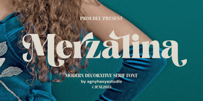 Merzalina is a Decorative Stylish Serif Display Font, Elegant, Classic yet Modern. Come in 2 (two) weights (regular & bold) including slants, and is created with Stylistic Alternates and Ligatures. Perfect for your design projects like logos, branding, advertising, product designs, stationery, photography, art quotes, wedding designs, fashion designs, and more. Featured with Uppercase and Lowercase, Numeral and Punctuation, Multilingual Support, and Opentype Features.
 - Saffron by Tall Chai,
$15.00 Saffron is a contemporary, luxurious sans-serif font family with weights ranging from Light (300) to Bold (700). Features: Available in 5 weights Over 320 glyphs supporting extended Latin Ideal for display texts: Titles, Logos and Headlines etc. Perfect for branding and rebranding Supports OpenTypes features like Ligatures and Stylistic Alternates Symbols for 10 major currencies including Bitcoin provided in all weights
 - Frigtona by FHFont,
$19.00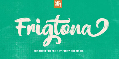 Frigtona is script font with a hand-lettering brush style, with OpenType features included. Suitable for design, element design, wedding, event, t-shirt, logo, badges, sticker, and awesome work. Features Of The Font: - All Standard Character, Symbol, Multi-lingual Support, Ligature, Stylistic Sets and Swashes. - PUA Encoding Follow Me: - https://www.instagram.com/FHFont - https://twitter.com/FH_Font - https://www.facebook.com/FHFont/ - https://id.pinterest.com/feydesign/
 - Matinee Idol by Comicraft,
$19.00 Now showing at your local picture house is the latest romantic comedy coupling featuring Matinee Idol and Matinee Idol Bold; famous faces you've come to know and love in features like Warners' "Hush" and Columbia's "The Evil That Men Do." Stop by our lobby and check these fonts out. Oh, and please remember to refrain from smoking and talking during the show!
 - Closer Text by Mint Type,
$35.00 Closer Text is a narrower, more compact version of previously released Closer. Closer Text is a highly customizable Swiss grotesque with overclosed aperture. Featuring some humanistic shapes, Closer Text feels less bland though still relatively neutral. Closer Text comes in 9 weights (18 styles altogether), features extensive language support including Cyrillic and is highly customizable with 7 stylistic sets to mix and match.
 - Queen Bee by Stefani Letter,
$12.00 Queen Bee is a sweet and cute font with special heart characters. Get inspired by its gorgeous swashes and create beautiful designs with a romantic touch to any crafting project! This font is PUA encoded which means you can access all of the amazing glyphs and swashes with ease! It also features a wealth of special features including alternate glyphs and ligatures.
 - Fatkat by HansCo,
$15.00 Fat Kat is a bold retro serif fonts that feels clean and fun an incredible modern retro aesthetic. This font features a ligature feature on capital letters which allows the font to look unique with a wavy style. Use this Fat Kat serif font to add that special modern retro touch to any design idea you can think of! Enjoy!
 - Beagle Sign by Attype Studio,
$14.00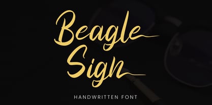 Beagle Sign is a stylish signature font with ending stylistic set that make amazing combination. perfect for any product like branding, invitation, stationery, wedding designs, social media posts, advertisements, product packaging, product designs, label, photography, watermark, special events or anything. Features: - Beagle Sign.otf - Multilingual Support - ligature - Ending stylistic set - Support Opentype features --- Hope you enjoy with our font! Attype Studio
 - Diamond by Monotype,
$29.99The Diamond Negative and Diamond Positive fonts feature sans serif capitals and figures in a diamond shaped background, in positive and negative form. Diamond Negative and Diamond Positive are useful in labelling, on invitations and certificates and for short headlines and intros in advertising. Diamond Bodoni features condensed Bodoni-style capitals and figures reversed on to a diamond shaped background. - Henares Street by Arendxstudio,
$15.00 Heares Street - Brush Font inspired by urban fonts with sharp and beautiful letters that create fonts that are modern, trendy and elegant. Heares Street came with opentype features such stylistic alternates, stylistic sets & ligatures good for logotype, poster, badge, book cover, tshirt design, packaging and any more. Features : • Character Set A-Z • Numerals & Punctuations (OpenType Standard) • Accents (Multilingual characters) • Ligature • Alternate
 - Margoline by Letterhend,
$19.00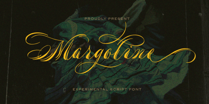 Introducing, Margoline script font. Margoline is a swash handwritten font that is perfect for branding, packaging, wedding invitation, card, etc. Features : uppercase & lowercase numbers and punctuation multilingual alternates and ligatures swash PUA encoded We highly recommend using a program that supports OpenType features and Glyphs panels like many of Adobe apps and Corel Draw, so you can see and access all Glyph variations.
 - Shohibul by Arendxstudio,
$15.00 Shohibul - Brush Font with sharp and beautiful letters that create fonts that are modern, trendy and elegant. Came with opentype features such stylistic alternates, stylistic sets & ligatures good for logotype, poster, badge, book cover, tshirt design, packaging and any more. Features : • Character Set A-Z • Numerals & Punctuations (OpenType Standard) • Accents (Multilingual characters) • Ligature • Alternate There it is! I really hope you enjoy it
 - Plottage by Arendxstudio,
$14.00 Introducing a new font called Pottage - Handwritten Font inspired by urban fonts with sharp and beautiful letters that create fonts that are modern, trendy and elegant. Pottage came with opentype features such stylistic alternates, stylistic sets & ligatures good for logotype, poster, badge, book cover, tshirt design, packaging and any more. Features : • Character Set A-Z • Numerals & Punctuations (OpenType Standard) • Accents (Multilingual characters) • Ligature
 - Quride by Arendxstudio,
$18.00 Introducing my new font - Quride Quride is a modern Serif with a very unique alternate and ligature Quride came with opentype features such stylistic alternates, stylistic sets & ligatures good for logotype, poster, badge, book cover, tshirt design, packaging and any more. Features : -Uppercase & Lowercase -Multilingual support -Number, -Symbol -Punctuation. -Support in Mac and Windows OS -Support in design application (photoshop, illustrator, and more) .
 - Character Sans by Brave Lion Fonts,
$14.00 Character Sans is a detail full sans serif typeface in 5 styles. It features all european languages, ligatures, arrows and minuscule numbers. It's characteristic style features are straightened ends and sharp curves. The lighter weights have great white spaces and their width is orientated on the heavier weights. Character Sans was made to have style and not to be uniform.
 - Lafisken Signature by Tebaltipis Studio,
$12.00 Lafisken Signature is a typeface with personality. You can use it as a logo, badge, insignia, packaging, headline, poster, etc The alternative characters in this font were divided into several OpenType features such as Stylistic Alternates, Stylistic Sets, and Ligature. The OpenType features can be accessed by using OpenType program such as Adobe Illustrator, Adobe Photoshop, and Adobe InDesign. Thank you!
 - The font Gaban is an intriguing and innovative typeface, meticulously designed by the talented deFharo, a Spanish type designer. Gaban draws its inspiration from the adventurous spirit of pirate stor...
- Ah, Jellyka by Jellyka Nerevan – the font that decided to take a leisurely stroll through the whimsical garden of creativity, wearing its most charming attire. Picture if you will, each letter crafte...
- Signyard by Albatross,
$19.00 Based on the popular Microbrew Family (Rising Star, May 2014), Signyard is a display family trapped in time. Inspired by vintage restaurant and hotel signs, Signyard comes decked out in incandescent bulbs for a an authentic retro feel. The family has a unique vintage cinema style, but also works well with a variety of subject matter including weddings, birthdays, breweries, coffee houses, cigar shops, and many more. Signyard is an all caps display font, but the lowercase act as alternates. For super-easy alternates, just mix uppercase and lowercase letters. To add to the realism, Signyard includes double-letter ligatures. Sporting a healthy compliment of features and languages, Signyard is a very versatile display family. Signyard features 6 styles, 4 layers, symbols and opentype features. Opentype features include automatic fractions, subscript numbers, superscript numbers, and double-letter ligatures. Also included are old style numerals, and catchwords. (in the symbols font)
 - Raluxe by Prestigetype Studio,
$18.00 Need a font for a brand and personal visual identity? Introducing, our outstanding premium font duo, Raluxe; consisting of a ligature-rich Serif and elegant Script. These fonts are designed to pair harmoniously, specifically use for brand visual identities and personal identities such as logos, headlines, titles, labels, stationery, magazine, fashion industry, social media banner, business cards, or any advertising purposes. This typeface has been made carefully to make sure it's premium quality. Features : Numbers and Punctuation Multilingual Ligatures Alternates OpenType features *You can only access the ligatures and alternates feature in uppercase We highly recommend using a program that supports OpenType features and Glyphs panels like many of Adobe apps and Corel Draw, so you can see and access all Glyph variations. We hope you enjoy our font – please do let us know by emailing us at info@prestigetype.com or prestigetypestudio@gmail.com if you need something!
 - Fascinate Pro by Stiggy & Sands,
$29.00 A soft Art Deco inspired typestyle with panache The Fascinate Pro Family, which includes both Regular & Inline styles, began as a nod to Art Deco yesteryear and typefaces like Broadway, yet they have an exaggerated x-height and softness that give them a friendly yet sophisticated vibe. Even with their high contrast weighting, the Fascinate Pro family is cleanly legible at small sizes, while the Inline style is better visible at larger display sizes. See the 5th and 6th graphics for a comprehensive character map preview. OpenType features include: - Full set of Inferiors and Superiors for limitless fractions. - SmallCaps feature. - Oldstyle (default) and Standard Tabular figure sets. - A small collection of Standard Ligatures. - A Stylistic Alternates feature for an alternate lowercase i and j style. Approx. 581 Character Glyph Set: each style of Fascinate Pro comes with a glyph set that includes standard & punctuation, international language support, and additional features.
 - Yasemin by Bülent Yüksel,
$24.00 My wife name is Yasemin. After building this typeface, I wanted to honor with my wife’s name. I think I fully reflects the character I created in my mind. I created ornaments and connected glyphs. Yasemin is an OpenType font that contains 1045 glyphs. Ligatures, alternates, starting, endings, a wide range of latin languages and a set of ornaments. And words specially designed to use in advertising slogan, stationery for weddings, birthdays, etc. TIPS: Try using Yasemin at a 20º angle so that the slanted strokes, ornament become perfectly vertical. Having the decorative ligatures feature (dlig) activated is a good option to see letters dance. TECHNICAL: It is absolutely recommended to use this font with the standard ligatures feature (liga) activated. It makes letters ligate perfectly and also improves the space between words. UPDATES: - 3 December 2015 Opentype Feature (fractions) update. - 20 March 2019 Opentype Feature (fractions) update. Some bug fixes.
 - Bistern by Letterhend,
$19.00 About the Product Bistern is a typeface which is inspired by vintage lettering sign and art. While this font has a victorian touch, it still looks bold and solid. Very suitable for for headline, logotype, apparel, invitation, branding, packaging, advertising etc with old school / retro theme. This typeface contains with beautiful decorative ornaments in vector format that ready to use to create a vintage lettering in sec. It also comes in uppercase, lowercase, punctuations, symbols & numerals, stylistic set alternate, ligatures, etc also support multilingual and already PUA encoded. Features : ornaments in vector format uppercase & lowercase numbers and punctuation multilingual alternates and ligatures swashes PUA encoded We highly recommend using a program that supports OpenType features and Glyphs panels like many of Adobe apps and Corel Draw, so you can see and access all Glyph variations. How to access opentype feature : letterhend.com/tutorials/using-opentype-feature-in-any-software/
 - Raboka by Twinletter,
$13.00 Introducing “RABOKA Font” – Where Playful Typography Takes the Lead. RABOKA Font is a celebration of playful design. With its whimsical theme, this font infuses a delightful and lighthearted touch into your creative projects. Whether you’re crafting invitations, posters, or branding materials, RABOKA Font effortlessly grabs attention and brings a sense of fun to your designs. Created with meticulous craftsmanship, RABOKA Font radiates the joy and creativity of playful typography, instantly captivating your audience. Its versatility knows no bounds, making it a perfect fit for a wide range of applications, from children’s book illustrations to party invitations. RABOKA Font enhances both readability and style with its quirky, eye-catching characters, providing a unique and engaging look to your text. Plus, it supports various languages, ensuring it resonates with a diverse audience. Elevate your creative projects with the exuberance of RABOKA Font. Explore this exceptional typeface today and let your designs dance with the spirit of playful typography. – PUA Encoded Characters – Fully accessible without additional design software.
 - Fallujah by Arabetics,
$39.00 A typeface design with extra isolated scattered letters and random careless look. It has six members, normal, bold, and medium, all of which come in two styles, regular and left-slanted italic styles. This font family design follows the guidelines of Mutamathil Taqlidi type style with one glyph for every basic Arabic Unicode character or letter, as defined by the Unicode Standards, and one additional final form glyph, for the freely-connecting letters in traditional Arabic cursive text. Fallujah employs variable x-height values. It includes only the Lam-Alif ligatures. Soft-vowel diacritic marks, harakat, are selectively positioned. Most of them appear by default on the same level, following a letter, to ensure that they would not interfere visually with letters. Tatweel is a zero-width glyph. Keying the tatweel key before Alif-Lam-Lam-Ha will display the Allah ligature. Fallujah includes both Arabic and Arabic-Indic numerals, in addition to standard punctuations.
 - Tavern by FontMesa,
$25.00 Tavern is a super font family based on our Algerian Mesa design, with Tavern we've greatly expanded the usability by creating light and bold weights plus all new for 2020 with the introduction of extra bold and black weights Tavern is now a five weight family. The addition of the bold weight made it possible to go further with the design by adding open faced shadowed, outline and fill versions. Please note, the fill fonts are aligned to go with the open faced versions, they may work with the outline versions, however you will have to apply them one letter at a time. The Tavern Fill fonts may also be used a stand alone font, however, the spacing is much wider than the regular solid black weights of Tavern. In the old days of printing, fill fonts rarely lined up perfect with the open or outline font, this created a misprinted look that's much in style today. To create that misprinted look using two different colors, try layering the outline fonts offset over the top of the solid black versions. Next we come to the small caps and X versions, for a font that's mostly seen used in all caps we felt a small caps would come in handy. The X in Tavern X stands for higher X-height, we've taken our standard lowercase and raised it for greater visibility in small text and for signage where you want the look of a lowercase but it needs to be readable from the street. In August of 2016 I started the project of expanding this font into more weights after seeing the font in use where someone tried creating a bold version by adding a stroke fill around the letters. The result didn't look very good, the stroke fill also caused the shadow line to merge with the serifs on some letters. This lead me to experiment to see if a new bold weight was possible for this font and I'm pleased to say that it was. After the bold weight was finished I decided to type the regular and bold weights together in a first word thin second word bold combination, however the weight difference between the two wasn't enough contrast. This lead me to wonder if a lighter weight was possible for this font, as you can see yes it was, so now for the first time in the history of this old 1908 type design you can type a first word thin second word bold combination. So why the name change from Algerian to Tavern? Since the original font was designed in England by the Stephenson Blake type foundry I decided to give this font a name that reminded you of the country it came from, however, there were other more technical reasons. During the creation of the bold weight the engraved shadow line was sticking out too far horizontally on the bottom right of the serifs dramatically throwing the whole font off balance. The original font encountered this problem on the uppercase E, L and Z, their solution was a diagonal cut corner which was now needed across any glyph in the new bold weight with a serif on the bottom right side. In order to make the light and regular weights blend well with the bold weight diagonal cut offs were needed and added as well. This changed the look of the font from the original and why I decided to change the name, additional concerns were, if you're designing a period piece where the font needs to be authentic then this font would be too new. Regular vs. Alt version? The alternate version came about after seeing the regular version used as a logo and secondary text on a major product label. I felt that some of the features of the regular version didn't look good as smaller secondary text, this gave me the idea to create an alternate version that would work well for secondary text in an advertising layout. But don't stop there, the alternate version can be used as a logo too and feel free to exchange letters between both regular and alternate versions. Where are the original alternates from Algerian? Original alternates from Algerian are built into the regular versions of Tavern plus new alternates have been created. We're excited to introduce, for the first time, all new swash capitals for this classic font, you're going to love the way they look in your ad layout, sign or logo. The best way to access alternate letters in Tavern is with the glyph map in Adobe Illustrator and Adobe InDesign products, from Adobe Illustrator you can copy and paste into Photoshop as a smart object and take advantage of all the text layer style features Photoshop has to offer. There may be third party character maps available for accessing alternate glyphs but we can't advise you in that area. I know what you're thinking, will there be a Tavern Condensed? It takes a lot of hours to produce a large font family such as this, a future condensed version will depend on how popular this standard version is. If you love Tavern we're happy to introduce the first weathered edge version of this font called Bay Tavern available in February 2020.
 - Curvesta by wearecolt,
$18.00 Combining classic serifs with curvy features, the Curvesta poster/display font has lots to offer. A real modern classic.
 - Mary Roman by Yuanchen Jiang,
$30.00 A set of typeface that combine detail features from different style of serif typeface originally designed for screen use.
 - PN Froogfright by Illustration Ink,
$3.00 This hand-written, whimsical font features a cute hand-written print with no descenders and added ooze dripping throughout.
 - Trooper JNL by Jeff Levine,
$29.00Trooper JNL joins a large collection of stencil fonts from Jeff Levine, and features a bold sans serif design. - Rosse by Letterara,
$10.00 Rosse features an irregular baseline, making it the perfect font to give your designs a fun and unique feel!
 - P22 Plymouth by IHOF,
$34.95 Plymouth is a pen-drawn calligraphic font of narrow proportions featuring plain capitals and an alternate range with swashes.
 - Ah, the elusive font EMILKOZAK.COM | fartdeco, a typographical enigma that caters to the refined taste of those who appreciate a good giggle alongside their graphic design. Picture this: the roaring ...
- Youth Heritage by Heyfonts,
$15.00 Youth Heritage Font is a vintage bold script font that pays homage to the rich visual heritage associated with youthful exuberance and retro aesthetics , This typeface combines bold, expressive strokes with a script style reminiscent of classic hand-lettering from bygone eras, capturing the spirit of vintage design. Here's a detailed explanation of the key features and characteristics of the Youth Heritage Font: Features: Vintage Aesthetics: The Youth Heritage Font is designed to evoke a sense of nostalgia, drawing inspiration from vintage typography prevalent during the mid-20th century, Its design elements reflect the bold and charismatic lettering styles associated with retro signage and advertising. Bold and Expressive Strokes: One of the defining features of this font is its bold and expressive strokes. Each letter is crafted with confidence, making a strong visual impact. This characteristic contributes to the font's ability to command attention and stand out in various design applications. Script Style: The script style of the font imparts a handwritten and personalized feel. The cursive letterforms flow seamlessly, creating a sense of dynamism and adding a touch of informality to the overall design. Distinctive Lettering: Each letter in the font is crafted with attention to detail, featuring unique and distinctive characteristics. This ensures that the font maintains its individuality and offers a distinct typographic personality. Applications: Vintage Branding: The Youth Heritage Font is well-suited for vintage branding projects. Apparel Design: Designers in the fashion industry can leverage this font for apparel branding and graphic designs. Its bold script style adds a retro flair to T-shirts, hoodies, and other clothing items, giving them a timeless and stylish appeal. Retro Signage: The bold and expressive nature of the font makes it a perfect choice for retro signage and display purposes. Event Posters and Flyers: When designing promotional materials for events, concerts, or parties with a vintage theme, the Youth Heritage Font can contribute to a cohesive and visually appealing poster or flyer design. Social Media Graphics: Its bold and expressive script style can make posts and announcements more engaging and shareable.
 - Chrome Slab by Ferry Ardana Putra,
$19.00 Introducing Chrome Slab, our brand new aesthetic semi-condensed serif font that embodies a perfect balance of elegance and versatility. With its captivating uppercase characters and exquisite design, this font is set to elevate your design projects to new heights. Chrome Slab boasts up to 45 beautiful ligatures, meticulously crafted to add a touch of sophistication and uniqueness to your typography. These ligatures seamlessly blend letterforms together, creating fluid and visually pleasing connections that enhance the overall aesthetic appeal of your text. *Make user to use capital letters to activate ligature features. In addition to its stunning ligatures, this font supports multilingual language, making it an ideal choice for projects with diverse linguistic requirements. Whether you're working with English, Spanish, French, German, or any other language, Chrome Slab ensures seamless integration and legibility across different typographic needs. The semi-condensed structure of Chrome Slab optimizes space utilization, allowing for efficient and impactful designs without sacrificing readability. Its compact yet elegant proportions make it perfect for a wide range of applications, including editorial designs, branding materials, packaging, and digital displays. With Chrome Slab, you'll have a powerful tool at your disposal, enabling you to create visually striking and professionally polished designs. Its aesthetic appeal, versatile ligatures, and multilingual support make it a must-have font for designers seeking to make a lasting impression. ——— Chrome Slab features: A full set of uppercase Numbers and punctuation Multilingual language support PUA Encoded Characters OpenType Features +279 Total Glyphs Up to 45 Aesthetic Ligatures ——— ⚠️To enable the OpenType Stylistic alternates, you need a program that supports OpenType features such as Adobe Illustrator CS, Adobe InDesign & CorelDraw X6-X7, Microsoft Word 2010 or later versions. There are additional ways to access alternates/swashes, using Character Map (Windows), Nexus Font (Windows), Font Book (Mac) or a software program such as Pop Char (for Windows and Mac). ⚠️For more information about accessing alternative, you can see this link: http://adobe.ly/1m1fn4Y
 - Heading Now by Zetafonts,
$39.00 Heading Now is the new incarnation of Heading Pro, developing the original typeface family designed by Francesco Canovaro for Zetafonts into a superfamily with 160 variant combinations. Built around 10 different widths, ranging from ultra-compressed to ultra-wide, and eight weights from thin to heavy, Heading Now provides a full spectrum of sans serif type solutions to your design problems. Born as a space-optimizing typeface for headers and titles, Heading Now can be used in its compressed widths to manage space on the printed page and on the screen. In these widths Heading Now excels in titles and subheadings, timetables, infographics and in situations of exuberant and excessive copywriting. On the other side of the width spectrum, you can find extended width variants, ready to be used for titling where style and energy matter more than pixel or paper economy. Heading family is not only made of extreme widths: you can use the medium width range to design body text. Matching italics provide versatility in text use, as well as a dynamic display alternate to the bolder weights. Heading Now keeps the original design of Heading, but extends the width and weight range while keeping its (post) modernist attention to readability and details. Each Heading Now font includes over 1100 characters with coverage for 200+ languages using Latin, Cyrillic and Greek alphabets. A full array of open-type features is included in each weight featuring also stylistic alternates, small caps, old-style and tabular numerals and positional figures. • Suggested uses: born as a space-optimizing typeface for headers and titles, Heading Now can be used in its compressed widths to manage space on the printed page and on the screen. Perfect for contemporary branding, web design, packaging and countless other projects; • 162 styles: 8 weights + 8 italics x 10 different widths + 2 variable fonts; • 1100 glyphs in each weight; • Useful OpenType features: Access All Alternates, Small Capitals From Capitals, Case-Sensitive Forms, Glyph Composition / Decomposition, Denominators, Fractions, Kerning, Standard Ligatures, Lining Figures, Localized Forms, Mark Positioning, Mark to Mark Positioning, Numerators, Oldstyle Figures, Ordinals, Proportional Figures, Stylistic Alternates, Scientific Inferiors, Small Capitals, Stylistic Set 1, Stylistic Set 2, Stylistic Set 3, Stylistic Set 4, Subscript, Superscript, Tabular Figures, Slashed Zero; • 220 languages supported (extended Latin, Cyrillic, Greek alphabets): English, Spanish, Portuguese, French, Russian, German, Javanese (Latin), Vietnamese, Turkish, Italian, Polish, Afaan Oromo, Azeri, Tagalog, Sundanese (Latin), Filipino, Moldovan, Romanian, Indonesian, Dutch, Cebuano, Igbo, Malay, Uzbek (Latin), Kurdish (Latin), Swahili, Greek, Hungarian, Czech, Haitian Creole, Hiligaynon, Afrikaans, Somali, Zulu, Serbian, Swedish, Bulgarian, Shona, Quechua, Albanian, Catalan, Chichewa, Ilocano, Kikongo, Kinyarwanda, Neapolitan, Xhosa, Tshiluba, Slovak, Danish, Gikuyu, Finnish, Norwegian, Sicilian, Sotho (Southern), Kirundi, Tswana, Sotho (Northern), Belarusian (Latin), Turkmen (Latin), Bemba, Lombard, Lithuanian, Tsonga, Wolof, Jamaican, Dholuo, Galician, Ganda, Low Saxon, Waray-Waray, Makhuwa, Bikol, Kapampangan (Latin), Aymara, Zarma, Ndebele, Slovenian, Tumbuka, Venetian, Genoese, Piedmontese, Swazi, Zazaki, Latvian, Nahuatl, Silesian, Bashkir (Latin), Sardinian, Estonian, Afar, Cape Verdean Creole, Maasai, Occitan, Tetum, Oshiwambo, Basque, Welsh, Chavacano, Dawan, Montenegrin, Walloon, Asturian, Kaqchikel, Ossetian (Latin), Zapotec, Frisian, Guadeloupean Creole, Q’eqchi’, Karakalpak (Latin), Crimean Tatar (Latin), Sango, Luxembourgish, Samoan, Irish, Maltese, Tzotzil, Fijian, Friulian, Icelandic, Sranan, Wayuu, Papiamento, Aromanian, Corsican, Breton, Amis, Gagauz (Latin), Māori, Tok Pisin, Tongan, Alsatian, Atayal, Kiribati, Seychellois Creole, Võro, Tahitian, Scottish Gaelic, Chamorro, Greenlandic (Kalaallisut), Kashubian, Faroese, Rarotongan, Sorbian (Upper Sorbian), Karelian (Latin), Romansh, Chickasaw, Arvanitic (Latin), Nagamese Creole, Saramaccan, Ladin, Kaingang, Palauan, Sami (Northern Sami), Sorbian (Lower Sorbian), Drehu, Wallisian, Aragonese, Mirandese, Tuvaluan, Xavante, Zuni, Montagnais, Hawaiian, Marquesan, Niuean, Yapese, Vepsian, Bislama, Hopi, Megleno-Romanian, Creek, Aranese, Rotokas, Tokelauan, Mohawk, Onĕipŏt, Warlpiri, Cimbrian, Sami (Lule Sami), Jèrriais, Arrernte, Murrinh-Patha, Kala Lagaw Ya, Cofán, Gwich’in, Seri, Sami (Southern Sami), Istro-Romanian, Wik-Mungkan, Anuta, Cornish, Sami (Inari Sami), Yindjibarndi, Noongar, Hotcąk (Latin), Meriam Mir, Manx, Shawnee, Gooniyandi, Ido, Wiradjuri, Hän, Ngiyambaa, Delaware, Potawatomi, Abenaki, Esperanto, Folkspraak, Interglossa, Interlingua, Latin, Latino sine Flexione, Lojban, Novial, Occidental, Old Icelandic, Old Norse, Slovio (Latin), Volapük;
 - Lektorat by TypeTogether,
$35.00 Florian Fecher’s Lektorat font family is one for the books, and for the screens, and for the magazines. While an editorial’s main goals are to entertain, inform, and persuade, more should be considered. For example, clear divisions are necessary, not just from one article to the next, but in how each is positioned as op-ed or fact-based, infographic or table, vilifying or uplifting. From masthead to colophon, Lektorat has six concise text styles and 21 display styles to captivate, educate, and motivate within any editorial purpose. Magazines and related publications are notoriously difficult to brand and then to format accordingly. The research behind Lektorat focused on expression versus communication and what it takes for a great typeface to accomplish both tasks. In the changeover from the 19th to 20th century, German type foundry Schelter & Giesecke published several grotesque families that would become Lektorat’s partial inspiration. Experimentation with concepts from different exemplars gave birth to Lektorat’s manifest character traits: raised shoulders, deep incisions within highly contrasted junctions, and asymmetrical counters in a sans family. After thoroughly analysing magazine publishing and editorial designs, Florian discovered that a concise setup is sufficient for general paragraph text. So Lektorat’s text offering is concentrated into six total styles: regular, semibold, and bold with their obliques. Stylistic sets are equally minimal; an alternate ‘k, K’ and tail-less ‘a’ appear in text only. No fluff, no wasted “good intentions”, just a laser-like suite to focus the reader on the words. The display styles were another matter. They aim to attract attention in banners, as oversized type filling small spaces, photo knockouts, and in subsidiary headings like decks, callouts, sections, and more. For these reasons, three dialed-in widths — Narrow, Condensed, and Compressed — complete the display offerings in seven upright weights each, flaunting 21 headlining fonts in total. If being on font technology’s cutting edge is more your goal, the Lektorat type family is optionally available in three small variable font files for ultimate control and data savings. The Lektorat typeface was forged with a steel spine for pixel and print publishing. It unwaveringly informs, convincingly persuades, and aesthetically entertains when the tone calls for it. Its sans serif forms expand in methodical ways until the heaviest two weights close in, highlighting its irrepressible usefulness to the very end. Lektorat is an example of how much we relish entering into an agreed battle of persuasion — one which both sides actually enjoy.
 - JT Collect by OGJ Type Design,
$35.00 JT Collect is a hybrid sans-serif typeface for the 21st century that takes a playful approach to the type design heritages of Germany and Switzerland. Confidently built on a geometric structure and infused with elements from traditional grotesque typefaces, it hits the sweet spot between geo and grot. I developed JT Collect purely digitally, drawing from years of experience with analog type design. The letters aren’t based on one particular source but seek to merge different type genres from the first half of the 20th century and lift them to a contemporary quality level. JT Collect is less reserved than strictly geometric designs and brings some industrial workmanship and honesty into the game. The six weights plus three optical sizes of JT Collect offer what you need to make an impact. While cool and elegant in the Light weight, the fonts show more presence on the page as they grow bolder. To this end, I drew the letterforms with a slightly unrefined, brawny air in the bolder weights. This sets them apart from the perceived purity of more geometric designs. The Book weight is ideal for short texts and medium-length copy, and the forceful Bold makes wordmarks look crisp and lets headlines radiate cosmopolitan self-confidence. JT Collect is suitable as a primary typeface for branding, advertising, packaging, stationery, posters, documents, and websites from trades and industries as diverse as food & fashion, media & makers, culture & creators, games & gems, sports & startups. Use JT Collect for film titles or watch faces, for leaflets or store signs, for business cards or billboards: this font family is as adaptable as a chameleon (and like a chameleon, it’s never boring). Try it in different contexts. You won’t be disappointed. Its adaptability also makes JT Collect a great starting point for poised and persuasive font combinations. Even a sans/sans pairing is possible due to hybrid nature of JT Collect—something that’d be hard to achieve with most other sans-serif typefaces on the market. You can add to it a heavy slab from the OGJ library, like Temper Wide. You might go for a geometric or a grotesque typeface as secondary (text) typeface. Or you could set your body copy in a classic serif typeface such as Caslon, Sabon, or Plantin. That’s right: JT Collect is a true team player. Whether you need a grotesque or a geometric sans: try JT Collect. You can get the best of both worlds.
 - Junegull by Typodermic,
$11.95 Introducing Junegull, the typeface that seamlessly blends retro-tech design with a contemporary twist. With its friendly all-caps rounded sans, Junegull is like a breath of fresh air—a perfect combination of technological prowess and gentle charm. But don’t let its cuddly appearance fool you; Junegull is like a murderous mechanical teddy bear, with a sharp edge that’s ready to take on any design challenge. For those who crave something wilder, Junegull Beach is the font for you. This wild sibling is perfect for those who want to take their designs to the next level. With Junegull Beach, every letter pair is carefully crafted to give you a more realistic, sandy feel. It’s like taking a walk on the beach, with every letter a grain of sand that transports you to a world of creativity. What sets Junegull Beach apart is its tailor-made pairs, giving you a font that’s uniquely yours. Whether you’re designing a logo, a website, or a poster, Junegull Beach will help you stand out from the crowd with its dynamic and playful style. So why settle for an ordinary font when you can have Junegull and Junegull Beach? With their retro-tech design and contemporary charm, these fonts are a must-have for any designer looking to create something truly extraordinary. Most Latin-based European writing systems are supported, including the following languages. Afaan Oromo, Afar, Afrikaans, Albanian, Alsatian, Aromanian, Aymara, Bashkir (Latin), Basque, Belarusian (Latin), Bemba, Bikol, Bosnian, Breton, Cape Verdean, Creole, Catalan, Cebuano, Chamorro, Chavacano, Chichewa, Crimean Tatar (Latin), Croatian, Czech, Danish, Dawan, Dholuo, Dutch, English, Estonian, Faroese, Fijian, Filipino, Finnish, French, Frisian, Friulian, Gagauz (Latin), Galician, Ganda, Genoese, German, Greenlandic, Guadeloupean Creole, Haitian Creole, Hawaiian, Hiligaynon, Hungarian, Icelandic, Ilocano, Indonesian, Irish, Italian, Jamaican, Kaqchikel, Karakalpak (Latin), Kashubian, Kikongo, Kinyarwanda, Kirundi, Kurdish (Latin), Latvian, Lithuanian, Lombard, Low Saxon, Luxembourgish, Maasai, Makhuwa, Malay, Maltese, Māori, Moldovan, Montenegrin, Ndebele, Neapolitan, Norwegian, Novial, Occitan, Ossetian (Latin), Papiamento, Piedmontese, Polish, Portuguese, Quechua, Rarotongan, Romanian, Romansh, Sami, Sango, Saramaccan, Sardinian, Scottish Gaelic, Serbian (Latin), Shona, Sicilian, Silesian, Slovak, Slovenian, Somali, Sorbian, Sotho, Spanish, Swahili, Swazi, Swedish, Tagalog, Tahitian, Tetum, Tongan, Tshiluba, Tsonga, Tswana, Tumbuka, Turkish, Turkmen (Latin), Tuvaluan, Uzbek (Latin), Venetian, Vepsian, Võro, Walloon, Waray-Waray, Wayuu, Welsh, Wolof, Xhosa, Yapese, Zapotec Zulu and Zuni.