10,000 search results
(0.026 seconds)
- Laverty Castaroza by Letterhend,
$17.00 Introducing, Laverty Castaroza. A one of a kind display typeface with unique ligatures, provided in 4 weights - bold, medium, regular, light. This font perfectly made to be applied especially in logo, and the other various formal forms such as invitations, labels, logos, magazines, books, greeting / wedding cards, packaging, fashion, make up, stationery, novels, labels or any type of advertising purpose. Features : uppercase & lowercase numbers and punctuation multilingual ligatures alternates swashes PUA encoded We highly recommend using a program that supports OpenType features and Glyphs panels like many of Adobe apps and Corel Draw, so you can see and access all Glyph variations. For accessing opentype feature, kindly check this link letterhend.com/tutorials/using-opentype-feature-in-any-software/ Email us to letterhend@gmail.com if you need something! Happy Designing!
 - Grantland by Letterhend,
$19.00 Grantlad is a condensed hand drawn brush font which is purposely made for headline, display or logotype, and signature which need a standout appearing. This font is also suitable to be applied especially in logo, and the other various formal forms such as invitations, labels, logos, magazines, books, greeting / wedding cards, packaging, fashion, make up, stationery, novels, labels or any type of advertising purpose. Features : uppercase & lowercase numbers and punctuation multilingual alternates & ligatures PUA encoded We highly recommend using a program that supports OpenType features and Glyphs panels like many of Adobe apps and Corel Draw, so you can see and access all Glyph variations. How to access opentype feature : letterhend.com/tutorials/using-opentype-feature-in-any-software/ Email us to letterhend@gmail.com if you need something! Happy Designing!
 - Slime Yogurt by Letterhend,
$19.00 Slime Yogurt is a fun and playful font which is made by a natural hand writing. The bold stroke make this font looks stands out, very suitable to be applied especially for logo, title, headline, slogan / tagline and the other various formal forms such as invitations, labels, logos, magazines, books, greeting / wedding cards, packaging, fashion, make up, stationery, novels, labels or any type of advertising purpose. Features : uppercase & lowercase numbers and punctuation multilingual alternates & ligatures PUA encoded We highly recommend using a program that supports OpenType features and Glyphs panels like many of Adobe apps and Corel Draw, so you can see and access all Glyph variations. How to access opentype feature : letterhend.com/tutorials/using-opentype-feature-in-any-software/ Email us to letterhend@gmail.com if you need something! Happy Designing!
 - Boldistrike by Letterhend,
$19.00 Boldstrike is a retro bold script which will bring you back to 60s feel. The bold letterform with swash makes this typeface looks standout to be used for your retro theme project. This font perfectly made to be applied especially in logo, and the other various formal forms such as invitations, labels, logos, magazines, books, greeting / wedding cards, packaging, fashion, make up, stationery, novels, labels or any type of advertising purpose. Features : uppercase & lowercase numbers and punctuation multilingual ligatures alternates swashes PUA encoded We highly recommend using a program that supports OpenType features and Glyphs panels like many of Adobe apps and Corel Draw, so you can see and access all Glyph variations. For accessing opentype feature, kindly check this link letterhend.com/tutorials/using-opentype-feature-in-any-software/
 - Rumble Born by Letterhend,
$19.00 Rumble Born is a retro bold script which will bring you back to 60s feel but still with fun and playful look. This font perfectly made to be applied especially in logo, and the other various formal forms such as invitations, labels, logos, magazines, books, greeting / wedding cards, packaging, fashion, make up, stationery, novels, labels or any type of advertising purpose. Features : uppercase & lowercase numbers and punctuation multilingual ligatures alternates swashes PUA encoded We highly recommend using a program that supports OpenType features and Glyphs panels like many of Adobe apps and Corel Draw, so you can see and access all Glyph variations. For accessing opentype feature, kindly check this link letterhend.com/tutorials/using-opentype-feature-in-any-software/ Email us to letterhend@gmail.com if you need something! Happy Designing!
 - Valegan by Letterhend,
$17.00 Introducing, Valegan Display Font, display font with a touch of vintage look and feel. This font duo is also perfectly made to be applied especially in logo, headline, signage and the other various formal forms such as invitations, labels, logos, magazines, books, greeting / wedding cards, packaging, fashion, make up, stationery, novels, labels or any type of advertising purpose. Features : Regular & Stamp Style uppercase & lowercase numbers and punctuation multilingual alternates / swashes and ligatures PUA encoded We highly recommend using a program that supports OpenType features and Glyphs panels like many of Adobe apps and Corel Draw, so you can see and access all Glyph variations. How to access opentype feature : letterhend.com/tutorials/using-opentype-feature-in-any-software/ Email us to letterhend@gmail.com if you need something! Happy Designing!
 - Bilfanny by ryan creative,
$10.00 Hi creative greetings... Introducing the latest fonts. Bilfanny is a script typeface with digitally drawn strokes with a brush preasure that give the font a natural, realistic look Get a simple and fun digital script font touch with glyphs and open type features a Swash binding style, plus Added Ornament, Alternate and Ligature . This font is more decorative and artistic suitable for art or fashion brands. It can be used for various purposes. such as brand name, Wedding, Invitation, product promotion business, etc. FEATURES; -Uppercase, Lowercase, Foreign Support, Numbers and Punctuation. -Otf, Ttf & Woff files -Alternative, Swash, Ligature & Ornament. -Works on PC. -Simple installation. -Accessible in Adobe Illustrator, Adobe Photoshop. Adobe InDesign, it even works in Microsoft Word. -Fully accessible without additional design software. Bilfanny is encoded with Unicode PUA, which allows full access to all additional characters without having to design any special software. Mac users can use the Font book, and Windows users can use the Character map to view and copy any extra characters to paste into your favorite text editor/app. Thank you for visiting;)
 - Haboro Sans by insigne,
$- Quit trudging through the thick with encumbering fonts, and spring to the front of the pack with the cutting edge sans serif, Haboro Sans. With nothing to clutter up your work, your editorial designs, websites, and software will be sharp and clear. While this hyperfamily is simple in character, it (like Haboro Slab and Haboro as well) provides you with plenty of options. Haboro Sans features simple geometric shapes to help you achieve that perfect effect wherever you use it. Enjoy the comforting reassurance that this multi-tool of a typeface family can work on most anything, including packaging, branding, web copy, and more. Take the simplicity of Haboro Sans a step farther with OpenType features, too. Haboro Sans contains special glyphs like Titling, Small Caps and Oldstyle figures that give your work just enough of a distinct touch. For even more options, use the entire Haboro hyperfamily to expand your capabilities. Put some simple class into your projects with the traditional look of Haboro Sans. Your layouts, websites, iPhone apps, advertising, and newspapers (to name just a few) will thank you.
 - Antique by Storm Type Foundry,
$26.00The concept of the Baroque Roman type face is something which is remote from us. Ungrateful theorists gave Baroque type faces the ill-sounding attribute "Transitional", as if the Baroque Roman type face wilfully diverted from the tradition and at the same time did not manage to mature. This "transition" was originally meant as an intermediate stage between the Aldine/Garamond Roman face of the Renaissance, and its modern counterpart, as represented by Bodoni or Didot. Otherwise there was also a "transition" from a slanted axis of the shadow to a perpendicular one. What a petty detail led to the pejorative designation of Baroque type faces! If a bookseller were to tell his customers that they are about to choose a book which is set in some sort of transitional type face, he would probably go bust. After all, a reader, for his money, would not put up with some typographical experimentation. He wants to read a book without losing his eyesight while doing so. Nevertheless, it was Baroque typography which gave the world the most legible type faces. In those days the craft of punch-cutting was gradually separating itself from that of book-printing, but also from publishing and bookselling. Previously all these activities could be performed by a single person. The punch-cutter, who at that time was already fully occupied with the production of letters, achieved better results than he would have achieved if his creative talents were to be diffused in a printing office or a bookseller's shop. Thus it was possible that for example the printer John Baskerville did not cut a single letter in his entire lifetime, for he used the services of the accomplished punch-cutter John Handy. It became the custom that one type founder supplied type to multiple printing offices, so that the same type faces appeared in various parts of the world. The type face was losing its national character. In the Renaissance period it is still quite easy to distinguish for example a French Roman type face from a Venetian one; in the Baroque period this could be achieved only with great difficulties. Imagination and variety of shapes, which so far have been reserved only to the fine arts, now come into play. Thanks to technological progress, book printers are now able to reproduce hairstrokes and imitate calligraphic type faces. Scripts and elaborate ornaments are no longer the privilege of copper-engravers. Also the appearance of the basic, body design is slowly undergoing a change. The Renaissance canonical stiffness is now replaced with colour and contrast. The page of the book is suddenly darker, its lay-out more varied and its lines more compact. For Baroque type designers made a simple, yet ingenious discovery - they enlarged the x-height and reduced the ascenders to the cap-height. The type face thus became seemingly larger, and hence more legible, but at the same time more economical in composition; the type area was increasing to the detriment of the margins. Paper was expensive, and the aim of all the publishers was, therefore, to sell as many ideas in as small a book block as possible. A narrowed, bold majuscule, designed for use on the title page, appeared for the first time in the Late Baroque period. Also the title page was laid out with the highest possible economy. It comprised as a rule the brief contents of the book and the address of the bookseller, i.e. roughly that which is now placed on the flaps and in the imprint lines. Bold upper-case letters in the first line dramatically give way to the more subtle italics, the third line is highlighted with vermilion; a few words set in lower-case letters are scattered in-between, and then vermilion appears again. Somewhere in the middle there is an ornament, a monogram or an engraving as a kind of climax of the drama, while at the foot of the title-page all this din is quietened by a line with the name of the printer and the year expressed in Roman numerals, set in 8-point body size. Every Baroque title-page could well pass muster as a striking poster. The pride of every book printer was the publication of a type specimen book - a typographical manual. Among these manuals the one published by Fournier stands out - also as regards the selection of the texts for the specimen type matter. It reveals the scope of knowledge and education of the master typographers of that period. The same Fournier established a system of typographical measurement which, revised by Didot, is still used today. Baskerville introduced the smoothing of paper by a hot steel roller, in order that he could print astonishingly sharp letters, etc. ... In other words - Baroque typography deserves anything else but the attribute "transitional". In the first half of the 18th century, besides persons whose names are prominent and well-known up to the present, as was Caslon, there were many type founders who did not manage to publish their manuals or forgot to become famous in some other way. They often imitated the type faces of their more experienced contemporaries, but many of them arrived at a quite strange, even weird originality, which ran completely outside the mainstream of typographical art. The prints from which we have drawn inspiration for these six digital designs come from Paris, Vienna and Prague, from the period around 1750. The transcription of letters in their intact form is our firm principle. Does it mean, therefore, that the task of the digital restorer is to copy meticulously the outline of the letter with all inadequacies of the particular imprint? No. The type face should not to evoke the rustic atmosphere of letterpress after printing, but to analyze the appearance of the punches before they are imprinted. It is also necessary to take account of the size of the type face and to avoid excessive enlargement or reduction. Let us keep in mind that every size requires its own design. The longer we work on the computer where a change in size is child's play, the more we are convinced that the appearance of a letter is tied to its proportions, and therefore, to a fixed size. We are also aware of the fact that the computer is a straightjacket of the type face and that the dictate of mathematical vectors effectively kills any hint of naturalness. That is why we strive to preserve in these six alphabets the numerous anomalies to which later no type designer ever returned due to their obvious eccentricity. Please accept this PostScript study as an attempt (possibly futile, possibly inspirational) to brush up the warm magic of Baroque prints. Hopefully it will give pleasure in today's modern type designer's nihilism. - Tobelord by Haksen,
$17.00 TOBELORD is a strong modern sans serif style with All Caps feel nice balanced. Its wide range of uppercase with ligatures allow versatile design options and works perfectly for headlines, logos, posters, packaging, T-shirts and much more. Ligatures feature is default setting in Adobe Illustrator or Adobe Photoshop in Uppercase character. So when you want not to use the ligatures. Open glyphs panel : In Adobe Photoshop choose tool Window Character and then please klick fi symbol In Adobe Illustrator choose tool Window Type Open Type and then please klick fi symbol Have a great day, Haksen
 - Profont Sans by Logofonts,
$10.00 Pro Font is Sans Serif fonts great for product logo, poster, headline, card logo, web, magazine, packaging, stationery and much more. Easily creates your own logo type with fonts. Pro Font Sans has an Open Type feature to access a large selection of unique alternative letters and many ligatures to make it easier for you to create. Pro Font Sans can be accessed perfectly on design applications such as Adobe Illustrator, Adobe Photoshop, Corel Draw, Affinity Designer but does not rule out the possibility that it can also be accessed using web-based applications such as kittl, canva, artboard studio and others.
 - Carolyna by Emily Lime,
$59.00 Carolyna is an elegant, yet whimsically handwritten calligraphy font that was created with readability in mind. It uses open-type features to assist with letter flow and to give each creation that modern, hand-lettered touch. With over 1000 characters, there are many stylistic alternates to choose from, tons of foreign characters so you can write in other languages, and fun swashes to give headings a little something extra. Note: The Pro version contains ALL characters - but if you can't use open-type, I highly recommend opting for one of the other options where what you see is exactly what you get!
 - FF Clifford by FontFont,
$68.99 Japanese type designer Akira Kobayashi created this serif FontFont in 1999. The family has 6 weights, (including italics) and is ideally suited for book text, editorial and publishing as well as small text. FF Clifford provides advanced typographical support with features such as ligatures, small capitals, case-sensitive forms, fractions, super- and subscript characters, and stylistic alternates. It comes with a complete range of figure set options – oldstyle and lining figures, each in tabular and proportional widths. FF Clifford received several awards: the U&lc Type Design NY award in 1998 and the TDC2 award in 2000.
 - Mocer by Logofonts,
$10.00 Mocer is Modern Serif fonts great for product logo, poster, headline, card logo, web, magazine, packaging, stationery and much more. Easily creates your own logo type with fonts. Mocer has an Open Type feature to access a large selection of unique alternative letters and many ligatures to make it easier for you to create. Mocer can be accessed perfectly on design applications such as Adobe Illustrator, Adobe Photoshop, Corel Draw, Affinity Designer but does not rule out the possibility that it can also be accessed using web-based applications such as kittl, canva, artboard studio and others.
 - Wonder Magnolia by Supfonts,
$15.00 Wonder Magnolia is a modern serif with vintage charm, fashionable appearance with a touch of retro Quick access - using the built-in OPEN TYPE functions. Just add "-" or "_" to the letter and instantly get an alternative. This feature works in most applications Font is an open type with clean shapes and precise kerning. It includes ligatures and alternations with a total of 522 characters encoded by the PUA. Also in the package you will find a list of all ligatures and alternatives Language support: All European languages Don't forget to subscribe so you don't miss out on the new awesome fonts Dima
 - Al Bizantheum by Aluyeah Studio,
$120.00 Bizantheum, remarkable new modern display font. Inspired by the majesty and mystique of the Byzantine era buildings. Coming with 130+ stunning and super easy to use alternates. Very suitable for magazine, headline, website, ads, product package and all type of design project you have. Features: OpenType support Multilingual support (15 languages) PUA Encoded Super Easy to Use alternates - It's OpenType support but you can easily call alternates character using special combination like A.2 R.3 h.5 etc. so you don't need special software. To get results like the preview just type B.3iz.2ant.2he.2um
 - Special Elite Pro by Stiggy & Sands,
$29.00 Our Special Elite Pro brings the unique individuality of the Special Elite Type No. NR6 vintage typewriter keyset to the digital age. Antique typewriters would type with a warmth and appeal to them, primarily because of their unpredictable “grunge” results from force of keystrokes to ribbon and paper. The SmallCaps and extensive figure sets add a more serious note to the nature of the typeface. OpenType features include: - SmallCaps. - Full set of Inferiors and Superiors for limitless fractions. - Tabular, Proportional, and Oldstyle figure sets (along with SmallCaps versions of the figures). - Stylistic Alternates for Caps to SmallCaps conversion.
 - Hearttiger by Haksen,
$12.00 Hearttiger is a beauty handwritten script style with upper and lowercase feel nice balanced. Its wide range of uppercase and lowercase alternates allow versatile design options and works perfectly for headlines, logos, posters, packaging, T-shirts, postcards and much more. Ligatures feature is default setting in Adobe Illustrator or Adobe Photoshop in Uppercase character. So when you want not to use the ligatures. Open glyphs panel : In Adobe Photoshop choose tool Window Character and then please klick fi symbol In Adobe Illustrator choose tool Window Type Open Type and then please klick fi symbol Have a great day, Haksen
 - Noyh A by Typesketchbook,
$39.00 Noyh A is altered from the form of the original Noyh to give an addition to the Handmade type. It’s delightful being used alone or in combination with Noyh. You may find it on art publications, in fancy cafes, or even on marriage invitation card. Features include Bistro which has rough edge and the smoother edge Cafe with options of texture to add variations to the type. It also comes with Manuscript and Handdrawn designs that match to them and support caption texts. Element and Handdrawn patterns are available to complement the 17 letters of Noyh A.
 - Tips by Linotype,
$29.00The symbol family Tips, (which stands for “Type-Image-Piktogramm-Schrift” in German, or type-image-pictogram-font in English) contains six different fonts of pictograms and stylized icons. Tips Active is full of sports pictograms, which are similar to those that were designed for the 1972 Olympic Games in Munich. Tips Astro contains astrological signs. Tips BCom depicts icons for use in business communication or web design. Tips Count is a font featuring numbers inside of various circles. Tips This Way and Tips Travel are both collections of pictograms for use in navigation and other signage systems. - Helotypo by Logofonts,
$10.00 Helotypo is Sans Serif fonts great for product logo, poster, headline, card logo, web, magazine, packaging, stationery and much more. Easily creates your own logo type with fonts. Helotypo has an Open Type feature to access a large selection of unique alternative letters and many ligatures to make it easier for you to create. Helotypo can be accessed perfectly on design applications such as Adobe Illustrator, Adobe Photoshop, Corel Draw, Affinity Designer but does not rule out the possibility that it can also be accessed using web-based applications such as kittl, canva, artboard studio and others.
 - Modica by Monotype,
$25.99 Modica is a strong and agile Geometric Sans type family comprising 18 fonts. This typeface began life as “Meccanica” – a quirky, heavy, engineering typeface, that later evolved into the more conservative “Technica” type family. And now, the typeface has been distilled down to its simplest and most perfect form to become “Modica”. Modica is a nimble typeface that can handle a multitude of applications – everything from body copy to retail fashion to corporate identities... why not put Modica to task today? Key features: • 9 weights in Roman and Italic • Full European character set (Latin only) • 450+ glyphs per font.
 - Farrerons Serif by Tipo Pèpel,
$39.00 Specially designed for text size, Farrerons is a full-working Open-type Font. Looking superbly readible but providing a distinctive formal character for immediate impact due to its sudden strokes, mixing delightfully the ancient Roman Trajan inspired uppercase characters with lowercase characters inspired in XV´s humanistic types. A contemporary design that evokes the past but also embraces the future. The font features a full set of small caps, aligning, proportional, oldstyle and proportional oldstyle figures, plus stylistic sets for initial and finishing decorative characters. The font also contains an extended character set supporting Central Europe and Cyrillic languages.
 - Buena by mazefonts,
$53.00 Hello Buena - From Wood to Digital Type Buena is the first word I read on a letterpress paper, printed by my colleague and friend Wolfgang Wick. I was fascinated by the power of this fat wooden letters at first glance. So I started to create a digital version of it and »Buena Black« was born. Due to the fact that the original punches had only upper- case glyphs, I created the lowercase characters by myself. After that it was time to design the family... Buena is full of OpenType features. To get fully acces, go to www.mazefonts.de and Download the Type Specimen.
 - LTC Pabst Oldstyle by Lanston Type Co.,
$24.95 Frederic W. Goudy originally designed Pabst in 1902. This lettering was used by the Pabst Brewing Company for their promotional materials. It was later developed into type for ATF. Goudy later licensed Pabst Oldstyle to the Lanston Type Library. Lanston Pabst Oldstyle features several differences from the more familiar ATF version. Some caps are narrower while some lower case characters are wider than the ATF version. The descenders are also shorter in the Lanston version. Logotypes of italic words and, of, and the are included as originally designed as well as ligatures including the unusual tt ligature.
 - Rolling by Gatype,
$14.00 Introducing Rolling - a typeface inspired by classic style script. This font has many alternative styles, and ligatures, so you can play around with it using the OpenType feature and create letters with a natural touch. This type of font is perfectly made to be applied especially to logos, and various other formal forms such as invitations, labels, logos, magazines, books, greeting/wedding cards, packaging, fashion, make-up, stationery, novels, labels, or whatever. type of advertising objective. The script includes a set of uppercase characters, numbers, Alternates, etc. Thank you very much for viewing and Enjoying it.
 - Roadie PB by Pink Broccoli,
$16.00 Roadie was inspired by a 1981 Hallmark card with lettering that was full of frolicking fun. Filled with a childish persona and a playful bounce, this Roadie has a lot to offer. As with some of my previous type designs, it is a typographic dance, wonderfully skipping across designs, surprising with each letter typed. With an extensive character set, and clean sharpie marker-like look, Roadie is a joy to typeset with, and it comes with a stylistic alternates feature that shuffles the Capitals and lowercase that share similar unicase forms that add to the quirky playfulness.
 - Peosa by Logofonts,
$10.00 Peosa is Modern sans serif fonts great for product logo, poster, headline, card logo, web, magazine, packaging, stationery and much more. Easily creates your own logo type with fonts. Peosa has an Open Type feature to access a large selection of unique alternative letters and many ligatures to make it easier for you to create. Peosa can be accessed perfectly on design applications such as Adobe Illustrator, Adobe Photoshop, Corel Draw, Affinity Designer but does not rule out the possibility that it can also be accessed using web-based applications such as kittl, canva, artboard studio and others.
 - Victorixel by Quatype,
$35.00 Victorixel is a pixel font that incorporates the Victorian wood-type style. In order to organically combine these two styles, I abandon the exaggerated and ornate shape, yet the essence of the wood type was retained, such as the forked serif at the beginning and end of the letter stem. Victorixel family has over 800 glyphs (including emojis) and it supports lots of Latin-alphabet-based languages. It is suitable for the title, poster, etc. *EASTER EGG* Turn on the ligature OpenType features and input MBTI+emoji will output the MBTI emojis. For instance: ENTPemoji Enjoy!
 - Different by Haksen,
$12.00 Different is a Bold beauty handwritten script style with upper and lowercase feel nice balanced. Its wide range of uppercase and lowercase alternates allow versatile design options and works perfectly for headlines, logos, posters, packaging, T-shirts, postcards and much more. Ligatures feature is default setting in Adobe Illustrator or Adobe Photoshop in Uppercase character. So when you want not to use the ligatures. Open glyphs panel : In Adobe Photoshop choose tool Window Character and then please klick fi symbol In Adobe Illustrator choose tool Window Type Open Type and then please klick fi symbol Have a great day, Haksen
 - Scorno by Rosario Nocera,
$22.99 Scorno is a geometric sans serif that offers a high legibility also in the lighter weights. Scorno is ideal for sports and technology. The shape of its letters makes it different from most geometric fonts, making it suitable for branding, magazines, catalogues and much more. Scorno is available in nine weights, from thin to heavy plus matching italics and it comes with open type features like old style and lining figures, ligatures, numerator, denominator, scientific figures, and fractions. What’s more, it also features the bitcoin symbol in the currencies set.
 - Barkanon by wearecolt,
$29.00 Barkanon is not your ordinary humanist sans serif typeface. Blending modern styling with classic humanist flow creates a bold and captivating look. Designed to be expressive in the right places and legible where needed. Barkanon is great for headings, body copy, logos, etc. Barkanon was picked to be a part of the 2024 Typodarium and an early version of the font was featured on James Edmonson's (Oh No Type Co) YouTube channel Barkanon covers 96 languages, 9 styles plus italics, with stylistic alternates, ligatures, and other opentype features.
 - Spring Dessert by Letterhend,
$16.00 Spring Dessert is stylish retro font with bubbly touch.This font perfectly made to be applied especially in logo, and the other various formal forms such as invitations, labels, logos, magazines, books, greeting / wedding cards, packaging, fashion, make up, stationery, novels, labels or any type of advertising purpose. Features : uppercase & lowercase numbers and punctuation multilingual ligatures alternates PUA encoded We highly recommend using a program that supports OpenType features and Glyphs panels like many of Adobe apps and Corel Draw, so you can see and access all Glyph variations.
 - Marysville by Letterhend,
$16.00 Introducing, The Marysville. A retro bold script which will bring you back to 60s feel.This font perfectly made to be applied especially in logo, and the other various formal forms such as invitations, labels, logos, magazines, books, greeting / wedding cards, packaging, fashion, make up, stationery, novels, labels or any type of advertising purpose. Features : uppercase & lowercase numbers and punctuation multilingual ligatures alternates swashes PUA encoded We highly recommend using a program that supports OpenType features and Glyphs panels like many of Adobe apps and Corel Draw, so you can see and access all Glyph variations.
 - High Recoil by Letterhend,
$17.00 High Recoil is a rough handwritten brush script with organic textured. This font is suitable to be applied especially in logo, and the other various formal forms such as invitations, labels, logos, magazines, books, greeting / wedding cards, packaging, fashion, make up, stationery, novels, labels or any type of advertising purpose. Features : Uppercase & lowercase Numbers and punctuation Alternates & Ligatures Multilingual PUA encoded We highly recommend using a program that supports OpenType features and Glyphs panels like many of Adobe apps and Corel Draw, so you can see and access all Glyph variations.
 - Migliore by Letterhend,
$19.00 Migliore is a versatile and classy script. This font perfectly made to be applied especially in logo, and the other various formal forms such as invitations, labels, logos, magazines, books, greeting / wedding cards, packaging, fashion, make up, stationery, novels, labels or any type of advertising purpose. Features : uppercase & lowercase numbers and punctuation multilingual ligatures alternates swashes PUA encoded We highly recommend using a program that supports OpenType features and Glyphs panels like many of Adobe apps and Corel Draw, so you can see and access all Glyph variations.
 - Blueheria by Letterhend,
$19.00 Blueheria is bold script which looks great for vintage and adventure theme! This font is also suitable to be applied especially in logo, and the other various formal forms such as invitations, labels, logos, magazines, books, greeting / wedding cards, packaging, fashion, make up, stationery, novels, labels or any type of advertising purpose. Features : Uppercase & lowercase Numbers and punctuation Multilingual Alternate Character PUA encoded We highly recommend using a program that supports OpenType features and Glyphs panels like many of Adobe apps and Corel Draw, so you can see and access all Glyph variations.
 - Grace & Hope by HandletterYean,
$16.00 Grace & Hope is a beautiful handwritten font. It features doodles and underlines. This eye-catching font will take your designs to the next level! Fall in love with its authentic feel and use it to create gorgeous wedding invitations, beautiful stationary art, eye-catching social media posts, and cute greeting cards. To access the alternate glyphs, you need a program that supports OpenType features such as Adobe Illustrator CS, Adobe Photoshop CC, Adobe Indesign, and CorelDraw. More information about how to access alternate glyphs, check out this link: http://goo.gl/ZT7PqK
 - Black Wagoon by Letterhend,
$16.00 Black Wagoon is organic display font with unique and fun looks. This font is also suitable to be applied especially in logo, and the other various formal forms such as invitations, labels, logos, magazines, books, greeting / wedding cards, packaging, fashion, make up, stationery, novels, labels or any type of advertising purpose. Features : regular and stamped version numbers and punctuation multilingual & ligatures PUA encoded We highly recommend using a program that supports OpenType features and Glyphs panels like many of Adobe apps and Corel Draw, so you can see and access all Glyph variations.
 - Gadira by Letterhend,
$19.00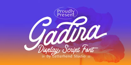 Gadira is a casual and free style script display font. This font perfectly made to be applied especially in logo, and the other various formal forms such as invitations, labels, logos, magazines, books, greeting / wedding cards, packaging, fashion, make up, stationery, novels, labels or any type of advertising purpose. Features : uppercase & lowercase numbers and punctuation multilingual ligatures alternates swashes PUA encoded We highly recommend using a program that supports OpenType features and Glyphs panels like many of Adobe apps and Corel Draw, so you can see and access all Glyph variations.