10,000 search results
(0.314 seconds)
- Kingthings Xander - Unknown license

- Grange Shadow - Unknown license

- Maily by Nathatype,
$29.00 Maily is a display serif font to provide efficient quality, consistency and performance. It shows light, expressive, moving nuances in balanced function and creativity. The font’s main character is the hooks on each letters’ edges like other serif fonts. In addition, it is truly legible because of the wide spaces of the letters with which you may freely apply for any text sizes. You can also enjoy the available features in this font. Features: Stylistic Sets Multilingual Supports PUA Encoded Numerals and Punctuations Maily fits best for various design projects, such as posters, banners, logos, magazine covers, quotes, headings, printed products, invitations, name cards, merchandise, social media, etc. Find out more ways to use this font by taking a look at the font preview. Thanks for purchasing our fonts. Hopefully, you have a great time using our font. Feel free to contact us anytime for further information or when you have trouble with the font. Thanks a lot and happy designing.
 - DavidFarewell by Ingrimayne Type,
$9.95 David Farewell is a decorative flare-serif typeface family with medium contrast. It has four styles: regular, bold, italic, and bold italic.
 - Anori by Océane Moutot,
$29.90 Anori is a playful sans serif. Inspired by handwriting and the playfulness of the italic sharp, Anori is a dynamic, high contrast and smooth typeface. It will bring originality to your designs and the large variety of glyphs will give you freedom for all of your projects. Anori is available in 10 styles, from light to black, in roman and italic.
 - Nouvelle by Mina Arko,
$45.00Nouvelle is an elegant sans serif family of six fonts (light, regular, semibold and italics). This modular typeface works just as well as display typeface as it does in body text. Because of the high x-hight it stays readable in very small sizes. It has 1884 characters: oldstyle numerals, ligatures and extra characters that support almost all European languages. - Pipo by bb-bureau,
$65.00 Pipo is a minimalist rounded tubular and stencil font in 5 weights (Thin, Light, Regular, Medium & Bold) — many symbols and cleverly ligatured! language: all latin glyphs
 - Linja by Fenotype,
$14.95 Linja is an elegant ultra condensed font. It's best for display use in magazines, books & posters. Linja font was originally designed in 2002. Now it's been remade with the complete character set and six different versions.
 - Ornatique - 100% free

- WW2 BlackltrAlt - Unknown license

- VaticanianInitials - 100% free

- Blackletter - Unknown license

- Core Sans A by S-Core,
$19.00 Core Sans A Family from S-Core is a modern sans-serif typeface that is clean, simple and highly readable. It is a part of the Core Sans Series (Core Sans N SC, Core Sans N, Core Sans NR, Core Sans M and Core Sans G). Letters in this type family are designed with genuine neo-grotesque and neutral shapes without any decorative distractions. The spaces between individual letter forms are precisely adjusted to create the perfect typesetting. Core Sans A family consists of 8 weights (Thin, Extra Light, Light, Regular, Medium, Bold, Extra Bold, Heavy) with their corresponding italics. Core Sans A contains complete Basic Latin, Cyrillic, Central European, Turkish, Baltic character sets. Each font includes proportional figures, tabular figures, numerators, denominators, superscript, scientific inferiors, subscript, fractions and case features. We highly recommend it for use in books, web pages, screen displays, and so on.
 - Valentine by profonts,
$51.99 Valentine is another brand-new profonts script typeface family with versions in light, light italic, medium and medium italic, supplied in the new OpenType Pro font format. Valentine contains about 1.100 glyphs for every weight, covering the complete Latin character set (West, East, Baltic, Turkish, Romanian), and a huge number of handmade ligatures, character combinations and alternates to make it a perfect OpenType Pro connecting script. Valentine is a very distinguished, elegant and versatile script font.
 - Jukotha by Twinletter,
$10.00 Jukotha is a casual retro from the san serif font family that carries a vintage theme, this font is designed with care so that it can produce a blend of letters and become a sweet and elegant word but still natural. by using this font, your work will become stronger and more extraordinary. This font is suitable for various graphic promotion media, banners, posters, logos, typography, hand lettering, packaging, t-shirts, labels, and much more.
 - Kelvingi Rodrige by Letterena Studios,
$10.00 Hi, Everyone! If you’re looking for a gorgeous font to attract your audiences or customers then we’ve got the font for you! Introducing Kelvingi Rodrige - A Serif Font This handmade font typeface with modern style looks very interesting for loads of different projects and promotions. It is perfect to be used on your website, for your social media branding, Pinterest banners, printed products, and more! Features: Multilingual Support Ligatures Alternates PUA Encoded Numerals and Punctuation
 - Racing by Sensatype Studio,
$15.00 Racing is a Modern Ultra Sport font that created special for Branding, Title and more stand out typography for sport and action. It's so perfect to add your style and headline overview for sport, technology, actions, and fighting theme. And specially for this font, we crafted for bold action style and modern feels so enjoy to create any project that will show your main idea out. Racing Modern Ultra Sport font ready with: Creative characters prepared to get best results Preview as a inspirations that you can do with Racing font Ready with All Uppercase characters Wish you enjoy our font. :)
 - Quador by Fontador,
$24.99 Quador is a squarish serif, especially designed for contemporary typography on print and screen. The superellipse-based forms and high x-height allow large and open letterforms, perfectly adapted to the pixel grid on screen. With rounded serifs Quador provides a soft and friendly atmosphere. The font contains 6 weights from light to ultrabold plus true italics. 1.115 glyphs include 187 ligatures, small caps, tabular, old style, fractions …, and a wide range of flexibility for latin language and cyrillic support for every typographical needs. Quador is a contemporary serif typeface, special for logotypes, brands, magazines and editorial.
 - Narrow Path by Ingrimayne Type,
$9.00 NarrowPath is a family of 18 condensed and ultra-condensed sans-serif typefaces. The family was derived from the font family NarrowWay by adding true lower-case letters. Some alternative letters forms can be reached with the OpenType feature of stylistic sets. The character spacing in most of the styles is quite loose and it can be tightened with an application's character spacing if needed. These typefaces are display faces that can be useful for squeezing tall lettering into tight spaces. Uses may include packaging, signage, and titles.
 - Altair by Zetafonts,
$39.00 Altair is a sans serif type family derived from Zetafonts's Digitalino typeface. The original bold design by Francesco Canovaro has been expanded in a seven weights family, suitable for a wide range of design uses, from body copy to display text and ranging from a thin weight to the ultra one. Altair's main originality lies in the calligraphic roots of its design, that gives it a friendly, confident look that is perfect for corporate voices, new technology startups, news blogs and any other case where a solid design must be given an emotional context.
 - Bay Area Nouveau JNL by Jeff Levine,
$29.00 Bay Area Nouveau JNL is an ultra bold, Art Nouveau headline font inspired by hand lettering on the cover of a piece of 1911 sheet music entitled "The Only Pal I Ever Had Came from 'Frisco Town'".
 - Quitos by Nathatype,
$29.00 Want to transport your audience to a world of wonder with your branding? Want your headings to spark happiness and engagement? Quintos-Serif Font A modern and elegant serif font that’ll make your audience swoon and enhance your branding projects, printed materials, and website design. This font was created to bring out modernity and style. Ideal for social media banners; posts, and ads, printed quotes, t-shirt designs, packaging, or even as a modern text overlay to any background image. Features: Stylistic Set Alternates Swashes PUA Encoded Numerals and Punctuation Thank you for downloading premium fonts from Nathatype
 - Comment by cm5dzyne,
$12.00Comment is a unique yet still basic sans serif created to provide a consistent, attractive appearance in print, especially in small-to-medium sizes. - Callimba by Letterena Studios,
$10.00 Are you trying to make an elegant, modern, and stylish statement with your invitations, social media, website, or printed materials? Ready to enchant your audience and enhance your branding? Introducing Callimba - A Serif Font Callimba is a gorgeous serif font that will whisk you away to a place of style! We are hoping that through this elegance and passion edged font, you can maximize your designs, reign in sales or make lasting impressions. The ideal font for social media banners; posts, and ads, printed quotes, t-shirt designs, packaging, or even as a modern text overlay to any background image. Callimba includes Multilingual Options to make your branding globally acceptable. Features: Ligatures Alternates Multilingual Support PUA Encoded Numerals and Punctuation
 - Quador Display by Fontador,
$24.99 Quador Display is a serif, especially designed for contemporary typography on print and screen. The superellipse-based forms and high x-height allow large and open letterforms, perfectly adapted to the pixel grid on screen. The font contains 6 weights from light to ultrabold plus true italics. 1.049 glyphs include 282 ligatures, tabular, old style, fractions …, and a wide range of flexibility for latin language support for every typographical needs. Quador Display is a contemporary serif typeface, special for logotypes, brands, magazines and editorial.
 - Dear And Fans by Anaya Studio,
$8.00 Dear and Fans is all class. A stylish modern font that is a mix of serif and sans serif. It's soft curves mixed with high contrast glyphs lend it self to both feminine and masculine qualities. With a contrasting light italic, Dear and Fans works great in layout design for quotes or body copy. The Elegant curves also make for a unique logo or masthead. Dear and Fans comes with multilingual support also. Full upper/lower case, numbers, punctuation and multilingual support. Full italic style included also.
 - Peachboys Handwritten Font by Maulana Creative,
$13.00 Peachboys is a modern handwritten display font. With slanted medium contrast stroke, fun character. To give you an extra creative work. Peachboys font support multilingual more than 100+ language. This font is good for logo design, Social media, Movie Titles, Books Titles, a short text even a long text letter and good for your secondary text font with sans or serif. Make a stunning work with Peachboys font. Cheers, Maulana Creative
 - Manforest by Maulana Creative,
$12.00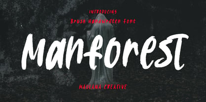 Manforest is a brush handwritten display font. With medium brush stroke, fun character. To give you an extra creative work. Manforest font support multilingual more than 100+ language. This font is good for logo design, Social media, Movie Titles, Books Titles, a short text even a long text letter and good for your secondary text font with sans or serif. Make a stunning work with Manforest font. Cheers, Maulana Creative
 - Racoti by Twinletter,
$12.00 Racoti is a sans serif font with four weights: Light, Regular, Medium, and Bold. It has a simple, calm, and elegant aesthetic. This font is ideal for a wide range of projects, including quotes, websites, logos, greeting cards, branding materials, and more! of course, your various design projects will be perfect and extraordinary if you use this font because this font is equipped with a font family, both for titles and subtitles and sentence text, start using our fonts for your extraordinary projects.
 - Qotho by Scholtz Fonts,
$7.50 Qotho is a clean, geometric sans serif font, available in five weights. Qotho Dark, Qotho Medium, Qotho Light and Qotho Thin also come in two widths, regular and Cond. Clear and versatile, Qotho is designed for magazine pages, newspapers etc. Its large x-height and simple lines make it extremely legible. The font contains over 235 characters - (upper and lower case characters, punctuation, numerals, symbols and accented characters are present). It has all the accented characters used in the major European languages.
 - Planetype by CozyFonts,
$20.00 The Planetype Font Family is Modern. It has 6 Font Styles: X-Light, Light, Medium, Inline, Bold, & X-Bold. Each style has a consistent weight with a square serif of equal weight to its vertical and horizontal strokes. Planetype™ for short or Planet-Type font styles all have extremely clean edges and are sharply defined. There is a standard kerning applied, however evenly letter-spacing these family members give a distinct personality and continues to command the negative space just as in tight kerned examples. The compatible relationship of these font family members, weight to weight, and X-Light to X-Bold is seamless and the overall design coloring of words and sentences is well balanced and extremely legible. The Planetype Family fonts are matching members glyph to glyph. This family works in modern, contemporary and vintage settings. The Planetype Medium matches the outer weight of Planetype Inline. Their are several unique Glyphs that set the character of this family, such as: Caps B, M, Q, R, X and Lower Case a, e, k, r, z to begin with. The numerals and dingbats also have several unique glyphs that flow with the family Style in every matching weight. These characteristics lend well in designing logos, brands, and even monograms. Starting with Planetype X-Light the designer has a command of the clean lines yet expressing Modernism and a touch of Architectural structure. Planetype Medium & Planetype Inline are a dynamic duo giving a positive/negative readability.
 - Scion by Type Innovations,
$39.00 ‘Scion’ is an original design by Alex Kaczun. The inspiration for the typeface came from the Toyota SCION logo, which bears its name. In Alex’s own words, "I loved the simplicity, proportions and hi-tech look of the logo and decided to create an entire new design series based on its unique look". The fonts come in five flavors: thin, light, regular, bold and black. All the font weights were designed systematically on tabular widths so that the user can make adjustments to overall type color without changing the line length. In addition, Alex Kaczun has provided us with several alternate glyph substitions to further enhance the overall appeal of this contemporary new design. The large Pro font character set, which supports most Central European and many Eastern European languages, makes this typeface series ideally suited for display copy as well as text composition. In the near future, Alex plans to include a narrow, compressed and ultra expanded, along with true-drawn italic variations to further expand the possibilities of this great new display series.
 - FM Bebel by FontMeister,
$29.95 Bebel is a straight forward font. A modern geometric typeface influenced by architectural reproduction drawings such as blueprints and dyelines. It's medium weight makes it very legible, even in small sizes. You can use this font to create posters, greeting cards, scrapbooks, CD labels, T-shirts, coffee mugs, digital videos websites and banners.
 - Morepling by Forberas Club,
$16.00 This font can use in any media like tees design, poster, banner or movie logo type. Let's try ! Awesome font be with you !
 - Toma Sans by JAM Type Design,
$- Toma Sans is a sans serif type family of seven weights plus matching italics. Influenced by the geometric-style sans serif faces that were popular during the 1920s and 30s, the fonts are based on geometric forms that have been optically corrected for better legibility. Toma Sans has a functional look with a friendly open touch. While the ExtraLight and the black weights are great performers in display sizes the light, regular and medium weights are well suited to longer texts. The small x-height and the restrained forms lend it a distinctive elegance. The typeface has an extended character set to support most European languages.
 - Valley - 100% free

- Parisine Std by Typofonderie,
$59.00 Ultra legible forceful sanserif in 32 fonts Parisine was born as official parisian métro signage typeface. This family of typefaces has become over years one of the symbols of Paris the Johnston for the London Underground or the Helvetica for the New York Subway. The Parisine was created to accompany travelers in their daily use: ultra-readable, friendly, human while the context is a priori hostile. Meanwhile, Parisine is now a workhorse and economical sanserif font family, highly legible, who can be considered as a more human alternative to the industrial-mechanical Din typeface family. More human, but not fancy: No strange “swashy” f, or cursive v, w etc. on the italics, to keep certain expected regularity, important for information design, signages, and any subjects where legibility, sobriety came first. Born as signage typeface family, the various widths and weights permit a wider range of applications. In editorial projects, the Compress version will enhances your headlines, banners, allowing ultra large settings on pages. The Narrow version will be useful as direct compagnon mixed to standard width version when the space is limited. The various Parisine typeface subfamilies Parisine is organised in various widths and subsets, from the original family Parisine, Parisine Gris featuring lighter versions of the usual weights and italics, Parisine Clair featuring extra light styles, to Parisine Sombre with his darker and extremly black weights as we can seen in Frutiger Black or Antique Olive Nord. Many years of adjustments were necessary to refine this complex family. Initially, Parisine was designed by Jean François Porchez in 1996 for Ratp to solely fulfil the unique needs of signage legibility. Parisine remain the official corporate typeface of the public transport in Paris, the worldwide capital for tourism, and now integral part of the French touch. Directly related, Parisine Office was initially created for Ratp’s internal and external communication, Parisine Office is available at Typofonderie too. Not connected with Ratp and public transports, Parisine Plus was created as an informal version of Parisine. Parisine: Introducing narrow and compressed families About Parisine Parisine helps Parisians catch the right bus Observateur du design star of 2007
 - Zooja by Aerotype,
$48.00 Zooja™ and Zooja Light have alternates for every capital and lowercase letter, consecutive characters are controlled with the OpenType Ligature feature. Zooja Elements & Borders has 90+ fun decorative doodads, borders and corners that play well with the fonts. Zooja Catchwords has 60+ hand drawn word glyphs and Zooja Banners & Patterns has 17 repeatable patterns and 50+ banner and frame elements to help pull it all together.
 - SK Gunaydin by Salih Kizilkaya,
$9.99 SK Gunaydin is a display sans serif font family designed by Salih Kızılkaya in 2022. Thanks to its high contrast ratio, it offers high readability in all the media you need. It contains a total of 3120 glyphs, 624 glyphs in each font, and offers full support for languages using the Latin alphabet. This font family, which includes 3 different styles, classic, outline and shadow, and 5 different fonts, contains all the characters you will need in designs. You can visit the Behance prohe page for high resolution versions of the project images.
 - TT Nooks by TypeType,
$39.00 TT Nooks useful links: Specimen | Graphic presentation | Customization options TT Nooks is an experimental font family that includes a high contrast serif, TT Nooks, and an upright italic, TT Nooks Script. Despite the difference in style, both subfamilies get along well, which is partially thanks to their similar proportions. Each of the subfamilies includes 4 weights: Light, Regular, Bold and Black. The main subfamily is TT Nooks—a stylish high-contrast serif with a light touch of self-centeredness. If TT Nooks were a person, it would be an elegant lady with an independent and firm personality. In the original sketches of TT Nooks there were traces of a broad pen, but in the course of further evolution the typeface moved away from this style, retaining only the high contrast of strokes. In addition, in the process of design searches TT Nooks has obtained a touch of geometricity. The serifs in TT Nooks stand out especially visibly thanks to their geometric shape that resembles slippers. In addition to their peculiarity, such serifs add stability to the font and allow better compensation of the black and white ratio within the letters. TT Nooks has small capitals for Latin and Cyrillic alphabets, as well as a set of stylistic alternates (including some figures) that makes the typeface a bit more geometric. In addition, we have drawn more than 25 ligatures, including ligatures for capital letters, slashed zero and many other useful OpenType features. TT Nooks Script is a complementary family designed to harmoniously extend the main family and expand its scope. The forms of the characters in bold and light fonts of TT Nooks Script are quite different. For example, Black & Bold have high contrast strokes and an open aperture, and in Regular & Light the aperture of the characters is closed. TT Nooks also has small capitals for Latin and Cyrillic alphabets, ligatures, oldstyle figures and other OpenType features. In light faces, TT Nooks Script is more humanist and has artifacts inherent to the continuous movement of a flat pen. In bold faces, TT Nooks Script has a very dense and dynamic typing rhythm, and the shape of the letters begins to geometrize. We had had the difficult task of preserving the continuity of forms between bold and light faces, and we have managed to solve it thanks to the found rhythm, which united different fonts, and proximate stylistic solutions.


