10,000 search results
(0.052 seconds)
- Kinderz by MaxnorType,
$15.00 Kinderz is a fun display font with lots of styles and multilingual support. The design has a relaxed feel and is intended for purposes related to kids and teenagers, but can also be used for all modern informal themed designs. It can be used for various purposes, especially those related to kids and teenagers, such as for logo design, branding, posters, banners, stationery, and so on.
 - Winter End by Abo Daniel,
$13.00 introducing WINTER END - quirky craft font - It is great for quotes, lettering, t-shirt design, mug, card, cutting, embroidery, banner, and anything for your craft project. Uppercase and lowercase characters match each other. The Winter Doodles make this font complete. What's included? - Winter End - Winter End Doodles Features - Uppercase - Lowercase - Numeral & Punctuation - Multilingual - Ligatures - Doodles - PUA encoded Hope you love it. regards, Abo Daniel Studio
 - Quick Game by Linecreative,
$16.00 Introducing “Quick Game”, the futuristic font that was inspired from a sci-fi movie. Quick Game is a display font that is suitable on your headline to your magazine, flyer, poster or neon installation. Also clearly shaped to be applied in print design like t-shirt, mug, banner or motion graphic. • Uppercase • Lower-caps • Numbers • Punctuations • Supports Multi linguage (Latin Western Europe) • Ligatures Character & Stylistic alternates Character
 - Kramps by Mvmet,
$16.00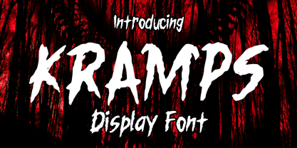 Kramps is a very cool horror display font. It will be perfect for your horror and Halloween-themed needs! You can use it for anything ranging from t-shirts and clothing, to your scary book designs, Halloween party needs, greeting cards, stickers, posters, banners, or anything that needs a horror touch. Try it to create fabulous designs and feel the horror and Halloween vibes with it!
 - Portsmooth by Abo Daniel,
$13.00 PORTSMOOTH - signature font- it is great for branding, packaging, card, logo, tote bag design, cup drink design, banner, and anything project with an elegant touch but still looks crafty. I created 38 ligatures to make this font look so natural. This font is perfectly combined with swash Features: - Uppercase - Lowercase - Numeral - Multilingual - 38 Ligatures - swash - PUA encoded I hope you love it... regards, Abo Daniel Studio
 - Hob Gob NF by Nick's Fonts,
$10.00Although not credited, the inspiration for this typeface, originally called "Dancer", has all the earmarks of the work of legendary lettering artist Alf Becker. Creepy and kooky, mysterious and spooky, but not in the least ooky, this monocase face is just what the doctor ordered; Dr Frankenstein, that is. Both versions of this font include the complete Unicode Latin 1252 and Central European 1250 character sets. - Sigwald by Good Java Studio,
$20.00 Sigwald is born from bold and fun style fonts. That's available on other file from letter A-Z and a-z. Versatile for design poster, logo, branding, label, quote, headline profil, banner, t-shirt design, packaging, magazine, brochure, and many more your amazing work with this fonts. Features: - Included file: Sigwald Regular (OTF) - Simple installation - Support for MAC and PC - PUA encoded - Stylistic Alternates
 - Easter Park by Yoga Letter,
$17.00 "Easter Park" is a very cute display font and is perfect for your Easter moments. This font is equipped with uppercase letters, lowercase letters, alternate lowercase letters, alternate uppercase letters, multilingual support, symbols and numbers. This font is very easy to use and there is already a user guide in the preview. Can also be used for posters, stickers, banners, logos, covers, movie titles, and more.
 - ResotYc by Glukfonts,
$6.00 Decorative, extra bold font ResotYc with which you can work in three ways: with Uppercase, with lowercase as Unicase and with mixed uppercase & lowercase for best result. Automatic contextual alternates and ligatures built into the font compensate for whitespace area differences. Geometric strokes and simplicity makes ResotYc Uppercase excellent for headers, banners or advertising slogans and MixedCase is perfect for fun headlines and outstanding logos.
 - The Averia Serif font is a unique and captivating creation by Dan Sayers, distinguished for its warm and inviting character that stems from an intriguing experimental project. The project embarked on...
- Phone Pro by Tamar Fonts,
$50.00 "Relation Between Typology and Type Design" 'PRISTINE'; this font is—neither beautiful nor ugly, neither vigorous nor weak, neither traditional nor modern, neither serif nor sans serif, neither script nor printable, neither a text font nor a display font—it is rather all of the above, which makes it a more versatile typographic tool—[handwritten] characters that are well-suited for a wide variety of applications—from editorial design, [friendly] greeting cards... to branding, advertising, publicity and digital. Each glyph design combines its unique shapes and stylish ink-traps with parabolic curves. Each glyph design has been treated as an 'individual character'—the way I would treat a breathing, living, vulnerable and courteous human being; looking after each and every character as if it was my only child — bringing to light the authenticity and uniqueness of each individual, as well as my objective to bring about peace and harmony between them all as a whole. Designed with the intention of harmonizing between four scripts — Latin, Cyrillic, Greek and Hebrew; the whole family has a comprehensive set of characters—in addition to the Latin letters, the Phone typeface also has a full set of characters for Vietnamese, partially extended Cyrillic, Greek and Hebrew (sold separately). The t_t ligature is something unique to Phone, as well as the t_z ligature, among others and extras. A distinctive trait of the Phone typeface, is a high x-height combined with relatively short ascenders. The Phone typeface is in a way evoking the feeling of some Gaelic font and of the [Egyptian] Papyrus font (by Chris Costello, though, not being based on neither of those), having an exotic and an exquisite look, under the category of "Soft Fonts & Friendly Faces". Copyright Tamar Fonts/Hillel Glueck 2021 ALL RIGHTS RESERVED Any unauthorized distribution of my work is strictly prohibited, and will be prosecuted; do the right thing, and do not participate in the piracy of my typefaces; if you appreciate my work, then please pay for it and help me prosper — thank you!
 - TT Phobos by TypeType,
$35.00 TT Phobos useful links: Specimen | Graphic presentation | Customization options TT Phobos is a pliable display serif with a soft and gentle character. The features of the typeface are the moderate contrast between bold and thin strokes, pliable visual compensators, and the counter-clockwise bend of internal ovals. In addition to 6 weights and 6 italic, TT Phobos also includes two original decorative fonts, inline and stencil. Despite its pliability and display character, TT Phobos is dynamic enough and is well suited for text arrays even in large text blocks. The serifs of letters are completely asymmetrical and bring in dynamics when reading the text from left to right. Thanks to the harmonious contrast of black and white forms and internal negative spaces of the letters, as well as its broad letter spacing, the typeface is well read in small sizes. In this case, the character of the letters is completely preserved, partially thanks to the exaggerated elegant visual compensators. The ornamental pattern used in TT Phobos Inline varies for capital and lowercase letters. Capital letters implement a more complex double inline with a rhombic element in the middle, and in the lower case features a simplified form of the inline, made in a single movement. Thanks to the original cutting, TT Phobos Stencil stands out for its expression, and the rounded cuts add even more visual style to the font. TT Phobos consists of 14 faces: 6 weights (Light, Regular, DemiBold, Bold, ExtraBold, Black), 6 Italics, inline and stencil. There are 17 ligatures in TT Phobos, including several Cyrillic ones. The typeface has stylistic alternates, which adds an italic effect to the upright fonts, and a little solemnity of the upright version to the italics. In addition, we have not forgotten about the old-style figures and other useful OpenType features, such as ordn, sups, sinf, dnom, numr, onum, tnum, pnum, liga, dlig, salt (ss01), frac, case.
 - Phone Pro Hebrew by Tamar Fonts,
$30.00 Note: the 'Phone Pro Hebrew' typeface, includes just the Hebrew characters of the comprehensive "Phone Pro" family font, sold separately [on this MyFonts site], so they are economical for those interested just in the Hebrew Characters. And regarding the “Phone Pro” project in general, this is what I wrote: 'PRISTINE'; this font is—neither beautiful nor ugly, neither vigorous nor weak, neither traditional nor modern, neither serif nor sans serif, neither script nor printable, neither a text font nor a display font—it is rather all of the above, which makes it a more versatile typographic tool—[handwritten] characters that are well-suited for a wide variety of applications—from editorial design, [friendly] greeting cards... to branding, advertising, publicity and digital. Each glyph design combines its unique shapes and stylish ink-traps with parabolic curves. Each glyph design has been treated as an 'individual character'—the way I would treat a breathing, living, vulnerable and courteous human being; looking after each and every character as if it was my only child — bringing to light the authenticity and uniqueness of each individual, as well as my objective to bring about peace and harmony between them all as a whole. Designed with the intention of harmonizing between four scripts — Latin, Cyrillic, Greek and Hebrew; the whole family has a comprehensive set of characters—in addition to the Latin letters, the Phone typeface also has a full set of characters for Vietnamese, partially extended Cyrillic, Greek and Hebrew (sold separately). The t_t ligature is something unique to Phone, as well as the t_z ligature, among others and extras. A distinctive trait of the Phone typeface, is a high x-height combined with relatively short ascenders. The Phone typeface is in a way evoking the feeling of some Gaelic font and of the [Egyptian] Papyrus font (by Chris Costello, though, not being based on neither of those), having an exotic and an exquisite look, under the category of "Soft Fonts & Friendly Faces".
 - East by Tarallo Design,
$22.99 East is a simple and confident typeface. It is timeless and current, but with a subtle nostalgia of vintage Jazz albums, film credits, newspapers, and signage. The light weight has excellent legibility at small sizes. The Extra Bold weight will capture attention. Its condensed width allows a lot of text in little space. East is versatile, but would be a good choice for film titles, labels + packages, posters, publications or any design where space is limited. It has six weights between Light and Extra Bold. A variable font with weight and slant axes is available and included in a full family purchase. The OpenType features include; stylistic sets, a one story ‘a’, hooked letters, seriffed uppercase I and 1, a slashed zero, raised colon and punctuation (Spanish), several German eszetts, ligatures, diverse bullets, and vertically stacked pre-built fractions. It will support western and central European languages as well as other Latin-based written languages. Read on if you are not familiar with variable fonts. What makes a variable font special is that all font weights are inside of one file and you can incrementally control the width and italic slant between Light (300) and ExtraBold (800). These changes are commonly made with slide controls in the font/type palette of the software. Variable fonts are also smaller in file size, which benefit both web and software performance. Currently variable fonts are supported by Adobe, Sketch, Corel Draw, and most web browsers. Check for your software support here: www.v-fonts.com/support.
 - Body by Zetafonts,
$39.00 Body graphic project at Behance Body is a type family designed for Zetafonts by Cosimo Lorenzo Pancini with Andrea Tartarelli. Conceived as a contemporary alternative to modernist superfamilies like Univers or Helvetica, Body tries to maximize text readability while providing a wide range of options for the designer. It comes in two variants (Body Text and Body Grotesque), each in four widths and four weights: regular and bold for basic typesetting, light and extrabold for display use. Body Grotesque applies to the sans serif modernist skeleton little imperfections and quirks inspired by our research in early 20th century type specimens. Curves are slightly more calligraphic and a light inverse contrast is applied to bold weights, giving the typeface a slight vintage appearance in display use. Body Text, on the contrary, challenges the modernist aesthetics maximizing horizontal lines and using open terminals for letters like “s” and “a” that appear normally dark in modernist grotesques. For both variants, the normal width family is slightly condensed in an effort to maximize space usage; the Slim width is provided for extremely dense texts or side notes while the Fit width is optimized for display usage as in logos, headings or titles. The Large width manages to look elegant in its light weight while becoming a valid heading or subtitle font in its extrabold weights. All the 64 fonts in the Body superfamily include a complete latin extended character set with small caps for over 70 languages, Russian cyrillic, open type positional numbers, stylist sets and alternate forms.
 - OBO Classic by Juri Zaech,
$19.00 OBO Classic is the second installment of the OBO series, a type collection based on a square. Every character is mapped on a 1x1 ratio which allows for horizontal and vertical settings alike. Or mixed, like crosswords. OBO Classic is a display interpretation of a traditional Old-style Serif. The “distortion” which maps each character to a square creates unusual proportions to what we are used to from classic serif typefaces. The result is a monospaced font. While each individual letter feels conventional on its own, when brought together in words the result feels contemporary. Thanks to the square base vertical and horizontal – and mixed – settings are possible and easy to apply. There are a few exceptions for certain punctuation and special characters that are half the width for better spacing; and the word space’s width can easily be adjusted through OpenType stylistic sets. Talking about spacing, for strictly horizontal typesetting there is the option to turn on kerning for a number of characters to create a cleaner texture across words and phrases. OBO Classic is best set in large sizes and is most comfortable in editorial and display settings. A series of icons complete the character set. A selection comes as pixel graphics which adds further contrast to the traditional legacy of the typeface.
 - Aviano Wedge by insigne,
$24.99 Firm and resolute, the sharp, triangular wedge serifs of the new Aviano Wedge stamps your copy with the confidence of late 19th century luxury, wealth, and power. Indicative of banknotes and financial strength, the large, elegant Aviano Wedge is composed in the Latin style. Aviano Wedge takes its original footing from period signage found on a building in Asheville, NC. While shaped largely by engraved faces, the elegant Aviano Wedge maintains the extra-wide comfort and ease found with the rest of the Aviano series. Aviano Wedge comes in six different weights and is packed with OpenType features. As a complement to these characters, Aviano Wedge includes 40 discretionary ligatures for artistic typographic compositions. To see these features in action, please see the informative .pdf brochure. OpenType capable applications such as Quark or the Adobe Creative suite can take full advantage of the automatically replacing ligatures and alternates. Aviano Wedge also includes support for all Western European languages. This new face has also been designed to pair well with the rest of the Aviano series, including our best-selling Aviano, Aviano Serif, Aviano Sans, Aviano Didone, Aviano Flare, Aviano Contrast, and Aviano Slab. Use it alone, or combine Aviano Wedge with any of these other fonts to build the strong presence you’re looking for.
 - Elisetta by Sudtipos,
$39.00 Musical notes and letterforms, silences and white spaces, pentagrams and lines, music and writing have much in common and go beyond time, cultures, styles and locations. This new typeface emerges from the blend between the lyrics and the harmony, rhythm, femininity and luminosity of the traditional musical forms. It`s not about blues or rock, tango or salsa, instead it recovers the neoclassical characteristics of the current musical notation system and revitalize the essence of its signs. Taking care of both the function and the form, Elisetta has been specially designed for the writing of texts and musical sheets considering all its elements and communication needs. This source of inspiration also makes the font really good for extensive texts, since its design is based on situations that require high line performance, great readability and high aesthetic coherence. With 5 variables that vary in weight and style, the typography gathers asymmetry and organic nature in vertical structure, narrow horizontal proportions, high x height and extreme contrast between black and white. Elisetta Book has been created for the writing of clear texts and long lines composed in small sizes inside and outside the pentagram; Elisetta Italic intensifies the organic nature of the musical keys by offering softer signs, contextual alternates and initial caps; finally, Elisetta Display increase and emphasize the contrast between vertical stems and horizontal lines to highlight short texts and titles. For those who love music and for those who like romantic forms, this typography has a lot to offer: Elisetta is the best option to write light words with style, compose clear and rhythmic lines and read comfortable paragraphs with high performance. You can tell everybody this is your font, how wonderful life is while you're in the world! * This typeface was originally designed and supervised as «Elisa», the main project of the Master in Typography at University of Buenos Aires, Argentina.
 - KiddoTR is a captivating typeface that breathes a delightful air of whimsy and fun into any design project it touches. This font stands out for its playful yet readable nature, making it an impeccabl...
- TT Ricordi Marmo by TypeType,
$29.00 TT Ricordi Marmo useful links: Specimen | Graphic presentation | Customization options TT Ricordi Marmo extends the series of experimental projects within the TT Ricordi fonts collection. The main goal of the TT Ricordi project is to look for gems in old signs and on stone and bringing those inscriptions back to life in the form of contemporary fonts with the umbrella name TT Ricordi. TT Ricordi Marmo is an original experimental project by Eugene Tantsurin inspired by inscriptions at Basilica di Santa Croce in Florence. Working on it, we wanted to create a contemporary typeface that would unite the elements of a Florentine sans-serif mixed with more traditional visual solutions typical for the period's serifs. As a result, we got a bright and somewhat provocative typeface with irregular serif distribution, some unusual contours and a free spirit. In small body size TT Ricordi Marmo makes a neutral impression, but as the size gets bigger, the user is taken on a playful quest to search for interesting moves, graphic peculiarities and unusual solutions. TT Ricordi Marmo is great for poster design, packaging, and setting large and medium-sized inscriptions. Thanks to its idiosyncrasy, the typeface may look nice both at a poster in a grand academic theater and at an acid rave party. You can find a set of icon patterns that can be used in several ways. First, you can substitute letters with these patterns, thus getting an inscription with a visible graphic element. Then you can also construct borders and interval marks, or just use them as icons. All patterns are perfectly adapted to the design of letters in the font. TT Ricordi Marmo consists of 2 styles and one variable font. Each of the styles contains over 630 glyphs and 18 OpenType features. As we have conceived TT Ricordi Marmo as a poster typeface from the very beginning, it features small capitals instead of lowercase characters. In addition, the typeface has a set of interesting ligatures, stylistic alternates, pointers, hands, and pattern icons. TT Ricordi Marmo OpenType features list: AALT, CCMP, LOCL, NUMR, ORDN, TNUM, PNUM, CASE, SS01 (Alternative latin E), SS02 (Alternative Eszett), SS03 (Alternative Cyrillic I), SS04 ( Alternative Amper- sand), SS05 (Romanian Comma Accent), SS06 (Dutch IJ), SS07 (Catalan Ldot), DLIG, CALT, SALT.
 - Stevens Titling by Linotype,
$29.99 Stevens Titling refers to the classic Roman alphabet as it appears on the Trajan column and numerous other monuments. With its realistic brush strokes, it shows the letterforms as they might have been sketched on the marble before the stonecutter reached for his hammer and chisel. The four fonts that constitute the Stevens Titling suite are named after animals — badger, boar, sable and wolf –, each known for the specific character of its hairs when used to make painting brushes. Sable Brush is the most formal and elegant, with solid forms which show no obvious trace of the handdrawn brush stroke; it comes with a set of small capitals for those classical titles preferred by Hollywood. In fact, each of these fonts would do a great job as a film title and poster font. The Badger Brush variant is compact and firm; Boar Brush is dramatic, and in Wolf Brush each part of the letter is made up of realistic, dry strokes.
 - Odisean SC - Personal use only

- Leo Arrow - 100% free

- Ristretto Pro by Mint Type,
$- Ristretto Pro is an extremely narrow display sans-serif font family available in 8 weights. It features rich language support, 6 sets of figures and small caps. Ristretto Pro also comes with its slab-serif counterpart - Ristretto Slab Pro.
 - Muraba by NamelaType,
$19.00 Muraba Font is a one-of-a-kind, bold vintage serif display typeface, defined by its distinctively thick, squared-off serifs that offer decorative flair. This versatile typeface is ideal for various applications, including logos, headers, and display text
 - Betabet by Elemeno,
$25.00Betabet was drawn using traditional serif fonts as a guideline. The scribbled style and serifs combine to make an unusual font. Betabet does not look like handwriting, but works well where handwriting or script fonts might seem too insubstantial. - Display Dots Three Sans by Gerald Gallo,
$20.00 Display Dots Three Sans and Serif are display fonts not intended for text use. They were designed specifically for display, headline, logotype, branding, and similar applications. Display Dots Three Sans and Serif include an uppercase alphabet, numbers, and punctuation.
 - Display Dots Four Sans by Gerald Gallo,
$20.00 Display Dots Four Sans and Serif are display fonts not intended for text use. They were designed specifically for display, headline, logotype, branding, and similar applications. Display Dots Four Sans and Serif include an uppercase alphabet, numbers, and punctuation.
 - Maknoe by ahweproject,
$14.00 Maknoe is a classic serif typeface. This beautiful serif font is suitable for logo, headline, cover book, magazine, and many more. Maknoe font is PUA encoded, which means you can access all of the glyphs and swashes with ease!
 - Claudia Alves by DYSA Studio,
$19.00 Claudia Alves is a New Modern Serif Typeface. This another collection of Serif is perfect for your next branding project, excellent for your business. Claudia Alves have a smooth edges, so this font gives an authentic handcrafted feel style.
 - Single Tyne by Jonahfonts,
$35.00 A single top serif creates a modern look between serifs and a single weight font. SingleTyne contains short ascenders and descenders for tight line spacing designed as a display face that also works well for short sentences and paragraphs.
 - Littler Serifada by Intellecta Design,
$21.90a bold sans serif family with many variants - LCT Picon by LCT,
$35.00 Big modern sans-serif family, for multiple use.
 - Minshar MF by Masterfont,
$59.00 Tender and serif font with romantic tender touch.
 - Qraxy by Mans Greback,
$59.00 Qraxy is a crazy and unstable serif font.
 - Trubetzkoy by MacCampus,
$30.00A serifed phonetic Unicode font, extensive character set - Flexy by AKTF,
$25.00 This is a sans serif version of Flexy.
 - Gnarlee by Gerald Gallo,
$20.00 Gnarlee is a casual hand-drawn serif font.
 - Grotesca Defragmentation by Intellecta Design,
$16.90a round sans serif with optical art effects - TT Ricks by TypeType,
$19.00 Attention! Important information! There is no Cyrillic support in TT Ricks! TT Ricks useful links: Specimen | Graphic presentation | Customization options About TT Ricks: We are glad to present you the new font TT Ricks, which continues the line of trendy and yet affordable TypeType Starter Kit fonts. TT Ricks is a flamboyant elzevir-type serif, for which the words “cute” or “calm” are not a fitting definition. TT Ricks can be classified as a display title typeface that works especially well at large and medium sizes in packaging design, book graphics and posters. The typeface is inspired by the pre-digital font “De Vinne”, which was designed in 1892 by the designer Gustav F. Schroeder. We liked certain aspects of the historical prototype, but at the same time, when creating TT Ricks, we did not want to limit ourselves—on the contrary, we were eager to discover a completely new spirit and bring bright details to the font. The TT Ricks typeface stands out for its strong contrast, noticeable sharp serifs, narrow letterforms with a pronounced displacement of flows in the arches. The typeface has very dense spacing, and in the bold style, the text set begins to resemble Gothic by its richness and tension. Important visual features of TT Ricks are the dashing shapes of ascenders and descenders, the thin and sharp stroke endings, and the “elzevier legs” of the letters R K k. In the lowercase round characters c e s, you can notice the pronounced slope of the oval, which contrasts with the general set of the font. These "slanted" signs and ascenders and descenders of the letters f and y are designed to cut the monotony of a set and to entertain the reader's eyes. The TT Ricks typeface consists of three weights (Regular, Medium, Bold) and one variable font. Each style consists of 553 glyphs and contains 18 OpenType features. The most interesting features are stylistic alternates for the letters R K k with alternative short leg shapes, two sets of figures for working with upper and lower case characters, and a set of original icons that further reveal the spirit of the family. Please note! If you need OTF versions of the fonts, just email us at commercial@typetype.org Attention! Important information! There is no Cyrillic support in TT Ricks! TT Ricks OpenType features: aalt, ccmp, locl, numr, ordn, tnum, onum, lnum, pnum, case, liga, calt, ss01, ss02, ss03, ss04, ss05, ss06 TT Ricks language support: Acehnese, Afar, Albanian+, Aleut (lat), Alsatian, Aragonese, Arumanian+, Asu, Aymara, Azerbaijani +, Banjar, Basque +, Belarusian (lat), Bemba, Bena, Betawi, Bislama+, Boholano+, Bosnian (lat), Breton +, Catalan+, Cebuano+, Chamorro+, Chichewa, Chiga, Colognian+, Cornish, Corsican +, Cree, Croatian, Czech+, Danish, Dutch+, Embu, English+, Esperanto, Estonian+, Faroese+, Fijian, Filipino+, Finnish, French, Frisian, Friulian+, Gaelic, Gagauz (lat), Galician+, Ganda, German+, Gikuyu, Guarani, Gusii, Haitian Creole, Hawaiian, Hiri Motu, Hungarian+, Icelandic+, Ilocano, Indonesian+, Innu-aimun, Interlingua, Irish,

