10,000 search results
(0.05 seconds)
- Aseel by MAKYN,
$40.00 Aseel is a contemporary and legible typeface. It is intended to work well in the context of information and signage design. It also works well as a body text typeface as it is characterized by open counter forms and a large x-height. It is based on the Naskh calligraphic structure and has a medium stroke contrast. The letters are condensed to fit more information per line and it exists in three weights, regular, medium and bold.
 - Western Nightmare by Woodcutter,
$55.00 The Font has an aggressive and bloody appearance, evoking the wild west and supernatural horror. The design is dense and strong, with each letter occupying a significant space in the line. Overall, the font creates a sense of danger, death, and horror in the old west. It's perfect for use in horror western movie posters, event advertisements, or anywhere you want to create an atmosphere of suspense and tension in the wild west.
 - Shoplifter - Unknown license

- ! Jamiroquai ! - Unknown license

- Kremlin - Unknown license

- Peex - Unknown license

- Ahakin by Twinletter,
$15.00 We’re excited to share with you our newest typeface family, the Ahakin San Serif. This new set of fonts will give your designs luxury and uniqueness for all kinds of project needs. This pack comes in 18 different styles which makes it perfect for a wide variety of projects. Each style has been uniquely created to maximize beauty and character. This font is specially designed for a variety of display design and branding projects, but will also look great as headlines, text, banners, posters, or anything else. of course, your various design projects will be perfect and extraordinary if you use this font because this font is equipped with a font family, both for titles and subtitles and sentence text, start using our fonts for your extraordinary projects.
 - Goda by Twinletter,
$10.00 Introducing the sanserif font Goda. We design this very tempting and beautiful font with gentleness and yet still fit if you use it in various projects with masculine and feminine themes. We designed this san serif family font by paying attention to the combination of each letter to create a beautiful impression and appearance, making it easier to answer your needs, both formal and non-formal needs. This font is perfect for a wide variety of design projects, sporting events, branding, banners, posters, movie titles, food and beverage, technology, quotes, clothing, logotypes, and more. Of course, your various design projects will be perfect and amazing if you use this font because this font comes with a font family, both for titles and subtitles and sentence text, start using our fonts for your amazing projects.
 - Dezaru Faux by Twinletter,
$15.00 DEZARU is a fictitious Japanese display font created by combining Japanese letters with well-known and understood san serif fonts from throughout the world. Imagine all promotional materials can be understood and understood by all audiences in various parts of the world, your message will reach the hearts of the audience, and your brand will be very easy to remember by many people because the display of this font is contemporary and different from the others. Logotypes, food banners, branding, brochure, posters, movie titles, book titles, quotes, and more may all benefit from this font. Of course, using this font in your various design projects will make them excellent and outstanding; many viewers are drawn to the striking and unusual graphic display. Start utilizing this typeface in your projects to make them stand out.
 - Brifa by Twinletter,
$10.00 Introducing our newest font called Brifa. Fonts that have unique letters create a distinctive impression when applied to words or text. We designed this san serif family font by paying attention to the combination of each letter to create an elegant impression and appearance making it easier for you to use it according to what you need, both formal and non-formal needs. This font is perfect for a wide variety of design projects, sporting events, branding, banners, posters, movie titles, food and beverage, technology, quotes, clothing, logotypes, and more. Of course, your various design projects will be perfect and amazing if you use this font because this font comes with a font family, both for titles and subtitles and sentence text, start using our fonts for your amazing projects.
 - Thole by Twinletter,
$12.00 Introducing the Thole font, a very elegant and clean san serif family, with a characteristic width and graceful impression, for designs with feminine or masculine themes, this font will look strong and strong in your design projects. There is a strong impression in this font, both from the width of the letters, the corners in this font are also equipped with ligatures and alternates to complement your needs. This font is perfect for games, sporting events, branding, banners, posters, movie titles, book titles, quotes, clothing, logotypes, and more. of course, your various design projects will be perfect and extraordinary if you use this font because this font is equipped with a complimentary font family, both for titles and subtitles and sentence text. start using our fonts for your amazing projects.
 - BF Rotwang Pro by BrassFonts,
$39.99 The BF Rotwang™ Pro is a contemporary new edition and re-design of a formerly design by Guido Schneider. Named after the C.L. Rotwang, the inventor of the Mensch-Maschine from the film Metropolis (1925/1926), BF Rotwang plays with the character traits of high-contrast transitional serif typefaces and Didone-style typefaces. BF Rotwang is a typeface characterized by balanced elegance. It is sensitive, sophisticated and self-confident, but unobtrusive. The heavy weights have the power and dynamic for strong headlines and exciting logotypes, the lighter cuts the elegance and lightness for use in continuous text. All letters and characters are a touch condensed, so the typeface looks compact and works space-saving. BF Rotwang™ Pro supports up to 200 Latin-based languages. The family comes with 7 weights plus matching Italics. Each font contains more than 1.220 glyphs, featuring a wide range of alternate characters, small caps, figure sets, fractions, more than 35 ligatures, many currency symbols, special characters and other useful symbols. The style sets give you the option to individualize and adjust the typeface to the requirement of your design, without changing the general visual feeling.
 - Specific by Fatih Güneş,
$12.00 It has a higher uppercase structure than the normal ones. It has a condensed, rounded and squared character. It is a typeface which you can use in posters, packagings, newspaper & magazine ads, logos, banners, promo images & soccer uniforms.
 - Doge's Venezia by Greater Albion Typefounders,
$15.00 Doge’s Venezia is one of a set of four typefaces, the others being Doge’s Delight, Doge’s Darker and Doge’s Banner. Together they make up a splendid family of Victorian inspired Tuscan faces, allowing for an integrated design approach.
 - All Pro JNL by Jeff Levine,
$29.00All Pro JNL is a sports font embellished with stars and stripes and is perfect for team banners, sportswear and sports-oriented ads. The font contains alphabet, numerals and the most basic of punctuation with very little kerning. - Doge's Darker by Greater Albion Typefounders,
$15.00 Doge’s Darker is one of a set of four typefaces, the others being Doge’s Delight, Doge’s Banner and Doge’s Venezia. Together they make up a splendid family of Victorian inspired Tuscan faces, allowing for an integrated design approach.
 - Albion Seventies by Greater Albion Typefounders,
$20.00 Albion Seventies is a display typeface from that fun era of psychedelic wallpaper, bright colours and bright orange everything! It's a splendid face for posters and banners, and did we mention, it works really well with orange backgrounds?
 - Summer Sugar by Selvia Design,
$15.00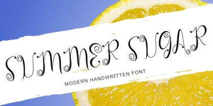 "Summer Sugar" is a unique, curly handwritten font. This font is equipped with uppercase, lowercase, numerals, punctuation, and multilingual support. It is suitable for summer, graduation, Christmas, the 4th of July, memorials, banners, branding, stickers, ornaments, and others.
 - Doge's Delight by Greater Albion Typefounders,
$15.00 Doge’s Delight is one of a set of four typefaces, the others being Doge’s Darker, Doge’s Banner and Doge’s Venezia. Together they make up a splendid family of Victorian inspired Tuscan faces, allowing for an integrated design approach.
 - Black Mortal by Yoga Letter,
$30.00 "Black Mortal" is an elegant and unique block font. This font is perfect for logos, movie titles, business branding, stickers, book titles, banners, posters, Halloween, Black Friday, and more. Equipped with uppercase, lowercase, numerals, punctuation, and multilingual support
 - Galaxy Power by Yoga Letter,
$30.00 "Galaxy Power" is an elegant display block font that is perfect for action movie titles, graffiti, 3D works, advertisements, banners, posters, branding, stickers, mockups, and more. This font is equipped with uppercase, lowercase, numerals, punctuation, and multilingual support.
 - Pylox Street by Garisman Studio,
$22.00 Introducing a new graffiti Pylox Street Inspired from street art born Pylox Street Suitable for many design project, branding, packaging, logo, wall art, headline, template, banner, poster, and many more projects. These include all caps, punctuation, and numerals.
 - Zombie Predator by Yoga Letter,
$18.00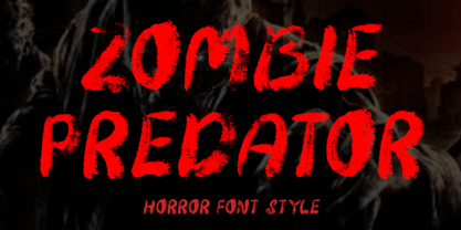 "Zombie Predator" is a scary horror display font. This font is very suitable for horror movie titles, Halloween, banners, posters, stickers, branding, book titles, and more. This font is equipped with uppercase, lowercase, numerals, punctuation, and multilingual support.
 - Barollo by Greater Albion Typefounders,
$16.00 Barollo is a boisterous, lively, display family of two typefaces, offered in regular and shaded form. It’s ideal for eye-catching banners and posters that call for clear and forceful type, with a sense of fun and life.
 - Valentine Blackletter by Yoga Letter,
$18.00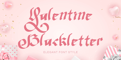 "Valentine Blackletter" is a unique and elegant blackletter font. This font is equipped with uppercase, lowercase, numerals, punctuation, and multilingual support. It is very suitable for Valentine's Day, invitations, weddings, spring, summer, banners, branding, stickers, logos, and others.
 - Qualitype by Bülent Yüksel,
$19.00 QUALITYPE + VARIABLE FONT FAMILY "QualiTYPE" font extends its use by providing weights from "Thin" to "Black". Natural curves, ridges, and curved bodies grow in character as the font gains weight. "Qualitype" is an exciting serif font with contemporary twists. It has a distinctive sound that preserves the simplicity and elegance of classic "serif" fonts with a fresh, stylish rework. Her personality is bold and fills the space without shouting, she looks elegant and confident. The low X-height provides a great amount of visibility at all weights and is optically corrected for better readability. In the process of working on "Qualitype" we wanted to expand the functionality of the typeface a bit more, so after a few tries two different fonts were born: "Old", "Neo" and "italics" versions. "Qualitype" is perfect for use in magazines, in the fashion industry, in the branding of premium goods and services. "Qualitype" is quite versatile and suitable for use both in headings and in text arrays. In addition, we have done manual hinting in the typeface, and now it can be used with a clear conscience in the web and applications. “Quality” typeface consists of 56 styles: 2 style, 2 Shining, 7 weights and italics. Each typeface style consists of 860+ glyphs (except for the decoratives). “Qualitype” supports over 80+ languages. A variant version of the basic styles has been prepared for the most demanding users. Using the variability slider, you can adjust and select the individual thickness regardless of the current weight distribution. An important clarification - not all programs support variable technologies yet, you can check the support status here: https://v-fonts.com/support/. OPENTYPE FEATURES aalt, dnom, onum, pnum, tnum, lnum, numr, frac, zero, sing, sups, subs, case, c2sc, smack, salt, hist, titl, holing, dig, liga, ss01, ss02, ss03, ss04, ss05, ss06, ss07, ss08, ss09, ss10, kern FEATURE SUMMARY: - 4 Axes: 2 Style: Old and Neo. 7 weights: Thin, Light, Book, Regular, Medium, Bold and Black. 2 Shining: Dark and Lamp. Matching italics (12º) for all weights and style . - Matching small caps for all weights and widths. - Lining and old style figures (proportional and tabular). - Alternate characters (a, d, g, m, n, p, q, r, u, y). - Unlimeted fractions. - 24 Dingbats. - Extended language support. - Extended currency support. You can contact me at buyuksel@hotmail.com, pre-purchase and post-purchase with questions and for technical support. You can enjoy using it.
 - Clean and Glam by Pixel Colours,
$22.00 Clean and Glam is a sweet handwritten font duo that has a sassy modern style to create the most beautiful design projects. ❤️ Includes a light monoline script font that is so chic and clean, and it combines perfectly with the uppercase sans to create amazing text combinations. Works great for Logos & branding, product packaging, product design, labelling, wedding design, social media posts, advertisement, editorial design, etc. Includes: Clean and Glam: A light modern script font. Includes numerals, uppercase and lowercase characters, punctuation and some cute hearts. Clean and Glam Sans: A modern uppercase sans font that is the perfect match of the script, great for descriptions, taglines, ingredients, etc. Includes numerals, uppercase and lowercase characters, punctuation and more cute hearts. Language support
 - Boardwalk Avenue by Fenotype,
$30.00 Boardwalk Avenue is an elegant type collection of three styles and two weights of each. It’s divided into Boardwalk Pen, Boardwalk Antiqua and Boardwalk Serif. Boardwalk Avenue’s core is a connected mono linear script that works fantastic when paired with either of the impressive serif styles. All the fonts work great on their own but try putting them all together for a complete display font setup for a project. Here’s a short introduction on what’s included: Boardwalk Avenue Pen is a connected Script. It’s great for headlines, quotes or in packaging. It has a casual hand drawn vibe to it but it’s clean and legible. It’s equipped with automatic Contextual Alternates that keep the connections smooth and versatile. For instance when you type double letter another of them will automatically change to add variation. Or if you type “i” for example, as a first letter after space or after capital letter the code will add starting point to the letter to keep the letterforms more balanced. If you need more ambitious letterforms you can try Swash or Titling Alternates -there’s alternates for every standard letter and seek for even more alternates from the glyph palette. Boardwalk Avenue Antiqua is a high contrast serif with strong character. It’s great for glamorous headlines or as a logotype. Boardwalk Avenue Serif is a low contrast serif with bulky character. It’s great for strong and sturdy headlines or as a logotype.
 - AZN Knuckles Varsity by AthayaDZN,
$10.00 Introducing "AZN Knuckles Varsity" font by AthayaDZN. Revolutionizing a varsity slab serif, combining sharp and rounded edges, angled serif, and a variety of weights, fitting it into the modern scene. Equipped with 3 styles ( Defined, Regular, Stencil ) Use the Defined version if you are aiming for that slab serif look, just like the name suggested, it defines the modernized slab serif on each letter, giving it that retro look yet still in the modern scene. Especially on the light weight of this version, the slab serif is really prominent. Use the Regular Version if you are aiming for any type of design that you see this font fits especially the modern scene, just like how it's advertised. Use the Stencil version if you are aiming to make a statement, my favorite one is the Bold and Italic version of the Stencil if I was to make a statement, just like the preview where it says "Anarchy", the separated shapes of the letter combined with it's bold and slanted shape is perfect to make a strong statement. Language Support : Afrikaans, Albanian, Danish, Dutch, English, Estonian, Filipino, Finnish, French, Galician, Indonesian, Irish, Italian, Luxembourgish, Norwegian, Portuguese, Romansh, Scottish Gaelic, Spanish, Swedish, Swiss German, Uzbek (Latin). And that's it for this font, thank you for purchasing the product, I wish you success on your projects. Please enjoy the font and let me know if you needed any help or if you have any questions -Athaya twitter.com/Athaya_DZN behance.net/athayadzn
 - Ronduit Capitals Light is a distinctive font created by the talented designer Ivan Filipov. This typeface stands out for its unique approach to geometry and simplicity, while still maintaining an air...
- Kimono Kong - Unknown license

- Katarine by Suitcase Type Foundry,
$75.00From today's point of view Katarine has a rather unusual origin. Initially an all-caps display face, what was to become the Medium weight of the family was augmented with a lower case, then the character set was completed by adding all the missing glyphs. The next step was the creation of the Light and the Bold weights with matching Italics. This working method compromised the relationships between the characters across the different weights After some consideration the decision was made to start over and draw the complete family from scratch. This time the "conventional" process was followed — first the Light and Bold weights were designed. Those extremes were used to interpolate the Regular, Medium and Semibold weights. When compared to the original, the glyphs of the new fonts are slightly wider. The construction of the letters is sturdy, with an x-height that varies from the heaviest to the lightest weights. The relationship of the stem weight between the horizontal and vertical strokes is carefully balanced. Characters are open and firm; the italics have room to breathe. The original fonts included two sets of small caps — Small Caps and Petite Caps. However neither set were suited for emphasis, with the Small Caps being too tall and the Petite Caps too short. We decided to replace them both with one set of traditional small caps, slightly taller than the x-height, perfectly suited for emphasis in text usage. The original version of Katarine was partly incorporated into the new OpenType versions. Thus most of the original arrows, frames and boxes can be found in the new Katarine. Each individual weight now contains 830 glyphs, nine sets of numerals, small caps, numerous ligatures and fractions. An additional font named Numbers contains numerals in circles and squares, and is now augmented with accented caps and a number of terminal alternatives, which can easily be accessed through stylistic sets. We also added two extra variants, Experts Regular and Experts Black (in inverted form). Katarine Std preserves the solid construction and excellent legibility of the original family, but has now become a fully featured OpenType typeface. Katarine is suited for a broad range of applications, from simple layouts to intricate corporate systems. It is the typeface of choice where the cold, austere character of modern sans serifs are inappropriate, yet simple shapes and good legibility are required. - PG Gothique Variable by Paulo Goode,
$300.00 IMPORTANT: This is the VARIABLE VERSION of PG Gothique This is my addition to a long line of traditional gothic typefaces. As you can probably tell, PG Gothique Variable is inspired by classics such as Trade Gothic, News Gothic, Franklin Gothic, Alternate Gothic, and Gothic Gothic. Well, maybe not the last one... But Paulo, we have all those already, why would we want to add PG Gothique Variable to our collection? This typeface has many subtle design nuances that differentiates itself from its historical influences. Also, this is possibly the most comprehensive Latin gothic font family released to date. It has 99 default styles that cover pretty much every width and weight you could ever need, while this variable version unlocks options to match your exact style preference – including the angle of italic. PG Gothique Variable is designed to handle a multitude of applications, from branding projects, to titles, body text, user interfaces, and film poster credits. This typeface has a style that will suit the purpose. There are 99 default instances in this family, ranging from Thin to Ultra weights across six widths in both roman and italic. Activate Stylistic Set 1 and you will get the alternate slab-serif-style capital “I” that offers improved legibility when placed adjacent to a lowercase “l”. PG Gothique Variable has an extensive character set that covers every Latin European language. See full details and hi-res examples at https://paulogoode.com/pg-gothique
 - Fabular by Tour De Force,
$25.00 Fabular is our serif font family with 12 styles. Inspired by vintage typefaces, but designed for modern purposes, Fabular comes in 6 weights with matching Italics. Short, thick and rounded serifs, spiced by specific terminal endings and finial bring gentle visual softness to Fabular's design. Tightly spaced by its serif's design, Fabular packs paragraph easily with great balance and rhythm within the sentences. It is decorative and serious font family at the same time which gives wide range of possibility for designers to use it: on posters, packages, labels, magazines, websites and many more situations. Contains Fractions, Oldstyle Figures, Denominator and Numerator as OpenType features.
 - Scorno by Rosario Nocera,
$22.99 Scorno is a geometric sans serif that offers a high legibility also in the lighter weights. Scorno is ideal for sports and technology. The shape of its letters makes it different from most geometric fonts, making it suitable for branding, magazines, catalogues and much more. Scorno is available in nine weights, from thin to heavy plus matching italics and it comes with open type features like old style and lining figures, ligatures, numerator, denominator, scientific figures, and fractions. What’s more, it also features the bitcoin symbol in the currencies set.
 - Plastilin by ParaType,
$25.00 Plastilin type family of two weights obtained its name due to the soft, curved, stroke terminals of characters (J, K, L, R and others) and the little pointed serifs, as if extruded from stroke plastic mass. The character set has a lot of additional Latin and Cyrillic ligatures, as well as several alternate letter forms. Plastilin was designed for ParaType by Oleg Karpinsky in 2005. It is for use both in display setting and short text passages. In 2008 the author added two weights (Light and Black) and improved letterforms of some characters.
 - Salom by Schriftlabor,
$44.00 Salom was designed by Austrian type designer Igor Labudovic during his year at Reading University. Besides Latin, it originally included Arabic and Hebrew. The peaceful coexistence of both writing systems in his fonts led him to combine the words Salaam and Shalom to the font family name. Salom’s sibling, Salom Sans, features the same letter proportions and therefore allows a rich spectrum of diverse typography, yet keeping the harmony between all styles. The sans has an additional light weight, while the serif comes with an expressive stencil style.
 - Aircrew by Vanarchiv,
$28.00 Aircrew is a neutral, humanist sans-serif family optimized for signage applications in display sizes. Its large x-height enhances readability and its letterforms help distinguish characters from each other, increasing legibility. Aircrew has vertical terminals, low contrast, and short ascenders and descenders. The weight variations between uppercase and lowercase characters provide the perfect balance and its slightly condensed proportions allow more words to fit in less space. There are two different versions of Aircrew, positive and negative. This avoids optical effects that cause uneven thickness and unsteady readability in either light or dark backgrounds.
 - Kau by Scholtz Fonts,
$21.00 Kau is a quirky, sans serif display font in two weights. Its funky, stencilled outline bursts onto the page with in-your-face energy, just demanding to be noticed. Kau Black is big and bold, specially crafted for posters, headlines, ads and logotypes. Kau Light forms a perfect foil - clear, skinny and edgy. Use the two together, in a contrasting explosion of form, to create exciting contrasts and vibrant designs The font has all the features of a fully professional typeface. Language support includes all European character sets.
 - Maiden Orange Pro by Stiggy & Sands,
$29.00 Our Maiden Orange Pro is a light and festive slab serif font inspired by custom hand lettered 1950's advertisements. Clean and legible, while also being offbeat and friendly, this font lends itself to a wide variety of uses. The SmallCaps and extensive figure sets offer a slightly more serious tone as well as a wider range of design use. Opentype features include: - SmallCaps. - Full set of Inferiors and Superiors for limitless fractions. - Tabular, Proportional, and Oldstyle figure sets (along with SmallCaps versions of the figures). - Stylistic Alternates for Caps to SmallCaps conversion.


