10,000 search results
(0.036 seconds)
- Bigsize by Astageni,
$16.00 Unleash the playful vibes with Bigsize, a vibrant display font crafted to command attention and inject a dose of fun into any design. The bold, rounded letterforms make it a perfect choice for titles, headlines, and product packaging. Its whimsical charm also positions it as an ideal companion for brands targeting a youthful or lighthearted audience. Bigsize isn't just about fun; it's designed to be both playful and functional. Its readability, even at larger sizes, ensures that your message shines through. The font's distinctive style is a testament to the designer's creative exploration of letterforms, resulting in a typeface that strikes the perfect balance between playfulness and legibility. With over 350 glyphs, including support for broad Latin and Cyrillic languages, Bigsize proves its versatility across various design projects. Whether you're working on posters, billboards, logos, or digital ads, this font is your ticket to making a bold and memorable statement. Whether you're crafting a poster, developing packaging for a brand, or spearheading an advertising campaign, Bigsize is the font that will set your project apart. Its bold and comical aesthetic captivates your audience's attention, while its readability ensures your message resonates effortlessly."
 - Yusyad by Eyad Al-Samman,
$20.00 The typeface Yusyad is designed mainly for a very sentimental and emotional reason. Metaphorically, it is a modest artistic gift offered virtually from the designer to one of his beloved and cherished persons in this life, namely, his loyal and devoting wife. She represents one of the most essential motives for many artistic and non-artistic works that the designer achieved during his life. This was done through her tranquil personality, infinite patience, sincere support, and endless encouragement. The designer's partner (i.e., the significant other) lives with him along with their three children looking both always for a life full of peace, achievements, philanthropy, and of course love. The typeface's name Yusyad is a portmanteau word consists of two morphemes. It is a simple name-meshing for two different names. Those names represent the name of the designer's wife (Yusra) and the name of the designer (Eyad). Yusyad is like an epithet that ties the two partners' honest and eternal relationship until the last day of their lives. Technically, Yusyad is a sans-serif condensed and display typeface. It comprises seven fonts with dual styles and multiple weights. Specifically, it has two main styles, namely, the normal and the inline design. The normal style comes in five weights (i.e., thin, light, regular, bold, and black) whereas the inline style has two weights (i.e., regular and bold). The typeface is designed with more than 700 glyphs or characters. Its character set supports nearly most of the Central, Eastern, and Western European languages using Latin scripts including the Irish and the Vietnamese languages. The typeface is appropriate for any type of typographic and graphic designs in the web, print, and other media. It is also absolutely preferable to be used in the wide fields related to publication, press, services, and production industries. It can create a very impressive impact when used in movies' or TV-series titles, posters, products’ surfaces, logos, signage, novels, books, and magazines covers, medical packages, as well as the product and corporate branding. It has also both of lining and old-style numerals which makes it more suitable for any printing or designing purposes. To end, Yusyad's condensed appearance—especially the inline style—makes it very memorable, eye-catching, and striking for advertising, marketing, and promotional purposes.
 - Rezak by TypeTogether,
$36.00 Nothing is hidden in the simplistic forms and overt aesthetic of Anya Danilova’s Rezak font family. Rezak is not a type family directly from the digital world, but was inspired by the stout presence of cutting letters out of tangible material: paper, stone, and wood. With only a few cuts, the shapes remain dark and simple. With more cuts, the shapes become lighter and more defined, resulting in a dynamic type family not stuck within one specific category. The Black and medium weights began as one approach before separating into display and text categories. The four text weights were created through pendulum swings in design direction that experimented with contrast, angles, tangent redirections, and the amount of anomalies allowed. The text weights are vocal when set larger than ten points and subtle at smaller sizes. The tech-heavy Incised display style came last, employing a surprising range of trigonometric functions to make it behave exactly as desired. Its look can result in something distinctive and emotional or completely over-the-top. Most normal typefaces change only in thickness; Rezak changes in intention, highlighting the relationship between dark and light, presence and absence, what’s removed and what remains. Rezak’s Black and Incised display styles are like a shaft of light in reverse and are perfect in situations of impact: websites, headlines and large text, gaming, call-outs, posters, and packaging. The tone works for something from youthful or craft-oriented to organic and natural products. Try these two in logotypes, complex print layering, branding, and words-as-pattern for greater experimentation. The text styles are bold, energetic, well informed, and round out the family with four weights (Regular, Semibold, Bold, Extrabold) and matching italics for a family grand total of ten. These jaunty styles work well in children’s books, call-outs, movie titles, and subheads for myriad subjects such as architecture, coffee, nature, cooking, and other rough-and-tumble purposes. Rezak’s crunchy letters are meant to expose rough, daring, or dramatic text. A further benefit is that this family is not sequestered within one specific genre or script, so it can be easily interpreted for other scripts, such as its current Latin and extended Cyrillic which supports such neglected languages as Abkhaz, Itelmen, and Koryak. Rezak’s push toward creativity and innovation, with an eye on typography’s rich history, reinforces our foundry’s mission to publish invigorating forms at the highest function and widest applicability.
 - Able by T-26,
$39.00The history of Able’s connection with the Harry Potter phenomenon is really up in the air. It’s a catch-22 in this business - you either promote your own work and negotiate expensive exclusive licenses, or you work with a promoter and sell your designs to anyone and everyone. It could have been an in-house designer at Rowling’s publisher, Scholastic, or a freelancer who proposed Able for the headings and such. The responsible party licensed it from T26, and JK Rowling’s storytelling made it a star. (I suppose it’s ironic that there’s a whole lot of unwritten history in the typography business.) Able’s rise to fame really is a classic love story between reading and type design. If the books weren’t so popular, Able might still be waiting for some Mexican fast food chain to pick it up for packaging design. The movie deal certainly made the font all the more recognizable, what with its merchandising campaign. Popularity can also cripple a great decorative face. It’s always being recognized as “The Harry Potter Font.” It might just have to wait a few decades for the Potter phenomenon to subside to be freed from the “Chamber of Pigeonholed Fonts.” In the meantime, I’m sure that a lot of fledgling graphic design apprentices are reading their new Potter books, being charmed by the idea of type design when they’re not turning the pages too fast to notice. - PGF Americas by PeGGO Fonts,
$27.90 PGF-Americas is a font family, created by Pedro González for Peggo Fonts between 2015 and 2021. Inspired by Rudolf Koch’s Carved Letter design artwork. PGF-Americas delivers a readable, playful, and versatile experience through a font-weight range that goes from thin to ExtraDark plus two Inline weights, an Initials set, one set with ornaments and the other with weather theme dingbats that follow a coherent rhythm and proportions of the family core. An expressive tool that can consistently be applied as decorative complements to solve label, books & movie cover design, headlines, posters and friendly educational products. It adds generous OpenType features with the same spirit as the default versions. Access All Alternates Glyphs Composition/Decomposition Localized Forms Subscript Scientific Inferiors Superscript Numerators Denominators Fractions Ordinals Linig Figures Proportional Figures Tabular Figures Oldstyle Figures Case-Sensitive Forms Discretionary Ligatures Standard Ligatures Full Widths Swash Stylistic Alternates Stylistic Set 1, Stylistic Set 2, Stylistic Set 3, Stylistic Set 4 It supports over 300 Latin based languages: Abenaki, Afaan Oromo, Afar, Afrikaans, Albanian, Alsatian, Amis, Anuta, Aragonese, Aranese, Aromanian, Arrernte, Arvanitic (Latin), Asturian, Atayal, Aymara, Azerbaijani, Bashkir (Latin), Basque, Belarusian (Latin), Bemba, Bikol, Bislama, Bosnian, Breton, Cape Verdean Creole, Catalan, Cebuano, Chamorro, Chavacano, Chichewa, Chickasaw, Cimbrian, Cofán, Cornish, Corsican, Creek, Crimean Tatar (Latin), Croatian, Czech, Danish, Dawan, Delaware, Dholuo, Drehu, Dutch, English, Esperanto, Estonian, Faroese, Fijian, Filipino, Finnish, Folkspraak, French, Frisian, Friulian, Gagauz (Latin), Galician, Ganda, Genoese, German
 - Reeford by MysticalType,
$12.00 Reeford is a unique typeface with a sporty, modern and adventurous edge. Created to give additional punch titles, Reeford packs a complete set of capital letters, numbers, and punctuation. Whether it's a show, sporting event, logo design or a simple missing cat poster, Reeford is made to make an impact. Each letter is a three-line thick puzzle completed which took months to collect. Hope you enjoy the results! Thank you very much for watching, any questions I will be happy to answer. Thank you! Candi Erwanto
 - 02-Sep by Device,
$39.00 An update and extension to the popular September family. An authoritative and robust design for headline and shorter texts in the lighter weights, this modern family has all the necessary weight and presence for corporate and academic use, company brochures, branding, sport packaging, television idents, posters, packaging and film titles. This all-new version includes: Six extra weights in both upright and italic, bringing the full family to nine weights Extended character set Old style numbers Numerators and denominators Superior and inferior numbers Alternate glyphs
 - Shàngó Chiseled by CastleType,
$59.00 Based on the elegant and somewhat delicate Shàngó "Classic", Shàngó Chiseled goes to the other extreme with a bold and emphatic design that continues the legacy of the beautiful classic proportions of Dr. Schneidler's original titling typeface. Warm, cheerful, open, and sensitively masculine, Shàngó Chiseled can give you the impact you need. Perfect for an embossed look, or of classic lettering in stone. A complete character set that supports most European languages. Shàngó Chiseled is a member of the extended Shàngó family (Classic, Chiseled, Sans, Gothic).
 - Bryce Pro by SoftMaker,
$15.99 While most script typefaces are slanted, Bryce is an upright script. Bryce can be used everywhere where an informal, handwritten style is desired, for example in signage and on posters. SoftMaker’s Bryce Pro typeface comes with a huge character set that covers not only Western European languages, but also includes Central European, Baltic, Croatian, Slovene, Romanian, and Turkish characters. Case-sensitive punctuation signs for all-caps titles are included as well as many fractions, an extensive set of ligatures, and separate sets of tabular and proportional digits.
 - Montague Script Bold by Stephen Rapp,
$59.00 Montague Script Bold is a beefed up version of the 2009 Type Directors Club Award winning Montague Script. The added weight makes it more ideal for display purposes like book titling, packaging, and headlines. Like the original award winning version, it features an energetic rhythm with loads of swashes and ligatures. Having its origin in fine sable brush lettering done on smooth vellum paper, both versions are ideal for greeting card and invitation text. There are beginning, ending, and alternate versions for almost every letter.
 - Royal Crescent by Sharkshock,
$100.00 Royal Crescent is an all caps display sans with an emphasis on elegance and simplicity. The uniform width is consistent throughout creating low contrast in all three weights. There are slight variations, between a few upper and lowercase characters which can be used interchangeably. Titling was its primary purpose but will prove useful in a variety of situations. Use it for web headers, a magazine, or a luxury logo. This family is equipped with Basic/Extended Latin, punctuation, symbols, diacritics, Cyrillic, kerning, and fractions.
 - Nazari by RodrigoTypo,
$25.00 Nazari is a typeface for titles with personality, character and multiple alternatives to design. Nazarí is inspired by Arabic lettering and calligraphy, but updates its shapes through games of high contrast, geometric design and rounded terminals. The family has 4 styles: Regular, Regular Inline, Sans and Sans Inline. In turn, Nazari is divided into a basic set and an extended set. The basic set supplies all the essential characters to design any graphic piece. The extended set also contains different contextual alternatives, ligatures and swashes.
 - Chandler Pro by SoftMaker,
$15.99 SoftMaker’s Chandler Pro is a flamboyant brush script face. Originally designed with a certain far-Eastern touch in mind, it is great for casual typopgraphy. Chandler Pro contains OpenType layout tables for sophisticated typography. It also comes with a huge character set that covers not only Western European languages, but also includes Central European, Baltic, Croatian, Slovene, Romanian, and Turkish characters. Case-sensitive punctuation signs for all-caps titles are included as well as many fractions, and separate sets of tabular and proportional digits.
 - Titulata by Tipo,
$85.00 The design for Titulata was based on the need for a titles of extreme weight, dynamics and soft morphology. Strong and clear, it takes graceful form in the line and is legible even in small bodies. The script variable is softer and features some punch-line touches, providing another vision and incorporating traits of manual writing. One important feature is that both styles have the same rendering in text box, reason why signs can be combined without other alteration that the form of the printed word.
 - Bringtong by Josstype,
$13.00 Bringtong is a brush script inspired by Hot Rod lettering and sign painting. Bringtong is a very versatile script: it includes end swashes, swash caps, small caps, lots of alternate characters and underline option. It has over 362 glyphs. Bringtong is bouncy and smooth and has a very organic feel. You have a lot of options to customize it and that makes it perfect for logos, packages and titles. If you have any questions, please feel free to contact me via email: joelpopon@gmail.com
 - Artisandra by Agny Hasya Studio,
$12.00 Artisandra Is a Decorative Stylish Serif Display Typeface That Is Elegant, Classic Yet Modern. It Comes in 2 (Two) Style (Regular and italic) and Is Created With Stylistic Alternates and Ligatures. Combine It and Make Your Perfect Typography Design! Featured with Uppercase and Lowercase, Numeral and Punctuation, Multilingual Support, and Opentype Features. Perfect for Your Design Projects Like Logos, Branding, Advertising, Product Designs, Stationery, Magazine Designs, Book/Cover Title Designs, Photography, Art Quotes, Wedding Designs, Fashion Designs, Special Events, Labels, Product Packaging, and More.
 - Le Monde Livre Classic Std by Typofonderie,
$59.00 A Renaissance style typeface in 4 series Le Monde Livre Classic works beautifully on text and titling settings. Designed as an extension of Le Monde Livre, this family distinguishes itself by its historical forms and by its numerous stylistic effects. Le Monde Livre Classic’s italics follow the models of the Renaissance and feature italic capital and lowercase swashes. Le Monde Livre Classic works beautifully for book typography, magazine settings from text to display. Le Monde Livre Classic revisited Type Directors Club .44 1998 European Design Awards 1998
 - Ardina Display by DSType,
$50.00 Ardina was designed for the Portuguese newspaper Jornal de Notícias. Right after the exclusivity period, we decided it was a wonderful addition to our type library, therefore we redesigned it and included an extended set of characters. Ardina is a soft and warm news typeface, with five weights and matching italics, three grades (Display, Title, and Text), and slightly narrow proportions but with a very nice x-height. It’s the right typeface for a serious newspaper that intends to achieve a very contemporary feeling.
 - Carita by Goodigital13,
$20.00 Great to use for logos, inspirational quotes, t-shirt graphics, typography art, apparel, labels, posters, business cards, stylized wedding invitations, prints, signs, book cover designs headlines, titles, etc. Beauty Influencer, Interior Designer, or run a Cooking YouTube channel – looking for a way to stand out from your competition. Maybe you feel like your birthday e-cards are missing that “something”. If you can say “yes” to any of these then hold on to your seats and get ready for a modern, fun, and delightful experience!
 - Tourist Postcard JNL by Jeff Levine,
$29.00 Alf Becker graced many issues of “Signs of the Times” (a trade magazine for the sign industry) with his innovative hand lettered alphabets for others to use as design inspirations. His 134th submission was titled “Post Card Type”, a condensed thick-and-thin stylized Art Deco design. This served as the inspiration for Tourist Postcard JNL, which is available in both regular and oblique versions. Thanks to Tod Swormstedt of S.T. Media Group and the American Sign Museum for providing the work image for this type revival.
 - Ablaj by MhrfType,
$50.00 Ablaj, a typeface created for texts and titles, with a family of 8 weights. It is designed as a modern narrative of the ancient Kufic script by MhrfType. It is meticulously designed and continuously improved. The typeface supports a separate weight set, And the complete family is included in Ablaj Variable, containing all the glyphs and features. It provides designers with tools to create greater rhythm and design depth. Ablaj proportions are precisely aligned with the Sans assets, providing a perfect balance of positive and negative space.
 - National Nouveau JNL by Jeff Levine,
$29.00 The hand lettered title on the cover for the (ca. 1917) sheet music for “After the War is Over” provided the design inspiration for National Nouveau JNL, which is available in both regular and oblique versions. A precursor to the Art Deco movement which would arrive within the next decade, this bold thick-and-thin design embraces the elements of both Art Nouveau and Art Deco in one type design and gets its name from the patriotic spirit of America during “The Great War”.
 - Nouveau Fashion JNL by Jeff Levine,
$29.00 A pleasant Art Nouveau hand lettered title is featured on the sheet music cover for "You Brought A New Kind of Love to Me". The song is from the 1930 Paramount film "The Big Pond" featuring Maurice Chevalier and Claudette Colbert. The original lettering was done with a round point pen nib, and showed a lot of small inconsistencies. For the digital version it has been "tightened up" a bit and is now available as Nouveau Fashion JNL, in both regular and oblique versions.
 - Modified Gothic by Linotype,
$29.99Modified Gothic is an art deco titling face developed by the Linotype Design Studio. This typeface includes the following features: letterforms drawn with a monoweight line, a relatively narrow character base, proportionally altered small caps" in lieu of a lower case, and a distinctly round feeling. Use Modified Gothic anytime you need to evoke the spirit of the roaring 20s! Modified Gothic looks great in headlines, as well as in short lengths of large body text. Modified Gothic is part of the TakeType 4 Library." - Love Song JNL by Jeff Levine,
$29.00 Love songs are the perennials of music, outlasting all other popular fads and styles that come and go. The 1920s through the 1940s is considered by some to be the Golden Age of the American love song. Thousands upon thousands of copies of popular sheet music sold, and the cover lettering and art on many titles were from some of the finest illustrators of their time. Love Song JNL recreates the Art Deco-flavored design found on one such piece of sheet music from the 1930s.
 - SJURecord by Ingrimayne Type,
$9.95 The inspiration for SJURecord was calligraphic lettering used for the title of a student newspaper, St. John’s Record, during the late 1920s and early 1930s. The three upper-case and nine lower-case letters were considerably different from any calligraphic lettering I had developed, so I thought creating a complete typeface around these twelve letters would be an interesting challenge. The SJCRecord family has four members: regular, oblique, shadowed, and oblique shadowed. There are alternate letters for A, J, L, S, V, W, and X.
 - Woody by Wiescher Design,
$39.50 Frans Masereel wrote or should I rather say cut some "novels in pictures" around 1927. They are written in powerful black and white woodcuts and were apparently printed from the original cuttings, at least that what it looks like. On the cover he cut the titles in rough wooden letters. Those letters inspired me to produce Woody. Maybe some day I will add a second weight, wich will be an extended cut. But for the time being this is enough woodwork. Your woodcutter Gert Wiescher
 - Jazz Beat Stencil JNL by Jeff Levine,
$29.00 The 1960 British film “Beat Girl” (released in the U.S. as “Wild for Kicks”) was a typical [for its time] story of a teenage girl looking to have some fun by hanging out with SoHo beatniks and going against parental authority. One of the posters for the film features the title in a condensed slab serif stencil form, with eroded edges. The basic letter forms were smoothed out and cleaned up resulting in Jazz Beat Stencil JNL, which is available as in both regular and oblique versions.
 - Shakuro Brush by Letterhend,
$16.00 Introducing, Shakuro. As you can see, this brush typeface has unique letterforms inspired by japanese kanji typography. Very suitable to use for headlines, titles, logos or anything especially related to Japanese or asian themes. Features : uppercase & lowercase (alternates) numbers and punctuation multilingual PUA encoded We highly recommend using a program that supports OpenType features and Glyphs panels like many of Adobe apps and Corel Draw, so you can see and access all Glyph variations. Email us to letterhend@gmail.com if you need something! Happy Designing!
 - Automata by NOS,
$29.00 Introducing Automata, the typeface that combines futuristic appearance and easy readability. Great for titles but also for logos and text at medium/small sizes, making Automata suitable for a wide range of applications. In addition to its smooth, clean lines and geometric aesthetic, Automata offers a variety of customizable options such as stylistic alternates, logo discretionary ligatures and multiple weights including extra-light and black. The support for many languages makes Automata a global typeface. Add a touch of the future to your design work.
 - Ames' Roman by Greater Albion Typefounders,
$16.00 Ames’ Roman is a stylish ‘New-Style’ Didone Roman family offered in divers weights and widths. It is designed to embody clarity combined with dramatic contrast between horizontal and vertical strokes. All typefaces include small capital forms, new and old style numerals (and indeed ‘small capital’ numerals for consistency). Ames’ is a Roman with the charm of the past and the spirit of the future! It’s ideal for headings and titles and anywhere else you need text of distinction. Watch out for the forthcoming Ames’ Text…
 - Methalia by Romie Creative,
$15.00 Methalia modern script typeface. Contains a complete set of lowercase, uppercase, alternative, ligatures, punctuation, numbers and multilingual support. Work in sync with Methalia to create awesome calligraphic creations. You can use it for a variety of purposes: logos, wedding invitations, titles, signatures, t-shirts, letterheads, signage, labels, posters, etc. How to access all alternative characters, using the Windows Character Map with Photoshop: https://www.youtube.com/watch?v=Go9vacoYmBw How to access all alternative characters using Adobe Illustrator: https://www.youtube.com/watch?v=XzwjMkbB-wQ thank you
 - Fathoni by Letterfreshstudio,
$14.00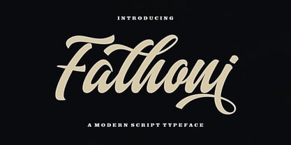 Fathoni is a modern handwritten calligraphy script. It contains the complete set of lowercase, uppercase, alternative, ligature, punctuation, numbers, and multilingual support. Work in harmony with Fathoni to create extraordinary calligraphy creations. You are welcome to use it for various purposes: logos, wedding invitations, titles, signatures, t-shirts, letterheads, nameplates, labels, posters, and more. How to access all alternative characters, using Windows Character Map with Photoshop https://www.youtube.com/watch?v=Go9vacoYmBw How to access all alternative characters using Adobe Illustrator: https://www.youtube.com/watch?v=XzwjMkbB-wQ
 - Jana Thork by Outras Fontes,
$26.90 Jana Thork is a synthesis of stone engraved capital letterforms and uncial and half-uncial calligraphic styles. The idea of the typeface designer Ricardo Esteves was to seek for the limits between our uppercase and lowercase mental concepts. This family can be useful to compose titles, short texts, labels and letterings that need to look attractive to the eye. The family includes Regular and Bold styles, so it can be used in graphic designs that need more complex hierarchic relations or greater visual impact.
 - Hangbird by Melvastype,
$35.00 Hangbird is a modern brush script with lots of alternate characters, swashes and underlines. It is very versatile and has many options for customization. You can build up words and phrases that suit your specific needs and liking. That makes Hangbird a good choice for logos, titles and lettering pieces. Hangbird has various alternatives for uppercase, several end swashes, connecting and non-connecting lowercase and options for ascenders and descenders. By altering these options you can have an end result that is almost like lettering.
 - Rosales by Latinotype Mexico,
$39.00 Rosales integrates humanist style with geometry in a typography highly inspired by calligraphy. It has eight weights in round and italic variants, which also have a set of initial capital letters, small caps, Oldstyle and Lining figures, as well as two stylistic sets that allow for more humanist or more geometric versions. Basically, it covers whatever you’re going to need. The family’s extreme weights were designed for titles, while the intermediate weights are for texts. The first ones are perfect for displays and logos.
 - Ardina Text by DSType,
$50.00 Ardina was designed for the Portuguese newspaper Jornal de Notícias. Right after the exclusivity period, we decided it was a wonderful addition to our type library, therefore we redesigned it and included an extended set of characters. Ardina is a soft and warm news typeface, with five weights and matching italics, three grades (Display, Title, and Text), and slightly narrow proportions but with a very nice x-height. It’s the right typeface for a serious newspaper that intends to achieve a very contemporary feeling.
 - Marcellus Pro by Stiggy & Sands,
$29.00 Our Marcellus Pro was inspired by classic Roman inscription letterforms. Clarity and beauty are embodied in the standard lowercase, while this historically influenced typeface also nods to the powerful presence of the Trajan titling style with its SmallCaps set. When combined together, Marcellus is a gorgeous flare-serif typeface, rich with presence and usability. Opentype features include: - SmallCaps. - Full set of Inferiors and Superiors for limitless fractions. - Tabular, Proportional, and Oldstyle figure sets (along with SmallCaps versions of the figures). - Stylistic Alternates for Caps to SmallCaps conversion.
 - 6th Aniversario by deFharo,
$21.00 6th Aniversario is a rounded condensed typography, handwritten and elegant, perfect for writing good advertising titles in graphic design of posters, flyers or publications in general where space saving and readability is required. Includes the Bitcoin symbol (ligatures): b# The Commercial version includes: - 492 glyphs. Latin Extended-A • OTF & TTF - OpenType Functions: Fractions, Alternate Annotation Forms, All Alternates, Superscript, Superiors, Slashed Zero, Superior letters, Localized Forms, Numbers Small Caps, Inferiors, Scientific Inferiors, Discretionary Ligatures, Numerators, Standard Ligatures, Subscript, Extended Fractions, Ordinals, Denominators, Oldstyle Figures, Historical Forms.
 - Voyage by Fenotype,
$35.00 Voyage is a smooth and friendly vintage script family of two weights and ornament sets. Voyage is packed with alternate characters and OpenType features to allow you create customized headlines. To activate the alternates click on Swash, Contextual, Stylistic or Titling Alternates or Discretionary Ligatures in any OpenType savvy program or manually select the characters from Glyph Palette. Always keep on Standard Ligatures for the best outcome. Combine Voyage with Voyage Ornaments to complete your designs. For the best price purchase the Complete Voyage Family.