780 search results
(0.041 seconds)
- The Poisoned Heart by Din Studio,
$29.00 The Poisoned Heart is a beautiful retro script. It's made with a naturally handwritten style. This font will make your design more beautiful and powerful, and is suitable for any design such as branding, quotes, wedding invitations, lettering projects and more. Features: - 76 Alternates - Accents (Multilingual Characters) - 10 Ligatures - PUA encoded - Numerals and Punctuation (OpenType Standard) I hope you enjoy it! Thanks for visiting and purchasing my font! Regards Donis M Din Studio
 - Quietism Variable by Michael Rafailyk,
$150.00 A smooth contemplative Antiqua with aspiring to the sky ascenders, inspired by the Quietism philosophy. Clarity of the mind is achieved by bringing the body into a state of calm and contemplation, and this is reflected in the design – the quiet horizontal serifs (body) are opposed to the peaky soaring ascenders (mind). The design also features four optical size subfamilies with different x-height and contrast, oldstyle diagonal stress, oldstyle figures by default, smooth details and slightly dark texture. Variable axes: Weight, Contrast, X-Height. Scripts: Latin, Greek, Cyrillic. Languages: 480+. The complete list of supported languages: michaelrafailyk.com/quietism Kerning: 4553 class-to-class pairs. Hinting: Not applied. Format: TTF – OpenType with TrueType outlines. Variable Font: Quietism Variable provides more options than static versions, and has three axes: Weight (Thin–Black), Contrast (Low-High), and X-Height (Low-High). Variable fonts includes thousands of styles that you can access using a sliders on graphic editor or via CSS on web browser. Mixing different axes gives you extra styles not represented by static fonts. Optical Size: The typeface is represented by four subfamilies: Text (low contrast, high x-height – for paragraph 10-20 pt), Deck (medium contrast, medium x-height – for subheading 20+ pt), Display (high contrast, medium x-height – for heading 72+ pt), Poster (high contrast, low x-height – for big size 120+ pt). Small Caps: Lowercase letters and Oldstyle Figures are replaced with Small Capitals forms. Capitals to Small Caps: Uppercase letters, all figures, and some punctuation are replaced with Small Capitals forms. Case Sensitive Forms: ()[]{}‹›«»-–—•·#%‰@ and Arrows are centered on capitals. Oldstyle figures are replaced with Lining figures. Oldstyle Figures: 0123456789 #%‰. Designed to work with lowercase letters. Used by default. Lining Figures: 0123456789 #%‰. Figures are the same height as uppercase letters (cap height). Proportional Figures: Lining, Oldstyle, Small Caps, Capitals to Small Caps. Tabular Figures: Lining, Oldstyle, Small Caps, Capitals to Small Caps. Ordinals: adehnorst. Superscript, Subscript, Numerator, Denominator: 0123456789. Fractions: ¼½¾⅐⅑⅒⅓⅔⅕⅖⅗⅘⅙⅚⅛⅜⅝⅞⅟ (precomposed). Any other fractions (even those typed through a slash) will also be displayed correctly, with the automatic replacement to Numerator + fraction + Denominator. Slashed Zero: All 0 figures. Contextual Alternates: Number sign character (#) before uppercase letters is replaced by its version centered on capitals. Hyphen character (-) between two uppercase letters is replaced by its version centered on capitals. First of two TT letters is replaced by its alternate form. Letters vwy before the letters fijmnprtuvwxy are replaced with an alternate shorter versions that fits better in the context. Contextual Alternates (Greek): ΆΈΉΊΌΎΏ. Greek uppercase accented characters lose their tonos accent and retain only dieresis in All Caps and Small Caps modes. Turned on by default. If you need tonos accents in All Caps then turn off Contextual Alternates (calt) feature. Stylistic Alternates: FTГТИЦЩцщ and their versions with diacritical marks. Stylistic Set 01 “Arrows”: Left <- Right -> Up Left Right <-> Up Down North West South East \> South West Stylistic Set 02 “Round-Square Cyrillic”: ДИЙЍЛФвгджзийѝклнптцчшщьъю characters are replaced with its Bulgarian or Russian forms. Stylistic Set 03 “Cyrillic Tse Shcha short tails”: ЦЩцщ characters are replaced with its alternate form with short tail. Stylistic Set 04 “Cyrillic I full serifs”: ИЙЍӢ characters are replaced with its alternate form with inner serifs. Stylistic Set 05 “FT bent inward serif”: FTГ characters and their versions with diacritical marks are replaced with its alternate form with right head serif that bent inside. Stylistic Set 06 “Small Caps centered on Capitals”: Small Caps are vertically centered on uppercase letters. Standard Ligatures: fi fl fb ff fh fj fk ffb ffh ffi ffj ffk ffl. Discretionary Ligatures: Th ct st. Localized Forms: 52 character substitutions for Azeri, Bulgarian, Catalan, Dutch, German, Kazakh, Macedonian, Moldavian, Polish, Romanian, Serbian, Tatar, Turkish. Glyph Composition/Decomposition (Diacritics): Full Latin and based Vietnamese set of diacritics (571 characters). Precomposed.
 - Novecento Slab by Synthview,
$22.00 Novecento Slab is the “slab serif” companion of Novecento Sans , a font family inspired on european typographic tendencies between the second half of 19th century and first half of the 20th. This font face is designed to be used mostly for headlines, visual identities or short sentences, both in big and small sizes. Novecento Slab family comes in 32 styles, speaks 76 latin based languages, has 590 glyphs and 16 stylistic opentype features for advanced typography.
 - Bianca Kamelo by Ivan Rosenberg,
$16.00 Bianca Kamelo is a modern hand-lettered font with 67 standard ligatures and unique 676 "love ligatures" which connect names with style. Font includes multilingual support for Western and Central Europe. It is ideal for weddings invitations, baby showers, blogs and websites, instagram, branding, invitations, business cards, and many more. This font also include complete set of alternates for uppercase and lowercase characters and stylistic ends for lowercase characters. To activate the "love ligatures" you just need to enable "standard ligatures" and type name without separator (space). For example BiancaKamelo. If the name ending with standard ligature, you need to disable that ligature, enable ligature for last name character and first surname character. For example: ChristianKate - disable ligature for ChristianKate and enable for ChristianKate. For access to Stylistic Alternates is required software with glyphs panel like Photoshop, Illustrator etc. Ligatures shows up automatically.
 - Bandira Script by Rillatype,
$14.00 Bandira Script gives you the handcrafted feel that is perfect for logotypes, apparel, invitations, branding, packaging, advertising, and more. This typeface comes in a clean and rough version with uppercase, lowercase, punctuations, symbols and numerals, 06 stylistic set alternate, ligatures, swashes, multi-lingual support and is already PUA encoded. To access the swashes just type _1 ... _3 in the end of the word, example Bandira_1, Bandira_2, Bandira_3 If you have any other question feel free to reach us at rillatype@gmail.com Thanks.
 - Sometimes Rough by Arterfak Project,
$26.00 Sometimes Rough, a new brush font with a real hand-lettered brush in solid ink. The letterforms have many personalities; sometimes strong, feminine, sometimes elegant, or manly. The modern-vintage design, flexible for a lot of needs. Create a natural typographic with this font, including 150+ alternate characters that give you more variations. Ideal for logos, merchandise, craft, poster, flyer, books, menu, packaging, advertising and more. Features: Uppercase Lowercase Numbers Symbols Accented characters Stylistic alternates Stylistic set 01-07 Contextual Alternates
 - Bosphorus by Bülent Yüksel,
$19.00 Ideally suited for advertising and packaging, editorial and publishing, logo, branding and creative industries, poster and billboards, small text, wayfinding and signage as well as web and screen design. Optimized for web, tablet and smartphone applications. Also “Bosphorus” is a perfect screen display font. Technical information: “Bosphorus” provides advanced typographical support for Latin-based languages. An extended character set, supporting Central, Western and Eastern European languages, rounds up the family. The designation “Bosphorus 50 Normal 53 Regular” forms the central point. The first figure of the number describes the stroke thickness: 51 Thin to 56 Black. 5 Width / 6 Weights and italics also “Bosphorus” total 60 types. The family contains a set of 530 characters. Case-Sensitive Forms, Classes and Features, Fractions, Superior, Inferior, Denominator, Numerator, Old Style Figures just one touch easy In all graphic programs. You can contact me at buyuksel@hotmail.com, pre-purchase and post-purchase with questions and for technical support. UPDATE: 1- Some glyph unicode error correction / 04-06-2018 - Euro Unicode - Idottacent Unicode - Oganec Unicode - Middot Unicode 2- New Version 2.0 / 25-06-2021 You can enjoy using it.
 - Bosphorus Variable by Bülent Yüksel,
$149.00 Ideally suited for advertising and packaging, editorial and publishing, logo, branding and creative industries, poster and billboards, small text, wayfinding and signage as well as web and screen design. Optimized for web, tablet and smartphone applications. Also “Bosphorus” is a perfect screen display font. Technical information: “Bosphorus” provides advanced typographical support for Latin-based languages. An extended character set, supporting Central, Western and Eastern European languages, rounds up the family. The designation “Bosphorus 50 Normal 53 Regular” forms the central point. The first figure of the number describes the stroke thickness: 51 Thin to 56 Black. 5 Width / 6 Weights and italics also “Bosphorus” total 60 types. The family contains a set of 530 characters. Case-Sensitive Forms, Classes and Features, Fractions, Superior, Inferior, Denominator, Numerator, Old Style Figures just one touch easy In all graphic programs. You can contact me at buyuksel@hotmail.com, pre-purchase and post-purchase with questions and for technical support. UPDATE: 1- Some glyph unicode error correction / 04-06-2018 - Euro Unicode - Idottacent Unicode - Oganec Unicode - Middot Unicode 2- New Version 2.0 / 25-06-2021 3- Variable / 18-02-2022 You can enjoy using it.
 - Pollen by TypeTogether,
$49.00 This typeface finds a perfect balance between technical excellence, careful design of letter forms for extended reading, and a measured dose of charm and personality. Its informal feel allows for successfully typesetting a wide range of applications, from magazines and fiction books to advertising and websites. Calligraphy, be it done with the broad-edge pen, brush, or other tools, has been fundamental in the development of Pollen. Its influence is clearly visible in the construction of the top serifs contrasting the curved bottom serifs and the fluid aspect of terminals and tails, such as on “g” and “r”. The shapes of the diagonal letters are based on a less formal calligraphic model, but still uses the broad edge pen. The letters were then subject to a further process of pencil drawing and digital re-interpretation, which gave them the final shape. The designs of “e” and “c” are derived from drawings made with only one continuous line, with the pencil always touching the paper. The letters “g” and “y” express the intention to bring informal elements to a typeface intended for long text reading, usually characteristic of casual writing. Pollen consists of 3 basic styles with an extended OpenType Pro character set and large language support, perfectly serving the most common typographic needs.
 - Two Sugars by Set Sail Studios,
$16.00 Introducing the Two Sugars Script Font! Two Sugars is a playful yet striking clean monoline script font, available in 2 weights and includes bonus extra stars & underlines. It's chunky, hand-drawn letterforms are guaranteed to stand out whether that be on light hearted merchandise designs or more impactful quote designs. The Two Sugars family consists of; Two Sugars Regular • A clean, connecting script font containing upper & lowercase characters, numerals, and a large range of punctuation. Two Sugars Extras • A set of 26 hand-drawn stars & underlines designed to compliment your Two Sugars script fonts. Simply install this as it's own separate font, and type any A-Z character to generate one of the extras. Two Sugars Bold & Two Sugars Extras Bold • If you're looking for a chunkier version of the Two Sugars & Two Sugars Extras fonts, simply switch to the bold versions! Alternates • Are available for lowercase descenders g, j, z, & y. These have elongated tails to add some extra flair to your text, and are accessible by switching on 'Stylistic Alternates' or via a Glyphs panel. Language Support • Two Sugars supports the following languages; English, French, Italian, Spanish, Portuguese, German, Swedish, Norwegian, Danish, Dutch, Finnish, Indonesian, Malay, Hungarian, Polish, Croatian, Turkish, Romanian, Czech, Latvian, Lithuanian, Slovak, Slovenian
 - Echo Soul by Set Sail Studios,
$14.00 Introducing Echo Soul; a free-flowing and carefree brush font duo, hand painted with love. Echo Soul speaks from the heart and doesn't hold back. With elongated brush strokes and a natural flow, it's the perfect choice for handwritten quotes, product packaging, and logo designs with a personal and affectionate touch. The Echo Soul family consists of; 1. Echo Soul • A handwritten script font containing upper & lowercase characters, numerals and a large range of punctuation. 2. Echo Soul Alt • This is a second version of Echo Soul, with a completely new set of lowercase characters. If you wanted to avoid letters looking the same each time to recreate a custom-made style, or try a different word shape, simply switch to this font for an additional layout option. 3. Echo Soul Sans • An all-caps font containing uppercase-only characters, perfect for supporting text to compliment the Echo Soul Script font. Also includes numerals and a large range of punctuation. Stylistic Alternates • Are also available for several lowercase characters - these have elongated tails and look great when placed at the end of a word. These can be used by turning on 'Stylistic Alternates' in OpenType capable software, or accessing via a Glyphs panel.
 - Lugo by Eurotypo,
$90.00 The font "Lugo" is a heavy typeface designed for use in headlines and caption text. Their design has a strong visual impact, a persuasive and seductive personality throughout its organic shapes. This is a versatile and expressive font. Lugo can create an appealing atmosphere, conveying a gamut of message and emotions. It is well suited in the jobbing areas like packaging, logotypes, magazines, web pages and advertising, etc. Lugo has all the advantages of OpenType features that allow a variety of combinations: You may choose to set types in connected or unconnected ways, being used as body text or headlines for its good legibility, visual impact and accurate kerning. It has more than thousand glyphs: swashes, standard and discretional ligatures, stylistics and contextual alternates, old style numerals, word ending and tails. It has also an extended character set to support Central and Eastern European as well as Western European languages. Lugo is a city in northwestern Spain in the autonomous community of Galicia. The Celtic name Lug suggests that it may have been a sacred site. Augustus founded the Roman town of Lucus Augusti in 15-13 BCE following the pacification of this region. It is the only city in the world to be surrounded by completely intact Roman walls.
 - K-Block by HiH,
$10.00 K-Block was inspired by a hand-lettered sign by a young lady by the name of Kristina Lee. It captures a light-hearted, youthful feeling and is not intended to be taken too seriously. It was drawn for fun and is fun to use. Its very inconsistency insists on being casual and relaxed. Probably better for a birthday party announcement than a bank letterhead. Can you imagine a Just-For-Fun National Bank? K-Block Solid compliments K-Block and provides a stronger presence when required. For two-color work, K-Block can be layered on top of K-Block Solid to provide a different color outline for a very effective presentation. Full Western European character set plus alternate g and y, as well as a Th ligature. If you have a drawing program like Corel Draw, you can easily convert the alternate g and y to curves and stretch out the tails to underline an entire word. The zip package of each font includes two versions. There is an OTF version which is in Open PS (Post Script Type 1) format and a TTF version which is in Open TT (True Type)format. Use whichever works best for your applications. K-Block and K-Block Solid are sold separately.
 - TX Signal Signifier by Typebox,
$39.00Eight designers present a set of icons that indicate the fun and fantastic world of signage. Each collaborator's solution represents a completely different interpretations on signage vernacular. Akira Kobayashi's "Subsumption", obscured by foliage, offers a perspective that signs on Japanese roads can be vague and beautiful. M.A.D.'s "People Signs" is a graphical association of people signage with a variety of well known situation symbols. Cynthia Jacquette's "Honest Arrows" are a series of arrows that attempts to honestly tell you how to get from point A to Point B in a big, confusing city. Mike Kohnke's "Road Kill" and the "Bump & Bruise" highlight how signs make for perfect targets when unloading a round of buckshot, and the licking a contruction barrier often endures. Joachim Muller-Lance's "Traffic Blends" places faces on things! Hey, didn't you give your first car a nickname? Cars are alive, you know - they guzzle and smoke all day. Jean-Benoît Lévy's "Inner-State" was inspired while reading the California driver handbook to pass a driver's test. Kevin Roberson's "Tail Lighting" reminds us to drive carefully and not to forget to signal. Diana Stoen's "Drivers Out There" shows us "driver personality archetypes", including the lil'ol lady that everyone tries to avoid. - Ahmed by Linotype,
$187.99Ahmed is a modern Arabic headline face, first produced by Linotype-Hell Ltd. in the early 1980s. Originally developed as a simplified face, its design recalls the inscriptional and decorative tile work lettering of the medieval period. The strong treatment of the tails of certain characters departs from the more traditional style of tapering these finials, introducing a modern feel to the design. The contrasting proportions of the tall vertical strokes and the rather elongated counters lend a monumental look to Ahmed, allowing its effective use in titling. During the later 1980s Ahmed was developed into a traditional typeface, with the introduction of medial forms to improve character spacing and balance. Recently, Ahmed has been converted into the OpenType font format, ensuring its continued popularity as a heading face for newspaper typesetting. The Ahmed typeface contains two weights, Ahmed and Ahmed Outline. Both of the OpenType fonts include Latin glyphs from Clearface Gothic Roman inside the font files, allowing a single font to set text in both most Western European and Arabic languages. The two Ahmed fonts include the Basic Latin character set and the Arabic character set, which supports Arabic, Persian, and Urdu. They include tabular and proportional Arabic, Persian, and Urdu numerals, as well as a set of tabular European (Latin) numerals. - Planet Express by Estudio Calderon,
$29.99 Family type designed by Felipe Calderón. This type is a display with a modern style and a different and innovative concept. The development of this type was a challenge because it was set out from the begining as a script font with ornaments and complements, where the round shapes do not have prominence in the result. Planet Express is an interesting job from the aesthetic point of view, it works for big scale texts and contains little shadow-cuts in each character to give it more personality and stand out among other fonts from this gender. I hope this new project works to solve issues in design. Planet Express is composed of Regular & Italics, it has 250 intelligent ligatures to produce the best signs in big scale, it is perfect for branding and works very well with the geometric complements. It is designed with programming in opentype: Ligatures, Discretionary ligatures, Stylistic Alternates, Stylistic set 01, Stylistic set 02, Stylistic set 03, Stylistic set 04, Stylistic set 05, Stylistic set 06, Stylistic set 07, Stylistic set 08 & Stylistic set 09, multiple language support and a complete set of extras like arrows, catchwords, flags, emblems, hands, fleurons & crossed elements. Planet Express can be used in different ways, each character pretends to cover the needs in any circumstance where it is used. It is funny to write words and play with the complements. It also works with current concepts in graphic design like sports, cars, hip hop, music, social network, skateboarding and more. Everybody can use this font, it works with different languages like italian, french, portuguese, danish, german and so forth. See specimen and samples here. Enjoy it!
 - HWT Republic Gothic by Hamilton Wood Type Collection,
$24.95 The Republic Gothic series was among the last original wood type designs manufactured by Hamilton Manufacturing Co. It was first shown in Hamilton's New Gothic Faces in Wood Type (c. 1920). The design features a sans-serif style reminiscent of brush-formed letters popular with sign painters of the era. Originally issued in 6 different widths and in both outline and solid versions, this digital release features the "Extended" width known as Hamilton Republic Gothic series 775 & 776. The pair of outline and solid is designed as 'chromatics' that can be printed one over the other to achieve multiple color effects or individually as stylistic alternatives. This release features the first ever digitization of Republic Gothic. The two fonts are carefully aligned and kerned to allow for multicolor overlayment in any digital design program. It features a full Western and Central European Character set.
 - Morekids by LetterStock,
$20.00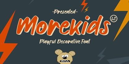 **Morekids Font** This pair was inspired by the playful poster design that i saw on some coffee shop, It was crafted by hand specially to add natural handmade feeling in its brand identity than i make it clean with pentool. **Opentype features** Morekids font has 176 character set included Morekids Font is very good looking in logo, labels, product packaging, invitations, advertising and others. This fonts works with folowing languages: Afrikaans, Albanian, Asu, Basque, Bemba, Bena, Chiga, Cornish, Danish, English, Estonian, Filipino, Finnish, French, Friulian, Galician, German, Gusii, Indonesian, Irish, Italian, Kabuverdianu, Kalenjin, Kinyarwanda, Low German, Luo, Luxembourgish, Luyia, Machame, Makhuwa-Meetto, Makonde, Malagasy, Malay, Manx, Morisyen, North Ndebele, Norwegian Bokmål, Norwegian Nynorsk, Nyankole, Oromo, Portuguese, Romansh, Rombo, Rundi, Rwa, Samburu, Sango, Sangu, Scottish Gaelic, Sena, Shambala, Shona, Soga, Somali, Spanish, Swahili, Swedish, Swiss German, Taita, Teso, Vunjo, Zulu Thank you for using this font. LS
 - Apocalypto Display by FoxType,
$10.00 Apocalypto Display is a Unique Modern Elegant Typeface with Web-fonts. It's a very versatile font that works great in large and small sizes. Apocalypto Font would perfect for branding, logos, headlines, Captions. or simply as a stylish text overlay to any background image. Strong capitals and a smooth, open lowercase are effective in a variety of applications. It's shown a clean, minimalist, warmth, quirky, yet still purposed to be versatile and easy to read. 07 Weights with 14 Styles Included. Free updates and feature additions.
 - Mr Palker by Letterhead Studio-YG,
$35.00 A slab serif Mr Palker and grotesque Mr Palkerson build one superfamily together. These are blank types. In a way even the display ones. Typefaces for newspapers, announcements, cheap advertising and police posters. Mr Palker and Mr Palkerson will turn every language into a fence. And due to six types of faces one can choose what material should the fence be made from — from Thin steel rods to the Black stone blocks. In their simplest appearance Mrs P&P are intended for the solid blank composition in victorian or industrial style. They are quite decent, a bit old-fashioned slab serif and grotesque with closed aperture. All my types have layers. Walker and Palkerson also do. Besides the standard set of symbols, they have 4 add-ons. 1. Alternate glyphs, including unicase ones. 2. Ligatures with A letter. 3. Extra tall small caps. 4. Two-storey ligatures. All this options are intended for the complex composition. The additional letters are rather eccentric as their main function here is to imitate the victorian oddities. Imitate, parody, just not repeat. There are lower-case As and Es in the set in height of small caps and uppercases. They can turn every writing into the unicase. The lower-case A (as well as uppercase and small caps version of it) has deliberately by my taste grown a ludicrous tail. To compensate it I’ve built all the possible ligatures - ад, ал, ая. There are 35 of this ligatures all together. Take a closer look at the Russian letters D, L, K, Ya from the main set as well as their alternates. The additional glyphs are one more comic than the other — on purpose to imitate (not to repeat!) the victorian set. This sets have lowercase numbers. And small caps numbers as well. What a modern typeface without them. They also have an У-letter with a generously curvy tail. As if before the WWI. The Latin of course has alternates as well. It has letters to make the perfect French sound more like the russian provincial version of it. The tails of Js and Ts can be made a little bit more open — or a little bit closed. My favorite feature here, an invention of a kind - extra tall small caps. It allows to compose logos with the small caped uppercases directly from the keyboard. The small caps of this typefaces are usually much taller than the customary ones. This is the kind of small caps that Palker and Palkerson have. More to that, the strokes’ weight and the letters width are corresponded to the uppercases. Just a ready set for making a logo a la 1913 style. With a unicase, one has to mind! One more trick with the tall small caps is a possibility to make them work like lower uppercases. Their height is just in between of lower- and uppercases. Isn’t it great to have an additional set of uppercase working ponies in stock for the case of emergency. And finally — the trademark of Palkers family, two-storey ligatures. They are made in the height of uppercases and turn every writing into an ornament or a puzzle of a kind, while at the same time making them much shorter. Each face has 90 of them. Mainly those are twins: CC, BB, DD and so on. ll this things are for the unhasty compositing, even for lettering. Which means that for the things which are not there you always should have Command+Option+O and some patience. Also — among the two storey ligatures one also can find some belvedere villas. All my types are glasses from the one kaleidoscope. The P&Ps family was preliminary part of the victorian set, which already has 1 Cents and Clarendorf - optionally one can add Costro, Gordoni, Handy, Guardy, Surplus, Red Ring, Red Square, Babaev to the list. And also Sklad, Odessa, Dreamland, Romb, Platinum - here, at Letterhead’s, every second one is victorian. All together our typefaces can allow one to set advertisement of any kind, even the trickiest one, and compose everything, from the coffee place’s menu to the antiquarian magazine.
 - Mr Palkerson by Letterhead Studio-YG,
$35.00 A grotesque Mr Palkerson and slab serif Mr Palker build one superfamily together. These are blank types. In a way even the display ones. Typefaces for newspapers, announcements, cheap advertising and police posters. Mr Palker and Mr Palkerson will turn every language into a fence. And due to six types of faces one can choose what material should the fence be made from — from Thin steel rods to the Black stone blocks. In their simplest appearance Mrs P&P are intended for the solid blank composition in victorian or industrial style. They are quite decent, a bit old-fashioned slab serif and grotesque with closed aperture. All my types have layers. Walker and Palkerson also do. Besides the standard set of symbols, they have 4 add-ons. 1. Alternate glyphs, including unicase ones. 2. Ligatures with A letter. 3. Extra tall small caps. 4. Two-storey ligatures. All this options are intended for the complex composition. The additional letters are rather eccentric as their main function here is to imitate the victorian oddities. Imitate, parody, just not repeat. There are lower-case As and Es in the set in height of small caps and uppercases. They can turn every writing into the unicase. The lower-case A (as well as uppercase and small caps version of it) has deliberately by my taste grown a ludicrous tail. To compensate it I’ve built all the possible ligatures - ад, ал, ая. There are 35 of this ligatures all together. Take a closer look at the Russian letters D, L, K, Ya from the main set as well as their alternates. The additional glyphs are one more comic than the other — on purpose to imitate (not to repeat!) the victorian set. This sets have lowercase numbers. And small caps numbers as well. What a modern typeface without them. They also have an У-letter with a generously curvy tail. As if before the WWI. The Latin of course has alternates as well. It has letters to make the perfect French sound more like the russian provincial version of it. The tails of Js and Ts can be made a little bit more open — or a little bit closed. My favorite feature here, an invention of a kind - extra tall small caps. It allows to compose logos with the small caped uppercases directly from the keyboard. The small caps of this typefaces are usually much taller than the customary ones. This is the kind of small caps that Palker and Palkerson have. More to that, the strokes’ weight and the letters width are corresponded to the uppercases. Just a ready set for making a logo a la 1913 style. With a unicase, one has to mind! One more trick with the tall small caps is a possibility to make them work like lower uppercases. Their height is just in between of lower- and uppercases. Isn’t it great to have an additional set of uppercase working ponies in stock for the case of emergency. And finally — the trademark of Palkerson family, two-storey ligatures. They are made in the height of uppercases and turn every writing into an ornament or a puzzle of a kind, while at the same time making them much shorter. Each face has 90 of them. Mainly those are twins: CC, BB, DD and so on. ll this things are for the unhasty compositing, even for lettering. Which means that for the things which are not there you always should have Command+Option+O and some patience. Also — among the two storey ligatures one also can find some belvedere villas. All my types are glasses from the one kaleidoscope. The P&Ps family was preliminary part of the victorian set, which already has 21 Cents and Clarendorf - optionally one can add Costro, Gordoni, Handy, Guardy, Surplus, Red Ring, Red Square, Babaev to the list. And also Sklad, Odessa, Dreamland, Romb, Platinum - here, at Letterhead’s, every second one is victorian. All together our typefaces can allow one to set advertisement of any kind, even the trickiest one, and compose everything, from the coffee place’s menu to the antiquarian magazine.
 - Diocletian by Type Fleet,
$12.00 Diocletian fortiter in re, suaviter in modo Diocletian typeface captures the essence and glory of the Diocletian’s palace, one of the most imposing heritages of the late Roman empire. It is designed to bring the confidence and fortune to contemporary communication in a heroic and gentle manner. Diocletian typeface is based on the Uncial script, made up of wide, rounded letters. It is desirable for cafes, restaurants, shops, hotels and apartments. The typeface’s x-height is around 76% of its capitals. The font is enriched with ligatures and special characters.
 - Eternal Spring by Krismagraph,
$19.00 Eternal Spring is an elegant and modern San serif font family. It's sans serif in 8 weights from Thin to ExtraBold font. Comes with 76 unique ligatures and 27 alternates. Eternal Spring is a multipurpose font perfect for any project, with high contrast glyphs, giving it a feminine and masculine quality, modern, and easy to read. Excellent in layout design for quotes or body copy, best used as a display for headings, logos, branding, magazines, product packaging, invitations, and others. This font is easy to use and has OpenType features.
 - Saxo Grammaticus by Jonas Stensgaard,
$8.00 Saxo Grammaticus is a beautiful and friendly family that works great with family themes, elegant & classy material and professional settings. It's so versatile you'll find yourself coming back to it over and over for your projects, and that's whether you're looking to create logos, quotes, poster designs, brochures, packaging, anything with big letters like headlines, wedding invitations, holiday cards, advertisements, signs and on and on and on... There is a total of 107 ligatures and 76 alternates! That's plenty of options for any designer wanting to give those big letters a little extra wham bam!
 - Meliana Script by Arterfak Project,
$13.00 Meliana is a joyful handwriting font, created with a freestyle hand-lettering and a bit bouncy letterform that gives cute and friendly looks. Inspired by children's style and natural handwriting, Meliana Script is suitable for logo, packaging, quote, apparel, cards, invitation, wedding, branding, poster, and more! Meliana is equipped with lots of alternates, there are ligatures, alternates, and stylistic set 01 - 06 that you can mix and match to get more variation of typographic design! You can combine the font with Meliana Extras, containing the swash and doodles.
 - Oliver Queen by LetterStock,
$17.00 Oliver queen Font This pair was inspired by the retro poster design that i saw on some coffee shop, It was crafted by hand specially to add natural handmade feeling in its brand identity than i make it clean with pentool. Opentype features Oliver queen font has 176 character set Cricket Font is very good looking in logo, labels, t-shirt prints, product packaging, invitations, advertising and others. What includes Multilingual support (Western European characters). This fonts works with folowing languages: Afrikaans, Albanian, Asu, Basque, Bemba, Bena, Chiga, Cornish, Danish, English, Estonian, Filipino, Finnish, French, Friulian, Galician, Gusii, Indonesian, Irish, Italian, Kabuverdianu, Kalenjin, Kinyarwanda, Low German, Luo, Luxembourgish, Luyia, Machame, Makhuwa-Meetto, Makonde, Malagasy, Malay, Manx, Morisyen, North Ndebele, Norwegian Bokmål, Norwegian Nynorsk, Nyankole, Oromo, Portuguese, Romansh, Rombo, Rundi, Rwa, Samburu, Sango, Sangu, Scottish Gaelic, Sena, Shambala, Shona, Soga, Somali, Spanish, Swahili, Swedish, Swiss German, Taita, Teso, Vunjo, Zulu Thank you for using this font. LS
 - Sherlina by Strong,
$20.00 Sherlina Script Sherlina Script a fresh & modern new script with a handcrafted calligraphy style, decorative characters and dancing baseline! Very pretty for invitations such as greeting cards, branding materials, business cards, quotes, posters and more!! Sherlina Script comes with 476 glyphs. Alternative characters are divided into several Open Type features such as Swash, Stylistic Sets, Stylistic Alternate, Contextual Alternate. The Open Type feature can be accessed using Open Type savvy programs such as Adobe Illustrator, Adobe InDesign, Adobe Photoshop version of Corel Draw X, and Microsoft Word. And this Font has provided PUA unicode (custom coded font). so that all alternative characters can be easily accessed in full by a craftsman or designer. Sherlina Script: Uppercase & Lowercase Letters International Languages & Symbols Support Punctuation & PUA Numbers Unicode Range Standard Alternative Style If you don't have a program that supports OpenType features such as Adobe Illustrator and CorelDraw X Versions, you can access all the alternative glyphs using Font Book (Mac) or Character Map (Windows). thank you
 - Cy Grotesk by Kobuzan,
$25.00 Cy Grotesk is the result of combining the clear forms of mid 20th-century European neo-grotesks and the expressiveness of the 19th-century grotesques. It is display typeface with an eccentric character and a special rhythm. Symbols have sharp long angled spurs and large wedge incision between the bowl and the stem, diluting it with smooth curves and the tight aperture. Built like a multifunctional workhorse that has a wide range of font uses. This type family consists of 27 styles that are adjustable in weight and width. Or one variable font with 2 axes. From pure thin to radically black. From roomy key to catchy grand. All styles include an extended set of Latin characters and a basic Cyrillic. Features: – Total glyph set: 676 glyphs; – 27 styles (3 widths x 9 weights) + variable; – Support 210+ languages; – Latin Extended; – Cyrillic Basic. OpenType features: – Uppercase, lowercase; – Proportional, circled, tabular numerals, superiors, inferiors, fractions; – Punctuations and symbols; – Arrows; – Stylistic sets (ss01-ss10); – Ligatures; – Case-sensitive forms.
 - Ernestone Script by Strong,
$20.00 Ernestone Script Ernestone Script a fresh & modern new script with a handcrafted calligraphy style, decorative characters and dancing baseline! Very pretty for invitations such as greeting cards, branding materials, business cards, quotes, posters and more!! Ernestone Script comes with 476 glyphs. Alternative characters are divided into several Open Type features such as Swash, Stylistic Sets, Stylistic Alternate, Contextual Alternate. The Open Type feature can be accessed using Open Type savvy programs such as Adobe Illustrator, Adobe InDesign, Adobe Photoshop version of Corel Draw X, and Microsoft Word. And this Font has provided PUA unicode (custom coded font). so that all alternative characters can be easily accessed in full by a craftsman or designer. Ernestone Script: Uppercase & Lowercase Letters International Languages & Symbols Support Punctuation & PUA Numbers Unicode Range Standard Alternative Style If you don't have a program that supports OpenType features such as Adobe Illustrator and CorelDraw X Versions, you can access all the alternative glyphs using Font Book (Mac) or Character Map (Windows). thank you
 - FS Ostro by Fontsmith,
$80.00 Cosmopolitan Elegance Named after a southerly wind that blows over the Mediterranean Sea, FS Ostro breathes warmth into letterforms with their roots in colder, stark Modern typefaces. FS Ostro is a typeface imbued with balanced and sophisticated elegance. It’s discerning and sensitive, self-assured but understated. One for the well-travelled reader. Thoughtful contrast FS Ostro draws inspiration from a wide range of sources, such as 19th century British Scotch Roman designs, Italian modern style typefaces and highly contrasted display Spanish examples. Its text version offers a consistent rhythm and robust texture that is easy on the eye. This elegant, cosmopolitan typeface is characterised by its thoughtfully modulated contrasts between thick and thin, sharp angles, and sophisticated curves. Exaggerated touches in display “What is more restrained and sober in text, becomes purposefully prominent and more detailed in display,” says Fontsmith designer Alessia Mazzarella. These exaggerated details for the display version can be seen in the letter terminals, such as those in the ‘a’ and ‘g’ and the tail of the ‘Q’, as well as in the set of numerals, fractions, arrows, borders and ornaments, which can be used to build decorative framing elements. Fluid italics The less rigid and curvaceous italics of modern style typefaces were the inspiration for FS Ostro’s own subtle, flowing italic styles. The letterforms are confident and fluid, creating an overall sense of refinement and modernity.
 - TG Riota Gothic by Tegami Type,
$35.00 TG Riota Gothic is a brand new digital sans serif typeface in geometric style with many faces and possibilities with good proportions forms. TG Riota Gothic is outstanding for use in small text or even bigger sizes with seven weights, two axes & 14 styles, including the variable font. It comes with three alternative groups (single story alternates, no tail alternates & square dot alternates), which you can combine to maximize your needs—also supplied with a bunch of ligatures (standard & discretionary ligatures), lining figures (proportional, denominators, numerators, fractions, subscript & superscript), case-sensitive forms, symbol & Each typeface contains over 674 glyphs covered more than 90 languages Latin based. Language Supports: Afrikaans, Albanian, Asu, Azerbaijani, Basque, Bemba, Bena, Bosnian, Catalan, Chiga, Colognian, Cornish, Croatian, Czech, Danish, Dutch, Embu, English, Estonian, Faroese, Filipino, Finnish, French, Friulian, Galician, German, Gusii, Hungarian, Icelandic, Indonesian, Irish, Italian, Kabuverdianu, Kalaallisut, Kalenjin, Kamba, Kikuyu, Kinyarwanda, Latvian, Lithuanian, Low German, Lower Sorbian, Luo, Luxembourgish, Luyia, Machame, Makhuwa-Meetto, Makonde, Malagasy, Malay, Maltese, Manx, Meru, Morisyen, North Ndebele, Norwegian Bokmål, Norwegian Nynorsk, Nyankole, Oromo, Polish, Portuguese, Romanian, Romansh, Rombo, Rundi, Rwa, Samburu, Sango, Sangu, Scottish Gaelic, Sena, Shambala, Shona, Slovak, Slovenian, Soga, Somali, Spanish, Swahili, Swedish, Swiss-German, Taita, Teso, Thai, Turkish, Turkmen, Upper Sorbian, Vunjo, Walser, Welsh, Western Frisian, Zulu. Typeface Designed by Iqbal Firdaus Published by Tegamitype® Foundry Presentation Design by Eunike Agatha & Dennise Nathalie
 - FS Ostro Variable by Fontsmith,
$119.99Cosmopolitan Elegance Named after a southerly wind that blows over the Mediterranean Sea, FS Ostro breathes warmth into letterforms with their roots in colder, stark Modern typefaces. FS Ostro is a typeface imbued with balanced and sophisticated elegance. It’s discerning and sensitive, self-assured but understated. One for the well-travelled reader. Thoughtful contrast FS Ostro draws inspiration from a wide range of sources, such as 19th century British Scotch Roman designs, Italian modern style typefaces and highly contrasted display Spanish examples. Its text version offers a consistent rhythm and robust texture that is easy on the eye. This elegant, cosmopolitan typeface is characterised by its thoughtfully modulated contrasts between thick and thin, sharp angles, and sophisticated curves. Exaggerated touches in display “What is more restrained and sober in text, becomes purposefully prominent and more detailed in display,” says Fontsmith designer Alessia Mazzarella. These exaggerated details for the display version can be seen in the letter terminals, such as those in the ‘a’ and ‘g’ and the tail of the ‘Q’, as well as in the set of numerals, fractions, arrows, borders and ornaments, which can be used to build decorative framing elements. Fluid italics The less rigid and curvaceous italics of modern style typefaces were the inspiration for FS Ostro’s own subtle, flowing italic styles. The letterforms are confident and fluid, creating an overall sense of refinement and modernity. - Half SunBurst-w4-02 - Unknown license

- RePublic by Suitcase Type Foundry,
$75.00In 1955 the Czech State Department of Culture, which was then in charge of all the publishing houses, organised a competition amongst printing houses and generally all book businesses for the design of a newspaper typeface. The motivation for this contest was obvious: the situation in the printing presses was appalling, with very little quality fonts existing and financial resources being too scarce to permit the purchase of type abroad. The conditions to be met by the typeface were strictly defined, and far more constrained than the ones applied to regular typefaces designed for books. A number of parameters needed to be considered, including the pressure of the printing presses and the quality of the thin newspaper ink that would have smothered any delicate strokes. Rough drafts of type designs for the competition were submitted by Vratislav Hejzl, Stanislav Marso, Frantisek Novak, Frantisek Panek, Jiri Petr, Jindrich Posekany, and the team of Stanislav Duda, Karel Misek and Josef Tyfa. The committee published its comments and corrections of the designs, and asked the designers to draw the final drafts. The winner was unambiguous — the members of the committee unanimously agreed to award Stanislav Marso’s design the first prize. His typeface was cast by Grafotechna (a state-owned enterprise) for setting with line-composing machines and also in larger sizes for hand-setting. Regular, bold, and bold condensed cuts were produced, and the face was named Public. In 2003 we decided to digitise the typeface. Drawings of the regular and italic cuts at the size of approximatively 3,5 cicero (43 pt) were used as templates for scanning. Those originals covered the complete set of caps except for the U, the lowercase, numerals, and sloped ampersand. The bold and condensed bold cuts were found in an original specimen book of the Rude Pravo newspaper printing press. These specimens included a dot, acute, colon, semicolon, hyphens, exclamation and question marks, asterisk, parentheses, square brackets, cross, section sign, and ampersand. After the regular cut was drafted, we began to modify it. All the uppercase letters were fine-tuned, the crossbar of the A was raised, E, F, and H were narrowed, L and R were significantly broadened, and the angle of the leg and arm of the K were adjusted. The vertex of the M now rests on the baseline, making the glyph broader. The apex of the N is narrower, resulting in a more regular glyph. The tail of Q was made more decorative; the uppercase S lost its implied serifs. The lowercase ascenders and descenders were slightly extended. Corrections on the lower case a were more significant, its waist being lowered in order to improve its colour and light. The top of the f was redrawn, the loop of lowercase g now has a squarer character. The diagonals of the lowercase k were harmonised with the uppercase K. The t has a more open and longer terminal, and the tail of the y matches its overall construction. Numerals are generally better proportioned. Italics have been thoroughly redrawn, and in general their slope is lessened by approximatively 2–3 degrees. The italic upper case is more consistent with the regular cut. Unlike the original, the tail of the K is not curved, and the Z is not calligraphic. The italic lower case is even further removed from the original. This concerns specifically the bottom finials of the c and e, the top of the f, the descender of the j, the serif of the k, a heavier ear on the r, a more open t, a broader v and w, a different x, and, again, a non-calligraphic z. Originally the bold cut conformed even more to the superellipse shape than the regular one, since all the glyphs had to be fitted to the same width. We have redrawn the bold cut to provide a better match with the regular. This means its shapes have become generally broader, also noticeably darker. Medium and Semibold weights were also interpolated, with a colour similar to the original bold cut. The condensed variants’ width is 85 percent of the original. The design of the Bold Condensed weights was optimised for the setting of headlines, while the lighter ones are suited for normal condensed settings. All the OpenType fonts include small caps, numerals, fractions, ligatures, and expert glyphs, conforming to the Suitcase Standard set. Over half a century of consistent quality ensures perfect legibility even in adverse printing conditions and on poor quality paper. RePublic is an exquisite newspaper and magazine type, which is equally well suited as a contemporary book face. - United Kings by Mans Greback,
$59.00 United Kings is a masterfully crafted formal script font that exudes an air of perfection and fine art. Designed for high-end projects and showcasing genuine, authentic craftsmanship, this font brings an unparalleled sense of balance and beauty to your creative work. The exquisite, well-crafted letterforms of United Kings make it an exceptional choice for logotypes, professional branding, and artisanal projects that require a touch of finesse and sophistication. Use ¤ to make tail swashes, or multiple for longer swashes. Example: Kingdom¤¤¤ Use underscores _ anywhere in a word to make an underline. Example: Belo__ved Use # after any letter to give it a crown. Example: Que#en The United Kings font family includes six elegant styles to suit various design needs: The weights Thin, Regular and Bold, enabling your design to range from a delicate and graceful style for a refined touch, to a more bold, assertive and captivating presence for impactful designs. In addition to the thicknesses, each style is provided as Italic. Built with advanced OpenType functionality, United Kings ensures top-notch quality and provides you with full control and customizability. It includes stylistic and contextual alternates, ligatures, and other features to make your designs as unique and impressive as the font itself. United Kings offers extensive lingual support, covering all Latin-based languages, from Northern Europe to South Africa, from America to South-East Asia. It contains all the characters and symbols you'll ever need, including all punctuation and numbers.
 - Andulka by Storm Type Foundry,
$44.00A universal typeface for books, magazines and newspapers must be economizing, quiet, strong in drawing, but original and peaceful at the same time. Type "for all weather" must resist also many difficulties of printing on different surfaces. Therefore, the basic design "Text" is slightly darker and legible from 6 point size even in a dim light, whereas "Book" reduces the effect of running ink and saves toner cartridge. In offices of smaller companies these lighter fonts are welcomed as toner-savers. Andulka also need less space on the page than other text typefaces and saves paper too. Medium and Bold designs keep the original grace, changing its weight only in shadows. Italics may remind humanistic inspiration and forcing the horizontal of x-height with robust horizontal serifs, whereas Roman lower case maintains the baseline. Basic numerals are non-aligning proportional, but there are available upper case figures as well as special numerals drawn for the same height as small caps, which is just about a hairline above the x-height. The characteristic feature of Andulka is a squinted eye in letters 'a', 'c', 'f', 'r', 's', 'k', and softened diagonals through all characters in family. Diagonals were always disturbing and gripping attention extensively. Serifs are stressed trapezoids reminding small beaks at curved endings, descenders 'j' and 'y' may evoke tail feathers of budgerigar. Andulka [budgerigar] sings lovely and is everyday quiet companion. The whole family consists of 24 separate fonts for graphic studio, office or home. - Aquawax Pro by Zetafonts,
$39.00 Aquawax Pro PDF Specimen Aquawax Graphic Project on Behance Created as a custom brand typeface in 2008 by Francesco Canovaro, Aquawax is one of Zetafonts most successful typefaces - having been chosen, among the others, by Warner Bros for the design of the logo for the Aquaman movie. Its logo design roots are obvious in the design details, from the blade-like tail of the Q and the fin-like right leg of the K to the intentionally reversed uppercase W, as well as the rounded edges softening the stark modernist lettershapes. While this details make the typeface extremely suitable for logo and display design, especially in the bolder weights, the open, geometric forms of the letters and a generous x-height make it extremely readable at small sizes, making it perfect for body text and webfont use. In 2019 the family was completely redesigned by the Zetafonts team, expanding the original glyph set to include Cyrillic and Greek and adding three extra weights and italics to the original six weights, for a total of 27 weights (including 9 pictograms). The restored and revamped version, named Aquawax Pro, also includes full Open Type features for Positional Figures, Stylistic Alternates, Discretionary Ligatures and Small Caps, and adds to the typeface new alternate glyph shapes, accessible as Stylistic Alternates. Optimized for maximum screen readability, it covers over 200 languages that use the Latin, Cyrillic and Greek alphabet, with full range of accents and diacritics.
 - Coventry Garden NF Pro by CheapProFonts,
$10.00 I have improved and added diacritics to this elegant alphabet, and generally cleaned it up to a professional standard. It is well suited to logos, menus, invitations and other things wanting a touch of elegance. Nick Curtis says: "I came across this particular treatment for swash caps in an old book on letterhead design. The original had been handlettered, but I though it might be convenient to have a ready-made font to accomplish the same effect, and here it is. As an extra added feature, the “§” sign is an ampersand with a long tail." ALL fonts from CheapProFonts have very extensive language support: They contain some unusual diacritic letters (some of which are contained in the Latin Extended-B Unicode block) supporting: Cornish, Filipino (Tagalog), Guarani, Luxembourgian, Malagasy, Romanian, Ulithian and Welsh. They also contain all glyphs in the Latin Extended-A Unicode block (which among others cover the Central European and Baltic areas) supporting: Afrikaans, Belarusian (Lacinka), Bosnian, Catalan, Chichewa, Croatian, Czech, Dutch, Esperanto, Greenlandic, Hungarian, Kashubian, Kurdish (Kurmanji), Latvian, Lithuanian, Maltese, Maori, Polish, Saami (Inari), Saami (North), Serbian (latin), Slovak(ian), Slovene, Sorbian (Lower), Sorbian (Upper), Turkish and Turkmen. And they of course contain all the usual “western” glyphs supporting: Albanian, Basque, Breton, Chamorro, Danish, Estonian, Faroese, Finnish, French, Frisian, Galican, German, Icelandic, Indonesian, Irish (Gaelic), Italian, Northern Sotho, Norwegian, Occitan, Portuguese, Rhaeto-Romance, Sami (Lule), Sami (South), Scots (Gaelic), Spanish, Swedish, Tswana, Walloon and Yapese.
 - American Christmas by Mans Greback,
$79.00 American Christmas is a funky and decorative season's typeface. As a cozy winter script, it brings a festive touch to every word, with letters that seem to dance joyously across the page. Its bold flow is reminiscent of retro holiday signage, evoking a sense of nostalgia and warmth. This typeface is adorned with stars that twinkle like lights on a tree, adding a sparkle to your seasonal greetings. This typeface family is provided in three starry versions and one clean, and also comes with an extra symbol font for beautiful Xmas icons. Use parenthesis symbols () [] {} to make stars around any word. Example: {Xmas}[Songs] Use underscore _ after any word to make a swash. Example: Santa_ Multiple underscores make longer tails. Example: Yuletide____ The font is built with advanced OpenType functionality and guaranteed top-notch quality, containing stylistic and contextual alternates, ligatures and more automatic and manual features; all to give you full control and customizability. It has extensive lingual support, covering all Latin-based languages, from North Europa to South Africa, from America to South-East Asia. It contains all characters and symbols you'll ever need, including all punctuation and numbers. With American Christmas, Mans Greback has crafted a typeface that captures the essence of the holiday spirit. Each character is designed to convey the excitement and heartfelt connection of the season, making it an ideal choice for those moments when you want your message to be wrapped in the warmth of the holidays.
 - Metairie by insigne,
$24.99 Get in the swing with Metairie. This high-contrast script from Jeremy Dooley sets the rhythm for your next headline or short phrase with its fresh, expressive forms. Metairie’s (sometimes exaggerated) scrawled letterforms play on the colorful world of calligraphy to bring you a fully developed personality of its own. Inspired by elixirs and pharmaceuticals of the 1800s, this design has forms that dig down deep to the soul. It brings a unique, vibrant feel for your next message. The typeface supports all major Latin languages, and the expanded OpenType capabilities let you slide elements easily and quickly into your design. Metairie also includes a number of distressed options. Improv a bit, too, with Metairie’s decorative ornaments, variations on the fleur de lis. Ornaments and tails are accessed through the glyph palette or using the Swash function. An extensive set of ligatures gives you more options for humanizing the handwriting on the page. Then take it up a notch by using the glyph palette to find the perfect solution for project. You have full access to this amazing capability with InDesign, Illustrator, QuarkXpress and similar software. We recommend that you explore what this font can offer by using the glyph palette. Get a glimpse of the font’s strength by looking over the brochure in PDF format in the "Gallery" section. Ready to step in? Take a stab at your next design with Metairie. It could be just the color you need.
