10,000 search results
(0.031 seconds)
- Quietism Variable by Michael Rafailyk,
$150.00 A smooth contemplative Antiqua with aspiring to the sky ascenders, inspired by the Quietism philosophy. Clarity of the mind is achieved by bringing the body into a state of calm and contemplation, and this is reflected in the design – the quiet horizontal serifs (body) are opposed to the peaky soaring ascenders (mind). The design also features four optical size subfamilies with different x-height and contrast, oldstyle diagonal stress, oldstyle figures by default, smooth details and slightly dark texture. Variable axes: Weight, Contrast, X-Height. Scripts: Latin, Greek, Cyrillic. Languages: 480+. The complete list of supported languages: michaelrafailyk.com/quietism Kerning: 4553 class-to-class pairs. Hinting: Not applied. Format: TTF – OpenType with TrueType outlines. Variable Font: Quietism Variable provides more options than static versions, and has three axes: Weight (Thin–Black), Contrast (Low-High), and X-Height (Low-High). Variable fonts includes thousands of styles that you can access using a sliders on graphic editor or via CSS on web browser. Mixing different axes gives you extra styles not represented by static fonts. Optical Size: The typeface is represented by four subfamilies: Text (low contrast, high x-height – for paragraph 10-20 pt), Deck (medium contrast, medium x-height – for subheading 20+ pt), Display (high contrast, medium x-height – for heading 72+ pt), Poster (high contrast, low x-height – for big size 120+ pt). Small Caps: Lowercase letters and Oldstyle Figures are replaced with Small Capitals forms. Capitals to Small Caps: Uppercase letters, all figures, and some punctuation are replaced with Small Capitals forms. Case Sensitive Forms: ()[]{}‹›«»-–—•·#%‰@ and Arrows are centered on capitals. Oldstyle figures are replaced with Lining figures. Oldstyle Figures: 0123456789 #%‰. Designed to work with lowercase letters. Used by default. Lining Figures: 0123456789 #%‰. Figures are the same height as uppercase letters (cap height). Proportional Figures: Lining, Oldstyle, Small Caps, Capitals to Small Caps. Tabular Figures: Lining, Oldstyle, Small Caps, Capitals to Small Caps. Ordinals: adehnorst. Superscript, Subscript, Numerator, Denominator: 0123456789. Fractions: ¼½¾⅐⅑⅒⅓⅔⅕⅖⅗⅘⅙⅚⅛⅜⅝⅞⅟ (precomposed). Any other fractions (even those typed through a slash) will also be displayed correctly, with the automatic replacement to Numerator + fraction + Denominator. Slashed Zero: All 0 figures. Contextual Alternates: Number sign character (#) before uppercase letters is replaced by its version centered on capitals. Hyphen character (-) between two uppercase letters is replaced by its version centered on capitals. First of two TT letters is replaced by its alternate form. Letters vwy before the letters fijmnprtuvwxy are replaced with an alternate shorter versions that fits better in the context. Contextual Alternates (Greek): ΆΈΉΊΌΎΏ. Greek uppercase accented characters lose their tonos accent and retain only dieresis in All Caps and Small Caps modes. Turned on by default. If you need tonos accents in All Caps then turn off Contextual Alternates (calt) feature. Stylistic Alternates: FTГТИЦЩцщ and their versions with diacritical marks. Stylistic Set 01 “Arrows”: Left <- Right -> Up Left Right <-> Up Down North West South East \> South West Stylistic Set 02 “Round-Square Cyrillic”: ДИЙЍЛФвгджзийѝклнптцчшщьъю characters are replaced with its Bulgarian or Russian forms. Stylistic Set 03 “Cyrillic Tse Shcha short tails”: ЦЩцщ characters are replaced with its alternate form with short tail. Stylistic Set 04 “Cyrillic I full serifs”: ИЙЍӢ characters are replaced with its alternate form with inner serifs. Stylistic Set 05 “FT bent inward serif”: FTГ characters and their versions with diacritical marks are replaced with its alternate form with right head serif that bent inside. Stylistic Set 06 “Small Caps centered on Capitals”: Small Caps are vertically centered on uppercase letters. Standard Ligatures: fi fl fb ff fh fj fk ffb ffh ffi ffj ffk ffl. Discretionary Ligatures: Th ct st. Localized Forms: 52 character substitutions for Azeri, Bulgarian, Catalan, Dutch, German, Kazakh, Macedonian, Moldavian, Polish, Romanian, Serbian, Tatar, Turkish. Glyph Composition/Decomposition (Diacritics): Full Latin and based Vietnamese set of diacritics (571 characters). Precomposed.
 - Cachex - Unknown license

- The Keandro by Reyrey Blue Std,
$14.00 The Keandro is a bold script typeface with noble and vintage looks. The Keandro has lots of alternate characters, swashes and ligatures. It has also a bunch of tails with different widths to give the vintage logotype or sports look to your design. It’s well suited for logos, lettering artwork, t-shirt designs, editorial illustrations to name a few. This font is PUA encoded which means you can access all of the glyphs and swashes with ease! Includes: Uppercase and Lowercase Swash Ligatures PUA Encode Support
 - MMC Insignia Pro by MMC-TypEngine,
$42.50 MMC INSIGNIA PRO, is an Iconic & Emblematic Neogothic Geometric Display… Assembled by Trivial Squares and Diagonals Symbols Pattern from a puzzled grid Aftermath!! Includes Small Caps & Stylistic Alternates!! +Extra Monospaced Figures. In 22 styles, with Obliques, both for single display and layer Typesetting, plus OpenType Features & Bonus Blocks Fonts! MMC Insignia Pro, is the cursive version of MMC Insignia and the default or main lowercases in ‘SC’ feature plus cursive stylistic alternates and sets such as Monospaced figures… Its atmosphere stands by on both Corporative to Decorative, Modern & Fashion, Federalist, Bohemian, Romantic, Ludic, Treasured Look, Etc. This Display font-family is the result of the repeated applications of this unique infamous Icon or Symbol, of two counterpointed triangles, implicit as hourglasses, in order to compose an innovative and unprecedented typographic pattern and modulation concept through the letterforms, in an extremely Geometric style. The Graphic Sign used throughout this type, is a remarkable trend used already in Logos of different businesses, whose most famous case refers to a famous International Bank, which doesn’t need to be mentioned, as it is instantly associated! This characteristic innovation was the main motivation while creating this type. Usage Suggestions: Type Fancy Titling texts, Display Remarkable Logos, Branding Projects, Labels, Emblems, Fashion Patterns, or in everything Noble and designed for Excellence as a type of Insignia, or distinguished marks and attributes of Royalty and Power!! That’s also forwardly, the reason why it was named MMC Insignia… TIPS: 1-Combine styles into innumerous possibilities of Chromatic Typesetting, by ‘central pasting’ layers… You may dislocate layers for improvisations! 2-USE BLOCK “FREE-STYLES” 1 & 2 also to add default 3D! Change 3D directions by switching Block 1 to Block 2, that way you can Zig-Zag words and lines. *Also shift the block layer up to bottom limit, it makes the 3D direction turn upside down. Greetings! André, MMC-TypEngine.
 - Lydia Sans by Craceltype,
$35.00 Lydia Sans™ is an elegant geometric sans serif with a charming profile and organic flow. Inspired by the clean typography of the 1920s, it's character and legibility make it suitable for any kind of text applications, from brand design to extensive text layouts. Lydia Sans™ has 22 styles, variable font technology and its weight range spreads from hairline to ultra bold forms. Flexible and adaptable, it covers 230+ languages, including extended Latin, Cyrillic and Greek writing systems. With over 1300 glyphs per style, its Opentype features include alternative shapes, small caps, standard and discretionary ligatures, localised forms in Latin and Cyrillic, case sensitive forms, numerators and denominators, proportional and tabular figures, slashed zero, fractions and more. As a workhorse type system, Lydia Sans™ is a sans serif for everyday use and a great choice for a wide range of applications. • Suggested uses: perfect for brand design, editorial design, web design and packaging design; • 22 styles: 11 weights + 11 italics. • 2 variable fonts; • 1315 glyphs in each weight; • OpenType features: Access All Alternates, Small Capitals From Capitals, Contextual Alternates, Case-Sensitive forms, Glyph Composition, Discretionary Ligatures, Denominators, Fractions, Standard Ligatures, Lining Figures, Localised forms, Numerators, Oldstyle Figures, Scientific Inferiors, Small Capitals, Stylistic Alternates, Stylistic Set 1, Stylistic Set 2, Stylistic Set 3, Stylistic Set 4, Stylistic Set 5, Stylistic Set 6, Stylistic Set 7, Stylistic Set 8, Subscript, Superscript, Tabular Figures, Slashed Zero; • 220 languages supported (extended Latin, Cyrillic, Greek alphabets).
 - Stipeta - Unknown license

- Pacioli by MADType,
$29.00 This font is based on an alphabet published by Luca Pacioli in his 1509 mathematical treatise De divina proportione. In this book, Pacioli describes how to build the Roman alphabet geometrically using lines, squares and circles. Pacioli was not the first or the last man in his era to describe the building of letters mathematically. Felice Feliciano did this before Pacioli, and Albrecht Dürer further developed these forms years after. According to Pacioli, the thick strokes should be 1/9th of the height, and the thin strokes should have 1/2 the weight of the thick strokes. I felt that this beautiful alphabet needed to be restored to its full geometric glory and set out to construct an accurate replica using Pacioli's instructions. Included in the font you'll find the letters that have the grid overlay and also the letters without the grid. The letters J, W, U, and Z were not included in the book, so I have created my own versions of these characters that fit into Pacioli's grid. Pacioli shows two different Os in the book, so I have included the second O as well as a second J, Q, and Z as OpenType stylistic alternates. Also included in the font are border patterns and a fleuron taken from the cover of the book.
 - Elevator Boy by PizzaDude.dk,
$20.00Watch Elevator Boy bounce up and down, a playful, whimsical display type that looks like fun and tastes like Saturday morning cartoons. Mmmmmm.... it's like font candy! - Sunbreak by Olivetype,
$18.00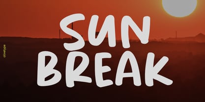 Sunbreak is a bold handwritten font, carefully handcrafted to become a true favorite. Its casual charm makes it appear wonderfully down-to-earth, readable, and ultimately, incredibly versatile. Sunbreak will look outstanding in any context, whether it’s being used on busy backgrounds or as a standalone headline! This font is supporting Multi-Languages, which includes: Afrikaans Albanian Catalan Danish Dutch English Estonian Finnish French German Italian Norwegian Portuguese Spanish Swedish Zulu.
 - P22 Sweepy Pro by IHOF,
$39.95 Sweepy is based on his popular Pooper Black but it is lighter and has connecting letters. Sweepy is a brush script that is casual and fluid. In the expanded OpenType version Sweepy is loaded with over 50 alternate characters and ligatures that offer more flexible lettering options. (Sweepy Basic includes 230 glyphs, Sweepy Pro includes 462 glyphs.)
 - Kelvinized - 100% free

- BN Machine - Unknown license

- BN Kuktus - Unknown license

- BN Smash - Unknown license

- Wanker - Unknown license

- Pistol Script by Alphabet Agency,
$17.50 Pistol Script is a beautiful decorative italic script font. The font is ideal for use in vintage and hipster themes. The font offers a versatile numbers of alternative characters and discretionary ligatures that provides many design options and possibilities. The font includes basic Latin characters; uppercase, lowercase, numbers, punctuation, international Latin characters, many alternative characters and discretionary ligatures (over 250 characters)
 - Asphodelª - Unknown license

- Six Pounder by Crumphand,
$20.00 Introducing, Sixpounder Fonts. inspired by indonesian Tribes, Tatto and Poster band. easy to read, easy access to opentype. What's Included The Fonts ? Uppercase Lowercase Symbols Numbers Stylistic Set 1 Stylistic Set 2 Stylistic Set 3 Stylistic Set 4 European Multilingual Thank You, Regards!
 - Pure Psychedelia by Mysterylab,
$19.00 For a versatile timeless look that's sure to bring any groovy graphic idea to life, we have dubbed this offering: Pure Psychedelia. This condensed font is shot through with twin strands of modernized Art Nouveau and reimagined 1960s psych. This classic stylistic mélange is distilled down to a heady mix of hippy-trippy lava lamp blobs and assertively pointy end tapers, for a unique vibe and a dynamic linear flow.
 - Galant - Personal use only

- Manticore - Unknown license

- Dynasty by Device,
$39.00 Dynasty is an extensive and versatile family that exploration and modernisation of the typographic quirks associated with the 'American Gothic' type school (in much the same way as English Grotesque was an exploration of Gill/Johnston idea-space) and adds chamfered elements to dots and tails to emphasise and extend the early machine-made aesthetic. Elegantly clean and readable at headline and small text settings, where (as with all fonts in small sizes) the introduction of tracking will improve legibility.
 - Borris Romance by Zamjump,
$13.00 Borris Romance a modern sans with simple, clean, and elegance, inspired by the cooperplate pen with tail. Specially designed for elegant-themed projects, perfectly suitable for creating simple, clean, lifestyle design such as logos, title, and magazine and more. The font features standard ligatures.
 - Amarissima by Vasava Fonts,
$30.00 Amarissima is a display font inspired in vintage Italian signs of baker shops. Regardless its crafty inspiration, the construction remains highly mechanical and structured. It has several OT features being the most iconic its contextual alternates that automatically create tails on every single word.
 - BB book B by bb-bureau,
$65.00 A font family in continuation of the bb-book A , also kicking up weight, width and contrast, but upside down. 4 styles: condensed, regular, expanded and ultra-expanded.
 - Kalash by Tomass Gavars,
$7.00 Kalash is minimalistic monospaced font family. Each glyph has eased 45° angled cut and has the right properties to fit with various styles. Combine multiple weights for best results. Each font includes 230 Glyphs & Latin support.
 - Happy Holidays by Comicraft,
$19.00 Back in 2006 when we first released our Happy Holidays font, we thought the War on Christmas was over! We'd taken down our Menorahs, our Christmas trees, reclining Buddhas and red, black and green Kwanzaa decorations, and were prepared to sprinkle nothing more than a little Season's Greetings over our end of year celebrations. When we saw our friends and neighbors at department stores, we'd greet them with a simple, cordial, non-denominational “Happy Holidays.” But the font showed up at our company party this year having learned over 200 new languages (and, it must be said, a little bit loaded on Stylistic Alternates) in a mood to celebrate EVERYTHING. It was wishing people happy Bodhi Day, Solstice, Festivus, you name it! It even brought (count 'em) THREE new outfits based on the colors of Christmas, Hanukkah and Kwanzaa. So may the designs on the cups of the hot beverages that take you through the long dark coffee break of the soul that stretches from Halloween to Thanksgiving to New Year's Day be a little more festive this year with the refreshed, Remastered, all-inclusive spirit of Happy Holidays!
 - Cavole Slab by insigne,
$22.00 Cavole Slab is a new slab serif, designed in early 2011, that has a strong influence from Dutch typography. The name is an altered form of the Portuguese word for feather, emphasizing the typefaceís soft and friendly character. Slab serifs give this face plenty of impact and make it an excellent choice for contemporary designers. The font family includes a very dark and powerful black all the way down to a hairline thin weight, giving a tremendous versatility. The family also features dynamic italics that add plenty of emphasis and momentum. Cavole Slab is suitable for both headline and text settings and should easily find its place in a number of different settings, from corporate identity to magazine body copy. There are six weights that come with complementary italics, and each font includes over 450 characters and extended Latin-based language support. The typeface family comes in OpenType format, and OpenType alternates are easily accessible through OpenType enabled applications such as the Adobe suite or Quark. Please see the informative .pdf brochure to see what OpenType features are available and to see them in action.
 - Conso by Larin Type Co,
$15.00 CONSO is an elegant, modern and contrast sans-serif font family. It includes upright and Italic style, each of them has seven weights from thin to bold. This is a multi-purpose font that is perfect for any project, it is contrasted, modern and easy to read. With it, you can create logos, use in advertising, packaging, book covers and magazines, headings, descriptions and much more. CONSO includes stylistic alternates with a teardrop-shaped tail for uppercase and lowercase, with them, you can change the style of your project and add personality to it and make it more stylized. This font is easy to use has OpenType features.
 - Brightown by MJB Letters,
$24.00 Introducing Brightown, our latest font creation that seamlessly blends authenticity with a contemporary signature style. Crafted to emulate natural hand strokes, this font exudes a casual yet refined demeanor. With additional features such as ligatures, alternates, tail swashes, and underline swashes, 'Brightown' offers a versatile toolkit for creative expression. Ideal for branding, signatures, posters, packaging, stationery, and beyond, this font elevates your design projects with a touch of personalized elegance. Step into a world where your typography speaks volumes – embrace 'Brightown.'
 - Water Splash by Putracetol,
$21.00 Water Splash is a unique display font. This font is inspired by the water splash shape. There are 3 directions for the splash water (direction to the left, up and down and to the right), and they are alternate from this lowercase font. With these variations, it will make it easier for you to create creativity for your project. Water Splash would be perfect for branding, logo, product, title, quotes, doodle, comic, books, greeting cards, toys, posters, baby clothing, picture books, etc.
 - Simple Crush by Bogstav,
$15.00 Simple Crush is my down-to-earth-comic-font with no hassle! Well, actually Simple Crush might take you by surprise here and there - because there is no real rules to height, width, curves and thickness…or whatever. When it comes to Simple Crush, you’re in luck - because Simple Crush is legible and stands out as a strong comic font, ready for action…even though the mission is a party invitation, birthday, poster or products for kids and pets!
 - StyleBats - Unknown license

- Janda Stylish Script by Kimberly Geswein,
$5.00 I love the trends in handwritten calligraphy and wanted to play with playful lettering. I've heard from many of my customers that they don't use Open Type software and feel limited in the cool features of OT scripts because of this, so I've replaced the | (bar key) with a left-sided tail to start the lowercase r and s in words that begin with those letters.
 - Antonia by Typejockeys,
$60.00 Antonia is an original type family of 46 font, 7 weights and 4 optical sizes. Born in the middle of the Alps, Antonia is as modern as it is down to earth. The multi-variant package includes text, display, and italic styles, looking crisp and perfect in all sizes and applications. Antonia is our first release available in Variable font format.
 - Mr Eaves Modern by Emigre,
$59.00 Mr Eaves is the often requested and finally finished sans-serif companion to Mrs Eaves, one of Emigre’s classic typeface designs. Created by Zuzana Licko, this 2009 addition to the Emigre Type Library expands the versatility of the original Mrs Eaves with two complimentary families: Mr Eaves Sans and Mr Eaves Modern. Mr Eaves was based on the proportions of Mrs Eaves, but Licko took some liberty with its design. One of the main concerns was to avoid creating a typeface that looked like it simply had its serifs cut off. And while it matches Mrs Eaves in weight, color, and armature, Mr Eaves stands as its own typeface with many unique characteristics. The Sans version relates most directly to the original serif version, noticeably in the roman lower case letters a, e, and g, as well as in subtle details such as the angled lead in strokes, the counter forms of the b, d, p, and q, and the flared leg of the capital R, the tail of the Q. The distinctly loose-fitting letter spacing of Mrs Eaves was applied also to the Sans version. This, together with generous built-in line spacing due to a small x-height and extended ascenders and descenders, renders the same kind of lightness and airiness when setting text that is so characteristic of Mrs Eaves. Deviations from the original Mrs Eaves are evident in the overall decrease of contrast, as well as in details such as the flag and tail of the f and j, and the finial of the t, which were shortened to maintain a cleaner, sans serif look. And the lower case c had to be balanced out differently after it lost its top ball terminal. And with the loss of serifs, Mr Eaves set width is slightly narrower. Mr Eaves Italic also carries over many forms from its Mrs Eaves model, most notably the v, w, and z, which are unusually flamboyant for a sans italic design. It also utilizes lead in and terminal tails that are reminiscent of the serif italic. The biggest departure here is the width of the characters. The extra narrow gauge and delicate features seemed more appropriate for the Serif than the Sans. To allow for a comfortable fit, Mr Eaves Italic has a more robust design and wider character width. Meanwhile, the Modern family provides an overall less humanistic look, with simpler and more geometric-looking shapes, most noticeably in the squared-off terminals and symmetric lower case counters. This family has moved furthest from its roots, yet still contains some of Mrs Eaves’ DNA. The Modern Italic is free of tails, and overall the Modern exhibits more repetition of forms, projecting a cleaner look. This provides stronger differentiation from the serif version whenever a more contrasting look is desired. Each version (Sans and Modern) contains its own set of alternates providing unique options for applications such as headlines, word logos, letterheads, pull quotes, and other short text settings. Both the Sans and Modern come in six weights. The simpler forms of a sans-serif provide the opportunity of more weights than do serif letter forms, which are more complex in structure, making it difficult to accommodate additional weight without distortions. Regular and Bold match the original Mrs Eaves weights, while the Heavy provides an additional weight for extra emphasis.
 - Mr Eaves Sans by Emigre,
$59.00 Mr Eaves is the sans-serif companion to Mrs Eaves, one of Emigre’s classic typeface designs. Created by Zuzana Licko, this 2009 addition to the Emigre Type Library expands the versatility of the original Mrs Eaves with two complementary families: Mr Eaves Sans and Mr Eaves Modern. Mr Eaves was based on the proportions of Mrs Eaves, but Licko took some liberty with its design. One of the main concerns was to avoid creating a typeface that looked like it simply had its serifs cut off. And while it matches Mrs Eaves in weight, color, and armature, Mr Eaves stands as its own typeface with many unique characteristics. The Sans version relates most directly to the original serif version, noticeably in the roman lower case letters a, e, and g, as well as in subtle details such as the angled lead in strokes, the counter forms of the b, d, p, and q, and the flared leg of the capital R, the tail of the Q. The distinctly loose-fitting letter spacing of Mrs Eaves was applied also to the Sans version. This, together with generous built-in line spacing due to a small x-height and extended ascenders and descenders, renders the same kind of lightness and airiness when setting text that is so characteristic of Mrs Eaves. Deviations from the original Mrs Eaves are evident in the overall decrease of contrast, as well as in details such as the flag and tail of the f and j, and the finial of the t, which were shortened to maintain a cleaner, sans serif look. And the lower case c had to be balanced out differently after it lost its top ball terminal. And with the loss of serifs, Mr Eaves set width is slightly narrower. Mr Eaves Italic also carries over many forms from its Mrs Eaves model, most notably the v, w, and z, which are unusually flamboyant for a sans italic design. It also utilizes lead in and terminal tails that are reminiscent of the serif italic. The biggest departure here is the width of the characters. The extra narrow gauge and delicate features seemed more appropriate for the Serif than the Sans. To allow for a comfortable fit, Mr Eaves Italic has a more robust design and wider character width. Meanwhile, the Modern family provides an overall less humanistic look, with simpler and more geometric-looking shapes, most noticeably in the squared-off terminals and symmetric lower case counters. This family has moved furthest from its roots, yet still contains some of Mrs Eaves' DNA. The Modern Italic is free of tails, and overall the Modern exhibits more repetition of forms, projecting a cleaner look. This provides stronger differentiation from the serif version whenever a more contrasting look is desired. Each version (Sans and Modern) contains its own set of alternates providing unique options for applications such as headlines, word logos, letterheads, pull quotes, and other short text settings. Both the Sans and Modern come in three weights. The simpler forms of a sans-serif provide the opportunity of more weights than do serif letter forms, which are more complex in structure, making it difficult to accommodate additional weight without distortions. Regular and Bold match the original Mrs Eaves weights, while the Heavy provides an additional weight for extra emphasis.
 - Carnegie Classic by Wilton Foundry,
$59.00 Carnegie Classic differs from Carnegie 1 & 2 in that the capital letters are larger in height; several connecting strokes and letter shapes have also been refined. Classic also has many more ligatures and is only available in Open Type. Like Carnegie 1 & 2, Classic is a based on my own functional hand lettered calligraphy. Characters are disciplined yet fluid and spontaneous, creating a unique overall texture that is visually very pleasing. Carnegie Classic is ideally suited for wedding and event invitations, certificates, maps, menus, place cards, announcements, memorial documents, titles, testimonials, birth and death certificates, etc. In the gallery is a an image with all the ligatures available in Open Type.
 - Evanston Alehouse by Kimmy Design,
$10.00 Evanston Alehouse is the first font in a larger collection of typefaces inspired by years leading up to the American prohibition. For the past two years I was living in Evanston, IL, a suburb of Chicago. After learning it was one of the birthplaces of the prohibition movement, I set out to learn more about it, and decided to develop a type collection that captures the dynamic era in our nation’s history. In the century that prefaced the ratification of the 18th amendment, saloons, taverns and alehouses boomed as the American working class enjoyed beer and discovered whiskey and gin. At the same time, the Temperance League was forming and gaining strength. By the turn of the century, these temperance societies were common in the culture of the country, with individual towns and states already on the move to abolish alcohol consumption. However, it was undeniable that by this time in history, America loved to drink. This font is inspired by the signage seen outside such drinking establishments. Back to the modern era, Evanston Alehouse is a 25 font family that includes 3 weights, 4 widths and 3 heights. It has special features that add depth to the font, with discretionary ligatures and stylistic alternatives. It also includes a complementary set of ornaments, including line breaks, frames, borders, and laurels. Here’s a snapshot of what you get with Evanston Alehouse: 2 Styles/Postions: Sharp (regular) and Round 3 Weights: Light, Medium and Black 4 Widths: 1826 (condensed), 1858 (narrow), 1893 (wide) and 1919 (expanded) 3 Heights: Capitals, lowercase and small caps 2 Alternatives: Discretionary Ligatures and Stylistic Alternatives 1 Ornament font with over 100 graphic extras
 - Ein Schwein - Unknown license


