10,000 search results
(0.046 seconds)
- Aftershock Debris CondSolid - Unknown license

- Aftershock Debris Condensed - Unknown license

- Y2k Subterran Express KG - Unknown license

- Will-Harris - Unknown license

- Fordham JNL by Jeff Levine,
$29.00 Fordham JNL is a slab serif typeface in regular and oblique versions that has a casual, informal look reminiscent of 50s and 60s-era ad headlines.
 - Rightly So NF by Nick's Fonts,
$10.00An entry in the Palmer and Rey 1884 specimen book named, somewhat prosaically, Geometric Gothic provided the inspiration for this rectilinear romp through the alphabet. As apt as it is for a period piece of its time, it's also oddly and equally comfortable in a retro space-age environment. Both versions include complete Latin 1252, Central European 1250 and Turkish 1524 character sets, with localization for Moldovan, Romanian and Turkish. - Numancia NF by Nick's Fonts,
$10.00This elegant and somewhat edgy typeface is a faithful revival of Numantina, designed by Carl Winkow amd released by Madrid's Fundición Tipográfica Nacional in the 1940s. The lowercase letters take their design cues from medieval Spanish uncial lettering, making this face a natural choice for intriguing headlines and subheads. Both versions feature the complete Latin 1252, Central European 1250 and Turskish 1254 character sets, with localization for Lithuanian, Moldovan and Romanian. - Quieta by Italiantype,
$39.00 Quieta is a humanist serif typeface inspired by the aesthetics of Italian Renaissance and by the empowering history of the painter Artemisa Gentileschi, first woman to be admitted to an Academy of Fine Arts in Italy. The designer, Maria Chiara Fantini, has used sharp flat-nib calligraphic strokes to add a vibrant contemporary vibe to the traditional humanist proportions. Classical details (such as the beak of the “e” and the angled stress of the “o”), are balanced by a modern and readable low-contrast design, developed in a range of six weights with a matching set of true italics. A Display weight, with lighter shapes and stronger contrast has been developed excel in logos, headlines and captions. The wide array of alternate, decorative and swash glyphs and the full coverage of over 200 extended latin languages make Quieta a solid, highly readable and elegant typeface perfect for body text both on the screen and on the printed page. Graceful and powerful at the same time, this typeface family is ready to help you when in need of the timeless appeal of a self-conscious feminine elegance.
 - Caballero by Fabio Godoy,
$29.95 Typographical Caballero is a family created by Fabio Eduardo Godoy Angel, the concept is inspired by a type with firm and clear, with perfect posture and personality to be used by Graphic Designers and Architects, in terms of print, TV Corporate Identity, Merchandising - Other Projects. Ideal for antetétulos, titles, subtitles, texts from 12 Pts. Caballero Outline and Caballero Outline Italic, are presented as an option for antetétulos, titles and subtitles as well as short texts from 20 Pts. Caballero in his presentation Outline, allows wide range of applications in regard to the use of color, and be combined with Caballero Regular and Caballero Italic. Font Project Caballero, is set with a vertical and horizontal logic calligraphic lines, amount of contrast medium, antlers mullet and its completions are straight.
 - Point by Ndiscover,
$29.00 Point™ aims to be an epitome of the Geometric Style. Inspired by intemporal classics such as Futura, Avant Garde or Avenir, passing through more contemporary approaches of the same style; ignited by the overarching narrative of the Modernity (Perfect Geometric Shapes) and careful design decisions, Point™ is a font that references the past as well as projects itself to the contemporaneity. With a total of 10 weights, with respective hand adjusted obliques, Point™ has a total of 20 styles with Extended Latin support as well as Cyrillic, all with the most needed Opentype features, such as fractions, tabular and oldstyle figures, alternates, case sensitive forms, etc. Point™ has a superb versatility and can be used in almost every circumstance, try it for yourself and see what point Point™ makes.
 - Bleak by Andinistas,
$34.00 @andinistas presents Bleak , an experimental font designed by #carlosfabiancg. Bleak is based on the imaginative use of contrast applied in the empty space and on the dramatic distributions of the wide and compressed horizontal of more than 400 textured symmetric capitals inspired by compositions of the Lissitzky, Theo van Doesburg, among others. In the Europe of the 20s, scarce resources prevailed, which gave these great artists the firm determination and dedication to create a visual vocabulary, characteristic of the composition with movable types of wood and metal. As they did not readily dispose of the forms of the letters they required, they did not hesitate to construct them with metal rulers, ornaments and other improvised pieces and remains and obtained in the forgotten corners of the typographic composition workshop.
 - Farmhouse by Victory Type,
$20.00Farmhouse is a rustic serif typeface that was inspired by the woodcarved store signs on Main Street in a quaint little village nearby. Farmhouse is based upon the shapes of Baskerville but has a unique rustic character all its own. - Adoha by Letterena Studios,
$17.00 Proudly present Adoha Typeface. A modern and classic serif typeface featuring its own unique style & modern look. This typeface is perfect for an elegant & luxury logo, book or movie title design, fashion brand, magazine, clothing, lettering, quote, and so much more.
 - Dishta Bikailen by Letterena Studios,
$17.00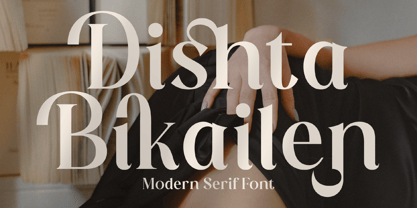 Dishta Bikailen is a serif modern and classic typeface that has its own unique style & modern look. This typeface is perfect for an elegant & luxury logo, book or movie title design, fashion brand, magazine, clothes, lettering, quotes, and so much more.
 - Romalika by Letterena Studios,
$17.00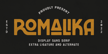 ROMALIKA is a serif modern and classic typeface that has its own unique style & modern look. This typeface is perfect for an elegant & luxury logo, book or movie title design, fashion brand, magazine, clothes, lettering, quotes, and so much more. **Uppercase
 - Abstract by Los Andes,
$29.00 Abstract is a contemporary and eclectic serif typeface inspired by today's life and created in times of pandemic. This family includes a true italic variant —that has its own personality— alternates, lining and old style figures, numerators and denominators & Cyrillic support.
 - Uplift by Fontop,
$11.00Uplift is a modern serif typeface with its own character and charisma. Works cool both when used in headlines, magazines, pull quotes and also in branding, unique logos, etc. Uplift comes with multilingual support also and also feature stylistic alternates. - Huntsman by Solotype,
$19.95Issued from the Haddon Foundry in England. Most of their original faces had names beginning with H, like their own name. Some of their types were designed by Phil May, but we cannot guarantee that this is one of them. - Alexander Quill by Canada Type,
$24.95 Alexander Quill was originally designed in the early 1980s to be cut in 14 point for casting into foundry type for the setting and printing of limited edition books at Pie Tree Press, Jim Rimmer's private sanctum. This alphabet exhibits traditional calligraphic tension, which helps its simple, somewhat octagonal forms play well together for an easy read. Its setting expresses a dramatic sense of history or fantasy. Alexander Quill was updated and remastered for the latest technologies in 2012. It comes with plenty of built-in alternates, a glyphset of over 410 characters, and supports the majority of Latin-based languges. 20% of this font's revenues will be donated to the GDC Scholarship Fund, supporting higher typography education in Canada.
 - OL Hebrew Cursive by Dennis Ortiz-Lopez,
$30.00 This font contains every variant found in the Hebrew Bible such as the “mutilated” Waw in Numbers 25: verse 12, the small Heh in Genesis 2: verse 4 and the Nun Inversum before Numbers 10: verse 35 and after verse 36 and elsewhere as well as oversized consonants and various double-wide consonants used in inscriptions.
 - OL Hebrew Formal Script by Dennis Ortiz-Lopez,
$30.00 This font contains every variant found in the Hebrew Bible such as the “mutilated” Waw in Numbers 25: verse 12, the small Heh in Genesis 2: verse 4 and the Nun Inversum before Numbers 10: verse 35 and after verse 36 and elsewhere as well as oversized consonants and various double-wide consonants used in inscriptions.
 - OL Hebrew Formal Script With Tagin by Dennis Ortiz-Lopez,
$30.00 This font contains every variant found in the Hebrew Bible such as the “mutilated” Waw in Numbers 25: verse 12, the small Heh in Genesis 2: verse 4 and the Nun Inversum before Numbers 10: verse 35 and after verse 36 and elsewhere as well as oversized consonants and various double-wide consonants used in inscriptions.
 - GDR Traffic Symbols by TypoGraphicDesign,
$9.00 The typeface GDR Traffic Symbols is designed from 2021 for the font foundry Typo Graphic Design by Manuel Viergutz. The rough dingbat display typeface is inspired by the past and the future. 306 glyphs / decorative extras like icons, arrows, dingbats, emojis, symbols, geometric shapes, catchwords, decorative ligatures (type the word #LOVE for ❤ or #SMILE for ☺ as OpenType-Feature dlig) and stylistic alternates (5 stylistic sets). For use in logos, magazines, posters, advertisement plus as webfont for decorative headlines. The font works best for display size. Have fun with this font & use the DEMO-FONT (with reduced glyph-set) ■ Font Name: GDR Traffic Smybols ■ Font Styles: 1 Icons + DEMO (with reduced glyph-set) ■ Font Category: Display for headline size ■ Glyph Set: 306 glyphs / decorative extras like arrows, dingbats, emojis, symbols ■ Design Date: 2021 ■ Type Designer: Manuel Viergutz
 - Blackberry by Los Andes,
$25.00 Blackberry is a display typographical family inspired on the design of vintage packaging, old fashion ads and show business marketing campaigns. This font brings back Woodtype characteristics such as angular serifs, and light and diagonal curves, which make it a fresh and current proposal for contemporary design needs. Blackberry has a dynamic system of layers that include 3D extrusions, shadows, outline and inline graphics, as well as a series of dingbats and flags. The system is supported for over 200 Latin-based languages. In total, the 10 Blackberry fonts provide a wide array of combinations and possibilities for high impact graphics, such as labels, packaging, posters, branding, record and movie covers, among others.
 - Nixin by Kinobrand,
$33.00 A nixie tube is a technology from the 50’s used to display numerals that are composed by metal filaments that light up much like a lamp bulb. Due to their beauty these little numerals (0-9) are a love case for any designer, and formally it’s where the inspiration for the Nixin typeface came from. All the other typeface characters and weights are an interpretation from the original 10 numerals, always keeping the same minimalistic spirit and formal elegance. Nixin is a geometric and regular typeface, with a vintage touch and a bit of modernism.
 - Contane Condensed by Hoftype,
$49.00 Contane Condensed is the slim complement to the Contane Family. Its economic proportions permit space saving applications, in particularly, eye catching headlines and subheads. Contane Condensed is high-contrasted, and the spiky wedge shaped serifs, still result in an elegant text flow. Contane supports up to 80 languages and it’s OpenType format allows a wide range of typographic applications. 20 styles offer fine graduation of the weights. All weights contain small caps, ligatures, superior characters, proportional lining figures, tabular lining figures, proportional old style figures, lining old style figures, matching currency symbols, fraction- and scientific numerals, matching arrows and alternate characters.
 - Mouse Memoirs Pro by Stiggy & Sands,
$29.00 Our Mouse Memoirs Pro was inspired by vintage Mickey Mouse, Beagle Boys, and Uncle Scrooge comic books put out by Walt Disney in the 50's and 60's. It nods to the Disney aesthetic with an all-around fun personality and truly animated look. The chipper letterforms engage the audience, while the SmallCaps and extensive figure sets expand the scope of use. Opentype features include: - SmallCaps. - Full set of Inferiors and Superiors for limitless fractions. - Tabular, Proportional, and Oldstyle figure sets (along with SmallCaps versions of the figures). - Stylistic Alternates for Caps to SmallCaps conversion.
 - Korolev Rough by Device,
$39.00 Korolev Rough is an inky, distressed version of Korolev , designed to mimic vintage letterpress, photocopies or hot metal on rough paper. A 20-weight sans serif family based on lettering by an anonymous Soviet graphic designer from the propaganda displays at the Communist Red Square parade in 1937, it has been named in honor of Sergey Pavlovich Korolyov, or Korolev, considered by many to be the father of practical astronomics. Every weight and style comes with an alternate double-story “a”. The complete Korolev family includes standard, italic, condensed, and compressed versions, each in five weights.
 - Empira by Hoftype,
$49.00 Empira is a new high-contrasted face. While its principal structure shows some reference to transitional faces, the pronounced graphic shape of its elements are definitely of contemporary origin. It appears crisp, sharp and even somewhat fancy. Empira supports up to 80 languages and its OpenType format allows a wide range of typographic applications. 20 styles offer a fine gradation of the weights. All weights contain small caps, ligatures, superior characters, proportional lining figures, tabular lining figures, proportional old style figures, lining old style figures, matching currency symbols, fraction- and scientific numerals, matching arrows and alternate characters.
 - Alien League - Unknown license

- Absentia Serif by DR Fonts,
$19.00 The Absentia collection welcomes this modern serif option to broaden its typographic horizons and offer designers greater versatility. The new member shares the traits and proportions that sets this family apart, such as the truncated capital ‘A’ apex, the calligraphic ‘l’ and the distinctive ‘g’. Yet Absentia Serif adds its own personality to the mix, integrating forward-looking attributes into traditional letterforms. Laid out as bilateral or one-sided configurations, the transitional serifs help maintain a tight, orderly baseline. The balanced stroke contrast increases in the bolder weights and exudes an elegant appearance. This finely crafted typeface promotes legibility at the smallest sizes and makes it the ideal solution for body text. Available in ten weights with matching italics and two variable fonts, Absentia Serif is loaded with OpenType features such as stylistic alternates, fractions, superscript, subscript, as well as standard and discretionary ligatures.
 - Letterbot by Comicraft,
$19.00 "If you prick me, do I not bleed? If you tickle me do I not laugh? If you poison me do I not DIE? And if you wrong me shall I not REVENGE?" "I am not a TYPEWRITER! I am not a MACHINE! I am -- NOT -- JUST -- a lettering ROBOT! I -- AM -- A -- HUMAN -- BEING!" Having trouble with YOUR lettering artist? LETTERBOT is here to help. Take all the fuss and muss out of dealing with a real person and install this helpful and responsive robotic font. It has no opinions of its own and will assist you in the lettering of your comic without all that tedious human interaction which lettering artists seem to think they're entitled. Designed by John JG Roshell.* *Now obsolete. Features: Four weights (Regular, Italic, Bold & Bold Italic) with upper and lower case alphabets. Includes Western & Central European accents and Cyrillic characters.
 - Rue Display by Winnie Tan,
$29.00 Rue is an organic, casually ornamental, narrow-faced sans serif. It is a display type structured with random traces of calligraphic tendencies. It does not begin with any noble ideals, other than to mediate between the muse of imagination and the act of realization. The spirited and exploratory design is the materialization of a feeling about fonts as a family of organisms taking on a life of its own, in work and play. Rue is the epitome of vanity and indulgence which seems to purpose itself well in aesthetics, wellness and botanicals. Its whimsical quality also suggests applications in the form of gifts and ornamentation. In retrospect, Rue was conceived as a typeface, used as an image and discovered as an ornament. It comes in 5 weights of light, regular, medium, semibold and bold, and their matching italics. Rue Display was published in 2010 by TypeTogether. http://www.behance.net/gallery/Rue/373854
 - Ronet by yasireknc,
$10.00 It can be tricky to find typefaces that can convey the feeling of personal warmth that comes from a handwritten note, custom brandings, special series of products, especially as we type more and more and write with a pen or pencil less and less. To add some more of that warmth to a font, I’ve made Ronet. A duo font based on the my handwriting. Double eponymous styles of the font —Ronet and Ronet Alternative— each have a unique flavor with its own rhythm and character. It can be used on branding designs, product labels, invitation cards, social purposes which is bloggers, influencers but they were capable of so much more, and I’m happy to share them for general use. Ronet has extraordinary alternative characters, that makes these fonts so impressive. These two styles have dynamic substitution, alternates, and beautiful kerning! Nevertheless, they each support an impressive range of languages using the Extended Latin alphabets and because they were designed to work well in a simple tool, a rare feature of these fonts is that they look just as good no matter where you use them. LOTS of writing, and then even more care once I developed and refined digital outlines from the samples. Ronet and Ronet Alternative each wrote pages and pages of letters to produce lots of examples for comparison and selection, in order to get the most authentic overall texture that captured the spirit of my left hand.. Ronet feels friendly and personal, like a neighbor or local shopkeeper who always seems happy to see you. This will perk up your social feeds in a snap. Start with Ronet and just add in your design to make it perfect. What started with a simple pen and paper has become a diverse and ever-expanding creative outlet that blends hand-drawn creativity with cutting-edge technology — and the end results are popping out everywhere, from advertising to design and decor to art and DIY.
 - Hangulatin EN by URW Type Foundry,
$99.99 To obtain maximum pleasure in working with Hangulatin, please use the typeface as follows: 1 Open an OpenType-savvy program 2 Select the "Hangulatin“ typeface. 3 Copy the following test text into your document: HEL LO WORLD ! THE QUICK BROWN FOX JUMPS O VER THE LA ZY DOG . If this fails to bring about the desired result, please make sure that you are using an OpenType-savvy program and that usage of the OpenType features is activated in that program. Standard graphic programs are suited to that purpose. The same applies to Microsoft Word starting from the 2010 version upwards.To have fun and success with your new typeface, please write all words in the format shown in the sample text, i.e. all syllables need to be written in capital letters and separated from one another using spacecharacters (for single letters leave 2 spaces). If, however, a desired syllable is not to be substituted, proceed as follows: Please check + to see whether it is a word from the English language; + whether the word has been spelled correctly; + whether the word has been subdivided into syllables correctly; + whether the syllable has been terminated with a space character (allow 2 spaces for single letters).
 - The Cartel by Say Studio,
$12.00 About the Product The Cartel is a elegant serif font . This typeface has been made carefully to make sure its premium quality and luxury feel. The ligatures makes this typeface unique and stands out rather than the regular serif font. Very suitable for logo, headline, tittle, and the other various formal forms such as invitations, labels, logos, magazines, books, greeting / wedding cards, packaging, fashion, make up, stationery, novels, labels or any type of advertising purpose. Features : numbers and punctuation multilingual ligatures alternates PUA encoded FAQ's : Where are the TTF's? They are included in a download link( in a text file) in your main download file. 1 user 2 computers installation (Desktop License) You may NOT use for broadcast or Cinema/Motion Picture. You may NOT resell this font in any platform without further permission from designer. Do NOT embed font files in app/game/e-pub (for desktop license) You may NOT use the fonts in templates for sale/free. ( web/print/app ) For other license use please contact us. SOFTWARE REQUIREMENTS : Fonts and alternate : No special software required they may be used in any basic program /website apps that allows standard fonts That's it folks! You can go ahead and get cracking :) Follow My Shop For Upcoming Updates Including Additional Glyphs And Language Support. And Please Message Me If You Want Your Language Included or If There Are Any Features or Glyph Requests, Feel Free to Send me A Message. Have a Good Day !
 - 1557 Civilité Granjon by GLC,
$42.00 Living from 1545 in Lyon, France, the famous punchcutter Robert Granjon created a typeface that looked like his own handwriting. The first book printed with this font, in 1557, was probably Dialogues de la vie et de la mort by Innocent Ringhier. We offer the complete typeface. It is a charming font with historical forms (long s, final s and others) and many ligatures, enriched with accented letters and other characters that did not exist in the original (thorn, eth, lslash and others), and a lot of alternates that permit rich and varying typography. Warning: all characters appear with the 1500s manual blackletter old style, especially letters “e” “r” or “h” alternate and some ending forms, and may be difficult to read at first, but it quickly becomes very easy. The font contains all characters for Baltic, Western European (Including Celtic), Eastern European, Northern European, and Turkish languages.
 - Grauna by Typeóca,
$40.00 Graúna is Typeóca’s first ‘serious typeface’. The idea was to produce a revival of Block Heavy, removing the ‘rough’ texture from its outline. Though other revivals existed, most of them approached the Block family as a whole, leaving aside the idiosyncrasies that make the Heavy weight so unique. In the early stages of its development, however, we realized that a lot of its quirkiness is only possible precisely because of the ‘rough’ texture we were trying to remove. That way, we started going further and further away from the original model, and thinking about the typeface in its own terms, resulting in an impactful yet friendly sans serif, ideal for logos and short titles.
 - Companion Old Style by Matteson Typographics,
$19.99 A unique design accurately revived by Steve Matteson in 2021. Frederic Goudy designed Companion Old Style for Women’s Home Companion in 1928. In his own words: “I believe the new letter I showed him, both in roman and italic, is one of the most distinctive types I have ever made. It incorporates features which deliberately violate tradition as to stress and curves, but which are so handled that attention is not specifically drawn to the innovations introduced.” Companion Old Style exudes the style of pre-World War 2 Americana. The unique characteristics are wonderful for greeting cards, wedding announcements and holiday invitations. Companion’s nostalgic letterforms are light hearted and quirky yet highly readable.
 - Gloss by Typodermic,
$11.95 Are you ready to unleash your inner punk fashionista? Look no further than Gloss, the ultimate typeface for anyone who wants to make a statement. With its roots in Champion, a classic metal script from the ’50s, Gloss combines vintage vibes with a modern twist. But don’t be fooled by its retro origins—this font is anything but ordinary. Thanks to OpenType ligatures, each paint drip in Gloss is unique and unpredictable, adding a touch of spontaneity to your designs. And when set on an incline, the slightly skewed letters make a bold and dramatic statement. But what really sets Gloss apart is its trashy fashion edge. With a twice-recycled look that blends the best of the ’50s and ’80s, Gloss is the perfect choice for anyone who wants to embrace their inner rebel. So why settle for ordinary when you can make a splash with Gloss? Whether you’re designing a poster, creating a logo, or just looking to add some edge to your typography, Gloss is the ultimate choice for anyone who wants to stand out from the crowd. Most Latin-based European writing systems are supported, including the following languages. Afaan Oromo, Afar, Afrikaans, Albanian, Alsatian, Aromanian, Aymara, Bashkir (Latin), Basque, Belarusian (Latin), Bemba, Bikol, Bosnian, Breton, Cape Verdean, Creole, Catalan, Cebuano, Chamorro, Chavacano, Chichewa, Crimean Tatar (Latin), Croatian, Czech, Danish, Dawan, Dholuo, Dutch, English, Estonian, Faroese, Fijian, Filipino, Finnish, French, Frisian, Friulian, Gagauz (Latin), Galician, Ganda, Genoese, German, Greenlandic, Guadeloupean Creole, Haitian Creole, Hawaiian, Hiligaynon, Hungarian, Icelandic, Ilocano, Indonesian, Irish, Italian, Jamaican, Kaqchikel, Karakalpak (Latin), Kashubian, Kikongo, Kinyarwanda, Kirundi, Kurdish (Latin), Latvian, Lithuanian, Lombard, Low Saxon, Luxembourgish, Maasai, Makhuwa, Malay, Maltese, Māori, Moldovan, Montenegrin, Ndebele, Neapolitan, Norwegian, Novial, Occitan, Ossetian (Latin), Papiamento, Piedmontese, Polish, Portuguese, Quechua, Rarotongan, Romanian, Romansh, Sami, Sango, Saramaccan, Sardinian, Scottish Gaelic, Serbian (Latin), Shona, Sicilian, Silesian, Slovak, Slovenian, Somali, Sorbian, Sotho, Spanish, Swahili, Swazi, Swedish, Tagalog, Tahitian, Tetum, Tongan, Tshiluba, Tsonga, Tswana, Tumbuka, Turkish, Turkmen (Latin), Tuvaluan, Uzbek (Latin), Venetian, Vepsian, Võro, Walloon, Waray-Waray, Wayuu, Welsh, Wolof, Xhosa, Yapese, Zapotec Zulu and Zuni.


