10,000 search results
(0.17 seconds)
- Churchward 69 by BluHead Studio,
$25.00 Churchward 69 is a ten weight typeface family originally designed during the late 1960’s by the late type designer Joseph Churchward. From the extremely condensed Regular weight to the outlandishly heavy Ultra Black, this square sans serif makes an audacious statement. Even the Italics are extreme at their 17 degree angle! Churchward 69 includes 5 weights, Regular, Bold, Extra Bold, Black, and the gorgeous Ultra Black, and their italics. Joseph sure knew how to draw heavy weights! All members of the Churchward 69 family have OpenType features, including proportional and tabular figures, unlimited fractions, superior and inferior figures, and ordinals. Each font also has an extensive character set to support many western European languages.
 - Qene G by Balibilly Design,
$21.44 Say hello to Qene-G Typeface, Qene-G is based on a problem that often occurs when I design, which is to combining typefaces in typographic art. I am pretty sure you also in this problem, so Qene-G Typeface comes to solve the problem. Qene-G is a complete package consisting of serif fonts and signature scripts. A careful approach makes this font give a luxurious and elegant taste to your project. Smooth curves, some flowy terminals, and flirty tails will make your project looks unique. The handmade signature combination emphasizes the style that you create in the natural beauty atmosphere. Qene-G consists of 5 families, they are Qene-G-Regular, Qene-G-Regular Italic, Qene-G-Outline, Qene-G-Outline Italic, and Qene-G-Script. You will get all caps letters with 2 styles that you can access via uppercase and lowercase buttons, charming script fonts, and tons of ligatures and stylistic alternates. Complete with Unicode and PUA which allows you to access all features without graphic design software. Your project will travel around the world with 131 languages of this font. Qene-G is a strikingly versatile font, It is a bold choice for branding projects, fashion magazine imagery, social media text overlays, posters, website headers, and more. Let's start creating stand out designs with this font. We are pleased to tell you about our newest product made with totality, please CLICK HERE
 - CA Texteron by Cape Arcona Type Foundry,
$40.00 CA Texteron is a modern text font family to cover the most common typographical needs with a minimum of weights. It is aiming for a serious but unconventional look, which is achieved by combining round and edgy forms in the same font, often in the same glyph, and by using Humanist and modern form-principles at the same time. It merges classical type-design with an experimental spirit. CA Texteron combines elements of the dynamic renaissance principle with the static neo-classic style, which makes it hard to classify. The result is a post-modern hybridization. The Regular weight works best in text size, and with more letter-space also for footnotes. The low contrast makes it robust and legible even in very small sizes. Bold, Italic and Small Caps are intended for emphasis. Bold, Bold Italic and Heavy make good headlines, that reveal the unconventional details. The Italic is not just a slanted version of the Regular weight but has individual forms and typical italic characteristics.
 - Calligraphica by Monotype,
$49.00Calligraphica was designed because there are very few inline fonts, and even fewer inline calligraphic fonts. The original forms were written with a split pen in a single stroke. The minuscules have a rougher look and the capitals have a smoother shape to imitate hand written calligraphy with more formal, decorative initial caps. The Calligraphica family contains 6 fonts: Calligraphica Regular and Italic are the regular upright roman true italic version of the font. The ascenders on this font are a bit higher than the capital letters--this is standard for most fonts. Calligraphica LX Regular and Italic are similar to the first 2 fonts except their ascenders are longer and reach high above the capital letters--giving these fonts a taller appearance. Calligraphica SX Regular and Italic are similar to the first 2 fonts except their ascenders are shorter and are the same height as the capital letters--giving these fonts a shorter appearance. - 1543 Humane Petreius by GLC,
$42.00 The regular style of this family was inspired from the typeface used in Nuremberg, Germany, by Johannes Petreius in 1543 to print the famous “De Revolutionibus Orbium Coelestium,” the well-known mathematical and astronomical essay by Nicolaus Copernicus. Petreius was also using an original italic style, as he did for the “De Sculptura” by Gaurico Pomponio, in 1542. Unfortunately, nobody seems to know who was the punchcutter of this Jenson-style font. Also included is a title file, containing initials (without diacritics) and small caps (with diacritics). In our three styles (Regular & Italic + Titling), font faces, kerning and spacing are as closely as possible identical to the original. This Pro font is covering Western, Eastern and Central European, Baltic and Turkish languages, with standard and long-s ligatures in regular and italic styles. Both have twin-letter ligatures, but the italic style has extra (genuine) ligatures for f and t with vowels.
 - Quars by Letterjuice,
$66.00 Quars is a text and display typeface family designed to work on magazines. However, it is also suitable for books and other editorial material. It has a strong personality with elegant, sharp and contemporary features. This typeface comes from several subtle influences, from the contrast of the Scotch Romans to the sharpness of contemporary Dutch designers. Quars is a crystal clear and neat typeface full of small details, its structure is bursting with curves and accurate features which gives it its firm personality. Its italic experiments with the boundaries of italics themselves; with just 1 degree of slant Quars Italic accomplishes its purpose of highlighting pieces of text within its Roman. This carefully thought out inclination protects the uppercase from the usual distortion which Italic caps suffer. It offers a generous glyph set with many ligatures specially crafted for titling and ornaments based on anonymous metal types found in the drawers of an old printing workshop in a coast town near Barcelona.
 - Clavo by Dada Studio,
$29.00 Clavo was picked for the EXHIBITION CALL FOR TYPE - NEW TYPEFACES and is presented in the Gutenberg Museum in Mainz, Germany. Clavo is a multipurpose font family. Its warmth comes from subtle details, classical proportions and traditional forms, while harmonious structure prevents distraction while reading. This makes Clavo a universal typeface. In all sizes, from caption to display. The family consists of ten weights. They were not created in a linear way. The steps between the weights were adjusted carefully to avoid a mechanical graduation, in favor of optical harmony. Clavo covers all latin languages. It contains a wide set of numerals, small capitals, fractions and other OpenType goodies. And of course every weight comes with matching italics.
 - Sagan by Associated Typographics,
$29.00 Sagan was designed as an alternate to Ramsey ; you could call them brothers. It was drawn, redrawn, and expanded on, to put it lightly. It boasts 770 glyphs in each weight, covering all European languages, and also contains an extended Cyrillic. Sagan provides advanced typographical support with features such as case-sensitive forms, old style numerals, fractions, and many alternate glyphs. Like all of our typefaces, Sagan is fun to use. Sagan has 7 weights, with accompanying italics for each weight, ranging from Extra Light to Black. It is ideally suited for branding, editorials, advertising, packaging, posters, billboards and digital screen design. Sagan will work hard for your brand or project. Make a statement that demands notice.
 - Concasse by Lillan Team,
$9.90 The family comes in five weights from Thin to Black, all with true italics; and a variable file in weight and slant. Concasse is multi-purpose and reads well in body copy, the open shapes ensure excellent legibility in even the smallest text sizes, while the lightest and boldest weights deliver impact to headlines and other display uses.
 - Cagile by Java Pep,
$17.00 Cagile is a family font that comes with 4 styles like regular, italic, semi-bold, and semi-bold font. Cagile presents a minimalist but classy look, all characters are can represent what a project purpose that you want. The font is also nice and standout working for wedding invitations, logo, pull quotes & monograms, headlines, title, and more.
 - DF Staple Mono by Dutchfonts,
$33.00 DF Staple Mono is a personal answer on the archaic and ‘middle-of-the-road’-forms of typewriter typefaces like ‘Courier’ and ‘American Typewriter’. The form of a staple (office supply no. 1) and its transformations inspired me during the design process. The first four weights are all monospaced and are completed with a real italic.
 - Cheraty by Skypia,
$18.00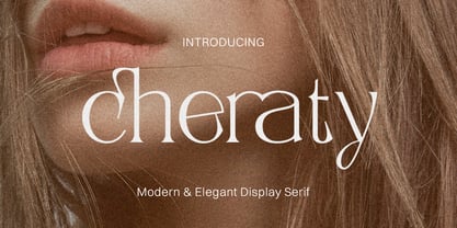 Cheraty - a sophisticated, charming serif with a fashionable touch. Specially designed for luxury, elegant, feminine projects, Cheraty is perfectly suitable for creating modern, chic design such as logos, packaging, editorial, and more. What is included: Cheraty Regular Cheraty Outline Cheraty Italic Features All Uppercase and Lowercase Number & Symbol Supported Languages Alternates and Ligatures PUA Encoded Thank you, Skypia
 - Flacon by jpFonts,
$19.95 Flacon is a friendly, round and soft, yet elegant and extremely versatile typeface family with each seven weights for roman and italic. All fonts have an extended character set including small caps, ligatures and swash letters for better typography. Flacon can be used for texts as well as for headlines, logos, packaging, stationary and much more.
 - Acherus Grotesque by Horizon Type,
$25.00 Acherus Grotesque is a rounded sans serif type family based on geometric forms. It comes in 20 styles, 10 uprights and matching italics. In this version standard greek and cyrillic scripts added plus all glyphs renewed. Each weight includes extended language support, ligatures and more. Acherus Grotesque is incredibly useful for nearly any creative design. Acherus Specimen Behance
 - Etewut Sans by Etewut,
$29.00 Etewut foundry proudly presents Etewut sans family. It includes 20 font styles and each of them supports extended Latin, basic Cyrillic and modern Greece languages. Styles variety is from formal and bold to italic and decorative. More of all there are many ligatures and alternative symbols in each font. And finally the typeface has minuscule letters and numbers!
 - Rolf by MysticalType,
$10.00 Rolf is a modern font of condensed typeface, Rolf is a narrow neutral geometric font designed for headlines and posters. The Italic weights are designed with high-quality compensation for all circles and strokes, made to combine rotalik techniques and details on each slope. Rolf has expanded Latin coverage to be ideal for Western, Central and Eastern European languages.
 - COCOTA by Top Type,
$9.00 Cocota is a sans serif/display font. This font has a gentle and authoritative character. You can use this font to make banners, advertisements, websites, business cards, quotes, and more. The advantages of this font include features such as : Regular, Italic, All Caps, Stylistic Alternate. Cocota is the best choice for you. Don't hesitate to own it.
 - Codeworld by Par Défaut,
$49.00 Codeworld is a geometrical sans serif font family (5 weight, italic and variable) It contains more than 800 characters including the Latin, Cyrillic and Greek alphabet. There are also 13 OpenType features (Superior; Inferior; Numerator; Denominator; Fraction ; Small Capital; Small Capitals from Capitals; Contextual Alternate; Case Sensitive; Access All Alternates; Stylistic Set; Standard Ligature; Discretionary Ligature).
 - Codeworld Mono by Par Défaut,
$49.00 Codeworld Mono is geometrical and monospaced sans serif font family (include 5 weight, italic and variable) It contains more than 800 characters including the Latin, Cyrillic and Greek alphabet There are also 11 OpenType features (Superior; Inferior; Numerator; Denominator; Fraction; Small Capital; Small Capitals from Capitals; Contextual Alternate; Case Sensitive; Access All Alternates; Stylistic Set; Standard Ligature; Discretionary Ligature).
 - Herrmann by driemeyerdesign,
$19.00 Herrmann is a sans serif typeface family. It was especially designed for use in headlines, but it's great legibility also allows for use in longer texts and smaller sizes. The geometrical design gives it a distinct industrial / architectural style. Herrmann comes in 10 styles (thin, light, regular, semibold and bold, all in regular and italic) and has 374 glyphs.
 - Aragon Condensed by Canada Type,
$24.95The condensed version of Hans van Maanen's Aragon is a headline star. The elements that made Aragon a popular "Dutch Garamond" text repeat here, with the slight stress shifts and tapering stems optimized for headline use. Aragon Condensed also comes in bold and italic variations. All three fonts contain extended language support, superiors and inferiors, and class-based kerning. - Lonie by Par Défaut,
$35.00 Lonie is sans serif font family (include 5 weight, italic and variable) It contains more than 1200 characters including the Latin, Cyrillic and Greek alphabet There are also 15 OpenType features (Superior; Inferior; Numerator; Denominator; Fraction; Tabular Lining; ;OldStyle Figure; Small Capital; Small Capitals from Capitals; Contextual Alternate; Case Sensitive; Ordinals; Access All Alternates; Stylistic Set).
 - Chupada by Tipo Pèpel,
$14.00 Chupada is an ultra-condensed font family noted for their exaggerated x-height, which consists of five different weights, accompanied by their italic version. It contains all the central european characters and Cyrillic. Chupada with its bold semi-modular forms make it ideal for use in headlines, posters, titles and anywhere you need for create impact.
 - Feast of Flesh BB - Personal use only

- Extension by Red Rooster Collection,
$45.00Designed by Les Usherwood. Digitally engineered by Steve Jackaman. Many of the weights and the italics were created after Les’ death. - Chardonnay by BA Graphics,
$45.00A beautiful text font that works equally well as a headline font, great for books and magazines. Available with matching Italic. - Glob by Resistenza,
$35.00 Glob is a multilanguage bubble-letter font. ?Includes Italic, outline & a rough version, Check out also Modern Love Slanted - Turquoise - Nautica
 - Sure, let's dive into the delightful world of "Amurg" by Sabina Chipara, shall we? Imagine if the letters you type, instead of falling in line like good little soldiers, decided to throw a little soi...
- Ah, the mighty Tabarra Shadow! Picture this: If fonts were characters at a grand costume party thrown by Typography itself, Tabarra Shadow would arrive fashionably late, decked out in its enigmatic g...
- Terfens Contrast by insigne,
$35.00 Terfens draws influence from chancery scripts, updating it for the twenty-first century. Terfens Contrast is derived from Terfens' DNA and retains its humanist tone. It’s tall x-height gives it a friendly but not informal feel. With Terfen Contrast, calligraphy-inspired letterforms are rendered with a high contrast nib, lending raw vitality and expressivity. This juxtaposition gives the letters a sense of firmness and energy, but also of heavenly, delicate beauty. Terfens is a full-service branding and packaging solution, containing a lot of personality, combining the passion of a broad nib pen with the beauty of a brush. Terfens is a "workhorse typeface" comprising 48 typefaces in three widths and eight weights. There are ligatures and swashes in all weights, as well as support for more than 72 languages. Another powerful typeface to add to your collection of eye-catching fonts. Terfens draws influence from chancery scripts, updating it for the twenty-first century. Terfens Contrast is derived from Terfens' DNA and retains its humanist tone. It’s tall x-height gives it a friendly but not informal feel. With Terfen Contrast, calligraphy-inspired letterforms are rendered with a high contrast nib, lending raw vitality and expressivity. This juxtaposition gives the letters a sense of firmness and energy, but also of heavenly, delicate beauty. Terfens is a full-service branding and packaging solution, containing a lot of personality, combining the passion of a broad nib pen with the beauty of a brush. Terfens is a "workhorse typeface" comprising 48 typefaces in three widths and eight weights. There are ligatures and swashes in all weights, as well as support for more than 72 languages. Another powerful typeface to add to your collection of eye-catching fonts. • Recommended uses: modern branding and logo design, powerful editorial design, exciting packaging, and a wide range of additional jobs. • 54 font styles, including eight weights, eight italics, and three widths. • Each weight has 500+ glyphs. Useful Opentype features include: Access All Alternates, Discretionary Ligatures, Denominators, Fractions, Kerning, Standard Ligatures, Lining Figures, Numerators, Oldstyle Figures, Ordinals, Scientific Inferiors, Subscript and Superscript.
 - Neiva Flowers by Niznaztype,
$15.00 Thanks for checking my font’s work, Neiva Flowers typeface. It’s postmodern script font. Neiva Flowers have a feminism styles and ethnic curves. Very perfect for adding unique and slegant character to your branding project. Also, Neiva Flowers font is suitable for wedding lettering, beautiful touch in your all graphic design. This font have two styles, regular and italic. It contains a full set of lowercase, uppercase, punctuation, numeral and multilingual support. Neiva Flowers typeface also can support your design to be more better. You can use it in lettering, wall painting, cover, advertising, invitation, card, feminism design, script lettering design and more.
 - Linotype Puritas by Linotype,
$29.99The German designers Gerd Sebastian Jakob and Jörg Ewald Meißner developed the Linotype Puritas family in 1999. The family, which has six text styles as well as a ornament set, displays a very geometric design, which harks back to the German modernist experiments with typography and lettering from the 1920s. The letters in Linotype Puritas Light, Linotype Puritas Medium, and Linotype Puritas Bold all have a slight slant to them. Not to be confused with an italic-grade slant, which may be found in the Light, Medium, and Bold Italic styles, these acute slants add a dynamic quality to text. The Linotype Puritas Ornaments font contains several dingbats and border elements, all drawn in the same line style as the companion letters. The entire Linotype Puritas family is included in the Take Type 4 collection from Linotype GmbH." - Rival Slab by Mostardesign,
$25.00 A touch of modernism for all kinds of projects Like the rest of the family (Rival Sans and Rival Serif), Rival slab has round shapes with bevelled endings on certain letters such as G, Q or Z. These are the characteristics that make Rival Slab a contemporary cast iron for all kinds of projects. It provides advanced typographical support with features such as case sensitive forms, small caps, ligatures, alternate characters, fractions, slashed zero, circled, pro kerning…It comes also with a complete range of figure set options It comes in 16 weights with corresponding italics and it’s suited for multiple purposes including editorial use, web font, apps, digital ads, ebook, and also for advertising, long text, packaging and branding. As a modern sans serif font family, Rival Sans has true italics to give more style in long texts.
 - Tabac Big by Suitcase Type Foundry,
$39.00 Tabac Big can satisfy all expressionists desiring idiosyncratic colouring in setting because it provides black weights. But at the same time it offers solutions for orthodox environmentalists who like to save ink and toner — all the fragile hair styles are intended just for them. Less clearly-defined typographers can then choose from the six other weights, from Thin through Light, Regular, Medium, Semibold and Bold, including true italics. Tabac Big is a first and universal choice where we look for pronounced display type as a complement to text type. Its modern drawing, made up of precise arcs, sharp lines and seemingly simple segments, gives a clear and unmistakeable impression every time. And yet the typeface knows how to intrigue — especially in shaping the italics, which fully expresses the typeface’s unique details, such as its large bulbous instrokes and outstrokes and heavy wedge serifs.
 - Winslow Book by Kimmy Design,
$25.00 Winslow Book is a playfully modern typeface with 6 weights and packed with styling features. Delicate features give it a playful feel while keeping Scotch Modern attributes of vertical stress, bracket serifs and ball terminals, while unique features give it a personality of its own. Winslow was designed to be a perfect typeface for text and display purposes. Because optionality is always fun, Winslow comes with an array of alternative features that add an extra bit of flair. From stylistic alternatives to tail serifs (in K, k, d, h, m, n) to complete new character designs (for g, y and &) a designer can choose which style they need for any project. Discretionary ligatures also create alternatives to all capital letter combinations. The family also comes with a playful set of italics that compliment the roman as well as their own set of alternatives.
 - Scrapyard Script by Mans Greback,
$69.00 Scrapyard Script is a bold, heavy font with a cool and funky vibe that captures the essence of street style and urban culture. Ideal for streetwear branding, concert posters, funky album covers, and other projects that require a cool, contemporary vibe, Scrapyard Script is a display font that adds an energetic, dynamic touch to your designs. Its unique style makes it a great choice for projects that need to stand out and make an impact. Use multiple _ ¤ # to make swashes of different lengths. Example: Rockstar____ (Download required.) The Scrapyard Script font family includes four high-quality styles to suit various design needs: Regular: A bold, paintbrush-inspired style with a youthful edge Italic: Adds a touch of movement and expressiveness to the regular style Bold: An even bolder and heavier presence for more impactful designs Bold Italic: Combines the assertiveness of bold with the energy of italic Built with advanced OpenType functionality, Scrapyard Script ensures top-notch quality and provides you with full control and customizability. It includes stylistic alternates, ligatures, and other features to make your designs truly unique. It has extensive lingual support, covering all Latin-based languages, from Northern Europe to South Africa, from America to South-East Asia. It contains all characters and symbols you'll ever need, including all punctuation and numbers.
 - Bionic Comic Exp Italic is one of those fonts that takes you on a whimsical journey through the realms of creativity and eccentricity the moment you lay eyes on it. Crafted by the talented team at Ic...
- P22 Underground Pro by P22 Type Foundry,
$49.95 The P22 Underground Pro font family started in 1997 as the first and only officially licensed revival of Edward Johnston’s London Underground railway lettering. The original design by Richard Kegler sought to be as true to the original as possible. In 2007 P22 revised and expanded the fonts into a massive character set with additional weights, language support, and stylistic alternates. Endeavoring to make this font family a more versatile and useful tool for a designer, P22 sought to add true italics to this stalwart type design. The only other existing italic interpretation of Johnston’s Underground type was executed by the inimitable Dave Farey and Richard Dawson at Housestyle Graphics. We asked Dave Farey to imagine an Underground italic that would pair well with the P22 Underground, done as if Edward Johnston himself might approach the design challenge. This new italic version was then expanded for all six of the existing P22 Underground weights and characters sets by James Todd of JTD Type. Final mastering of the P22 Underground Pro roman and italic with a streamlined yet still expansive language coverage by P22 partner Patrick Griffin of Canada Type. These refinements remain true to the original Johnston design while employing contemporary typographic finesse to create six weights with optional alternates to increase legibility. The new P22 Underground Pro family is now a rock-solid and very versatile humanist sans serif font family that should be a cornerstone of any designer’s typographic toolkit. After five years in development, the new P22 Underground Pro is the most iconic and useful font family ever presented by P22 Type Foundry.
 - Alizé by TypeTogether,
$49.00 Alizé is a three-weight typeface inspired by the chancery italic of the 16th century. It is a high-contrast face, created with syncopations in axes and proportions and subtle irregularities that form a lively and delicate weave, suitable for setting a single word, a special expression, or a short block of prose. The family does not contain a roman, and instead promotes the italic as a primary style, a common printing convention in the 16th and 17th centuries. The italic lowercase predates inclined capitals by about twenty years, and as a nod to this typographic evolution, Alizé’s capitals, small capitals, and figures are very slightly inclined to match the energy of the lowercase. The low x-height and long ascenders and descenders, features associated with finesse and luxury, are reminiscent of the Venetian-style italic, but are further emphasised. Unlike the Venetian italic, however, Alizé has a sharp slope, giving a prominent sweep across the page (alizé is the name of trade wind). Each font of Alizé has a character set count of exceeding 700, and contains an abundance of ligatures, dynamic fractions, ornaments, and pan-European language support. They have also been manually hinted for the highest-quality display on both print and screen.
 - Scoundrel by Comicraft,
$19.00 Leathery and Loopy Letterer of Legend, Richard Starkings has pointed his Apple Pencil at Procreate on his iPad and proceeded to raise the bar on lower case for this scandalous series of squiggles we had to call Rendered in the style of ShoutOut, this jaunty new Comicraft offering features both upper and lower case and recreates a pen lettering style of which we honestly thought Old Man Starkings was no longer capable! Suitable for jolly journal entries, hand-written notes to loved ones and sundry laundry lists, SCOUNDREL does more than Shout, and it does it quite quietly too! Scoundrel includes four weights (Regular, Italic, Bold & Bold Italic) with upper and lower case alphabets plus Western and Central European international characters.
