10,000 search results
(0.02 seconds)
- Zzzap by Comicraft,
$19.00 Run your hand under the tap and then thrust your fingers in the electrical outlet nearest to you* and you'll get the same effect that our latest release, ZZZAP will have on comic book readers everywhere when Electro, The Shocker, Black Lightning, Storm and Darth Sidious turn the dark side of the force on them. *The management accepts no responsibility for any adverse effects experienced by comic book font users who stick moistened digits into the power supply after installing this font for the purposes of comparison (it's probably best to just take our word for it). Batteries not included, void where prohibited.
 - Diversa by DSType,
$40.00 Diversa is a typeface that takes a very different path from the most fonts, both in terms of appearance and usability. Diversa is a single typeface with 9 fonts within, containing 2760 glyphs*, divide in 9 stylistic sets, but the main difference is that all the glyphs are kerned with each other, which means you can swap glyphs between stylistic sets and keep them properly kerned - unbracketed serifs, bracketed serifs, engraved, stencil, sans, slab, baroque, stencil sans, stencil slab and a stylistic set that mixes them all in a rotative feature. Diversa: Because uniformity sucks! *requires applications which have Open Type access/features.
 - Linotype Zensur by Linotype,
$29.99Linotype Zensur is part of the Take Type Library, chosen from the entries of the Linotype-sponsored International Digital Type Design Contests of 1994 and 1997. This fun font was created by French designer Gérarld Alexandre and contains one weight. The characters look as though parts of each of them were censored or removed, leaving just enough left over to know what was meant. The basic forms of this font are sans serif and the rounded corners give it an almost soft character. Linotype Zensur is a distinctive typeface which is especially good for headlines in larger point sizes. - Franklin Stone by Ironbird Creative,
$15.00 Franklin Stone is a organic hand drawn typeface inspired by vintage type with hand drawn feel. Comes with regular, condensed and stamp. This typefaces is perfect for people looking for vintage aesthetic. Suitable for any graphic designs such as branding materials, t-shirt, print, logo, poster, t-shirt, quotes .etc You may not use the fonts in templates or for sale/free or on template websites. ( web/print/app ) We hope you enjoy the font, please feel free to comment if you have any thoughts or feedback. Thanks for purchasing and have fun! Regards, Ironbird Creative
 - Bandalero by Linotype,
$29.99Bandalero is a witty display font from British designer Richard Yeend. The letterforms in this poster/display typeface are quite square-ish and geometric. The lowercase letters have short x-heights, and the uppercase letters look dressed for a showdown, with bandoleer-like elements strapped across their tops. Because of this, Bandalero should only be used in large sizes, where it can really stare down its opponent, or reader. This might be the best font yet for a keep out sign! Bandalero was designed in 2003, and is part of the Take Type 5 collection, from Linotype GmbH." - Rotundus by dayflash,
$35.99 Rotundus is an elegant sans serif typeface based on geometric shapes. Precise lines and accurate curves with sharp corners are the main characteristics of this fresh and modern font family. While unconventional letterforms give Rotundus its distinctive appearance, a tall x-height and a condensed width provide good legibility and nice readability even at smaller sizes. With its contemporary feel, Rotundus is suitable for almost any type of analogue and digital application. A rounded sibling of Rotundus is available as Rotundus Rounded. The Rotundus font family includes unique letterforms, exclusive ligatures and extensive OpenType features. Rotundus comes in six weights with matching italics.
 - Linotype Renee Display by Linotype,
$29.00Linotype Renee is part of the Take Type Library, selected from contestants of Linotype’s International Digital Type Design Contests of 1994 and 1997. It was a prize-winning entry of American designer Renee Ramsey-Passmore. The letters of this font are strictly constructed with a grid, which is still visible in the weight Types + Lines. The figures are designed with only the basic forms of circle, rectangle and triangle, giving the font an individual and technical feel. Some letters are only recognizable in the context of a word, making Linotype Renee exclusively for short headlines in large point sizes. - Bandleader JNL by Jeff Levine,
$29.00 How does one arrive at a font name? With the thousands of digital typefaces available, it's not an easy process. Bandleader JNL was modeled from the hand-lettered title on a piece of sheet music called "Largo", which means "slow tempo". Since the names "Largo" and "Tempo" were already taken, what other musical theme would fit? The lettering is in an Art Deco style, and Big Band was all the rage of the Art Deco period; therefore "Bandleader". Sometimes the road to naming a font takes on many twists and turns but the end result is always gratifying.
 - NoweAteny by Linotype,
$29.99Linotype Nowe Ateny is part of the Take Type Library, which features the winners of Linotype’s International Digital Type Design Contest from 1994 to 1997. Designed by Dariusz Nowak-Nova, Nowe Ateny is a frantic handwriting font whose capital letters include technical-looking grid lines and end points. These seem to anchor the letters without reducing their volatility. The font consciously lacks elements which increase legibility, sacrificing them for the sake of more design oriented ideals. Nowe Ateny is thus good for headlines in larger point sizes, especially when the look of the text is as important as its content. - Whale Song by Hanoded,
$15.00 I grew up with the ‘Save The Whales’ slogan: I remember watching the news and seeing little Greenpeace dinghies taking on huge Japanese whalers, and activists clinging on for dear life. I haven’t heard that slogan for a while: maybe because whaling is soooo 1890’s, but also maybe because the world has other problems to address. Out of respect for the ‘Save The Whale’ activists, I named this fattish font Whale Song. Whale Song is a robust comic font. It was especially created for book covers, product packaging and posters and, of course, it comes with a whale of diacritics.
 - Dazzle by Device,
$29.00 Op-art never looked so good. Taking a cue from the popularity in the 1970s of deco Prismas and their related contemporary interpretations, this geometric font updates the trend. Overlap text in different colours or black and white for eye-teasing moiré combinations. An image above illustrates the use of Dazzle Underprint, a uniform-width version of the font that is placed under Dazzle and used to create two-colour effects simply and easily. Dazzle Underprint is not intended for solo use, only as an underprint — please see Dazzle Unicase for a range of undecorated weights.
 - Telegraph by ParaType,
$25.00 Telegraph font family was developed on the base of scanned images of telegraph printing machines. It consists of 4 styles: Natural is the most close to original scans with all defects of positioning and dirty print on the rough telegraph paper tape; Clean style uses cleaned contours, but keeps disorder in positioning; Straight is straightened along base line; Clean Straight style has self-explaining name. The fonts can be used for imitation of wire texts and in advertising and display typography. Upgraded version with extended character set was released in 2011 by ParaType. Designer Gennady Fridman.
 - Linotype Vision by Linotype,
$29.99Linotype Vision is part of the Take Type Library, chosen from the entries of the Linotype-sponsored International Digital Type Design Contests of 1994 and 1997. Created by German designer Dan-André Neimeyer, the font contains five weights. The characters look as though they are constructed of fragments fitted only loosely together. Just enough of each character is put onto paper so that the eye of the reader can complete the conventional form. Based loosely on sans serif forms, the font has a futuristic, mathematical feel. Linotype Vision is exclusively for headlines in point sizes of 18 and larger. - Youngblood Antique by insigne,
$21.99 Youngblood Antique is a distressed non-connected formal script with tall, sweeping ascenders. Three variants are available, including an inked regular font, a font drawn with a dry brush and a distressed, grungy version. Sixty-four OpenType ligatures add a realistic, natural effect and ensure that no two letters in a word repeat. Youngblood Antique also includes OpenType ending swashes, and old style figures and 30 alternate characters that allow designers to customize the ascender and descender swashes. Be sure to check out the non-distressed original Youngblood. Youngblood Antique works great in conjunction with insigne Splats!.
 - MFC Haute Monde Monogram by Monogram Fonts Co.,
$19.95 The source of inspiration for Haute Monde Monogram is the 1934 "Book of American Types" by American Type Founders. Found in that specimen book was a wonderfully elegant traditional smallcap-Capital-smallcap monogram alphabet known as “Elite Monogram Initials”. This elegant typeface is now digitally remastered and updated for modern use with functionality beyond its original intentions. Download and view the MFC Haute Monde Guidebook if you would like to learn a little more. MFC Haute Monde Monogram comes complete with Pro format fonts. You will require with programs that can take advantage of OpenType features contained within the Pro fonts.
 - Linotype Laika by Linotype,
$29.99Linotype Laika is part of the Take Type Library, chosen from the entries of the Linotype-sponsored International Digital Type Design Contests of 1994 and 1997. This fun font was created by Dutch designer Mark van Wageningen, who based its forms on those of a sans serif font but gave them wavy, irregular contours. They look almost as though they lie just under the surface of a pool and the movement of the water gives them their undulating appearance. The dynamic Linotype Laika is especially good for headlines in larger point sizes or shorter texts in point sizes of 14 or larger. - Urban Barbarian by Comicraft,
$19.00 He’s been mixing one part artist and one part barbarian since 2005. Brutal, ruthless, cutthroat, he moves through the concrete jungle, unsheathing his, um, sword, taking what he wants without care or remorse. He follows no rules. He is the URBAN BARBARIAN. The Spoils of Battle Await Him! Is he Conan? Roger ‘Mad Men’ Sterling? No, he’s Dan Panosian. Artist. Author. Lover of fine women, drinker of fine scotch, drawer of fine pictures. This is his fine font. Well, one of them. See the families related to Urban Barbarian: Dan Panosian Features: Two fonts: all-uppercase GIANT and upper/lowercase DWARF.
 - Sattinda by MC Creative,
$10.00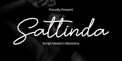 Sattinda is a thin and elegant handwritten font. It features a cute and joyful style that will take your designs to the next level! perfect for branding projects, logo, wedding designs, social media posts, advertisements, product packaging, product designs, label, photography, watermark, invitation, stationery and any projects that need handwriting taste. What’s Included : Standard Glyphs Ligature Works on PC & Mac Simple installations Accessible in the Adobe Illustrator, Adobe Photoshop, Adobe InDesign, even work on Microsoft Word. PUA Encoded Characters – Fully accessible without additional design software. Fonts include multilingual support for; ä ö ü Ä Ö Ü ß ¿ ¡
 - Neumatic Gothic Round by Arkitype,
$16.00 Neumatic Gothic Round is a condensed sans-serif family. It has a tall Cap Height as well as x-height to balance it. Neumatic Gothic Round is versatile in use as a Headline font or as a text font. Neumatic Gothic Round has loads of options to play around with. Included in the glyph set are small caps, a stylistic uppercase superscript, stylistic alternates and circled numbers to name some. The typeface was designed with the graphic designer in mind to make beautiful typographic layouts with ease by using all the options you have in Neumatic Gothic Round.
 - Rotundus Rounded by dayflash,
$35.99 Rotundus Rounded is a rounded sibling of Rotundus, an elegant sans serif typeface based on geometric shapes. Precise lines and accurate curves with soft edges are the main characteristics of this fresh and modern font family. While unconventional letterforms give Rotundus Rounded its distinctive appearance, a tall x-height and a condensed width provide good legibility and nice readability even at smaller sizes. With its contemporary feel, Rotundus Rounded is suitable for almost any type of analogue and digital application. The Rotundus Rounded font family includes unique letterforms, exclusive ligatures and extensive OpenType features. Rotundus Rounded comes in six weights with matching italics.
 - Parmesan Revolution by RM&WD,
$30.00 This font take inspiration by the Parmesan ( Parmesan means "born in the city of Parma" like Me, and not the chees of course) famous typographer Giambattista Bodoni from 1700s. Is a font designed to perform better when used in high dimension like Headline in Ad, Titles in Magazines or Blogs, Logos, Naming, Packaging... Is easy to have great result using contextual & stilistic alternatives, ligatures and other SS alternatives, as show in the posters. Is highly raccomended graphic applications with OpenType tab, such Adobe Illustrator or Photoshop or Quark Xpress InDesign, for the use of OpenType Features.
 - TF The Fest by Tyfomono,
$29.00 Take your design game to the next level with a bold, thick and expressive font that truly looks hand painted. The Fest uses authentic looking fonts and is sure to grab the attention of customers and designers alike. We made 2 styles for The Fest, it lets you explore and improve the personality of your design works. This version is also great for blocks of text and small print. Slanted - With a little improvement for the slanted version, The Fest Slanted is fit for the any size. These style is alternative of your choices for the look.
 - Gosford by Factory738,
$15.00 Gosford is a luxury and elegant serif font. It teases your eyes with its curves yet still able to maintain its classy composure. The variety of weights provide a range of choices that will help you find the best typographic colour. The available stylistic Ligature and Alternate offer a perfect font for anything your creativity takes you. 5 Weights (Light, Regular, Semibold, Bold, Black) Basic Latin A-Z and a-z Numerals & Punctuation Stylistic Alternates & Ligatures Multilingual Support for ä ö ü Ä Ö Ü ... OTF file format Free updates and feature additions Thanks for looking, and I hope you enjoy it.
 - Stick-A-Round by PintassilgoPrints,
$24.00 Stick-A-Round started as an attempt to domesticate the wild Daft Brush font. During the process, though, it begun taking its own shape and personality, with friendly rounded terminals, dynamic interlock pairs and lots of alternates. There are at least 4 variations for each letter and 2 for the numbers and for some punctuation marks, plus an extra set of stylistic alternates. Besides showing up such a good humor, this font brings a lovely mate loaded with handy ornaments to jazz up your designs. Stick-A-Round, And Have Some Fun. I bet you will!
 - Local Groceries by Invasi Studio,
$15.00 Inspired by the hand-painted paper signs typically seen in grocery stores during the 1920s to 1970s. This is now available in a digital format that still has the appearance and feel of hand-painted letters. Take a look at a few samples in the thumbnails to see what you can do with them. Local Groceries comes with a combination pairing font. It combines both regular and script fonts. Local Groceries is suitable for vintage and contemporary marketing, branding, merchandise, and packaging designs. Features: Uppercase & Lowercase Numerals & Punctuation Alternates and Ligatures Multilanguage Supports 60+ Latin based languages
 - Darling heights by Redy Studio,
$19.00 Darling heights font is the perfect choice for a handwritten design. You can use it for quotes on your blog, posters, and other marketing materials, or even wedding invitations. Darling heights also includes 164 ligatures that will connect letters smoothly – helping to make the words flow more naturally. This font is perfect for leaving a lasting impression and making any design bit more special than usual.\ Feel free to give me a message if you have a problem or question. Thank you so much for taking the time to look at one of our products. ~Redy
 - Kvell by VP Creative Shop,
$12.00 Introducing Kvell - elegant display typeface Kvell is luxury and tall font with multilingual support. It's a very versatile font that works great in large and small sizes. Kvell is perfect for branding projects, home-ware designs, product packaging, magazine headers - or simply as a stylish text overlay to any background image. FEATURES Uppercase, lowercase, numeral, punctuation & Symbol Regular Italic Multilingual support No special software is required to type out the standard characters of the Typeface. Canva friendly Feel free to contact me if you have any questions! Mock ups and backgrounds used are not included. Thank you! Enjoy!
 - SK Merih by Salih Kizilkaya,
$9.99 SK Merih is a geometric sans serif and semi-condensed font family. Produced with a clean and modern design approach, SK Merih can be easily used in titles, body texts and many points you may need in design. SK Merih takes its name from Mars. Although Merih is not used today, it is the Turkish equivalent of Mars. SK Merih consists of 12 fonts and 5244 glyphs in total and has multilingual support. In this way, it contains all the typographic elements you will need in your designs. You can visit my Behance account to examine the project images in more detail.
 - Linotype Not Painted by Linotype,
$29.99Linotype Not Painted is part of the Take Type Library, chosen from the contestants of Linotype’s International Digital Type Design Contests of 1994 and 1997. This fun font from German designer Robert Bucan grabs attention immediately. The forms are made up of multiple layers. The upper case’ alphabet forms, numerals and punctuation are two different styles of the same character, one over the other, and the lower case’ letters are composed of the lower case and upper case of the same letter superimposed. Linotype Not Painted is particularly good as a headline font in larger point sizes. - Bulby by Mircea Boboc,
$25.00 After creating an original light bulb symbol from scratch, I incorporated it in all letters and punctuation signs, ensuring a distinct rhythm and creative variation. The result is a highly recognizable font with a unique appearance, which can inspire you as a designer in many imaginative directions. This font is especially fitting for Christmas-themed projects where light installations take center stage. Similarly, if you represent a light bulb company, consider utilizing it in your indoor presentations or social media posts to showcase the playful voice of your brand. After all, everybody needs their light bulb moment.
 - Suco De Laranja by Hanoded,
$20.00 I like orange juice. Come on, who doesn't? Orange juice is the drink of heroes; it's the elixir of life; it's the gods' own ambrosia. Suco De Laranja means orange juice in Portuguese and I named this font thus, just because I love the stuff! Suco De Laranja is a very narrow, very gentle typeface with a rough edge. It comes in a variety of languages and guess what? I have added Cyrillic as well. Just to be complete. So there you have it: a font named after a juice. Take a sip and enjoy! На здоровье!
 - SomaSkript by ArtyType,
$29.00 SomaSkript is a natural extension to the basic Somatype font design, adding more variety to the family, all of which have similar features. Basically, by widening the uprights and maintaining the thin cross-bars it takes on more of a script-like quality, hence the name. Slanting the letters reinforces the script illusion and consequently brings a broader application to the font’s original format. When designing the Somatype alphabet originally, I always envisaged maximizing on its potential by creating an incised version. This variation not only emphasizes the implied script qualities within the name but brings out the softer, feminine side of the typeface. This evolutionary process creates a different looking font altogether and in turn the slanted version emphasizes the elegant quality even more so.
 - Simple Serenity by Set Sail Studios,
$26.00 Discover an exquisitely elegant modern typography pairing with the Simple Serenity Font Duo. This beautiful set combines a contemporary take on a classic serif with a clean & modern fine calligraphy script—creating the perfect pair for stunning logos, wedding designs, quotes, display text and more. This font family includes; Simple Serenity Script • A clean, elegant hand-drawn script font containing upper & lowercase characters, all punctuation and numerals. Contains 50 ligatures to help the text flow naturally and add a custom-made feel. Includes 9 alternate characters for d,k,f,g,h,i,j,t,y which have extra flourishes. Also includes beginning and end swashes for every lowercase letter. Simple Serenity Serif • A modern take on a classic serif font. Contains uppercase-only characters, all punctuation & numerals. Includes 14 ligatures for extra flair and uniqueness, as well as 10 alternate characters for Q,A,M,E,R,K,U,F,H,W. Using Ligatures and Alternates; Both fonts contain a number of 'Standard Ligatures' (unique double-letter pairings) and 'Stylistic Alternates' (alternative letter designs) to provide you with more customisation options. Make sure these functions are switched on in your software in order to access these characters. You can also access these characters via a Glyphs panel. This is available on most Adobe software & Affinity Designer. Language Support; Both fonts support English, French, Italian, Spanish, Portuguese, German, Swedish, Norwegian, Danish, Dutch, Finnish, Indonesian, Malay, Hungarian, Polish, Turkish, Icelandic, Slovenian
 - Claston Script by Krafted,
$10.00 Turn the page to the future and leave all the past behind. It’s a new age and you will move the cogs of the world forward! There is no need to worry or fear, the Claston Script will pave the way for you. With its clean script-type design and curved indentations, this font will take your projects to the next level! Move forward with elegance and bring your audiences to where your vision is: the future. It might take some time to get them there, but that’s okay! You have the perspective, the frame of mind, and most importantly the attitude to wrap it all together into a neat project! The Claston Script aims to bring out a modern and stylish view to what you make. It fits right in with your designs, whatever it is! It’s beautiful without trying too hard, it’s gorgeous without being apologetic, it’s brave in the face of uncertainty, these all represent you. Easily connect with your urban and forward thinking audience with this script and blow their minds!
 - Greuceanu by DePlictis Types,
$36.00 “Greuceanu” is the the name of a brave romanian fairy tale character and his mission was to eliberate de Sun and the Moon that were stolen by some Dragon like creatures that in romanian folklore they are called “ Zmei”. It inspired me to create this decorative uppercase display typeface with strong influences from old cyrillic writing and also a touch of fun and geometrical construction explorations. Besides Extended Latin Support it includes also Cyrillic and Greek alphabets as you already can expect from most of DePlictis Types releases. This decorative typeface goes well for use in book covers and headlines and only your creativity is the limit of its usability.
 - Otoboke by Typodermic,
$11.95 Far out, fellow psychonauts, have you checked out the trippy typeface called Otoboke? Let me tell you, this font is not from this world—it’s straight from the cosmos! With its mind-bending letter pair thingamajigs, even repeating letters are otherworldly. Take a closer look at Otoboke, and you’ll notice the fur texture—it’s like the letters are alive and ready to party! But where did this font’s tripped-out, letterforms come from, you ask? Well, they were inspired by none other than Louis Minott’s 1965 classic, Davida, channeling the vibes, and taking it to a whole new level. So, if you’re ready to take your graphic design to a whole new dimension, look no further than Otoboke. This typeface is not for the faint of heart—it’s for the true freakazoids. Most Latin-based European writing systems are supported, including the following languages. Afaan Oromo, Afar, Afrikaans, Albanian, Alsatian, Aromanian, Aymara, Bashkir (Latin), Basque, Belarusian (Latin), Bemba, Bikol, Bosnian, Breton, Cape Verdean, Creole, Catalan, Cebuano, Chamorro, Chavacano, Chichewa, Crimean Tatar (Latin), Croatian, Czech, Danish, Dawan, Dholuo, Dutch, English, Estonian, Faroese, Fijian, Filipino, Finnish, French, Frisian, Friulian, Gagauz (Latin), Galician, Ganda, Genoese, German, Greenlandic, Guadeloupean Creole, Haitian Creole, Hawaiian, Hiligaynon, Hungarian, Icelandic, Ilocano, Indonesian, Irish, Italian, Jamaican, Kaqchikel, Karakalpak (Latin), Kashubian, Kikongo, Kinyarwanda, Kirundi, Kurdish (Latin), Latvian, Lithuanian, Lombard, Low Saxon, Luxembourgish, Maasai, Makhuwa, Malay, Maltese, Māori, Moldovan, Montenegrin, Ndebele, Neapolitan, Norwegian, Novial, Occitan, Ossetian (Latin), Papiamento, Piedmontese, Polish, Portuguese, Quechua, Rarotongan, Romanian, Romansh, Sami, Sango, Saramaccan, Sardinian, Scottish Gaelic, Serbian (Latin), Shona, Sicilian, Silesian, Slovak, Slovenian, Somali, Sorbian, Sotho, Spanish, Swahili, Swazi, Swedish, Tagalog, Tahitian, Tetum, Tongan, Tshiluba, Tsonga, Tswana, Tumbuka, Turkish, Turkmen (Latin), Tuvaluan, Uzbek (Latin), Venetian, Vepsian, Võro, Walloon, Waray-Waray, Wayuu, Welsh, Wolof, Xhosa, Yapese, Zapotec Zulu and Zuni.
 - Toshna by astype,
$35.00 Toshna is a classic garaldic typeface family offering three real optical type sizes. The Display weight for titles and headlines is kept very tall, thin and graceful. The Book weight for body text is drawn essentially wider, more round with robust, bold details. The punctuations and accents strictly serve the demands of body text. They are substantially bigger and more readable. Despite the fact that the width is running economically, the user notes the fonts ‘big face, that qualifies for eye friendly long texts.
 - Lovage by RagamKata,
$14.00 Lovage is Modern Elegant Serif Typeface The serifs that we made specifically for the needs of elegant branding, with additional ligatures and alternates in a more feminine and unique form will be ready to add value to your brand. It's great to take advantage of designers or product owners who need a solution to make their designs look more classy and modern. This font is specially designed for fashion-themed projects, perfectly suitable for creating elegant, chic, lifestyle designs such as logos, titles, magazines, and more.
 - Skillet by Fenotype,
$19.00 Skillet is a bold vintage style serif font full of hedonism and joie de vivre. Skillet has strong character and extremely smooth features and self-confidence that springs from within. Skillet comes in two weights: Regular and Condensed. Even though the difference is small, Regular takes over the space while Condensed gives a more intimate impression. Skillet comes with a wide range of OpenType -features. Keep Standard Ligatures on in normal use. Try Discretionary Ligatures, Swash, Stylistic or Titling Alternates for custom headlines or logos.
 - Vglee by Ingrimayne Type,
$8.50 With its split serifs, Vglee looks like it could be a copy of an “Old West” font but it is not. It was constructed by taking a motif and applying it regardless of consequences. Vglee does not have lower-case letters but it does include a full set of Western and Central European accented characters. Its distinctive, odd appearance can be useful in small doses for decorative purposes. The VgleeStar style contains only the ornament. It is intended to be used in layers with Vglee.