10,000 search results
(0.032 seconds)
- Pupcat by Typodermic,
$11.95 Introducing Pupcat, the typeface that will take your design game to the next level. This display font is not your ordinary font. Inspired by the iconic movie posters of the 1960s, Pupcat’s unicase design is the perfect blend of whimsy and sophistication. With its unorthodox design, Pupcat will add a playful touch to any message you want to convey. Its flared strokes add an element of drama that will capture the attention of your audience. Plus, with its four weights and italics, you can create a hierarchy of text that is both visually pleasing and easy to read. Whether you’re working on a magazine spread, a movie poster, or a branding project, Pupcat is the perfect typeface for those who want to stand out. Its versatility and unique design make it an excellent choice for any project that requires a touch of creativity and fun. So, what are you waiting for? Get your hands on Pupcat and let your imagination run wild. With this typeface, your designs will never be boring again. Trust us, Pupcat is the missing piece you didn’t know you needed. Most Latin-based European writing systems are supported, including the following languages. Afaan Oromo, Afar, Afrikaans, Albanian, Alsatian, Aromanian, Aymara, Bashkir (Latin), Basque, Belarusian (Latin), Bemba, Bikol, Bosnian, Breton, Cape Verdean, Creole, Catalan, Cebuano, Chamorro, Chavacano, Chichewa, Crimean Tatar (Latin), Croatian, Czech, Danish, Dawan, Dholuo, Dutch, English, Estonian, Faroese, Fijian, Filipino, Finnish, French, Frisian, Friulian, Gagauz (Latin), Galician, Ganda, Genoese, German, Greenlandic, Guadeloupean Creole, Haitian Creole, Hawaiian, Hiligaynon, Hungarian, Icelandic, Ilocano, Indonesian, Irish, Italian, Jamaican, Kaqchikel, Karakalpak (Latin), Kashubian, Kikongo, Kinyarwanda, Kirundi, Kurdish (Latin), Latvian, Lithuanian, Lombard, Low Saxon, Luxembourgish, Maasai, Makhuwa, Malay, Maltese, Māori, Moldovan, Montenegrin, Ndebele, Neapolitan, Norwegian, Novial, Occitan, Ossetian (Latin), Papiamento, Piedmontese, Polish, Portuguese, Quechua, Rarotongan, Romanian, Romansh, Sami, Sango, Saramaccan, Sardinian, Scottish Gaelic, Serbian (Latin), Shona, Sicilian, Silesian, Slovak, Slovenian, Somali, Sorbian, Sotho, Spanish, Swahili, Swazi, Swedish, Tagalog, Tahitian, Tetum, Tongan, Tshiluba, Tsonga, Tswana, Tumbuka, Turkish, Turkmen (Latin), Tuvaluan, Uzbek (Latin), Venetian, Vepsian, Võro, Walloon, Waray-Waray, Wayuu, Welsh, Wolof, Xhosa, Yapese, Zapotec Zulu and Zuni.
 - Yellande by Typodermic,
$11.95 Travel back in time with Yellande, the typeface that captures the essence of Montreal’s rich architectural history. Inspired by the wrought-iron ornamentation that adorns the city’s urban landscape, Yellande is a font that will transport you to a bygone era of grandeur and romance. With its elegant and sophisticated design, Yellande is the perfect typeface for any project that requires a touch of class and refinement. Whether you’re creating a travel brochure for a luxury hotel, designing a wedding invitation, or crafting a menu for a high-end restaurant, Yellande will add a touch of elegance and sophistication to your work. The swash style of Yellande is reminiscent of the flowing curves and intricate details of Montreal’s wrought-iron architecture. Its fancy capital letters will make any headline or title stand out, adding a touch of glamour and elegance to your design. So why settle for ordinary when you can elevate your design with Yellande? Let this typeface take you on a journey through Montreal’s rich history and inspire your creativity with its curled wrought-iron look. Yellande is the perfect choice for anyone looking to add a touch of elegance and sophistication to their design. Most Latin-based European writing systems are supported, including the following languages. Afaan Oromo, Afar, Afrikaans, Albanian, Alsatian, Aromanian, Aymara, Bashkir (Latin), Basque, Belarusian (Latin), Bemba, Bikol, Bosnian, Breton, Cape Verdean, Creole, Catalan, Cebuano, Chamorro, Chavacano, Chichewa, Crimean Tatar (Latin), Croatian, Czech, Danish, Dawan, Dholuo, Dutch, English, Estonian, Faroese, Fijian, Filipino, Finnish, French, Frisian, Friulian, Gagauz (Latin), Galician, Ganda, Genoese, German, Greenlandic, Guadeloupean Creole, Haitian Creole, Hawaiian, Hiligaynon, Hungarian, Icelandic, Ilocano, Indonesian, Irish, Italian, Jamaican, Kaqchikel, Karakalpak (Latin), Kashubian, Kikongo, Kinyarwanda, Kirundi, Kurdish (Latin), Latvian, Lithuanian, Lombard, Low Saxon, Luxembourgish, Maasai, Makhuwa, Malay, Maltese, Māori, Moldovan, Montenegrin, Ndebele, Neapolitan, Norwegian, Novial, Occitan, Ossetian (Latin), Papiamento, Piedmontese, Polish, Portuguese, Quechua, Rarotongan, Romanian, Romansh, Sami, Sango, Saramaccan, Sardinian, Scottish Gaelic, Serbian (Latin), Shona, Sicilian, Silesian, Slovak, Slovenian, Somali, Sorbian, Sotho, Spanish, Swahili, Swazi, Swedish, Tagalog, Tahitian, Tetum, Tongan, Tshiluba, Tsonga, Tswana, Tumbuka, Turkish, Turkmen (Latin), Tuvaluan, Uzbek (Latin), Venetian, Vepsian, Võro, Walloon, Waray-Waray, Wayuu, Welsh, Wolof, Xhosa, Yapese, Zapotec Zulu and Zuni.
 - Miss Donna by Scholtz Fonts,
$15.00 Miss Donna - contemporary, powerful, versatile and casual. Curvy, sassy, fast-talking, and utterly useable, she takes you into the world of movie posters, decor ads, fashion posters and tags, greeting cards and invitations. Her lines are bold, clean and legible. The Miss Donna family comes in four styles: - REGULAR - clean good lines and generous curves - for decor ads, greeting cards, copy - NARROW - slim (more compact), and elegant with contained curves - for greeting cards, invitations, copy - BLACK - bold statement, round, generous curves - for movie posters, fashion posters - BLACK CAPS - especially designed for "all-caps" printed text. Use for headings & subheads. Miss Donna Black Caps contains capitals in two sizes and this gives you the ability to generate text of two types: - a correctly spaced and kerned upper case, OR - a TRUE Small Caps -- as opposed to the false Small Caps produced by a well-known word processing application. In a correctly proportioned Small Caps the stroke width should not be reduced in the same proportion as the letter height is reduced. The stroke width of the small capitals should rather be equal or close to the stroke width of the corresponding upper case characters. Note: When using script fonts it is NOT usually advisable to use text in ALL caps. The best effects for headings and subheads are obtained with an initial upper case letter followed by lower case characters. BUT, Miss Donna will still produce excellent results with all caps if you are using an application that supports kerning. If you are using upper and lower case then it is not necessary to use kerning, although it may make a slight difference on occasion. Miss Donna contains over 235 characters - (upper and lower case characters, punctuation, numerals, symbols and accented characters are present). It has all the accented characters used in the major European languages.
 - Lerku by Typodermic,
$11.95 Looking for a typeface that embodies both grit and grandeur? Look no further than Lerku. This crispy font takes its inspiration from the timeless classic Bold Antique by Morris Fuller Benton, but it adds a grungy edge that’s perfect for today’s contemporary designs. With letter pair ligatures that help break up the monotony of repeating characters, Lerku is perfect for OpenType-savvy applications that demand a bit of variation. Whether you’re designing a website, a logo, or a marketing campaign, Lerku will give your message a bold, authoritative voice that’s sure to make an impact. So if you want to add a touch of vintage charm to your design, while still keeping it fresh and modern, Lerku is the perfect choice. Most Latin-based European writing systems are supported, including the following languages. Afaan Oromo, Afar, Afrikaans, Albanian, Alsatian, Aromanian, Aymara, Bashkir (Latin), Basque, Belarusian (Latin), Bemba, Bikol, Bosnian, Breton, Cape Verdean, Creole, Catalan, Cebuano, Chamorro, Chavacano, Chichewa, Crimean Tatar (Latin), Croatian, Czech, Danish, Dawan, Dholuo, Dutch, English, Estonian, Faroese, Fijian, Filipino, Finnish, French, Frisian, Friulian, Gagauz (Latin), Galician, Ganda, Genoese, German, Greenlandic, Guadeloupean Creole, Haitian Creole, Hawaiian, Hiligaynon, Hungarian, Icelandic, Ilocano, Indonesian, Irish, Italian, Jamaican, Kaqchikel, Karakalpak (Latin), Kashubian, Kikongo, Kinyarwanda, Kirundi, Kurdish (Latin), Latvian, Lithuanian, Lombard, Low Saxon, Luxembourgish, Maasai, Makhuwa, Malay, Maltese, Māori, Moldovan, Montenegrin, Ndebele, Neapolitan, Norwegian, Novial, Occitan, Ossetian (Latin), Papiamento, Piedmontese, Polish, Portuguese, Quechua, Rarotongan, Romanian, Romansh, Sami, Sango, Saramaccan, Sardinian, Scottish Gaelic, Serbian (Latin), Shona, Sicilian, Silesian, Slovak, Slovenian, Somali, Sorbian, Sotho, Spanish, Swahili, Swazi, Swedish, Tagalog, Tahitian, Tetum, Tongan, Tshiluba, Tsonga, Tswana, Tumbuka, Turkish, Turkmen (Latin), Tuvaluan, Uzbek (Latin), Venetian, Vepsian, Võro, Walloon, Waray-Waray, Wayuu, Welsh, Wolof, Xhosa, Yapese, Zapotec Zulu and Zuni.
 - Interrogator Stencil by Typodermic,
$11.95 Interrogator Stencil. This is not your average typeface. It’s a weapon in your design arsenal, engineered for maximum impact. With its military-inspired design and crosshair divisions, Interrogator Stencil is built to command attention and convey authority. Its technical style makes a bold statement, lending your message an assertive accuracy that cannot be ignored. Whether you’re creating a poster for a sci-fi blockbuster or designing a logo for a cutting-edge tech company, Interrogator Stencil is the perfect typeface to elevate your designs to the next level. This font is not for the faint of heart. It’s for those who demand perfection, who refuse to settle for anything less than the best. So if you’re ready to take your designs to the next level, gear up with Interrogator Stencil and get ready to dominate the battlefield of graphic design. Most Latin-based European writing systems are supported, including the following languages. Afaan Oromo, Afar, Afrikaans, Albanian, Alsatian, Aromanian, Aymara, Bashkir (Latin), Basque, Belarusian (Latin), Bemba, Bikol, Bosnian, Breton, Cape Verdean, Creole, Catalan, Cebuano, Chamorro, Chavacano, Chichewa, Crimean Tatar (Latin), Croatian, Czech, Danish, Dawan, Dholuo, Dutch, English, Estonian, Faroese, Fijian, Filipino, Finnish, French, Frisian, Friulian, Gagauz (Latin), Galician, Ganda, Genoese, German, Greenlandic, Guadeloupean Creole, Haitian Creole, Hawaiian, Hiligaynon, Hungarian, Icelandic, Ilocano, Indonesian, Irish, Italian, Jamaican, Kaqchikel, Karakalpak (Latin), Kashubian, Kikongo, Kinyarwanda, Kirundi, Kurdish (Latin), Latvian, Lithuanian, Lombard, Low Saxon, Luxembourgish, Maasai, Makhuwa, Malay, Maltese, Māori, Moldovan, Montenegrin, Ndebele, Neapolitan, Norwegian, Novial, Occitan, Ossetian (Latin), Papiamento, Piedmontese, Polish, Portuguese, Quechua, Rarotongan, Romanian, Romansh, Sami, Sango, Saramaccan, Sardinian, Scottish Gaelic, Serbian (Latin), Shona, Sicilian, Silesian, Slovak, Slovenian, Somali, Sorbian, Sotho, Spanish, Swahili, Swazi, Swedish, Tagalog, Tahitian, Tetum, Tongan, Tshiluba, Tsonga, Tswana, Tumbuka, Turkish, Turkmen (Latin), Tuvaluan, Uzbek (Latin), Venetian, Vepsian, Võro, Walloon, Waray-Waray, Wayuu, Welsh, Wolof, Xhosa, Yapese, Zapotec Zulu and Zuni.
 - Antique Tuscan No 9 by HiH,
$8.00 Antique Tuscan No.9 was one of the earlier wood-type designs by William Hamilton Page. It was first shown among the specimens produced in 1859, shortly after Page entered into a new partnership with Samuel Mowry, owner of the Mowry Axle Company. The new company was named Page and Company and was located at the Mowry facility in the Greenville section of Norwich, Connecticut. Antique Tuscan No.9 is an extra-condensed version of the tuscan style that had been released in moveable type by Vincent Figgins of London in 1817 and had become so popular for advertising in the intervening years. Because of the extreme compression in the design, we might be tempted to describe it as "Triple-X," but that might be misleading. The analogy would, of course, be to clothing sizes, not movie ratings. Because of the compression, this typeface reads best when set extra-extra-extra large. For printing, we recommend 36 points or larger. For the screen, we suggest at least 72 points. An unusual and distinctive design, it is best used with discretion. If I were doing a term paper for school or submitting an article to a magazine for publication, I might use it for the title page, to grab someone’s attention. I would certainly not use it for the main body of text - not if I expected anyone to read what I wrote. If you wonder why we make this recommendation, take the Ten-Point challenge. Print this paragraph using Antique Tuscan No.9 and set the font size at 10 points. If you are young and blessed with good eyesight, you will probably be able to read it - with effort. So, here is the challenge: hand it to your Grandmother and ask HER to read it.
 - Betaphid by Typodermic,
$11.95 Introducing Betaphid, a sleek and modern display typeface designed to embody the principles of science and technology. Its minimalist aesthetic, inspired by the bold lines and raw textures of brutalist architecture, evokes a sense of futuristic innovation that is perfect for science fiction themes. But Betaphid is more than just a visually stunning typeface—its austere features are also designed to enhance the technical precision and geometric accuracy of your creations. With its clean lines and perfect proportions, Betaphid will lend a sense of order and logic to your designs, making them appear more polished and professional. Whether you’re creating a website, a product label, or a scientific report, Betaphid is the ideal font for conveying a sense of scientific authority and technical expertise. So why settle for less when you can achieve perfect geometric precision with Betaphid? Try it today and take your designs to the next level. Most Latin-based European writing systems are supported, including the following languages. Afaan Oromo, Afar, Afrikaans, Albanian, Alsatian, Aromanian, Aymara, Bashkir (Latin), Basque, Belarusian (Latin), Bemba, Bikol, Bosnian, Breton, Cape Verdean, Creole, Catalan, Cebuano, Chamorro, Chavacano, Chichewa, Crimean Tatar (Latin), Croatian, Czech, Danish, Dawan, Dholuo, Dutch, English, Estonian, Faroese, Fijian, Filipino, Finnish, French, Frisian, Friulian, Gagauz (Latin), Galician, Ganda, Genoese, German, Greenlandic, Guadeloupean Creole, Haitian Creole, Hawaiian, Hiligaynon, Hungarian, Icelandic, Ilocano, Indonesian, Irish, Italian, Jamaican, Kaqchikel, Karakalpak (Latin), Kashubian, Kikongo, Kinyarwanda, Kirundi, Kurdish (Latin), Latvian, Lithuanian, Lombard, Low Saxon, Luxembourgish, Maasai, Makhuwa, Malay, Maltese, Māori, Moldovan, Montenegrin, Ndebele, Neapolitan, Norwegian, Novial, Occitan, Ossetian (Latin), Papiamento, Piedmontese, Polish, Portuguese, Quechua, Rarotongan, Romanian, Romansh, Sami, Sango, Saramaccan, Sardinian, Scottish Gaelic, Serbian (Latin), Shona, Sicilian, Silesian, Slovak, Slovenian, Somali, Sorbian, Sotho, Spanish, Swahili, Swazi, Swedish, Tagalog, Tahitian, Tetum, Tongan, Tshiluba, Tsonga, Tswana, Tumbuka, Turkish, Turkmen (Latin), Tuvaluan, Uzbek (Latin), Venetian, Vepsian, Võro, Walloon, Waray-Waray, Wayuu, Welsh, Wolof, Xhosa, Yapese, Zapotec Zulu and Zuni.
 - Brush Stroke by Letters&Numbers,
$21.00 Use of a thick brush and expressive strokes make Brush Stroke a raw, bold typeface. It is suitable for headings and short paragraphs. Brush Stroke is extended, containing West European diacritics making it suitable for multilingual environments and publications.
 - CheckerHat - Unknown license

- Lovely Orange by Almarkha Type,
$23.00 Lovely Orange – Fun Display Playful Sans full of charm . It will take any DIY-project to the next level! Lovely Orange is perfect for Craft , product packaging, product designs, label, branding projects, logo, wedding designs, social media posts, advertisements, watermark, invitation, stationery and any projects
 - Vandalust Graffiti by Sipanji21,
$18.00 Vandalust is a unique display font with a graffiti-like appearance. Use this font for any crafting project, apparel design, logotype, advertising, wall decoration, and pretty much anything that requires a personalized look. Take your designs to the next level with this stunning font!
 - The Ponkys by Sipanji21,
$18.00 The Ponkys is a Strong display font with a graffiti-like appearance. Use this font for any crafting project, apparel design, logotype, advertising, wall decoration, and pretty much anything that requires a personalized look. Take your designs to the next level with this stunning font!
 - Rough Therapy by Hanoded,
$15.00 No, I don’t need therapy - at least, not that I’m aware of. I needed a bold and rough name for this bold and rough font. Rough Therapy is a strong display font. Comes in a clean and a dirty version, so take your pick!
 - Keepsmile by Almarkha Type,
$29.00 Keepsmile is a Rounded Playful Sans full of charm . It will take any DIY-project to the next level! Keepsmile is perfect for Craft , product packaging, product designs, label, branding projects, logo, wedding designs, social media posts, advertisements, watermark, invitation, stationery and any projects.
 - Jarkids by Raditya Type,
$12.00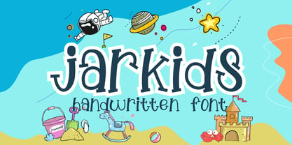 Jarkids is a picture of fun, uniqueness, and authenticity. This eye-catching handwritten font will turn your creative ideas into a standout. It will take your various design projects to the highest level, be it branding, headings, wedding designs, invitations, signatures, logos, labels, and more!
 - MBF Typerisme by Moonbandit,
$16.00 Moonbandit proudly presents, Typerisme. The modern take on the typewriter font. This typeface is perfect for your old, retro, vintage distressed look without going overboard. Huge kerning to boost clarity. Use it for body text, headline, title, one liner, anything! this typeface is versatile.
 - Ring O Fire by Cool Fonts,
$24.00 Ring O Fire was inspired by a game I used to play where you suspend a coin over a glass with a paper napkin and take turns burning holes in the napkin with a cigarette until the coin drops. Is that weird or what?
 - Modusa by Aqeela Studio,
$20.00 Modusa is a very fancy display font. Expertly designed to be a true favorite, this font has the potential to take your every creative idea to the highest level! Based on the Lunda typeface first created by Karl Erik Forsberg, in 1941. thank you
 - Fort Courage JNL by Jeff Levine,
$29.00 Fort Courage JNL is a bold slab serif wood type in the French Clarendon genre, taking its name as a tongue-in-cheek reference to the cavalry fort populated by a number of post-Civil War misfits in the 1960s television comedy "F Troop".
 - Wooden Head by Sipanji21,
$18.00 Wooden Head is a unique display font with a graffiti-like appearance. Use this font for any crafting project, apparel design, logotype, advertising, wall decoration, and pretty much anything that requires a personalized look. Take your designs to the next level with this stunning font!
 - Fancy Nouveau JNL by Jeff Levine,
$29.00 The 1907 sheet music for "Take Me Back to Dear Old Dixie" had the song title hand lettered in a decorative serif typeface with strong Art Nouveau influences. This design is now available digitally as Fancy Nouveau JNL, in both regular and oblique versions.
 - Lumbero by Almarkha Type,
$22.00 Lumbero is a Stylish & Playful Sans full of charm . It will take any DIY-project to the next level! Lumbero is perfect for Craft , product packaging, product designs, label, branding projects, logo, wedding designs, social media posts, advertisements, watermark, invitation, stationery and any projects.
 - Hermine by Raditya Type,
$12.00 Hermine is a picture of fun, uniqueness, and authenticity. This eye-catching handwritten font will turn your creative ideas into a standout. It will take your various design projects to the highest level, be it branding, headings, wedding designs, invitations, signatures, logos, labels, and more!
 - Swingsnug by Almarkha Type,
$25.00 Swingsnug is a Stylish & Playful Sans full of charm . It will take any DIY-project to the next level! Swingsnug is perfect for Craft , product packaging, product designs, label, branding projects, logo, wedding designs, social media posts, advertisements, watermark, invitation, stationery and any projects
 - Street Eagle Graffiti by Sipanji21,
$14.00 Street Eagle is a unique display font with a graffiti-like appearance. Use this font for any crafting project, apparel design, logotype, advertising, wall decoration, and pretty much anything that requires a personalized look. Take your designs to the next level with this stunning font!
 - Garamond Premier by Adobe,
$35.00Claude Garamond (ca. 1480-1561) cut types for the Parisian scholar-printer Robert Estienne in the first part of the sixteenth century, basing his romans on the types cut by Francesco Griffo for Venetian printer Aldus Manutius in 1495. Garamond refined his romans in later versions, adding his own concepts as he developed his skills as a punchcutter. After his death in 1561, the Garamond punches made their way to the printing office of Christoph Plantin in Antwerp, where they were used by Plantin for many decades, and still exist in the Plantin-Moretus museum. Other Garamond punches went to the Frankfurt foundry of Egenolff-Berner, who issued a specimen in 1592 that became an important source of information about the Garamond types for later scholars and designers. In 1621, sixty years after Garamond's death, the French printer Jean Jannon (1580-1635) issued a specimen of typefaces that had some characteristics similar to the Garamond designs, though his letters were more asymmetrical and irregular in slope and axis. Jannon's types disappeared from use for about two hundred years, but were re-discovered in the French national printing office in 1825, when they were wrongly attributed to Claude Garamond. Their true origin was not to be revealed until the 1927 research of Beatrice Warde. In the early 1900s, Jannon's types were used to print a history of printing in France, which brought new attention to French typography and the Garamond" types. This sparked the beginning of modern revivals; some based on the mistaken model from Jannon's types, and others on the original Garamond types. Italics for Garamond fonts have sometimes been based on those cut by Robert Granjon (1513-1589), who worked for Plantin and whose types are also on the Egenolff-Berner specimen. Linotype has several versions of the Garamond typefaces. Though they vary in design and model of origin, they are all considered to be distinctive representations of French Renaissance style; easily recognizable by their elegance and readability. Garamond Pemiere Pro was designed by Robert Slimbach, and released in 2005." - Steiner - Unknown license

- Tripper Pro by Underware,
$50.00 Tripper is a rock-hard display font family. The six styles – from Light to Black – of this robust stencil typeface will assure your text grabs all the attention it can get. Instead of settings large amount of texts, just use this font for a small amount of words. Or even better: just one word. But most importantly: make it really, really, really big. The lightest weight is pretty condensed, and slowly expands when the weight increases. The bridges – essential to a stencil font – have the same width across all styles, so you can safely apply all styles in the same size without the risk of stencils falling apart. Due to the absence of curves throughout the whole family, Tripper is suitable for more limited, industrial applications too. Tripper comes in several flavours. Next to the basic flavour, there is a stencil family which automatically creates borders around every letter, word or line. Then there is Tripper Rough, a textured version with that intelligent random, grungy look. Together with the previously released multi-colour font Tripper Tricolor, the complete family consists of 24 styles. Tripper is equipped with a bunch of OpenType features, like different figure styles, fractions, superiors, etc. But if all the OpenType ding-dong is not enough for you, just try the ornaments. The separate ornament font comes with icons, indicators, manicules, banderoles and patterns.
 - Trasandina by TipoType,
$24.00 Trasandina is a very unique font-family: a modern, versatile, workhorse typeface with a special personality, given by the mix of humanist and geometric models, remaining far from both extremes. This typeface has 9 styles plus their matching italics, it has an incredible wide range of weights, from very thin to an ultra thick stem. This was made following the Luc(as) de Groot’s Interpolation Theory. Trasandina’s versatility also resides in the +800 characters that each weight includes, having several open type features and language support for more than 200 languages. This font has been specially designed for web (using hinting instructions), making it work in small and large sizes on different types of screen resolutions. Trasandina’s most interesting feature is its flexibility: On one hand, is easy to read thanks to its humanistic letterforms which allow this typeface to be legible in small sizes while remaining neutral (specially around its middle weights). And, at the same time, it’s perfect for logos and posters that need a lot more personality, this is mainly due to its more geometric nature in light and bold weights. Thank you for your support! It’s people like you that allow our team to keep enjoying creating new fonts. That’s why we’d like to hear from you! Send us your work using our fonts: info@tipotype.com, and you'll have a special 50% OFF on Tipotype at Myfonts
 - Tolyer by Typesketchbook,
$25.00 Tolyer font is an extra large super family of 50 fonts! In many cases quantity doesn’t mean quality but here we have such a big abundance of contrast, styles, weights and special effects in one place that it actually doesn’t pay attention to the fact this is an all caps family. When it comes to strong headlines, titles, posters, masculine brand names Tolyer type family is probably one of the best choices in sans serif typography. You could easily pick from low to high contrast outlines, uprights and obliques, 3D effects or different artistic textured styles to make your work diverse, expressive and attractive. Tolyer font offers you maximum readability even in poor display conditions like low quality printing or low resolution monitors. In some cases poor print quality could even add more value to the final result, because Tolyer has a lot of potential to be used in difficult conditions. Letterpress and high embossing are one of those print effects that really suit Tolyer best. Use it in high contrast with background environment, higher ink flow, don’t think about the dot gain and you should definitely use a textured paper – this is what Tolyer really likes and deserves. It will thank you for this with authentic look, classic vintage style and strong but attractive presence.
 - Kate Greenaway's Alphabet by Wiescher Design,
$49.50 Some time ago I bought my smallest book ever: Kate Greenaway’s Alphabet* 57 x 72 mm. I thought it was the sweetest little book I had ever seen. Not knowing about the fame of the designer Kate Greenaway (1846-1901), I put it in some dark drawer and looked at it from time to time. Kate’s books were all outstanding successes in English publishing history; she was an icon of the Victorian era. Some of those books are still being reprinted today. This little gem I had accidentally acquired has become very rare and I have not found any reprints yet. So I thought maybe I could adapt her drawings for use on today’s computers. I ventured to redraw her delicate illustrations, blowing them up 300 percent, being forced to simplify them without losing her touch. It took quite some time! While redrawing them, I discovered that she most certainly drew them in at least three different sessions as well. Then I scanned my drawings and put them in a font. To make the font more usable, I added the ten numerals in Kate’s style; the original does not have those. I hope she would have liked my adaptations. Yours in a very preserving mood, Gert Wiescher. * Kate Greenaway’s Alphabet, edited by George Rutledge & Sons, London and New York, ca. 1885.
 - Lovers Pro by Scholtz Fonts,
$35.00 Lovers is a romantic, elegant handwritten calligraphic script, with well over 300 additional characters, including standard and discretionary ligatures, swashes and stylistic alternatives. Use of its extensive OpenType features enable the designer to create text that constantly changes, giving the impression of genuine handwriting, but handwriting that has all the flair and styling of hand-done calligraphy produced towards the end of the twentieth century. Lovers is based on traditional calligraphic ideals, but I've combined these with my own brand of relaxed, handwritten spontaneity, to design a font that is formal yet free and accidental, traditional yet contemporary. The font’s extravagant curves and swashes make it perfect for valentine’s day and wedding media, book covers, greeting cards, and certificates, in fact for any design work that requires a romantic or opulently elegant look. The range of stylistic alternatives and swashes enable users to create a wide range of moods in their work. In many ways it is a calligraphy toolkit. Lovers contains the accented characters used in the major European languages. What sets it apart from most other calligraphic fonts is that it appears so genuinely handwritten and avoids the uptight formality that characterizes so many of the fonts in this genre. Try Lovers, enjoy its wealth of OpenType features and let its vigorous yet elegant exuberance delight you and enhance your creativity!
 - FM Bolyar Pro by The Fontmaker,
$29.00 Bolyar Pro type family is the ancestor of our successful font Bolyar . We decided to develop it to a new higher level - making it more sophisticated, detailed and useful at the same time. The new improved Bolyar is able to satisfy every typographic taste and meet the ever growing design requirements for high quality typefaces. If you are addicted to classic vintage style, then you could easily use Bolyar Pro for almost anything - from letterhead, logos and catchy headlines to elegant packaging, book covers and wine labels. Alternates, Swashes and Ligatures will help you customize almost every single letter and fit perfectly to your artwork. Bolyar Pro type family is showing an abundance of many new useful features and options like: - Five weights each sold as separate font - Over 1200 glyphs per weight - Full multilingual support of all European languages as well Greek and Cyrillic - Brand new Alternates and Swashes fully supported in all languages (even with accented characters) - Many useful ligatures - Full Open Type and True Type support for Mac and Win Platforms - New Bolyar Ornaments - a new complimentary font exclusively designed to fit the new Bolyar Pro, containig decorative shields, frames, ornaments and borders. Bolyar Pro font family is great for any kind of labels - in this link you could see some amazing examples how to use it alone or in combination with our Bolyar Ornate Pro font family.
 - Marchioness by MKGD,
$13.00 Marchioness is a typeface that was built on the same basic structure as Lady Edith. I considered making it a subset of Lady Edith but felt that its overall appearance projected a uniqueness that allowed it to stand on its own. Although still maintaining a definite Art Deco form, it differentiates itself from its parent font by possessing a more opulent, if not regal, construction. The bones may be that of Lady Edith, but the typeface itself is most certainly Marchioness. There is no lower case for Marchioness as it is a decorative font. The Upper case version serves both the upper and lower case keys. Marchioness has a glyph count of 389 and supports the following languages; Supported Languages: Afrikaans, Albanian, Asu, Basque, Bemba, Bena, Bosnian, Catalan, Chiga, Colognian, Cornish, Croatian, Czech, Danish, Embu, English, Esperanto, Estonian, Faroese, Filipino, Finnish, French, Friulian, Galician, German, Gusii, Hungarian, Icelandic, Indonesian, Irish, Italian, Kabuverdianu, Kalaallisut, Kalenjin, Kamba, Kikuyu, Kinyarwanda, Latvian, Lithuanian, Low German, Lower Sorbian, Luo, Luxembourgish, Luyia, Machame, Makhuwa-Meetto, Makonde, Malagasy, Malay, Maltese, Manx, Meru, Morisyen, North Ndebele, Norwegian Bokmål, Norwegian Nynorsk, Nyankole, Oromo, Polish, Portuguese, Romanian, Romansh, Rombo, Rundi, Rwa, Samburu, Sango, Sangu, Scottish Gaelic, Sena, Shambala, Shona, Slovak, Slovenian, Soga, Somali, Spanish, Swahili, Swedish, Swiss German, Taita, Teso, Turkmen, Upper Sorbian, Vunjo, Walser, Zulu
 - Sultan by Canada Type,
$24.95Sultan is a revival and expansion of a 1954 Matrin Kausche typeface called Mosaik. This design highlights the unmistakable Arabic/Moorish calligraphy influence on Celtic lettering, by way of the highly active Andalusian culture from the ninth century until the crusades in the early eleventh century. Although Celtic lettering evolved on its own and prompted different calligraphic styles after the crusades, elements of the Arabic influence survived with it, its appeal remaining evident to this very day. For instance, this kind of lettering is very similar to the one Louis Tiffany used to make the most recognizable athletic insignia in North America - the New York Yankees logo, which is now over 110 years old, and has inspired hundreds of spin-offs in many athletic and non-athletic fields all over the world. The original character set made by Kausche was quite minimal, consisting of only numerals and uppercase letters along with a few alternates. But in this digital version the set has been considerably expanded into uppercase, lowercase, numerals, punctuation, a complete set of accented characters, and more than 15 alternate letters built into the font. Sultan is a great font choice particularly for design contexts of fantasy, middle ages legend, mystical and new age content, pirate literature, and Irish history. But it is also an excellent all-purpose display and poster font in general. - Ruth Script by Estudio Calderon,
$68.99 Ruth Script is perfect for neon signs, we took as referents some of these signs found in the street, especially those hanging in bars, billiard halls, motels and night clubs, we also took into consideration the Photo-lettering One Line manual to solve ligatures and alternatives (We want to thank Ed Ronthaler for that treasure to study and learn). The scripts can be considered as a compendium of connections, aesthetic and functional alternatives, where all the possible word combination is a universe depending on the language and the user's creativity. We have developed a project that offers to our customers a bridge that connects the brush with the digital typography through a partial vowels and consonants control and ligatures with opentype programming. We know that the scripts make typography users, fall in love. That is why we have created a type font that achieves all the demands and requests for any project where our font can be applied. Ruth Script was designed with patience and love, with the purpose of recovering the work done by those people who have been working as letterer during decades and that have left us hundreds of guides, books and videos. A great legacy! We want to invite you to use Ruth Script in your projects and fall in love with ESTUDIO CALDERÓN's new daughter. ENJOY IT!
 - Kubrick by Quadrat,
$25.00 Kubrick is an experiment in extremes. The Light font is very tall and slender, the Black font is very massive, and Kubrick's slender counters push some of its glyphs to the edge of recognition. The thin counters and negative spaces also give text set in Kubrick a definite visual sparkle, especially in all-uppercase settings. Because of its extreme letterforms, Kubrick is recommended only for large display use. The default letterspacing is set fairly wide to keep text legible. Kubrick was a double-experiment. One part of it was to see how heavy and massive a typeface I could make while still keeping it legible. The other part was to develop a Multiple Master font. Multiple Master fonts were a format developed by Adobe that allowed the user to change things like the weight and width of a typeface. Monollith started as just such a Multiple Master typeface, but when Adobe discontinued the Multiple Master format, I stopped work on the typeface. Later I decided to continue work on it, but as five separate font weights: Light, Medium, Bold, ExtraBold and Black. Very rectilinear letterforms with extremely narrow counters and negative spaces. The five fonts go from very thin and condensed to very heavy and extended. Use in large display settings where unornamented high visual impact is desired.
 - Restrict by Twinletter,
$12.00 Restrict is a san serif font that we design with a wide selection of beautiful characters and strong characteristics. Having a distinctive shape that is attractive to the eye and easy to read when you make it as a sentence is our main goal in designing this font. Not limited to that, the bold calligraphy font is designed to keep paying attention to the beauty of each letter, there are alternate options for the letters which are certainly easy for you to access, so you can automatically customize the letters you want to enhance the visual appearance of your design project. This charming font also offers the beauty of abstract typography harmony for a wide variety of design projects, including digital natural handwriting for designs, quote designs, for social media business designs, advertisements, trademarks, food and beverage promotion banners, text, posters, a signature, and all designs require handwriting or whatever design you want. What’s Included : File font Web Fonts Standard glyphs Ligature Works on PC & Mac Simple installations Accessible in Adobe Illustrator, Adobe Photoshop, Adobe InDesign, even work on Microsoft Word. PUA Encoded Characters – Fully accessible without additional design software. Fonts include multilingual support for; Afrikaans, Albanian, Croatian, Czech, Danish, Dutch, English, Estonian, Finnish, French, German, Hungarian, Italian, Norwegian, Polish, Portuguese, Slovak, Slovenian, Spanish, Swedish Thank you for your purchase! Hope you enjoy our font!
 - Headlight by Typodermic,
$11.95 Introducing Headlight: the intriguing sans-serif typeface that is anything but ordinary. With its unique blend of oval-nib embellishments and mechanistic squareness, Headlight is a font that demands attention. Designed in a superelliptical style, each letter is crafted with rounded corners and a one-of-a-kind design that sets it apart from other fonts. But Headlight isn’t just about style—it’s also incredibly functional. Available in five weights and italics, this font is perfect for a wide range of applications, from branding and advertising to editorial design and more. And with its numerals available in both lined proportional and old-style proportional styles, Headlight is a font that can truly do it all. If you’re looking for a typeface that combines style and function in a truly unique way, look no further than Headlight. Try it out today and see for yourself why this superelliptical font is turning heads in the design world. Most Latin-based European writing systems are supported, including the following languages. Afaan Oromo, Afar, Afrikaans, Albanian, Alsatian, Aromanian, Aymara, Bashkir (Latin), Basque, Belarusian (Latin), Bemba, Bikol, Bosnian, Breton, Cape Verdean, Creole, Catalan, Cebuano, Chamorro, Chavacano, Chichewa, Crimean Tatar (Latin), Croatian, Czech, Danish, Dawan, Dholuo, Dutch, English, Estonian, Faroese, Fijian, Filipino, Finnish, French, Frisian, Friulian, Gagauz (Latin), Galician, Ganda, Genoese, German, Greenlandic, Guadeloupean Creole, Haitian Creole, Hawaiian, Hiligaynon, Hungarian, Icelandic, Ilocano, Indonesian, Irish, Italian, Jamaican, Kaqchikel, Karakalpak (Latin), Kashubian, Kikongo, Kinyarwanda, Kirundi, Kurdish (Latin), Latvian, Lithuanian, Lombard, Low Saxon, Luxembourgish, Maasai, Makhuwa, Malay, Maltese, Māori, Moldovan, Montenegrin, Ndebele, Neapolitan, Norwegian, Novial, Occitan, Ossetian (Latin), Papiamento, Piedmontese, Polish, Portuguese, Quechua, Rarotongan, Romanian, Romansh, Sami, Sango, Saramaccan, Sardinian, Scottish Gaelic, Serbian (Latin), Shona, Sicilian, Silesian, Slovak, Slovenian, Somali, Sorbian, Sotho, Spanish, Swahili, Swazi, Swedish, Tagalog, Tahitian, Tetum, Tongan, Tshiluba, Tsonga, Tswana, Tumbuka, Turkish, Turkmen (Latin), Tuvaluan, Uzbek (Latin), Venetian, Vepsian, Võro, Walloon, Waray-Waray, Wayuu, Welsh, Wolof, Xhosa, Yapese, Zapotec Zulu and Zuni.
 - TT Phobos by TypeType,
$35.00 TT Phobos useful links: Specimen | Graphic presentation | Customization options TT Phobos is a pliable display serif with a soft and gentle character. The features of the typeface are the moderate contrast between bold and thin strokes, pliable visual compensators, and the counter-clockwise bend of internal ovals. In addition to 6 weights and 6 italic, TT Phobos also includes two original decorative fonts, inline and stencil. Despite its pliability and display character, TT Phobos is dynamic enough and is well suited for text arrays even in large text blocks. The serifs of letters are completely asymmetrical and bring in dynamics when reading the text from left to right. Thanks to the harmonious contrast of black and white forms and internal negative spaces of the letters, as well as its broad letter spacing, the typeface is well read in small sizes. In this case, the character of the letters is completely preserved, partially thanks to the exaggerated elegant visual compensators. The ornamental pattern used in TT Phobos Inline varies for capital and lowercase letters. Capital letters implement a more complex double inline with a rhombic element in the middle, and in the lower case features a simplified form of the inline, made in a single movement. Thanks to the original cutting, TT Phobos Stencil stands out for its expression, and the rounded cuts add even more visual style to the font. TT Phobos consists of 14 faces: 6 weights (Light, Regular, DemiBold, Bold, ExtraBold, Black), 6 Italics, inline and stencil. There are 17 ligatures in TT Phobos, including several Cyrillic ones. The typeface has stylistic alternates, which adds an italic effect to the upright fonts, and a little solemnity of the upright version to the italics. In addition, we have not forgotten about the old-style figures and other useful OpenType features, such as ordn, sups, sinf, dnom, numr, onum, tnum, pnum, liga, dlig, salt (ss01), frac, case.

