10,000 search results
(0.257 seconds)
- Milionaria by 3Wprotype,
$10.00 Introducing the Milionaria font, which is used for the needs of designers who are looking for characters such as signature writing which is used for logo designs, branding, invitation cards, business cards and so on. This font is inspired by the natural but elegant handwriting style of characters.
 - Underdoug by PizzaDude.dk,
$15.00 All caps font with squarish letters. At first sight, it may look a little bit ordinary, but watch it with massive text - then you will notice the bounciness and the contextual alternates that automatically switches between the 5 different versions of each letter! Comes with massive language support!
 - Mi Negra by Letritas,
$25.00 Mi negra is a funny and hilarious typography designed especially for children, thought and created by Isabel de Gregorio. It could be described as an original combination between a semi-handwright and semi sans-serif font. Thanks to its structure and nice endings "Mi Negra" is recommended for composing short texts (logotypes, packing, posters, etc.). It may similarly be used for illustrations and comics, as well as in printing press works for children from 6 to 13 years old for instance. Mi Negra has been conceived to be a useful support in all kinds of illustrations works (please note that Isabel, the type designer, considers herself primarily an illustrator). The font designer of Mi Negra tells that every time she needed to provide some text data (i.e. in children infographies) and needed to make them more understandable and suitable for children, she used this typography. The former idea was than to create a font who could be a second option to comic sans, but as the project started to reveal its forms, it was clear that it was revealing another connotation and its own character. In this way, Mi Negra went on modifying its forms and the more it developed, the more it was showing its new characteristics and concepts. The family is composed of three weighs: Light, regular and black. It provides also interesting functional ligatures. It also includes a dingbat with nice doggies. It has 434 characters and can work with 208 languages.
 - Schnorr Gestreckt by HiH,
$12.00 Peter Schnorr was a German artist/illustrator of Art Nouveau period (called Jugendstil in Germany and Austria). He was quite adept at calligraphy and did a variety of commercial work, including business signs. He designed at least four different alphabets and collaborated with Bruce Rogers on advertising work and title page designs for books. One of their clients was the publishing house of Houghton Mifflin. I have not been able to discover anything else about him, but I suspect he might be the grandson of the Bavarian artist Jules Schnorr von Carolsfeld, who was once commissioned to do a mural by Ludwig II of Bavaria (whose famous castle was copied by Disneyland). Schnorr did not give individual names to his fonts. Where there is no historical name, we like to follow the tradition initiated by Bauer and name fonts after their designer, with a descriptive adjective in the designer’s native language. Gestreckt is German for stretched or elongated. An interesting deign detail of this typeface is the cross bar of the “T” --it is NOT symetrical. The right hand side extends only 88% as far as the left hand side (a ratio of 9:8). I presume this was done for a more pleasing letter fit. Today Schnorr’s design is frequently offered under the name “Ambrosia.” However. close inspection will usually reveal that the serifs have been treated differently. I believe our font has a greater fidelity to the original design. Please also compare the design of the various auxiliary characters to those in other fonts. Often they are either borrowed from an inappropriate font of a different period or are missing altogether. We make every effort to design characters that are in keeping with the overall design and spirit of the typeface. For example, see the superscript Registered Trademark symbol (0174) and the Double s (0223). I think both are quite successful. Schnorr Gestreckt ML represents a major extension of the original release. In addition to the standard 1252 Western Europe Code Page with character slots up to decimal position 255, there are glyphs for the 1250 Central Europe, the 1252 Turkish and the 1257 Baltic Code Pages. There are also two alternate letter forms, one ornament and seven ligatures with Unicode codepoints (Private Use Area) and OpenType aalt, ornm & liga GSUB layout features. There are a total of 318 glyphs and 351 kerning pairs. Please note that some older applications may only be able to access the Western Europe character set (approximately 221 glyphs). This release also incorporates a redesign of several glyphs: the comma, quotes, acute accent, and grave accent.
 - Padraig Nua by Tony Fahy Font Foundry,
$25.00 Padraig Nua is a font conceptualized and designed by Tony Fahy. It is a European Celtic font, contemporary to many languages, not just of Europe but of the world. It’s origin is influenced by events in Ireland in the 1960s when it was decided that the uncial letterform should not be used further in Irish schools for the Irish language—Gaelic—and that it should be replaced by the Roman letterform—the Cló Romhanach as it was called afterwards. This happened overnight without any apparent discussion. It probably had a lot to do with Ireland joining the EEC, as the EU was called then. It had a massive effect on the Irish language and culture, in that the distinguishing factor that gave the language it’s identity—the half uncial/uncial fonts that were in use in all school, government and society documentation and merchandise—were lost overnight. No one said how or why. It was just done. To this day, all documentation is bi-lingual in government and Gaelic is taught in schools and universities—and decreed so by the European Union—but the presentation for both languages is the Roman letterform. Throughout the world, there are millions of Irish Americans and Irish Canadians, Irish Europeans, Australian Irish, African Irish and many living in the Middle East and Asia—and this new font—Padraig Nua, will appeal to many of them, visually recalling their roots. No one had thought, in those days, of commissioning a design that might update the Gaelic language to a more contemporary appearance that would keep the cultural nature of it intact with a revised and updated font—at one with Europe, the US and the world. Tony Fahy designed Padraig Nua (New Patrick) to address the problem. It keeps an appearance that lends towards the Gaelic language but steers it in the direction of Roman fonts. Some characters reflect letterforms from the Irish/Gaelic manuscripts and uncial fonts.
 - Hanseat by profonts,
$41.99 Hanseat is a profonts typeface family by Ralph M. Unger, heavily inspired by Germany’s official DIN 1451 Engschrift. Originally, the German DIN (Deutsches Institut für Normung / German Committee for Industrial Standardization) typefaces were taken as the standard traffic fonts for street signs and house numbers. During the 1980s, the DIN fonts became digitally available for sign making systems, initially again primarily for traffic sign purposes. However, later on, the DIN fonts became also popular in the world of designers and art directors. Hanseat is a modern, contemporary interpretation of the DIN fonts, responding to the ever growing demand for such typeface designs reflecting the spirit of the industrial area.
 - Savage Sword by Comicraft,
$29.00 Mother of Mitra, Crom’s Devils and other Savage WORDS! The only thing better than one dead Pict is TWO! Or THREE! Or FOUR! And what better than this SAVAGE font to sound the sword strokes of a BARBARIAN BORN?! Hack! Slice! Cut your fiendish foes into pieces with Comicraft’s SAVAGE SWORD and tell your SAVAGE TALES to all and sundry and even those you’ve sundered! BE AWARE! Handle with care and keep some neosporin or other antibacterial cream at hand -- being Savage and filled with Berserker Rage may result in unintended wounds to yourself and your kinsmen. Savage Sword features two sets of automatically alternating uppercase characters, plus support for Western & Central Europe and Vietnamese.
 - Core Circus Rough by S-Core,
$20.00 Core Circus Rough is a textured version of Core Circus which is a layered type family consisting of seven 3D effect layers, eight 2D effect layers and one shadow effect layer. Uppercase and lowercase letters are separated by such features that counters are opened or closed. Core Circus provides other closed counter styles such as numbers with opentype feature (Stylistic Alternatives). Also available Core Magic Rough (Slab-Serif version of Core Circus Rough) The shape of Core Circus is simple but the combinations of effect fonts are impressive. Core Circus makes your works charming and special with endless combinations (at least 262,551 kinds). This family is really nice for book titles, headlines, logotypes and any artworks.
 - Santorio by Skinny Type,
$15.00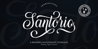 Please welcome our newest script typeface, Santorio Script, a beautiful script typeface with unique alternatives and strokes. This font is very suitable to be applied especially to logos, and various other formal forms such as invitations, labels, logos, magazines, books, greeting / wedding cards, packaging, fashion, make up, stationery, novels, labels or other types of fonts. advertising purposes. Feature : uppercase & lowercase numbers and punctuation multilingual ligature alternative PUA encoded We highly recommend using a program that supports the OpenType feature and the Glyphs panel like many Adobe and Corel Draw applications, so that you can view and access all variations of Glyphs. Email us to skinnyart871@gmail.com if you need anything! Happy Designing! Thank you
 - Arbour Soft by TypeUnion,
$35.00 Arbour Soft is the cheeky version of it's big brother, Arbour. The soft version creates a smooth finish that flows perfectly across screens and print. Arbour Soft comes in 7 weights, from a delicate extra-light to a soft, strong black, with matching soft italics for each upright. The soft black weights are perfect for your new brand or article headlines, and the light weights are great for calling out text. The mid weights are perfect for longer texts.
 - Vintage Wedding by Edyta Demurat,
$40.00 Vintage Wedding is a collection of 432 icons, divided into 4 categories. These symbols were selected and created in order to bring to mind the past times, yet at the same time, to retain the modern design. You can find here such rare and beautiful objects as phonograph or cult eyeglasses. The font includes many diverse elements, which will help you create compositions out of flowers, to choose commemorative vases, and even to dress the bride and groom!
 - Nightfate by Sipanji21,
$13.00 Nightfate is a unique display font with a graffiti-like appearance. Use this font for any crafting project, apparel design, logotype, advertising, wall decoration, and pretty much anything that requires a personalized look. Take your designs to the next level with this stunning font! have a nice day.
 - Sparkling Horizon by Letterhanna Studio,
$19.00 Introducing "Sparkling Horizon" – a mesmerizing handwritten font that captures the essence of boundless creativity and shimmering elegance. With every stroke, this font evokes the sensation of glistening sunlight on the horizon, infusing your designs with a touch of radiant charm. Whether used for invitations, logos, or creative projects, "Sparkling Horizon" brings a sense of enchantment to your words. Let your imagination take flight as you create with this font.
 - LTC Obelysk Grotesk by Lanston Type Co.,
$24.95 Obelysk Grotesk was designed by the Lanston Drawing Office in the late 1980s. This face is a reconstruction of Spire (1937) drawn by Sol Hess. The skeleton of Spire Roman stands with the serifs removed. Like Spire, this font has no lower case, but does offer alternate cap styles in some of the lower case positions. Spire and Obelysk have both been used prominently in the fashion industry.
 - Eskapade by TypeTogether,
$53.50 The Eskapade font family is the result of Alisa Nowak’s research into Roman and German blackletter forms, mainly Fraktur letters. The idea was to adapt these broken forms into a contemporary family instead of creating a faithful revival of a historical typeface. On one hand, the ten normal Eskapade styles are conceived for continuous text in books and magazines with good legibility in smaller sizes. On the other hand, the six angled Eskapade Fraktur styles capture the reader’s attention in headlines with its mixture of round and straight forms as seen in ‘e’, ‘g’, and ‘o’. Eskapade works exceptionally well for branding, logotypes, and visual identities, for editorials like magazines, fanzines, or posters, and for packaging. Eskapade roman adopts a humanist structure, but is more condensed than other oldstyle serifs. The reason behind this stems from the goal of closely resembling the Fraktur style to create harmony in mixed text settings. Legibility is enhanced by its low contrast between thick and thin strokes and its tall x-height. Eskapade offers an airy and light typographic colour with its smooth design. Eskapade italic is based on the Cancellaresca script and shows some particularities in its condensed and round forms. This structure also provided the base for Eskapade Fraktur italic. Eskapade Fraktur is more contrasted and slightly bolder than the usual darkness of a regular weight. The innovative Eskapade Fraktur italic, equally based on the Cancellaresca script previously mentioned, is secondarily influenced by the Sütterlin forms — an unique script practiced in Germany in the vanishingly short period between 1915 and 1941. The new ornaments are also hybrid Sütterlin forms to fit with the smooth roman styles. Although there are many Fraktur-style typefaces available today, they usually lack italics, and their italics are usually slanted uprights rather than proper italics. This motivated extensive experimentation with the italic Fraktur shapes and resulted in Eskapade Fraktur’s unusual and interesting solutions. In addition to standard capitals, it offers a second set of more decorative capitals with double-stroke lines to intensify creative application and encourage experimental use. The Thin and Black Fraktur styles are meant for display sizes (headlines, posters, branding, and signage). A typeface with this much tension needs to keep a good harmony between strokes and counters, so Eskapade Black has amplified inktraps and a more dynamic structure seen in the contrast between straight and round forms. These qualities make the family bolder and more enticing, especially with the included uppercase alternates. The Fraktur’s black weights are strident, refusing to let the white of the paper win the tug-of-war. It also won’t give away its secrets: Is it modern or historic, edgy or amicable, beguiling ornamentation or brutish presentation? That all depends on how the radically expanded Eskapade family is used, but its 16 fonts certainly aren’t tame.
 - Keraton by Letterara,
$8.00 Keraton is a monoline script with a signature look. It will take any design project to the next level.
 - SwirlityScript by Ingrimayne Type,
$9.95 SwirlityScript takes an old (16th or 17th century) calligraphic script style and combines it with the caps from SwirlityText.
 - Botanical Scribe by Three Islands Press,
$39.00 The Raphael of Flowers is what they called Pierre-Joseph Redouté a couple hundred years ago. The Belgian native became famous in France, where he painted floral watercolors for both Marie Antoinnette and Empress Josephine. But what cemented his legacy was his perfection of a stipple engraving technique that brought his art to the masses. Botanical Scribe is modeled after the neat, cursive hand-inscribed legends on these antique prints. Because it simulates handlettering, the font retains a warm, organic quality not seen in fancy modern scripts while remaining both elegant and legible. (Its many ligatures lends to this authenticity.) Good for formal invitations or historical simulations.
 - Breve Title by DSType,
$50.00 Breve was designed for use in editorial projects. Simple but with enough personality to stand by is own, in a quest for a more forceful and contemporary appearance. All the fonts in Breve superfamily, share the same exact structure, both in terms of anatomy and functionality. The Text versions provide a softer and warm feel to the typographic palette and is intended for use in much longer passages of text, while the Title versions are distinguished by non-descending letterforms, making the titles and headlines much more uniform and interesting. The News version is more classic, with ball terminals and classic proportions, while the Display is, somehow, the set of fonts we had to design: extra-black, ultra-contrasted, proud-display fonts.
 - Breve News by DSType,
$50.00 Breve was designed for use in editorial projects. Simple but with enough personality to stand by is own, in a quest for a more forceful and contemporary appearance. All the fonts in Breve superfamily, share the same exact structure, both in terms of anatomy and functionality. The Text versions provide a softer and warm feel to the typographic palette and is intended for use in much longer passages of text, while the Title versions are distinguished by non-descending letterforms, making the titles and headlines much more uniform and interesting. The News version is more classic, with ball terminals and classic proportions, while the Display is, somehow, the set of fonts we had to design: extra-black, ultra-contrasted, proud-display fonts.
 - Breve Text by DSType,
$50.00 Breve was designed for use in editorial projects. Simple but with enough personality to stand by is own, in a quest for a more forceful and contemporary appearance. All the fonts in Breve superfamily, share the same exact structure, both in terms of anatomy and functionality. The Text versions provide a softer and warm feel to the typographic palette and is intended for use in much longer passages of text, while the Title versions are distinguished by non-descending letterforms, making the titles and headlines much more uniform and interesting. The News version is more classic, with ball terminals and classic proportions, while the Display is, somehow, the set of fonts we had to design: extra-black, ultra-contrasted, proud-display fonts.
 - Breve Sans Text by DSType,
$50.00 Breve was designed for use in editorial projects. Simple but with enough personality to stand by is own, in a quest for a more forceful and contemporary appearance. All the fonts in Breve superfamily, share the same exact structure, both in terms of anatomy and functionality. The Text versions provide a softer and warm feel to the typographic palette and is intended for use in much longer passages of text, while the Title versions are distinguished by non-descending letterforms, making the titles and headlines much more uniform and interesting. The News version is more classic, with ball terminals and classic proportions, while the Display is, somehow, the set of fonts we had to design: extra-black, ultra-contrasted, proud-display fonts.
 - Breve Slab Text by DSType,
$50.00 Breve was designed for use in editorial projects. Simple but with enough personality to stand by is own, in a quest for a more forceful and contemporary appearance. All the fonts in Breve superfamily, share the same exact structure, both in terms of anatomy and functionality. The Text versions provide a softer and warm feel to the typographic palette and is intended for use in much longer passages of text, while the Title versions are distinguished by non-descending letterforms, making the titles and headlines much more uniform and interesting. The News version is more classic, with ball terminals and classic proportions, while the Display is, somehow, the set of fonts we had to design: extra-black, ultra-contrasted, proud-display fonts.
 - Breve Sans Title by DSType,
$50.00 Breve was designed for use in editorial projects. Simple but with enough personality to stand by is own, in a quest for a more forceful and contemporary appearance. All the fonts in Breve superfamily, share the same exact structure, both in terms of anatomy and functionality. The Text versions provide a softer and warm feel to the typographic palette and is intended for use in much longer passages of text, while the Title versions are distinguished by non-descending letterforms, making the titles and headlines much more uniform and interesting. The News version is more classic, with ball terminals and classic proportions, while the Display is, somehow, the set of fonts we had to design: extra-black, ultra-contrasted, proud-display fonts.
 - Breve Display by DSType,
$50.00 Breve was designed for use in editorial projects. Simple but with enough personality to stand by is own, in a quest for a more forceful and contemporary appearance. All the fonts in Breve superfamily, share the same exact structure, both in terms of anatomy and functionality. The Text versions provide a softer and warm feel to the typographic palette and is intended for use in much longer passages of text, while the Title versions are distinguished by non-descending letterforms, making the titles and headlines much more uniform and interesting. The News version is more classic, with ball terminals and classic proportions, while the Display is, somehow, the set of fonts we had to design: extra-black, ultra-contrasted, proud-display fonts.
 - Breve Slab Title by DSType,
$50.00 Breve was designed for use in editorial projects. Simple but with enough personality to stand by is own, in a quest for a more forceful and contemporary appearance. All the fonts in Breve superfamily, share the same exact structure, both in terms of anatomy and functionality. The Text versions provide a softer and warm feel to the typographic palette and is intended for use in much longer passages of text, while the Title versions are distinguished by non-descending letterforms, making the titles and headlines much more uniform and interesting. The News version is more classic, with ball terminals and classic proportions, while the Display is, somehow, the set of fonts we had to design: extra-black, ultra-contrasted, proud-display fonts.
 - Wasted Youth by Wing's Art Studio,
$12.00 Wasted Youth: A 90s Grunge Inspired Brush Font by Wingsart Studio Wasted Youth is a versatile brush font with shades of grunge, punk and horror. The font comes in three styles including a clean-edged original, plus two additional versions drawn with inky brush and marker pen. It takes inspiration from 90s grunge bands, with a hand-made punk aesthetic that’s equally at home in music videos, album covers, horror movies and skate culture. It aims to combine the best of these popular looks into one versatile font. Along with its unique uppercase and lowercase characters, Wasted Youth also comes with a host of custom ligatures, underlines and alternatives, along with numerals, punctuation and language support. It’s a truly flexible font that can be shaped into titles and headlines that look authentically hand-made. Try it on t-shirts, posters, stickers, movie titles, YouTube videos and more! Check out my visuals to see it in action.
 - Film Preview JNL by Jeff Levine,
$29.00 An Oct. 7, 1931 advertisement in a British trade paper for the film industry carried the unusual title “The Bioscope Peaks of National Approval”. Just as unusual was the hand lettering for this ad – a quirky, casual bit of novelty typography that inspired Film Preview JNL; available in both regular and oblique versions.
 - Trevor by TypeTogether,
$36.80 Teo Tuominen’s Trevor took its first breath as a revival of an 18th century antiqua, but culminated in an entirely new and good-natured family. Trevor is an affable slab serif in nature: both heavy and kind. Known for their familiarity and their dark colour, the terminals of slab serifs put additional weight along the line to maintain an inky presence. Their clunky forms reveal slight immaturity and arouse the reader’s sympathy for the subject at hand. Trevor connects with others by consciously riding the line between being personal and commanding. One goal with Trevor was to pair the robust nature of a low contrast slab serif with more sophisticated elements, such as the ball terminals. So wherever one looks in Trevor, rounded corners rule the day, softening the overall appearance by mimicking ink spread made by old metal type. The easygoing look is tempered by very few inktraps and sharp corners, mostly to the inside of characters and in acute angles. Whatever Trevor is paired with, it has an altruistic outlook in that it sees the best in others. It’s the neighbourly type family — the neighbour you actually want. Trevor’s almost monolinear weight and high x-height give it a typewriter look in the extralight and light weights, but the whole family was made to work with many other font styles, design work, and information structures. It certainly finds its home in packaging and advertising, its sturdy verticality and narrowness fit the needs of headlines and intro text, and its seven weights are primed for plays and involved text needing many layers of distinction. The black weight is treated like a separate display style with altered ball terminals and serifs to capitalise on the added heft. Trevor’s seven roman weights cover the Latin A Extended glyph set to bring its kindly and commanding outlook to your projects. Along with alternate version of the ‘R’ in the black weight, its OpenType features include both tabular and proportional lining and oldstyle figures, ligatures, and fractions. The complete Trevor family, along with our entire catalogue, has been optimised for today’s varied screen uses.
 - Relic Forest Island 3 by Jehansyah,
$9.00 Relic forest island III, This is the newest font from the previous generation, Relic island I and Relic Island II, this design comes with a more detailed touch with very charming carvings, comes with several families that you can make your best design choice for later this year and in the future, with several monograms and families that you can choose according to your design, this design will add inspiration to your project, and see, how it will work for you, and make this font your best choice thank you very much
 - Sensal by Larin Type Co,
$14.00 Sensal this is a beautiful vintage font in the Art Deco style. elegant and attractive, it will attract attention and create a unique atmosphere. this font is made in two styles - Regular and Outline, this will allow you to combine and make your design more voluminous. Also in this font there are alternates, with their help you can change the dynamics of the font and make it lightweight. Try changing alternatives and you will see how many options you can get. This font is easy to use and has OpenType features.
 - CarlMarx by Adobe,
$29.00This typeface is based on lettering by Carl Marx (1911?1991), designed during his first semester at the Bauhaus in Joost Schmidt?s class, in 1932. Although the letter proportions are based on Schmidt?s teachings, the forms are not constructed from compass and ruler, but drawn with brush and marker, lending the words a warm and lively touch. Hidetaka Yamasaki redrew the letters from scratch and added all missing characters for today?s needs. A set of hanging figures, alternates for some critical letterforms (such as f, r, and t) as well as several ligatures make CarlMarx especially suitable for use in body text. As suggested by Marx, Yamasaki captured two weights from the original drawing and perfectly adjusted light and bold to highlight words and create hierarchy in headlines ? without losing or adding space. True to the original, Yamasaki captured the wobbly contour in CarlMarx, preserving warmth in the condensed geometric style of the early 1930s. - Zimeta by Twinletter,
$12.00 Zimeta is a sanserif font with a unique style that we created specifically for you to satisfy your diverse demands, where a friendly font and strong character make your project bold and powerful. of course, your various design projects will be perfect and extraordinary if you use this font because this font is equipped with a font family, both for titles and subtitles and sentence text, start using our fonts for your extraordinary projects.
 - Glaston by Gatype,
$12.00 Hello friends... We are proud to present our new font. New natural Glaston with handwriting and script style makes this font look elegant, natural, stylish. Glaston would be perfect for invitations, logos & branding, photography, advertising, watermarks, social media posts, product packaging, product designs, labels, wedding designs, stationery, special events or anything else that requires a taste for handwriting. What this font includes: Glaston (OTF) Fully accessible without additional design software. Fonts include multilingual support. Enjoy!
 - Sukothai by Linotype,
$155.99Sukothai is a traditional Thai design based on early metal type. The classic and distinct forms make it excellent for setting text at small sizes or in large passages. Originally released by Linotype for digital photocomposition, now both the Light and Bold weights are available in OpenType format. This makes it possible to dynamically and precisely position the various levels of superscript and subscript vowel signs and tonal marks. In addition to this, the complete Unicode page range for Thai is covered to ensure flawless conversion between other OpenType fonts using Unicode. The accompanying Latin design matches well in scale and texture and supports most Western European languages making it ideal for setting bilingual texts. - Beauty Salon by Thomas Käding,
$10.00 Inspired by the sign outside a beauty salon, it is an art-deco all-caps font. This font will NOT make you more attractive to the opposite sex.
 - Fordor Incised NF by Nick's Fonts,
$10.00Based on a old standard, Tudor Black, this version offers a dramatic inline treatment that adds sparkle and grace. The typeface takes its name from Ford Motor Company's old designation for a sedan. Both versions of the font include 1252 Latin and 1250 CE (with localization for Romanian and Moldovan) character sets. - Templit JNL by Jeff Levine,
$29.00Templit JNL is one of a number of fonts modeled from actual lettering stencils by Jeff Levine. This one takes its style from a set of individual letters and numbers used for marking and identifying objects. Some of the letters and numbers have solid shapes rather than traditional stencil breaks in the characters. - Clean Notes by The Arborie,
$11.00 Write beautifully and neatly with the Clean Notes font. It gives you the option to write beautiful and legible notes while maintaining a classic handwritten look. It's perfect for use in any note-taking app or computer. Think about using this font in a website or scrapbook to inject personality into any project.
 - Loopkin by Ben Burford Fonts,
$25.00 Loopkin is a new display font from Ben Burford Fonts. It's a stylistic take on the classic modern serif font that has been a staple in high fashion publications for decades. This OpenType font comes with a full set of characters as well as ligatures and alternative characters using the stylistic sets.