10,000 search results
(0.055 seconds)
- Mezzano by Surplus Type Co,
$18.00 Mezzano is a classic retro-inspired sans serif display font - perfectly suited for any design that requires a timeless aesthetic with a little personality. This product features an extensive set of ligatures which will help your typography stand out, as well as multilingual support to maximize the applications. Perfect for editorial designs, web design projects, social content & much more!
 - Headlined Solid by Thinkdust,
$10.00 Where Headlined creates bold statements, Headlined Solid states facts. Simple, sans serif and steady as a rock, Headlined Solid does what needs to be done, no more and no less. For pragmatism and clarity of form this font couldn’t be better. Alternatively if you're looking for something a little more filthy, check out the original Headlined.
 - Splinterhand by Hanoded,
$12.00 No, I did not have a splinter in my hand when I came up with the name for this font. It sounded right, so I used it! Splinterhand is a script font made with an almost dried out marker pen. It comes with a whole bunch of diacritics and it can be used for just about anything.
 - Tartufo by Hanoded,
$15.00 A Tartufo is a truffle in Italian. I have to admit, I have never eaten one, so I couldn’t really tell you if they’re any good. I suppose they are, but you’ll have to find that out for yourselves! Tartufo font is a bit of a weird font. It was hand made with a rollerball pen on some very expensive French paper. As I was drawing each glyph, I figured I might as well include Cyrillic and Greek. Tartufo is not a text font - I’d use it for packaging, posters, book covers and T-shirts. Comes with a whole bunch of diacritics!
 - Million Smiles by Subectype,
$17.00 Introducing our newest font, "Million Smiles", a casual bold script font with hand-letterred style. Million Smiles is an upgraded version of our previous font, "Billion Dreams". In this new version, we've rounded the edges a bit for a softer look, compared to the sharp edges of the old one. This enchanting font is the perfect choice for design projects that aim for a fun, urban, and classy vibe. It adds a touch of cool to your creativity without losing its elegant charm.
 - Lust Text by Positype,
$29.00 Yes, finally. This one took the most time and the most restarting. Years went into imagining what Lust Text should look like and how it should structurally behave in order to truly improve upon a setting that includes any of the Lust typefaces. I approached it as much from the side of the type designer, as I did a potential user. The flow, the warmth, the personality needed to be there, but all of the excess had to be removed responsibly. In the process, and in need of inspiration, I looked backward to historical artifacts and precedent. In each early Lust Text approach, the solution was lackluster and/or vanilla and not actually a ‘Lust’ typeface. The exercise was not in vain though. By exploring past examples, I found my footing drawing for media now and how it might be used later—all the while, producing seamless, elegant curves and restrained indulgence (that sounds almost silly to say, but I like it). The Lust Collection is the culmination of 5 years of exploration and development, and I am very excited to share it with everyone. When the original Lust was first conceived in 2010 and released a year and half later, I had planned for a Script and a Sans to accompany it. The Script was released about a year later, but I paused the Sans. The primary reason was the amount of feedback and requests I was receiving for alternate versions, expansions, and ‘hey, have you considered making?’ and so on. I listen to my customers and what they are needing… and besides, I was stalling with the Sans. Like Optima and other earlier high-contrast sans, they are difficult to deliver responsibly without suffering from ill-conceived excess or timidity. The new Lust Collection aggregates all of that past customer feedback and distills it into 6 separate families, each adhering to the original Lust precept of exercises in indulgence and each based in large part on the original 2010 exemplars produced for Lust. I just hate that it took so long to deliver, but better right, than rushed, I imagine.
 - Switched On by Type Innovations,
$39.00 Switched On and Switched Off where two fonts developed by placing points on a pre-defined square grid template. The experiment was to explore all the variations possible by just using straight connecting lines on a grid. I stumbled on the final concept, almost accidentally, and was amazed by the numerous possibilities. Both designs where created to work together. By adjusting the stroke and inline proportions between the two fonts, I was able to achieve a good overall color balance between 'Switched On' (dark letters on a light background), and the 'Switched Off' design as a knockout treatment (light letters on a dark background). Used in this way, both fonts visually appear similar in overall weight and proportion. They harmonize well together. Used separately, they make for some interesting visual effects and headline treatments. The fonts are best used at large point sizes, but they are still legible in a variety of smaller sizes. I think that by experimenting with these two fonts one can achieve some stunning visual effects. Explore and have fun.
 - RMU Edelgotisch by RMU,
$30.00 RMU Edelgotisch is a carefully redrawn revival of the then trend-setting Schelter & Giesecke hot-metal original from the fin-de-siècle period. This fine vintage font elevates all your projects in an Art Nouveau style. To reach the historical long s, either type the integral sign [ ∫ ] or turn the round s into the long s by using the OT feature historical forms. It is also recommended to activate the OT feature discretionary ligatures.
 - Syntachron by Mofr24,
$11.00 Syntachron is an extraordinary monospaced font that stands out with its futuristic and mecha-inspired design. What sets this font apart is its unique ability to combine simplicity, modernity, and boldness, resulting in a visually captivating typeface. It is the perfect choice for those seeking to create impactful posters, eye-catching marketing materials, captivating logos, attention-grabbing headlines, and engaging book and magazine layouts. One of the distinguishing features of Syntachron is its compatibility with the Cyrillic alphabet, offering versatility and style for a wide range of design projects. Whether you're working on international branding campaigns or multi-language publications, this font seamlessly integrates with the Cyrillic characters, ensuring consistency and cohesiveness across different languages. In terms of typeface pairing, Syntachron harmonizes exceptionally well with related families and typefaces that share its sleek aesthetics and futuristic vibe. It complements and enhances other fonts, enabling designers to create stunning combinations that amplify the impact of their designs. Beyond its striking appearance, Syntachron excels in its functional aspects. The font comes in a variety of styles, allowing for versatility in design choices. Its monospaced nature ensures consistent character widths, making it ideal for code snippets, technical documentation, and typewriter-style layouts. Furthermore, Syntachron offers a comprehensive character set with special features, enabling the seamless creation of diverse and engaging designs. The design concept behind Syntachron was to capture the essence of a futuristic world and merge it with the mechanical elements of mecha-inspired aesthetics. The result is a font that exudes a sense of cutting-edge technology and boldness, empowering designers to create visually striking and impactful designs that captivate their audience. Syntachron was meticulously created to fulfill the need for a font that seamlessly merges modern simplicity with futuristic design elements. Its purpose is to provide designers with a versatile tool that sparks creativity and enables them to craft stunning visual experiences. With its sleek aesthetics, support for the Cyrillic alphabet, and functional aspects, Syntachron is an indispensable asset for any design project seeking to embrace the future.
 - Doright Black NF by Nick's Fonts,
$10.00 This typeface takes its design cues from Dudley Upright, a Dan X. Solo find from the sixties. This version is considerably wider than the original, which increases its legibility while retaining its flower-power vibe. Both flavors of this font feature the 1252 Latin, 1250 Central European, 1254 Turkish and 1257 Baltic character sets.
 - Winter Beauty by Typestory,
$12.00 Winter Beauty is a sweet, fancy hand-lettered script. The playful rounded characters make it the perfect font for creating stunning calligraphy art. Add it to your designs and make them come alive!
 - Joleigh by Supfonts,
$12.00 This font is a new Signature Script with a floating baseline, ligatures, swashes and multilingual support :) Joleigh Script will look beautiful on holiday invitations, wedding invites and stationery, logos, and more. Test it out below to see how it could look for your next project! Includes: Uppercase and lowercase Numbers and punctuation Foreign language support 159 ligatures Check out my blog: www.instagram.com/dmitriychirkov pinterest.com/dmitriychirkov7 Enjoy!
 - Maelie by Supfonts,
$15.00 Hello dears! This font is a new Calligraphic Script. Here is that: floating baseline, ligatures and multilingual support :) Maelie Script will look beautiful on holiday invitations, wedding invites and stationery, logos, and more. Test it out below to see how it could look for your next project! Includes: Uppercase and lowercase Numbers and punctuation Foreign language support Ligatures Check out my blog: https://www.instagram.com/zloillev pinterest.com/dmitriychirkov7
 - Feruka by Twinletter,
$10.00 Introducing the Feruka sanserif font. All Capital sans is charming and valiant in its application, a font with a bold style and strong character that makes your design look bold and bold to convey messages to consumers in every design, this font is equipped with regular and bold thin variations to simplify and meet project needs you. We designed this san serif family font by paying attention to the combination of each letter to create a beautiful impression and appearance, making it easier to answer your needs, both formal and non-formal needs. This font is perfect for a wide variety of design projects, sporting events, branding, banners, posters, movie titles, food and beverage, technology, quotes, clothing, logotypes, and more. Of course, by using this font your various design projects will be perfect and amazing, because this font comes with a family of fonts, both for titles and subtitles and sentence text, start using our fonts for your amazing projects.
 - Forked Tongue by Comicraft,
$19.00 Are you Troubled by Ghostly Voices in the night? Do you hear the Terrifying Tones of Demons and Ghouls in your Attic or Cellar? Have you or any of your family spoken with "Forked Tongue? Well, talk of the devil, Forked Tongue happens to be the latest offering brought to you buy our courteous and efficient staff this month (now on call twenty-four hours a day to serve all your supernatural lettering needs). If it Sounds Spooky, it most probably speaks with Forked Tongue. Oh, but if you really have got ghosts or poltergeists, well, um, we don't know who you gonna call. Features: Four weights (Regular, Italic, Bold & Bold Italic) with upper and lower case alphabets. Includes Western and Central European international characters.
 - Diane Script by GroupType,
$27.00 In 1995, FontHaus came upon a rare opportunity to create a revival of Aries, a little known and previously unavailable typeface by the legendary Eric Gill. Discovering a lost typeface by one of the major designers of the 20th Century, was the discovery of a buried treasure, and being the first type company to release it was an honor. Thirteen years later, FontHaus came across another little known typeface treasure: Diane. Designed by the legendary French designer Roger Excoffon in 1956, this remarkable script has never been faithfully recreated until now. In close collaboration with Mark Simonson, FontHaus and Mr. Simonson painstakingly researched rare type books, publications, European metal type services, and period showings from the United States, England, Germany and from the University of Groningen in the Netherlands. Finding full specimens of the font turned out to be quite a challenge. In most cases, only the caps and lowercase were shown. Furthermore, the more we researched Diane, many curious facts came to light. The caps in earlier specimens of Diane are completely different from specimens published later, suggesting that the face was redesigned at some point, perhaps in the mid-1960s. So we are left with two different sets of caps. The original had very elaborate, swirly strokes, very characteristic of Excoffon¹s gestural designs for posters and logos. Later on, these appear to have been replaced by a set of simpler, more traditional script caps. The original caps are criticized in one source Mark found (Practical Handbook on Display Typefaces, 1959) as being "exquisite" but "not highly legible". Perhaps this is what led to the simpler caps being introduced. Nevertheless, FontHaus's release includes not only both sets of caps, but a range of alternates and a number of new characters not originally available such as the Euro, and a magnificent alternate Ampersand to name a few.
 - Bandriya by RGB Studio,
$16.00 Introducing Bandriya smooth and authentic handwritten font a must-have for any handwritten font collection. Perfect for: elegant branding, wedding stationery, romantic book cover designs, classy packaging, album covers, handwritten quotes, greeting cards, unique social media posts and more. Includes: Basic Latin A-Z and a-z Numbers Symbols PUA Encode Multi-language Support Thanks and have a wonderful day, If you have any questions, please get in touch with us Don't forget to check out our other products.
 - Gunter by That That Creative,
$15.00 Gunter is a bold modern quirky half serif half sans serif display font that is in a category all on its own. it has a super-strong grounded horizontal present with playful cuts and loops inspired by 60's and 70's design. It was designed with Social Media in mind as it is sure to stand out. It comes with an alternate style set with more traditional caps if you don't want to get too crazy.
 - Strokes by Favorite Fonts,
$17.00 The "Strokes" font family presented here has several styles: regular, italic, bold and bold italic. The font supports the alphabet consisting of Latin letters and symbols, Cyrillic, Tatar. The composition of the font "Strokes" includes graphemes from uppercase and lowercase letters, numbers, standard characters. The originality of the font lies in its name. The "Strokes" font is made up of many intersecting lines, forming rounded sans-serif letters, but at the same time smooth and easy to read, which will fit perfectly into your composition. The unusualness and attractiveness of the font makes it noticeable among the texts that surround us everywhere. This property is convenient to use on signs, logos, corporate identity, product packaging. The decorativeness of the font is eye-catching and will add important accents to your work.
 - Hysterian by Gassstype,
$23.00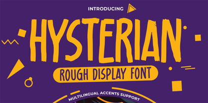 Hello Everyone, introduce our new product Hysterian is a Rough Display Font.This Playful Kids with a natural feel. This handmade font will make your design has a beautiful natural touch for each details. It is perfect for any design project as Invitation,logo, Kids,book cover, craft or any design purposes. This font is PUA encoded which means you can access all of the magical glyphs. That is Hysterian has charming unique,authentic and relaxed characteristic more natural look to your text. It also features a wealth of special features including Alternates glyphs.
 - Rathery by Scratch Design,
$15.00 Please welcome, Rathery Rathery is a textured handwritten script font made by Love. This font is detailed and has a beautiful shape. It will give you a summer vibe in your design. This font will be perfect for posters, invitations, branding, social media content, headlines, body text in magazines, logos and many more. What you'll get : Uppercase and lowercase Numbers & punctuation Multilingual support Alternates for lowercase Ligatures Please make sure you have your OpenType Ligatures turned on to see the magic of ligatures. Thank you for your purchase! Hope you enjoy our font!
 - Koran by Genesislab,
$10.00 Koran Sans is a clean family sans humasnist style that is absolutely perfect for editorial headlines. The complete font family of upright and italic letters is easy for you to use 18 styles in many projects. This font is complete with symbols and multilingual. This font style is bold, bold, and sleek, making it perfect for editorial, web, posters, t-shirts, and magazine covers. . etc Including: Uppercase Letters, Numbers, Punctuation & Symbols. Multilingual Support Koran sans exudes character but is still useful thanks to its restrained geometric styling and modern construction.
 - Marydale by Three Islands Press,
$29.00 While helping produce a trade magazine years ago, I admired the hand-lettering of the art director -- a woman named Marydale -- and suggested she let me model a font after her penmanship. She agreed and drew out the alphabet, and I launched an old copy of Fontographer and (to shorten a long story) ended up developing my very first digital typeface. Which has since, astonishingly, become famous worldwide. So now the real Marydale gets the mixed blessing of seeing her handwriting (and name) plastered all over the planet. Full release has regular, bold, and black weights.
 - Cinta by Tipo Pèpel,
$21.00 We are really happy to introduce you to Cinta, a brand new elegant sans serif font designed for text. It has a humanistic skeleton, dressed up with a hand-made mechanical suit, which made it rush, audacious. A dedicated tribute to the breakdown of mestizo music rhythm, bright, dreamy but completely real. Full of a broad variety of weights and versions, it’s able to produce subtle changes in the typographic stain. Perfect to make delicate hierarchy both in web and text and show the world their family background undoubtedly. Prudent and thrifty, condensed forms and with a generous x-height, it almost accidentally saves space and avoids being a spendthrift. Discreet even in the italic, slightly slanted to produce a subtle change of look on web use, will make a delightful for the most exquisite users with the audacity of modernity. Classic but not silly. Generous in abundance, with small caps, old numerals, denominators and numerators, fractions, ligatures, all you need to survive in the new modern life of Opentype with elegance. Polyglot, with support for Latin languages, Central European and Cyrillic. A delicate friend who will delight ladies and gentlemen who are discerning and cosmopolitan.
 - Halcyon by Studio Buchanan,
$12.00 Halcyon is a post-geometric typeface made up of 16 fonts across 8 weights. Each weight contains an upright with a corresponding true italic. Halcyon's design builds on the foundations of classic typefaces such as Futura, Gill Sans and ITC Avant Garde Gothic, by mixing their geometric structure with more modern humanist qualities and attributes. The result is a friendly and approachable personality with a sophisticated and serious edge. Halcyon feels familiar, but unique, playful but not asinine. The versatility of its character makes Halcyon a reliable choice for any design decision. With a large variety of weights, and a whole host of Open Type features, Halcyon can adapt to fit the tone of your communications. The lighter weights present a more refined and formal voice, while the heavier, oversized weights grow more exuberant. It's large x-height and open apertures increase it's legibility, making it perfect for setting large display headlines or small sized, long form text. Halcyon is a multilingual family with hundreds of accented characters, and allows for customisable characters through diacritic combinations. All European languages are already covered, alongside many more within the Latin alphabet.
 - Excalibur Stone by Comicraft,
$19.00 After the death of Uther Pendragon, long before Arthur was King of the Britons and before Galahad was destined to find the Holy Grail, the mighty sword Excalibur appeared, thrust into a Stone bearing the inscription; “Whosoever Pulleth Out This Sword of this Stone and Anvil, is Rightwise King Born of England!” While no champion worthy of becoming king was able to pull the sword, England was plunged into the Dark Ages... the legend on the stone aged, and became cracked and weathered... much as one might find on your stone tablet, ipad or mobile device. See the families related to Excalibur Stone: Excalibur Sword.
 - Mela by Resistenza,
$39.00 Mela was created with a pointed brush and walnut ink using thick brushstrokes. The original idea was to make a kind of urban graffitti with a fat brush, but the final result is more refined and elegant. Something new - light and bold together. The letters are a little bit slanted using sharp strokes, the brush gives the illusion of a fat-tipped marker. This handmade typeface has a lot of contrast, it brings together the beauty of the calligraphic shapes and strokes with the esthetics of a modern urban style. It creates a carefree feeling, contemporary, adding a perfect modern touch to your work. The possibilities for customized layouts are limitless, using the opentype ligatures and alternates to you make Mela your own. Mela Pro contains 473 glyphs: alternates, ligatures, icons, ornaments, and much more. Mela regular is limited to letters, figures and punctuation. Mela & Mela Pro are perfect for headlines and short texts. Use it for magazines, packaging, advertising, branding, posters, editorials, TV, movies and websites to give to your projects the unmistakable human touch of beautiful handwritten letters.
 - Lust Pro by Positype,
$50.00 Confident and versatile, Lust Pro™ is an exercise in indulgence—an attempt to create something over the top and vastly useful. If Lust Pro seems both new and familiar, that’s because it is. The series unapologetically channels Herb Lubalin, but produced with a deliberate, contemporary twist. There is an intentional slyness infused in the letterforms—the extreme thick and thin lines flow effortlessly without becoming gratuitous. It’s always just enough, not too much. What makes the type series so appealing? The curves. When asked to describe the letterforms, most people unwittingly allude to the human form, using adjectives usually reserved for describing physical traits… creating all-too-familiar comparisons. Summerour has grown to accept this as unavoidable and reasonable given his acknowledgement of its influences and has provided nuances within the letterforms to accentuate that. Intended to be set large, the typeface boasts 3 widths and 5 weights and matching italics for both the Regular and Didone variants (that’s 60 fonts in total), making it perfect for editorial use and a highly flexible solution for any display need.
 - Lust Pro Didone by Positype,
$50.00 Confident and versatile, Lust Pro™ is an exercise in indulgence—an attempt to create something over the top and vastly useful. If Lust Pro seems both new and familiar, that’s because it is. The series unapologetically channels Herb Lubalin, but produced with a deliberate, contemporary twist. There is an intentional slyness infused in the letterforms—the extreme thick and thin lines flow effortlessly without becoming gratuitous. It’s always just enough, not too much. What makes the type series so appealing? The curves. When asked to describe the letterforms, most people unwittingly allude to the human form, using adjectives usually reserved for describing physical traits… creating all-too-familiar comparisons. Summerour has grown to accept this as unavoidable and reasonable given his acknowledgement of its influences and has provided nuances within the letterforms to accentuate that. Intended to be set large, the typeface boasts 3 widths and 5 weights and matching italics for both the Regular and Didone variants (that’s 60 fonts in total), making it perfect for editorial use and a highly flexible solution for any display need.
 - Tijuf by Twinletter,
$15.00 Introducing our newest display font, Tijuf, this font designed with a unique and creative shape gives you the ease of use in a variety of your project needs. designed in a fun, cheerful, and unique style. When used in conjunction with other fonts in our collection, it gives you the ability to create unique, captivating, and highly impressive visual displays. of course, your various design projects will be perfect and extraordinary if you use this font because this font is equipped with a font family, both for titles and subtitles and sentence text, start using our fonts for your extraordinary projects.
 - Wubble by Typodermic,
$11.95 Welcome to Wubble Labs—where we don’t just think outside the box, we dissolve it! Our team of mad scientists has been busy experimenting with the latest in colloidal glopulation technology, and we’re thrilled to present our latest creation: Wubble, the blobbiest, squishiest, most liquid font you’ve ever seen! We know what you’re thinking, “liquid font? What the heck does that even mean?” Well, let us tell you, Wubble is more than just a font—it’s a living, breathing, dripping typographical workfish. Each letter is like a tiny blob of ooze, flowing and shifting in a mesmerizing dance of liquidy goodness. But don’t let Wubble’s gooey exterior fool you—this font is the product of years of careful research and development. Our team of scientists have spent countless hours studying the precise characteristics of colloidal glopulation, perfecting every last detail to bring you the finest liquid font ever produced. So if you’re ready to take your design game to the next level, come on down to Wubble Labs and see what all the fuss is about. We promise, once you go Wubble, you’ll never go back! Most Latin-based European writing systems are supported, including the following languages. Afaan Oromo, Afar, Afrikaans, Albanian, Alsatian, Aromanian, Aymara, Bashkir (Latin), Basque, Belarusian (Latin), Bemba, Bikol, Bosnian, Breton, Cape Verdean, Creole, Catalan, Cebuano, Chamorro, Chavacano, Chichewa, Crimean Tatar (Latin), Croatian, Czech, Danish, Dawan, Dholuo, Dutch, English, Estonian, Faroese, Fijian, Filipino, Finnish, French, Frisian, Friulian, Gagauz (Latin), Galician, Ganda, Genoese, German, Greenlandic, Guadeloupean Creole, Haitian Creole, Hawaiian, Hiligaynon, Hungarian, Icelandic, Ilocano, Indonesian, Irish, Italian, Jamaican, Kaqchikel, Karakalpak (Latin), Kashubian, Kikongo, Kinyarwanda, Kirundi, Kurdish (Latin), Latvian, Lithuanian, Lombard, Low Saxon, Luxembourgish, Maasai, Makhuwa, Malay, Maltese, Māori, Moldovan, Montenegrin, Ndebele, Neapolitan, Norwegian, Novial, Occitan, Ossetian (Latin), Papiamento, Piedmontese, Polish, Portuguese, Quechua, Rarotongan, Romanian, Romansh, Sami, Sango, Saramaccan, Sardinian, Scottish Gaelic, Serbian (Latin), Shona, Sicilian, Silesian, Slovak, Slovenian, Somali, Sorbian, Sotho, Spanish, Swahili, Swazi, Swedish, Tagalog, Tahitian, Tetum, Tongan, Tshiluba, Tsonga, Tswana, Tumbuka, Turkish, Turkmen (Latin), Tuvaluan, Uzbek (Latin), Venetian, Vepsian, Võro, Walloon, Waray-Waray, Wayuu, Welsh, Wolof, Xhosa, Yapese, Zapotec Zulu and Zuni.
 - HiH Firmin Didot by HiH,
$10.00 Before Bodoni, there was Didot. With the publication by Francois Ambroise Didot of Paris in 1784 of his prospectus for Tasso’s La Gerusalemme Liberata, the rococo typographical style of Fournier de Jeune was replaced with a spartan, neo-classical style that John Baskerville pioneered. The typeface Didot used for this work was of Didot’s own creation and is considered by both G. Dowding and P. Meggs to be the first modern face. Three years later, Bodoni of Parma is using a very similar face. Just as Bodoni’s typeface evolved over time, so did that of the Didot family. The eldest son of Francois Ambroise Didot, Pierre, ran the printing office; and Firmin ran the typefoundry. Pierre used the flattened, wove paper, again pioneered by Baskerville, to permit a more accurate impression and allow the use of more delicate letterforms. Firmin took full advantage of the improved paper by further refining the typeface introduced by his father. The printing of Racine’s Oeuvres in 1801 (seen in our gallery image #2) shows the symbiotic results of their efforts, especially in the marked increase in the sharpness of the serifs when compared to their owns works of only six years earlier. It has been suggested that one reason Bodoni achieved greater popularity than Didot is the thinner hairlines of Didot were more fragile when cast in metal type and thus more expensive for printers to use than Bodoni. This ceased to be a problem with the advent of phototypesetting, opening the door for a renewed interest in the work of the Didot family and especially that of Firmin Didot. Although further refinements in the Didot typeface were to come (notably the lower case ‘g’ shown in 1819), we have chosen 1801 as the nominal basis for our presentation of HiH Firmin Didot. We like the thick-thin circumflex that replaced the evenly-stroked version of 1795, possible only with the flatter wove paper. We like the unusual coat-hanger cedilla. We like the organic, leaf-like tail of the ‘Q.’ We like the strange, little number ‘2’ and the wonderfully assertive ‘4.’ And we like the distinctive and delightful awkwardness of the double-v (w). Please note that we have provided alternative versions of the upper and lower case w that are slightly more conventional than the original designs. Personally, I find the moderns (often called Didones) hard on the eyes in extended blocks of text. That does not stop me from enjoying their cold, crisp clarity. They represent the Age of Reason and the power of man’s intellect, while reflecting also its limitations. In the title pages set by Bodoni, Bulmer and Didot, I see the spare beauty of a winter landscape. That appeals to a New Englander like myself. Another aspect that appeals to me is setting a page in HiH Firmin Didot and watching people try to figure out what typeface it is. It looks a lot like Bodoni, but it isn't!
 - Sincerely by Canada Type,
$24.95Whether with pen on paper, or in digital, realistically connecting vertical handwriting is never an easy task to accomplish. After working with many handwriting fonts, and after intently dissecting so many different handwritings, one tends to expect such things to be quirky, disconnected, and almost never upright. In fact, in spite of vertical handwriting’s academically-sung virtues of rationality, efficiency, clarity and logic, very few people manage to deviate from the natural slant when writing. Even fewer manage to make the vertical handwriting connect and keep its natural flow. Calligraphy and upright cursive aside, it is almost impossible to make a vertical letters connect and maintain a real handwriting appearance. This is where the genius of this design comes in to bridge the gap between upright handwriting and calligraphy. Sincerely is based on one of the most fascinating handwriting designs to ever come out of Germany: Karlgeorg Hoefer’s 1968 Elegance for the Ludwig & Mayer foundry. It is a handwriting with the full meaning of the word, yet it possesses the rare, very commanding and appealing trait of being both vertical and connected while managing to remain realistic. It is the ultimate branding iron of handwriting fonts. When set and printed, Sincerely simply cannot be ignored. Ideal for humanity-asserting poster designs, lettering of short wording with plenty of space, poetry, notes, greeting cards, craft literature, book covers, history-related designs, and a whole range of other applications. - FS Pimlico by Fontsmith,
$80.00 Born in the 70s Personal influences are unavoidable in type design and usually find their way through into finished fonts. At Fontsmith, one period in particular provides inspiration, according to FS Pimlico designer, Fernando Mello. “Jason and Phil have always known that I’m very into the visual language of the 70s. I know that Jason shares my love of the 70s and Phil will sometimes admit to being a fan, too. I think that’s the reason they were both so supportive in the development of this font. “And, of course, we all share an interest in good-humoured and intelligent design. We like to think it’s a Fontsmith characteristic.” Back from black FS Pimlico started in an unusual place: with a tubby, penguin-like lowercase “a” that Fernando Mello had been sketching. From “a” grew the rest of the alphabet – a bubbly, fat, friendly family with a brush-written quality that became FS Pimlico Black. The black weight certainly isn’t the normal starting point for creating a regular and bold weight, but Fernando pressed on, driven by a glut of influences: brush-writing; Letraset and early digital systems catalogues; the type of Herb Lubalin and Tony di Spigna; 70s clothes and vinyl; and 70s revival disco nights in London’s Pimlico and Vauxhall. Natural or flourished Not often do fonts come along that seem to span the ages. FS Pimlico is at home in an office environment providing a fresh clear identity in communications or providing text that’s clear and easy to read. But it likes to party, too, 70s style. With the OpenType features switched on, a designer can totally change the look of their work, and create point-of-sale, headlines and titles that stand out and get noticed.
 - FS Pimlico Variable by Fontsmith,
$249.99Born in the 70s Personal influences are unavoidable in type design and usually find their way through into finished fonts. At Fontsmith, one period in particular provides inspiration, according to FS Pimlico designer, Fernando Mello. “Jason and Phil have always known that I’m very into the visual language of the 70s. I know that Jason shares my love of the 70s and Phil will sometimes admit to being a fan, too. I think that’s the reason they were both so supportive in the development of this font. “And, of course, we all share an interest in good-humoured and intelligent design. We like to think it’s a Fontsmith characteristic.” Back from black FS Pimlico started in an unusual place: with a tubby, penguin-like lowercase “a” that Fernando Mello had been sketching. From “a” grew the rest of the alphabet – a bubbly, fat, friendly family with a brush-written quality that became FS Pimlico Black. The black weight certainly isn’t the normal starting point for creating a regular and bold weight, but Fernando pressed on, driven by a glut of influences: brush-writing; Letraset and early digital systems catalogues; the type of Herb Lubalin and Tony di Spigna; 70s clothes and vinyl; and 70s revival disco nights in London’s Pimlico and Vauxhall. Natural or flourished Not often do fonts come along that seem to span the ages. FS Pimlico is at home in an office environment providing a fresh clear identity in communications or providing text that’s clear and easy to read. But it likes to party, too, 70s style. With the OpenType features switched on, a designer can totally change the look of their work, and create point-of-sale, headlines and titles that stand out and get noticed. - Kadeworth by Typodermic,
$11.95 Introducing Kadeworth—the bold, contemporary typeface that commands attention. With its daring, rounded design, Kadeworth is a true standout in the world of graphic design. Its compact, space-saving letters pack a powerful punch, making it the perfect choice for headlines and bold statements. But don’t be fooled by its sleek exterior—Kadeworth also has a soft side. Its smooth letterforms have a warm, inviting quality that will draw your audience in and keep them engaged. Whether you’re creating a cutting-edge tech brand or a stylish lifestyle blog, Kadeworth will bring your message to life with its unique blend of strength and softness. With its hi-tech voice, Kadeworth is perfect for modern designs that demand attention. It’s versatile enough to work in a variety of settings, from edgy editorial layouts to sleek corporate branding. So why settle for a dull, lifeless typeface when you can elevate your designs with Kadeworth’s bold, rounded charm? Try it out today and see the difference for yourself. Most Latin-based European writing systems are supported, including the following languages. Afaan Oromo, Afar, Afrikaans, Albanian, Alsatian, Aromanian, Aymara, Bashkir (Latin), Basque, Belarusian (Latin), Bemba, Bikol, Bosnian, Breton, Cape Verdean, Creole, Catalan, Cebuano, Chamorro, Chavacano, Chichewa, Crimean Tatar (Latin), Croatian, Czech, Danish, Dawan, Dholuo, Dutch, English, Estonian, Faroese, Fijian, Filipino, Finnish, French, Frisian, Friulian, Gagauz (Latin), Galician, Ganda, Genoese, German, Greenlandic, Guadeloupean Creole, Haitian Creole, Hawaiian, Hiligaynon, Hungarian, Icelandic, Ilocano, Indonesian, Irish, Italian, Jamaican, Kaqchikel, Karakalpak (Latin), Kashubian, Kikongo, Kinyarwanda, Kirundi, Kurdish (Latin), Latvian, Lithuanian, Lombard, Low Saxon, Luxembourgish, Maasai, Makhuwa, Malay, Maltese, Māori, Moldovan, Montenegrin, Ndebele, Neapolitan, Norwegian, Novial, Occitan, Ossetian (Latin), Papiamento, Piedmontese, Polish, Portuguese, Quechua, Rarotongan, Romanian, Romansh, Sami, Sango, Saramaccan, Sardinian, Scottish Gaelic, Serbian (Latin), Shona, Sicilian, Silesian, Slovak, Slovenian, Somali, Sorbian, Sotho, Spanish, Swahili, Swazi, Swedish, Tagalog, Tahitian, Tetum, Tongan, Tshiluba, Tsonga, Tswana, Tumbuka, Turkish, Turkmen (Latin), Tuvaluan, Uzbek (Latin), Venetian, Vepsian, Võro, Walloon, Waray-Waray, Wayuu, Welsh, Wolof, Xhosa, Yapese, Zapotec Zulu and Zuni.
 - Girasol by Lián Types,
$35.00 This is a cute story about a mother and her son. :) About a decade ago my own mother got very interested in my work. She used to say my letters had so many swirls and dazzling swashes, and suggested my job seemed to be very fun. She wondered if she could ever try to make her own alphabet... Well, she is a civil engineer and a maths teacher, and appeared to be a little tired of exact sciences... I remember answering this, while she was listening with her typical tender look: -"Mamá... While type-design may be a really enjoyable thing to do, it also involves having a great eye and knowledge about the history of letters: nice curves and shapes require a meticulous study and, like it happens in many fields, practice makes perfect"-. Well, she raised her eyebrows at me. -"and so what?"- She didn't have any experience neither in the field of art nor in the field of graphic design so, I told her that if she really wanted to get into this she should borrow some of my calligraphic books from my beloved shelves in my office. So... she did. Some weeks after that, she came to me with many sketches made with pencils and markers: some letters where very nice and unique while others naturally needed some work. I remember she added ball terminals to all of her letters (even if they didn't need them) because that was one of the rules she imposed. After some back and forth, we had the basis for what would be today, ten years later, the seed of this lovely font Girasol. Her proposal was nice, something I was not accustomed to do, that’s why many years later I decided to watch it with fresh new eyes and finished it. While she was in charge of making the lowercase letters, I helped with the uppercase and also added my hallmark in the alternates, already seen in others of my expressive fonts. The result is an upright decorative font that follows the behavior of the copperplate nib with a naive touch that makes it really cute and useful for a wide range of products. Many alternates per glyph make Girasol a very fun to use font which will delight you. Above posters are a proof of that! This font is a gift for my mother, Susana, who, in spite of her exacts academic background, taught me that beauty can also be found in the imperfect. 1 NOTES (1) In my fonts I'm always in seek of the perfect curve. When I designed Erotica and Dream Script, I read about Fibonacci’s spirals!
 - Legendaria by Corradine Fonts,
$59.95 Legendaria is a very sophisticated and elegant connected script font. Its more than 1300 ornamented characters make it incredibly versatile. Most lower case letters have at least 15 different options, including tails and flourishes. For Open Type users “Legendaria OT” is the best choice instead the separated files of ornamental complementary fonts.
 - Murisa Barbara by Murisa Studio,
$10.00 This time we present to you our newest font. Barbara is one of our proud fonts. Barbara is designed with the inspiration of a woman's beauty. Barbara was born with stunning elegance. You can use this font for your daily needs, such as writing a message, quote words, or the name of the recipient of your invitation. You can of course also use this font in your products. Barbara will perfect your product. Elegance, cheerfulness, beauty will be the main attraction for your product. Get it right now.
 - Antafeda by Gloow Studio,
$15.00 Antafeda is our another retro script typeface. Use this typeface and you will make a retro design with ease! Combined your design with dozens of stylistic alternates and elegant swashes which is included in this typeface, this retro typeface is really perfect for logo design, t-shirt, vintage and retro badge, vintage quotes, branding, packaging, etc. Antafeda features: A full set of upper & lowercase characters Numbers & punctuation Multilingual language support PUA Encoded Characters +320 Glyph Up to 80 Stylistic Alternates with Swashes and Ligatures! OpenType Features To enable the OpenType Stylistic alternates, you need a program that supports OpenType features such as Adobe Illustrator CS, Adobe InDesign & CorelDraw X6-X7, Microsoft Word 2010 or later versions. There are additional ways to access alternates/swashes, using Character Map (Windows), Nexus Font (Windows), Font Book (Mac) or a software program such as Pop Char (for Windows and Mac). Thankyou for purchasing our product, hope you like and have fun with our product. If you have any queries, questions or issues, please don't hesitate to contact us directly. If you satisfied with our product, please give 5 stars rating. Happy Designing...