10,000 search results
(0.041 seconds)
- Ornable by Casloop Studio,
$16.00 Meet Ornable Typeface, your font of choice for a captivating blend of Renaissance, Art Nouveau, Medieval, and Art Deco vibes. This single-weight typeface is designed for those seeking a font that embodies a rich tapestry of artistic nuances. With 35 meticulously crafted ligatures, Ornable ensures your text is not just seen but experienced. Dive into the charm of fractions for precise numerical representation and case-sensitive forms for a perfect interplay of uppercase and lowercase letters. Stand out effortlessly with the inclusion of a unique arrow symbol, adding a modern touch to your designs. Ornable adapts seamlessly to various themes, from the classic allure of Renaissance to the bold geometry of Art Deco. Whether you're crafting posters or logos, Ornable celebrates your creativity with sharp lines and intricate details. It's the ideal choice for projects that demand a touch of mystique and retro charm. Capture the essence of artistic movements with this typeface and step into a world where past and future converge – embrace Ornable and redefine the boundaries of your creative expression.
 - Love Duets by Ingrimayne Type,
$9.00 LoveDuets is a family of two novelty fonts that have letters on hearts. There are at least five other font families on myfonts that have have letters on hearts but LoveDuets differs from them because it uses the OpenType feature of Contextual Alternatives (calt) to put two letters on each heart, one on the left side and a second on the right side. The two styles in the family can be used in layers to increase color possibilities. The brace characters have empty half hearts that can be used to replace spaces or to complete hearts at ends of lines. LoveDuets can be used when hearts are appropriate such as for Valentines Day, anniversaries, and weddings.
 - Magic Daisy by Supfonts,
$10.00 Hello, friends. I keep experimenting with handwritten fonts, shapes and lines. I want the font to set the tone, the atmosphere, look defiant, and read well. Try my new font, I think it combines all these qualities. Simple and clear, looks at ease. It is perfect for decoration or design where you don't need strict style :) Test it out below to see how it could look for your next project! Includes: Uppercase and lowercase Numbers and punctuation Foreign language support Ligatures Check out my blog: https://www.instagram.com/zloillev pinterest.com/dmitriychirkov7 Enjoy
 - Acroyear by Typodermic,
$11.95 Looking for a unique display typeface that will set your designs apart? Look no further than Acroyear! This quirky font is based on a soft, capsule shape that is sure to catch the eye of anyone who sees it. And while it can be used horizontally, it truly shines when placed on an upward incline. Whether you’re designing a poster, logo, or website, Acroyear is the perfect font to add a touch of personality to your work. Its soft curves and playful vibe make it perfect for anything from children’s books to edgy fashion campaigns. But don’t just take our word for it—give Acroyear a try for yourself and see how it can elevate your designs to the next level. With its unique style and endless versatility, this font is sure to become a staple in your toolkit in no time. So why wait? Try Acroyear today and see the difference it can make! Most Latin-based European, Greek, and some Cyrillic-based writing systems are supported, including the following languages. Afaan Oromo, Afar, Afrikaans, Albanian, Alsatian, Aromanian, Aymara, Bashkir (Latin), Basque, Belarusian (Latin), Bemba, Bikol, Bosnian, Breton, Bulgarian, Cape Verdean, Creole, Catalan, Cebuano, Chamorro, Chavacano, Chichewa, Crimean Tatar (Latin), Croatian, Czech, Danish, Dawan, Dholuo, Dutch, English, Estonian, Faroese, Fijian, Filipino, Finnish, French, Frisian, Friulian, Gagauz (Latin), Galician, Ganda, Genoese, German, Greek, Greenlandic, Guadeloupean Creole, Haitian Creole, Hawaiian, Hiligaynon, Hungarian, Icelandic, Ilocano, Indonesian, Irish, Italian, Jamaican, Kaqchikel, Karakalpak (Latin), Kashubian, Kikongo, Kinyarwanda, Kirundi, Komi-Permyak, Kurdish (Latin), Latvian, Lithuanian, Lombard, Low Saxon, Luxembourgish, Maasai, Macedonian, Makhuwa, Malay, Maltese, Māori, Moldovan, Montenegrin, Ndebele, Neapolitan, Norwegian, Novial, Occitan, Ossetian, Ossetian (Latin), Papiamento, Piedmontese, Polish, Portuguese, Quechua, Rarotongan, Romanian, Romansh, Russian, Sami, Sango, Saramaccan, Sardinian, Scottish Gaelic, Serbian, Serbian (Latin), Shona, Sicilian, Silesian, Slovak, Slovenian, Somali, Sorbian, Sotho, Spanish, Swahili, Swazi, Swedish, Tagalog, Tahitian, Tetum, Tongan, Tshiluba, Tsonga, Tswana, Tumbuka, Turkish, Turkmen (Latin), Tuvaluan, Uzbek (Latin), Ukrainian, Venetian, Vepsian, Võro, Walloon, Waray-Waray, Wayuu, Welsh, Wolof, Xhosa, Yapese, Zapotec Zulu and Zuni.
 - Quandor by Stiggy & Sands,
$29.00 The Quandor Family began as a digitization of a film typeface from LetterGraphics known simply as "Impacta". The original specimen included standard Capitals and Lowercase, as well as a Biform character set. We've fleshed out the original style and added an Oblique to the family, but we just couldn't leave it alone at that, and beefed it up to include an Ultra Black and Ultra Black Oblique style as well, because uber heavyweight font styles are the bees knees. Chocked full of features, including Biform alternates, SmallCaps, and SmallCaps Biform alternates, this family is built to perform. See the 5th graphic for a comprehensive character map preview. Opentype features include: - Full set of Inferiors and Superiors for limitless fractions. - SmallCaps feature. - Tabular and Proportional figure sets. - A small collection of Standard Ligatures. - Stylistic Alternates for Biform alternates and SmallCaps Biform alternates. Approx. 818 Character Glyph Set: Each style of Quandor comes with a glyphset that includes standard & punctuation, international language support, and additional features.
 - Lomesty by Sabrcreative,
$25.00 Introducing Lomesty, a captivating signature monoline font that exudes elegance and style. Designed with precision and attention to detail, Lomesty is the perfect choice for adding a touch of sophistication to your projects. Whether you're creating wedding invitations, branding materials, or personal stationery, this font will leave a lasting impression. With its seamless integration of uppercase and lowercase letters, Lomesty offers versatility and flexibility in your designs. Its extensive range of numbers and punctuations ensures consistency and harmony throughout your typography. Lomesty goes beyond language barriers with its multilingual support, allowing you to express yourself in various languages and cater to a diverse audience. From English to Spanish, French to German, Lomesty has got you covered. Unlock the full potential of Lomesty with its PUA encoding, which provides easy access to alternate glyphs and ligatures. This feature enhances the flow and uniqueness of your designs, making them truly stand out. Experience the beauty and finesse of Lomesty, where every stroke embodies elegance. Let this signature monoline font elevate your projects and bring them to life. Whether it's a logo, a website, or an art print, Lomesty will leave a lasting impression.
 - HT Libreria by Dharma Type,
$19.99 This font consists of thin lines, we get very delicate impression.The straight lines are regularly arranged, at the same time, this font has very beautiful curved lines. So its overall atmosphere is intelligent and sophisticated. Holiday Type Project offers retro hand drawing scripts. Inspired by retro script on shopfront lettering, wall paint advertisements in Italy around 1950s. Check out the script fonts from Holiday Type!
 - Time To Play by Vozzy,
$10.00 Introducing vintage label font named Time To Play. This font has a wide languages support with west european and cyrillic characters (check out all available characters on previews). The font family has four styles: Base, Grunge, Volume and Texture. All styles have the same metrics and kerning. This font will look good on any vintage styled designs like a poster, T-shirt, label, logo, etc.
 - Andara by BonjourType,
$15.00 'Andara' is a handwritten font. We created this font for any modern branding brand. Unique and natural hand touch gives a different impression, this can make attention to take a closer look at your brand. Some agencies like this font for branding modern products, you can also make a large number of logos with one font as this font is suitable for use on web logos, signatures, portfolios, prints, headers, magazines, book covers, printed t-shirts, crafts, and cosmetic packaging. Hope this is a font worthy of your collection. Thank you,
 - Hawkes by Kimmy Design,
$15.00 Hawkes is an extensive handmade typeface family that comes with a bundle of weights, widths and styles, all designed to work cohesively. Here is a breakdown of the Hawkes family. Hawkes Sans: The primary subfamily is a sans-serif typeface that includes nine fonts: three weights (light, medium and bold) and three widths (narrow, regular and wide). Within this set are an array of stylistic features; including small capitals, character style alternatives, discretionary ligatures and contextual alternatives. See details below for more information on OpenType Features. Hawkes Variable Width Sans: The secondary subfamily is the same base sans-serif fonts but combined in variating widths. Essentially, it takes all three widths of each weight and randomly mixes them together. This creates a funky and creative alternative to the more traditional sans-serif set. The variations are for the uppercase, lowercase, small capitals, ligatures and numbers. Hawkes Script: The last subfamily is the script typeface. It’s a quirky script with variations of its own, including ligatures, swashes and contextual alternatives (again, see below for further details.) The script font works great as a complimentary style to the sans-serif, or on it’s own. FEATURES Alright, let’s get into all the extra goodies this typeface has to offer. Small Capitals: Small caps are short capital letters designed to blend with lowercase text. These aren’t just capital letters just scaled down but designed to fit with the weight of both the lowercase and capitals. With Hawkes, small caps can either sit on the baseline (in line with the base of the capital and lowercase) or to be lifted to match the height of the capital letters by applying the discretionary ligature setting in the OpenType panel. These small capitals have a dot underlining them that sit along the baseline. The feature offers a unique display affect that is great for logos, titles and other headline needs. Discretionary Ligatures: A discretionary ligature is more decorative and unique combination than a standard ligature and can be applied at the users discretion (as the name indicates.) The specific styling for these ligatures varies for different fonts. With Hawkes, they are used as an all capital styling feature, or to lift the small capitals to align with the height of the capitals. In the former setting, both lowercase and uppercase letters are first changed to all capitals, then a specialized set of letter combinations are transitioned so small characters are positioned within a main capital letter. These combinations only happen with main characters that include an applicable stem, such as C F K L R T Y. Some of these combinations include two or three characters. When Small Caps is turned ‘on’, this feature will lift the small caps to the height of the capital letter. For more information, please check out the user guide! Stylistic Alternatives: Stylistic alternates are a secondary form of a character, often used to enhance the look or style of a font. For Hawkes, these alternatives provide a slightly more handmade feel. A - the capital and small capital A will lose its pointed apex and become rounded. Think of it more as an upside-down U than an up-side-down V ;-) Oo, G, Ss, Cc- these characters’ topmost terminal becomes a loop. The O is applied automatically, the G S and C need to be turn on individually. Titling Alternatives: This feature does sort of the opposite of what it intends. Instead of being used for titling purposes, this feature makes the text look better in paragraph text settings. Kk Rr h n m - curved terminals on the are straightened e - the counter stroke also gets straightened from a more looping motion y - the shape of y is changed from a rounded character to a sharper apex (think more like a ‘v’ than ‘u’) Contextual Alternatives: Contextual alternates are glyphs designed to work within context of other adjacent glyphs. With Hawkes Sans, there are three slightly different variations per character. The feature rotates the application of each variation. This helps with organic authenticity, so if you have two e’s next to each other, they won’t look identical (reflecting the natural variations in handwriting and lettering.) With Hawkes Variable width fonts, I have created a contextual pattern that randomizes the widths of each character. So, when the feature is turned ‘on’ in the OpenType panel, the widths would alternate in a pattern such as: Narrow, Wide, Regular, Narrow, Regular Wide, Narrow, etc. It happens automatically so the user doesn’t have to think or worry about getting a random seed. With Hawkes Script, contextual alternates allow strokes to connect properly from one character to the next while maintaining a believable, natural flow. Connecting strokes are present for two letters next to each other but are replaced by a shorter stroke when located at the end of a word or sentence. Some characters have in-strokes when located at the start of a word. When a character is preceded by a capital letter that doesn’t connect, it too needs an in-stroke or altered spacing. This feature is complicated and messy, but luckily you don’t really have to think about it! I’ve done all the coding so all you have to do is turn ‘on’ the feature in the OpenType panel and you are off to the races! I’m just letting you know what’s happening behind the scenes. Swashes: These are just for Hawkes Script and provide tail swashes to the start and ends of letters. There are three different options. You can pick the basic option by turning ‘on’ the swash feature in the OpenType panel, or you can pick using the Glyph panel. Stylistic Sets: This feature work in new versions of Illustrator CC and InDesign CC. You can pick specific styling sets instead of turning on an entire feature. For example, let’s say you want to have a loopy S, but not a loopy C or O, you can just turn on the S in the Style Set. It also helps create the little drop box that pops up when you hover over a character, showing you the alternates associated with that character. This makes it easy to pick and choose specific styles you want in a word or headline. ---------- And there it is folks! That’s all the basic info on Hawkes, I know it’s been a lot and I appreciate you hanging on. If you are like me and need more of a visual reference to accessing all these goodies, I’ve made a user guide to help navigate Hawkes and everything it has to offer. Altogether this extensive family boasts 14 total fonts in a wide array of styles, weights and widths, making it a great addition to any handmade type collection. Enjoy!
 - Hocky by Sensatype Studio,
$15.00 Hocky is an Ultra Condensed Headline Sans Serif Font that perfect for headline, Title, Instagram post, etc. A new San Serif Font that we created special for Headline, Title and more stand out typography needs, with extra ligature that will add your variations. It's so perfect to add your style and headline overview. And specially for Headline font, we crafted for unique style and modern feels so enjoy to create any project that will show your main idea out. Hocky Ultra Condensed Headline Sans Serif Font ready with: Any options to get creative variations (combination of Ligature Characters) Preview as a inspirations that you can do with Hocky font Ready with All characters Wish you enjoy our font. :)
 - Varien SS by Sensatype Studio,
$15.00 A Modern Strong Display Font that perfect for technology, sport, racing, action design project. A new Display Font that we created special for Headline, Title and more stand out typography needs, with extra outline that will add your variations. It's so perfect to add your style and headline overview. And specially for Headline font, we crafted for futuristic style and modern feels so enjoy to create any project that will show your main idea out. Varien Modern Strong Display Font ready with: Any options to get creative variations (combination of Outline Characters) Preview as a inspirations that you can do with Varien font Ready with All Uppercase characters Wish you enjoy our font. :)
 - Grish by Sensatype Studio,
$15.00 A Modern Sans serif font are prepared special for action, bold, and sport design needs. A new Sans serif font that we created special for Headline, Title and more stand out typography needs, with extra outline that will add your variations. It's so perfect to add your style and headline overview. And specially for Brisk font, we crafted for futuristic style and modern feels so enjoy to create any project that will show your main idea out. Grish Brutalism Sans Serif Font ready with: Any options to get creative variations (combination of Outline Characters) Preview as a inspirations that you can do with Grish font Ready with Uppercase and Lowercase characters Wish you enjoy our font. :)
 - ATF Headline Gothic by ATF Collection,
$59.00 ATF Headline Gothic cries out to be used in headlines, and that is exactly how it was used after it was first created by American Type Founders in 1936 with newspapers in mind. It would be hard to imagine a better typeface for a shocking, front-page headline in a scene from an old black-and-white movie. With its all-caps character set, and its big, bold, condensed design, ATF Headline Gothic is the epitome of its name. “Extra! Extra!” The style of ATF Headline Gothic recalls the bold, condensed gothic display faces of the 19th century, but with more refinement in its details than many large types of the time (typically wood type). Its most recognizable trait is the restrained, high-waisted M, with short diagonal strokes that end with their point well above the baseline; this avoids the sometimes cramped look of a bold condensed M with a deep “V” in the middle, common in many similar headline faces. The digital ATF Headline Gothic comes in a single weight, all caps, like its predecessor, but offers two styles: one crisply drawn, and a “Round” version with softer corners, to suggest a more “printed” feel, reminiscent of wood type. Of course, in either style it includes a full modern character set, including symbols such as the Euro, Ruble, and Rupee, that didn’t exist in 1936.
 - Caliber by Loaded Fonts,
$15.00A highly decorative slab-serif that is combat ready. The steady contrast and sharp angles make it great for titles and posters. Mechanical and aggressive but can easily be used for static background text and shapes. May keep Bodoni and Niagara Solid company if not for just a short while. - Majidah by insigne,
$21.99Majidah is an attempt to replicate the look and feel of an ancient script taken from the pages of an antique document. It has a Middle Eastern feel to it, but could be used for a wide range of applications. Majidah includes a number of OpenType features, including alternatates, ligatures and old style figures, and includes accents for wide range of languages. - Skript by Wilton Foundry,
$49.00 Skript attempts to capture the essence of handwritten calligraphy. It emphasizes downstrokes and omits hair strokes with a contemporary stencil-like effect. Text is very readable since the foundation of each character remains intact. There many alternatives that make Skript versatile in a variety of applications. Compared to Carnegie Classic, Skript is more legible but less compact. Skript is available in Opentype.
 - Pardon Me Boy! by Greater Albion Typefounders,
$8.00 Pardon me boy, is that the Chattanooga Choo-choo? Well, not quite, but "Pardon Me Boy!" is a set of silhouette based ornaments capturing railway locomotives and rolling stock from around the world. Use it to form up trains to make suitable themed rules and borders, or just for fun anywhere a bit of locomotive power will add life and movement!
 - A Likely Story by Comicraft,
$39.00 Finally an animated alphabet with a tall tale to tell -- perfectly suited to putting words in the mouths of mutts, talking tigers and anthropomorphic animal characters of all kinds. The precise thick and thin pen strokes of these eight versatile weights are well suited to gag strips, classic cartoons and maybe even that internet meme you've been thinking about for weeks!
 - Rangarang by Si47ash Fonts,
$24.00 "At last, something beautiful you can truly own!" This is the first Persian Arabic & Latin COLOR font ever designed! Chromatic or Color fonts are fairly new. And Persian Arabic color fonts are extremely rare. Here, you get a font that supports both Arabic and Latin! Rangarang [means colorful] font comes in with a wonderful color set and variety in forms. Every single glyph has a unique palette of colors. If you look closely at the glyphs, you'll see complex paths and connections in every single one of them. Each glyph could be seen as a typographic artwork! Rangarang font is great for entertainment design, posters, business cards, website titles, magazine illustrations, logotypes, book covers, banners, billboards,... There are countless options! Notes: - SVG fonts contain vector letters with gradients and transparency. - These fonts will show up in apps that are compatible with color fonts, like Adobe Photoshop CC 2017.0.1 and above, Illustrator CC 2018. Learn more about color fonts and their support in third-party apps on: www.colorfonts.wtf - Don't worry about what you see here in the preview section in your browser. You may see the glyphs in black here, but this font is working EXACTLY how you can see it in the font pictures I put here. So if you use it in apps that support colored fonts, you can be sure that after installing the font on the system you will be able to use it like every other font. Shahab Siavash, the designer has done more than 30 fonts and got featured on Behance, Microsoft, McGill University research website, Hackernoon, Fontself, FontsInUse,... Astaneh and Hezareh text and headline fonts, Yaddasht and Yadgar handwriting fonts,... already got professional typographers, lay-out and book designers' attention as well as some of the most recognizable publications in Persian Arabic communities.
 - Axiom by Australian Type Foundry,
$30.00Influenced heavily by the work of Erik Spiekerman, Axiom came out of a desire to capture Spiekerman's simplicity and elegant style. Axiom seems to work well when extended. - Noki by ActiveSphere,
$30.00 The new release is called Noki. A font family Ideal for flyers, label, logos, magazine, product branding, corporate branding, signage, posters and certainly in advertising. Check it out !
 - Skulduggery by Hanoded,
$15.00 I was playing around with some brushes and ink, and out came Skulduggery. Use it for any project you can apply the term ‘skulduggery’ to. Or not. Whatever.
 - Grafinc by PosterType,
$18.00 Grafinc is fat, black and robust. It is a geometric-based display typeface that comes in two cuts: ExtraBlack and Rounded. Grafinc can be used for all types of media – print, web, broadcasting or games. Despite its robust appearance and display character, Grafinc is very friendly typeface. It appears to be very legible in smaller sizes, too. The cuts include some very fine ligatures, making its appearance very rhythmic and smooth. Available in OpenType and western languages.
 - Abrog by Product Type,
$19.00 Meet Abrog, a futuristic technology font designed to add a sophisticated and inspiring touch to any of your designs. Abrog combines elements of modern technology with the sophistication of design, creating a font that is not only aesthetic but also exudes sustainability. Each character in Abrog reflects a future concept, bringing a sense of cutting-edge technology to your work. Do not miss this opportunity! Get Abrog Futuristic Technology Font now and let each character be a portal to your design future.
 - Adeline by ryan creative,
$10.00 Adeline which has a simple and minimalist design. In this font, there are no serifs or extra lines that stand out at the ends of the letters, making them appear more minimalistic and easier to read. Adeline can be used in both modern and contemporary designs, and is suitable for use in a variety of fashion media, posters, magazines, typography and other digital media. FEATURE; -Uppercase -Support Foreign, Numbers and Punctuation. -Alternative. -Regular. -Works on PC. -Simple installation. -Accessible in Adobe Illustrator, Adobe Photoshop. Adobe InDesign, it even works in Microsoft Word. -Fully accessible without additional design software. Adeline is encoded with Unicode PUA, which allows full access to all additional characters without having to design any special software. Mac users can use the Font book, and Windows users can use the Character map to view and copy any extra characters to paste into your favorite text editor/app. Thank you for visiting ;)
 - Papercute by S&C Type,
$9.00 2018 Update: We extended the language support, added a Black version and added new ornaments. Thank you! Papercute is a cute hand-drawn font designed by Fanny Coulez and Julien Saurin in Paris. Inspired by paper cutting, this font is easy to read, easy to play. Small caps are a little different than caps to create alternative glyphs. We also designed a set of cute paper ornaments, to enhance your designs. We also designed an inline version of this font: Papercute Inline . You could follow us on our Instagram: instagram.com/sc.type Merci beaucoup!
 - Fatum by ParaType,
$25.00 Fatum™ is a new original ultrablack slab serif typeface that was initiated by the impression of the TDC 2011 exhibition. Redundant stem thickness and closed character shapes make a feeling that counterspaces are the narrow slits cut in massive character bodies. Fatum can be used in large sizes in placards, playbills, in the headings of magazines, newspapers and Web-pages, as initials in book setting, for typographic illustrations and compositions. Ultrablack weight also gives a possibility to insert pictures, ornaments or other decorations into the contours of letters. This typeface was designed by Sveta Morozova and released by ParaType in 2013.
 - Banjelo by Keristyper Studio,
$14.00 Banjelo is inspired by the 90's vibes, making it feel retro, vintage, and classy. This font is good for logo design, Social media, Movie Titles, Books Titles, short text even long text letters, and good for your secondary text font with script, sans, or serif. Featured: * Standard Uppercase & Lowercase * Numeral & Punctuation * Multilingual : ä ö ü Ä Ö Ü ß ¿ ¡ * Alternate & Ligature * PUA encoded We recommend programs that support the OpenType feature and the Glyphs panel such as Adobe applications or Corel Draw. so you can use all the variations of the glyphs. Hope you enjoy our fonts!
 - Gottera by Keristyper Studio,
$14.00 Gottera is a condensed font with visual elegance, smooth curves make your work look more attractive. This font is good for logo design, Social media, Movie Titles, Books Titles, short text even long text letters, and good for your secondary text font with the script, sans, or serif. Featured: Standard Uppercase & Lowercase Numeral & Punctuation Multilingual : ä ö ü Ä Ö Ü ß ¿ ¡ Alternate & Ligature PUA encoded We recommend programs that support the OpenType feature and the Glyphs panel such as Adobe applications or Corel Draw. so you can use all the variations of the glyphs. Hope you enjoy our fonts!
 - Worn Gothic by Baseline Fonts,
$39.00 Worn Gothic, a typeface from the Grit History™ B family, creates rock solid text-- characters that are weathered, defined and strong, like the body of a gargoyle. Worn Gothic is rugged but legible, whose words stay firmly liquid, like dates stamped in concrete. Disjointed K legs create an unnerving look that makes you stare into the structure of the type. Oddities like this complement the integrity of its fluctuating strokes and consistent X-Height. It offers a few stylistic alternates to maintain readability at any size, in many languages. Worn Gothic offers full Greek character support as well as all punctuation.
 - Kitsch by Zetafonts,
$39.00 Designed by Francesco Canovaro with help from Andrea Tartarelli and Maria Chiara Fantini, Kitsch is a typeface happily living at the crossroads between classical latin and medieval gothic letterforms. But, rather than referencing historical models like the italian Rotunda or the french Bastarda scripts, Kitsch tries to renew both its inspirations, finding a contemporary vibe in the dynamic texture of the calligraphic broad-nib pen applied to the proportions of the classical roman skeleton. The resulting high contrast and spiky details make Kitsch excel in display uses, while a fine-tuned text version manages to keep at small sizes the dynamic expressivity of the design without sacrificing legibility. Both variants are designed in a wide range of weights (from the almost monolinear thin to the dense black), and are fully equipped with a extended character sets covering over two hundred languages that use latin, cyrillic and greek alphabets. Special care has been put in designing Kitsch italic letterforms, with the broad-nib movements referencing classical italian letterforms to add even more shades to your typographic palette. The resulting alternate letter shapes have also been included in the roman weights as Stylistic Alternates - part to the wide range of Open Type features (Standard and Discretionary Ligatures, Positional Numerals, Small Caps and Case Sensitive Forms) provided with all the 32 weights of Kitsch. Born for editorial and branding use, Kitsch is fashionable but solid, self-confident enough to look classic while ironic enough to be contemporary.
 - Breezy Pro by Reyrey Blue Std,
$18.00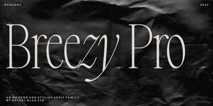 Introducing, Breezy Pro Typeface. A classical typeface with a complementary italic version. It's elegant, modern, and stylish. Mix and match them to create eye-catching effects and make every word a masterpiece. Breezy Pro is perfectly suited for fashion and magazine design, Inspirational quote designs, logo designs, simple and classy Logos, web font, branding, product packaging, and much more. This font is PUA-encoded, which means you can easily access all of the glyphs! Features : All Uppercase and Lowercase Number & Symbol Supported Languages Ligatures PUA Encoded Hope you enjoy our font!
 - Edison by HiH,
$12.00 Edison, is it Victorian or is it Art Nouveau? While this typeface may be found in Petzendorfer’s Treasury of Art Nouveau Alphabets, I believe the decorative spirals are more Victorian than “New Art.” To me, they looked tacked on, rather than organic -- with the industrial mechanics of a coiled spring, rather than the tendrils of a growing plant as the philosophical wellspring. Originally released by ATF in 1894 as Houghton, this typeface was re-released shortly thereafter by Bauer and Berthold in Germany as EDISON. Please do not make the mistake of thinking the font we offer here is no better than freeware fonts in cheap rip-off collections. This font has a set 218 characters and represents many hours manipulating the bezier curves to produce acceptable results. Available freeware fonts are often little more than raw scans with little accuracy of letterform. The muddy line intersections are a dead give-away. Frequently all you get is the alphabet itself. No numbers, no punctuation and don't even think about diacriticals. The font we offer represents a tremendous value. Considering the hours of work involved, I have no business charging so little. I could make better money cooking hamburgers or bagging groceries. But we want very much to encourage you to purchase and enjoy these fascinating historical typefaces and are making it as easy as possible for you to do so. So please encourage us and order Edison today.
 - Mosse by Deltatype,
$49.00 Mosse is an extraordinary sans-serif typeface that designed for improve readability, formal but casual, with straight cut at terminal and reverse angled at spur and finial give a little bit sweet. Mosse is simple and identical, come with nine weights allowed you to use the right weight to the right proportions. Mosse also support many languages, thanks to extended latin glyphs. Mosse come with standard Adobe Latin 4 glyphs, world-ready and mark2mark support.
 - Eccles by Greater Albion Typefounders,
$14.50 Eccles is another of our 'Early Victorian' typefaces, a series we started with the Wolverhampton family a little while ago. It might be described as 'extreme-Tuscan' in style but has a delicacy that many other Tuscan faces seem to lack. It's ideal for giving design projects a clear period feel, particularly in design and advertising work. We also see it having considerable application in preparing invitations to a certain type of happy event. At the other extreme, some of our younger associates have described it as 'your latest Steampunk font'. So perhaps we'll just have to settle on it having a split personality...
 - Prolexia by Dyslexica,
$10.00 Prolexia is designed to make the font friendly towards those with dyslexia. All the characters are unique with no rotation or mirroring, this makes it harder for the mind to mix up similar glyphs. The characters are made with the illusion of perspective: this helps orient characters in the correct direction to make mental reorientation harder. Finally the o shape is somewhat flattened, this also helps to counteract mental rotation of characters.
 - Frieze by Fine Fonts,
$29.00 The origin of this font was a frieze in the RAF Chapel in Westminster Abbey which Michael Harvey was commissioned to design and create. It was comprised of the names of the top brass in wartime Bomber Command, namely Dowding, Harris, Newall, Tedder, Portal and Douglas. The Brief was to cut the letters in bronze and gild them. Instead, they were cut in perspex and gilded. To sit comfortably within the long and narrow vertical space available beneath the chapel’s stained glass window, extended letterforms were used with many vertical serifs omitted and with lengthened horizontal serifs. Some twenty years later, the missing upper-case letters were drawn together with the lowercase letters and Frieze, the font, was born. Subsequently, additional weights and styles were added to create a font family of six styles.
 - Chenko by Studio K,
$45.00 Chenko is a nod to Alexander Rodchenko the Russian Constructivist artist and designer whose poster work is characterised by its stark, stripped down typography and bold, geometric graphics. It was truly revolutionary in its day, and continues to be influential in ours. Chenko is my own take on his deceptively simple letterforms, and designing a font without a curve or a diagonal (okay I cheated on a few details like the O-slash and A ring characters) presented some interesting design challenges!
 - AwanZaman by TypeTogether,
$93.00 AwanZaman has a three-phase story, beginning with Dr Mamoun Sakkal’s two Arabic styles and culminating with Juliet Shen’s Latin extension. AwanZaman started as simply Awan, a commission for a modern, clean, monoline typeface for writing headlines and story titles in a forward-thinking Kuwaiti newspaper. Awan was based on the geometric forms of Kufic script, while in phase two, a second typeface (Zaman) was designed to add enough calligraphic Naskh details to make it easy to read in demanding newspaper settings. Together these two phases give the typeface a warm, familiar, and progressive look, as well as an explanatory two-part name — AwanZaman. Since most editorials use typical Naskh headline fonts with an exaggerated baseline, Awan’s rational forms immediately distinguish it as a modern and progressive voice in the crowded field of Arabic editorial typefaces. As the companion Arabic typeface, Zaman has the same basic proportions and forms as Awan, but with many cursive, energetic, and playful details. And since modern monoline fonts are increasingly being used to set extended texts, more features were borrowed from Naskh calligraphy to expand the typeface’s use from headlines into text setting. When using the AwanZaman Arabic family, Awan (geometric Kufic forms) is the starting point. To add the sweeping, energetic personality of Zaman (calligraphic Naskh forms), simply activate an alternate character through the option of 20 stylistic sets available in any OpenType-savvy software. The two typefaces function as one file — the AwanZaman Arabic family — allowing users to combine features from both designs to transform the appearance of text from geometric and formal to playful and informal. The third phase of AwanZaman’s development introduced a companion Latin typeface designed by Juliet Shen to fulfil the persistent need in the Arabic fonts market for modern and geometric bilingual type families. Due to the Arabic’s monolinear strokes, AwanZaman Latin was destined to be a sans serif with a tall x-height, larger counters, and corresponding stem thickness to harmonise with the Arabic’s overall text colour and page presence. But it needed much more. One of AwanZaman’s chief assets is making the two languages look on a par when typeset side by side. Arabic and English readers will have a different sense of what that entails, but this type family defers to the Arabic — graceful and artistic with a good mix of straight stems and curved forms. Latin in general doesn’t aesthetically flow the way Arabic does, yet the tone of the Latin needed to mirror both the Arabic’s more squarish curves and formal personality of Awan and the undulating and more playful shapes of Zaman without looking outlandish. That need was met by creating some novel Latin characters, which are accessed through four stylistic sets the same way as AwanZaman Arabic. The alternates are not just clever in the way they look and how they echo the Arabic aesthetic, but also in harmonising the disparate languages and serving designers well when needing a balanced, bilingual text face with a warm and lively voice. AwanZaman is a clever, seven-weight powerhouse that makes extensive use of OpenType’s stylistic sets (20 in the Arabic and four in the Latin) so writers and designers can make the most of everything from a single glyph in display sizes down to dense text in paragraphs. As AwanZaman Arabic has no italic, neither does the Latin; contextual distinction normally handled by italics is achieved by exploiting the family’s seven weights. AwanZaman’s intricate OpenType programming supports Persian and Urdu, with features such as the returning tail of Barri Yeh treated properly. From its inception in geometry to its melding of two worlds with novel forms, AwanZaman is a personal labor by designers Dr Mamoun Sakkal and Juliet Shen, and embodies the TypeTogether ideals of serving the global community with innovative and stylish typeface solutions. The complete AwanZaman Arabic and Latin families, along with our entire catalogue, have been optimised for today’s varied screen uses.