10,000 search results
(0.033 seconds)
- Gamundia Pro by RMU,
$50.00 In 2012 the city of Schwäbisch Gmünd will celebrated its 850th anniversary, and in 2014 it was host town to the State Garden Show of Baden-Württemberg. These both celebrations were the background to create a special font for my home town and give it the town’s ancient name. Inspired by Excoffon’s Diane, I drew and digitized a new, multilingual script font which covers the main European languages written in Latin or Cyrillic letters. For users typing in the Serbian language, I recommend to activate the OT feature Stylistic Alternatives.
 - Claudius by RMU,
$25.00 A blackletter font tending towards the gothic which was released by Klingspor, Offenbach am Main, in 1937. Claudius can be used for clerical as well as for secular purposes and shows a strong character of its own. The original esthetic atrocities of placing the dieresis within the letters A and O - due to former German industry standards - were abolished. Allow the font's beauty spread by giving it enough leading between the lines. This font contains various useful ligatures, and by activating the Ordinals feature and typing 'N', 'o' and period you get an oldstyle numbersign.
 - Something Real by Gassstype,
$25.00 Hello Everyone, introduce our new product Something Real – Pure Handmade Typeface font with a Signature Style and classy style, this font is great for your creative projects such as watermark on photography, and perfect for logos & branding, photography, invitation, watermark,advertisements,product designs, stationery, wedding designs,label ,product packaging, special events or anything that need handwritting taste. That is why Something Real has charming, authentic and relaxed characteristic more natural look to your text with a more natural look to your text. You can activate Ligature OpenType panel.
 - arnica by Justi,
$15.00 Arnica is a display font based on a simple geometry that uses circles (and modules) as a structure. It is an experimental project where, in place of upercases, has alternate characters and swashes. Furthermore, arnica has 50 discretionary ligatures which, when activated, give a totally different touch to the font and also has the bold weight, which reinforce the experimentalism of the project. Combining lowercases with upercases, plus discretionary ligatures and bolds, you can write the same word in several different ways. The character set offers more than 400 glyphs and support for many languages.
 - Schwabacher by RMU,
$25.00 One of my favorite blackletter fonts - Schwabacher - redrawn and redesigned, whereby I took care to stick to the original forms as close as possible. This font which has its roots in the 15th century represents at the most the uprising humanism in this period. To get access to all ligatures, it is recommended to activate both Standard and Discretionary Ligatures. By using the OT feature Stylistic Alternatives you get the historical German umlauts which are small e above a, o, u, A, O, and U. This font contais also oldstyle figures.
 - FALLING SKIES is not just a font; it's an adventurous journey through the clouds, where letters don't just sit, they plummet with style. Created by the ever-inventive SpideRaY, this font seems to cap...
- Bird Script by Lián Types,
$24.95 Characterized by quickness, lightness, and ease of movement, Bird Script is a font which challenges many aspects of type-design: every single stroke, comes directly from the author’s hand and tries to reflect not only the tool used, but also his feelings at the moment of writing. Bird Script is a font filled up with the energic gestures of what it’s called gestural calligraphy, a not very explored field in typography, where hardly ever a letter comes the same way two times: When manipulating the pen, the letterer seeks for the beauty of the differences and the grace of a confident execution. Originally done with a flat speedball pen nib nº5 and retouched with pencil for the bolder elements, it turned into a very pleasant to the eyes font which dances between the formal rules of typography and the artistic look of calligraphy. Bird Script Pro and Bird Script Light Pro come with many ligatures, alternates and ornaments. Into the standard ligatures we find lots of pairs of two and three ligated letters so when they are activated the font seems alive. However if none of them are activated, the font gives a really particular text pattern, specially in smaller sizes. Get Bird Script, add rhythm to your work.
 - Kinfolk Pro by Fontforecast,
$29.00 Kinfolk Pro is a font collection of six fonts. The main styles Rough and Smooth are extremely sturdy and bold brush fonts. As the name suggests the smooth style has clean, crisp contours and the rough version has the authentic strokes of a slightly dried out brush. Both versions have 606 glyphs and 4 alternate ornamented capital letters to play with, organized in stylistic sets. With Discretionary Ligatures and Contextual Alternates activated you can access elongated swashes by simply typing +1 (+2, +3, +4, +5) in front of any letter and =1 (=2, =3, =4, =5) at the back. On top of that Kinfolk Pro Rough and Smooth have some extra stand alone swashes that can be accessed via the glyphs panel or by typing _1, _2 ,_3 _4 _5. Kinfolk Pro Script is a fully connected script that goes together beautifully with the other styles. For the best connections, activate Discretionary Ligatures and Contextual Alternates. Additionally there is Kinfolk Pro Ornaments for extra swashes, ink blobs and interesting strokes. Kinfolk Pro Arrows and Kinfolk Pro Flowers both offer 230 glyphs to further juice up your designs. You'll need an Open Type savvy application to get the most out of Kinfolk Pro.
 - Garava - 100% free

- Febyetska by CBRTEXT Studio,
$15.00 Febyetska is an elegant new signature style font. The thick and thin parts of each glyph give the impression of beauty and make it classy. With a new style, we want to help your project or brand become fresher and make it elegant and pleasant for all who see it.
 - Aloner by HansCo,
$17.00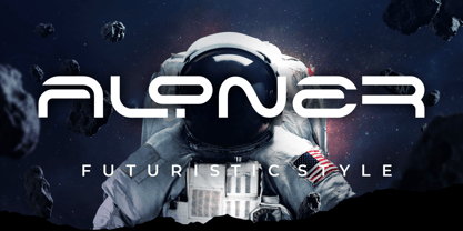 ALONER is a modern monoline font with unique style that will make your design looks modern and futuristic. You can use this font for any purpose, especially to make logotype like a technology logo brand. This typeface is comes in uppercase, lowercase, punctuation, symbols, numerals, etc also support multilingual. Enjoy!
 - Strippy by Just Font You,
$18.00 Inspired from the bold and loud visual statements from the 90s poster and graphic design trend, makes Strippy can’t hold itself to be born in this universe. A clean, square, and bold form of body, makes Strippy is the simple way to go to shot your statement louder and wider.
 - Spektakel by PizzaDude.dk,
$15.00 Spektakel is danish for something noisy - just like this font! Comes with 5 different versions of each letter, and these cycles as you type! A great way to make your text all wild and grungy - and still legible! Of course, without making too much noise, Spektakel has got multi language support!
 - Better Chocolatte by Violatype,
$14.00 Introducing, “Better Chocolatte font” is a font with unique and natural handwriting, has a natural curve, so that it makes your design better. “Better Chocolatte font” is perfect for branding logos, invitations, magazines, quotes, crafts, and more, there are standard ligatures in it, which will make your designs even better.
 - Sugar Crakers by Atom,
$19.00 Sugar Crakers is a bold signature font with pointed corners and supported with over 45 ligatures. Use your imagination to make company logos, product labels, headlines, and other designs that will make your designs come alive and become more selling points. Use Sugar Crackers for the success of your next project.
 - Posy by kapitza,
$49.00 Posy is a flower font inspired by the plant Sison Amomum or Stone Parsley. We find its structure utterly beautiful, and it inspired us to create the 52 cute graphic illustrations which make up this font. The various sizes of illustrations in this font make it easy to create stunning compositions.
 - Southville by Rillatype,
$15.00 Introducing, Southville! a bold and fun display font. it's bold characteristic and round at the edges makes this font bold and brave but have soft and fun charm. this font is perfect for books, packaging, branding, make up, novel, label, etc. Features : uppercase & lowercase numbers and punctuation multilingual PUA encoded
 - Chellaras Script by FadeLine Studio,
$20.00 Introduce Chellaras Script! This time is different, This font comes with a thin and italic style. Giving rise to an elegant, sweet and simple style. Made very slowly to make it look beautiful. Available 544 glyphs in it! Believe me, this font can increase your creativity in making certain designs!
 - Clockmaker by Sudtipos,
$49.00 Sudtipos is proud to announce the release of Clockmaker, an 8-weight family that takes initial inspiration from typography around the turn of the twentieth century. Clockmaker takes aesthetic references from Victorian, Art Nouveau and Art Deco advertising and typography, taking special influence from John F. Cummings’ all-caps – and never digitized – type design Elandkay. Clockmaker is a robust multi-weight family that includes an array of ligatures as well as alternate characters and support for all latin languages. The design process began with developing and modernizing the uppercase letterforms, followed by designing the lowercase and additional weights. Creating a diverse and playful set of uppercase ligatures was an almost endlessly enjoyable task; they are one of Clockmaker’s most charming features. Clockmaker is an impeccable choice for designs requiring a vintage flair such as a luxury liquor labels, restaurant identities, lavish hotels and many other applications where elegance and grace are needed. In addition to its historical references, Clockmaker is an homage to my grandfather who was a master craftsman, repairing antique clocks and fine watches with great skill and mathematical precision. Watching him work was fascinating and it has been a joy to remember those quiet and curious moments from my childhood while designing this font.
 - FF Info Pict by FontFont,
$62.99 Erik Spiekermann, working in collaboration with Ole Schäfer, originally designed FF Info® Display for use in the context of wayfinding systems. The variants FF Info™ Text and FF Info™ Correspondence were developed later for text setting and office communication. FF Info Display The sober and clear forms of the sans serif FF Info Display have been deliberately molded to make them perfect for use on wayfinding systems. The font by Ole Schäfer and Erik Spiekermann not only takes the problem of lack of space into account - it is some 15% narrower than comparable typefaces - the characters have also been designed to ensure they remain legible even in adverse conditions for reading. As text on signs often contains words with which readers are unfamiliar and which are thus deciphered letter for letter rather than perceived as whole words, it is essential to provide for a clear differentiation between glyphs. Additional serifs on the lowercase "i" and uppercase "I" and a small arch on the terminal of the lowercase "l" ensure that it is possible to readily discriminate between these particularly problematic letters. Moreover, sharp corners on glyphs can also make it difficult to read signs with backlighting or when driving past. The rounded corners of FF Info Display counteract this effect and make sure that the character forms remain well defined.FF Info Display is available in five carefully coordinated weights, from Regular to Bold. In the corresponding italic variants, the letters appear overall more rounded while the lowercase "a" has a closed form and the "f" has a descender. Also included among the glyphs of FF Info Display are several ligatures and arrow symbols. Pictograms with different themes that complement the typeface are also available in four weights. FF Info Text Thanks to his know-how gained through designing other typefaces, Erik Spiekermann became aware that fonts created for use in problematic environments can be used in many different situations. In smaller point sizes, FF Info Display cuts a fine figure when used to set longer texts. So Spiekermann carefully reworked FF Info Display to produce FF Info Text, a font perfected for use in this context. Not only can the characters be more generously proportioned, certain features, such as additional serifs to aid with the differentiation of problematic letters, are also no longer necessary in textual surroundings. The upright styles have a double-story "g" while Spiekermann has added oldstyle figures and small caps. FF Info Correspondence FF Info Correspondence has also been designed for setting block text although it recalls the style of old typewriter characters and is specifically intended for use in office communication. The characters of this third member of the family are thus more formal, without rounded terminals but with rectangular punctuation marks. The narrower letters are provided with large serifs to give them more space although, at the same time, this reduces the differences in terms of letter width among the alphabet. In contrast with its two siblings, FF Info Correspondence has only three weights, each with corresponding italic.The three styles of the FF Info super family cover an extensive range of potential applications. If the different kerning is adjusted manually, the three styles harmonize happily with each other and can be readily used in combination to set, for example, headlines and texts and also creative display options.
 - Oh, okay, picture this: BattleLines by Blambot Fonts, it's like the ultimate secret weapon for your design arsenal, especially if you're about to embark on a project that's screaming for that punchy,...
- VLNL Gindicate by VetteLetters,
$30.00 The alcoholic beverage Gin is drunk around the world, as far back as the 13th century. Originally distilled as a medicine, it draws its main flavour from juniper berries. Gin is colourless itself but – due to its smooth taste – a major ingredient in a long list of famous colourful cocktails. Gimlet, Singapore Sling, Negroni, Charlie Chaplin, French 75, Vesper, Tom Collins, White Lady, Aviation, Monkey Gland, Southside, Gin Gin Mule and New Orleans Fizz are but a few of them. That made us decide it simply cannot be missing from the Vette Letters font collection. Vette Letters designer Henning Brehm originally designed VLNL Gindicate for the 2015 action movie Hitman: Agent 47. It was specifically used for the logo and signage of the maverick ‘Syndicate International’ organisation in the film. It lay dormant in a folder for a while, when it was reworked into this flashy 5 weight family. VLNL Gindicate is a rounded modern sans serif family, suitable for a multitide of applications, corporate or otherwise. It has somewhat of a warm sci-fy feel, without being overtly techno-ish. In the family are 3 regular weights (Light - Regular - Bold), but also an Inline and Multiline weight for extra design possibilities. Company logos, brand identities, music flyers or posters, you name it. VLNL Gindicate will spice up any design. Bottom’s up!
 - FF Kaytek Slab by FontFont,
$50.99 Kaytek™ Slab is a fresh take on the correspondence typefaces of the 90s - which were originally designed for the demands of office environments. Just like its predecessors, this text typeface is robust and hard-working - meaning it works well in challenging design or printing environments - but it’s not without personality. Look closer at the lowercase g and a, especially in the italic, and you can see some unexpected elements of subversiveness within the design. This blend of sturdiness and quirkiness means it’s just as relevant for information-heavy projects, such as annual reports, as it is in more expressive environments. Although first and foremost designed for text, Kaytek Slab’s details shine through in its heavier weights and larger sizes, meaning it also has display potential. Every style of the typeface takes up exactly the same amount of space, thanks to the way Radek Łukasiewicz created the design. He based the entire typeface on a single, master set of proportions. This means designers can switch between styles without the text being reflowed, making it particularly useful in magazines, where space might be limited, and also on the internet, where hover links appear in a different style. As well as its roots in the office, Kaytek Slab draws on a little bit more 90s nostalgia. It’s named for the first and only Polish walkman, and embodies the same solid, no-nonsense shapes that made the analogue technology of the era so charming. Kaytek Slab is robust and solid. Kaytek Slab comes in 12 weights, from Thin to Black Italic, and offers multi-language support. Kaytek Sans, Kaytek Headline and Kaytek Rounded, are also available.
 - Gemma by Homelessfonts,
$49.00 Homelessfonts is an initiative by the Arrels foundation to support, raise awareness and bring some dignity to the life of homeless people in Barcelona Spain. Each of the fonts was carefully digitized from the handwriting of different homeless people who agreed to participate in this initiative. Please Note: these fonts include only the latin alphabet; no accented characters, no numbers or punctuation. MyFonts is pleased to donate all revenue from the sales of Homelessfonts to the Arrels foundation in support of their mission to provide the homeless people in Barcelona with a path to independence with accommodations, food, social and health care. Gemma was born in Madrid 37 years ago. After spending many years in the capital, she decided to start over again and moved to Barcelona. A series of misfortunes and wrong decisions left her on the street. Gemma is a calm, emotional person who likes to take her time to do things and, if there’s one thing the street can offer, it’s time. The street lets you listen carefully, watch without being seen. Being in the street isn’t pleasant at all. Seeing people who’ve just showered go past makes you miss even more things that many take for granted. Breakfast, a clean smell, paying for a metro ticket. Being homeless is much more than having nowhere to sleep. Life in the street is hard, says Gemma, but she also sees the positive side. “It’s the best way to get to know human beings.” She likes to see the street as if it were a school. A school she has been in and out of for too long.
 - AM Consist by Alexey Markin,
$50.00 This font I had, had only to wake up, sit down and draw it.
 - Politica MF by Masterfont,
$59.00 Unique square letter design enhanced with round edges that make any signage stand out.
 - Tango MF by Masterfont,
$59.00 A super elegant and serif font will make your next book cover stand out.
 - Zania by Agnieszka Ewa Olszewska,
$20.00 Zania is a display typeface. Its characteristic element is cutting in the stem that makes this font very memorable and easy to recognize. Contains stylistic alternates, ligatures, diacritics, and OpenType features that will help you make your project more unique. Has an experimental vibe and nice movement from left to the right thanks to serifs placed in the top left and bottom right part of the letter. It has smooth edges that make it look more friendly. The letter contrast is high. Looks good in logotypes, branding, magazine titles, book covers, posters.
 - Reaper BT by Bitstream,
$50.99Thomas Oldfield’s typeface, Reaper, is reminiscent of inscribed Greek letterforms but he claims that its origin is much simpler than that. “I recall”, Tom says, “that I just began the design by making the uppercase ‘I’ and continued using it to make up the other characters.” The cap only typeface has alternate cap forms in the lowercase positions, including a vastly scaled downed O and Q that make for some unusual text settings. Contrary to what the name might have you believe, there’s a lot of life in this quirky typeface. - Squabslab by Gassstype,
$23.00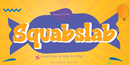 Hello Everyone, introduce our new product Squabslab - Handmade Bold Font Display, inspired by the title of the sports poster and We make it very energetically. Squabslab font with strong and challenging nuances. very suitable for the title, typography, Poster, magazines, brochures, packaging,Websites and much more for your design needs, making your designs more modern and professional This handmade font will make your design has a beautiful natural touch for each details. It is perfect for any design project as Invitation,logo, book cover, craft or any design purposes.
 - Larch by Mans Greback,
$29.00 Larch is a clear and crisp high quality script typeface. It consists of five weights: White, Bright, Shaded, Dark & Black. Each style is working great separately, but they make the perfect combination together. Larch is designed by Måns Grebäck in 2016. The font supports hundreds of languages. It contains contextual and stylistic alternates, swashes and ligatures. Write # after any lowercase letter to make swashes! You can also write % after the following letters to make left swashes: b d f h i j k l t Example: Black% Lar#ch
 - Ahganirya by Hishand Studio,
$15.00 Ahganirya is display font that boasts a modern, minimalist design, making it perfect for businesses looking for a clean and sophisticated look. The font's elegant curves and sharp edges make it a stunning choice for logos, business cards, and other design projects. Ahganirya font offers versatility and flexibility to designers looking to create a cohesive and professional brand identity. Whether you're working on a print or digital project, Ahganirya font's legibility and unique design will surely make your work stand out. Complete with - ligatures - alternates - regular - italic - icon - kerning - multilingual support
 - QEWUR by Twinletter,
$15.00 Introducing QEWUR, our newest font, an authentic font with a Japanese style theme, with an attractive and decent font shape to make your project elegant, special, gorgeous, and charming, and easy to remember for the audience. Logotypes, food banners, branding, brochure, posters, movie titles, book titles, quotes, and more may all benefit from this font. Of course, using this font in your various design projects will make them excellent and outstanding; many viewers are drawn to the striking and unusual graphic display. Start utilizing this typeface in your projects to make them stand out.
 - Blackbuster by Gassstype,
$25.00 Hello Everyone, introduce our new product Blackbuster - All Caps Bold Typeface Display, inspired by the title of the sports poster and We make it very energetically. Blackbuster font with strong and challenging nuances. very suitable for the title, typography, Poster, magazines, brochures, packaging, Websites and much more for your design needs, making your designs more modern and professional. This handmade font will make your design has a beautiful natural touch for each details. It is perfect for any design project as Invitation,logo, book cover, craft or any design purposes.
 - Valve by Typodermic,
$11.95 Introducing Valve—the ultimate industrial typeface for the modern age. With its superelliptical letterforms and pragmatic stroke logic, Valve is the perfect choice for anyone looking to evoke the cold, hard world of plastics, pharmaceuticals, electronics, and alternative energy. But don’t be fooled by Valve’s emotionless, android-like forms. This is a typeface that packs a punch, with soft stroke ends that lend it a touch of elegance and sophistication. Whether you’re designing a cutting-edge tech brochure or a sleek new website, Valve is the perfect choice for anyone who wants to convey a sense of modernity and precision. And unlike other ultramodern typefaces that rely on tongue-in-cheek references to retro futurism, Valve is purely synthetic. Built solely from artificial elements with no specific structural source, this is a typeface that’s as forward-thinking as they come. So why settle for a typeface that’s stuck in the past when you can choose Valve and embrace the future? And with OpenType fractions, numeric ordinals, and a wide range of currency symbols included, Valve is more versatile than ever. Available in five weights—Extra-Light, Light, Regular, Bold, and Heavy—as well as a set of sleek obliques, Valve is the perfect choice for anyone looking to take their design game to the next level. So what are you waiting for? Choose Valve today and see the difference that a truly ultramodern typeface can make. Most Latin-based European writing systems are supported, including the following languages. Afaan Oromo, Afar, Afrikaans, Albanian, Alsatian, Aromanian, Aymara, Bashkir (Latin), Basque, Belarusian (Latin), Bemba, Bikol, Bosnian, Breton, Cape Verdean, Creole, Catalan, Cebuano, Chamorro, Chavacano, Chichewa, Crimean Tatar (Latin), Croatian, Czech, Danish, Dawan, Dholuo, Dutch, English, Estonian, Faroese, Fijian, Filipino, Finnish, French, Frisian, Friulian, Gagauz (Latin), Galician, Ganda, Genoese, German, Greenlandic, Guadeloupean Creole, Haitian Creole, Hawaiian, Hiligaynon, Hungarian, Icelandic, Ilocano, Indonesian, Irish, Italian, Jamaican, Kaqchikel, Karakalpak (Latin), Kashubian, Kikongo, Kinyarwanda, Kirundi, Kurdish (Latin), Latvian, Lithuanian, Lombard, Low Saxon, Luxembourgish, Maasai, Makhuwa, Malay, Maltese, Māori, Moldovan, Montenegrin, Ndebele, Neapolitan, Norwegian, Novial, Occitan, Ossetian (Latin), Papiamento, Piedmontese, Polish, Portuguese, Quechua, Rarotongan, Romanian, Romansh, Sami, Sango, Saramaccan, Sardinian, Scottish Gaelic, Serbian (Latin), Shona, Sicilian, Silesian, Slovak, Slovenian, Somali, Sorbian, Sotho, Spanish, Swahili, Swazi, Swedish, Tagalog, Tahitian, Tetum, Tongan, Tshiluba, Tsonga, Tswana, Tumbuka, Turkish, Turkmen (Latin), Tuvaluan, Uzbek (Latin), Venetian, Vepsian, Võro, Walloon, Waray-Waray, Wayuu, Welsh, Wolof, Xhosa, Yapese, Zapotec Zulu and Zuni.
 - Breathe by Lián Types,
$20.00 ATTENTION COSTUMERS! A new version of this font was released in 2019. Take a look: Breathe Neue Reaching a total of more than 1000 glyphs, Breathe Pro is Maximiliano R. Sproviero’s gift of the year. The aim of the designer was once more to give the user the chance to play and travel from very formal and conservative letterforms to the amazing world of swashes and flourishes. Possibilities of alternating and ligating characters in this font are absolutely fantastic. After his last creation, Parfait Script, Lián wanted to make a more universal font. Delighted by typographic works of Didot and his followers of the beginnings of 1800, Maximiliano R. Sproviero started what became another obsessive project, which is now named Breathe, “cuando las letras respiran...” what could be translated as “when letters breathe”, due to the feeling that you are reading letters that are alive. Breathe comes in two styles which have a significant difference as regards to the quantity of glyphs available inside. If you want to get the most complete style, with over 1000 glyphs, (including contextual alternates, stylistic alternates, swashes, terminal forms, titling alternates, historical forms, stylistic sets, standard ligatures, stylistic ligatures, decorative ligatures and frames) then your choice should be Breathe Pro. On the other hand, if you are interested in having a less decorative font with the nice touch of Lián’s style, then your choice should be Breathe Standard, a more limited version of Breathe, including terminal forms (leaves) and frames. With Breathe Pro you will surely have fun at the same time you are designing and that is not an unimportant thing. The world of type-designers is growing each year, and the features of Open-Type are letting them think their creations as if they were truly pieces of art. At least, Breathe Pro is inspired in the Art of our predecessors, those who with a pen loaded of ink would decorate each letter, each page in such a lovely way. Yes, -lovely- is the word. We would not have the amazing lettering artists, calligraphers, typographers of nowadays if that -love for letters- had not traveled from generation to generation. Breathe Pro is an example of this love. An example of what Maximiliano R. Sproviero feels about typography and letters. Pssst... Look for more images and the User’s Guide at the gallery section to see it in use! http://origin.myfonts.com/s/aw/original/89/0/46067.pdf
 - Retrio by Luxfont,
$18.00 Introducing Retrio. Original glyphs with echoed behind. As if the letters were moved, but the kinetic trail remained. Colored, gradient, with transparency or solid - many options in one family for any task and for every taste. The font will emphasize the style of the 20th century in illustration. Discos, electro music, records, nostalgia - these are the associations that this font family evokes, which is very important in design. At the same time, the Retrio font is not outdated, it was created taking into account modern trends in retro themes. A unique family in which there are both color and classic monochrome versions. Great versatility in use is provided by the many fonts in the set. Great for ad designs, posters, headlines and covers. Check the quality before purchasing and try the FREE DEMO version of the font to make sure your software supports color fonts. P.s. Have suggestions for color combinations? Write me an email with the subject "Retrio Color" on: ld.luxfont@gmail.com Features: - Free Demo font to check it works. - Uppercase and lowercase the same size. - With transparency and without. - Mega high-quality gradients in letters. - Kerning. IMPORTANT: - Multicolor version of this font will show up only in apps that are compatible with color fonts, like Adobe Photoshop CC 2017.0.1 and above, Illustrator CC 2018. Learn more about color fonts & their support in third-party apps on www.colorfonts.wtf -Don't worry about what you can't see the preview of the font in the tab "Individual Styles" - all fonts are working and have passed technical inspection, but not displayed, they just because the website MyFonts is not yet able to show a preview of colored fonts. Then if you have software with support colored fonts - you can be sure that after installing fonts into the system you will be able to use them like every other classic font. Question/answer: How to install a font? The procedure for installing the font in the system has not changed. Install the font as you would install the classic fonts. How can I change the font color to my color? · Adobe Illustrator: Convert text to outline and easily change color to your taste as if you were repainting a simple vector shape. · Adobe Photoshop: You can easily repaint text layer with Layer effects and color overlay. ld.luxfont@gmail.com
 - Kinesthesia by Typodermic,
$11.95 Introducing Kinesthesia, the hypermodern typeface that channels the sleek, futuristic aesthetic of liquid crystal displays. With its sharp diamond points and hi-tech letterforms, Kinesthesia is the perfect choice for anyone looking to communicate their message with a cool, technical tone. Whether you’re designing a cutting-edge website, a high-tech advertisement, or a bold logo, Kinesthesia will give your work an unmistakable edge. But what sets Kinesthesia apart from other typefaces on the market? For starters, it offers a wide range of monetary symbols, as well as numeric ordinals, primes, and OpenType fractions. So whether you’re writing a report for work or creating a digital design for a client, you can be confident that Kinesthesia has all the symbols and characters you need to convey your message with precision. And of course, let’s not forget Kinesthesia’s angular design. With its sharp, diamond-shaped points, this typeface is the perfect choice for anyone looking to add a contemporary edge to their work. Available in Ultra-Light, Extra-Light, Light, Regular, Semi-Bold, Bold, and Heavy with obliques, Kinesthesia offers a wide range of weights and styles to suit any design need. So if you’re ready to take your design game to the next level, look no further than Kinesthesia. With its technical aesthetic and wide range of features, this typeface is the perfect choice for anyone looking to make a bold, unforgettable statement. Most Latin-based European writing systems are supported, including the following languages. Afaan Oromo, Afar, Afrikaans, Albanian, Alsatian, Aromanian, Aymara, Bashkir (Latin), Basque, Belarusian (Latin), Bemba, Bikol, Bosnian, Breton, Cape Verdean, Creole, Catalan, Cebuano, Chamorro, Chavacano, Chichewa, Crimean Tatar (Latin), Croatian, Czech, Danish, Dawan, Dholuo, Dutch, English, Estonian, Faroese, Fijian, Filipino, Finnish, French, Frisian, Friulian, Gagauz (Latin), Galician, Ganda, Genoese, German, Greenlandic, Guadeloupean Creole, Haitian Creole, Hawaiian, Hiligaynon, Hungarian, Icelandic, Ilocano, Indonesian, Irish, Italian, Jamaican, Kaqchikel, Karakalpak (Latin), Kashubian, Kikongo, Kinyarwanda, Kirundi, Kurdish (Latin), Latvian, Lithuanian, Lombard, Low Saxon, Luxembourgish, Maasai, Makhuwa, Malay, Maltese, Māori, Moldovan, Montenegrin, Ndebele, Neapolitan, Norwegian, Novial, Occitan, Ossetian (Latin), Papiamento, Piedmontese, Polish, Portuguese, Quechua, Rarotongan, Romanian, Romansh, Sami, Sango, Saramaccan, Sardinian, Scottish Gaelic, Serbian (Latin), Shona, Sicilian, Silesian, Slovak, Slovenian, Somali, Sorbian, Sotho, Spanish, Swahili, Swazi, Swedish, Tagalog, Tahitian, Tetum, Tongan, Tshiluba, Tsonga, Tswana, Tumbuka, Turkish, Turkmen (Latin), Tuvaluan, Uzbek (Latin), Venetian, Vepsian, Võro, Walloon, Waray-Waray, Wayuu, Welsh, Wolof, Xhosa, Yapese, Zapotec Zulu and Zuni.
 - Pctl4800 by Typodermic,
$11.95 Introducing PCTL4800, a technical sans-serif typeface that’s a must-have in every designer’s toolkit. This typeface is the perfect choice for those who want to achieve a modern or futuristic aesthetic without the vintage baggage or technological gimmickry. With its somber and principled design, PCTL4800 is the perfect choice for conveying a sense of technical sophistication. What sets PCTL4800 apart is its unique corner index notch, a design feature that hints at an unknown technical necessity, such as an orientation prompt like the notch on an SD card. This feature adds a touch of mystery and intrigue to your designs, making them stand out from the crowd. And if you prefer a more conservative design, PCTL9600 is the typeface for you. It has all the same great features as PCTL4800, but without the corner index notch. Both typefaces come with six weights and italics, giving you a wide range of options for any project you’re working on. Why not add PCTL4800 or PCTL9600 to your font collection today and take your designs to the next level with its technical sophistication? Most Latin-based European, Vietnamese, Greek, and most Cyrillic-based writing systems are supported, including the following languages. Afaan Oromo, Afar, Afrikaans, Albanian, Alsatian, Aromanian, Aymara, Azerbaijani, Bashkir, Bashkir (Latin), Basque, Belarusian, Belarusian (Latin), Bemba, Bikol, Bosnian, Breton, Bulgarian, Buryat, Cape Verdean, Creole, Catalan, Cebuano, Chamorro, Chavacano, Chichewa, Crimean Tatar (Latin), Croatian, Czech, Danish, Dawan, Dholuo, Dungan, Dutch, English, Estonian, Faroese, Fijian, Filipino, Finnish, French, Frisian, Friulian, Gagauz (Latin), Galician, Ganda, Genoese, German, Gikuyu, Greenlandic, Guadeloupean Creole, Haitian Creole, Hawaiian, Hiligaynon, Hungarian, Icelandic, Igbo, Ilocano, Indonesian, Irish, Italian, Jamaican, Kaingang, Khalkha, Kalmyk, Kanuri, Kaqchikel, Karakalpak (Latin), Kashubian, Kazakh, Kikongo, Kinyarwanda, Kirundi, Komi-Permyak, Kurdish, Kurdish (Latin), Kyrgyz, Latvian, Lithuanian, Lombard, Low Saxon, Luxembourgish, Maasai, Macedonian, Makhuwa, Malay, Maltese, Māori, Moldovan, Montenegrin, Nahuatl, Ndebele, Neapolitan, Norwegian, Novial, Occitan, Ossetian, Ossetian (Latin), Papiamento, Piedmontese, Polish, Portuguese, Quechua, Rarotongan, Romanian, Romansh, Russian, Rusyn, Sami, Sango, Saramaccan, Sardinian, Scottish Gaelic, Serbian, Serbian (Latin), Shona, Sicilian, Silesian, Slovak, Slovenian, Somali, Sorbian, Sotho, Spanish, Swahili, Swazi, Swedish, Tagalog, Tahitian, Tajik, Tatar, Tetum, Tongan, Tshiluba, Tsonga, Tswana, Tumbuka, Turkish, Turkmen (Latin), Tuvaluan, Ukrainian, Uzbek, Uzbek (Latin), Venda, Venetian, Vepsian, Vietnamese, Võro, Walloon, Waray-Waray, Wayuu, Welsh, Wolof, Xavante, Xhosa, Yapese, Zapotec, Zarma, Zazaki, Zulu and Zuni.
 - Rotis II Sans by Monotype,
$50.99 Developed over several years by the late Otl Aicher and first released in the late 1980s, the Rotis® typeface has become a timeless classic. ROTIS II SANS HISTORY Aicher was a renowned German designer and corporate image consultant. He created the four basic designs of Rotis – sans serif, semi sans, semi seif and serif – within an extended typeface family concept, wherein all designs share a common cap height, lowercase x-height, basic stem weight and general proportions. While each version is part of the large, integrated family, each was also designed to function on its own as a distinctive typestyle. The result is that all members of the Rotis family combine smoothly with each other. Aicher, however, did not design the Rotis family with the weights and proportions normal for more contemporary releases. Rotis Sans Serif, for example, was drawn with just six weights and only two italics. Starting in 2010, Robin Nicholas, senior designer for Monotype Imaging in the UK, and freelance designer Alice Savoie collaborated to bring Rotis Sans Serif up to current standards. The result is Rotis II Sans, a completely new addition to the Rotis family. “We devised our approach together,” recalls Savoie, “deciding which weights to start with, what kind of alterations to make to the original Rotis, etc. I went to work on the typefaces, regularly submitting proofs to Robin. We would then decide in tandem on the next steps to take.” Nicholas elaborates, “We revisited the range of weights and added matching italics so that the new additions to the family offer increased versatility. We optimized the outlines, corrected the weight of several letters and re-examined overall spacing and kerning. In addition to a new set of numerals, with a height similar to the capitals, we also drew case-sensitive punctuation.” ROTIS II SANS USAGE The new Rotis II Sans suite comprises 14 typefaces: seven weights, ranging from extra light to black, each with a companion italic. The designs are available as OpenType® Pro fonts, allowing for automatic insertion of ligatures and fractions. Pro fonts also offer an extended character set supporting most Central European and many Eastern European languages. Aicher’s original Rotis designs were widely used for branding and advertising. With the addition of Rotis II Sans, the family is again poised to become a powerful communicator.
