10,000 search results
(0.251 seconds)
- Boundar by Huruforia,
$8.00 Boundar is a sans serif font with a Geometric style, this font consists of 6 Weights and 208 Glyph. Boundar is taken from the Indonesian word "Bundar" which means circle because in this font there are so many circle elements in the manufacturing process. And I (Grapya) as the designer in this font hope, Boundar Typeface can be useful for you. If there is an error or anything that is less pleasing, you can contact us via our email, we will be happy to receive a review from you so that my team and I can be better in the future. and please note that every font that we upload in front of your monitor screen must have been tested by the curator of MyFonts. Thank You, Grapya & Suratoria Team
 - Brutman by Sardiez,
$36.00 The purpose of Brutman was to create a typeface that reimagined the incise style for the 21st century. Its roots emerge from the humanistic style, adopting the structures of the roman capitals for the upright version and some features of the chancery style for the italics. On the other side, its contours are forged by the frankness of the brutalist style, which can be seen in the asymmetrical flared terminations, the sharp shoulders and the diagonal cuts that emulate the stress of the broad nib pen. The result is a typeface that combines a sleek character with a historical flair. It conveys a feeling of modernity and sophistication when it comes to shine in big sizes, but on the functional size has sharp shapes that make it perform very well on small ones.
 - Sancoale by insigne,
$22.00 Sancoale is a new sans serif that is simple and geometric. It is a contemporary design that is distinctive and unique, but not too far outside the box. This makes for a typeface family that is very useful for many applications. The design is simplified without stems or spurs in the default character set. The OpenType alternates do include alternates with stems, and there are six weights with true italics. Please see the informative .pdf brochure to see these features in action. OpenType capable applications such as Quark or the Adobe suite can take full advantage of the automatically replacing ligatures and alternates. This family also includes the glyphs to support a wide range of languages. Sancoale is a great choice for a professional designer that wants to achieve a simple but still unique look.
 - Decoral Soft by Totem,
$30.00 Decoral Soft depicts the character of Art Deco period typography and reinterprets it into modern approaches. This typeface is a friendly and flexible family that is fun to use. It comes with a set of 670 characters per weight, supporting over 50 different languages using the Latin alphabet. Decoral Soft also comes with special stylistic sets and swash characters that allow the user to be creative and playful with the type, helps enhance many different possibilities that certainly will spice up your design. Decoral Soft will satisfy all your typographic needs, from book jackets to monograms to packaging, logos, and even wedding invitations—timelessly elegant, with a distinctive flair that exudes Art Deco typography in a fresh, modern way. The wide selection of titling alternates and ligatures make copyfitting a delight.
 - Like Butterflies by Bogstav,
$10.00 Now here's a font that is named Like Butterflies, but has got nothing to do with butterflies! What? Why? Well, I recently heard the song "Even flow" by Pearl Jam and took a trip down memory lane - back to my early twenties. I remember how the lyrics affected me, and had an impact on how my life changed the years to follow. Maybe the style of the font does not reflect the inner meaning of the song, but it does reflect a look back in time for me - and the change that took place. Nevertheless, I hope you enjoy the somewhat simple, handmade style of Like Butterflies and the 4 versions that works very well together! Please notice that each letter has got 5 slightly different versions to choose from!
 - Catalina by Kimmy Design,
$10.00 Earlier this year I visited a bakery in Newport Beach, CA and fell in love with the organic design and typography of the place. Hand-drawn menus, table cards, chalkboards, and wall quotes surrounded the charming spot. It inspired me to create a new font family based on the combination of hand drawn fonts. Included in this package are 5 font families, with 2 graphic ornament fonts. Each font family contains at least a light, medium and bold. Here is a breakdown of what's cookin' at Catalina's Bakery: Catalina Anacapa: Tall and skinny, this font comes in 3 weights for both sans and slab serif styles. It includes contextual alternatives (giving 3 versions of each letter), stylistic alternatives for select letters (A, K, P, Q, R, Y) and also includes Small Caps. Catalina Avalon: Based off Anacapa, this sub family has a high contrasting line weight. It comes in light, regular and bold as well as an inline alternative for both sans and slab serif styles. Avalon also includes opentype features such as contextual alternatives (giving 3 versions of each letter), stylistic alternatives for select letters (A, K, P, Q, R, Y) and small caps for each letter. Catalina Clemente: In a more standard width, Clemente is one of the two sub families that can be used for paragraph text as well as headlines. It's organically geometric in style and comes in ALL CAPS and lowercase, includes upright and custom italics, and has the opentype feature giving 3 versions of each letter. Catalina Script: A great compliment with the display sub-families, Catalina Script rounds out the package with a hand-drawn cursive flair. It includes contextual alternatives (giving 2 variations to each letter) as well as stylistic alternatives for many of the capital and lowercase letters. It has special ligatures for some letter combinations, and titling alternatives for all the capital letters. Catalina Typewriter: The second of the paragraph text sub-families, this typewriter inspired hand-drawn font family works great as either a display or paragraph text. It has contextual alternatives with 3 versions of each letter, and comes in both upright and custom italics versions. Catalina Extras! These two fonts go perfectly with the Catalina Family. They includes borders, frames, arrows, banners, flourishes and more. Catalina Flourish has all of it's options in a light and bold style, to use the light version type all lowercase letters, then to make something bold, used it's uppercase (or shift+) characters. For a breakdown of graphic/letter correlation, see the breakdown PDF. All of Catalina was drawn by the same hand, using the same ink and technique. While they contrast in their type styles, they work together perfectly to create one cohesive font family.
 - Anisette Std Petite by Typofonderie,
$59.00 Geometric font inspired by shop signs in 4 styles Anisette has sprouted as a way to test some ideas of designs. It has started with a simple line construction (not outlines as usual) that can be easily expanded and condensed in its width in Illustrator. Subsequently, this principle of multiple widths and extreme weights permitted to Jean François Porchez to have a better understanding with the limitations associated with the use of MultipleMaster to create intermediate font weights. Anisette built around the idea of two widths capitals can be described as a geometric sanserif typeface influenced by the 30s and the Art Deco movement. Its design relies on multiple sources, from Banjo through Cassandre posters, but especially lettering of Paul Iribe. In France, at that time, the Art Deco spirit is mainly capitals. Gérard Blanchard has pointed to Jean Francois that Art Nouveau typefaces designed by Bellery-Desfontaines was featured before the Banjo with this principle of two widths capitals. The complementarity between the two typefaces are these wide capitals mixed with narrow capitals for the Anisette while the Anisette Petite – in its latest version proposes capitals on a square proportions, intermediate between the two others sets. Of course, the Anisette Petite fonts also includes lowercases too. Anisette Petite, a geometric font inspired by shop signs in 4 styles So, when Jean François Porchez has decided to create lowercases the story became more complicated. His stylistic references couldn’t be restricted anymore to the French Art-déco period but to the shop signs present in our cities throughout the twentieth century. These signs, lettering pieces aren’t the typical foundry typefaces. Simply because the influences of these painted letters are different, not directly connected to foundry roots which generally follow typography history. The outcome is a palette of slightly strange shapes, without strictly not following geometrical, mechanical and historical principles such as those that typically appear in typefaces marketed by foundries. As an example, the Anisette Petite r starts with a small and visible sort of apex that no other similar glyphs such as n or m feature, but present at the end of the l and y. The famous g loop is actually inspired by Chancery scripts, which has nothing to do with the lettering. The goal is of course to mix forms without direct reports, in order to properly celebrate this lettering spirit. This is why the e almost finishes horizontally as the Rotis – and the top a which must logically follow this principle and is drawn more round-curly. This weird choice seemed so odd to its designer that he shared his doubts and asked for advise to Jeremy Tankard who immediately was reassuring: “Oddly, your new top a is fine, it brings roundness to the typeface, when the previous pushes towards Anisette Petite to unwanted austerity.” The Anisette Petite, since its early days, is a mixture of non-consistent but charming shapes. Anisette, an Art Déco typeface Anisette Petite Club des directeurs artistiques, 46e palmarès Bukva:raz 2001
 - Schizophrenia G - Unknown license

- Remarkably Dressed by Bogstav,
$12.00 A handmade layered font that wants to be a part of your next creative project!
 - Primal Scream by Comicraft,
$19.00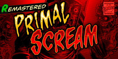 AAAAAAAARRRRRR RAGGGHHHHHHHHH HHHHGRRRRAAAAA GGHHHHHHHHHHAIE EEEEERGHHHHHHHH HHHGRAARGHHGHH HHHHKKKKKAAAAA IIIEEEEEEEEEEEEHHH HHHHHHHHGGGGGG HHHHHHHHRRRARRRRRRRRRGHRRRRR AAAAAAAAAAAARRRRRRR!!!!!!!!!!!!!! Ahhh. That felt good.
 - Tara by Haiku Monkey,
$10.00Tara is a bold, fun handwriting font that scales really well to large point sizes. - TDR by VSF,
$16.00 A heavy futuristic display font that can be strecthed and squiched without losing its identity.
 - Hastrico DT by DTP Types,
$46.00 Sans serif grotesque with a rounded feel that makes it suitable for text or display.
 - Wee Ian by m u r,
$10.00Searching for a font that resembled true children's handwriting. Ideal for anything related to children. - Gulerod by Bogstav,
$12.00 Gulerod is carrot in danish - doctors suggest that you eat at least one every day!
 - Babo by Nedamamo,
$15.00 A Handdrawn typeface that can be used to create almost all types of design projects.
 - Stomper by MADType,
$21.00 Inky and grungy, Stomper is perfect for your layouts that require the look of imperfection.
 - KG How Many Times by Kimberly Geswein,
$5.00 A cute, markered skinny font that is tall and neat with plenty personality to spare.
 - Buster by ITC,
$29.99Buster is a shadowed typeface that Tony Wenman designed in 1972 for Letraset transfer sheets. - Worstveld Sting by Typotheticals,
$10.00Not to be confused with Worstveld Sling, this is a further redesign of that font. - MHF Headbanger by MetalHead,
$14.95 A balance of ballad-meets-distortion that will make you want to Bang Your Head!
 - Imagine a font that decided to throw on a tuxedo, sip a glass of exquisite wine, and then, mid-sip, dash off to join a carnival. That, my friend, is Reprise Script by Avid Technology. It's like the h...
- Ashemore by insigne,
$34.99 Ashemore developed as a result of my visits to Barcelona, Spain and to Germany, followed soon after by a visit to Asheville, North Carolina. Blending the styles of art and architecture from these three areas may seem initially to result in an unusual formula, but the distinct and flamboyant style of Art Nouveau and the Arts and Crafts style combined with the more strict rules of a sans serif transfer well into a beautiful and very usable blend of these individually eccentric forms. The resulting font retains the Art Nouveau and Craftsman style flavors, which shine through the typeface despite its geometric base. One of the font’s defining characteristics is the unique terminators of its C, G and S. This face’s texture and rhythm also moves well in longer texts. These and other features give Ashemore a restrained bohemian vibe that seems particularly appropriate for a coffee house or an art gallery. The Ashemore family has a full range of six weights from thin to black and includes condensed and extended options for a total of 36 fonts. The typeface also includes some unique OpenType alternates that make the superfamily even more versatile. Ashemore is equipped for complex professional typography, including alternates, small caps and many alternate characters. The face also has a number of numeral sets, including tabular figures, fractions, old-style, lining figures and superiors and inferiors. OpenType-capable applications such as Quark or the Adobe Suite can take full advantage of automatic ligatures and alternates. You can find these features demonstrated in the .pdf brochure. Ashemore also includes the glyphs to support a wide range of languages, including Central, Eastern and Western European languages. In all, Ashemore supports over 40 languages that use the extended Latin script, making the new addition a great choice for multi-lingual publications and packaging. Ashemore was designed by Jeremy Dooley with production assistance from Lucas Azevedo and Marcelo Magalhaes. Kerning assistance from iKern.
 - Sancoale Slab by insigne,
$32.00 The contemporary feel of the Sancoale superfamily takes a bolder turn with this futuristic slab. Built from Sancoale's successfully simple geometry, Slab's serif elements and tall x-height give the face an energetic, yet clean figure that easily complements its cousins: Sancoale Softened--a sans with blunted terminals; Sancoale Narrow; and, of course, the original Sancoale itself. The weights of each member have been balanced carefully to ensure compatibility with the others, and when used together, the combination creates a powerful design that is easy to identify. With weights ranging from the classier Thin to the authoritative Black, Slab opens the door to a range of applications. Used in different text sizes, its tech image is legible and neutral enough for longer bodies of copy--both in print and on the web. Have a more prominent need? The web font also stands out well in a headline or even as a display face. Slabís great personality puts a strong foot forward without giving its reader a kick in the teeth. Whatever the task, this font's one to capture the Zeitgeist into your work. All Insigne fonts are fully loaded with OpenType features. Sancoale Slab is also equipped for complex professional typography, including alternates with stems, small caps and plenty of alts, including "normalized" capitals and lowercase letters. The face includes a number of numeral sets, including fractions, old-style and lining figures with superiors and inferiors. OpenType-capable applications such as Quark or the Adobe suite can take full advantage of automatically replacing ligatures and alternates. You can find these features demonstrated in the .pdf brochure. Included are small caps, fractions, old-style and lining numbers, scientific superior/inferior figures, complete ordinal and inferior alphabet, and a set of symbols and arrows. The Sancoale family also includes the glyphs to support a wide range of languages, including Central, Eastern and Western European languages. In all, Sancoale Slab supports over 40 languages that use the extended Latin script, making the new addition a great choice for multi-lingual publications and packaging.
 - Dynatype by Alphabet Soup,
$60.00 Suddenly...it’s the World of Tomorrow! With the push of a button Dynatype automates your typesetting experience. Dynatype is actually Two fonts in One–without switching fonts you can instantly change from Dynatype’s “regular” style to its alternate connecting version with the simple push of a button. For more details download “The Dynatype Manual” from the Gallery Section. What is Dynatype? Dynatype is the upright, slightly more formal cousin of Dynascript. It shares many of the characteristics of it’s slightly older relation, but is drawn entirely from scratch and has it’s own unique character. Dynatype may be reminiscent of various mid-century neon signage, and of sign writing, Speedball alphabets and even baseball scripts. Its design also takes some cues from a historical typographic curiosity that began in Germany in the ‘20s and which lasted into the ‘60s—when Photo-Lettering gave it the name "Zip-Top". Basically it was believed to be the wave of the future—that by weighting an alphabet heavier in its top half, one could increase legibility and reading speed. The jury’s still out on whether or not there’s any validity to this notion, but I think you’ll agree that in the context of this design, the heavier weighting at the top of the letters helps to create some uniquely pleasing forms, and a font unlike any other. Typesetters across the planet will also be able to set copy in their language of choice. Dynatype’s 677 glyphs can be used to set copy in: Albanian, Basque, Catalan, Cornish, Croatian, Czech, Danish, Dutch, Esperanto, Estonian, Faroese, Finnish, French, Galician, German, Hungarian, Icelandic, Indonesian, Irish, Italian, Kalaallisut, Latvian, Lithuanian, Malay, Maltese, Manx, Norwegian Bokmål, Norwegian Nynorsk, Oromo, Polish, Portuguese, Slovak, Slovenian, Somali, Spanish, Swahili, Swedish, Turkish, and Welsh—and of course English. Sorry! Off-world languages not yet supported. PLEASE NOTE: When setting Dynatype one should ALWAYS select the “Standard Ligatures” and “Contextual Alternates” buttons in your OpenType palette. See the “Read Me First!” file in the Gallery section.
 - Dellena by DM Studio,
$20.00 The Dellena Handwritten Font is a captivating and versatile typeface that combines the charm of natural handwriting with a contemporary aesthetic. With its flowing letterforms and clean, legible design, this font offers a wide range of creative possibilities for your projects, from branding and invitations to social media graphics and more. Features: Handwritten Elegance: Dellena Handwritten Font exudes the elegance and authenticity of a handwritten script. Its graceful letterforms offer a personal and human touch to your designs, making it ideal for projects that require a blend of elegance and approachability. Clean and Legible Design: Despite its handwritten style, this font maintains excellent legibility. Each character is carefully crafted to ensure readability at various sizes. Whether it's in print or on a digital screen, your text will remain clear and accessible. Versatile Application: This font is incredibly versatile and well-suited for a variety of design projects. Use it for branding, invitations, social media posts, blog headlines, and more. Its adaptability makes it suitable for both personal and professional use. Uppercase and Lowercase Letters: The font includes both uppercase and lowercase letters, providing creative flexibility for your designs. You can mix and match cases to create visually appealing typography that suits your project's needs. Punctuation and Symbols: In addition to the alphabet, Dellena Handwritten Font includes a comprehensive set of punctuation marks, numerals, and common symbols. This ensures consistency and ease of use when incorporating the font into your design projects. Easy to Install and Use: Installing and utilizing the Dellena Handwritten Font is straightforward. It is compatible with both Windows and Mac operating systems and can be easily integrated into popular design software, including Adobe Photoshop, Illustrator, and InDesign. Elevate your designs with the elegance and versatility of the Dellena Handwritten Font. Let its flowing letterforms and clean design add a touch of personal and human connection to your projects. Whether you're crafting branding materials, invitations, or digital content, this font offers a stylish and readable solution for your typographic needs.
 - Balister by Rotterlab Studio,
$15.00 Introducing Special creative products for you, our products will give you an extraordinary experience that will not be forgotten. Balister A popular and professional Handwritten font. Modern and elegant, this typeface is made of beautiful creative strokes. Balister This font is perfect for your creative ideas, both formal and informal. It has a modern style with a touch of creative ideas that is very suitable to be applied anywhere that requires creative ideas such as invitation cards, letterheads, website logos, social media, banners, advertisements, brochures, packaging products, leather products, and any product that requires writing. By using this font, all of your products will look luxurious, elegant, and attractive, please try and see the results. This font includes a complete set of beautiful upper and lowercase letters, numbers, a wide variety of punctuation marks, and ligatures. All lowercase letters include a start and end, providing a realistic style. everything you get. Encoded PUA Character – Can be accessed completely without additional design software., Please note that Stylistic Alternates will require professional design software such as Adobe Illustrator, Photoshop, InDesign or Inkscape. Thank you...
 - Mr Gabe by Leksen Design,
$- Check out Mr Gabe in motion! Mr Gabe is a typeface designed to dance. Not that it’s a flamboyant display face, but that it has a liveliness, especially in its heavier weights, that dances across the page. And the letters include a selection of exuberant flourishes that can be used to kick up a ruckus or make a sweeping gesture. Mr Gabe is a high-contrast serif typeface with vertical stress, a “modern” face in traditional type terms. Even in the regular weight, the contrast between thick and thin strokes is very obvious. Designer Andrea Leksen has given many of the lowercase letters ball terminals, teardrop shapes that make Mr Gabe seem decorated even when most of its letter forms are conservative. If you need more bells and whistles, or perhaps revolving mirror balls and dancing shoes, you can explore the font’s collection of ornaments and decorative borders. Mr Gabe comes in four weights, from Regular to Black, with italics for each. Each font includes over 57 ligatures, 31 illustrations and borders, small caps and proportional oldstyle numerals.
 - Mockey Clown by IKIIKOWRK,
$19.00 Proudly present Mockey Clown - Cloud Type, created by ikiiko Mockey Clown is a decorative hipster font in a cloud style. This font is a contemporary and stylish typeface that is ideal for any creative project looking for a distinctive and trendy look. This font style is ideal for designs that need to communicate a sense of movement and whimsy because it has rounded edges, flowing lines, and a slightly bolder appearance. This letter has 3 styles that you can mix or play with to make it more decorative with the addition of bold or contrasting colors, creating a trendy look that is perfect for modern designs. Overall, this typeface is a sleek, customizable choice for any design project that needs a fresh, trendy look. This typeface is perfect for an youth stuff, magazine layout, poster, fashion brand, urban style, quotes, or simply as a stylish text overlay to any background image. What's Included? 3 Styles: Regular / Outline / Fill Uppercase & Lowercase Numbers & Punctuation Ligature (Bonus) Multilingual Support Works on PC & Mac
 - Dumper by LetterStock,
$25.00 Introducing "Dumper" - Your Original Hand-Drawn 60's Retro Bold Font Step into the bold and vibrant world of "Dumper," a font that seamlessly blends original hand-drawn craftsmanship with the iconic style of the 60's retro era. Ideal for posters, headlines, and vintage-themed branding projects, this font exudes a dynamic energy that adds a bold statement to your designs. Key Features: Original Hand-Drawn Craftsmanship: Each character in "Dumper" is crafted by hand, bringing a unique and authentic touch to your creations. 60's Retro Bold Vibes: Immerse your designs in the bold and lively spirit of the 60's, making "Dumper" a perfect choice for projects seeking a retro aesthetic. Why Choose "Dumper": Craft posters and headlines that command attention with bold and dynamic lettering. Design branding materials that transport your audience back to the vibrant 60's era. Establish a brand presence with a font that effortlessly captures the essence of retro boldness. Download "Dumper" Now and Let Your Designs Boldly Embrace the 60's Retro Vibe!
 - Rakochuk by Twinletter,
$17.00 Rakochuk is the ideal font for your project if you want a typeface that has a classic, retro, and vintage vibe in a condensed form. This typeface has a unique shape that will bring a classic touch to your project and was designed with attention and detail in mind. Not only that, but Rakochuk includes ligature and alternate characteristics, providing you greater freedom in its application, especially when you need a more personal touch in your design. This typeface is appropriate for international projects due to its linguistic support. If you want to bring an elegant classic, retro, or vintage feel to your project, consider Rakochuk. Get it now and set your project out from the crowd! What’s Included : - File font - All glyphs Iso Latin 1 - Alternate, Ligature - Simple installations - We highly recommend using a program that supports OpenType features and Glyphs panels like many Adobe apps and Corel Draw so that you can see and access all Glyph variations. - PUA Encoded Characters – Fully accessible without additional design software. - Fonts include Multilingual support
 - Jingo by Canada Type,
$39.95 This is the digital makeover and major expansion of a one-of-a-kind melting pot experiment done by VGC and released under the name Mardi Gras in the early 1960s. It is an unexpected jambalaya of Art Nouveau, Tuscan, wedge serifs, curlycues, ball endings, wood type spurs and swashes, geometry and ornamental elements that on the surface seem to be completely unrelated. But the totality works in a surprisingly loud and playful way that really defies categorization. Jingo is really five fonts in one: Over 1000 glyphs, four character sets, ornaments, swashes and ligatures. The forms are interchangeable in uppercase, lowercase and unicase settings. There is nothing low-key about this typeface. It is well suited for use on posters and book covers that require happy weirdness. But most of all it's great for those who like to fiddle with their type setting until amazingly conicidental pleasantnesses ensue. If you're that kind of designer and you know what you're doing, get Jingo, start up that glyph palette, and play away.
 - Tin Lizzie JNL by Jeff Levine,
$29.00 One of the most unusual sets of antique stencils spotted for sale online comprises a set of twenty-four classic logos of early 20th Century automobile companies. For whatever purpose that is now lost to time, these stencils represented the logos of many of America's finest auto manufacturers; most now just historical memories. The logos were painstakingly redrawn, maintaining the distinctive look of the hand made cutting, although it was an exacting process - some of the images were taken at an angle, and a bit of artistic license had to be used as a compensatory factor. It is to be noted that any and all of the logos presented in this font are the intellectual property of the companies, successors or assignees that may still hold the rights to these symbols. No endorsements by such corporate entities are either expressed or implied. Additionally, it is advised that any use of these logos be restricted to historical or hobby purposes, and they should not be used in a way that would construe any authorized reproduction of the logos in a commercial fashion.
 - MGN Edinson Monospace by Morgana Studio,
$17.50 MGN Edinson is a modern typeface that is both stylish and versatile. This font is perfect for creating a sleek and contemporary design that will appeal to today's audiences. It has a minimalist design that is clean and easy to read, making it an ideal choice for modern digital applications. MGN Edinson is a monospace font that features a consistent width for each character, giving it a uniform look that adds to its modern aesthetic. Our new product, a cutting-edge mobile app, uses MGN Edinson font to give it a modern and professional look. The app features a sleek and intuitive design with a focus on user experience. The modern type of MGN Edinson font adds to the overall design of the app, creating a seamless and cohesive user interface. The monospace font is particularly useful for displaying data and statistics in a clear and organized way. The use of MGN Edinson font adds a touch of sophistication to the product, making it the perfect choice for users who demand high-quality design and functionality.
 - Tessie Some More by Ingrimayne Type,
$12.00 A tessellation is a shape that can be used to completely fill the plane without gaps or overlaps—simple examples are isosceles triangles, squares, and hexagons. Tessellation patterns are eye-catching and visually appealing, which is the reason that they have long been popular in a variety of decorative situations. TessieSomeMore has two family members, a solid style that must have different colors to be useful and an outline style. They can be used separately or they can be used in layers with the outline style on top of the solid style. For rows to align properly, leading must be the same as point size. To see how patterns can be constructed, see the “Samples” file here. Shapes that tessellate and also resemble real-world objects are often called Escher-like tessellations. Most of the shapes in TessieSomeMore are Escher-like. Over half are either bug-like and bird-like shapes. There are also a few animal and other object shapes as well as some geometric or abstract shapes that have visual appeal.
 - Remeeq by Twinletter,
$17.00 Introducing Remeeq, the futuristic font that will take your designs to the next level! With 53 alternate characters for uppercase letters and 49 ligatures, this font offers endless possibilities for creating unique and futuristic designs. The sleek and modern design of this font is perfect for those looking to create designs that are cutting-edge and ahead of their time. Whether you’re designing for a sci-fi movie poster or a tech startup, Remeeq is the font that will make your designs stand out from the crowd. Plus, with multilingual support, you can use this font for projects in any language. Upgrade your design project with Remeeq and impress your audience with your futuristic and innovative designs. What’s Included : - File font - All glyphs Iso Latin 1 - Alternate, Ligature - Simple installations - We highly recommend using a program that supports OpenType features and Glyphs panels like many Adobe apps and Corel Draw so that you can see and access all Glyph variations. - PUA Encoded Characters – Fully accessible without additional design software. - Fonts include Multilingual support
 - TessieBugs by Ingrimayne Type,
$23.95 A tessellation is a shape that can be used to completely fill the plane—simple examples are isosceles triangles, squares, and hexagons. Tessellation patterns are eye-catching and visually appealing, which is the reason that they have long been popular in a variety of decorative situations. These Tessie fonts have two family members, a solid style that must have different colors when used and an outline style. They can be used separately or they can be used in layers with the outline style on top of the solid style. For rows to align properly, leading must be the same as point size. To see how patterns can be constructed, see the “Samples” file here. TessieBugs contains shapes that resemble insects such as moths, ants, butterflies, and weevils. (Earlier tessellation fonts from IngrimayneType, the TessieDingies fonts, lack a black or filled version so cannot do colored patterns. The addition of a solid style that must be colored makes these new fonts a bit more difficult to use but offers far greater possibilities in getting visually interesting results.)
 - Centerpiece by Heyfonts,
$18.00 Centerpiece is Psychedelic typeface refers to a style of typography that emerged in the 1960s during the height of the counterculture movement. It is characterized by its bold, vibrant colors, and graphic designs that incorporate abstract shapes, curves, and patterns. The psychedelic typeface is often associated with the mystical and surreal since it draws inspiration from altered states of consciousness experienced through the use of psychedelic drugs. It also incorporates a variety of lettering techniques such as bending, twisting, and outlining. The typefaces have a distinctive look that evokes a sense of free-spirited creativity and experimentation. Psychedelic typefaces can be used for various purposes, including posters, album covers, and promotional materials. To sum it up, psychedelic typeface is a unique style of typography that was popularized during the 1960s and is still relevant today. It incorporates bold colors, graphic designs, and a range of lettering techniques that create an eye-catching and trippy aesthetic. It is a testament to the counterculture movement and the power of artistic expression.
 - Scratch SCF by Scholtz Fonts,
$15.00Scratch SCF is a grunge font with a difference. It has an irregular, almost random outline that suggests an old-fashioned quill pen that is leaking and scratching its way across the page. There are also connotations of simplicity, of a writer that is unsophisticated, possibly learning to write for the first time. This is a font that avoids all the associations of slick, worldly-wise urbanity, of cynicism and of "the medium being more important than the message". Instead the simplicity of Scratch SCF conveys a sincerity and integrity of design that bespeaks simplicity and old-fashioned honesty. All these associations are conveyed with a contemporary look, without resorting to rehashing the past with yet another retro font. Scratch SCF has a full character set: all upper and lower case characters, all special and accented characters and all punctuation, numerical and mathematical characters. All have been carefully spaced and kerned. Scratch SCF Staggered is a little more "grungy" than the regular style because the individual letters do not rest on the same baseline and thus have more vitality. - Nostalgic Typewriter by Typehead Studio,
$10.00 Nostalgic Typewriter is a typewriter font that exudes classic vintage charm with an irresistible allure. Inspired by the iconic typewriters that once dominated the world of manual typing, this font brings forth warm nostalgia and timeless appeal in every character. Key Features: Classic Aesthetics: Every letter in the Nostalgic Typewriter is meticulously crafted to create a classic look that harks back to bygone eras of manual writing. Vintage Power: The font captures invaluable retro vibes in its design, with rough edges and character placement that evoke an authentic feel from yesteryears. Character Diversity: Nostalgic Typewriter boasts a variety of characters, including uppercase, lowercase, numbers, and special symbols. All are designed to cater to your diverse design needs. Ease of Use: This font is ready to enhance a wide range of projects, such as poster designs, stickers, greeting cards, t-shirts, and more. With flexible licensing, you can confidently use it for personal or commercial projects. High-Quality: Nostalgic Typewriter is crafted with attention to detail and top-notch quality, ensuring that your printed or digital output will always captivate.
