2,496 search results
(0.007 seconds)
- Palestina by Tipo,
$50.00 Palestina is a sans serif font designed for reading texts and inspired in the condensed Trade Gothic font, which features a strong influence from the time of metal foundry-based typography. The characteristic of its design is easily recognizable and very stable to use for titles and newspaper and magazine headlines.
 - Edigna by Johannes Hoffmann,
$25.00 Edigna is a clean, rounded sans-serif with a tall x-height. It contains five different weights and a matching inline style. The font family supports a variety of languages, including Western, Southern, Northern and Central European as well as Eastern European. It's good for headlines, posters, brands, and magazines.
 - Hatchery JNL by Jeff Levine,
$29.00 A photo from Gene Gable (a regular contributor of ideas to Jeff Levine Fonts) shows the vintage signage for the Lasher Hatchery in a slightly different take on the classic Art Deco solid letter style. Since good ideas, like eggs can be hatched, thus the font's name of Hatchery JNL.
 - MPI French Antique by mpressInteractive,
$5.00 French Antique was first shown in the specimen books of William H. Page & Company in 1869. The font is extremely tall and thin, with serifs taller than many character's widths. Lines are straight and clean with no fuss. French Antique can fit a lot of headline into a small space.
 - Ahmed by Linotype,
$187.99Ahmed is a modern Arabic headline face, first produced by Linotype-Hell Ltd. in the early 1980s. Originally developed as a simplified face, its design recalls the inscriptional and decorative tile work lettering of the medieval period. The strong treatment of the tails of certain characters departs from the more traditional style of tapering these finials, introducing a modern feel to the design. The contrasting proportions of the tall vertical strokes and the rather elongated counters lend a monumental look to Ahmed, allowing its effective use in titling. During the later 1980s Ahmed was developed into a traditional typeface, with the introduction of medial forms to improve character spacing and balance. Recently, Ahmed has been converted into the OpenType font format, ensuring its continued popularity as a heading face for newspaper typesetting. The Ahmed typeface contains two weights, Ahmed and Ahmed Outline. Both of the OpenType fonts include Latin glyphs from Clearface Gothic Roman inside the font files, allowing a single font to set text in both most Western European and Arabic languages. The two Ahmed fonts include the Basic Latin character set and the Arabic character set, which supports Arabic, Persian, and Urdu. They include tabular and proportional Arabic, Persian, and Urdu numerals, as well as a set of tabular European (Latin) numerals. - Bubol by Hipopotam Studio,
$19.00 Typeface designed for award winning website www.bubole.pl. To be able to change fills and stroke color separately we created 3 fonts. Each glyph has an alternative version so it can give a more handmade impression.
 - The Devils Poetry by Michael W. Moss,
$10.00 The Devil's Poetry is a new blackletter typeface from Michael W. Moss. The lowercase letters feature a pleasing hexagonal visual cadence while the capital letters stand tall and modestly ornate. The Devil's Poetry is available in three styles and features a Unicode Latin Extended-A character set. "Sarcasm is The Devil's Poetry."
 - Stina by profonts,
$41.99 profonts Stina is an cursive font based on cross stitch pattern. It can be used in (very) tall letters but it also keeps legible in smaller sizes. Because of its joined letter pairs and ligatures it keeps the flow of a "handwritten" cursive font. So, you ever felt like stitching? - Start today.
 - Modern Fantasy by Hanoded,
$15.00 I have no idea why I named this font Modern Fantasy: it just popped up in my head and it stuck. I don’t consider myself to be ‘modern’ (but I’m certainly not old fashioned!), nor do I have particularly modern fantasies… Modern Fantasy is an elegant all caps font: thin, tall and lovely.
 - Oishigo by GlyphStyle,
$16.00 Oishigo is a freeform handwritten font, it has a tail that goes up and down randomly which makes this font look different and beautiful. This font has many different ligatures, more than 50 ligatures and additional alternates and swashes Font feature Uppercase, Lowercase, Numerals & Punctuations, Stylistic alternate, Ss01, Ss02 50+ igature, Swashes, Multilanguage
 - Hasan Enas by Hiba Studio,
$59.00 Hasan Enas is an Arabic text typeface. This font is designed for reading texts and inspired in the simple lines of Naskh calligraphy. It supports Arabic, Persian and Urdu. The characteristic of its design is easily recognizable and very stable to use for extended texts in magazines, newspapers, books, and other publications.
 - Finest by The Ocean Studio,
$17.00 Finest is a elegant handwritten font. The handwritten combined with Tail/swash font will make your design project more beautiful. Made for any professional project branding. It is the best for logos, branding and quotes. Features: – Beautiful Ligatures – Multilingual Support – PUA Encoded – Numerals and Punctuation Thank you for downloading from Ocean Stud.
 - Quetzal by Scriptorium,
$12.00Quetzal is a decorative font designed to look like letters formed by mosaic tiles in a Mayan or Aztec style. The font features two different character sets and customizable over-and-under decorative tails which can be added to any character to make hundreds of possible combination forms which nest together attractively. - Legendaria by Corradine Fonts,
$59.95 Legendaria is a very sophisticated and elegant connected script font. Its more than 1300 ornamented characters make it incredibly versatile. Most lower case letters have at least 15 different options, including tails and flourishes. For Open Type users “Legendaria OT” is the best choice instead the separated files of ornamental complementary fonts.
 - HT Farmacia by Dharma Type,
$19.99 This is a monoline script without descenders. Its tail gives us cute and lovely impression, but it is also methodical and punctual. Holiday Type Project offers retro hand drawing scripts. Inspired by retro script on shopfront lettering, wall paint advertisements in Italy around 1950s. Check out the script fonts from Holiday Type!
 - Brazil Pixo Reto by Just in Type,
$20.00In Brazil, young people sign their gang names on the top of São Paulo City buildings. Their letters are tall and structured just like the buildings that they have to scale. For them, typography has become an extreme sport. The font Brazil Pixo Reto pays homage to these new athletes of design. - Mosherif by HansCo,
$12.00 Mosherif is a type of sherif font created with the aim of using for logo branding and print media. This font has three style that can be combined manually with one another in one word / text so that it looks unique and interesting. One example is in the first preview ( cover ), where the word "MOSHERIF" was made using three font styles ( Mosherif Regular, Mosherif Tall and Mosherif Short ). You can make it manually by making a space and remove some characters between words "MOSHERIF" becomes "M HE F" with using the font "Mosherif Tall" and fill it with "Mosherif Regular" in character "O" and "R" and "Mosherif Short" in character "S" and "I" by stacking them. By bringing the concept of vintage, clean, thick and sharp, hopefully Mosherif can provide choices for designers. Enjoy!
 - Beyond Belief by Comicraft,
$19.00 Fact or Fiction? Are you troubled by strange noises in your font folder? Do you experience feelings of dread in Illustrator, Photoshop or Procreate? Have you or any of your family ever been haunted by an ampersand, cedilla or tilde? If the answer is yes, please don’t wait another minute. BEYOND BELIEF is ready to Believe YOU! Six weights of non-judgmental understanding and faith in everything you have to say -- even the most outrageous font conflicts and naming “coincidences”. Some say this font resembles our tall, friendly sans-serif font Tall Tales, but we don't know what they're talking about. Beyond Belief includes six fonts (Regular, Italic, Bold, Bold Italic, Heavy & Heavy Italic) with upper and lower case alphabets, automatic alternate letters, Crossbar I Technology and Western & Central European language support.
 - Teenage Rockstar by Teenage Foundry,
$19.00 TF Teenage Rockstar Display Script Font - a stylized design that is sure to bring a touch of elegance and sophistication to your projects. Our font features swooping tails on select lowercase letters, adding an extra level of flourish and personality that is sure to capture attention. There are 2 styles available (Regular & Extrude). Both font versions are meticulously crafted with attention to detail, ensuring that each letterform maintains its structural integrity while still conveying its unique style. With our display script font, you can create designs that are both elegant and impactful, giving you the freedom to express your creativity with confidence. Features: Uppercase, Lowercase, Numeral, Opentype Features, Punctuation & Multilingual. Note: To access tails, just type underscore + underscore + numeral. The alternates feature must be active. Example __3 For any questions please contact me 🙂 Thanks!
 - Sneaker Script by Dharma Type,
$34.99 This script loops and loops like a spaghetti using the power of OpenType alternates. The lettering made by this font would evoke your young days in the 60s & 70s.Please check the instruction in the Galley tab.
 - Ten Mincho by Adobe,
$69.00Ten Mincho is a Japanese typeface design from Adobe Originals, designed by Ryoko Nishizuka and useful for a broad range of settings, such as advertising copy, book titles, and headings. As a traditional Mincho-style design the strokes are slightly heavy and rounded, and exhibit smaller counter spaces. Ten Mincho also features a full set of Latin glyphs, collectively known as Ten Oldstyle and designed by Robert Slimbach. This relatively feature-rich Latin subset includes OpenType features such as small caps and old-style figures. Finally, look for a small number of color emoji in an SVG table, some of which are accessible as alternates. - Amora by Jen Wagner Co.,
$19.00 Amora is a messy, feminine, carefree script that is perfect for logos, posters, signage, and more! Fonts I paired with in the samples are Adobe Caslon, Proxima Nova (both available through www.typekit.com) and Bebas Neue. Comes with 79 ligatures for a totally unique hand-written feel! Includes: Upper + Lowercase Letters w/ alternates Non-English support 79 Ligatures Best for: Logos Branding Large format writing Feminine look + feel Paired with sans serifs (Proxima Nova, Bebas) and classic serifs (Adobe Caslon, Baskerville) Web headers Signage Wedding invitations and decor (table numbers, signage, balloons, etc.) Not best for: Small printing Long quotes (generally flows better with just a few words) Patterned backgrounds
 - Excalibur Sword by Comicraft,
$19.00 The Sword has been Drawn! The Quest for the Holy Grail has begun! When Arthur took the mighty sword of Excalibur from the Lady of the Lake, little did he know of the stories that would be spun, the myths that would be built around him, the Legend of Camelot and the Knights of the Round Table! And The Font. Merlin might have been King Arthur’s sage advisor, a font of wisdom and magicks, but never was Merlin available in postscript, truetype and opentype formats, nor was Lancelot, Arthur’s First Knight suitable for Celtic Display Lettering! See the families related to Excalibur Sword: Excalibur Stone.
 - Mr Palker by Letterhead Studio-YG,
$35.00 A slab serif Mr Palker and grotesque Mr Palkerson build one superfamily together. These are blank types. In a way even the display ones. Typefaces for newspapers, announcements, cheap advertising and police posters. Mr Palker and Mr Palkerson will turn every language into a fence. And due to six types of faces one can choose what material should the fence be made from — from Thin steel rods to the Black stone blocks. In their simplest appearance Mrs P&P are intended for the solid blank composition in victorian or industrial style. They are quite decent, a bit old-fashioned slab serif and grotesque with closed aperture. All my types have layers. Walker and Palkerson also do. Besides the standard set of symbols, they have 4 add-ons. 1. Alternate glyphs, including unicase ones. 2. Ligatures with A letter. 3. Extra tall small caps. 4. Two-storey ligatures. All this options are intended for the complex composition. The additional letters are rather eccentric as their main function here is to imitate the victorian oddities. Imitate, parody, just not repeat. There are lower-case As and Es in the set in height of small caps and uppercases. They can turn every writing into the unicase. The lower-case A (as well as uppercase and small caps version of it) has deliberately by my taste grown a ludicrous tail. To compensate it I’ve built all the possible ligatures - ад, ал, ая. There are 35 of this ligatures all together. Take a closer look at the Russian letters D, L, K, Ya from the main set as well as their alternates. The additional glyphs are one more comic than the other — on purpose to imitate (not to repeat!) the victorian set. This sets have lowercase numbers. And small caps numbers as well. What a modern typeface without them. They also have an У-letter with a generously curvy tail. As if before the WWI. The Latin of course has alternates as well. It has letters to make the perfect French sound more like the russian provincial version of it. The tails of Js and Ts can be made a little bit more open — or a little bit closed. My favorite feature here, an invention of a kind - extra tall small caps. It allows to compose logos with the small caped uppercases directly from the keyboard. The small caps of this typefaces are usually much taller than the customary ones. This is the kind of small caps that Palker and Palkerson have. More to that, the strokes’ weight and the letters width are corresponded to the uppercases. Just a ready set for making a logo a la 1913 style. With a unicase, one has to mind! One more trick with the tall small caps is a possibility to make them work like lower uppercases. Their height is just in between of lower- and uppercases. Isn’t it great to have an additional set of uppercase working ponies in stock for the case of emergency. And finally — the trademark of Palkers family, two-storey ligatures. They are made in the height of uppercases and turn every writing into an ornament or a puzzle of a kind, while at the same time making them much shorter. Each face has 90 of them. Mainly those are twins: CC, BB, DD and so on. ll this things are for the unhasty compositing, even for lettering. Which means that for the things which are not there you always should have Command+Option+O and some patience. Also — among the two storey ligatures one also can find some belvedere villas. All my types are glasses from the one kaleidoscope. The P&Ps family was preliminary part of the victorian set, which already has 1 Cents and Clarendorf - optionally one can add Costro, Gordoni, Handy, Guardy, Surplus, Red Ring, Red Square, Babaev to the list. And also Sklad, Odessa, Dreamland, Romb, Platinum - here, at Letterhead’s, every second one is victorian. All together our typefaces can allow one to set advertisement of any kind, even the trickiest one, and compose everything, from the coffee place’s menu to the antiquarian magazine.
 - Mr Palkerson by Letterhead Studio-YG,
$35.00 A grotesque Mr Palkerson and slab serif Mr Palker build one superfamily together. These are blank types. In a way even the display ones. Typefaces for newspapers, announcements, cheap advertising and police posters. Mr Palker and Mr Palkerson will turn every language into a fence. And due to six types of faces one can choose what material should the fence be made from — from Thin steel rods to the Black stone blocks. In their simplest appearance Mrs P&P are intended for the solid blank composition in victorian or industrial style. They are quite decent, a bit old-fashioned slab serif and grotesque with closed aperture. All my types have layers. Walker and Palkerson also do. Besides the standard set of symbols, they have 4 add-ons. 1. Alternate glyphs, including unicase ones. 2. Ligatures with A letter. 3. Extra tall small caps. 4. Two-storey ligatures. All this options are intended for the complex composition. The additional letters are rather eccentric as their main function here is to imitate the victorian oddities. Imitate, parody, just not repeat. There are lower-case As and Es in the set in height of small caps and uppercases. They can turn every writing into the unicase. The lower-case A (as well as uppercase and small caps version of it) has deliberately by my taste grown a ludicrous tail. To compensate it I’ve built all the possible ligatures - ад, ал, ая. There are 35 of this ligatures all together. Take a closer look at the Russian letters D, L, K, Ya from the main set as well as their alternates. The additional glyphs are one more comic than the other — on purpose to imitate (not to repeat!) the victorian set. This sets have lowercase numbers. And small caps numbers as well. What a modern typeface without them. They also have an У-letter with a generously curvy tail. As if before the WWI. The Latin of course has alternates as well. It has letters to make the perfect French sound more like the russian provincial version of it. The tails of Js and Ts can be made a little bit more open — or a little bit closed. My favorite feature here, an invention of a kind - extra tall small caps. It allows to compose logos with the small caped uppercases directly from the keyboard. The small caps of this typefaces are usually much taller than the customary ones. This is the kind of small caps that Palker and Palkerson have. More to that, the strokes’ weight and the letters width are corresponded to the uppercases. Just a ready set for making a logo a la 1913 style. With a unicase, one has to mind! One more trick with the tall small caps is a possibility to make them work like lower uppercases. Their height is just in between of lower- and uppercases. Isn’t it great to have an additional set of uppercase working ponies in stock for the case of emergency. And finally — the trademark of Palkerson family, two-storey ligatures. They are made in the height of uppercases and turn every writing into an ornament or a puzzle of a kind, while at the same time making them much shorter. Each face has 90 of them. Mainly those are twins: CC, BB, DD and so on. ll this things are for the unhasty compositing, even for lettering. Which means that for the things which are not there you always should have Command+Option+O and some patience. Also — among the two storey ligatures one also can find some belvedere villas. All my types are glasses from the one kaleidoscope. The P&Ps family was preliminary part of the victorian set, which already has 21 Cents and Clarendorf - optionally one can add Costro, Gordoni, Handy, Guardy, Surplus, Red Ring, Red Square, Babaev to the list. And also Sklad, Odessa, Dreamland, Romb, Platinum - here, at Letterhead’s, every second one is victorian. All together our typefaces can allow one to set advertisement of any kind, even the trickiest one, and compose everything, from the coffee place’s menu to the antiquarian magazine.
 - Madani by NamelaType,
$49.00 Madani is a geometric sans serif consisting of 9 weights ranging from Thin to Black and matching Oblique. With a touch of character choice, adding tails to some glyphs on the stylistic set 1 and pointing joined at some of the tapered characters in the stylistic set 2, suitable for display and body text font.
 - Terfens by insigne,
$24.99 Terfens is a sans serif with inspiration from chancery scripts like Stefania. Subtly rounded and eschewing harsh technical lines, Terfens is a warm and inviting typeface. Its tall x-height gives it a friendly but not overly informal feel. Its readability and unique contemporary look makes it suitable for a wide range of design applications.
 - Signorina by Talavera,
$20.00 Signorina is a funny font (a "funnty"?) not to be taken so seriously. It reminds me of slab serif designs, but jelly-stuffed instead of having wood. This font also works very well on small sizes because of it's tall x height. You can use this kind of font on both text and titles.
 - Bedtime Jewel by PizzaDude.dk,
$19.00 Bedtime Jewel was inspired by a kids drawing in the kindergarten, and I did my best to keep the childish approach while keeping the legibility. The result is a charming and naive font with a adventurous twist. Every lowercase letter has 3 different versions and capital letters R, K and Q has a swashy tail.
 - Federal Agent JNL by Jeff Levine,
$29.00 In the 1959 premiere season of “The Untouchables” (based on the book by Eliot Ness and Oscar Fraley) the opening title jumps off of the cover of the book and stretches out into tall, extremely condensed lettering. This inspired the type font Federal Agent JNL, which is available in both regular and oblique versions.
 - Wiramatra by Beewest Studio,
$25.00 Wiramatra is a modern Wire-Metric style font. This neat display font with unique wire cable on each character. Dainty and joyful, this font will be ideal for Sci fi Novel Tittle book, or writing techno modern wedding style invitations, cards or any other design that may need a techno futuristic romantic, personalized touch!
 - Hamilton by Scriptorium,
$12.00Hamilton is a tall, bold display font developed from hand lettering by Samuel Welo. It embodies elements of art nouveau poster lettering and turn-of-the-century advertising design. The result is handsome and versatile, well suited to many uses. The full version includes lots of nice alternate versions of many of the letters. - Las Valles Textured by Kaligra.co,
$29.00 Las Valles Textured is a tall, ultra-condensed sans serif font offered in 4 styles. Combining vintage charm with modern appeal, it boasts unique ligatures and versatile choices. The mix of rounded and regular styles adds a fresh touch. Particularly suitable for headlines, quotes, logos, web, and print design, including magazine covers, posters, and signage.
 - Gradechalky by Allouse Studio,
$16.00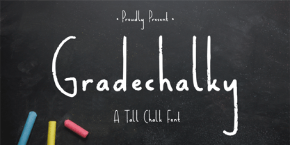 Proudly Present, Gradechalky A Tall Chalk Font. Gradechalky is perfect for any titles, logo, product packaging, branding project, megazine, social media, wedding, or just used to express words above the background. Gradechalky also come with Multi-Lingual Support. Enjoy the font, feel free to comment or feedback, send me PM or email. Thank You!
 - Rockless by Fargun Studio,
$16.00 Rockless is handwritten stylish copperplate calligraphy fonts, combines from copperplate to contemporary typeface with a dancing baseline, classic and elegant touch. Can be used for various purposes. such as headings, signature, logos, wedding invitation, t-shirt, letterhead, signage, lable, news, posters, badges etc. Features All Uppercase and Lowercase Number & Symbol Supported Languages Ligatures PUA Encoded
 - FunFair by Andrew Footit,
$14.00 This fun sans-hand typeface gives your designs and layouts a personal touch that leaves a smile. FUNFAIR has two weights each with italics. FunFair has tall letters and tight kerning to give a natural hand written style. It’s great for posters, cards and headings but also versatile enough for many kinds of typographic layouts.
 - Sun & Rain by Bonez Designz,
$25.00 A fun and fresh font that encapsulates both summer and winter with its tall, hand rendered style. A versatile style,the family works well for all kinds or projects from window displays to music albums The Sun and Rain family consists of three weights, light, regular and bold. The weights cover diacritic, Greek and Cyrillic.
 - Casualties Pro by The Type Fetish,
$45.00 Casualties Pro is an OpenType font that contains four variations of every character in its extended character set. OpenType-savvy applications will be able to rotate through the variations to give a more random look to the text.
 - Solidaritha Script by Great Studio,
$15.00 Solidaritha Script is a stylish calligraphy font that features a varying baseline, smooth line, classic and elegant touch. Can be used for various purposes.such as headings, signature, logos, wedding invitation, t-shirt, letterhead, signage, lable, news, posters, badges etc. Solidaritha Script features 389+ glyphs and 194 alternate characters. including initial and terminal letters, alternates, ligatures and multiple language support.
 - Happy Panda by Insan Perkasya,
$12.00 Let me introduce you, Happy Panda, is a font that combines tall uppercase letters and mini lowercase letters, both of which have their own uniqueness when used, especially when combined, they produce a unique font combination. This font is very suitable for designing quotes, magazine covers, and others. If you have any questions, don't hesitate to contact us