10,000 search results
(0.048 seconds)
- Riot Act 2 - Unknown license

- WILD AFRICA - Personal use only

- DS FlashSerif - Unknown license

- Pea Rachael - Unknown license

- Bigtyles by Forberas Club,
$16.00 Hi this is Bigstyles our new handwritten font, maybe this playful font theme can suits your upcoming event, party, or your personal project. This font is free for personal use, If you need an extended license or corporate license you can contact me at gasforberas@gmail.com.
 - Prospect by ParaType,
$25.00 PT Prospect™. An original serif family designed in 1997-2001 by Natalia Vasilyeva and licensed by ParaType. A face of wide proportions and free lettershapes. The serifs have slanted edges. Based partially on the hand lettering of the author. For use in titling and display composition.
 - Junlyne by Forberas Club,
$16.00 Hi this is Junlyne our new handwritten font, maybe this playful font theme can suits your upcoming event, party, or your personal project. This font is free for personal use, If you need an extended license or corporate license you can contact me at gasforberas@gmail.com.
 - Painted Gallery by Balpirick,
$15.00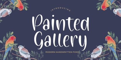 Painted Gallery is a Modern Handwritten Font. Painted Gallery is a cute, friendly and trendy handwritten font. Add it confidently to your projects, and you won’t be disappointed. Painted Gallery also multilingual support. Enjoy the font, feel free to comment or feedback, send me PM or email.
 - The Urbanists by Arendxstudio,
$18.00 The Urbanists is a free style font that has the characteristics of street art that shows freedom and is filled with unique characters. Features : • Character Set A-Z • Numerals & Punctuations (OpenType Standard) • Accents (Multilingual characters) • Ligature • Swash There it is! I really hope you enjoy it.
 - fancyPens by JOEBOB graphics,
$9.00 In case you find yourself looking for an erratic, inconsequent and loose free-style calligraphy font, I guess you need to look no further and try fancyPens. I used several pens in several ways on several days to create it and it shows. Hope you like it.
 - Ferocious by Arendxstudio,
$15.00 Predator - Brush Font is a free style font that has the characteristics of street art that shows freedom and is filled with unique characters Features : • Character Set A-Z • Numerals & Punctuations (OpenType Standard) • Accents (Multilingual characters) • Ligature • Alternate There it is! I really hope you enjoy it
 - MBF Alligra by Moonbandit,
$17.00 MBF Alligra is a modern geometric display font. It is inspired by a combination of modern digital life and the free will of human nature. This typeface is a perfect choice for urban life theme. Use Alligra as a logo, poster, headline, title, text and many more.
 - Hello Magnolia by Adante Creative,
$23.00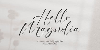 Hello Magnolia A Handwritten Calligraphy Font Hello Magnolia is perfect for product packaging, branding project, megazine, social media, wedding, or just used to express words above the background. Magnolia also multilingual support. Enjoy the font, feel free to comment or feedback, send me PM or email.
 - Blushmine by Adante Creative,
$23.00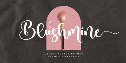 Introducing by Adante.Creative Proudly Present, Blushmine Blushmine A Beautiful Script Font Blushmine is perfect for product packaging, branding project, magazine, social media, wedding, or just used to express words above the background. Enjoy the font, feel free to comment or feedback, send me PM or email.
 - Biograf by Balpirick,
$15.00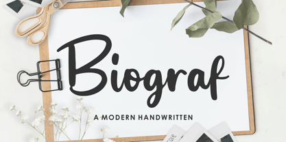 Biograf is a Modern Handwritten Font. Biograf is perfect for product packaging, branding project, megazine, social media, wedding, or just used to express words above the background. Biograf also multilingual support. Enjoy the font, feel free to comment or feedback, send me PM or email. Thank you!
 - Goodbye Kiss by Fat Hamster,
$25.00 Goodbye kiss is a stylish and elegant typeface. It comes with FREE logo design templates and illustrations. Goodbye kiss is a combination of femininity & brutality. This typefaces is perfect for tattoo projects, poster design, t-shirt design, printing, logo design, quotes, apparel design, album covers and etc.
 - Goldmind by Balpirick,
$15.00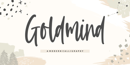 Proudly Present, Goldmind Font. Goldmind is a Modern Calligraphy font. Goldmind is perfect for product packaging, branding project, megazine, social media, wedding, or just used to express words above the background. Enjoy the font, feel free to comment or feedback, send me PM or email. Thank you!
 - Silentclaire by Allouse Studio,
$16.00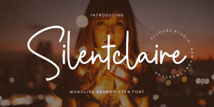 Proudly Presenting, Silentclaire A Monoline Handwritten Font Silentclaire is perfect for product packaging, branding project, megazine, social media, wedding, or just used to express words above the background. Silentclaire also multilingual support. Enjoy the font, feel free to comment or feedback, send me PM or email.
 - Sez Who Sez You by Comicraft,
$29.00 Hand-crafted by Richard Starkings in the classic style of Will Eisner's The Spirit, this free and easy font made its debut in the pages of...The Spirit! Never let it be said that those awfully nice chaps at Comicraft don't think about what they're doing!
 - Thinna Bell by Allouse Studio,
$16.00 Proudly PresentingTinna Bell, a Bold Script Font. Tinna Bell is perfect on any tittle, product packaging, branding project, megazine, social media, wedding, or just used to express words above the background. Enjoy the font, feel free to comment or feedback, send me PM or email. Thank You!
 - Rolasand by Balpirick,
$15.00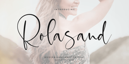 Rolasand is a Modern Handwritten Font. Rolasand is perfect for product packaging, branding project, megazine, social media, wedding, or just used to express words above the background. Rolasand also multilingual support. Enjoy the font, feel free to comment or feedback, send me PM or email. Thank you!
 - Quadrille 2 by Solotype,
$19.95This is a simplified Tuscan, free from excessive ruffles and flourishes. Types of this general design began to appear in profusion in the 1830, and continued as a popular form until the end of the nineteenth century. We added the lowercase to this one for increased usefulness. - Magic Clause by Balpirick,
$15.00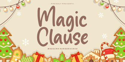 Magic Clause is a Modern Handbrushed Font. Magic Clause is a cute and friendly handwritten font. Get creative with its childlike playfulness, and use it to Magic Clause also multilingual support. Enjoy the font, feel free to comment or feedback, send me PM or email. Thank you!
 - Mbf Grub by Moonbandit,
$14.00 Grub is a bold, playful and fun typeface, it is ideal for branding, logo, title, headlines, poster and many other projects that needs an attention grabber. Use it on your projects to give that free spirit and bold look. Also include opentype features: ligature and alternate
 - Reveler JNL by Jeff Levine,
$29.00 The sheet music for "Good Night Angel" from the 1937 motion picture "Radio City Revels", had the movie's title hand lettered in a free form Art Deco sans serif design. This has been recreated digitally as Reveler JNL, which is available in both regular and oblique versions.
 - Brotusse by Forberas Club,
$16.00 Hi this is Brotusse our new handwritten font, maybe this playful font theme can suits your upcoming event, party, or your personal project. This font is free for personal use, If you need an extended license or corporate license you can contact me at gasforberas@gmail.com.
 - Malpicamoln by Allouse Studio,
$16.00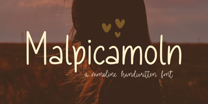 Proudly Presenting, Malpicamoln A Monoline Handwritten Font Malpicamoln is perfect for product packaging, branding project, megazine, social media, wedding, or just used to express words above the background. Malpicamoln also multilingual support. Enjoy the font, feel free to comment or feedback, send me PM or email.
 - Street Art by Arendxstudio,
$18.00 Street Art is a free-style font that has the characteristics of street art that shows freedom and is filled with unique characters. Features : • Character Set A-Z • Numerals & Punctuations (OpenType Standard) • Accents (Multilingual characters) • Ligatures • Alternates There it is! I really hope you enjoy it.
 - Summertime Breeze JNL by Jeff Levine,
$29.00 The opening title sequence for the 1958 film “The Long, Hot Summer” was hand lettered in a free-form style as if painted with loose paintbrush strokes. This served as the model and inspiration for Summertime Breeze JNL, which is available in both regular and oblique versions.
 - Neko Neco by Gatype,
$14.00 Neko Neco is a cute and naturally styled comic balloon display font suitable for logos, branding, greetings, social media themes, and birthday invitation designs. The font is suitable for children and cheerful events. If you have any questions please feel free to contact me! Thank You,
 - Autoprom Pro by Stefan Stoychev,
$29.88 AutopromPro is a modern sans serif display font with a geometric touch contains 24 styles. It comes in 6 weights and its matching rounded and italics. The Thin weight and Black Rounded Italic is a free of charge, so you can use them to your projects.
 - Street Power by Arendxstudio,
$17.00 Street Power is a free style font that has the characteristics of street art that shows freedom. It is filled with unique characters. Features : • Character Set A-Z • Numerals & Punctuations (OpenType Standard) • Accents (Multilingual characters) • Ligatures • Alternates There it is! I really hope you enjoy it.
 - The Overcook by Arendxstudio,
$22.00 The Overcook is a free style font that has the characteristics of street art that shows freedom and is filled with unique characters Features : • Character Set A-Z • Numerals & Punctuations (OpenType Standard) • Accents (Multilingual characters) • Ligature • Alternate There it is! I really hope you enjoy it
 - Olivine by URW Type Foundry,
$35.00 In an era of typographic neutrality, Pria Ravichandran adds spirit and flavour to the humanist sans, a genre that is known for legibility. Introducing Olivine. Olivine is a versatile type family that performs admirably across sizes. It is designed with maximum care ensuring legibility across various sizes, angles and distances. The sturdy shapes and the exaggerated ink traps fade to produce an even typographic colour and a lively texture in smaller text sizes. In larger display settings, the details become self-conscious and highlight the spectacular quality of the design. Olivine is neither experimental nor minimal, striking a balance between formality and friendliness. Olivine is clean as well as organic at the same time. Consisting of seven weights in roman and italics, the type-family address typographic hierarchy for texts of all kinds and sizes. Distinctive, yet neutral letterforms add personality to the type family. The counter-forms are large and open giving the design plenty of internal space which is balanced against the generous spacing of the characters. These features of Olivine make the reading process enjoyable in digital as well as the print medium. No squinting to read this type-family! If you are looking to add some flavour into your design, try Olivine. It is a trend-setting typeface that we predict is going that extra mile. Try before you buy, Olivine Medium and Medium Italic are available free for unlimited commercial usage.
 - Tune Up JNL by Jeff Levine,
$29.00 Tune Up JNL is a collection of music notation symbols for graphic design or basic music composition.
 - Sonata by Adobe,
$29.00The Sonata font contains 170 music notation symbols and is used for setting high quality sheet music. - Linotype Game Pi by Monotype,
$29.00The Game Pi font volume contains four fonts of game symbols, including chess, dominoes and playing cards. - Hand Writing of Janina by TypoGraphicDesign,
$19.00 The typeface Hand Writing of Janina is designed from 2021 for the font foundry Typo Graphic Design by Janina Fels & Manuel Viergutz. The character of the handwritten script typeface is rough, ruggend and raw. With state-of-the-art OpenType-Feature (like Contextual Alternates (calt) and Stylistic Alternates (salt)). Each uppercase and each lowercase letter has automatically alternated two variations to bring humanly-random characteristics of handwriting to life. 4 font-styles (Book, Bold, Dark & Icons) with 786 glyphs (Latin 3) incl. 100+ decorative extras like icons, arrows, catch words, dingbats, emojis, symbols, geometric shapes (type the word #LOVE for ♥︎ or #SMILE for ☺ as OpenType-Feature dlig) and stylistic alternates. For use in logos, magazines, posters, advertisement plus as webfont for decorative headlines. The font works best for display size. Have fun with this font & use the DEMO-FONT (with reduced glyph-set) FOR FREE! Font Specifications ■ Font Name: Hand Writing of Janina ■ Font Styles: 4 font-styles (Book, Bold, Dark, Icon) + DEMO (with reduced glyph-set) ■ Font Category: Display Script for headline size ■ Font Format:.otf (Mac + Win, for Print) + .woff (for Web) ■ Glyph Set: 786 glyphs (Latin 3 incl. decorative extras like icons) ■ Language Support: 93 languages: Afrikaans, Albanian, Asu, Basque, Bemba, Bena, Breton, Catalan, Chiga, Colognian, Cornish, Croatian, Czech, Danish, Dutch, Embu, English, Esperanto, Estonian, Faroese, Filipino, Finnish, French, Friulian, Galician, Ganda, German, Gusii, Hungarian, Inari Sami, Indonesian, Irish, Italian, Jola-Fonyi, Kabuverdianu, Kalenjin, Kamba, Kikuyu, Kinyarwanda, Latvian, Lithuanian, Lower Sorbian, Luo, Luxembourgish, Luyia, Machame, Makhuwa-Meetto, Makonde, Malagasy, Maltese, Manx, Meru, Morisyen, Northern Sami, North Ndebele, Norwegian Bokmål, NorwegianNynorsk, Nyankole, Oromo, Polish, Portuguese, Quechua, Romanian, Romansh, Rombo, Rundi, Rwa, Samburu, Sango, Sangu, Scottish Gaelic, Sena, Serbian, Shambala, Shona, Slovak, Soga, Somali, Spanish, Swahili, Swedish, Swiss German, Taita, Teso, Turkish, Upper Sorbian, Uzbek (Latin), Volapük, Vunjo, Walser, Welsh, Western Frisian, Zulu ■ Design Date: 2021 ■ Type Designer: Janina Fels, Manuel Viergutz
 - Nipsey by Putracetol,
$28.00 Introducing Nipsey - a unique display font inspired by vintage albums and posters from 1970s music bands. With its classic typeface and groovy impression, Nipsey brings a fun and retro vibe to your designs. What sets Nipsey apart is the combination of various alternates, such as swashes, stylistic sets, stylistic alternates, contextual alternates, and ligatures, making this font even more distinctive and versatile. Nipsey is perfect for a wide range of display purposes, including album covers, posters, labels, t-shirts, apparel, signage, quotes, logos, greeting cards, logotypes, and more. Its eye-catching design adds a touch of nostalgia and personality to any project, making it stand out in a crowd. To access the alternative characters in Nipsey, you can use OpenType savvy programs such as Adobe Illustrator, Adobe InDesign, Adobe Photoshop, Corel Draw X version, and Microsoft Word. The OpenType features allow you to easily switch between uppercase and lowercase letters, as well as apply alternates and ligatures to create unique and customized lettering compositions. In your zip package, you'll find the Nipsey font files in otf, ttf, and woff formats, providing versatility for different design projects. The font includes uppercase and lowercase letters, numerals, punctuation, and symbols, ensuring that you have all the elements you need for your designs. Nipsey also offers multilingual support, making it accessible for designers around the world to create designs in different languages. Whether you're designing for English, Spanish, French, or any other language, Nipsey has got you covered. If you have any questions, feedback, or comments, feel free to reach out to PutraCetol Design Studio via PM or email. The team is happy to assist you in your creative endeavors. In conclusion, Nipsey is a unique and versatile display font that brings a fun and retro vibe to your designs. With its alternative characters and multilingual support, Nipsey offers endless possibilities for creating eye-catching designs for various display purposes. So, let your creativity flow with Nipsey and elevate your design projects to the next level! Thanks for choosing Nipsey from PutraCetol Design Studio. Happy Creating!
 - The "Janda Closer To Free" font, designed by Kimberly Geswein, embodies a perfect blend of casual charm and heartfelt emotion, making it stand out in the realm of typography. This font captures the e...


