6,804 search results
(0.021 seconds)
- Mrs Green by Hipopotam Studio,
$2.00 Mrs Green is a great typeface for short texts, invitations, headlines, logotypes and advertising. We’ve started with a heavy capital G and A. At the beginning it was supposed to be just one fat style (still our favorite). But after a few months we’ve ended up with a family of 20 styles. It has contextual alternates, fractions, four types of figures (old style, lining, superior and inferior), ordinals and a case feature.
 - Lombardia Illuminata by Celebrity Fontz,
$24.99Lombardia Illuminata is a collection of Lombardic-style letters surrounded by natural forms of vines, leaves, trellises, scrolls, sun rays, and flowers. This beautifully ornate font includes one set of A-Z ornamental initials conveniently assigned to both the upper and lower case alphabet characters which are perfect for starting off the beginning of paragraphs in artistic publications, storybooks, fairy tales, and texts conveying the feel of medieval manuscripts of the 12th-16th centuries. - ITC Mona Lisa by ITC,
$29.99ITC Mona Lisa was designed by Pat Hickson, a stark and elegant typeface originally drawn in the 1930s by Albert Auspurg. The original drawings were long gone and the surviving metal type was already severely worn when Hickson studied Auspurg's design for his recreation. The result is a typeface which melds the flavor of the 1930s with current design standards. ITC Mona Lisa displays all the suave sophistication of Fred Astaire and Greta Garbo. - Bruce 532 Blackletter by Intellecta Design,
$23.90 A classic font design remastered by the type foundry Intellecta Design, from the extra-rare Bruce's New York typefoundry from 1882. Distressed and antique, use this font in display purposes for a stylized type design. Great display face for headers and antique-like projects. Contains a limited amount of letter designs. Using the "0" and "2" keys you get two different fleurons to start words. Use "1" or "3" keys to close words with fleurons.
 - Culpepper by Galapagos,
$39.00I've always admired the work of Rudolph Koch. Culpepper is what I think Neuland would have looked like if it had been developed with lowercase, small caps and a range of weights. I started work on this series in the late 80’s and, like so many of my ideas, it was shelved when life drew me in another direction. Culpepper is the name of one of the islands in the Galapagos chain. - Jenriv by Linh Nguyen,
$25.00 Inspired by designs of the early Renaissance, Jenriv brings out a sedate atmosphere and generous inner spaces. Starting with the idea of mixing straightforward strokes and curves, it results in kind masculine figures, but calm and humble. It reminds some archaic air but a simplified one. Jenriv embraces text flows, multiple languages, and various styles with standard OpenType features. It is well adapted to various applications, from medium body text to large headlines, or logotypes.
 - Routemaster by Work by Dan,
$12.00 Routemaster is a hand-drawn condensed title font by the graphic designer Daniel Thomas. Found under the stairs, hand painted on a dusty rolled up bus route canvas. Re-created and refined with additional glyphs, Routemaster is old, bold and unique. A characterful font. Pleasant for posters, lovely for a logo, brilliant for branding, tasteful for t-shirts, playful for packaging and becoming for book cover design. Enjoy your design journey with Routemaster
 - Lazy Morning by Hanoded,
$15.00 I can’t remember when I had a true lazy morning.. I was a looong time ago, before I had children! Even now, when I’m down with the flu, I can’t stay in bed for too long - it really seems like a waste of time! Lazy Morning is a nice handwritten font. I made it with a Sharpie pen. It comes with all diacritics and double letter ligatures for you to play with.
 - Friday Freak PB by Pink Broccoli,
$16.00 Friday Freak PB is a playful font inspired by the titling of the 1976 Disney film, "Freaky Friday". This font has a slightly clumsy stumble to it, adding to its personality and appeal. From slightly weird weighting to a ligatures feature that will auto-shuffle all-caps and all-lowercase settings to have a mix of both, keeps typesetting lively. Stir things up and get a little crazy with Friday Freak today!
 - Qafidut by Twinletter,
$18.00 Qafidut Groovy is a psychedelic-inspired retro typeface with a bold and playful character. It’s ideal for branding, product packaging, or even just to add a little flair to your editorial work. This elegant typography has a simple and contemporary look but with a touch of beautiful simplicity to give a modern feel to every curve of the letter. what are you waiting for start using this font to create your own special project now!
 - Blank Manuscript by Aah Yes,
$14.95Blank Manuscript allows you to produce sophisticated musical scoresheets even on basic Word Processors - anything from simple plain staves to complex full-page orchestral scores of your own design, to write in the notation yourself. The basic stuff is really easy and straightforward, but there's some quite advanced things you can do as well. So Copy and Save these Instructions. • The main stuff is simple and tends to follow the initial letter. Treble, Bass and Alto clefs are on upper case T B A (there are more clefs, below). The 5 Lines for the clefs are on L or l. • A small v will give a small vertical line (like a bar line) and a Big U will give a Big Upright - these can start or end a line or piece. • Time Signatures - type the following letters: Think of W for Waltz and it's easy to remember that 3/4 time is on W. Then from that they go up or down together like this: V=2/4 W=3/4 X=4/4 Y=5/4 Z=6/4 Compound Times are on H I J K like this: H=3/8 I=6/8 J=9/8 K=12/8 Common Time and Cut Common symbols can be found on semi-colon and colon respectively (all begin with Co- ). 2/2 3/2 are on lower case a and b, 7/4 and 7/8 are on lower case c and d, 5/8 is on small k (think POL-k-A) • Flat signs are on the numbers. Flat signs on LINES 1 to 5 are on numbers 1 to 5. Flat signs on SPACES 1 to 5 are on numbers 6 to 0 (space 1 being above line 1, space 5 being above the top line of the stave). Sharp signs are on the letters BELOW the long-row numbers. Which is q w e r t for the sharp signs on Lines 1 to 5, and y u i o p for sharp signs on spaces 1 to 5. Doing it this way means it works the same for all clefs, whether Treble, Bass, Alto, Tenor or any other. Sharp and Flat Signs always go in this order, depending on how many sharps or flats your key signature requires: Treble Clef Sharps t i p r u o e Flats 3 9 7 4 2 8 6 Bass Clef Sharps r u o e t i w Flats 2 8 6 3 1 7 = Alto Clef Sharps o e t i w r u Flats 7 4 2 8 6 3 1 • Guitar Chord Boxes are on G and g (G for Guitar) Upper Case G has a thick line across the top Lower case g has an open top, for chords up the fretboard TAB symbols are available: Six-string Tablature is on s & S for Six. Four-string Tablature is on f & F for Four. (Lower case has the "TAB" symbol on it, Upper Case has just the lines to continue.) Five-string tablature, is on lower case "j" (as in BAN-j-O) and of course L or l will continue the 5 lines. •RARE CLEF SIGNS including Tenor Clef, are on various punctuation marks, i.e. dollar, percent, circumflex, ampersand & asterisk, above the numbers 4 to 8. NOTE: The important symbols were kept on the letter and number keys, which are fairly standard all over, but some of the less important symbols are on various punctuation keys, which in different countries are not the same as on my keyboard. If it comes out wrong on your system, all I can say is it's right on the systems we've tried, and they'll be in here somewhere, probably on a different key. CLOSING THE ENDS OF THE LINES and BAR-LINES is done with the 3 varieties of brackets - brackets, brace and parentheses - Left/Right for the Left/Right end of the line. Parentheses L/R () which are above 9, 0 give a clef with a small vertical upright (the same as a bar line). Brace L/R and Brackets L/R (both on the 2 keys to the right of P on my keyboard) will close off a staff line with tall upright bars. Brace gives a double upright - one thick, one thin. Brackets give a single tall upright. A Big Upright is on Big U, (Big U for Big Upright) and a small vertical line is on small v (small v for small vertical). The Big Upright is the maximum height, and the small vertical is exactly the same height as a stave. And there's a tall upright Bar, on Bar (which is to the left of z on my keyboard, with Shift,) which is the same height as the bar on upper case U but twice as broad. • There's a staff intended for writing melodies, which is a little bit higher up than an ordinary treble clef giving a space underneath to put lyrics in - on m and M for Melody line. Lower case has the Treble Clef on, Upper case M has just the higher-up staff lines with no clef. (Use mMMMMMMM etc.) However this clef will be in the wrong place to put in sharp and flat signs, key signatures and so on, so if you use this clef you'll have to write the sharps, flats and key signature yourself. There's also a clef that's smaller (less tall) than the ordinary clef, but with the same horizontal spacing so it will align with other standard-sized clefs - on slash (a plain clef) and backslash (with a Treble Clef). • There are some large brackets for enclosing groups of staves, such as you'd use on large orchestral scores, on Upper Case N O P Q R, which can aid clarity. N and O on the left, Q and R on the right. P is a Perpendicular line to be used on both sides to increase the height of the enclosure, in this way but with the staff lines in between: N Q P P P P P P O R OTHERS —————————————— • Repeat marks are on comma (left) and period/full stop (right). • Hyphen is left as a sort of hyphen - it's a thin line like a single staff line, with the same horizontal spacing as ordinary staff lines - in case you want to draw a line across for a Percussion Instrument, or a Title or Lyric Line. • Space is a Space, but with HALF the width or horizontal spacing as ordinary staff lines, so 2 space symbols will be the same width as a clef symbol or line. • Grave (to the left of 1 on the long row, or hold down Alt and type 0096 then let go) gives a staff line that is one eighth the width of an ordinary staff line. • If you want manuscript in a clef and key which requires a flat or sharp sign in the space underneath the 5 lines, they’re on = equals and + plus . SYMBOLS • Many of these symbols will only be useful if you have worked out in advance which bars will need them, but they are here in case you've done that and wish to include them. • Symbols for p and f (piano and forte) are on 'less than' and 'greater than' < > (above comma and full stop) and m for mezzo is on Question, next to them. They can be combined to make mp, mf, ff, pp, etc. These signs -- and other signs and symbols like Pedal Sign, Coda Sign and so on -- can be found on various punctuation mark keys, including above 1, 2, 3 in the long row, and others around the keyboard. There's a sort of logic to their layout, but in different countries the keys are likely to give different results to what is stated here, so it's probably best to just try the punctuation and see if there's any you might want to use. (But on my keyboard a Coda sign is on circumflex - because of the visual similarity. Pedal sign is on underscore. A "Sign" symbol is on exclamation mark.) They were only included in case you really need them to be printed rather than handwritten. • However, a Copyright symbol is deemed necessary, and also included are a "Registered" symbol and a TradeMark symbol. They are found in the conventional places, and can be accessed by holding down ALT and typing 0169, 0174 or 0153 respectively in the numberpad section and letting go. • Staff lines with arco and pizz. above are on capital C and D respectively ---C for ar-C-o. • An empty circle above a staff line (to indicate sections by writing letters A, B, C or 1,2,3 inside for rehearsal marks) is on n. The actual signs for an A, B, C and D in a circle above the staff line can be produced by holding down ALT and typing 0188, 0189, 0190 and 0191 respectively and letting go. • The word "Page", for indicating page numbers, is on the numbersign key. • The two quotes keys, (quote single and quote double) have symbols representing "Tempo is", and "play as triplets", respectively. • INSTRUMENT NAMES There's a whole lot of Instrument Names built in (over a hundred) which can be printed out above the clef, and you do it like this. Hold down Alt and type in the given number in the numberpad section, then let go. For Piccolo it's 0130, for Flute it's 0131, Cornet is on 0154, Violin is on 0193, and the numbers go up to over 0250, it's a fairly complete set. There's also a blank which is used to align un-named clefs on 0096. Put them at the very beginning of the line for the best results. Here they are: WOODWIND Piccolo 0130 Flute 0131 Oboe 0132 Clarinet 0133 Eng Horn 0134 Bassoon 0135 Soprano Sax 0137 Alto Sax 0138 Tenor Sax 0139 Baritone Sax 0140 Saxophone 0142 Contrabassoon 0145 Recorder 0146 Alto Flute 0147 Bass Flute 0148 Oboe d'Amore 0149 Cor anglais 0152 Pipes 0241 Whistle 0242 BRASS Cornet 0154 Trumpet 0155 Flugelhorn 0156 Trombone 0158 Euphonium 0159 Tuba 0161 French Horn 0162 Horn 0163 Tenor Trombone 0164 Bass Trombone 0165 Alto Trombone 0166 Piccolo Cornet 0167 Piccolo Trumpet 0168 Bass Trumpet 0170 Bass Tuba 0171 Brass 0172 VOICES Vocal 0175 Melody 0176 Solo 0177 Harmony 0178 Soprano 0179 Alto 0180 Tenor 0181 Baritone 0182 Treble 0183 Bass 0197 (see also PLUCKED STRINGS) Descant 0184 Mezzo Soprano 0185 Contralto 0186 Counter Tenor 0187 Lead 0206 BOWED STRINGS Strings 0192 Violin 0193 Viola 0194 Cello 0195 Contrabass 0196 Bass 0197 Double Bass 0198 Violoncello 0199 Violin 1 0200 Violin 2 0201 Fiddle 0252 PLUCKED STRINGS Harp 0202 Guitar 0203 Ac. Gtr 0204 El. Gtr 0205 Lead 0206 Bass 0197 Ac. Bass 0207 El. Bass 0208 Slide Gtr 0209 Mandolin 0210 Banjo 0211 Ukelele 0212 Zither 0213 Sitar 0214 Lute 0215 Pedal Steel 0216 Nylon Gtr. 0238 Koto 0239 Fretless 0244 KEYBOARDS + ORGAN Piano 0217 El. Piano 0218 Organ 0219 El. Organ 0220 Harpsichord 0221 Celesta 0222 Accordion 0223 Clavinet 0224 Harmonium 0225 Synth 0226 Synth Bass 0227 Keyboards 0228 Sampler 0249 PERCUSSION and TUNED PERCUSSION Percussion 0229 Drums 0230 Vibes 0231 Marimba 0232 Glockenspiel 0233 Xylophone 0234 Bass marimba 0235 Tubular Bells 0236 Steel Drums 0237 Kalimba 0240 OTHERS Harmonica 0246 Mouth Organ 0247 FX 0251 Intro 0243 Verse 0245 Refrain 0248 Chorus 0250 un-named 0096 (this is a small spacer stave for aligning clefs without a name) ALSO copyright 0169 registered 0174 TradeMark 0153 Rehearsal marks 0188-0191 (giving A, B, C, D in a circle, an empty circle is on n ) Clef signs for Treble Bass Alto without any staff lines 0253-0255 An Alphabetic List of all signs: a 2/2 time b 3/2 time c 7/4 time d 7/8 time e sharp sign, centre line f Tab sign for 4-string tab g Guitar Chord Box, no nut h half-width stave I sharp sign, third space up j Tab sign for 5-string tab k 5/8 time l Lines - 5 horizontal lines for a stave m Melody Clef - a standard clef but placed higher up, with Treble sign n Stave with an empty circle above o sharp sign, fourth space up p sharp sign, space above stave q sharp sign, bottom line r sharp sign, fourth line up s Tab sign for 6-string tab t sharp sign, top line (fifth line up) u sharp sign, second space up v vertical line (bar-line) w sharp sign, second line up x Fretboard, four strings y sharp sign, first space up z Fretboard, five strings A Alto Clef B Bass Clef C “arco” above stave D “pizz.” above stave E Double Vertical Lines F Four Horizontal lines (for 4-string tab) G Guitar Chord Box with nut H 3/8 time I 6/8 time J 9/8 time K 12/8 time L Lines - 5 horizontal lines for a stave M Melody Clef - a standard clef but placed higher up, plain N Bounding Line for grouping clefs - top left O Bounding Line for grouping clefs - bottom left P Bounding Line for grouping clefs - Perpendicular Q Bounding Line for grouping clefs - top right R Bounding Line for grouping clefs - bottom right S Six Horizontal lines (for 6-string tab) T Treble Clef U tall, thin Upright line V 2/4 time W 3 / 4 time X 4/4 time Y 5/4 time Z 6/4 time 1 flat sign, first line up (the lowest line) 2 flat sign, second line up 3 flat sign, third line up 4 flat sign, fourth line up 5 flat sign, fifth line up (the top line) 6 flat sign, first space up (the lowest space) 7 flat sign, second space up 8 flat sign, third space up 9 flat sign, fourth space up 0 flat sign, space above stave - HS Alfaris by Hiba Studio,
$59.00 The idea of this font started while designing a logotype for a company named (Mazarat), consisting of 3D geometric looking shapes and overall structure. After designing several words, I thought of using the design concept of this logo to develop a geometric Kufi font for headline category. All letters of this typeface family were conceived with suitable coordinates and dimensions to create the first weight, bold, before finishing the rest of the letters to support Arabic, Persian, Urdu and Kurdish languages. Another weight was conceived, regular, which was designed closer to light to support applications that require variations in thickness. With a 3D look, this font is a simple and creative addition which can be useful for book titles in addition to a variety of other geometrical constructions projects. It brings new design concept for ends of Jeem, Ayn, Reh and Waw to enhance beauty and harmony and to enrich our previous geometrical font contributions which started with the release of HS Alhandasi and HS Almohandis from HibaStuido.
 - Sabre by Alias,
$60.00 I generally refer to our typefaces as ‘graphic’ rather than typographic. By that I mean their starting points are usually ways of constructing shapes and systems of shapes. As with other Alias typefaces, Sabre has stone and wood cut letterforms as a starting point. What is interesting about lettercutting is the connection between shape and material. These beautifully crafted letterforms have a particular sharpness which reflects, of course, how they were made. The idea of constructing letters from a kit of parts we first explored in early fonts Elephant and Factory. These are different in that they were very much grid-based, with a geometric structure. For Sabre I also had Fred Smeijers’ stencil construction drawings in mind. These show how a set of components can be the basis for a crafted, elegant typeface. Sabre is quite a loose interpretation of this idea. Sabre’s graphic shape means it works well at large sizes, with a dramatic, angular impact. Its aim is to be typographic enough to function for blocks of small-size text too.
 - Rialto Piccolo dF by CAST,
$305.00 Rialto dF is a book face inspired by calligraphic tradition. Named after the famous bridge in Venice, it was conceived as a bridge between calligraphy and typography, roman and italic. It can also be thought of as an imaginary bridge between Italy and Austria, since it is the result of collaboration started in 1995 between the Austrian Lui Karner and Venetian Giovanni de Faccio. The letterforms of Rialto dF were drawn directly in digital format with a starting point deriving from humanistic letterforms memorized in the hearts, minds and the manual ability of its designers… As tradition demands, uppercase, numerals and punctuation are used in combination with italics – the same solution adopted by Francesco Griffo when he cut his first italic for the Virgil, the first of the octavo series printed and published in Venice by Aldus Manutius in 1501. Rialto dF comes in two optical weights: Piccolo, for up to 14 pt, and Grande for 16pt and above. Alternate characters and various dingbats are also provided and these are available through OpenType features developed by type designer and technician Karsten Luecke.
 - Cedi by Typogama,
$25.99 The Cedi Typeface is a single weight display font that is based on the fluid handwritten style of a work colleague. This design is a fast flowing script that is both lively and original yet equally legible due to it's defined letterforms and open forms. Despite working well in a regular format, during the design process I started to look at ligatures as a solution for solving some problematic combinations. However, this small implementation soon got vastly expanded as I started to focus on the rythm of the letterforms and how best to convey the hand drawn feature in the design. A common problem in most script fonts is the repeating letterforms that would be particularily un-natural for this manual typeface, therefore hinting at it's digital source. The ligature concept soon evolved into over 2400 ligatures, trying to cover all repeating glyphs as well as finding more harmious combiations. This design was created for use in short text settings and use at large point sizes suiting titles, screen use or logo designs.
 - Boisterous Fun by Missy Meyer,
$12.00 Have you ever been drawing out the letters for a font, then you start making some multi-letter ligatures? Then you think up some more to make, and you make those too? And you keep making them, until you have over a hundred of them? No? Just me? Boisterous Fun is a font that started out simple -- a nice handwriting style with a single stroke width. But add in the ligatures, plus a dozen single-letter alternates and my usual crowd of accented characters for language support, and this baby has grown to over 600 characters total. It's a great casual font for branding or packaging, but it's also smoothed so it's easy for cutting. Boisterous Fun includes: - The usual A-Z, a-z, 0-9, and lots of punctuation; - Over 300 extended Latin characters for language support; - 140 alternates and ligatures for variety, all PUA-encoded for easy use! I had a ton of fun making it, and I hope you have a ton of fun using it!
 - VTC Bloke by Vintage Type Company,
$19.00 VTC Bloke is a revival of Miller & Richard’s classic metal typeface, ‘Egyptian Expanded’, including the three-dimensional, ‘Open’ style that was later introduced to the family. The roots of this typeface stem from the UK, where William Miller and his son-in-law Richard had their initial foundry in Edinburgh, Scotland. In addition to the beautiful and timeless type designs, the foundry gained a reputation for offering super small type sizes, designed for Bibles, dictionaries, documents, etc. Slab Serifs (or Egyptian Serifs) started to gain popularity in the early 19th century. It’s around this time, due to emerging industrial technologies, and an ever-expanding advertising industry, that type designers started to really experiment with letterforms that could help their clients distinguish themselves from the competitor, and catch people's eyes. The size of posters and advertising space was getting bigger, and bigger, and so was the type. All original letterforms have been re-drawn and cleaned up, with some more modern glyphs and characters added in. VTC Bloke supports Adobe Latin 1 Language Support.
 - Mommie by Hubert Jocham Type,
$59.90 In the early 1980s, at the start of my career, I had the opportunity to work in a print shop with classic lead setting. In those days I would study issues of U&lc magazine from ITC. What really caught my attention were scripts in the Spencerian style. I’ve been fascinated by this American penmanship tradition ever since. A few years ago I developed a font. Boris Bencic used it when he was redesigning L’Officiel magazine in Paris. I took these initial forms and developed them into the font Mommie when I started my own foundry. Although I usually design text typefaces, working on Mommie taught me how complex it can be to create a script headline font. The biggest challenge in this process has been to keep it alive and fresh. The Regular weight is only made for very big headlines. The thin lines with the bold drops are very elegant. For smaller sizes use the Medium and Small weight. It won the TDC 2008 award and was Judges Choice of Christian Schwartz.
 - King Throne by Nathatype,
$29.00 King Throne is a regal display font that exudes an air of grandeur and elegance. With its high contrast characters and distinctive swinging letter ends, this typeface commands attention and captivates the viewer with its majestic presence. The high contrast design of this font creates a striking visual impact. The stark difference between the thick and thin strokes adds a sense of drama and sophistication to each letter, making them stand out with a commanding presence. The font's weight distribution captures the eye and draws focus to the exquisite details of its letterforms. What sets King Throne apart is the captivating swinging ends of the letters. With a gentle curve and a flourish, these decorative elements add a touch of movement and grace to the font. The swinging letter ends contribute to the font's regal aesthetic, evoking images of royal script and elegant calligraphy. They elevate the font's overall appearance, transforming it into a true symbol of authority and power. For the best legibility you can use it in the bigger text. Enjoy the available features here. Features: Stylistic Sets Ligatures Multilingual Supports PUA Encoded Numerals and Punctuations King Throne fits in headlines, logos, attention-grabbing titles, product packaging, branding materials, editorial layouts and website headers. Find out more ways to use this font by taking a look at the font preview. Thanks for purchasing our fonts. Hopefully, you have a great time using our font. Feel free to contact us anytime for further information or when you have trouble with the font. Thanks a lot and happy designing.
 - CAL Bodoni Casale by California Type Foundry,
$47.00 This typeface has been beloved throughout history. Bodoni used it to print his first masterwork, but it has never before been publicly available. Now available for the first time, CAL Bodoni Casale has been painstakingly crafted from hi-res scans of 4 original Bodoni printings. Unlike many Bodonis drawn from computerized straight lines, this Bodoni follows the original contours of the master himself. With small caps, old style numbers, special options for $, %, £, €, Bodoni Casale allows you to make elegant pricing, sales signs, or logos. Besides it's authentic origins, Casale's 21st century debut includes Features & Alternates never seen before, including Frankenfont (giving the font 6 fun alternative uses with 1 click!). Other alternates, such as the $ and €, give the user options when styling their work. Various word and letter spacing options are also automatically included so the user can choose to preserve Bodoni's original spacings or go with a more modern look. The Bodoni for White on Black Most Bodoni fonts will start to disappear on black. Bodoni Casale’s robust strokes don’t disappear, even when set to smaller sizes. The robust strokes of this Bodoni font also lend visibility and legibility at large sizes with dark background, such as on signage. What You Get ✓Bodoni's original font, Roman + Italic and small caps ✓Style Sets for quick and beautiful formatting ✓5 Unicase Options ✓An army of percentage signs, dollar signs, and money symbols. ✓Punctuation Options for any reading situation ✓A Realistic and Inky look ✓Designed by Bodoni Himself For a Full Tour of Bodoni Casale, here's a video!
 - Christmas Picture by Reyrey Blue Std,
$18.00 Introducing, Christmas Picture Typeface. A classical and fun serif italic version. It's created specially for the Christmas Spirit. Christmas Picture is a great design choice this Xmas season for inspirational quote designs, logo designs, simple and classy Logos, web font, branding, product packaging, and much more. This font is PUA-encoded, which means you can easily access all of the glyphs! Features : All Uppercase and Lowercase Number & Symbol Supported Languages Stylistic Alternate PUA Encoded Hope you enjoy our font!
 - Jekatep by ActiveSphere,
$30.00 Jekatep is a sans-serif display font and works best in text and display applications, such as posters, headline, magazine, logos, titles, product branding, corporate branding and publishing. Jekatep font has three weights; light, regular, and bold, each available in italic, making a total of six styles. Each style has a full upper and lower-case, accents, punctuation and a selection of monetary symbols. Currently Available for Mac and PC, in Open Type, PostScript or TrueType.
 - Proxemic by Sarid Ezra,
$15.00 Proxemic is a bold sans based font with unique lowercase that will make your logo and design looks advance and modern. With the unique characteristic lowercase, this font can make your logo even more stunning only with simple steps. You can use this font for any purpose, especially to make logotype. You can mix and match the uppercase and lowercase to make your logo more advanced. This font also comes with number, symbol, and multilingual support!
 - Hacky by madeDeduk,
$17.00 Hacky is a stylish luxury serif family. It's clean and have the smooth angle with 9 variable weight and much alternative inside. Suitable to create any branding, product packaging, invitation, quotes, t-shirt, label, poster, logo etc. Feature UPPERCASE Lowercase Number & Symbol International Glyphs Uppercase Alternative Lowercase Alternative Ligatures If you need anything else just shoot me on email at: dedukvic@gmail.com or find more previews on my Instagram here : https://www.instagram.com/acekelgondolayu/?hl=en Hope you enjoy it.
 - Thesis Typewriter by Ana's Fonts,
$15.00 Thesis typewriter is a typewriter font collection that includes 3 typewriter fonts, sampled from three different thesis and reports from the 60s and 70s. Thesis Typewriter Weary has a textured look, while Thesis Typewriter and Thesis Typewriter Bold are smooth and include math symbols and Greek letters that will look great in digital collages. This collection is perfect for authentic vintage designs and digital collages, but will also look great in modern logo design, in branding and packaging.
 - Linotype Afrika by Linotype,
$29.99Linotype Afrika, from German type designer Jörg Herz, is part of the TakeType Library, chosen from the entries of the Linotype-sponsored International Digital Type Design Contest 1999 for inclusion on the TakeType 3 CD. Dancing, jumping, and playing, the lively beings of this symbol font exude joy. Ornaments and a few frolicking animals complete the font. Combining the single figures, whether as decoration or border, creates a pattern which will surprise you with its lightness and dynamism. - Cheorcy by Ergibi Studio,
$18.00 Cheorcy, This font inspired by the famous logo is simple but classy perfect for logotype, apparel, branding, packaging, very good for combining your design work with a clear line with several different weights that are very comfortable in the design area you are easy to read and as title, magazine, label, advertising and anything elegant. This typeface is comes in uppercase, lowercase, punctuations, symbols & numerals, ligature. Also support multilingual What's Included : STANDAR GLYPSH LIGATURES Ergibi Studio
 - Luxury Modish by Ergibi Studio,
$20.00 Luxury Modish is Modern Calligraphy font presentation from Ergibi Studio. Inspired by beautiful writing that has a luxurious feel with additional swash lines This font includes uppercase, lowercase letters, numbers, punctuation, symbols, swash and multilingual support. Luxury Modish is perfect for branding, photography, invitations, quotes, watermarks, advertisements, product designs, social media posts, stationery, labels, and more! I hope you enjoy this font. If you have any questions please don't hesitate to drop me a message :) Thank You, Ergibi Studio
 - Contender by Viaction Type.Co,
$17.00 Font Contender with a stamp effect gives a vintage feel and is suitable for adding a vintage feel to your design. There are 2 regular and oblique styles, complete with multilingual characters and stalistic alternatives. It is suitable for quotes, clothing designs, vintage logos, labels, posters, packaging designs and other designs. File Include (Font Family) : - Contender - Contender Slant Features : - Uppercase. - Lowercase. - Multilingual. - Punctuation & Symbol. - Stylistic Set. Thank you for buying. I hope you enjoy and thank you.
 - Amerta Misty by Letterhend,
$16.00 Introducing, Amerta Misty, a modern calligraphic font with tons of swashes! They works perfect for you who needs a typeface for headline, logotype, apparel, invitation, branding, packaging, advertising etc. This typeface comes with uppercase, lowercase, punctuation, symbols, numerals, stylistic set alternate, ligatures, etc also multilingual support. We hope you enjoy Amerta Misty. Please feel free to comment if you have any thoughts or feedback. Or simply send me a PM or email me at letterhend@gmail.com
 - Grassroots Typewriter by BeckMcCormick,
$16.00This font was inspired by a 1950’s Royal Quiet De Luxe Typewriter, and features textured letters & symbols, creating a realistic look & feel without needing to source your own antique machine! Each keystroke on an old typewriter shows variations based on the ink ribbon & how hard or soft the typebars strike the ribbon & paper. This font was designed to provide multiple options for each letter so that you can further customize the look & feel of your text. - Grotesco by Latinotype,
$39.00 This South American grotesk font blends the functionality of an American grotesk typeface with that unique Latino rhythm and flair. Sure it can be quite serious, but more importantly, its two alternate sets allow you to bring flavor to your logos, brands and advertising designs. We would like to especially thank Alfonso García for his help with digital editing, the development of a fresh italic version, as well as the addition of Cyrillic and currency symbols.
 - Major Production NF by Nick's Fonts,
$10.00 This typeface was designed specifically for producing movie posters, as well as VHS and DVD packaging for them. The uppercase letters are ultracondensed, and the lowercase letters are small caps, approximately a third the size of the uppercase. Also included are various logos and symbols suitable for the intended use, including those for MPAA ratings, and various audio and video formats. Both versions of this font include the complete Unicode Latin 1252 and Central European 1250 character sets.
 - Roquen by Letterhend,
$14.00 Meet Roquen, a display typeface, hand drawn! Bold, stands out, with a rustic and nostalgic look! Works perfectly for headline, logotype, apparel, invitations, branding, packaging, advertising, and more. This typeface is comes in uppercase, lowercase, punctuation, symbols, numerals, stylistic set alternate, ligatures, and also has multi-lingual support. We hope you enjoy Roquen. Please feel free to comment if you have any thoughts or feedback. Or simply send me a PM or email me at letterhend@gmail.com
 - Manekin by Say Studio,
$17.00 Manekin is Beauty Bold Script Font with a Beauty vintage style.This font is also equipped with 40+ stylistic Alternates and ligatures and also multi-language support which further adds to the creativity in using this font. This font is perfect for your creative projects such as Logotype, printed quotes, invitations, cards, product packaging, headers, Letterhead, Apparel , Web design, Magazine, Book, etc. FEATURES: - Uppercase - Lowercase - Punctuation and Marks - Symbols - 40+ stylistic Alternates & Ligatures Thanks, Have a wonderful Day, Say Studio
 - Lasvorga by Saskara Type,
$15.00 Lasvorga is a modern style vintage font and there are 108 standard and discretionary ligatures. Additional OpenType features include character variants, style sets, and multilingual support (including multiple currency symbols). I made this font from the inspiration of old vintage fonts, of course it is very sturdy and makes your design more luxurious. This font is also very good for logo types, magazine headlines, and others. If you need my help please contact me, thank you
 - Bemore Serif by Asenbayu,
$15.00 Bemore Serif is a decorative serif font that has a distinctive serif shape. This font has sleek and tall condensed letter proportions so it can give an attractive and elegant impression. You can use this font in both modern and vintage designs. This font is suitable for attractive packaging label designs, unique desired logos, trendy poster designs, fashion and many more. Bemore Serif font features: standard glyphs, stylistic alternates, stylistic ligatures, symbol, punctuation and multiple languages supported.
 - RT Dyans by Veteran Type,
$14.00 Dyans Font Family is a type of font that is inspired by vintage handwriting art that is often used in signwood, signpainting and others, usually this font is very suitable for manual hand lettering or hand painting art. This font uses the open type feature so you can explore alternative types in certain letters. Enjoyed This font conssist of: Stylistic Set Alternate Character Multilingual Support Math Symbol Numeral & Punctuation Hope your enjoy using this font Thank You.
 - Callifornia Script by Ferry Ardana Putra,
$10.00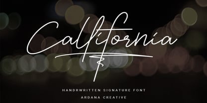 Callifornia is stylish signature script font which support OpenType features and includes, numeral, punctuation, ligatures and it also supports multi-languages. This font is perfect for branding projects, logo, wedding designs, social media posts, advertisements, product packaging, product designs, label, photography, watermark, invitation, stationery and any projects that need elegant feel. FEATURES • Ligatures • Uppercase and Lowercase letters • Numbering, Symbols, and Punctuations • Multilingual Support • Support for Adobe Illustrator, Corel Draw, Indesign or Adobe Photoshop • Support for MAC or WINDOWS
 - Sonus by Hoftype,
$39.00 Sonus – a new monoline family with dynamic-flow drive. Influenced by early English sans serifs - Powerful and energetic but with some classical features. Its firm structure makes it great for text and demonstrates its lively linearity in displays. Sonus comes in 16 styles, in OpenType format and with extended language support. All weights contain standard ligatures, proportional lining figures, tabular lining figures, proportional old style figures, lining old style figures, matching currency symbols, fraction and scientific numerals and arrows.