10,000 search results
(0.044 seconds)
- Going Places JNL by Jeff Levine,
$29.00 Based on hand lettering from a January 26, 1930 ad for the 1930 Fox Studios film "Let's Go Places", the lettering is an ultra bold serif design with numerous ball terminals throughout the character set. The typeface is both formal, yet casual and playful in appearance. Going Places JNL is available in both regular and oblique versions.
 - LTC Law Italic by Lanston Type Co.,
$24.95 Law Italic was designed as an imitation of a formal style of penmanship used in legal documents. It has a more pronounced angle than standard italics. It is intended to be used by itself but can be combined with other faces to suit a designer's inclination. Historically, this face was once used by Bruce Rogers strictly for headings.
 - Charlotte Serif by ITC,
$29.99Although designer Michael Gills was influenced by 18th century French type designer Pierre-Simon Fournier, Charlotte is best described as a modern roman typeface. Its clean cut style, accentuated by a strong vertical stress and unbracketed serifs, exudes an authoritative tone, guaranteeing its effectiveness for almost all text setting applications, but especially where a formal unmannered appearance is desired. - Amelia Rounded by TipoType,
$19.00 Amelia Rounded is a geometric sans that keeps the softness of humanistic strokes. The combination of contrasting styles makes Amelia Rounded an ideal choice for both body and display text. The different styles included in the Amelia Rounded family offer flexibility and variation for your projects, either for a formal or a relaxed look, thanks to the Up version.
 - Ovidius Script by GroupType,
$21.00 Ovidius is a formal script with solid structure. Characters present a look and feel of an ancient pen to very rough paper. The Ovidius family designed by Thaddeus Szumilas is now part of GroupType, a foundry specializing in period and revival typeface designs. These designs have not only important historical design roots, they possess great contemporary appeal.
 - ED Lithosphere by Emyself Design,
$16.00 ED Lithosphere is a sharp display serif font that looks elegant and modern. This font has a Stylish character set to add functionality and beauty to typography, besides that this font also has several features such as: Uppercase, Lowercase, Alternative character / Stylish set, Ligature, Diacritic (multilingual), punctuation, and symbols. This font is inspired by several typographic designs on social media, which are then created and designed to create a good character font that is easy to use for various graphic design needs. These fonts are perfect for cover designs, posters, UI, branding, fashion, logos, social media templates, packaging, etc.
 - Kleader by Edignwn Type,
$18.00 The Kleader Font is inspired by authentic typefaces in old posters. These font collections contain serif and sans serif fonts. Every font comes with 3 style typefaces (regular, rough and stamp). Kleader gives more extras 1 pack illustrations. This font includes some ligatures. The Kleader matches apply in some designs such as the logo, poster, label, badge, packaging, t-shirt, branding, quotes and more custom design. Kleader features : 3 style typefaces (regular, rough and stamp) All-caps, numeral, symbol and punctuation Ligatures Multilingual PUA Encoded Kleader includes : 7 fonts (serif, sans serif and dingbat) 13 hand-drawn illustrations in dingbat
 - Reywak by Product Type,
$15.00 Reywak is an impactful new font that merges the clean look of sans-serif fonts with the powerful symbolism of Arabic characters. Its readability makes it the perfect choice for headlines and long reads, while the unique allure of its arabesque design lends itself beautifully to posters and greetings. Reywak: use it to make your content a cut above the rest. of course, your various design projects will be perfect and extraordinary if you use this font because this font is equipped with a font family, both for titles and subtitles and sentence text, start using our fonts for your extraordinary projects.
 - Sancoale Slab by insigne,
$32.00 The contemporary feel of the Sancoale superfamily takes a bolder turn with this futuristic slab. Built from Sancoale's successfully simple geometry, Slab's serif elements and tall x-height give the face an energetic, yet clean figure that easily complements its cousins: Sancoale Softened--a sans with blunted terminals; Sancoale Narrow; and, of course, the original Sancoale itself. The weights of each member have been balanced carefully to ensure compatibility with the others, and when used together, the combination creates a powerful design that is easy to identify. With weights ranging from the classier Thin to the authoritative Black, Slab opens the door to a range of applications. Used in different text sizes, its tech image is legible and neutral enough for longer bodies of copy--both in print and on the web. Have a more prominent need? The web font also stands out well in a headline or even as a display face. Slabís great personality puts a strong foot forward without giving its reader a kick in the teeth. Whatever the task, this font's one to capture the Zeitgeist into your work. All Insigne fonts are fully loaded with OpenType features. Sancoale Slab is also equipped for complex professional typography, including alternates with stems, small caps and plenty of alts, including "normalized" capitals and lowercase letters. The face includes a number of numeral sets, including fractions, old-style and lining figures with superiors and inferiors. OpenType-capable applications such as Quark or the Adobe suite can take full advantage of automatically replacing ligatures and alternates. You can find these features demonstrated in the .pdf brochure. Included are small caps, fractions, old-style and lining numbers, scientific superior/inferior figures, complete ordinal and inferior alphabet, and a set of symbols and arrows. The Sancoale family also includes the glyphs to support a wide range of languages, including Central, Eastern and Western European languages. In all, Sancoale Slab supports over 40 languages that use the extended Latin script, making the new addition a great choice for multi-lingual publications and packaging.
 - Malnor Sans by Sikifonts,
$24.00 Malnor Sans is a normal sans serif family of 18 fonts. With modern style or neo-grotesque, Malnor sans has balanced proportions in every letter, and it's clean, minimal and cool. There are several alternative letters that can be used in both upright and oblique styles. Single story 'a' can give a more geometric impression, even though it is not purely geometric. There is also an alternative double story 'a' with a tail, a double story 'g' and an alternative 'l' that can be applied together via the 'salt' or 'stylistic sets' features for a slightly warmer feel. Malnor Sans currently has around 900 glyphs, including diacritical marks, that support a broad Latin-based language.
 - Skiltmaler by Imagi Type,
$15.00 Skiltmaler is the typeface that refers to the style of decorative arts during the Victorian era 1837 to 1901, the Victorian era was the period in which fly poster typography emerged. The large amount of colour in combination with large font sizes were created from movable metal type. As well as being made from wood, this was used to create the two-coloured typefaces. You would imagine this would be specific to the '3D' styled type seen on the poster to create the drop shadow. Skiltmaler works well with normal size text, but it works even better for large displays, short words, or even just to incorporate a few or single characters in a design.
 - Jungle Monogam by MonogramBros,
$12.00 Jungle Monogram Font is a perfect circle shaped monogram font consisting of 78 letters. With just a single font file you will be able to create beautiful monograms in just a matter of minutes after the purchase! Jungle Monogram Font comes with font file in OTF format. It features all the modern advanced font features such as Contextual Alternates, effectively eliminating the need to use multiple separate font files for left, center and right letters.
 - Sacramento Pro by Stiggy & Sands,
$39.00 The Sacramento Pro family of typefaces was inspired by a monoline, semi-connected script from hand-lettering artist brochure work of the 1950's and 1960's. With its sophisticated upright stance, it stands on a thin line between formal and casual lettering styles, yet it has a commanding presence for headlines and titles. The Slim adds a fine pen-line style, while the Stout style expands the formal/casual dichotomy much further than the original weight. Opentype features include: - Contextual Alternates for initial and final forms. - Stylistic Alternates for an alternate lowercase t. - Discretionary Ligatures* for catch words like “and”, “at”, “by”, “for”, “of”, “or”, “the”, “to”, and “with”. - Full set of Inferiors and Superiors for limitless fractions. - Proportional and Oldstyle figure sets. * Discretionary Ligatures not included in the Stout style due to heavyweight nature.
 - Mario by Tipo Pèpel,
$22.00 Once upon a time, Mestre Patau, the «Black» magician, concerned about children´s typefaces historical ugliness, decided to settle the matter and using his vector powers, made letters embellished to be used in that stories so that they were according with the great genius all children have inside. Well done face but happy, goodness is not incompatible with joy. A solid construction, smooth, rounded, vibrant, generous curves and even more generous x-height and general proportions, give to the letter the vitality and freshness needed for use in projects where formality is not a requirement. Naughty but welldone, although not heeding the overshoots or the formal alignments, no symmetry in the horns is, despite this, or because of it, a fresh, cheerful but perfectly legible type. A full menu of freshness in your tales and stories!
 - Body by Zetafonts,
$39.00 Body graphic project at Behance Body is a type family designed for Zetafonts by Cosimo Lorenzo Pancini with Andrea Tartarelli. Conceived as a contemporary alternative to modernist superfamilies like Univers or Helvetica, Body tries to maximize text readability while providing a wide range of options for the designer. It comes in two variants (Body Text and Body Grotesque), each in four widths and four weights: regular and bold for basic typesetting, light and extrabold for display use. Body Grotesque applies to the sans serif modernist skeleton little imperfections and quirks inspired by our research in early 20th century type specimens. Curves are slightly more calligraphic and a light inverse contrast is applied to bold weights, giving the typeface a slight vintage appearance in display use. Body Text, on the contrary, challenges the modernist aesthetics maximizing horizontal lines and using open terminals for letters like “s” and “a” that appear normally dark in modernist grotesques. For both variants, the normal width family is slightly condensed in an effort to maximize space usage; the Slim width is provided for extremely dense texts or side notes while the Fit width is optimized for display usage as in logos, headings or titles. The Large width manages to look elegant in its light weight while becoming a valid heading or subtitle font in its extrabold weights. All the 64 fonts in the Body superfamily include a complete latin extended character set with small caps for over 70 languages, Russian cyrillic, open type positional numbers, stylist sets and alternate forms.
 - Sequel Geo by OGJ Type Design,
$35.00 Sequel Geo is a geometric/neo-grotesque hybrid superfamily, influenced by formalized sans-serif typefaces from Germany and Swiss modernist type design—particularly Max Bill’s greek-styled lettering. 8 subfamilies and 120 individual fonts allow for a wide range of typographic expressions. Sequel Geo’s hallmark features, such as the circular “G” and punctuation, simple “t”, and two-story “a” turning one-story in bolder weights, persist throughout all styles. But it’s the formal and functional differences between subfamilies that let you really fine-tune your layouts. The three optical sizes of the core collection, “Body Text”, “Headline”, and “Display”, boast optimized spacing for the intended use. “Extended” packs some extra punch with 18 display-oriented styles. Finally, 48 “Graphic” styles in 4 subfamilies push to the Geometric side, replacing horizontal and vertical stroke endings with angular ones, simplifying letterforms. Sequel Geo is a journey through time and space. From 1920s Germany to 1950s Switzerland. All the while, its archetypal shapes are neutral yet confident, its appearance is classic.
 - Hostilica by Heypentype,
$20.00 Hostilica is a semi-serif family designed by mixing classic serifs in the age of romanticism era with contemporary modern shape and curves. It gives a warm, friendly, and inviting feeling without losing a formality of text fonts. Every weight was designed carefully to provide a unique look while maintained the unity of the type family. A thin weight gives your content an elegant, luxurious design feel. While the regular weight, designed for body text, gives your content a warm and friendly design feel. The bold weight will make your headlines stand-out with its fat counters and curves. Therefore, Hostilica will accomodate all your design needs, from text to display, from catchy to luxury. The italics of each weight will spice up your design project especially with letter 'f,s,r,k, and y'. Those italic versions paired with alternate and discretional ligatures will add an organic feeling to your designs. The italic styles are designed by emulating a handwriting stroke, and will give a more personal feel while still maintained a formal sense.
 - ZT Grafton by Zeune Type Foundry,
$30.00 ZT Grafton is a neo-grotesque typeface based on geometric shapes with contemporary, friendly, and strong emotion. ZT Grafton was built from scratch to be calm, smooth, and clean, while subtle humanist influences add warmth to this typeface. It's available in 8 weights and includes the exciting variable font format.
 - Poodle Tails PW by Patty Whack Fonts,
$5.00Poodle Tails PW is suitable for display use for titles, etc. This font contains the basic characters. Uppercase, lowercase, numerals, and basic punctuation. See the character map for all of the included characters. Poodle Tails PW is available in OpenType and TrueType format which are both included in the same package. - FF Hydra by FontFont,
$62.99 Canadian type designer Silvio Napoleone created this sans FontFont in 2004. The family has 20 weights, ranging from Light to Black in Normal and Extended (including italics) and is ideally suited for book text, editorial and publishing, logo, branding and creative industries as well as small text. FF Hydra provides advanced typographical support with features such as ligatures, alternate characters, case-sensitive forms, fractions, and super- and subscript characters. It comes with a complete range of figure set options – oldstyle and lining figures, each in tabular and proportional widths.
 - Favela by Borutta Group,
$29.00 Favela is an experimental, geometric and sans serif type family. It is characterised by scalable construction of glyphs – hairline version is at the same time condensed, regular is normal, and black is super extended, with short ascenders. Favela was made mainly for branding and display purposes but middle weights are prefect for short texts. Thanks to characteristic features compilation of extreme styles will work on layouts, websites and prints. Favela type Family consist 18 styles with scalable x-height and width.. All styles include over 500 glyphs with set of small caps.
 - Logx 30 by Fontsphere,
$12.00 LOGX-30 is a geometric, all-caps, display typeface. As a brother of LOGX-10 and LOGX-20 , this is the most narrow version in a series of three related typefaces. LOGX-30 is designed, like other LOGX versions, for a wide range of graphic designs and visual identifications. I think that it works best in works with a technical, geometric style, and rather striving for minimalism. Both the normal and the italic version can be used together to compose graphics, photos, large and small text in an interesting way.
 - Gogosquat by Bogusky 2,
$34.50Usually, the condensed version of a face comes after the regular design. Not with gogo squat. After gogo big, I thought how strong a regular version would be. A nice clean gutsy face. A "today" Franklin Gothic Extra Bold. I find it ideal for contemporary headlines as well as for logo solutions. As with gogo big, in my terms and conditions, I permit the modification of up to ten of the letter forms for logos and monograms, but logos and monograms only, not the typeface in normal usage. - Bernhard Fashion Pro by SoftMaker,
$15.99 Lucian Bernhard designed this typeface for American Type Founders in 1929. Bernhard Fashion sports tall ascenders, stylish embellishments, and much taller than normal capitals that drop below the baseline. This extra light typeface radiates elegance and lightness. SoftMaker’s Bernhard Fashion Pro typeface comes with a huge character set that covers not only Western European languages, but also includes Central European, Baltic, Croatian, Slovene, Romanian, and Turkish characters. Case-sensitive punctuation signs for all-caps titles are included as well as many fractions, an extensive set of ligatures, and separate sets of tabular and proportional digits.
 - 1676 Morden Map by GLC,
$42.00 This family was created -- inspired from the engraved typeface (Two styles : Normal & Italic) used in the pack of 52 playing cards who was describing the 52 counties forming a small Atlas of England and Wales and depicting English roads for the first time, published by Sir Robert Morden in 1676. Our OTF and TTF versions are covering Western, Eastern and Central European languages (including Celtic), Baltic and Turkish, containing historical and standard ligatures plus specific Old English abbreviations. The MacTT Classic version is containing the basic standard 256 glyphs including some extra ligatures.
 - Tiza by Sudtipos,
$39.00 Tiza is a rough take on informal faces and handwriting, brought on by the recent demand for scripts and brush lettering. Its flow leaves traces simulating runny pen ink, which makes it very suitable for handwriting-like paragraphs as well as casual greeting card and invitation setting. The bold weight, Tiza Negra, fits very nicely on book covers as well as large signs. Tiza is the proverbial reminder that typefaces can sometimes be more human than they are normally perceived. Designed by lettering great Angel Koziupa, and digitized and completed for Sudtipos by Alejandro Paul.
 - 1906 French News by GLC,
$38.00 We have created this family from the numerous derivatives in use for newspapers since the middle of the 1800s to the 1970s, inspired by the well known Clarendon. Mainly, the patterns are those used to print Le Petit Journal, a popular French Newspaper of the era (published from 1863 to 1937). The present version contains Normal, Italic, Bold and Bold Italic styles, in two sub families: 1906 French News for texts and titlings with upper and lower case, and 1906 French News Caps (Caps, small caps, small numerals, for texts and titlings).
 - Gogobig by Bogusky 2,
$25.00I have always been frustrated when looking for a bold condensed face. The choices were the usual? Helvetica Bold Condensed, Univers Bold Condensed or Alternate Gothic #2... all rather dated. I was looking for a really unique, clean, uncluttered sans serif face, so I decided to design one. I have since adapted it to many logo designs. So, in my terms and conditions, I decided to permit the modification of the letter forms for logos and monograms, but logos and monograms only, not the typeface in normal usage. - Malden Sans by Monotype,
$49.00 Malden Sans is a mischievous grotesque sans serif with charming details that gives designers a solid typographic voice. It was created by Michele Patanè with regular and condensed widths, as a utilitarian typeface family for print and digital environments. It was originally designed as part of a type system for cinema magazines, and embodies the devil-may care attitude of the silver screen. Designer Michele Patanè looked back to an earlier era of typography to create the typeface, embracing unusual details, rather than ironing them out. “There is a very naive way of using typography in the 30s and 40s, something not as clean as how it’s used in the late 50s and 60s when everything passed through a rationalisation of the typographic palette,” he explains. “In film magazines you can still see a bit of roughness, and I like that.” This is a design that’s desperate to be used in editorial environments, and has been created to stand up to lower quality paper. It would be equally at home on posters, packaging, and even in digital environments where designers are looking for something more expressive than another geometric sans serif. Malden Sans includes a Normal and Condensed range, with 7 weights in the normal and 6 in the Condensed, both including italics.
 - Righton by Letterhend,
$13.00 Introducing, Righton - a luxurious font duo that brings a classy and luxury look. It contains two fonts, script and serif, which perfectly pair. They work great if you need a typeface for headlines, logotypes, apparel, invitations, branding, packaging, advertising etc. This typeface is comes in uppercase, lowercase, punctuation, symbols, numerals, stylistic set alternate, ligatures, and also has Multi-Lingual support. We hope you enjoy the font, please feel free to comment if you have any thoughts or feedback. Or simply send me a PM or email me at letterhend@gmail.com
 - Funta by Gatype,
$12.00 Funta Script is a typeface or font design that can be used to style text. It is characterized by tails and is slightly cursive, often giving the appearance of playful or relaxed text. Funta Script is widely used for design projects such as invitations, greeting cards, posters, headers or just used to express words over the background. Displayed fonts: Uppercase, Lowercase, Numbers, Symbols, Accents, Styles, Swashes and Ligatures also Multilingual Support Enjoy the font, feel free to comment or feedback, send me a PM or email. Thank You!
 - Side Black by Zamjump,
$19.00 Side Back is a brush handwriting font following the correct writing rules in making brush letters. This font is a bit more unique because the lowercase style uses uppercase but there are some with lowercase style. Equipped with a ligature, and a wash to be used as a complement or sweetener to the design you make. very suitable for use in various designs, such as headers, websites, clothing, products, even for writing quotes. Congratulations on exploring your design using black side fonts. Included : - Multilingual support - Ligatures - Swash -character symbols
 - Dioksiany by sizimon,
$20.00 Introducing our new font the Dioksiany! Inspired by Sophisticated Fashion Style. Classy, contemporary paired font. It is free-flowing, fashionable, feminine, and friendly. Use the fonts for: logos, branding, wedding invitations, farmhouse decor, farmhouse signs, mugs, shirts, pantry labels, stickers, business cards, greeting cards, posters, social media, planner prints and websites. Dioksiany Includes: Uppercase, lowercase, numeral, punctuation & Symbol Multilingual support Stylistic alternates 55 Discretionary ligatures 10 swash (numeral keys) PUA Encoded Characters Fully accessible without additional design software. If you have any question please do not hesitate to contact me: sizimon.id@gmail.com
 - Dissident by Ronny Studio,
$25.00 Dissident Font is a cool alternative for you to easily create your Underground band logo or whatever. Using alternative fonts and ornaments will liven up the font and will look cooler and fiercer. It comes with a basic character set and a small group of symbols and signs frequently used in the extreme music sector - Death- and Blackmetal classics such as pentagram drops, roots, wings and more. Features : - All Caps - numbers & punctuation - Multilingual - PUA encoded Please contact us if you have any questions. Enjoy Crafting and thanks for supporting us! :) Thank you
 - Barlock by Arterfak Project,
$16.00 Introducing Barlock a strong display font, inspired by sports design and old school typography. Carefully designed with the curve-less of the letterform but not cubistic, and has a bold weight that suitable for an elegant-strong design. Barlock is an all-caps font equipped with a bunch of alternates characters that you can mix and match to your design concept. A perfect choice for logo, posters, apparel, labels, jersey, headline, quotes, books, packaging, and many more! Fonts featured : Uppercase Smallcaps Numbers Symbols & punctuation Multilingual PUA Encoded Stylistic set 01-03
 - Sellomitha by YuliusParyadi,
$11.00 Sellomitha (Handwritten/Script) is made according to its name which symbolizes charm and charisma. She is glamorous and wants to be the center of attention.This font is readable, catchy, and easy to use. This font is suitable for quotes, logo designs, magazines, business cards, and many other design projects. Sellomitha is includes: - full set uppercase and lowercase letter; - numerals; - multilingual support; - large number of punctuations; - more than 30 ligatures, and swash. Please add this font as your favourite hit like button, or follow me. I'll very happy for that and appreciated it.
 - Three Neon Lines by Kaer,
$19.00 Hello! Do you need colorful neon-style lettering? Please use the ready-colored font I've made. What you will get: * Colored and regular B&W styles * Uppercase (lowercase glyphs are same) * Multilingual support * Numbers and symbols If you have any questions or issues, please contact me: kaer.pro@gmail.com Best, Roman. --- *You can use color fonts in PS since CC 2017, AI since CC 2018, ID since CC 2019, QuarkXPress since 2018, Pixelmator, Sketch, Affinity Designer Since macOS 10.14 Mojave, Paint.NET Windows only.* *Please note that the Canva does not support color fonts!*
 - Mafuta by Scholtz Fonts,
$19.00Mafuta is a round, happy font, named for the Zulu word for "fat". In tribal societies in Africa, where food was often scarce and almost never easily come by, it was considered desirable to appear "well fed". Roundness was a symbol of high status in the tribe, and a sign of wealth. The up-beat, bold outline of the font celebrates the confidence of people who feel comfortable being who they are. The font manages to be both contemporary and African. It is best used for posters and for headings. - Mogand by Soerat Company,
$19.99 Mogand is a contemporary serif typeface that combines a humanist writing style. Mogand family is very suitable for various design needs such as a display font for editorial design, packaging, branding, broadcasting purposes and for any project that requires a clean, modern font with a strong character. This 9-weight family includes oblique and support around 200+ languages as well as several sets of figures. This font provides advanced typographic support with features such as ligatures, alternate characters, old-style figures, fractions, numerator/denominator, superior/inferior, and various symbols.
 - Ransta by Multype Studio,
$19.00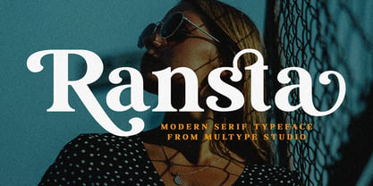 Ransta is a chic,classy, and modern serif font with many alternates character to access in OpenType features. This font is perfect for branding, logos, social media, advertisements, product packaging, watermark, invitation, stationery, tshirt, prints, posters and more What’s Included : Uppercase & Lowercase Stylistic Alternate Ligature Numbers & Symbols Works on PC / Mac Simple installations Accessible in the Adobe Illustrator, Adobe Photoshop, Adobe InDesign, even work on Microsoft Word PUA Encoded Characters, Fully accessible without additional design software. Multilingual support Thank you for your purchase! Hope you enjoy with our font!