10,000 search results
(0.12 seconds)
- Barmoor by Barmoor Foundry,
$15.00 Barmoor is a robust, classic roman display face, inspired by the letter designs of the Parisian craftsman Claude Garamond and other 16th century French engravers as well as antique roman letterforms. It works especially well letterspaced and in all caps. Alternate W, R, J, M, Q and K can be used to add a modest bit of flair to letterspaced, all cap treatments. Barmoor is mainly intended to be a display font or a limited text font.
 - Carte Blanche by Hanoded,
$20.00 Carte Blanche literally means 'Blank Ticket'. Yeah, yeah, it is also a very 007-ish catchphrase, but I wanted to give this elegant font a 'stylish' name and Carte Blanche popped up. All glyphs were hand drawn on a rather expensive piece of heavy-weight paper and were put into the font in between changing nappies, bouts of the flu and the subsequent wiping of snotty noses. Carte Blanche speaks most Roman-based languages - albeit nasally…
 - Grecian Empire by Elemeno,
$25.00The designer's father, Philip Grecian drew a logo for his business, Grecian Creative Services and asked Alex Grecian to expand on the logo. Alex extrapolated from the existing letters, creating a font to compliment his father's logo. Naming it was the easy part. Grecian Empire has since become one of the most popular fonts offered by Elemeno. The Strikes Back and Engraved styles have limited character sets and are far less versatile than the regular version. - Lazar by Discourse Type,
$5.00 Lazar takes its inspiration from the designs of early Russian designers like El Lissitzky. Designed initially as a custom font for a trainers collecting website it was expanded into a full family including a stencil, rounded and distressed styles. Lazar has a fresh and vibrant feel and is very flexible with its alternates lowercase characters, small caps and discretionary ligatures. It works well on posters, flyers and magazine. Mix all four styles to achieve unique typographic designs.
 - MC Scienta by Maulana Creative,
$15.00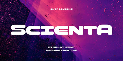 Scienta is a modern Decorative expanded sans Display font. Bold stroke, fun character with a bit of ligatures and alternates. To give you an extra creative work. Scienta font support multilingual more than 100+ language. This font is good for logo design, Social media, Movie Titles, Books Titles, a short text even a long text letter and good for your secondary text font with script or serif. Make a stunning work with Scienta font. Cheers, Maulana Creative
 - Victualia X by Dawnland,
$13.00 Victualia - casual, hand drawn (Wacom, illustrator) brush font. "Ligatures" have been created for some double letters to enhance the illusion of handwritten text. (TT, tt, ff, oo, OO, mm, MM, ll & LL - open type version of the font and open type compatible layout application required). Victualia was initially created in 2005 as part of a course that I attended to At Berghs , but has now been given a face lift as well as a full set of special characters.
 - KhaoSans by TypeK,
$35.00 KhaoSans is a Rounded typeface. The latin was inspired from Thai woodtype used as headline in old day Thai newspaper. The refined curve with some sharp end add uniquely beautiful touch to the typeface. In Thai language, ‘Khao’ (ข่าว) means ‘news’ and ‘Sans’ (สาร) means ‘message’. The font comes in 8 weights, ranging from a delicate ExtraLight to Black, with 3 widths (Normal, Wide, and Expanded). Matching italics are provided, resulting in a total of 48 styles family.
 - Rochek Display by Maulana Creative,
$15.00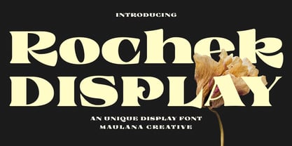 Rochek is a fancy Display serif font. With bold expanded stroke, fun character with a bit of ligatures and alternates. To give you an extra creative work. Rochek font support multilingual more than 100+ language. This font is good for logo design, Social media, Movie Titles, Books Titles, a short text even a long text letter and good for your secondary text font with sans or serif. Make a stunning work with Rochek font. Cheers, MaulanaCreative
 - Sarabande by Three Islands Press,
$24.00Sarabande is a painstaking reproduction of Jean Jannon's famous "Garamond" of 1621 -- also known as "Caracteres de l'universite." Whereas the original was intended for setting French and Latin text only, Sarabande has all standard international characters and diacritics, along with a Euro symbol. (There are however no characters for higher mathematics or logic, and the number of other unhistorical characters has also been kept to a practical minimum.) Sarabande comes with two styles: a roman and a true italic. - Bristone by Almarkha Type,
$29.00 Hello Everyone, Introduce our new collection, Bristone – Expanded Sans Family famous logos of Technology and brands that have very strong characteristics, Bristone has 6 Fonts that allow you to get a job with satisfying results. very suitable for posters, t-shirt, packaging, branding, logotype and more. Bristone font with strong and challenging nuances. very suitable for the title, typography, clothes, Poster, magazines, brochures, packaging,Websites and much more for your design needs, making your designs more modern and professional
 - LTC Forum Title by Lanston Type Co.,
$24.95 Forum Title was originally designed by Frederic Goudy in 1911. It was intended to be the heading font used for a book set in Kennerley. Based on inscriptional Roman stone cut capitals, this face is true to the early Roman forms which did not have a lower case. Forum exemplifies the classic Roman letterform at its finest. If a lower case were desired, Forum Title can be paired with Goudy Oldstyle for a harmonious hybrid font.
 - Rutland AOE by Astigmatic,
$19.95 80’s technotronic meets out of this world style in Rutland AOE. From its beefy weight to its narrow counters, Rutland AOE started as a digitization of a film typeface called Maccaro by LetterGraphics. This bulky technotastic typeface was taken from its limited character set and fleshed out to include an expanded language glyph set. This interstellar alphabet funhouse screams electronica/house flyers, space games, alien invasions and more. Rutland AOE is ready to abduct your designs.
 - Draw by Andinistas,
$37.00 Draw is a type family designed by Carlos Fabian Camargo G. Draw emphasizes the abundance of useful features to design messages with artistic purposes, spontaneous and vernacular, usually dressed in imaginative ideals to compose words, apparently drawn freehand. Draw is intended to be used in the context of graphic design as vogue, restaurants, weddings, art, clothing or imaginative supports where crafts and romance predominates. Draw contains professional typographic OpenType strategies to grant special character content: ligatures, swash and more.
 - Linotype Animalia by Linotype,
$29.00Linotype Animalia is part of the Take Type Library, chosen from the contestants of Linotype’s International Digital Type Design Contests of 1994 and 1997. The font was designed by German artist Johannes Plass and is full of surprises. It is like a walk through the zoo, where the j is a shark chasing a small fish and the K is a moose gazing at the sky. Linotype Animalia is intended exclusively for use in headlines with large point sizes. - Adriane Lux by Typefolio,
$49.00 Adriane Lux is the decorative, "inline" or "openface" titling companion to Marconi Lima's acclaimed Adriane Text family. This single weight offering is modeled after the Regular weight of the primary family. While Adriane Text is intended for thoroughly classical book design, Adriane Lux enters the fold as an equally traditional display face. Have it foil-stamped on your next faux-leather book cover design or embossed on your personal calling card for a touch of well-behaved, regal formalism.
 - Cobya by Creativemedialab,
$20.00 Cobya is inspired by the waves and the ocean. Some letter like A,W,V reflects the dynamic and beautiful shape of the waves. Try All Capitals and play with the spacing for a modern and fashionable look. Cobya consists of three widths condensed, normal and expanded. Each width has 9 weights, also a variable format. Cobya has distinctive and unique characteristics, so it is very suitable when used as a branding logo or fashion design concept.
 - Springrood by Teweka,
$17.00 Introducing Springrood Font, This Font is carefully crafted and balanced on script typefaces with a unique Retro style. Also with Extrude Version. You can use them as logos, badges, emblems, packaging, titles, posters, t-shirts, greeting cards, wedding invitations, etc. Alternative characters in this font are divided into several OpenType features such as Stylistic Alternates, Stylistic Sets, and Ligatures. OpenType features can be accessed using OpenType programs such as Adobe Illustrator, Adobe Photoshop, and Adobe InDesign.
 - Setsuko by Pelavin Fonts,
$20.00 Setsuko finds its origins on the ancient Silk Road, a network of trade routes crossing the continent of Asia, named for the Chinese silk trade which began in the Han Dynasty more than two thousand years ago. Originally designed to brand and package products celebrating the charm and mystery of the Ancient East, the characters in Setsuko are intended to express admiration and respect, not stereotyping or parody hoping to leave room for a designer's creativity and personal interpretation.
 - Hybi5 Finescript by Hybi-Types,
$12.50 The Hybi5 Finescript is intended for the more reputable applications. It’s fine and elegant look makes it great for invitations, menu and concert. The Hybi5 Finescript is technically based on my Hybi5 font family, but with a significantly different appearance. The font contains a lot of accents, ligatures and special characters. Please be sure to set kerning to “metric” and spacing to “zero” in your layout app and please allow ligatures for a more smooth look.
 - AZN Unified by AthayaDZN,
$14.99 Introducing "AZN Unified" font by AthayaDZN. UNIFIED was inspired by the evolving sports world that recently just expanded into the digital verse. UNIFIED’s rounded and sharp look is representing its nature of unity, equipped with 4 different angles of corners, UNIFIED achieved its mixed modern style of a bold serif font. Language Support : Afrikaans, Albanian, Danish, Dutch, English, Estonian, Filipino, Finnish, French, Galician, Indonesian, Irish, Italian, Luxembourgish, Norwegian, Portuguese, Romansh, Scottish Gaelic, Spanish, Swedish, Swiss German, Uzbek (Latin).
 - FS Siena by Fontsmith,
$80.00 Eclectic FS Siena is a typeface with history, and not just in the sense of having its origins in classical Roman lettering. Fontsmith founder Jason Smith first committed it to tracing paper while still at college, instinctively redrawing letterforms based on Hermann Zapf’s Optima according to ‘what felt right’. When Krista Radoeva took up the challenge to edit and extend the typeface, she and Jason were determined to preserve its subtly nonconformist and eclectic spirit. Like a great dish, there are individual components throughout the character set that all add flavour, and need to be balanced in order to work together. The smooth connection of the ‘h’ ‘m’ ‘n’ and ‘r’ contrasts with the corners of the ‘b’ and ‘p’. The instantly recognisable double-storey ‘a’ – the starting point of the design – contrasts with the single-storey ‘g’ and the more cursive ‘y’. And only certain characters – ‘k’, ‘w’, ‘v’ and ‘x’ in the lowercase and ‘K’, ‘V’, ‘W’, ‘X’ and ‘Y’ in the caps – have curved strokes. Transitional FS Siena is a contrasted sans-serif typeface, blending classical elegance and modern simplicity. Its construction and proportions are descended from classical broad-nib calligraphy and humanist typefaces, with a high contrast between the thick and thin strokes. The angle of the contrast, though, is vertical, more in the character of pointed-nib calligraphy and modernist typefaces. This vertical stress helps to give FS Siena a strong, cultured presence on the page. Idiosyncratic italics The italics for FS Siena were developed by Krista to complement the roman upper and lower-case alphabets first drawn by Jason. Many of the letterforms are built differently to their roman counterparts: there’s a single-tier ‘a’, a looped ‘k’ and connections more towards the middle of stems, such as in the ‘m’, ‘n’ and ‘u’. These distinctions, along with generally much narrower forms than the roman, give the italics extra emphasis within body copy, where the two are side-by-side. In editorial, especially, the combination can be powerful. To cap it all… In his original draft of the typeface, Jason found inspiration in Roman square capitals of the kind most famously found on Trajan’s Column in Rome. In keeping with those ancient inscriptions, he intended the capitals of FS Siena to also work in all-upper-case text, in logotypes for luxury consumer brands and property developments, for example. A little added space between the upper-case letters lets the capitals maintain their poise in a caps-only setting, while still allowing them to work alongside the lower-case letterforms. The caps-only setting also triggers a feature called case punctuation, which adapts hyphens, brackets and other punctuation to complement the all-caps text.
 - ATTACK OS by OS CORP,
$25.00 ATTACK OS font version: 1.0 is the first version, including 340 characters, there are 4 types of handwriting that are: Regular; Italic; Bold; Bold Italic. We work with agencies and brands on visual identities and custom type design. Do you need a new font? Or an adjustment of the existing one? We can handle it on a best technological and creative level. New font design We create a concept and drawing of a completely new font to emphasise the character of your brand or project. Modifications to our fonts We adjust one of our retail fonts to your needs. It usually means a small change in design, an extension of the language set or icons. Let’s discuss how we can work together
 - Bulmer by Monotype,
$29.00Cut as a private version for the Nonesuch Press in the early 1930s, Monotype Bulmer was first released for general use in 1939. Based on types, cut by William Martin circa 1790, used by the Printer, William Bulmer, in a number of prestigious works, including Boydell's Shakespeare. Martins types combined beauty with functionality. Narrower and with a taller appearance than Baskerville, it anticipated the modern face of Bodoni but retained vital qualities from the old face style. This new digital version of the Bulmer font family was drawn by Monotype following extensive research into the previous hot metal versions and a study of Bulmer's printed works. Additional weights have been designed together with a wide range of Expert and alternative characters. - Palomino Clean by My Creative Land,
$40.00 Please welcome Palomino Clean - a carefully digitized brother (or sister?) of Palomino calligraphy font family created using amazing Palomino Blackwing 602 pencils. Palomino clean can be safely used on the web - no need to worry about file size! - as well as in all desktop applications. All features are identical to Palomino Original - the script font is loaded with initial, medial and terminal alternates and swashes. Along with a help of three other fonts - condensed sans, simple sans and design elements font - you’ll be able to create stunning designs with a click of a mouse. This versatile font family will work perfectly for fashion, e-commerce brands, wedding boutiques, photography, quotes design and a lot more. It has extensive language support and fully unicode mapped.
 - Droid Sans by Ascender,
$92.99 Droid Sans Pro Font Family (2 fonts) are a humanist sans serif typeface designed by Steve Matteson, Type Director of Ascender Corp. The Font Family is an approachable, friendly set of typefaces optimized for display on screen. It was designed to provide optimal quality and legibility. It features upright stress, open forms and a neutral appearance. The font was optimized for user interfaces and to be comfortable for reading on a mobile handset in menus, web browser and other screen text. The font family contains Old Style Figures (requires an application that support advanced OpenType typographic features) and extensive character set coverage including Western Europe, Eastern/Central Europe, Baltic, Cyrillic, Greek and Turkish support. Contains: Droid Sans Pro Regular & Droid Sans Pro Bold
 - San Andre by Mans Greback,
$59.00 San Andre is a sport script font. Drawn and created by Mans Greback in 2021, this logotype lettering has a distinct retro style and a strong vintage personality, with a combination of soft brushes and strict backbones. Use multiple underscores to make swashes of different lengths. Examples: Andreas______ Athletics_______ (Download required.) San Andre is built with advanced OpenType functionality and has a guaranteed top-notch quality, containing stylistic and contextual alternates, ligatures and more features; all to give you full control and customizability. The font has extensive lingual support, covering all Latin-based languages, from North Europa to South Africa, from America to South-East Asia. It contains all characters and symbols you'll ever need, including all punctuation and numbers.
 - Bumble OS by OS CORP,
$3.00 BUMBLE OS font version: 1.0 is the first version, including 340 characters, there are 3 types of handwriting that are: Regular (Regular); Italic (Italic); Bold (Bold). We work with agencies and brands on visual identities and custom type design. Do you need a new font? Or an adjustment of the existing one? We can handle it on a best technological and creative level. New font design We create a concept and drawing of a completely new font to emphasise the character of your brand or project. Modifications to our fonts We adjust one of our retail fonts to your needs. It usually means a small change in design, an extension of the language set or icons. Let’s discuss how we can work together
 - Narziss Pro Cyrillic by Hubert Jocham Type,
$59.90 Since Mommie, I gradually got more into swirly ornaments. The massive contrast in the neoclassic style is perfect for thin swirly extentions to the characters. Even in an upright typeface. Narziss is very elegant in big headlinesizes. Use it only very big. What was the inspiration for designing the font? spencerian calligraphies and neoclassic contrast What are its main characteristics and features? Narziss is very elegant in very big sizes. The Regular version is without any ornament. The Drops version has some character like the e and the k that are more unique. The Swirls version has got carefully added swirls, that come out of the basic stroke and flow into other characters. Usage recommendations: Big headlines in magazines, brochures and invitations
 - Alternate Gothic Pro by SoftMaker,
$14.99 Alternate Gothic Pro is one of the fonts of the SoftMaker font library. Designed by Morris Fuller Benton in 1903 as a complement to his Franklin Gothic type, Alternate Gothic was created to solve a common problem: fitting headlines in narrow columns. For that purpose, it comes with three similar styles of varying widths. SoftMaker’s Alternate Gothic Pro typeface family contains OpenType layout tables for sophisticated typography. It also comes with a huge character set that covers not only Western European languages, but also includes Central European, Baltic, Croatian, Slovene, Romanian, and Turkish characters. Case-sensitive punctuation signs for all-caps titles are included as well as many fractions, an extensive set of ligatures, and separate sets of tabular and proportional digits.
 - Mondo News by Untype,
$30.00 Mondo News is a typeface designed to fulfill digital and paper publication editorial needs, its cared equilibrium between slightly condensed proportions and generous «x» height, offers optimum performance without compromising legibility. The modulation of thick and thin strokes in the middle weights is balanced for extensive text reading, while on the heavy weights becomes more dramatic making them ideal for strong headlines. Equipped with 760+ glyphs, support for more than 200 languages, smallcaps, alternates, ligatures, dingbats and plenty of OpenType features, Mondo News modern interpretation of tradition performs excellent both on screen and on paper, satisfy the most demanding editorial needs and will nourish your pages with a convincing and reliable atmosphere. Mondo News is part of the Untype Mondo family typographic system.
 - Circus Didot by ParaType,
$25.00 Circus Didot typeface presents a rework of a typical neoclassical serif type in a constructivist style. Analyzing the shapes of characters author placed basic geometric figures — triangles, rectangles, circles… above the contours of letters. Resulting constructions staying recognizable letters at the same time bore a resemblance to pictures of Russian avant-garde artists from 20th century. This discovery has brought an idea to design a typeface where the tendency of a modern serif type to rationalism and geometry is realized in maximum possible extent. The prototypes for the project were taken from the works of Didot, lettering experiments of Russian constructivists and art deco artworks. The technique of juggling with shapes and overall grotesque approach to the design explains the selection of the name for the font.
 - Umbero by NaumType,
$25.00 Umbero is an experimental geometric blackletter. Umbero was inspired by modern street art (by artists like Pokras Lampas, RETNA, etc.), gothic script and constructivism. It has an ornate and twitchy structure: you can not find two similar letters. Capital letters have even more complex structure, then lowercase, to the extent that you can even use them as initial letters with a different, more calm font if you want to achieve a medieval stylization in a contemporary way. Get Umbero if you need something extra for your design. Or vice versa use it as a starting point of your work. It’s a perfect choice for the mystic or contemporary logos, headlines, oversize typography, branding, identity, website design, album art, covers, posters, advertising, etc.
 - Shine Pro by Thinkdust,
$10.00 Shine Pro is the quintessential sans serif gentleman you’ve been looking for all your life. It doesn’t confuse, confound, or complicate - it politely offers up what it has as though your fontal satisfaction is the most important thing in the world; and to Shine Pro, it is. The Regular weight is subtle, gentle - his softer side; while the Bold weight has impact and creates an imposing, important air.. In order to please everyone, Shine Pro has an impressive 10,000 kerning pairs and extensive language support, including cyrillic. Designed with traditional influences but with a contemporary coup-de-grace, the clean, smartly turned out, and oh-so-reliable Shine Pro is ready to become your new go-to font for all matters.
 - Northura by Hipfonts,
$9.00 Introducing Northura, the epitome of elegance and versatility in the world of typography. This stunning modern sans typeface effortlessly combines minimalism, beauty, and legibility in perfect harmony. With an extensive range of 30 weights to choose from, Northura provides unparalleled flexibility, allowing you to tailor your designs with precision and finesse. Its clean and sleek lines evoke a sense of contemporary sophistication, making it ideal for a wide range of projects, from editorial layouts to branding materials. Whether you're aiming for a sleek and professional look or a stylish and artistic approach, Northura will elevate your designs to new heights, leaving a lasting impression on your audience. Embrace the essence of modern aesthetics with Northura and let its timeless elegance redefine your typographic journey.
 - Equipage by Kitchen Table Type Foundry,
$16.00 Équipage is a French word meaning ‘crew’. It is used for the crew on boats, airplanes, but it also applies to horse-drawn carriages and all that goes with it. Originally the word means ‘to fit out’ and it is probably derived from the Norse word ‘skipa’, which means ‘arrange, fit out a ship’. Then, if you’re really interested, the word ‘ship’ hails from this same word, just like the Danish ‘skib’, Middle Dutch ‘ship’, Dutch ‘schip’ and German ‘Schiff’. See? You learn something every day! Équipage is a really nice, handmade serif font. It is quite elegant and would look fantastic on labels, postcards and book covers. Comes with extensive language support and a set of alternates for the lower case glyphs.
 - Truesdell by Monotype,
$29.99 Frederic Goudy drew Truesdell in 1930 and first used it for an article in a quarterly journal for book collectors. Since it was a small family and not promoted, Goudy received few orders for fonts. The original drawings and matrices for the face were lost in the fire that destroyed Goudy's studio in 1939.The only known examples of Truesdell fonts reside in the extensive collection of typographic material at the Rochester Institute of Technology School of Printing. It was proofs from these fonts that served as the basis for Monotype's digital revival of the family. Monotype Truesdell was released in March of 1994, just slightly over fifty-five years after fire destroyed Goudy's original work. Truesdell font field guide including best practices, font pairings and alternatives.
 - Bilgres by Azzam Ridhamalik,
$18.00 Introducing Bilgres, a hippie-themed font that combines strong and gentle shapes with rounded edges, giving it a unique and playful style. This bold and wide font is perfect for creating eye-catching designs that stand out, whether you're designing posters, album covers, logos, or social media graphics. With extensive multilingual character support, including Latin Pro, Bilgres is versatile and adaptable to all your design needs. If you're looking to create designs that are both hippie and modern, Bilgres is the font for you. Its distinct and playful style will elevate your designs to the next level, making them pop and catch the eye. Don't wait to try out Bilgres – purchase now and start creating stunning, hippie and groovy designs that will leave a lasting impression.
 - Antry Sans by Mans Greback,
$59.00 Antry Sans is a cool uppercase typeface. With heavy letterforms in a sturdy appearance, this poster font gets attention while keeping clean. It is legible and clean, optimized for a non-complex design or headline. The Antry Sans font family consists of Thin, Regular and Bold, and each weight as Italic, totalling in six styles. The font is built with advanced OpenType functionality and has a guaranteed top-notch quality, containing stylistic and contextual alternates, ligatures and more features; all to give you full control and customizability. It has extensive lingual support, covering all Latin-based languages, from Northern Europe to South Africa, from America to South-East Asia. It contains all characters and symbols you'll ever need, including all punctuation and numbers.
 - Moreno by Typedepot,
$29.00 Meet Moreno – a semi serif typeface full of personality and flavor. A display typeface in its nature Moreno is free and informal yet stable and trustworthy. Moreno comes with extensive OpenType support - with its more than 15 OpenType features Moreno is giving you a great variety of stylistic alternatives as well as wide range of ligatures, tabular lining numerals, oldstyle numerals, fractions and many more. It comes in 8 carefully chosen weights from Extra Thin to Black plus their matching italics. Together with the 4 additional styles, Moreno becomes a diverse type family of 80 fonts suitable for a wide range of design needs like retail, package, food, branding etc. With its language support - over 200 languages, Cyrillic included - it is ready for world domination!
 - Six Week Holiday by Kitchen Table Type Foundry,
$16.00 In Holland, all kids have a six week long school holiday during the summer months. To prevent chaos, traffic jams and other madness, the government has divided the country in three regions (North, Middle and South) and school holidays start a few days to a week and a half apart. For kids this is the best time of the year, as they can have fun for a month and a half, but for us parents this sometimes is a bit of a logistic nightmare, as we still have to work! Six Week Holiday is an ode to the chaos of summer. It is a cute handmade ‘school’ font that will put some sunshine in your designs! Comes with extensive language support.