10,000 search results
(0.039 seconds)
- Grota by Latinotype,
$26.00 Grota is a very expressive font, has a gestural character inspired by the hand lettering . Grota is grotesque, unicase and exceptional. It has six weights ranging from thin to black with their italics. It is ideal for logos, brands, magazines, headlines, books. etc. Photography by Matías Troncoso
 - Margate JNL by Jeff Levine,
$29.00 A set of water-applied decals manufactured in 1962 by the American Decalcomania Company for Goodyear serves as the basis for Margate JNL. This block-style letter (with a hint of the Art Deco era) is bold, uniform in weight and commands attention in any titling application.
 - Stars And Type by Tim Kirkman,
$22.00 Stars & Type is a display font inspired by a road trip around the USA. It is bold, abstract and experimental and is meant for attention grabbing large headlines. Utilising stars to give a sense of Americana, it would be suited to editorial, advertising and display typography.
 - Mbf Grub by Moonbandit,
$14.00 Grub is a bold, playful and fun typeface, it is ideal for branding, logo, title, headlines, poster and many other projects that needs an attention grabber. Use it on your projects to give that free spirit and bold look. Also include opentype features: ligature and alternate
 - With A Twist by Letters by Wordsworth,
$23.00 With A Twist is not shy, not ordinary, not predictable which makes it the perfect choice for attention-getting titles. With A Twist Monoline is slightly more retiring and fun to fill in. Pull up a stool, order a martini & have some font fun - With A Twist.
 - Bigstorm by Letterhend,
$14.00 Bigstorm is a unique hand made font that will capture the attention at glance. This font is perfect to be used as signature, headline, lettering quotes, wedding invitation, fashion, etc. It also comes in uppercase, lowercase, punctuations, symbols & numerals, stylistic set alternate, ligatures, etc also support multilingual.
 - Runa Serif by Monotype,
$29.99Swedish designer Lennart Hansson began designing letterforms at the age of 20, and since then his exceptional calligraphic artwork has been on exhibit throughout the world. Hansson won the Nordic Typeface Competition in Copenhagen for his typeface Runa Serif, inspired by the forms of ancient Viking runes. - California Kingston by Crumphand,
$25.00 California Kingston display is a typography design product that is specifically created for use in the headlines, titles, or other prominent text elements of a design. This typeface is often characterized by its bold, attention-grabbing appearance and its ability to make text stand out on a page. The main goal of a California Kingston font display is to create an impact and draw the viewer's attention. This is typically achieved through the use of thicker and more pronounced strokes, unique shapes and design elements, and often, a more stylized appearance. California Kingston displays can be used in a variety of design projects, including posters, logos, packaging, advertisements, and more. They are often paired with complementary fonts to create a well-designed and cohesive visual identity. When choosing a California Kingston font display, it is important to consider the project's overall aesthetic and message, as well as the intended audience. It's also essential to ensure that the font is legible and easy to read, even at smaller sizes. Overall, a California Kingston font display is an excellent way to make a bold statement in a design and to capture the viewer's attention.
 - Irongate by CozyFonts,
$25.00 The Irongate Font Family has a retro personality. The common denominators, in all the glyphs, is a blunt center serif. The main top & bottom of each Cap & lower case glyphs have 'fan serifs', yep serifs that fan out. This font's influence is based on a monogram I designed for my daughter's wedding where she described her image of the event being 'Classic with a Vintage Flair'. Irongate can be pictured on many things dated from 1918 - 2018. The font is available in 4 basic weights Light, Regular, Bold & Extra Bold. An additional pdf is included that gives the code for an additional 14 Dingbats, with each weight. Irongate works extremely well with Invites, Stationary, Signage, Embroidery, Letterpress, Ads, Logos and anything that feels Industrial or Hand-Crafted, eg. Coffee, Breweries, Antiques, Woodcuts, Western Styles, Sports Styles, etc.
 - Quintus LeadedGlass is a font that exists in the realm of artistic imagination, embodying an exquisite blend of classic elegance and contemporary flair. Its design is inspired by the intricate crafts...
- Corton by Greater Albion Typefounders,
$14.00 Corton was inspired by the traditional lettering on a gravestone in an English village. While that might sound a rather solemn beginning, Corton has wonderfully lively air, with distinctive lively serifs and beautifully swashed downstrokes. Eight faces are offered: regular and titular each in three weights plus regular condensed. Between them they are ideal signage and display faces, merging 'olde-worlde' charm and fun character, but remaining clear and legible.
 - Dalcora by Linotype,
$29.99Dalcora was designed by Erwin Koch in 1989 in a single weight. The most distinguishing characteristic of this font is its unusual proportions. Text fonts are usually designed with more delicate horizontal strokes as the verticals, but Dalcora is exactly the opposite. Its slight slant to the right and the round forms of the letters make the font dynamic and cheerful. Dalcora is intended exclusively for headlines in larger point sizes. - Vanguard CF by Connary Fagen,
$35.00 Constructed for maximum impact in tight horizontal spaces, Vanguard's eight weights span a featherlight Thin to a striking Heavy, with accompanying obliques. Vanguard CF impresses in print, headlines, video, and social media. Vanguard CF pairs excellently with its sibling typeface, Integral CF. It also contrasts well with warmer styles, like Artifex CF and Greycliff CF. All typefaces from Connary Fagen include free updates, including new features, and free technical support.
 - Aimchestar by FHFont,
$18.00 Aimchestar is script with a hand-lettered brush style, and includes OpenType features. It is suitable for designs, weddings, events, t-shirts, logos, badges, sticker, and more to make your work awesome.
 - Standgrow by FHFont,
$19.00 Standgrow is script font with authentic clean brush style, this font basically script calligraphy with vintage style. Suitable for design, element design, wedding, event, t-shirt, logo, badges, sticker, and awesome work.
 - New Molly Script by Rifa Studio,
$12.00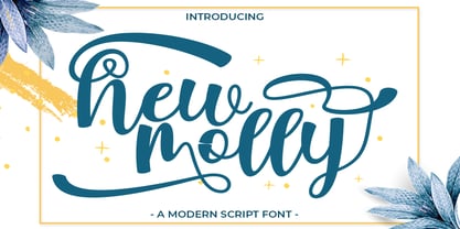 New Molly is a modern script.This font looks fresh, stylish, elegant and natural. This font is great for logo branding & invitations, wedding design, photography, quotes, posters, watermark, special events and much more.
 - Wonderfebia by FHFont,
$15.00 Wonderfebia is Script Wedding Font with modern calligraphy style so much opentype feature include of the font. Suitable for design, element design, wedding, event, t-shirt, logo, badges, sticker, and awesome work.
 - Magentasia by FHFont,
$16.00 Magentasia is Brush Script Font with Handlettering Brush Style, with opentype feature include of the font. Suitable for design, element design, wedding, event, t-shirt, logo, badges, sticker, and awesome work, etc...
 - Monoline Rounded JNL by Jeff Levine,
$29.00 Monoline Rounded JNL borrows the inline portion of Sales Event JNL. Making a few adjustments to some characters, it is now a lovely monoline with rounded terminals that emulates pen hand lettering.
 - Hard Stones Pro by FHFont,
$17.00 Hard Stones include sans, display, and script, retro combination with layered font, clean and rough vintage authentic style, Suitable for design, element design, event, t-shirt, logo, badges, sticker, and awesome work.
 - Planetype by CozyFonts,
$20.00 The Planetype Font Family is Modern. It has 6 Font Styles: X-Light, Light, Medium, Inline, Bold, & X-Bold. Each style has a consistent weight with a square serif of equal weight to its vertical and horizontal strokes. Planetype™ for short or Planet-Type font styles all have extremely clean edges and are sharply defined. There is a standard kerning applied, however evenly letter-spacing these family members give a distinct personality and continues to command the negative space just as in tight kerned examples. The compatible relationship of these font family members, weight to weight, and X-Light to X-Bold is seamless and the overall design coloring of words and sentences is well balanced and extremely legible. The Planetype Family fonts are matching members glyph to glyph. This family works in modern, contemporary and vintage settings. The Planetype Medium matches the outer weight of Planetype Inline. Their are several unique Glyphs that set the character of this family, such as: Caps B, M, Q, R, X and Lower Case a, e, k, r, z to begin with. The numerals and dingbats also have several unique glyphs that flow with the family Style in every matching weight. These characteristics lend well in designing logos, brands, and even monograms. Starting with Planetype X-Light the designer has a command of the clean lines yet expressing Modernism and a touch of Architectural structure. Planetype Medium & Planetype Inline are a dynamic duo giving a positive/negative readability.
 - Narziss Pro Cyrillic by Hubert Jocham Type,
$59.90 Since Mommie, I gradually got more into swirly ornaments. The massive contrast in the neoclassic style is perfect for thin swirly extentions to the characters. Even in an upright typeface. Narziss is very elegant in big headlinesizes. Use it only very big. What was the inspiration for designing the font? spencerian calligraphies and neoclassic contrast What are its main characteristics and features? Narziss is very elegant in very big sizes. The Regular version is without any ornament. The Drops version has some character like the e and the k that are more unique. The Swirls version has got carefully added swirls, that come out of the basic stroke and flow into other characters. Usage recommendations: Big headlines in magazines, brochures and invitations
 - Circus Didot by ParaType,
$25.00 Circus Didot typeface presents a rework of a typical neoclassical serif type in a constructivist style. Analyzing the shapes of characters author placed basic geometric figures — triangles, rectangles, circles… above the contours of letters. Resulting constructions staying recognizable letters at the same time bore a resemblance to pictures of Russian avant-garde artists from 20th century. This discovery has brought an idea to design a typeface where the tendency of a modern serif type to rationalism and geometry is realized in maximum possible extent. The prototypes for the project were taken from the works of Didot, lettering experiments of Russian constructivists and art deco artworks. The technique of juggling with shapes and overall grotesque approach to the design explains the selection of the name for the font.
 - Umbero by NaumType,
$25.00 Umbero is an experimental geometric blackletter. Umbero was inspired by modern street art (by artists like Pokras Lampas, RETNA, etc.), gothic script and constructivism. It has an ornate and twitchy structure: you can not find two similar letters. Capital letters have even more complex structure, then lowercase, to the extent that you can even use them as initial letters with a different, more calm font if you want to achieve a medieval stylization in a contemporary way. Get Umbero if you need something extra for your design. Or vice versa use it as a starting point of your work. It’s a perfect choice for the mystic or contemporary logos, headlines, oversize typography, branding, identity, website design, album art, covers, posters, advertising, etc.
 - Golden Record by Mans Greback,
$59.00 Golden Record is an elegant all caps sans serif typeface with a tall, classic, and high-quality feel. Its timeless design is perfect for adding a touch of sophistication to any project. The font's classiness evokes a sense of luxury and opulence, making it ideal for high-end branding and design applications. Golden Record is a versatile typeface family consisting of the styles Light, Regular, Bold, and Outline, each available in Italic, offering a wide range of creative possibilities. The idea for Golden Record came to life when Mans Greback was inspired by the elegance of vintage vinyl records and their iconic gold labels, merging classic aesthetics with modern design principles. Mans Greback is a Swedish typeface designer known for crafting high-quality fonts with a focus on versatility and aesthetics. He created Golden Records to provide designers with a unique and sophisticated typeface for upscale projects. Greback is committed to delivering exceptional quality in every font he designs, consistently pushing the boundaries of typography.
 - Mervato by Arterfak Project,
$19.00 Introducing Melvins - Font Set. The font combination which inspired by the vintage design. Includes 4 fonts with different styles that have unique looks, and are perfect pairs when combined. This font set is carefully designed with high attention to give a feel of vintage, old-school, and classic. Melvins consist of Condensed, Light, Expanded, & Script styles that are versatile to be used for many design purposes. Melvins Font Set including with 50+ vintage illustrations that will ease you to make a design in a sec and is also equipped with swash and alternate characters that you can mix and match to get a more vintage look. The perfect choice to be used to create logo, label, badges, logotypes, decals, shirts, posters, flyers, and etc.' Fonts featured : All capitals character set Lowercase (script) Numbers Symbols & punctuation Stylistic Alternates Swashes (script) Multilingual support PUA Encoded (no need for special software to access special characters) Thank you for your support! I hope you enjoy using Melvins Font Set.
 - Moving Headlines JNL by Jeff Levine,
$29.00 For decades, visitors to Times Square could look up and read the up-to-the-minute news flashes that moved across a giant electric sign on the face of the old New York Times Building (now known simply as One Times Square). According to Wikipedia's article on OneTimes Square: "On November 6, 1928, an electronic news ticker known as the Motograph News Bulletin (colloquially known as the "zipper") was introduced near the base of the building. The zipper originally consisted of 14,800 light bulbs and a chain conveyor system; individual letter elements (a form of movable type) were loaded into frames to spell out news headlines. As the frames moved along the conveyor, the letters themselves triggered electrical contacts which lit the external bulbs (the zipper has since been upgraded to use modern LED technology)." An example of this was seen in the 1933 Warner Bothers film "Picture Snatcher" starring James Cagney. This example inspired Moving Headlines JNL.
 - Ressonant by Octopi,
$9.00 With reference to the Type Heritage Project, this font (designer unknown) was cut by Henry Brehmer of New York for the Dickinson Type Foundary of Boston in c1879 and had the original trade name of Renaissant. John F. Cumming later cut a light-face derivative called “Artistic.” A history of the un-patented face can be found at the Type Heritage Project website. Ressonant has a full character set as well as ligatures, superiors, inferiors, numerators, denominators, old style figures, and auto-fractions. There are also alternate caps for N and M as in the original, and, unlike the original, comes in four weights. This font is a documented revival of a 19th-century typeface. The year, country, designer and/or foundry of origin will be published in a series of textbooks entitled “The Type Heritage Project.” Volume I explores quintessential Victorian faces, a spectacular trove of innovative gems; you can see samples by clicking the Type Heritage Project link above.
 - Goudy Text by Monotype,
$29.99The word Text" in Goudy Text™ is short for Textura, and textura is the style of blackletter or gothic writing developed in Northern Europe in the middle ages. The use of space in blackletter is quite different from what we know about Roman letterforms. Lowercase forms in blackletter writing and typefaces must be evenly textured with black and white elements, like the texture of weaving or fabric. Capital letters can provide either an integration of the even texture (by the use of decoration in their construction) or, if they are wide and open and filled with white, they provide bright spots of visual emphasis. Goudy, despite being an American in the twentieth century, understood well the fundamental texture of medieval blackletter and the importance of both density and light. He designed Goudy Text in 1928 for Lanston Monotype after studying the type in Gutenberg's 42-line bible; still one of the best models for designers of blackletter typefaces. The lowercase of Goudy Text has impact and medieval authenticity. The standard caps have some Victorian eccentricities but are mostly well drawn. The alternate, or "Lombardic" caps are spectacular - they set beautifully with the lowercase letters, providing the proverbial shafts of light through the Gothic cathedral's stained glass windows. Use this potent font in sizes 14 point or larger, for Christmas greetings, certificates, wedding invitations, advertising, or music collateral pieces." - Magista Winter by Agny Hasya Studio,
$12.00 Magista Winter Is a Fun Holiday Typeface With a Concept of the End of the Year Events Such as Christmas, New Year, and Winter. It Comes in 2 (Two) Styles (Regular & Slant) and Is Created With Some Alternate and Ligature. Featured with Uppercase and lowercase, Numeral and punctuation, Multilingual Support, and Opentype Features Perfect for Your Design Projects Like Advertising, Branding, Posters, Sale Signs, Product Designs, Special Events, Book Covers, Cards, Merchandise, Labels, Product Packaging, and More. Have Fun Creating and designing with Magista Winter Thank you! agnyhasyastudio
 - Lilith by Dawnland,
$13.00 Hand drawn shadow entities from the dark corners of Dawnland. Lilith X is ideal for: Initial characters - give your text a unparalleled facelift! Headlines - create a unique look for your posters, event graphics, book covers & music/media/game packaging. Preamble - reanimate the introduction... The main focus and usage of Lilith X are initial characters or headlines for posters, event graphics and music/media/game packaging. The bread text on the gallery images is written in Aeterna . Lilith X contain uppercase and small caps letters A-Z + swedish characters Å Ä Ö.
 - Megalito Slab ExtCond - Personal use only

- Champagne & Limousines - Personal use only

- Norberto by CastleType,
$59.00 Norberto, a CastleType original, is based on a Russian design from the late 19th century that in turn appears to be based on Bodoni. However, Norberto is a much warmer design than most Bodonis, with many soft touches such as very gentle curves from the serif at the top of B, D, P, and R; a jaunty cap on the ‘A’ (and Cyrillic ‘El’, ‘De’, etc); charmingly quaint numerals; hairline accents, and other subtleties that make it a wonderful addition to the Modern typefaces. In addition to several useful OpenType features, Norberto also offers extensive language support, including modern Greek and most languages that use the Cyrillic alphabet, as well as built-in keyboard support for Esperanto and Yoruba. Norberto now has a stencil version which combines the elegance of the original with the informality of a stencil cut. As one enthusiast says, "As a die-cut companion to his compact Norberto, Jason Castle's Norberto Stencil hits us right where we live with its svelte stature and sexy, Bodoni-esque bones." — Typedia
 - Bungire Retro by Product Type,
$17.00 Introducing Bungire Retro, the ideal answer for your projects with a retro, vintage, or classic modernist theme! Bungire Retro is the perfect font for bringing a sense of nostalgia and charm to your creations because of its distinctive and eye-catching design. With its extensive selection of alternates, Bungire Retro lets you personalize and produce genuinely distinctive typographic designs. When creating logos, posters, invitations, or other creative endeavors, Bungire Retro’s distinct retro vibes will enthrall your audience. Additionally, because of its linguistic support, it may be used for projects everywhere. With Bungire Retro, you can take your ideas to the next level and let your creativity shine. Get Bungire Retro right away to take your audience back to the heyday of classical modernism! What’s Included : - File font - All glyphs Iso Latin 1 - We highly recommend using a program that supports OpenType features and Glyphs panels like many Adobe apps and Corel Draw, so you can see and access all Glyph variations. - PUA Encoded Characters – Fully accessible without additional design software. - Fonts include Multilingual support. Thank you for your purchase!
 - Gin And Tonic by Mans Greback,
$49.00 Gin And Tonic is a classical serif typeface family. In a cocktail of soft arches and sharp corners, this traditional type has a multifaceted flavor, just like a well-balanced drink. Inspired by turn-of-the-century quality produce, Gin And Tonic is a genuine victorian typeface, that brings class and authenticity to any graphic project. The type of lettering that could be seen in an old-west saloon. This serif font is provided in eight styles: Thin, Regular, Bold and Thin Italic, Regular Italic, Bold Italic. As well as the Outlined style and its complementary Outline Italic. Write in CAPS for decorative conjunction words. Example: Gin AND Juice, Bird OF Prey (Download required.) The font is built with advanced OpenType functionality and has a guaranteed top-notch quality, containing stylistic and contextual alternates, ligatures and more features; all to give you full control and customizability. It has extensive lingual support, covering all Latin-based languages, from North Europe to South Africa, from America to South-East Asia. It contains all characters and symbols you'll ever need, including all punctuation and numbers.
 - Rome Ionic by 38-lineart,
$17.00 Rome Ionic is a serif display font inspired by architectural features in ancient Roman building columns. The Ionic columns are taller and slender compared to 'Doric and Corinthian' columns. On the Ionic Capitol column, there is a geometric spiral like a paper roll. We used those elements in this roman style font. The base of this font is serif shaped, more slender and towering, and equipped with 8-18 stylistic set alternates. This is the development of the basic shape on which we added spiral ornaments to the left and right. This serif font's characteristic is soft and simple, not sharp and complicated like Doric and Corinthian. The composition of the softness of the basic and alternate fonts does not reduce the splendor of this font. We complemented this font with support for the Latin extend as an analogy to the Roman region. Rome Ionic is perfect for 'impressive luxury and power' designs. With this font, your branding will show the robustness and refute the splendor of other products.
 - Platz Groteske FJ by Frncojonastype,
$27.00 fj Platz Groteske™ is the new font from frncojonastype project that culminates after almost 5 years of learning and development. fj Platz Groteske™ is a Neo-grotesk font with slight geometrical proportions with humanistic terminations. For this occasion, this font will show the normal version, however, the entire project contemplate condensed family, extended and the development of alphabets as Cyrrilic and Greek. This proposal is to improve the legibility in the Neo-grotesk fonts with generous gaps, vertical and square counter form and ascendents that exceed slightly the capitals. Counts with old numbers, small caps, modern numbers, tabular, numerators and denominators to fraccions, reference numbers to notes and formulas to face confidant and complex different stages. Ideal to editorial projects of informative content - scientific and titular of a huge impact because of the various alternative characters, stylistic options and a optometrical version to risky designers. To exclusive licenses and to follow the develop of this project, please visit frncojonas.com (WIP) Learn about upcoming releases, work in progress and get to know us better! Instagram: @frnco.jonas
 - Nutmeg by W Type Foundry,
$25.00 Nutmeg is a geometric typeface with a slight flavored touch. Although its structure is stick to the traditional forms, its details transform this typeface in a boldly project that separates it from other geometric fonts. Nutmeg’s texture can be perceived as a clean typeface that is comfortable to the human eye, furthermore, if you use it in big sizes Nutmeg’s details can be seen as a display font. Under these two ways of perceiving this typefamily, we took the decision of split this type project in two families: a cleaner and more rational Nutmeg versus a Headline version that has more flavored details at the end of the characters. Designed with powerful OpenType features in mind, each weight includes alternate characters, ligatures, fractions, special numbers, arrows, extended language support and many more… Perfectly suited for graphic design and any display/text use. The 36 fonts are the first part of a larger Nutmeg family. We’re proud to introduce: Nutmeg. Learn about upcoming releases, work in progress and get to know us better! On Instagram W Foundry On facebook W Foundry wtypefoundry.com
 - Yasmine Mutlaq by Arabetics,
$29.00 The Yasmine Mutlaq type family follows the guidelines of the Mutamathil Mutlaq type style. It has one glyph per basic Arabic Unicode character or letter. Each glyph is completely symmetrical around its vertical axis to facilitate bi-directional ordering. This family does not include any required ligatures and does not use glyph substitutions or forming but it does use marks positioning. Text strings composed using types of this family are non-cursive with stand-alone isolated glyphs. Yasmine Mutlaq employs four x-height values, two above and two below the x-axis. Its design uses curves with equally distributed weight. This family includes both Arabic and Arabic-Indic numerals, all required diacritic marks, in addition to all standard English keyboard punctuations and major currency symbols. It is available in regular styles. Also included is an additional font, Yasmine Mutlaq bidi that encodes same glyphs as symbols to facilitate user input from left to right using a Latin keyboard. The fonts in this family support the following scripts: Arabic, Persian, Urdu, Pashtu, Kurdish, Baluchi, Kashmiri, Kazakh, Sindhi, Uyghur, Turkic, and all extended Arabic scripts.

