10,000 search results
(0.038 seconds)
- M Yoyo HK by Monotype HK,
$523.99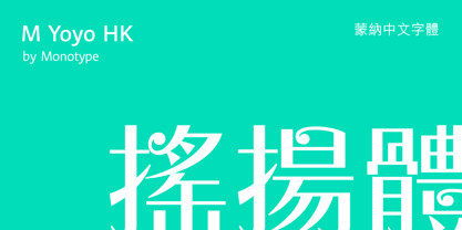 M Yoyo HK is a graphic style Traditional Chinese typeface. Graphic font designs have strong personalities and visual impact. Graphic style Traditional Chinese fonts feature decorative elements and pronounced graphics characteristics, suitable for catching attention in display applications.
 - Tagline by Robert Petrick,
$19.95 Tagline is a Fun, Bold casual font that was born from the New York graffiti style. Good for all your entertainment projects. Though "Tagline" is radical in style it's still very readable and calls attention to your message.
 - M Windy PRC by Monotype HK,
$523.99 M Windy PRC is a graphic style Traditional Chinese typeface. Graphic font designs have strong personalities and visual impact. Graphic style Traditional Chinese fonts feature decorative elements and pronounced graphics characteristics, suitable for catching attention in display applications.
 - M Stream HK by Monotype HK,
$523.99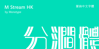 M Stream HK is a graphic style Traditional Chinese typeface. Graphic font designs have strong personalities and visual impact. Graphic style Traditional Chinese fonts feature decorative elements and pronounced graphics characteristics, suitable for catching attention in display applications.
 - M Rocky PRC by Monotype HK,
$523.99 M Rocky PRC is a graphic style Simplified Chinese typeface. Graphic font designs have strong personalities and visual impact. Graphic style Simplified Chinese fonts feature decorative elements and pronounced graphics characteristics, suitable for catching attention in display applications.
 - M Circus PRC by Monotype HK,
$523.99 M Circus PRC is a graphic style Simplified Chinese typeface. Graphic font designs have strong personalities and visual impact. Graphic style Simplified Chinese fonts feature decorative elements and pronounced graphics characteristics, suitable for catching attention in display applications.
 - M Rocky HK by Monotype HK,
$523.99 M Rocky HK is a graphic style Traditional Chinese typeface. Graphic font designs have strong personalities and visual impact. Graphic style Traditional Chinese fonts feature decorative elements and pronounced graphics characteristics, suitable for catching attention in display applications.
 - M Computer HK by Monotype HK,
$523.99 M Computer HK is a graphic style Traditional Chinese typeface. Graphic font designs have strong personalities and visual impact. Graphic style Traditional Chinese fonts feature decorative elements and pronounced graphics characteristics, suitable for catching attention in display applications.
 - Eloquence by Monotype,
$31.99 Eloquence has a modern aesthetic with a strong classical influence – this is the “Renaissance Remixed”. While being inspired by the first printed texts of the Renaissance period, this typeface has contemporary features such as a high x-height, open bowls and counters, along with razor-sharp serifs and terminals. It has been designed specifically for creating a pleasant reading experience. With a comprehensive character set, Eloquence can comfortably handle printed documents such as novels, magazines, annual reports, along with their equivalent online/digital formats. This 14-font family also has a few tricks up its sleeve by means of some neat, complementing discretionary ligatures and alternates that will prove to be useful embellishments to your typography. Small Caps are included too, along with corresponding diacritics meeting the Latin Extended specification. You can view more details, design examples, and a specimen PDF at eloquence-font.com Key Features: • 14 font family – 7 weights in Roman and Italic • Small Caps, Alternates, Ligatures, with Proportional, Old Style, Small Cap, Fractions, Numerators, Denominators, Superior, and Inferior Figures • Full European character set (Latin Extended) • 900+ glyphs per font.
 - Endorphin by Tall Chai,
$15.00 Endorphin is a stylish oblique sans-serif font family with weights ranging from Thin (100) to Black (900). Features: Available in 9 weights Over 550 glyphs supporting extended Latin Ideal for display texts: Titles, Logos and Headlines etc. Perfect for branding and rebranding Supports OpenTypes features like Ligatures and Stylistic Alternates Symbols for 10 major currencies including Bitcoin provided in all weights Description: The Endorphin font signifies racing forward. Each oblique character manifests that feeling of achievement and happiness that one gets after a great workout or after a refreshing game. Every character effortlessly integrates with modern design standards and interfaces. The fonts are professional and have a strong personality in them. This makes Endorphin perfect for use in modern apps and websites. Endorphin is built for the designing and marketing squads. It has a trendy geometric characteristic which is ideal for any branding and rebranding. Endorphin has lot of OpenType features (like ligatures and alternates) and the Extended Latin character set supports over a hundred languages. Race Forward!
 - Realest by Font Row,
$24.99 A great addition to every graphic designer's toolkit. Realest™ is a modern slab serif display font designed with mathematical precision. The entire typeface is crafted with consistent angles & measurements down to the smallest detail. It is built on mathematics. For this reason, it is a highly versatile display font, ideal for branding, logos, websites, ads, graphics, clothing & printable materials. What makes Realest™ stand out is its classy yet modern style. It could be classified as 'futuristic' (due to its square-shaped structure), yet the slab serif details add a touch of class that most futuristic fonts lack. This gives it a unique character, making it ready to perform well in a wide variety of creative projects. Features: • A unique fusion of Modern & Slab Serif styles. • Designed with mathematical precision. • The characters share the exact same dimensions (where possible). • Monospaced (with even spacing between characters). • Comes with a generous number of alternate glyphs & accented characters. • Available in both Regular & Extended (wide) styles. • Highly versatile Realest™ Extended is a completely free font that can be used in commercial projects.
 - Fester by Fontfabric,
$150.00 Get inspired with Fester Behance presentation After several years of iterations, our brand new sans family of 16 styles is ready to take over with vector excellence! Fester is a semi-condensed Grotesque developed to beam big messages across the galaxy with a clear, bold voice. Emerging as if from the future, this low-contrast sans warps slick lines and sharp terminals into unexpected geometric shapes for extra flair. Ranging from Thin to Heavy, the typeface is loaded with 8 weights + italics, one variable style, over 760 glyphs, and Extended Latin + Cyrillic for flawless work at hyper-speed. Fester syncs with designs that feature big type, sharp layouts, interfaces, outlines, and raster images to help decipher any cutting-edge idea and make a memorable first contact. Family overview: 8 weights (from Thin to Heavy) + italics Extended Latin Cyrillic 760 glyphs Variable Font 1 free font - Fester-ExraLight 130+ languages OpenType Features: Localized Forms Subscript and scientific inferiors Superscript (Superiors) Numerators and Denominators Fractions Lining Figures Tabular Figures Oldstyle Figures Case-Sensitive Forms Standard and Discretionary Ligatures Stylistic Alternates Contextual Alternates Slashed Zero
 - Antipol VF by phospho,
$75.00 With Antipol Variable, the reversed stress font was supplemented with Wide and Extended cuts in the Hairline weight. The ability to stretch single letters extremely wide is an exclusive goodie of the Variable version. Antipol is a Sans Serif design that reverses the conventions of a regular Latin Sans Serif. With a weight emphasis on the horizontals and its vertical terminals Antipol radiates a 1970s charisma known from the like of Antique Olive. Its modern and avantgardistic attributes are most pronounced in the Hairline weight, where ultra thin lines meet distinctive arrowhead-corners. This particular weight is meant for display settings, think full-page magazine titles or posters. Antipol Wide and Antipol Extended are a generous statement for graphic design with enough space to let the type breathe: art catalogs, lead texts, invitations, letterheads or brand identity. Any style comes with a wide range of OpenType features that goes beyond a standard display font: Small Caps, Proportional and Tabular Oldstyle Figures and Lining Figures, Fractions, and much more.
 - Moviemania by Artisticandunique,
$40.00 Moviemania - Sans Serif font Family - Multilingual - 12 STYLE Moviemania font family is a modern sans serif typeface with its sharp lines and soft turns that form its characteristic structure. It offers you two alternative concepts in your preferences with its sharp lines in upper cases and soft lines in lower cases. It has an ideal modern structure in your preferences for branding and identity creation in today's modern world. Absolutely perfect for movie titles, magazines, branding, branding identity, posters, logo designs, packaging designs, websites - all digital platforms and more! This font can meet your needs in all modern and classic creative projects. CHARACTER RANGES : Basic Latin, Latin-1 Supplement, Latin Extended-A, Latin Extended-B, General Punctuation, Currency Symbols, Letter like Symbols,Arrows, Mathematical Operators, Miscellaneous Technical, Geometric Shapes, Miscellaneous Symbols, CJK Symbols And Punctuation, Private Use Area (plane 0), Alphabetic Presentation Forms GLYPH COUNT : (543) Uppercase typeface Lowercase typeface Numbers Symbols Multilingual With this font you can create your unique designs. If you have a question, please contact me. Have a good time.
 - Futura PT by ParaType,
$30.00 Futura is a classic geometric sans serif, one of the crucial typefaces of the 20th century. It remains relevant today and is widely used in logos, headings, web and print. Futura was designed by Paul Renner for Bauersche Gießerei (Bauer) in 1927. The typeface is based on simple geometric forms and is close in the aesthetics to 1920s-30s constructivism and the Bauhaus. Futura PT is the most complete Cyrillic version of Futura. It’s a type system of 25 styles: 16 regular and 9 narrow, from Thin to Extrabold. Futura PT has linear and old style figures, subscripts and fractions. The typeface supports more than 100 languages: Western and Central European Latin and the Cyrillic-extended. The Cyrillic version of Futura was designed by Vladimir Yefimov in 1991–1995. He partially redesigned the typeface in 2007, making it a wholesome consistent system, and Isabella Chaeva added new styles. The typeface was released under the name Futura PT. Isabella Chaeva returned to work on Futura in 2022. The typeface has three new styles, old style figures and extended Cyrillic support.
 - Sol Pro by Canada Type,
$29.95 Based on the classic Sol design by Marty Goldstein and C.B. Smith, published by VGC in 1973, Sol Pro goes above and beyond the call of revival/retooling to include plenty of optical improvements to the original design, more weights, italics, small caps, biform shapes, alternates, and extended language support. This particular design is one of the more prominent forefathers and strong influencers of the soft, streamlined aesthetic that has been going strong in branding and geometric design for more than 40 years now. It cuts all links to melancholy and classic empire shapes, and introduces smooth contrast modulation that communicates sleek, adaptable youth, confidence, knowledge, and modern hi-tech presence. This is not your grandfather's Eurostile. This is your offspring's global hope, optimism, and total awareness. Sol Pro's extended character set and range of weights and widths makes it quite suitable for applications of all sizes, from small collateral to product branding and massive marketing campaigns. The Sol Pro complete family comes in 20 fonts, each containing over 520 characters. Available in single fonts or value-maximizing packages.
 - Bonspire Script by Mans Greback,
$69.00 Bonspire Script is a dynamic and creative script typeface. Brimming with lively swashes and optimistic flair, Bonspire Script embodies the essence of movement and creativity. Its swirly strokes lend it an air of playful sophistication, making it equally suitable for heartfelt love letters or eye-catching advertisements. Its handwriting-inspired design gives it an approachable and personal feel. The typeface dances across the page, infusing any text with a sense of joy and possibility. Use underscore _ anywhere in a word for swashes. Example: Love_rose Use multiple underscore for different swashes. Example: Wonder________woman Use Bonspire Script's built-in swashes and stylistic alternates to fully express your creativity. Its OpenType functionality ensures top-notch quality and customizability. The typeface offers extensive lingual support, covering all Latin-based languages, and includes all the characters and symbols you'll ever need. The creative force behind Bonspire Script is Mans Greback. Renowned for his ability to evoke emotion through typography, Greback has outdone himself with this lighthearted yet intricate design. His extensive portfolio showcases a knack for blending practicality with artistic flair, making each font a unique masterpiece.
 - Superline by Kavoon,
$14.00 SuperLine Typeface. A striking modern display font in three styles. SuperLine is a modern, all caps display font. Specifically developed for contemporary design styles and applications, it is supplied in three styles; regular, lined and outline. Although it can be used at smaller sizes, it has been designed primarily for use at larger scales. Perfect for branding projects, striking posters and as a unique display font for web or app development, you can make a statement with SuperLine. Extensions shape backgrounds are included. Designed to compliment the angles in the SuperLine typeface, these shapes are perfect for using as masks, image overlays or solid color background fills. They are supplied in Illustrator (ai and eps) vector format. Whats Include: Meticulously designed All uppercase display Comes in 3 styles, Regular, Lined and Outlined Allows for a vast range visual styles Webfont kit included (created via fontsquirrel) Licensed for Personal or Commercial use (OFL) Vector Extensions included (In Illustrator vector format) As ever, drop me a message if you have any questions.
 - Mont by Fontfabric,
$39.00 *Mont Specimen: http://bit.ly/montsp *Scroll down for the FREE DEMO fonts Features: • 744 glyphs in 20 styles; • Extended Latin, Cyrillic and Greek; • Perfect for headlines and logos; • Prominent x-height; • Distinctive pointed triangular bracketed “t”; • Coverage of multiple OpenType features; • Suitable for web, print, motion graphics etc. Mont is a geometric sans serif consisting of 10 weights ranging from Hairline to Black with matching italics. It supports Extended Latin, Cyrillic and Greek — more than 130 languages all together. The balanced characteristic of Mont with unique details, such as the pointed “t” and the prominent x-height makes it perfect for strong headlines and outstanding logos, but also suitable for long text. Mont comes with a range of OpenType features — including tabular figures, advanced typographic features such as ligatures, fractions, case-sensitive forms, superscripts, subscripts etc. The typefaceʼs versatility and merits make it easy to confront any graphic design challenge — web, print, motion graphics etc. Up with Mont to the top and beyond!Mont™ Font Field Guide including best practices, font pairings and alternatives.
 - Preto Semi OT Std by DizajnDesign,
$- Preto Semi is an experiment. It is an attempt to create a readable type for text point sizes (other than sans-serif and serif). Preto Semi is not a Sans with added serifs or Serif with serifs removed. The use of the serifs is redefined and used for other purpose(s). The serifs became the extension of the stroke, they help to solve the spacing problem of sans-serif types and they use the primary function of serifs – keeping the eye on the baseline and emphasize the horizontal rhythm of the lines of text. Preto Semi is intended for magazines and editorial design, as other members of Preto family. Preto is an extensive type family, which explores the function of serifs on readability and legibility. Preto consist of three subfamilies: Sans, Semi and Serif. Preto is designed for multilingual typesetting. All of the subfamilies have equal gray value but different texture which can be use to differentiate languages. Preto sub-families have two text weights and two bold styles (Regular -> Bold, Medium -> Black). Every weight has a companion Italic style as well.
 - Diaria Pro by Mint Type,
$40.00 Diaria started as a project in Typeface Architecture for Master in Advanced Typograghy at EINA, Centre Universitari de Disseny i Art de Barcelona, a course tutored by Laura Meseguer and Íñigo Jerez Quintana. Later it has developed into Diaria Pro, an extensive typeface including Cyrillic script, small caps, and various OpenType features. Diaria Pro is a low-contrast serif typeface designed as a primary text face for the newspapers. Its large x-height and static exteriors allow comfortable reading in narrow columns, and calligrafic counters as well as dynamic serifs add humanist detail to overall perception and incline contrast axis without affecting interletter counterforms. Besides extensive language support, Diaria Pro includes various OpenType features: ligatures, discretionary ligatures, small caps, 6 sets of digits, superiors, inferiors, fractions, ordinals, upper-case punctuation, and some language-specific features. Diaria Pro also has a sans-serif companion - Diaria Sans Pro. Some of the styles of Diaria Pro can be found in Mint Type Editorial Bundle together with other fonts which make some great pairs. Check it out!
 - Guilloche A by Wiescher Design,
$80.00 Guilloches were – in the old days – used to make the falsification of banknotes more difficult. The engraving of these intricate lines was done by a highly specialized mechanical machine, which was operated by an equally highly specialized engraving artist. Once the settings for a specific curve were changed back to zero it was very difficult, if not impossible to set them back to the old design. I have designed a useful set of Guilloches that join to form ribbons that create a kind of op-art 3d effect. Under the keys A-U and a-u you find joining pieces. Under the keys V-Z and v-z I placed start- and endpieces. 0-4 are different lenght straight extensions and 5-9 are not quite so straight extensions. All other keys are corner pieces that can be used as stand-alones or put in rows to make for superb decoration. With a little bit of experimentation and maybe colored overlays you can achieve super-phantastic designs. Your elegant type designer Gert Wiescher.
 - Meridiana Pro by Unio Creative Solutions,
$3.00 The concept behind Meridiana Pro was to create an amalgamation between a rounded sans and a monospaced font in order to obtain an extensive and usable variable type-system. This typeface encapsulates a symmetrical and balanced rhythm due to the unique blend of different sources of inspiration. Proportions are precisely adjusted with smooth contours and subtle contrasts. These forms give the font an eye-catching look without compromising elegance and minimalism, ensuring that each glyph will work well in any graphic design purpose. The focus was to create a versatile type family with range of alternates, ligatures, and symbols, including the extensive language support of most European languages. Meridiana Pro design space includes two axes, weight and italic and is available as a variable font or as a separate OpenType family, including weights from Thin to Heavy plus their obliques. Specifications: - Version included: Meridiana Pro Variable, Meridiana Pro Static - 8 weights with matching obliques - Multi-language support (Central, Eastern, Western European languages) - OpenType Features (Superscript and Subscript Numerals, Fractions, Ligatures, Alternates) Thanks for reading, Unio.
 - Enchanter by Cloveron Media,
$49.00 Cloveron Media unveils its first serif font that goes beyond the formal nature of typography. It celebrates the artistic expressions of graphic designers within themselves. The Name Mary Anne Remulla is the Master Designer behind the Enchanter Font. She aims to make graphic designers filled with delight and enjoy typography with its extensively artistic alternates and multilingual characters. The Font Style The serif style, known for its formal touch to typographic design, infuses the font with its professionalism as its regular. Using its middle alternate adds a hint of unique touch without losing the serif style's essence. The Enchanter font's start and end alternates are the designer's illustrations of design balance, which elevates its charm and enticing nature that adds to its overall artistic power. "I am fascinated by art and so by design. A font with alternates was my great revelation that I can do typography artistically, enthusiastically, and with freedom. I later found myself fascinated and lost in paper space, which then ended up that I completed my first font creation with extensive alternates for each letter." - Mary Anne Remulla
 - Preto Semi by DizajnDesign,
$24.00 Preto Semi is an experiment. It is an attempt to create a readable type for text point sizes (other than sans-serif and serif). Preto Semi is not a Sans with added serifs or Serif with serifs removed. The use of the serifs is redefined and used for other purpose(s). The serifs became the extension of the stroke, they help to solve the spacing problem of sans-serif types and they use the primary function of serifs – keeping the eye on the baseline and emphasize the horizontal rhythm of the lines of text. Preto Semi is intended for magazines and editorial design, as other members of Preto family. Preto is an extensive type family, which explores the function of serifs on readability and legibility. Preto consist of three subfamilies: Sans, Semi and Serif. Preto is designed for multilingual typesetting. All of the subfamilies have equal gray value but different texture which can be use to differentiate languages. Preto sub-families have two text weights and two bold styles (Regular -> Bold, Medium -> Black). Every weight has a companion Italic style as well.
 - Aceisida by JB Design,
$9.00 ACEISIDA is a font that supports over 100 languages from around the world. Basic and some Extended Cyrillic, Basic, Additional and Extended Latin, Basic Greek, and some newly added characters recently entered into use in everyday life. ACEISIDA is a font that elegantly combines the timelessness of antique design with the modernity of the grotesque. The absence of serifs results in a universally readable and sophisticated format. It was designed to focus on the main text, complementing other design fonts without disrupting them. This font is perfect for those who appreciate minimalism and refinement, and its smooth lines make it suitable for various design projects. It adds understated elegance to any design, making it the ideal choice for those who value simplicity, modernity, and sophistication. The font includes many glyphs for the Kazakh language, catering to the ongoing transition to the Latin script and accommodating various spellings. It also features a basic set of characters and glyphs with accents for the Greek language and an uppercase version of the letter “eszett” for German.
 - Debacle by Reserves,
$39.99 Debacle is a super bold contrastive display face built upon pure geometric shapes. Sharp, angular lines are countered against obtuse rounded forms creating a striking visual discord. Select inner corners are rounded, giving characters dual attributes, while linear round-end counters simultaneously contrast and compliment the square-ended punctuation and symbols. Stylistically, Debacle’s prominent letterforms effortlessly create type-as-image text settings. Its style relates to the lush display typefaces from the seventies, yet is highly contemporary in its refinement and finish. Features include: Precision kerning Basic Ligature set including ‘f’ ligatures (ae, oe, fi, fl, ffi, ffl, ff, fh, fj, ft, tt, th, ct, st, la, aj, fa, ls, es, ev, ew, tz, lv, lw, ti, it, ea, kv, ka, ky, yx, xy, yy, km, yw, wy, yv, vy, kw) Alternate characters (O, Q, _, $, ®, •) Slashed zero Full set of numerators/denominators Automatic fraction feature (supports any fraction combination) Extended language support (Latin-1 and Latin Extended-A) *Requires an application with OpenType and/or Unicode support.
 - FTY Varoge Saro Noest by The Fontry,
$25.00 VAROGE SARO NOEST arrives on your computer with OpenType replacement features standard, along with extended language support for Central European, Greek, Cyrillic and Extended Cyrillic. We've even included some nice character options for our German-speaking customers with the uppercase Eszett and a number of alternatives to the standard lowercase eszett. Also included is the new Turkish Lira. VAROGE SARO NOEST is a font with a very funny name. Sometimes it can be a funny font. Or a font that is fun. It looks kinda casual, but also a little bit handwritten--freeform and freehand. Or a form of block lettering with a rough edge. Not too rough. Just enough to break up the visual rigidity. But this is not a face in distress. It's mostly at ease in its surroundings. If it's in text mode, it handles the job comfortably. In headline mode it does well too. It's quite flexible and looking for a home. Give this font a home. See if you can figure out what to use it for. See if you see what we saw when we made it. We saw a font that's cool and elegant with a bit of a tantrum driving the node count. We also found it's impossible to look away from it. Anyone can see that. That's why you're here. That's why you're reading this. And VAROGE will do you a favor if you let it. Revisit your typographic beliefs and head over to the one persistent constant in life: your font list. Is VAROGE SARO NOEST on it? If it were to set up headquarters there, you might discover something ideal. That's the favor I was promising.
 - Bunaero Pro by Buntype,
$33.50 Buntypes Bunaero™ combines classical and contemporary characteristics to a unique and distinctive font family with extravagant but also harmonious appearance. The characters are clear, open and sometimes bellied. Especially the caps have a very high waistline. Based on this, four main states with different moods have been composed: The original Bunaero™, the more conservative “Classic”, the elegant and curvy “Up” and the matching ”Italic”. All states offer weights from a considerably thin „Hair“ to a real fat „Heavy“, so the family consist of 34 Styles, all with rather narrow width and very good legibility. The font was manually hinted and contains extensive handcrafted kerning tables to ensure flawless appearance in all media. It supports at least 99 languages incl. Vietnamese and provides ligatures, alternative glyphs, special localized forms and even more enjoyable OpenType® features. This Pro version of Bunaero also includes a lot of features for sophisticated users: Lining figures for headline setting; Intermediate linings and oldstyle figures for text setting; Tabular versions of all figures; Superiors, inferiors, numerators, denominators and automated fractions; Language specialities like a capital Eszett for the german language and extra characters with a polish kreska instead an acute; And many more. Further information: Bunaero™ Pro Specimen PDF Bunaero™ Pro OpenType® Quickguide Feature Summary*: -4 Moods: Normal, Classic, Up and Italic -9 weights: Hair, Light, Thin, SemiLight, Regular, SemiBold, Bold, ExtraBold and Heavy -Supports at least 99 Languages incl. eastern european and vietnamese languages -Overall width: Narrow or Space-Saving -Advanced f- ligature set including fb -Discretionary s- and c- ligatures -Alternative Characters: a, e, f, g, i, k, l, t, v, w, y, J, K, Q, R, and more -6 sets of figures: -Capital sized figures, oldstyle figures and intermediate figures, each in proportional and carefully adjusted tabular versions -Superiors, inferiors, numerators and denominators -Circled and negative circled figures -Capital German Eszett -Extra characters with Polish Kreska -Catalan Punt Volat -Extra characters with alternate minmalistic Cedille -Arrows -Automated feature for fractions as well as extended fraction character set -More than 1000 characters per font * Some features may only be available in OpenType®-savvy applications
 - Capsule by Eclectotype,
$40.00 Capsule is a reverse-stress, high-contrast, rounded sans-serif font with two distinct personalities. An all-caps face, there are however variations of some letters in the lowercase slots. The lowercase variants are more playful, with more bulbous elements that riff on phototype faces like Amelia and Data 70, but all can work together and be mixed and matched to your heart's content. Capsule boasts a bunch of esoteric discretionary ligatures to play around with, and stylistic alternates for 4, 7 and £. The language support is extensive enough to set essays in most Latin-based languages, even though that's the last thing you should be doing with this font! Capsule should be set large. The fit is tight and the kerning is aggressive. It's not what you'd call a workhorse, but Capsule is an All-Caps you'll (see what I did there?!) want to use for impactful headlines, cutting edge logos and post-modern layouts.
 - Covent BT by Bitstream,
$50.99Designed by Jochen Hasinger of Frankfurt, Germany, Covent BT is an unconventional geometric sans serif typeface, featuring rounded terminal ends and a stencil-like break of the contour in some glyphs. At first glance you might think of it as a display typeface, but the generous x-height and openness of the lowercase makes Covent BT very legible at text sizes. Central Europe and Cyrillic is supported in the extended glyph set. Each weight contains 485 glyphs and includes some alternate figures, some upper and lowercase alternates, as well as others, all accessible via OpenType features. Covent BT Symbols is a stylized geometric symbol font, intended to stand alone or used as a companion to the Covent BT typefaces. The array of glyphs covers many of the more popular icons of the day including symbols for web use, numbers, sports, travel and astrology, to name a few, each with its own unique stylized interpretation. - Finador by Julien Fincker,
$24.00 Finador is a modern, soft geometric sans family. The functional style of a geometric sans has been soften by open apertures and rounded corners. This makes it functional and friendly. The default version has open, modern apertures. Stylistic Set 2 includes the whole set with closed, classic apertures. A slightly different look. It´s like having a second font in just one font. So it´s up to you to choose the right look for your projects. The Finador family includes 8 weights, from thin to heavy + their matching italics. With 900+ glyphs per style it supports over 200+ latin based languages, includes an extended currency symbol set and a lot of Open Type Features like small caps, ligatures, fractions, alternates and many more. The lightest and boldest weights are good for display usage, while the middle weights can be also used for body text. As a versatile allrounder Finador supports almost every of your needs. It has the ability to become your next favorite workhorse family.
 - Blame by Haksen,
$15.00 Blame is a strong font family and sophisticated sans also serif Each font in the family can stand on its own, dynamic and authoritative in their own right. Bison includes ten all-caps fonts: a weight (clean and rough version), two outlines, four italics. - Blame Sans Clean and Rough Regular - Blame Serif Clean and Rough Regular - Blame Sans Clean and Rough Italic - Blame Serif Clean and Rough Italic - Blame Sans Outline Regular and Italic - Blame Serif Outline Regular and Italic FEATURES : a weight / Italics / Outlines / Numbers & Punctuation / Extensive Language Support USE Blame works great in any branding, logos, magazines, films. The different weights give you full range to explore a whole host of applications, while the outlined fonts give a real modern feel to any project. Thanks for having a peek at Blame. I hope you enjoy it and feel free to take it for a spin below! As always, if you have any questions just send me a message! I’m glad to help :) Haksen
 - Komet Pro by Jan Fromm,
$65.00 Komet is a sturdy typeface with a calm and upright feel. Although it derives inspiration from classical English sans-serifs, it’s not too closely related to that model. Komet, instead, feels rather more lively and contemporary. Its compact spacing, low stroke contrast and heavy dots and accents give it an almost monolinear quality. The diagonals are slightly curved and the counters of the round letters such as b, o and q are generously wide. The muted, understated middle weights are built for extended body copy, while Komet’s thin and dark weights look brisk and assertive and make for subtly expressive headlines. Komet is an ideal choice for editorial design, branding and corporate design. The Komet Pro family comes in eight weights with matching italics, from Thin to Black. Each font contains around 850 glyphs, including a rich repertoire of OpenType features. Small caps, ligatures, ten different figure sets with matching currency symbols, stylistic alternates and arrows make Komet Pro a comprehensive toolkit for ambitious typography.
 - Pluto by HVD Fonts,
$40.00 Pluto - and its straight companion Pluto Sans - was designed by Hannes von Döhren. The whole family consists of 16 Pluto Uprights, 16 Pluto Italics, 16 Pluto Sans Uprights and 16 Pluto Sans Italics; 64 fonts in all. Type designer Hannes von Döhren has created Pluto, a sweet type family consisting of 16 Uprights and 16 Italics; 32 fonts in all. The fonts are informal and friendly at first sight and lend themselves to display settings, however the straight and upright architecture of Pluto also makes it perfect for longer copy. Because of its large x-height, it even performs nicely in very small sizes. This contemporary type family is ideal for use in retail, cosmetics, food and hospitality applications and advertising. Pluto is equipped for complex, professional typography. The OpenType fonts have an extended character set to support Central and Eastern European as well as Western European languages. Each font includes alternate letters, fractions, lining-, tabular numbers, scientific superior/inferior figures and a set of arrows.
 - Masteria Wide by Mans Greback,
$69.00 Masteria Wide is a retro script typeface. An optimistic calligraphy lettering to bring you back to the golden age of hand-drawn advertisements, Masteria Wide is a professional quality handwriting font family. Drawn and created by Mans Greback in 2022, it is perfect for a vintage restaurant headline or nostalgic logotype design. Use underscore _ to make a swash. Example: Mast_eria Use multiple underscores to make a longer swash. Example: Super___human (Download required.) Masteria Wide is provided in eight diverse styles, such as Thin, Bold, Black, Italic and combinations to compliment each other and maximise your options and design experience. The font is built with advanced OpenType functionality and has a guaranteed top-notch quality, containing stylistic and contextual alternates, ligatures and more features; all to give you full control and customizability. It has extensive lingual support, covering all Latin-based languages, from Northern Europe to South Africa, from America to South-East Asia. It contains all characters and symbols you'll ever need, including all punctuation and numbers.
 - ST Remona Neue by Skinny Type,
$18.00 ST Remona Neue is a confident serif. Designed to reflect nature, it creates a sense of softness and natural expression. We pushed the concept in a usability-focused direction, to work as a bold tool and a beautiful communicator. ST Remona Neue allows for fluid designs in 3 styles. Regular, Italic, Outline and Latin based main language. The right slant advances aesthetics, brings energy and makes it suitable for modern design. The type family blends organic curves and soft repetition into strong and harmonious types. At large dot sizes you can appreciate the shape of the letters, while the same control and focus creates an even texture for small dot sizes and long reads. Fonts extend their use by providing a variety of unique language and style supports. The ST Remona Neue character set combines additional symbols, style alternatives, unique binding, and case sensitive punctuation - resulting in a stable, hardworking family ready to tackle projects of any size. Happy Designing
 - Komet by Jan Fromm,
$45.00 Komet is a sturdy typeface with a calm and upright feel. Although it derives inspiration from classical English sans-serifs, it’s not too closely related to that model. Komet, instead, feels rather more lively and contemporary. Its compact spacing, low stroke contrast and heavy dots and accents give it an almost monolinear quality. The diagonals are slightly curved and the counters of the round letters such as b, o and q are generously wide. The muted, understated middle weights are built for extended body copy, while Komet’s thin and dark weights look brisk and assertive and make for subtly expressive headlines. Komet is an ideal choice for editorial design, branding and corporate design. The Komet family comes in eight weights with matching italics, from Thin to Black. The glyph set of each font contains around 520 glyphs and provides good everyday support for most Latin-based languages. For a wider range of advanced OpenType features, Komet Pro is also available.
 - Hastafi by Mans Greback,
$49.00 Hastafi is a classy serif typeface. It is naturally bold, with contrasting, hairline thin horizontal strokes, and a confident character. Use it for any project that needs that extra bit of elegance and personality, without losing the thoughtfulness and authenticity of a serious serif font. The Hastafi family consists of eight beautiful styles: The Regular, for a medium and normal variety, and the flowing Italic version. It also contains a swash style for decorative additions to the letters, and each of the styles as an emphasized Bold. The font is built with advanced OpenType functionality and has a guaranteed top-notch quality, containing stylistic and contextual alternates, ligatures and more features; all to give you full control and customizability. It has extensive lingual support, covering all Latin-based languages, from North Europe to South Africa, from America to South-East Asia. It contains all characters and symbols you'll ever need, including all punctuation and numbers.
 - Kaeswaii by insigne,
$29.99 Introducing Kaeswaii, a font that is ideal for anyone wishing to infuse their creations with a dash of inspiration and delight. It's ideal for producing fresh designs that will stand out thanks to its unique contrast and rounded serifs. It has a joyful feel because of its high x-height, and its playful serifs give it a funky touch. Kaeswaii has enough variety to help your project look better than the rest with forty-eight different styles. Select from nine weights and italics for the standard, condensed, and extended styles. It has rounded corners and a luscious texture and a squishy, gloopy vibe. Atarimae, the hint is to use Kaeswaii when you want to infuse your products with a dash of inspiration and delight. It has a happy feel with its high x-height and rounded serifs. It's ideal for producing fresh designs. Put a playful spin on your work with the unique personality of Kaeswaii's rounded terminals. Let Kaeswaii bring life to your ideas!