10,000 search results
(0.042 seconds)
- Uravika Classy by Dumadi,
$14.00 URAVIKA CLASSY is a font with colorful nuances in your designs. In this amazing font you can collaborate with projects such as t-shirt designs, logos, book designs, titles, advertisements, social media branding, event titles and others. I hope you have a nice day, keep your spirits up, greetings Toni Dzulham -Dumadistyle 2020
 - Dindalove by Rezastudio,
$9.00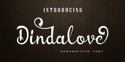 Dindalove is a modern calligraphy typeface. This font is made in a modern style with a very beautiful beginning and ending, elegantly, very casual and suitable for your various design needs Perfect for logo, branding, tittle, social media posts, advertisements, product packaging, product designs, label, photography, watermark, special event, magazine, web design, etc.
 - Tantinotes by Sronstudio,
$18.00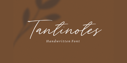 Introducing Tantinotes - Handwritten Font Tantinotes is a natural handwritten font, this font Is perfect for logo, invitation, stationery, wedding designs, social media posts, advertisements, product packaging, product designs, label, photography, watermark, special events or anything. Tantinotes comes with full set of uppercase and lowercase letters, multilingual symbols, numerals, punctuation. Thank You, Sronstudio
 - Valensa by Stefani Letter,
$12.00 Valensa is a fresh & modern script font. It has a bold style and will add an upscale to all your designs. This Font is perfect for many different projects such as logos & branding, invitations, stationery, wedding designs, social media posts, advertisements, product packaging, product designs, photography, watermarks, special events, and much more!
 - Mathelline by Almarkha Type,
$35.00 Introducing Mathelline is a Classy Script font with 2 style regular and italic. Inspired by luxury and branded stuffs make this font looks classy and awesome in many way to your latest project. Mathelline is perfect for logos & branding, photography, invitation, watermark, advertisements,product designs, special events or anything that need handwritting taste.
 - Extra Extra by Comicraft,
$19.00 EXCLUSIVE! Read all about it! The latest scoop from Comicraft is sure to be in all the newspapers today! The Times are a changin' -- comic book letterers everywhere can say a font farewell to typesetting the front pages of Planets and Bugles in Helvetica, Verdana or Gill Sans! Superhero's Pal, Johnny "Roshell" Olsen, was up all night writing copy for the late-night edition, making sure that your newspaper headlines and copy have a warm, pen lettered look... some might say a Rosen-glow! Put a little Extra Extra in your bylines and maybe there's a Pulitzer and an Eisner in your future! Not ready to purchase? Get ExtraExtra Engraved free with any purchase, or by subscribing to our newsletter at the bottom of this page. Features Seven fonts (Regular, Italic, Bold, Bold Italic, Heavy, Heavy Italic & Engraved) with upper and lower case alphabets.
 - Bacute by Afkari Studio,
$13.00 BACUTE Display Sans Typeface offers a captivating blend of contemporary design and readability, ensuring your projects stand out with finesse and clarity. Features: Three Unique Styles: Enjoy the versatility of BACUTE's three styles - Light, Regular, and Bold. Each style adds its distinctive visual appeal to complement various design aesthetics. Special Alternates: Unleash your creativity with alternative characters and glyphs that infuse uniqueness into your designs, allowing for personalized expressions. Complete Character Set: BACUTE includes uppercase and lowercase letters, numerals, punctuation, and a range of essential glyphs for comprehensive design flexibility. Cross-Platform Compatibility: Seamlessly use BACUTE across both PC and Mac platforms, effortlessly integrating with leading design software like Adobe Illustrator, Adobe Photoshop, Adobe InDesign, and Microsoft Word. Effortless Installation: Experience hassle-free installation, granting instant access to the font's capabilities without the necessity of additional design software. Multilingual Support: BACUTE ensures inclusivity by supporting a variety of special characters, catering to multiple languages, including ä, ö, ü, Ä, Ö, Ü, ß, ¿, and ¡. BACUTE adapts flawlessly to an extensive range of design projects, including Logos, Posters, Product Labels, Cartoons, Comics, Editorial Designs, Website/Blog Elements, Social Media Posts, Packaging Designs, Social Media Subtitle And more! Dive into the boundless potential that BACUTE Display Sans Typeface offers. Its modern aesthetic, coupled with a multitude of features, positions it as an invaluable asset for designers seeking to make an impactful impression without compromising readability. Embrace BACUTE to elevate your projects and captivate your audience with its distinctive charm!
 - American Christmas by Mans Greback,
$79.00 American Christmas is a funky and decorative season's typeface. As a cozy winter script, it brings a festive touch to every word, with letters that seem to dance joyously across the page. Its bold flow is reminiscent of retro holiday signage, evoking a sense of nostalgia and warmth. This typeface is adorned with stars that twinkle like lights on a tree, adding a sparkle to your seasonal greetings. This typeface family is provided in three starry versions and one clean, and also comes with an extra symbol font for beautiful Xmas icons. Use parenthesis symbols () [] {} to make stars around any word. Example: {Xmas}[Songs] Use underscore _ after any word to make a swash. Example: Santa_ Multiple underscores make longer tails. Example: Yuletide____ The font is built with advanced OpenType functionality and guaranteed top-notch quality, containing stylistic and contextual alternates, ligatures and more automatic and manual features; all to give you full control and customizability. It has extensive lingual support, covering all Latin-based languages, from North Europa to South Africa, from America to South-East Asia. It contains all characters and symbols you'll ever need, including all punctuation and numbers. With American Christmas, Mans Greback has crafted a typeface that captures the essence of the holiday spirit. Each character is designed to convey the excitement and heartfelt connection of the season, making it an ideal choice for those moments when you want your message to be wrapped in the warmth of the holidays.
 - ITC New Esprit by ITC,
$29.99Originally drawn in 1985, Jovica Veljović had intended to add a few kerning pairs and make some minor refinements to the letterforms. However, his work lead him to take a fresh look at the family. Veljović recalls, … I soon realized that some characters could benefit by more refined shapes and proportions. By the time I was done, I had worked on just about every character in the original design." In fact the end result is two systems: one optimized for extended texts; the other for display settings. The original elegance of the design is not lost, but the new design brings with it letterforms that are altogether more harmonious and balanced. The roman is dynamic and spirited, just oozing character. The italic by contrast is a little more restrained, but nonetheless an elegant and fitting accompaniment. The text-optimized fonts come with a generous x-height, and slightly less contrast; though its marginally wider proportions let in the light, making it very legible even at small sizes. ITC New Esprit ® is a versatile family, brought to you in four weights from regular to black. OpenType features like small caps, alternates, and a broad character set make this a welcome addition to everyone's font library. Whether you want elegant and legible text, or dynamic and personable headlines, then you'll want to click through to see more of ITC New Esprit. " - PowerUp by Grype,
$19.00 The gaming world is loaded with so many cool logotypes that never see the full font light of day. The PowerUp family finds its origins of inspiration in the Super Mario Bros. logotype, and been expanded upon to create its two unique styles and extruded shadow typefaces. PowerUp celebrates the geometric sans serif stylings of the original logotype, both in its condensed and heavyweight forms, and gives them the full character set they deserve. It's fun and functional. Each font includes a full standard character set with expansive international support of latin based languages, and 2 weight/width styles and three shadow styles. This highly stylized family is ready to electrify design urges, both digital and beyond. Here's what's included with the PowerUp Family: 480 glyphs per style - including Capitals, Lowercase, Numerals, Punctuation and an extensive character set that covers multilingual support of latin based languages. 5 styles: Regular, Black, Shadow, Black Shadow One, & Black Shadow Two. Layered Black & Black Shadow Two can be scaled down to 62% to match inspiration logotype. Here's why the PowerUp Family is for you: You're in need of a dynamic geometric font with extruded shadow layerable fonts You're a huge Super Mario Brothers fan You're a gamer, obsessed with all gaming related things You are looking for a techno style font family with Condensed AND Uber Black styles You just like to collect quality fonts to add to your design arsenal
 - Bunday Sans by Buntype,
$22.50 Buntype’s new Bunday™ Sans Font Family consists of four main states with different moods: the crisp and distinctive sans, the cute script styled upright and the matching italics (these upright styles are currently not available). All states of Bunday™ Sans share the same contemporary, clear and open base forms and create a space-saving and homogeneous text colour. Despite the fact that the overall width is space-saving or narrow, Bunday™ Sans offers good legibility. The font was manually hinted and contains extensive handcrafted kerning tables to ensure perfect appearance in all media. Bunday™ Sans ships with 9 standard, 9 upright italic, 16 italic styles from a considerable thin “Hair” to a pretty fat “Heavy” weight. It supports at least 99 languages and provides OpenType® features for ligatures, alternative glyphs, localised forms and more. Please take a look at the other members of the Bunday superfamily: Bunday™ Clean Bunday™ Slab Further information: Bunday Sans Specimen PDF Bunday Sans OpenType® Quickguide Feature Summary: 9 weights: Hair, Light, Thin, SemiLight, Regular, SemiBold, Bold, ExtraBold and Heavy 4 Moods: Sans, Upright, Sans Italic and Upright Italic Overall width: Narrow or Space-Saving Advanced “f” ligature set* “s” and “c” ligatures* Alternates Characters: a, ç, e, f, g, l, t, y and more* Capital German Esszett* Supports at least 99 Languages * Available only in applications with advanced OpenType® support
 - SST Thai by Monotype,
$67.99 Designed for global branding and supporting 93 languages, the SST® typefaces blend the organic readability and controlled structure of modern sans serif designs. In combining these attributes, the SST family is understated, versatile – and sure to be a timeless design. The SST Thai family has 4 fonts in total. It spans four weights from light to bold. SST’s subtle design traits provide a quietly handsome and consistently friendly typographic presence that can be used for just about any typographic application. Broad range branding applicability combined with coverage for almost a hundred languages, makes SST one of the most widely accessible and usable typefaces available. Originally designed in partnership with the global consumer brand, Sony, the SST family is one of the most comprehensive type families available. Since extensive multi-lingual support was a critical design goal from the beginning, Akira Kobayashi, Monotype type director and primary designer on the project, turned to a network of local designers around the world for their individual language expertise. As a result, the details – which could be as subtle as stroke curvature and width – are consistent across Latin, Greek, Cyrillic, Arabic and multiple Asian languages. SST performs equally well in print and on-screen and the designs can be used at very small sizes in packaging and catalogs; while massive print headlines – even complicated wayfinding projects pose no stumbling blocks to the family’s typographic dexterity.
 - Condemned by Grype,
$16.00 Condemned is a light destructive sans typeface created from an old damaged ATF Specimen Book from 1912, and looks reminiscent of poorly transferred rub off type. It contains a complete alternate core character set for a subtly randomized look. Here's what's included with Condemned: 684 glyphs - including Capitals, Lowercase , Numerals, Punctuation and an extensive character set that covers multilingual support of latin based languages. (see the 5th graphic for a preview of the characters included) Contextual Alternates that auto-switches between Capitals & Alternate Capitals, Lowercase and Alternate Lowercase, as well as Numerals and Alternate Numerals for visual randomness. To access the Contextual Alternates feature, you will need to be using software with Opentype compatibility otherwise you can access the alternate glyphs via a Glyphs panel. Stylistic Alternates feature that swaps all standard Capitals, Lowercase, and Numerals with their Alternates Alternate Capitals and Lowercase are complete with all international accented characters Font is provided in TTF & OTF formats. The TTF format is the standard go to for most users, although the OTF and TTF function exactly the same. Here's why Condemned is for you: You're into legible but distressed typestyle that imitates a random distress to it You love condensed gothics, and want to pair them with a distressed condensed gothic You're a fan of old Letraset/Transfertype rub off lettering You're recreating weathered military ephemera and want a typeface with some tooth to it You just like to collect quality fonts to add to your design arsenal
 - Lorenzo by Canada Type,
$24.95 The lifetime of Lorenzo de Medici (1449-1492) coincides with the rise of metal type as it displaced broad pen calligraphy for the production of books. This revolution marked the end of formal Western calligraphy, as the industry employed metalworkers who designed type according to geometric measurement while calligraphers were forced to become secretaries who practiced handwriting systems. Renaissance Florence should have witnessed the marriage of calligraphy and typography, just as all the other arts and sciences flourished as classical learning was applied to technical advances; but the metalworkers and geometricians measured, dissected and recast the calligraphic letters by crude indirect methods, and in the end took all the life out of them. Here they languished until digital type has made it possible to render the precise motion of the broad pen stroke into type. Lorenzo is a confluence of many strains from the Middle Ages, brought together within the classical harmony of the capitals. It attempts to bypass metal type, using calligraphic means to achieve the precision of type while retaining the life of the stroke: a classical font that would be familiar to Lorenzo himself as well as to the modern eye. The Lorenzo family comes in four weights, ranging from light to bold. Two sets of italics, one with swashed caps and ascenders, complement each weight. The family boasts extensive language support and an offering of over fifty calligraphic ornaments/flourishes included within the character set.
 - SST Vietnamese by Monotype,
$67.99 Designed for global branding and supporting 93 languages, the SST® typefaces blend the organic readability and controlled structure of modern sans serif designs. In combining these attributes, the SST family is understated, versatile – and sure to be a timeless design. The SST Vietnamese family has 4 fonts in total. It spans four weights from light to bold. SST’s subtle design traits provide a quietly handsome and consistently friendly typographic presence that can be used for just about any typographic application. Broad range branding applicability combined with coverage for almost a hundred languages, makes SST one of the most widely accessible and usable typefaces available. Originally designed in partnership with the global consumer brand, Sony, the SST family is one of the most comprehensive type families available. Since extensive multi-lingual support was a critical design goal from the beginning, Akira Kobayashi, Monotype type director and primary designer on the project, turned to a network of local designers around the world for their individual language expertise. As a result, the details – which could be as subtle as stroke curvature and width – are consistent across Latin, Greek, Cyrillic, Arabic and multiple Asian languages. SST performs equally well in print and on-screen and the designs can be used at very small sizes in packaging and catalogs; while massive print headlines – even complicated wayfinding projects pose no stumbling blocks to the family’s typographic dexterity.
 - Linotype Bengali by Monotype,
$103.99 Linotype Bengali, a revival This project by Neelakash Kshetriymayum and Fiona Ross commissioned by Monotype is at heart a revival of the now ubiquitous original Linotype Bengali typeface designed by Tim Holloway and Fiona Ross (1978-1982) based on Ross’s research for her doctoral studies in Indian Palaeography. The new Linotype Bengali is informed by more recent research by Ross and Kshetrimayum resulting in additional glyphs that serve contemporary needs in a variety of genres – the original had been specifically designed for newspaper composition and in now outdated digital formats. The new design makes use of OpenType features with the employment of contextual vowel signs for Bengali – a feature that Ross and Holloway had first introduced in Indian scripts for the Adobe Devanagari typeface – and has sophisticated contextual mark positioning. Furthermore, whereas the original design had existed in only two typestyles, extensive work has been undertaken to produce this new design in 5 weights: Light, Regular, Medium, Bold and Black. It has been an important aspect of this project to remain true to the original design concepts, and so to achieve optimal readability for sustained reading at small type-sizes, but the additional weights enable differentiation in document design, and afford users scope to produce textural variety in their outputs. This revival design is intended to widen the hitherto very limited palette of typographic choices in the field of textual communication in Bengali, Assamese and other languages that make use of the Bengali script.
 - Compatil Fact by Linotype,
$50.99Compatil is the first comprehensive type system which enables all typographical elements to be used to full effect in order to reproduce the message conveyed by text information. Four different type styles with a total of 16 weights including italics have been merged into a unique typographical network. There are now no limits to the font user's creativity. The system is a product of technical innovation and constitutes a new design approach which meets the highest aesthetic standards. For almost two years, a team of experts from Linotype has been working with initiator Professor Olaf Leu under the direction of Silja Bilz, Erik Faulhaber and Reinhard Haus to create the Compatil type system. Despite the Internet and TV, it is essential today to be able to absorb information quickly by being able to read it with ease. A fact that is becoming increasingly important both on-screen and on paper. It is the role of the font to increase legibility and to ensure typographically perfect results for text design work. The new Compatil type system meets all these needs. The Compatil is a part of the Platinum Collection. The following four different styles are available: Compatil Exquisit, Compatil Fact, Compatil Letter and Compatil Text. Compatil is available in various font formats: 16 separate OT Pro fonts including the small caps and Adobe Central European character set for OpenType-supporting applications like Adobe InDesign, or as 32 separate OpenType Com fonts for office communication, with the following special features: 1. Optimized display capabilities for computer screens eXcellent Screen Fonts (XSF-quality). 2. An extended, international character set, which supports 48 different languages for Microsoft Office applications like MS Word or as 64 PostScript fonts, which can be used in non-OpenType-supporting applications like Quark XPress. - Compatil Fact Paneuropean by Linotype,
$103.99Compatil is the first comprehensive type system which enables all typographical elements to be used to full effect in order to reproduce the message conveyed by text information. Four different type styles with a total of 16 weights including italics have been merged into a unique typographical network. There are now no limits to the font user's creativity. The system is a product of technical innovation and constitutes a new design approach which meets the highest aesthetic standards. For almost two years, a team of experts from Linotype has been working with initiator Professor Olaf Leu under the direction of Silja Bilz, Erik Faulhaber and Reinhard Haus to create the Compatil type system. Despite the Internet and TV, it is essential today to be able to absorb information quickly by being able to read it with ease. A fact that is becoming increasingly important both on-screen and on paper. It is the role of the font to increase legibility and to ensure typographically perfect results for text design work. The new Compatil type system meets all these needs. The Compatil is a part of the Platinum Collection. The following four different styles are available: Compatil Exquisit, Compatil Fact, Compatil Letter and Compatil Text. Compatil is available in various font formats: 16 separate OT Pro fonts including the small caps and Adobe Central European character set for OpenType-supporting applications like Adobe InDesign, or as 32 separate OpenType Com fonts for office communication, with the following special features: 1. Optimized display capabilities for computer screens eXcellent Screen Fonts (XSF-quality). 2. An extended, international character set, which supports 48 different languages for Microsoft Office applications like MS Word or as 64 PostScript fonts, which can be used in non-OpenType-supporting applications like Quark XPress. - Compatil Letter by Linotype,
$50.99Compatil is the first comprehensive type system which enables all typographical elements to be used to full effect in order to reproduce the message conveyed by text information. Four different type styles with a total of 16 weights including italics have been merged into a unique typographical network. There are now no limits to the font user's creativity. The system is a product of technical innovation and constitutes a new design approach which meets the highest aesthetic standards. For almost two years, a team of experts from Linotype has been working with initiator Professor Olaf Leu under the direction of Silja Bilz, Erik Faulhaber and Reinhard Haus to create the Compatil type system. Despite the Internet and TV, it is essential today to be able to absorb information quickly by being able to read it with ease. A fact that is becoming increasingly important both on-screen and on paper. It is the role of the font to increase legibility and to ensure typographically perfect results for text design work. The new Compatil type system meets all these needs. The Compatil is a part of the Platinum Collection. The following four different styles are available: Compatil Exquisit, Compatil Fact, Compatil Letter and Compatil Text. Compatil is available in various font formats: 16 separate OT Pro fonts including the small caps and Adobe Central European character set for OpenType-supporting applications like Adobe InDesign, or as 32 separate OpenType Com fonts for office communication, with the following special features: 1. Optimized display capabilities for computer screens eXcellent Screen Fonts (XSF-quality). 2. An extended, international character set, which supports 48 different languages for Microsoft Office applications like MS Word or as 64 PostScript fonts, which can be used in non-OpenType-supporting applications like Quark XPress. - Rhythm by Positype,
$42.00 I hate the idea of revivals. I have publicly said I choose not to do revivals because they make me uncomfortable. This is as close as I have been to crossing my own line. To be direct, Rhythm is based on the ATF typeface, Ratio (I just recently learned the foundry of origin). I came across this typeface from a printed specimen years ago when I was in school and held onto it. It was unique and I loved how well integrated the inline worked within both the flourish and serif of the glyphs—it was old, but not, reminiscent, but fresh. My specimen was limited in the glyph offering (it was c. 1930ish) and I realized a lot would need to be done to ‘finish’ it and bring it to contemporary expectations. I didn't want to do ‘retro’ and tried to avoid the visual trappings associated with it. What I did want to do is interpret what I had in the specimen and reinterpret it digitally, refining its construction and extending its typographic equity along the way. The ‘One’ and ‘Two’ (and their matching ‘Solids’) styles diverge providing various elaborations that coordinate well between rigid bracketed serifs and compact tails. I further expanded the glyph offering to include a full diacritic set, old style numerals, fractions, stylistic alternates, swashes, titling alternates and controlled flourishes that adhere to the efficient framework of the script. And yes, I refer to it as a ‘script’ because calling it a ‘cutesy serif’ seems wrong :) I hope this is seen less as a slavish revival and more as a championing of a really unique typeface. The Original Typeface was Adastra, designed by Herbert Thannhaeuser for the Foundry D. Stempel AG in Frankfurt, Germany.
 - Metal Thorn by Alit Design,
$22.00 Introducing "Metal Thorn" – a font that seamlessly blends the raw power of metal with the edgy intensity of thorns, all wrapped up in a cutting-edge cyber aesthetic. This font is a manifestation of metal brutalism, designed to make a bold statement with its fierce and avant-garde personality. Metal Brutalism Concept: Inspired by the industrial strength and unapologetic nature of metal, Metal Thorn embodies the essence of brutalism, creating a visual impact that is both commanding and unyielding. Fierce Thorn Design: The thorn elements within the font give it a sharp and aggressive edge, adding an extra layer of intensity. Each character is crafted with precision, making Metal Thorn a formidable choice for those who seek to convey strength and determination through typography. Modern Cyber Feel: Infusing a touch of cyber aesthetics, Metal Thorn transcends traditional boundaries. Its sleek and futuristic design elements make it perfect for projects that demand a contemporary, cutting-edge vibe. Extensive Glyph Set: With a generous set of 1014 characters, Metal Thorn ensures versatility and flexibility in your design projects. From standard Latin characters to multilingual support, this font caters to a wide range of creative needs. Alternate and Ligature Support: Unlock even more design possibilities with alternate characters and ligatures. Metal Thorn allows you to experiment with different letterforms, providing options for a customized and dynamic typographic experience. Multilingual Support: Metal Thorn breaks language barriers, offering comprehensive multilingual support. Communicate your message globally with ease, as this font accommodates a diverse range of languages. Whether you're working on a poster, branding, digital art, or any other creative endeavor, Metal Thorn is your go-to choice for a font that demands attention. Elevate your designs with the raw energy of metal, the fierceness of thorns, and the modern sophistication of cyber aesthetics – all encapsulated in the captivating Metal Thorn font.
 - Compatil Text by Linotype,
$50.99Compatil is the first comprehensive type system which enables all typographical elements to be used to full effect in order to reproduce the message conveyed by text information. Four different type styles with a total of 16 weights including italics have been merged into a unique typographical network. There are now no limits to the font user's creativity. The system is a product of technical innovation and constitutes a new design approach which meets the highest aesthetic standards. For almost two years, a team of experts from Linotype has been working with initiator Professor Olaf Leu under the direction of Silja Bilz, Erik Faulhaber and Reinhard Haus to create the Compatil type system. Despite the Internet and TV, it is essential today to be able to absorb information quickly by being able to read it with ease. A fact that is becoming increasingly important both on-screen and on paper. It is the role of the font to increase legibility and to ensure typographically perfect results for text design work. The new Compatil type system meets all these needs. The Compatil is a part of the Platinum Collection. The following four different styles are available: Compatil Exquisit, Compatil Fact, Compatil Letter and Compatil Text. Compatil is available in various font formats: 16 separate OT Pro fonts including the small caps and Adobe Central European character set for OpenType-supporting applications like Adobe InDesign, or as 32 separate OpenType Com fonts for office communication, with the following special features: 1. Optimized display capabilities for computer screens eXcellent Screen Fonts (XSF-quality). 2. An extended, international character set, which supports 48 different languages for Microsoft Office applications like MS Word or as 64 PostScript fonts, which can be used in non-OpenType-supporting applications like Quark XPress. - Adelle by TypeTogether,
$52.00 While Adelle is a slab serif typeface conceived by Veronika Burian and José Scaglione specifically for intensive editorial use, mainly in newspapers, magazines, and online, its personality and flexibility make it a true multipurpose typeface. Adelle’s superior screen rendering and cross-platform consistency has also made it one of our most popular webfonts. The intermediate weights deliver a neutral look when used in text sizes, providing the usual robustness expected in a newspaper font. The unobtrusive appearance, excellent texture, and slightly dark colour allow it to behave flawlessly in continuous text, even in the most unforgiving editorial applications. As it becomes larger in print, Adelle shows its personality through a series of measured particularities which make it easy to remember and identify. Its energetic character, so inherent to slab serif fonts, becomes evident when used for subheadings and headlines. A condensed series of seven weights with matching italics expand Adelle’s possibilities. This extension provides flexible solutions in situations where saving space is vital but losing legibility is not an option. The new condensed series shares the same personality, proportions, and skeleton of the Adelle family, creating an harmonious texture when combined. Be sure to check out the companion to Adelle, Adelle Sans, to complete the look of your design with the intended personality and flexibility. Awards – Third prize for Latin text typeface in the 2009 Granshan Type Design Competition – Won Gold for Original Typeface in the 2010 European Design Awards – Selected in the first Ukrainian typeface competition in 2010 – Exhibited at the Rutenia Calligraphy & Typography Festival (http://rutenia.org.ua/en/index_u.html) in Kyiv, 2010 – Selected in the 2011 Type Directors Club Tokyo Exhibition – Selected in Communication Arts 2011 Typography Annual – Selected in Yearbook of Type I, 2013 – Part of the exhibition «Call for Type» and subsequent book Neue Schriften (New Typefaces)
 - Lapis Pro by Canada Type,
$29.95 Lapis was Jim Rimmer's venture into a territory he'd earlier explored with his Lancelot and Fellowship faces. This time he stayed much longer, dug pretty deep, and had plenty of fun in there. The end result is the kind of mosaic of influences only a guy like Jim could consider, gather, manage and apply in a way that ultimately makes sense and works as a type family. On the surface Lapis seems like something that can be billed as what Jim would have called an "advertising text face". But under the hood, it's a whole other story. On top of the calligraphic, nib-driven base Jim usually employed in his faces, Lapis shows plenty of typographic traits from a variety of genres, from Egyptian to Latin, from blackletter angularity to Dutch-like curvature, with an overall tension even reminiscent of wood type. There are some Goudy-informed shapes that somehow fit comfortably within all this. Then it's all strung together with a mix of wedged, tapered and leaning serifs, placed with precision to reveal expert spontaneity and a great command of guiding the forms through counterspace. In the fall of 2013, the Lapis fonts were scrutinized and remastered into versatile performers for sizes large and small. The three weights and their italic counterparts have been refined and expanded across the board to include small caps, alternates, ligatures, ordinals, case-sensitive forms, six kinds of figures, automatic fractions, and a character set that covers an extended range of Latin languages. Each of the Lapis Pro fonts contains over 760 glyphs. For more details on the fonts' features, text and display specimens and print tests, consult the Lapis Pro PDF availabe in the Gallery section of this page. 20% of Lapis Pro's revenues will be donated to the Canada Type Scholarship Fund, supporting higher typography education in Canada.
 - Telegrafico - Unknown license

- Sungarden by Juraj Chrastina,
$39.00 Welcome to my hand-drawn garden! Enjoy the sunshine, surrounded by my line illustrations of flowers, leaves, birds, hearts, arrows, snowflakes and various ornaments. Sungarden is a bouquet of about 400 handmade pics and floral ornaments, created to get along well with my collection of 12 playful sans serifs and a cute script. Sungarden Script is packed with ligatures and automatic initial and terminal forms accessed through contextual altrenates. All the fonts have an extended character set to support Western and Central European languages. The Sungarden family is well-suited for nature cosmetics, organic food, handmade-style products, wedding and greeting cards, invitations, labels, packaging, menus, books or apparel. You can download the instruction PDF here.
 - Village Green JNL by Jeff Levine,
$29.00 Village Green JNL is based upon a font called “Giraffe Extended” from the 1892 edition of the MacKellar, Smiths & Jordan type specimen book, and is available in both regular and oblique versions. Its Art Nouveau styling can also fit well with 1960s counter-culture revival projects. According to Wikipedia “A village green is a common open area within a village or other settlement. Historically, a village green was common grassland with a pond for watering cattle and other stock, often at the edge of a rural settlement, used for gathering cattle to bring them later on to a common land for grazing. Later, planned greens were built into the centres of villages.”
 - Cubicoola by Little Type,
$20.00 Cubicoola is a playful, friendly and distinctive all-caps typeface inspired by hand-drawn posters. The deliberately wide width of some characters along with the gently variated angle, creates playful combinations. A symmetrical thin stroke with rounded endings makes it modern and legible typeface. It fits on book covers, posters, labels, greeting cards, announcements, headline messages, packaging or perhaps your next project logo. Applicable pretty well to all topics for kids. Contains a total of 429 glyphs, including latin extended diacritics for most languages. Carefully tuned kerning and 18 ligatures makes it even usable for longer paragraphs. Useful in both big and small sizes. Give it a try and summon interesting and creative letter combinations.
 - Cleargothic Pro by SoftMaker,
$15.99 Morris Fuller Benton designed the serifed Clearface typeface for ATF in 1907. He liked the design so much that he also created a flare-serif variation, Clearface Gothic, soon after. It is a great typeface for headlines. SoftMaker created an updated version, Cleargothic Pro, in 2012. SoftMaker’s Cleargothic Pro typeface family contains OpenType layout tables for sophisticated typography. It also comes with a huge character set that covers not only Western European languages, but also includes Central European, Baltic, Croatian, Slovene, Romanian, and Turkish characters. Case-sensitive punctuation signs for all-caps titles are included as well as many fractions, an extensive set of ligatures, and separate sets of tabular and proportional digits.
 - Garrigos by Underground,
$- Set of ornaments based on the decorative motifs used by the first typographic workshop in Buenos Aires: “Imprenta de Niños Expósitos”, between 1780 and 1824. This set is the product of an extensive historical research that aims to identify the type that came from Europe to the City during colonial times, and during the first years of Argentina’s independence. This group has a lot of diversity, which fluctuates between organic baroque forms and geometric neoclassical. Its characters can be used in editorial design along with Roman typefaces, they work individually or grouped to form different figures, guards or frames. It was baptized in honor to the first printer who worked in the workshop: the Spanish Agustín Garrigós.
 - Choplin by René Bieder,
$25.00 Choplin is a modern and clear geometric slab serif with a sturdy heart. It was designed based on the Campton Family, with the same principles in mind: geometry, simplicity and neutrality. As a consequence, Choplin could be seen as an immediate companion to the Campton Family. However, during the process lots of details were changed in order to sharpen the slab serif character which resulted in a slightly different interpretation. Similar to Campton, it is perfectly suited for graphic design applications ranging from editorial, corporate, web, interaction to product design. In addition, it has an extended range of alternative glyphs, ligatures and opentype features which provide flexibility and uniqueness wherever it is placed.
 - Carnac by Hoftype,
$49.00 Carnac, a minimalistic monoline face follows the same linear structure as its earlier released, rounded counterpart Carnas. Carnac, however, appears crisp and fresh because of its squared edges and angular contours. It is a clean, contemporary face with a wide range of styles from Thin to Black. Designed to be ideal for shorter and longer text applications and also for headlines and signage. The Carnac family consists of 16 styles and is well suited for ambitious typography. It comes in OpenType format with extended language support. All weights contain ligatures, superior characters, proportional lining figures, tabular lining figures, proportional old style figures, lining old style figures, matching currency symbols, fraction- and scientific numerals and matching arrows.
 - Figgins Sans by Shinntype,
$79.00 The first sans serif types were made in London in the early 19th century. They were severely modern, all caps and bold. The Figgins foundry, inventor of the term sans serif, showed a ?ne example in its specimen of 1836. The extra bold weight of Figgins Sans is a close revival of the original, with the addition of a lower case which retains its partly geometric, partly grotesque quality. The family is rounded out with other weights and an italic, and extended into Cyrillic and Greek, all executed in what is assumed to be as authentic a manner as possible, given the hypothetical nature of the exercise. Together with Scotch Modern, comprises The Modern Suite of matched fonts.
 - Fempowering by Franziska Herrmann Sustainable graphic design,
$14.00 GENDER DIVERSITY Introducing 'Fempowering' – designed to champion gender diversity in typography, created by a sustainable graphic designer who recognized the need for balance in a predominantly male field. SPACE-SAVING In the world of typography, space is often a precious commodity. 'Fempowering' is designed with this in mind. Its space-saving characteristics make it an ideal choice for print materials, editorial layouts, and any project where readability within confined space is paramount. GLYPH COLLECTION At the core of Fempowering lies an extensive glyph collection. It goes beyond the standard characters and numbers, embracing specialized symbols, mathematical notations, and even phonetic transcription. This comprehensive assortment opens new creative avenues, enabling you to craft unique and captivating designs. Franziska Herrmann
 - Casta by Dirtyline Studio,
$39.00 Casta is strong Modern contrasts make this typeface both impressive at display sizes and easily readable in text size, while the sharp shapes of the triangular serifs and the distinctive letter shapes show their strength in logo design and impressive editorial use. Casta come with elegant style, strength and contrasts, with features an extended latin character set of 429 glyphs covering over 28 languages, and includes advanced open type features like standard and discretionary ligatures, positional numerals, stylistic alternates and case sensitive brackets. Mixing versatility and personality, Casta is ready to be like a top model on the design catwalk, making your projects looking classic but contemporary, finely tuned but assertive, and elegant as the best luxury fashion.
 - Straight Line by K-Type,
$20.00 Straight Line is essentially an outline Modern, but drawn without any curves whatsoever. Thin horizontals and thick verticals provide the classic look of a Didone, updated and enhanced by clean, minimalist geometry. In addition to the Straight Line font itself, the package includes Straight Line Solid with matching spacing and kerning. The Solid font can be used solo, or layered with the outline font to provide a colour background. Straight Line is an excellent display face for contemporary, eye-catching headings and sub-headings, and the fonts contain a full complement of Latin Extended-A characters. The typeface was inspired by a 1930s experimental alphabet by the British artist, Percy J Smith.
 - Accia Forte by Mint Type,
$39.00 Accia Forte is a strong serif typeface with high contrast, large x-height and prominent serifs. Its loud contemporary feel will be ideal for titles as well as posters and web appearance. The font family contains 8 weights from Thin to Extra Bold, with matching true italics. It supports extensive language support including Cyrillic, as well as numerous OpenType features such as small caps, ligatures, several sets of figures, case-sensitive punctuation, ordinals. Accia Forte is a member of Accia Type System. It encompasses five typefaces ranging from sans-serif to expressive serif, giving you the possibility to create sophisticated cohesive designs. Accia Type system consists of Accia Sans, Accia Flare, Accia Piano, Accia Moderato, and Accia Forte.
 - Bozon by ROHH,
$39.00 Bozon™ is a modern, minimalist geometric grotesk typeface. Letter shapes are crafted with the highest care for proportions and legibility. This clean, sharp sans serif is a great choice for all kinds of modern projects including branding, logo design and display use. Bozon™ family consists of 10 weights with corresponding italic styles, that give total of 20 styles. Italic styles were hand drawn to get sharp and fine letter shapes. The family has extended language support, as well as broad number of OpenType features, such as small caps, case sensitive forms, ligatures, stylistic sets, contextual alternates, lining, oldstyle, tabular, circled and small cap figures, slashed zero, fractions, superscript and subscript, ordinals, currencies and symbols.
 - Myteri Tattoo by Mans Greback,
$59.00 Myteri is an expressive tattoo script font. Drawn and created by Mans Greback in 2021, this lettering has a wild rock'n'roll style and a tough personality, with graffiti-inspired calligraphy and vivid movements. To make swashes, use [ ] { } _ anywhere in a word. Example: Tatt_oos Write multiple [ ] { } to make swashes of different lengths. Example: Super[[[star (Download required) The font is built with advanced OpenType functionality and has a guaranteed top-notch quality, containing stylistic and contextual alternates, ligatures and more features; all to give you full control and customizability. It has extensive lingual support, covering all European Latin-based languages. It contains all characters and symbols you'll ever need, including all punctuation and numbers.
 - Departura by Nasir Udin,
$20.00 Departura is a sans-serif family inspired by art deco travel posters in early 20th century, fused with modern & geometric touch. It comes in 18 styles, 9 weights and its matching italics. With those style variatons, Departura offers many possibilities to be applied in many graphic or editorial projects.The modernized retro-look makes this family great to presents any contents related to travel, history & culture in the present/modern way. Also thanks to the extended latin character set so that Departura supports 200+ latin-based languages plus Cyrillic (including the Bulgarian and Serbian characters). P.s.: The Bold Italic & ExtraLight styles are free to download, so you can use them for any projects free of charge.
