10,000 search results
(0.058 seconds)
- Michiana Pro by BluHead Studio,
$39.00 Michiana Pro is my new, hand-crafted connecting script! I've been hand lettering cards and envelopes to my wife and family in this type style for years and decided it was time to make a font based on it. I typically start with a single thin stroke for each letter, then build up the weight of the heavy stroke, so there ends up being a lot of charming variations in terms of style and color. The overall finish is rough, yet friendly. Perfect for invitations, place cards, love notes, and with its large x-height, it sets nicely for text. I grew up running around the dunes and beaches along Lake Michigan in northwest Indiana, and I think the shoreline and dune grass has inspired my aesthetic. Michiana Pro takes the name from a small area along the lake between the Indiana and Michigan state lines. There are a lot of nice, modest homes nestled in the duneland forests. Thinking about what it's like back there, it's like having a bowl of steaming hot comfort food. So I hope Michiana Pro feels that way to you too. Michiana Pro features include: + extended character set for Western European language support + 1,205 glyphs + lowercase beginning and ending swashes + contextual initial and final letterforms + alternates for L, R, Z, f, g, p, t and y + 140+ ligatures + superior and inferior figures for unlimited fractions + ordinals (st, nd, rd, th) + 4 ornamental swashes + available in both OTF and TTF formats
 - Werd by Putracetol,
$24.00 Introducing Werd - a modern stylish serif font inspired by elegant and luxury typography. With its unique and beautiful design, Werd is perfect for adding a professional touch to your designs. This versatile font can be used in various design projects, such as headings, flyers, greeting cards, product packaging, book covers, printed quotes, logotypes, apparel designs, album covers, and more. Werd features alternative characters that are divided into several OpenType features, including swashes, stylistic sets, stylistic alternates, contextual alternates, and ligatures. These OpenType features can be accessed using software programs that support OpenType, such as Adobe Illustrator, Adobe InDesign, Adobe Photoshop, Corel Draw X version, and Microsoft Word. This allows you to customize your typography and create unique compositions that suit your design needs. In your zip package, you'll receive the Werd font files in otf, ttf, and woff formats, providing flexibility for different design projects. The font includes uppercase and lowercase letters, numerals, punctuation, and symbols, ensuring that you have all the essential elements for your designs. Werd also supports multilanguage characters, making it suitable for designing in different languages. Whether you're creating designs in English, Spanish, French, or any other language, Werd has got you covered. In summary, Werd is a modern stylish serif font that offers elegant and luxury typography for various design purposes. With its OpenType features and multilanguage support, Werd provides versatility and customization options for your designs. Thank you for choosing Werd from our collection. Happy designing!
 - Jazz Gothic by Canada Type,
$24.95Jazz Gothic is a digitization and expansion of an early 1970s film type from Franklin Photolettering called Pinto Flare. This type became an instant titling classic with jazz and soul album designers; then it caught on wildly with film and television designers. Blue Note and Motown would not have been the same without this face. Jazz Gothic is a simple geometric idea, quite likely originally inspired by the heavier display weights of Futura. The resulting product is a versatile message-driver that stands quite strong and cherishes the limelight, yet shows a playful and artistic side within its curvy thick swashes and rebellious unicase forms. In the hands of a good designer, Jazz Gothic eliminates any doubt about the delivery of the message or the attractive purposeful way it is delivered. It is the kind of typeface that loves a design program's bells and whistles. Knock it out of dark or light backgrounds, shade it, mask-alize it, roughen it, stretch it, squeeze it, and the message will still stand larger than life. Jazz Gothic comes in two fonts, a main one with a full character set to accommodate the majority of Latin-based languages, and a second one that contains about 50 alternates and swashed forms. The OpenType version is a single font that has all the alternates and swashes at the disposal of the buttons of OT-savvy program palettes. - Pinel Pro by URW Type Foundry,
$39.99 The characteristic ‘French face’ was originally made in 1899 under the supervision of Joseph Pinel. Thus, what was originally French 10 pt. Nº 2, got its present name. The Frenchman Joseph Pinel called himself a "typographical engineer", but was at the time employed as a type draughtsman at the Linotype Works in Altrincham. It appears that this and some other faces that he supervised, were, except for use on the Linotype, also meant for manufacturing matrices for the Dyotype. This composing machine was an invention of Pinel. The Dyotype was a rather complicated machine and consisted, like the Monotype, of two separate contraptions, a keyboard which produced a perforated paper ribbon and a casting machine which produced justified lines of movable type. Unlike the Monotype which has a square matrix carrier, the Dyotype had the matrices on a drum (in fact two drums, hence the name of the machine). A Pinel Diotype company was founded in Paris and a machine was built with the help of the printing press manufacturer Jules Derriey. As is often the case, a lack of sufficient capital prevented the commercializing of this ingenious composing machine. Coen Hofmann digitized the font from a batch of very incomplete, damaged and musty drawings, which he dug up in Altrincham. He redrew all characters, bringing up the hairstrokes somewhat in the process. The result is a roman and italic, while the roman font also includes Small Caps
 - FS Pimlico by Fontsmith,
$80.00 Born in the 70s Personal influences are unavoidable in type design and usually find their way through into finished fonts. At Fontsmith, one period in particular provides inspiration, according to FS Pimlico designer, Fernando Mello. “Jason and Phil have always known that I’m very into the visual language of the 70s. I know that Jason shares my love of the 70s and Phil will sometimes admit to being a fan, too. I think that’s the reason they were both so supportive in the development of this font. “And, of course, we all share an interest in good-humoured and intelligent design. We like to think it’s a Fontsmith characteristic.” Back from black FS Pimlico started in an unusual place: with a tubby, penguin-like lowercase “a” that Fernando Mello had been sketching. From “a” grew the rest of the alphabet – a bubbly, fat, friendly family with a brush-written quality that became FS Pimlico Black. The black weight certainly isn’t the normal starting point for creating a regular and bold weight, but Fernando pressed on, driven by a glut of influences: brush-writing; Letraset and early digital systems catalogues; the type of Herb Lubalin and Tony di Spigna; 70s clothes and vinyl; and 70s revival disco nights in London’s Pimlico and Vauxhall. Natural or flourished Not often do fonts come along that seem to span the ages. FS Pimlico is at home in an office environment providing a fresh clear identity in communications or providing text that’s clear and easy to read. But it likes to party, too, 70s style. With the OpenType features switched on, a designer can totally change the look of their work, and create point-of-sale, headlines and titles that stand out and get noticed.
 - Clear Sans by Positype,
$29.00 Clear Sans™ is a… wait for it… rational geometric sans serif. It is intended to fill a niche… to provide an alternative to the somewhat based-on-vernacular signage, somewhat geometric sans. I hear the word vernacular thrown around too much and too loosely. If a typeface is based in the vernacular, based on hand-painted or hand-crafted signage, then it should be based on the movements of the hand, retain that warmth and not on a pretty geometric model. For me, clean, geometric and precise doesn't have to be cold and expressionless. The original skeleton was hand-painted in 2008 to help determine and inform my decisions going forward. The typeface was completed shortly afterwards at the behest of an old friend for their identity. As usual, I expanded it, but considered retiring it since there were so many things similar out there. Years later, I had a chance to rediscover it and came to the conclusion that it could be improved, expanded in a logical and useful way, and introduced. I would be lying if I didn't admit that the rise of webfonts and embedded type in applications influenced many of the decisions I made about reworking Clear Sans™. Completely new Text and Screen fonts were developed that utitlize larger x-heights, space-saving widths, logical (and simplified) weight offerings… to name a few alterations. Even the pricing of each variant was considered to produce a more reasonable and simple solution for the developer, designer, professional and novice. Clear Sans™ is a departure from my previous sans serifs, but the influences of Aaux Next, Akagi Pro and Halogen are evident. Enjoy a light-hearted mini-site devoted to Clear Sans™
 - Clear Sans Text by Positype,
$25.00 Clear Sans™ is a… wait for it… rational geometric sans serif. It is intended to fill a niche… to provide an alternative to the somewhat based-on-vernacular signage, somewhat geometric sans. I hear the word vernacular thrown around too much and too loosely. If a typeface is based in the vernacular, based on hand-painted or hand-crafted signage, then it should be based on the movements of the hand, retain that warmth and not on a pretty geometric model. For me, clean, geometric and precise doesn't have to be cold and expressionless. The original skeleton was hand-painted in 2008 to help determine and inform my decisions going forward. The typeface was completed shortly afterwards at the behest of an old friend for their identity. As usual, I expanded it, but considered retiring it since there were so many things similar out there. Years later, I had a chance to rediscover it and came to the conclusion that it could be improved, expanded in a logical and useful way, and introduced. I would be lying if I didn't admit that the rise of webfonts and embedded type in applications influenced many of the decisions I made about reworking Clear Sans™. Completely new Text and Screen fonts were developed that utitlize larger x-heights, space-saving widths, logical (and simplified) weight offerings… to name a few alterations. Even the pricing of each variant was considered to produce a more reasonable and simple solution for the developer, designer, professional and novice. Clear Sans™ is a departure from my previous sans serifs, but the influences of Aaux Next, Akagi Pro and Halogen are evident. Enjoy a light-hearted mini-site devoted to Clear Sans™
 - Clear Sans Screen by Positype,
$21.00 Clear Sans™ is a… wait for it… rational geometric sans serif. It is intended to fill a niche… to provide an alternative to the somewhat based-on-vernacular signage, somewhat geometric sans. I hear the word vernacular thrown around too much and too loosely. If a typeface is based in the vernacular, based on hand-painted or hand-crafted signage, then it should be based on the movements of the hand, retain that warmth and not on a pretty geometric model. For me, clean, geometric and precise doesn't have to be cold and expressionless. The original skeleton was hand-painted in 2008 to help determine and inform my decisions going forward. The typeface was completed shortly afterwards at the behest of an old friend for their identity. As usual, I expanded it, but considered retiring it since there were so many things similar out there. Years later, I had a chance to rediscover it and came to the conclusion that it could be improved, expanded in a logical and useful way, and introduced. I would be lying if I didn't admit that the rise of webfonts and embedded type in applications influenced many of the decisions I made about reworking Clear Sans™. Completely new Text and Screen fonts were developed that utitlize larger x-heights, space-saving widths, logical (and simplified) weight offerings… to name a few alterations. Even the pricing of each variant was considered to produce a more reasonable and simple solution for the developer, designer, professional and novice. Clear Sans™ is a departure from my previous sans serifs, but the influences of Aaux Next, Akagi Pro and Halogen are evident. Enjoy a light-hearted mini-site devoted to Clear Sans™
 - FS Pimlico Variable by Fontsmith,
$249.99Born in the 70s Personal influences are unavoidable in type design and usually find their way through into finished fonts. At Fontsmith, one period in particular provides inspiration, according to FS Pimlico designer, Fernando Mello. “Jason and Phil have always known that I’m very into the visual language of the 70s. I know that Jason shares my love of the 70s and Phil will sometimes admit to being a fan, too. I think that’s the reason they were both so supportive in the development of this font. “And, of course, we all share an interest in good-humoured and intelligent design. We like to think it’s a Fontsmith characteristic.” Back from black FS Pimlico started in an unusual place: with a tubby, penguin-like lowercase “a” that Fernando Mello had been sketching. From “a” grew the rest of the alphabet – a bubbly, fat, friendly family with a brush-written quality that became FS Pimlico Black. The black weight certainly isn’t the normal starting point for creating a regular and bold weight, but Fernando pressed on, driven by a glut of influences: brush-writing; Letraset and early digital systems catalogues; the type of Herb Lubalin and Tony di Spigna; 70s clothes and vinyl; and 70s revival disco nights in London’s Pimlico and Vauxhall. Natural or flourished Not often do fonts come along that seem to span the ages. FS Pimlico is at home in an office environment providing a fresh clear identity in communications or providing text that’s clear and easy to read. But it likes to party, too, 70s style. With the OpenType features switched on, a designer can totally change the look of their work, and create point-of-sale, headlines and titles that stand out and get noticed. - Rensor S by Smartfont,
$25.00 Rensor S is minimalist font with smooth and elegant rounded edges. It has been designed with a clean, modern design aesthetic. Rensor S is perfect for poster design, ui design, mobile apps, branding and logo development, wayfinding and signage, digital art and much more.
 - Jobseeker JNL by Jeff Levine,
$29.00 At one time or another, everyone has filled out a job application. Jobseeker JNL emulates a hand-printed alphabet and numerals as one would find on such forms, but it is also useful for any project where a simple handwritten block print is needed.
 - Bright Orchid by Balpirick,
$15.00 Bright Orchid is a Bold Handbrushed Font. Bright Orchid is perfect for product packaging, branding project, megazine, social media, wedding, or just used Bright Orchid has multilingual support. Enjoy the font, feel free to comment or feedback, send me PM or email. Thank you!
 - Lugano by Greater Albion Typefounders,
$14.00 Lugano has it’s inspiration in 1920s advertising material and is ideal for lively banner lettering, posters and cover design. Four typefaces are offered - Lugano comes in regular, alternate, striped and alternate striped forms. Try it out and inject a little fun into your work today!
 - Melts Script Rough by Estudio Calderon,
$20.00 Melts Script Rough by Estudio Calderón is the textured version of Melts Script. It has a texture design in high definition that runs very good in any size and concepts. Good news! It includes a free version of “Melts Script Rough Sanscript One”. Specimen
 - Sweet Afton NF by Nick's Fonts,
$10.00 Samuel Welo offered the pattern for this font as a titling font for silent movies. Its rustic charm has held up well, some eighty years on. Both versions of this font support the Latin 1262, Central European 1250, Turkish 1254 and Baltic 1257 codepages.
 - Syarom Gladies by Arttype7,
$10.00 Syarom Gladies is a handmade font that has a unique alternative style. This font can be used with a clean style or with an alternative style of the old style. It is very suitable for logos, weddings. magazines, album covers, and much of your work.
 - California Sans by BA Graphics,
$45.00 California Sans designed as a beautiful easy reading text face also works great in Headlines. It also has a matching drawn Italic which makes a great combination for all your needs. Even as a stand alone Italic font it works in so many designs.
 - Savour Pro by profonts,
$51.99 Savour Pro's elegant, classic form has a calligraphic touch, almost a hand-written feel. The individual creation of the characters provide additional dynamics and vitality. Savour Pro comes with a complete set of upper case swashes as well as lining and old style figures.
 - Hebrew Liane Tanach by Samtype,
$189.00 This is a modern, wonderful, and beautiful font. This font is super readable and can be used from Posters to a Hebrew Bible. The readability of this font is amazing. This font has the modern Hebrew punctuation: Shevana, Kamatz Katan, Dagesh Hazak, and Cholam Chaser.
 - Rockin Rocker by Gassstype,
$27.00 Hello Everyone, introduce our new product Font Rockin Rocker This Is A Rough Display Font.This is a Textured Natural Style and classy style with a clear style and dramatic movement. That is has charming, authentic and relaxed characteristic more natural look to your text.
 - Goombah by Cool Fonts,
$24.00 Goombah is a cosmic journey to those cheezey cartoons of the early 60's. It can be used for a modern look or a retro look. It comes in 3 styles: regular, outline and generator (which has a filled outline with a space between).
 - Nymphe by Volcano Type,
$19.00Nymphe is a monoline typeface based on the form and character of an art nouveau illustration from 1907. It's somehow old fashioned but has modern influences that are reflected in irregular serifs in combination with decorative elements. Nymphe is best at sizes above 7 pt. - Rockin Stncl by Gassstype,
$29.00 Hello Everyone, introduce our new product Font Rockin Stncl This Is Rough Stencil Display Font.This is a Textured Natural Style and classy style with a clear style and dramatic movement. That is has charming, authentic and relaxed characteristic more natural look to your text.
 - Rauda by Graviton,
$12.00 Rauda font family has been designed for Graviton Font Foundry by Pablo Balcells in 2017. It is a display, sans serif, geometric typeface, with sharp angles that provides a strong and solid appearence. Rauda consists of 8 styles. Each containing glyph coverage for several languages.
 - Ziggy Sans by Just Jace,
$5.00 Ziggy Sans is my debut font, a straightforward headline typeface. It was devised from simple sketches and came together fairly smoothly, but very slowly. Each letterform is comprised of only two shapes for maximum consistency, and every letter combination has been painstakingly kerned by hand.
 - Caffe Lungo by Hanoded,
$15.00 Caffe Lungo is a beautiful set of handmade fonts. Lungo is very legible, very clear, but has that authentic ‘handmade’ look. Caffe Lungo comes in three weights, each with its own Italic style. I also added ligatures for the g_j and j_j letter combinations.
 - Neo Alcatraz by Sign Studio,
$15.00 Neo Alcatraz will help you to create futuristic and sporty designs. Perfect for branding, posters, book covers, magazines, trademarks, landing pages, mobile apps and more. This font has a simple yet strong form in its character. Minimalism, futuristic, sporty, that's the theme of Neo Alcatraz.
 - Fajowy by Edyta Demurat,
$22.00 Fajowy is a hand drawn typeface. The family is available in 12 weights. Fajowy has only upper characters with up to three alternate glyphs. Build in OpenType Contextual Alternates feature will automatically set alternate glyphs depending on frequency of appearance of the same character.
 - No Entry JNL by Jeff Levine,
$29.00 The hand lettered titles and credits from the 1958 war film “The Young Lions” command your attention with a bold block slab serif type style. This design has been digitally recreated as No Entry JNL, which is available in both regular and oblique versions.
 - Celliqath by Letterena Studios,
$10.00 Proudly present Celliqath Typeface , created by Storytype, A serif modern and classic typeface that has own unique style & modern look. This typeface is perfect for an elegant & luxury logo, book or movie title design, fashion brand, magazine, clothes, lettering, quotes, and so much more.
 - MBF Modifi by Moonbandit,
$15.00 Modifi is a straight cut modern monospace font. This typeface is inspired by the digital monotone living in urban lifestyle. Modifi has a few alternates to supply you with variety in your work and is perfect as a headline, title, branding, logo and many others.
 - Marceta by Fine Fonts,
$29.00 Marceta is based upon the uncial & half-uncial scripts of the fourth to eighth centuries. The font has been designed with different capital and lowercase characters which can be intermixed to give variation to the text and to enable pleasing word patterns to be created.
 - Balibong by Scratch Design,
$8.00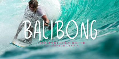 Balibong is a handwritten font with a casual look and vintage style. Balibong will be useful in your designs such as quotes, invitations, menu designs, logos, branding, clothing and some design for in a casual or vintage concept. Balibong also has Multi-Lingual support characters.
 - Marisco by estudioCrop,
$19.90 Marisco is Portuguese for shellfish. The font arose from the forms of classic tattoo types, especially those of mid-twentieth-century sailors, but it also has something of a nineteenth-century poster type flavor to it. Its main application is display type and poster design.
 - Mrs Berry by Hipopotam Studio,
$30.00 Mrs Berry is a hand drawn typeface designed for one of our books. You can use it as a regular monochrome typeface or layer different styles to achieve colorful combinations. Mrs Berry has upper and lowercase characters and supports both Latin and Cyrillic scripts.
 - Mountain Side by Epiclinez,
$18.00 Mountain Side is a sweet, joyful, and incredibly versatile handwritten font. It has beautiful and well-balanced characters and as a result, it matches a wide pool of designs. Add it to your most creative ideas and notice how it makes them come alive.
 - Schools Out by Comicraft,
$39.00 Originally created for Sound Effects in Marvel's GHOST RIDER 2099, our spraycan stylish HOOKY font has just the right Scrawl of the Wild for graph-iti enthusiasts everywhere -- and they wash right off with just a little splash of 'delete'. Spray it, don't Say it!
 - Tubby by Suomi,
$19.00 Tubby came about when I made a book with Cooper Black as a headline font. I started playing with heavy forms, and as a result was Tubby. It has a fat and friendly feel, and with swash italics it is fairly versatile in use.
 - Eloisse by Yumna Type,
$16.00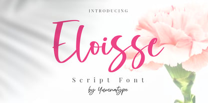 Eloisse is a beautiful handwritten font. Made for any professional project branding. It is the best for logos, branding and quotes. Every letter has a unique and beautiful touch. Includes: Eloisse (OTF) Features: Standard Ligatures PUA Encoded Multilingual Support Numerals and Punctuation by Yumnatype
 - Eskos by Pesotsky Victor,
$10.00 Eskos is designed for headings. It is deliberately diagonal and gives a sharp, oblique texture in the text set. It has rough irrational knots and oblique strokes. Eskos supportsBasic Latin, Cyrillic and more than 100 languages all together. The font was designed by Viktor Pesotsky.