10,000 search results
(0.03 seconds)
- Wisdom Merry by Aldedesign,
$13.00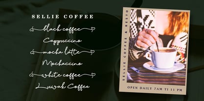 Wisdom Merry is a font with an incredibly sophisticated and classy feel. It has a natural, yet elegant touch and great legibility.
 - Tea Bag JNL by Jeff Levine,
$29.00 Inspired by a grocery store chain logo used up until 1975, this unusual Victorian-style typeface has a unique and interesting charm.
 - FG Rochelle by YOFF,
$16.95FG Rochelle has some special capitals like the B and R that makes it stand out from other script fonts. A beauty! - DavidFarewell by Ingrimayne Type,
$9.95 David Farewell is a decorative flare-serif typeface family with medium contrast. It has four styles: regular, bold, italic, and bold italic.
 - Bowler Hand by wearecolt,
$19.00 Bowler Hand has been created from hand drawn letter forms using a Rotring ink pen which gives the font a great look.
 - Mandala FX by Matthias Luh,
$16.00 Mandala FX is a new comic font mada by Matthias Luh. It has a nice style and quite a lot of characters.
 - FG Carola by YOFF,
$13.95FG Carola is bold and easy to read; the lowercase has an even appearance, so it looks really neat in block text. - Francesco Decorative by Intellecta Design,
$14.95In accordance with Roman use, please note that the cap 'U' in this font has been made to look like a 'V'. - Holz Caps by Authentic,
$39.50 Holz is the German word for wood, since this font has a woodcut character, I thought that would be the right name.
 - Cafe Aroma by BA Graphics,
$45.00A great looking script can be used for many applications; it even works extremely well as text. Has a old fashioned charm. - Minado Rough by RodrigoTypo,
$25.00 Minado Rough is a display sans, stencil and dingbat font family. This typeface has sixteen styles and was published by Rodrigo Typo.
 - Pluton Racing by Sipanji21,
$13.00 Pluton is a Futuristic Font which has a strong and decisive form, making it very suitable for logotypes, merchandise, especially racing teams
 - Refuse Pro by The Type Fetish,
$25.00 Refuse has an extended Latin, extended Cyrillic and Greek alphabet so it will work with most languages in Europe and the Americas.
 - Printers Leftovers JNL by Jeff Levine,
$29.00 Printers Leftovers JNL has an assortment of cartoons, embellishments, ornaments and decorations that span many eras and cover numerous tastes and styles.
 - Batoswash by T4 Foundry,
$21.00Avantgarde fonts Batory and Batoswash are monoline sansserifs designed by Bo Berndal. The futuristic Batory (think Bladerunner and Total Recall) and the spicier relative Batoswash come in three versions: Narrow, Middle and Wide. The font family is available in Truetype and Postscript for Mac and PC. Bo Berndal, born 1924, has been designing typefaces over 56 years, for Monotype, Linotype and other foundries. "Batory is a monoline reaction to my many calligraphic fonts", says Bo Berndal. "That is also the reason I did several widths instead of weights. Batory has short stems and high x-height. Batoswash is a Batory gone wild!" The successful Batory has already been used for logotypes, vignettes in magazines and as headline type. - Darcy by Atlantic Fonts,
$26.00 Darcy is bold and exuberant. As an all-cap family (exception “i”), every letter has an artsy, handmade alternate. For the most joyful bounce, choose all lower or mix up the cases. For a more even baseline, go with all uppercase. Darcy Prints has gestural, organic motifs and patterns, including leaves, grasses, flowers and abstract shapes. Each playful letter has two options with different looks easily available in upper/lower places. Darcy Designs is a cheerful picture font adapted from 26 of the hand-drawings in Darcy Prints. Darcy family is based on hand-lettered cards the designer makes for friends. Darcy family lends itself to products that celebrate warmth, creativity, and a zest for humor and fun!
 - Myteri Tattoo by Mans Greback,
$59.00 Myteri is an expressive tattoo script font. Drawn and created by Mans Greback in 2021, this lettering has a wild rock'n'roll style and a tough personality, with graffiti-inspired calligraphy and vivid movements. To make swashes, use [ ] { } _ anywhere in a word. Example: Tatt_oos Write multiple [ ] { } to make swashes of different lengths. Example: Super[[[star (Download required) The font is built with advanced OpenType functionality and has a guaranteed top-notch quality, containing stylistic and contextual alternates, ligatures and more features; all to give you full control and customizability. It has extensive lingual support, covering all European Latin-based languages. It contains all characters and symbols you'll ever need, including all punctuation and numbers.
 - Gondolieri by Greater Albion Typefounders,
$16.50 The design of Gondolieri has its origins in an experiment to combine aspects of Didone and Tuscan typefaces. The result has a continental 'Italianate' feel. If you wonder what lies behind the name, just look at the lower case 'f'...definite overtones of a Venetian Gondola here, and throughout the design. Gondolieri is offered in regular and bold weights, as well as a simplified form for smaller text use. All of these are available in three widths. The Gondolieri family has a lovely Didone, 'Belle Epoch' feel for use in design, posters, book covers and so forth. An extensive range of Opentype features, including ligatures and terminal forms is included in the regular and bold faces.
 - Grandecort by Ingrimayne Type,
$9.95Grandecort is derived from the OakPark family. It has lost the serifs, and has moved to a more traditional look. The upper case letters are a bit heavier than the lower case letters, but overall the letter shapes are fairly conventional for a bold, display face. In later 2018 the family was expanded to 9 fonts. GrancMitStripes was reworked to make four new faces: GrancAllStripes, GrancTopStripes, GrancBottomStripes, and GrancCaps. The last can be used as a background layer for the others. Also, The interior of GrandecortShadow was separated out to form GrandecortShadowInside. It has the same shapes as Grandecort-Regular but the spacing of GrandecortShadow and can be layered with the shadowed style to easily create bi-colored letters. - Vinho De Amora by Mans Greback,
$59.00 Vinho De Amora is a truly vintage serif font. Drawn by Mans Greback between 2019 and 2021, this font is created with inspiration from wine cellars, painted typography and genuine quality produce. It has a distinct sharp character, steady legs and a bold and wide appearance. The Vinho De Amora family consists of three styles: Black, White and Stencil; each one geometrically consistent and complimenting, perfect for stacking on top of each other to create more variations. The font is built with advanced OpenType functionality and has a guaranteed top-notch quality. It has extensive lingual support, covering all European Latin-based languages. It contains all characters and symbols you'll ever need, including all punctuation and numbers.
 - Terra Ignota by Three Islands Press,
$39.00 The idea for Terra Ignota came to me years ago as I was admiring a reproduction of "Amerique Septentrionale," a 1650 map by French cartographer Nicolas Sanson, given to me by my parents. The handlettering has a sort of rakish character, evocative of pirates or adventurers at a time of unbridled world exploration. I ended up putting the project aside, but the idea to create this font tugged gently at my mind until I simply couldn't ignore it any longer. The resulting typeface has an italic slant and a deliberate feel, in keeping with its historical roots. Useful for simulating old hand-lettered documents. Has a full character set (and then some).
 - Rikkia by Matt Chansky,
$21.00 Rikkia is synonymous with glamour and innovation and has an immediate high-end look that is both timeless and universally appealing. The font family is distinguished by modern ovals and subtle architectural angles. Stylish and versatile, Rikkia comes in wide and standard widths – from hair to bold. The font also has an alt character set for key glyphs like "a" and "R." You'll find a professional set of ligatures, multilingual options, fractions, and a the estimated symbol. Cosmetics, AI, engineering, healthcare, sports, editorial – and all points in between, Rikkia has you covered for a variety of layout needs. Clean, distinctive, memorable, and easily readable — an ideal choice for both print and screens.
 - Regent Pro by Storm Type Foundry,
$39.00 This modernized rustic Baroque Roman face paraphrases freely its model from the first half of the 18th century. The shape of the letters has been cleared from all unevenness and softness, but has retained its lively expression. It is deliberately rather cooler than the reverently digitized Baroque Roman type faces, since it was necessary to adjust it with regard to the visual experience of the contemporary reader. In addition, it has bold designs and aligning figures, which also considerably extends the range of its application. It is an entirely reliable text type face for the most demanding extensive works. Thanks to its calm expression and excellent legibility it is widely used when printing series of professional literature.
 - Wilderness X by Enfeeltype,
$15.00 Wilderness X is a font name that has a very wide wilderness concept. This font has a very large variety of characters, including isolated characters with strong definition and small text. It is also a font which can be used as a random display font. There are also many other options, such as: different stroke thickness and size, change the glyphs and so on A wilder a wilderness, the more rewarding the journey...I love the idea of exploring and staying on the edge, getting dirty and making my path is challenging. Wilderness X is not a bland font but has a bit of badness in it which makes it more interesting and attractive.
 - Batory by T4 Foundry,
$21.00Avantgarde fonts Batory and Batoswash are monoline sansserifs designed by Bo Berndal. The futuristic Batory (think Bladerunner and Total Recall) and the spicier relative Batoswash come in three versions: Narrow, Middle and Wide. The font family is available in Truetype and Postscript for Mac and PC. Bo Berndal, born 1924, has been designing typefaces over 56 years, for Monotype, Linotype and other foundries. “Batory is a monoline reaction to my many calligraphic fonts”, says Bo Berndal. "That is also the reason I did several widths instead of weights. Batory has short stems and high x-height. Batoswash is a Batory gone wild!" The successful Batory has already been used for logotypes, vignettes in magazines and as headline type. - Aquiline by GroupType,
$24.95 Handsome, adventurous, legible and elegant, this script has the feel of practical handwriting from past centuries. Aquiline is based on a cursive italic style influenced by the 16th century European writing masters. The Aquiline design team turned to Ludovico degli Arrighi, the great 16th century writing master, for period ideas on how to improve, strengthen and add grace to the font. Aquiline has strokes and gestures that seem very like the writing of Arrighi and Mercator, such as the flamboyant balloon of a flourish on the cap A; the graceful flourishes on the cap B, D, and L; and the compact lowercase with tall ascenders. Aquiline has a strong personality and is historically correct.
 - Myteri Script by Mans Greback,
$59.00 Myteri Script is an expressive calligraphy font. Drawn and created by Mans Greback, this handwritten lettering has a wild personality and tough appearance, with tattoo-inspired shapes and vivid movements. To make swashes, use [ ] { } _ anywhere in a word. Example: Tatt_oos It is provided in four slant and weight styles to further extend the possibilities of use. The font is built with advanced OpenType functionality and has a guaranteed top-notch quality, containing stylistic and contextual alternates, ligatures and more features; all to give you full control and customizability. It has extensive lingual support, covering all European Latin-based languages. It contains all characters and symbols you'll ever need, including all punctuation and numbers.
 - Kwalett by Ingrimayne Type,
$5.50 Kwalett is a sans serif typeface family with low contrast and a high x-height. Kwalett has two widths, each with five weights and each weight has an italics. The family is derived from the thinnest member of the Qualettee family. As members of that family get bolder, their contrast increases. As members of the Kwalett family get bolder, their contrast remains very low. Kwalett is designed to work better as text than the Qualettee family. The family has two ways to get fractions. A few fractions are preformed and are accessed with the OpenType discretionary ligatures feature. The OpenType fraction feature uses the superscript and subscript numbers to create any fraction.
 - Fireplace by Mans Greback,
$59.00 Fireplace is a decorative logotype font. Drawn and created by Mans Greback in 2020, this script typeface has a cozy and warm holiday vibe, bringing the thoughts to a Christmas Eve and winter season. It is a vintage sport lettering that has velocity, style and class. Use + * ¤ × to create snowflakes, sparkles and stars. Use [ ] < > after any word to create a swash. Example: Snow] For a longer swash, use several characters: Decorative>>>> The typeface is provided in four styles: Regular, Italic, Bold and Bold Italic. Each style contains alternates and ligatures, giving the calligraphy true customized possibilities. The font has extensive lingual support, covering all European Latin scripts. It contains all characters you'll ever need, including all punctuation and numbers.
 - Rettyllda by Twinletter,
$14.00 Rettyllda is a script-typeface that seems like it was handmade. This typeface has an exquisite, simple, lovely blend and harmony between letters, making it ideal for your particular project. Yes, as you can see, the ligature that gives this Rettyllda font its beauty and sensuality may assure beauty and sexiness in your creative project works. Not only that, but this font has a genuine handwritten feel to it, which has been developed to create a portion and composition that matches your demands. As a result, this typeface is appropriate for craft projects, children’s writing, adventure posters, food banner titles, wedding invitations, product packaging logos, quotations, social networking page covers, and furniture banners, headlines, book covers, and much more.
 - Kontora by NaumType,
$25.00 Kontora is elegant, universal and laconic geometric sans. Kontora has minimal amount of decor, mostly modern proportions and letterforms, but at the same time shows a touch of retro constructivist aesthetics. This version of Kontora sans comes in 9 weights, it has 590 glyphs, therefore it supports Latin Extended A (Western and Central European) and Cyrillic (Russian, Ukrainian, Bulgarian) languages. It has basic ligatures and two sets of stylistic alternates. Kontora is perfect for clean and minimalistic design, as well as it can be a breath of fresh air to a fully loaded complex layout. Use it for bold typography, headlines, posters, branding, packaging, it looks great in all caps and vivifies design as a text font.
 - Good Faster by Mans Greback,
$59.00 Good Faster is a bold script typeface. In a quirky calligraphic style, this flowing font has a rustic look and soft lines. The Good Faster family consists of four styles: Regular, Bold, Italic and Bold Italic, complimenting each other for the greatest design possibilities. The font is built with advanced OpenType functionality and has a guaranteed top-notch quality, containing stylistic and contextual alternates, ligatures and more features; all to give you full control and customizability. It has extensive lingual support, covering all Latin-based languages, from Northern Europe to South Africa, from America to South-East Asia. It contains all characters and symbols you'll ever need, including all punctuation and numbers.
 - Edo Pro by CheapProFonts,
$10.00 A free-flowing brush script with only uppercase letters. Now with a professional and multilingual character set! Vic Fieger says: "The letters in Edo were hand-drawn using a thick black permanent marker with a flat head. The head was chopped up using a box cutter to create a "brush" effect. The entire font was made while watching Bobobo-bo Bo-bobo. Edo has been used by video game-makers UbiSoft in their game adaptation of the 2007 animated film Surf's Up, as well as ads for the Fuse 2006 Warped Tour. More recently, it has turned up in such places as the cover for the US release of the manga Teru Teru x Shonen, and the logo for A&E's program, "The Cleaner." ALL fonts from CheapProFonts have very extensive language support: They contain some unusual diacritic letters (some of which are contained in the Latin Extended-B Unicode block) supporting: Cornish, Filipino (Tagalog), Guarani, Luxembourgian, Malagasy, Romanian, Ulithian and Welsh. They also contain all glyphs in the Latin Extended-A Unicode block (which among others cover the Central European and Baltic areas) supporting: Afrikaans, Belarusian (Lacinka), Bosnian, Catalan, Chichewa, Croatian, Czech, Dutch, Esperanto, Greenlandic, Hungarian, Kashubian, Kurdish (Kurmanji), Latvian, Lithuanian, Maltese, Maori, Polish, Saami (Inari), Saami (North), Serbian (latin), Slovak(ian), Slovene, Sorbian (Lower), Sorbian (Upper), Turkish and Turkmen. And they of course contain all the usual "western" glyphs supporting: Albanian, Basque, Breton, Chamorro, Danish, Estonian, Faroese, Finnish, French, Frisian, Galican, German, Icelandic, Indonesian, Irish (Gaelic), Italian, Northern Sotho, Norwegian, Occitan, Portuguese, Rhaeto-Romance, Sami (Lule), Sami (South), Scots (Gaelic), Spanish, Swedish, Tswana, Walloon and Yapese.
 - Whitenights by Linotype,
$29.99Whitenights is a contemporary text family, which was developed by the prolific Swedish typographer Lars Bergquist in 2002. Containing five weights (11 different fonts total), this family contains every tool you need to set splendid text. The base font of the family is Whitenights Regular, a reliable face designed in the old style manner. It ships in OpenType format, with old style figures. Whitenights Ligatures Regular is a supplementary font, which contains many extra ligatures (e.g., ffb, ffk, tt, and fj) whose use will improve the color" of a page of text set in Whitenights Regular. Whitenights Regular may be accented by combination with Whitenights Small Caps, Whitenights Italic, Whitenights Bold, and/or Whitenights Bold Italic. The Whitenights Italic, Bold and Bold Italic styles all have supplementary Ligature fonts available for purchase, similar to the Whitenights Ligatures Regular face described above. For larger, headline text, the specially designed Whitenights Titling is quite useful. This titling font has been optically redrawn and respaced for use in large sizes. Naturally, it has its own supplementary Ligature font as well. In books, magazines, and newsletters this font is a great display companion to the rest of the Whitenights family. Its use in conjunction with the text faces will make your typographical compositions more sophisticated. Last but not least in the Whitenights family is Whitenights Math, which contains many additional mathematical and logical glyphs not found in a standard font's character set. Used together, the above 12 styles can set almost any text or math-based document. The entire family is included in the Take Type 5 collection from Linotype GmbH." - ITC Greengate by ITC,
$29.99ITC Greengate is the result of a time-traveling, intercontinental collaboration--one between 21st century South African designer Richard Every, and early 20th century Scottish artist Jessie Marion King. Jessie Marion King (1875-1949) began her professional career as a book designer and illustrator, but over time her creativity found its outlet in many forms, including posters, jewelry, ceramics, wallpaper, fabrics, murals, interior design and costumes. After eventually settling in Kirkcudbright, Scotland, she founded Green Gate Close, a center for women artists. Although her style is reminiscent of the Art Nouveau artist, Aubrey Beardsley, King's aesthetic was an offshoot of the “Glasgow Style,” a Scottish hybrid of the Arts and Crafts movement and Art Nouveau. Often, her illustrations included hand lettering. It was just this kind of lettering that gave Richard Every his inspiration for ITC Greengate. When he saw some children's book illustrations that King created in 1898, he knew on the spot he had to complete the hand lettering as a typographic font. He began working on the typeface in 1996, but it took six years to be released as an ITC typeface. Every simplified and harmonized King's letterforms slightly and, most importantly, added a suite of lowercase characters. The result is a somewhat earthy Art Nouveau design, with a character quite distinct from typical digital revivals. Every's career has been as diverse as King's. He was born in Durban, South Africa and studied graphic design at ML Sultan Technikon in Durban. He's been an art director, freelance designer, the owner and manager of a nightclub and co-manager of a South African band. “Through it all,” he says, “typography has always been one of my passions.” - VLNL Melk by VetteLetters,
$29.99 At VetteLetters we like food but we also appreciate our drinks. Yes, of the non-alcoholic kind as well. Like milk. Contrary to what Arnold Schwartzenegger once said, Milk is not just for babies. It contains a whole lot of stuff that is genuinely good for you. Like proteins, carbohydrates, minerals (calcium a.o.) and many vitamins. One time visiting The Hague, Donald DBXL spotted a tile tableau on a brick wall, advertising a dairy factory called ‘De Sierkan’. Yellow sans serif letters on a bright blue background, dating back to the late 19th century, immediately grabbed DBXL’s attention. Especially because the tableau showed both regular and bold letters with some lovely peculiarities here and there. De Sierkan appeared to have been a milk factory solely operating in The Hague from 1879 until 1961. A number of these wall adverts are still to be seen in The Hague streets today. Photos were taken for later reference. Later is now, the lettering has been digitized, missing characters added, and VLNL Melk sees the light of day. VLNL Melk is an all-caps geometric display sans serif family of three weights, Regular, Bold and Black. The basic shape of the letters is a rectangle with rounded corners, leaving a sturdy no-nonsense look and feel. It has a distinct historic aura, but with both feet in this digital day and age. It can equally well be used for the logo of a hipster coffee place, as the cover of a historic novel. Actually, VLNL Melk kan be applied in a wide range of designs like logos, posters, flyers, book covers and magazine headlines.
 - Ablati by Hackberry Font Foundry,
$24.95 Ablati is the commercial release of the font designed during the production of our new font design book, “Practical Font Design”. It is a new serif font in my continuing objective of designing book fonts that I can really use. In many ways, Ablati is a very different direction for me. Designed to produce gaphics to use in the font design book, I was forced to really reconsider many of my working methods to make them work for outside readership. Like all designers, my internal design processes can get really sloppy. The book helped me clean up my act. Taking my inspiration from one of my favorite fonts of all time {though I've never really been able to use it much}, Romic, by Colin at Letraset, I decided to design a unilateral serif font. In most ways, this is a normal serif for me in that it has caps, lowercase, small caps with the appropriate figures for each case. This font has all the OpenType features in the new set developed for the book. There are several ligatures for your fun and enjoyment: bb gg ff fi fl ffi ffl ffy fj ft tt ty Wh Th and more. Several alternative forms, a dozen ornaments, and more. Like all of my fonts, there are: caps, lowercase, small caps, proportional lining figures, proportional oldstyle figures, & small cap figures, plus numerators, denominators, superiors, inferiors, and a complete set of ordinals 1st through infinity. Enjoy! The Oldstyle and Small Cap fonts are an attempt to have most of the OpenType characters available to people still using Type 1 and TrueType fonts.
 - Franzi Variable by Wannatype,
$211.00 The new sans-serif Franzi typeface family – as neutral as can be, but at the same time individual and striking. Its unmistakable character lies in the detail, with no effect pushing itself to the fore. As a wide-running typeface with a relatively large x-height, the typeface family is perfectly suited to small text sizes but, with its elegant details, it leaves nothing to be desired in display applications either. Originally designed with constructed, often rectangular elements, Franzi has gradually been rounded during the development process and is now less hard in order to guarantee optimal legibility. Franzi Variable is designed alongside the italic and the weight axes. The italics are softly and elegantly drawn, while the upright characters appear much more severe. The design appeal reveals itself in the two-storey ‘a’ – a tribute to legibility in body copy; however, for those who prefer the geometric in applications, an alternative single-storey ‘a’ is also available. All styles have small caps, superscript and subscript lowercase letters, lining, non-lining and small caps figures, fractions as well as several ligatures, alternative fonts, symbols and arrows. The Latin uppercase letters are also available as discreet swash variants. In addition to the extended Latin alphabet, the typeface family also includes the complete Greek, Cyrillic and International Phonetic Alphabet IPA. Franzi was created as a further development of an order to produce a sign for a therapy practice in Vienna’s Franz-Hochedlinger-Gasse – hence the name, which is more common as an abbreviation for Franziska than as a diminutive for the male name Franz: Franzi is therefore a hybrid typeface name which has female tendencies.
 - Belgato by Molly Suber Thorpe,
$9.00 Belgato is a vintage-inspired typeface with delicate details. It comes in six weights – plus italics! – for a total of 12 fonts, making it a highly versatile display face. The variable font version allows for ultimateweight and slant customization in print and web. Belgato has Latin, Greek, and Cyrillic alphabets, and supports dozens of languages, making it ideal for multilingual branding, publications, ads, social media, and more! I had so much fun designing this typeface, playing with classic serif letterforms to create an elegant, mid-century modern vibe. Belgato Light is fresh, airy, and delicate – perfect for feminine branding. By contrast, Belgato Black boasts fat curves with thin details, perfectly-suited to bold layouts and retro branding projects. Each Belgato font has 665 glyphs, encompassing: - the Latin alphabet (including hundreds of accented characters) - the Modern Greek alphabet - the Cyrillic alphabet (for Russian, Ukrainian, Bulgarian, and Serbo-Croatian) - discretionary ligatures - stylistic and alternate glyphs - numerals (lining and old style), small figures, and fractions - extensive punctuation, symbols, and diacritical markings Software: No special software is required to use Belgato fonts. You can even use these fonts with Canva! To access Belgato’s variable font features, ligatures, and stylistic alternates, it is best to use software that supports these functions (Adobe programs, Corel Draw, Sketch, etc). Languages: Belgato supports dozens of languages which use the Latin, Greek, and Cyrillic alphabets. Among the most common languages it supports are: English, Bulgarian, Catalan, Croatian, Czech, Danish, Dutch, Filipino, Finnish, Flemish, French, German, Modern Greek, Hungarian, Icelandic, Indonesian, Italian, Luxembourgish, Maltese, Norwegian, Polish, Portuguese, Russian, Serbo-Croatian, Spanish, Swedish, Swiss German, Turkish, and Ukrainian.
 - Minicomputer by Typodermic,
$11.95 Minicomputer is an exceptional typeface that pays homage to the antique look of computer fonts from the mid-20th century. It is a magnetic ink typeface, characterized by a versatile range of seven weights and italics, which is perfect for graphic design themes. Minicomputer also includes OpenType fractions and numeric ordinals, as well as an array of mathematical symbols that can add depth to any design. With its OpenType old-style numerals feature, Minicomputer enables users to evoke the original MICR E-13B numerals, the very numerals that were once used in bank checks. Back in the 1950s, the MICR E-13B numerals were printed in magnetic ink and were associated with the innovative technology of the time. But that didn’t stop Leo Maggs from creating Westminster, a typeface that emulated the look of the MICR E-13B. Soon after, dozens of magnetic typefaces appeared and quickly became fashionable. By the 1980s, home computers emerged, and the once fashionable magnetic typefaces became outdated. They were replaced with pixel fonts and dot matrix typefaces, which gave a fresh look to digital designs. However, designers today are reviving the magnetic typeface trend in a new context. Magnetic typefaces are now associated with a vintage look that has a unique and synthetic feel and an association with 1960s fashion trends. Despite the half-century since the first magnetic typefaces appeared, designers had limited choices when it came to using them, mainly having to rely on digitized versions of analog fonts from the 1990s. Minicomputer offers an exciting and modern take on the magnetic ink typeface and is a must-have for any designer or writer looking to add a touch of the past to their work. Most Latin-based European, Vietnamese, Greek, and most Cyrillic-based writing systems are supported, including the following languages. Afaan Oromo, Afar, Afrikaans, Albanian, Alsatian, Aromanian, Aymara, Azerbaijani, Bashkir, Bashkir (Latin), Basque, Belarusian, Belarusian (Latin), Bemba, Bikol, Bosnian, Breton, Bulgarian, Buryat, Cape Verdean, Creole, Catalan, Cebuano, Chamorro, Chavacano, Chichewa, Crimean Tatar (Latin), Croatian, Czech, Danish, Dawan, Dholuo, Dungan, Dutch, English, Estonian, Faroese, Fijian, Filipino, Finnish, French, Frisian, Friulian, Gagauz (Latin), Galician, Ganda, Genoese, German, Gikuyu, Greenlandic, Guadeloupean Creole, Haitian Creole, Hawaiian, Hiligaynon, Hungarian, Icelandic, Igbo, Ilocano, Indonesian, Irish, Italian, Jamaican, Kaingang, Khalkha, Kalmyk, Kanuri, Kaqchikel, Karakalpak (Latin), Kashubian, Kazakh, Kikongo, Kinyarwanda, Kirundi, Komi-Permyak, Kurdish, Kurdish (Latin), Kyrgyz, Latvian, Lithuanian, Lombard, Low Saxon, Luxembourgish, Maasai, Macedonian, Makhuwa, Malay, Maltese, Māori, Moldovan, Montenegrin, Nahuatl, Ndebele, Neapolitan, Norwegian, Novial, Occitan, Ossetian, Ossetian (Latin), Papiamento, Piedmontese, Polish, Portuguese, Quechua, Rarotongan, Romanian, Romansh, Russian, Rusyn, Sami, Sango, Saramaccan, Sardinian, Scottish Gaelic, Serbian, Serbian (Latin), Shona, Sicilian, Silesian, Slovak, Slovenian, Somali, Sorbian, Sotho, Spanish, Swahili, Swazi, Swedish, Tagalog, Tahitian, Tajik, Tatar, Tetum, Tongan, Tshiluba, Tsonga, Tswana, Tumbuka, Turkish, Turkmen (Latin), Tuvaluan, Ukrainian, Uzbek, Uzbek (Latin), Venda, Venetian, Vepsian, Vietnamese, Võro, Walloon, Waray-Waray, Wayuu, Welsh, Wolof, Xavante, Xhosa, Yapese, Zapotec, Zarma, Zazaki, Zulu and Zuni.