10,000 search results
(0.042 seconds)
- Times New Roman WGL by Monotype,
$67.99 In 1931, The Times of London commissioned a new text type design from Stanley Morison and the Monotype Corporation, after Morison had written an article criticizing The Times for being badly printed and typographically behind the times. The new design was supervised by Stanley Morison and drawn by Victor Lardent, an artist from the advertising department of The Times. Morison used an older typeface, Plantin, as the basis for his design, but made revisions for legibility and economy of space (always important concerns for newspapers). As the old type used by the newspaper had been called Times Old Roman," Morison's revision became "Times New Roman." The Times of London debuted the new typeface in October 1932, and after one year the design was released for commercial sale. The Linotype version, called simply "Times," was optimized for line-casting technology, though the differences in the basic design are subtle. The typeface was very successful for the Times of London, which used a higher grade of newsprint than most newspapers. The better, whiter paper enhanced the new typeface's high degree of contrast and sharp serifs, and created a sparkling, modern look. In 1972, Walter Tracy designed Times Europa for The Times of London. This was a sturdier version, and it was needed to hold up to the newest demands of newspaper printing: faster presses and cheaper paper. In the United States, the Times font family has enjoyed popularity as a magazine and book type since the 1940s. Times continues to be very popular around the world because of its versatility and readability. And because it is a standard font on most computers and digital printers, it has become universally familiar as the office workhorse. Times?, Times? Europa, and Times New Roman? are sure bets for proposals, annual reports, office correspondence, magazines, and newspapers. Linotype offers many versions of this font: Times? is the universal version of Times, used formerly as the matrices for the Linotype hot metal line-casting machines. The basic four weights of roman, italic, bold and bold italic are standard fonts on most printers. There are also small caps, Old style Figures, phonetic characters, and Central European characters. Times? Ten is the version specially designed for smaller text (12 point and below); its characters are wider and the hairlines are a little stronger. Times Ten has many weights for Latin typography, as well as several weights for Central European, Cyrillic, and Greek typesetting. Times? Eighteen is the headline version, ideal for point sizes of 18 and larger. The characters are subtly condensed and the hairlines are finer."
 - Times New Roman by Monotype,
$67.99 In 1931, The Times of London commissioned a new text type design from Stanley Morison and the Monotype Corporation, after Morison had written an article criticizing The Times for being badly printed and typographically behind the times. The new design was supervised by Stanley Morison and drawn by Victor Lardent, an artist from the advertising department of The Times. Morison used an older typeface, Plantin, as the basis for his design, but made revisions for legibility and economy of space (always important concerns for newspapers). As the old type used by the newspaper had been called Times Old Roman," Morison's revision became "Times New Roman." The Times of London debuted the new typeface in October 1932, and after one year the design was released for commercial sale. The Linotype version, called simply "Times," was optimized for line-casting technology, though the differences in the basic design are subtle. The typeface was very successful for the Times of London, which used a higher grade of newsprint than most newspapers. The better, whiter paper enhanced the new typeface's high degree of contrast and sharp serifs, and created a sparkling, modern look. In 1972, Walter Tracy designed Times Europa for The Times of London. This was a sturdier version, and it was needed to hold up to the newest demands of newspaper printing: faster presses and cheaper paper. In the United States, the Times font family has enjoyed popularity as a magazine and book type since the 1940s. Times continues to be very popular around the world because of its versatility and readability. And because it is a standard font on most computers and digital printers, it has become universally familiar as the office workhorse. Times?, Times? Europa, and Times New Roman? are sure bets for proposals, annual reports, office correspondence, magazines, and newspapers. Linotype offers many versions of this font: Times? is the universal version of Times, used formerly as the matrices for the Linotype hot metal line-casting machines. The basic four weights of roman, italic, bold and bold italic are standard fonts on most printers. There are also small caps, Old style Figures, phonetic characters, and Central European characters. Times? Ten is the version specially designed for smaller text (12 point and below); its characters are wider and the hairlines are a little stronger. Times Ten has many weights for Latin typography, as well as several weights for Central European, Cyrillic, and Greek typesetting. Times? Eighteen is the headline version, ideal for point sizes of 18 and larger. The characters are subtly condensed and the hairlines are finer."
 - Times New Roman Small Text by Monotype,
$67.99In 1931, The Times of London commissioned a new text type design from Stanley Morison and the Monotype Corporation, after Morison had written an article criticizing The Times for being badly printed and typographically behind the times. The new design was supervised by Stanley Morison and drawn by Victor Lardent, an artist from the advertising department of The Times. Morison used an older typeface, Plantin, as the basis for his design, but made revisions for legibility and economy of space (always important concerns for newspapers). As the old type used by the newspaper had been called Times Old Roman," Morison's revision became "Times New Roman." The Times of London debuted the new typeface in October 1932, and after one year the design was released for commercial sale. The Linotype version, called simply "Times," was optimized for line-casting technology, though the differences in the basic design are subtle. The typeface was very successful for the Times of London, which used a higher grade of newsprint than most newspapers. The better, whiter paper enhanced the new typeface's high degree of contrast and sharp serifs, and created a sparkling, modern look. In 1972, Walter Tracy designed Times Europa for The Times of London. This was a sturdier version, and it was needed to hold up to the newest demands of newspaper printing: faster presses and cheaper paper. In the United States, the Times font family has enjoyed popularity as a magazine and book type since the 1940s. Times continues to be very popular around the world because of its versatility and readability. And because it is a standard font on most computers and digital printers, it has become universally familiar as the office workhorse. Times?, Times? Europa, and Times New Roman? are sure bets for proposals, annual reports, office correspondence, magazines, and newspapers. Linotype offers many versions of this font: Times? is the universal version of Times, used formerly as the matrices for the Linotype hot metal line-casting machines. The basic four weights of roman, italic, bold and bold italic are standard fonts on most printers. There are also small caps, Old style Figures, phonetic characters, and Central European characters. Times? Ten is the version specially designed for smaller text (12 point and below); its characters are wider and the hairlines are a little stronger. Times Ten has many weights for Latin typography, as well as several weights for Central European, Cyrillic, and Greek typesetting. Times? Eighteen is the headline version, ideal for point sizes of 18 and larger. The characters are subtly condensed and the hairlines are finer." - Times New Roman PS Greek by Monotype,
$67.99In 1931, The Times of London commissioned a new text type design from Stanley Morison and the Monotype Corporation, after Morison had written an article criticizing The Times for being badly printed and typographically behind the times. The new design was supervised by Stanley Morison and drawn by Victor Lardent, an artist from the advertising department of The Times. Morison used an older typeface, Plantin, as the basis for his design, but made revisions for legibility and economy of space (always important concerns for newspapers). As the old type used by the newspaper had been called Times Old Roman," Morison's revision became "Times New Roman." The Times of London debuted the new typeface in October 1932, and after one year the design was released for commercial sale. The Linotype version, called simply "Times," was optimized for line-casting technology, though the differences in the basic design are subtle. The typeface was very successful for the Times of London, which used a higher grade of newsprint than most newspapers. The better, whiter paper enhanced the new typeface's high degree of contrast and sharp serifs, and created a sparkling, modern look. In 1972, Walter Tracy designed Times Europa for The Times of London. This was a sturdier version, and it was needed to hold up to the newest demands of newspaper printing: faster presses and cheaper paper. In the United States, the Times font family has enjoyed popularity as a magazine and book type since the 1940s. Times continues to be very popular around the world because of its versatility and readability. And because it is a standard font on most computers and digital printers, it has become universally familiar as the office workhorse. Times?, Times? Europa, and Times New Roman? are sure bets for proposals, annual reports, office correspondence, magazines, and newspapers. Linotype offers many versions of this font: Times? is the universal version of Times, used formerly as the matrices for the Linotype hot metal line-casting machines. The basic four weights of roman, italic, bold and bold italic are standard fonts on most printers. There are also small caps, Old style Figures, phonetic characters, and Central European characters. Times? Ten is the version specially designed for smaller text (12 point and below); its characters are wider and the hairlines are a little stronger. Times Ten has many weights for Latin typography, as well as several weights for Central European, Cyrillic, and Greek typesetting. Times? Eighteen is the headline version, ideal for point sizes of 18 and larger. The characters are subtly condensed and the hairlines are finer." - Times New Roman PS by Monotype,
$67.99In 1931, The Times of London commissioned a new text type design from Stanley Morison and the Monotype Corporation, after Morison had written an article criticizing The Times for being badly printed and typographically behind the times. The new design was supervised by Stanley Morison and drawn by Victor Lardent, an artist from the advertising department of The Times. Morison used an older typeface, Plantin, as the basis for his design, but made revisions for legibility and economy of space (always important concerns for newspapers). As the old type used by the newspaper had been called Times Old Roman," Morison's revision became "Times New Roman." The Times of London debuted the new typeface in October 1932, and after one year the design was released for commercial sale. The Linotype version, called simply "Times," was optimized for line-casting technology, though the differences in the basic design are subtle. The typeface was very successful for the Times of London, which used a higher grade of newsprint than most newspapers. The better, whiter paper enhanced the new typeface's high degree of contrast and sharp serifs, and created a sparkling, modern look. In 1972, Walter Tracy designed Times Europa for The Times of London. This was a sturdier version, and it was needed to hold up to the newest demands of newspaper printing: faster presses and cheaper paper. In the United States, the Times font family has enjoyed popularity as a magazine and book type since the 1940s. Times continues to be very popular around the world because of its versatility and readability. And because it is a standard font on most computers and digital printers, it has become universally familiar as the office workhorse. Times?, Times? Europa, and Times New Roman? are sure bets for proposals, annual reports, office correspondence, magazines, and newspapers. Linotype offers many versions of this font: Times? is the universal version of Times, used formerly as the matrices for the Linotype hot metal line-casting machines. The basic four weights of roman, italic, bold and bold italic are standard fonts on most printers. There are also small caps, Old style Figures, phonetic characters, and Central European characters. Times? Ten is the version specially designed for smaller text (12 point and below); its characters are wider and the hairlines are a little stronger. Times Ten has many weights for Latin typography, as well as several weights for Central European, Cyrillic, and Greek typesetting. Times? Eighteen is the headline version, ideal for point sizes of 18 and larger. The characters are subtly condensed and the hairlines are finer." - Antique Shadow by Wooden Type Fonts,
$15.00A modified remake of one of the popular wooden type fonts of the 19th century. This is an extra bold, shadowed, sans serif suitable for display. - Standard Poster by ParaType,
$25.00 Designed at Polygraphmash type design bureau in 1986. Based on "English" bold styles of the Ossip Lehmann type foundry (St.-Petersburg), of mid-19th century. The digital version was developed at ParaType in 1992 by Vladimir Yefimov. For use in advertising and display typography.
 - ELEKTRA ASSASSIN - Personal use only

- Motorway by K-Type,
$20.00 MOTORWAY is the companion typeface to TRANSPORT, the British road sign lettering. The Motorway alphabet was created for the route numbers on motorway signage, and is taller and narrower than the accompanying place names and distances which are printed in Transport. However, for Motorway Jock Kinneir and Margaret Calvert created only the numbers 0 to 9, the capitals A, B, E, M, N, S and W, ampersand, slash, parentheses and a comma. So, although the lettering made its first appearance on the Preston bypass in 1958, K-Type Motorway is the first complete typeface and contains all upper and lower case letters, plus a full complement of punctuation, symbols and Latin Extended-A accented characters. As with the Transport alphabet the starting point was Akzidenz Grotesk, Motorway taking inspiration from condensed versions. Changes were mainly driven by a quest for legibility, resulting in some reduced contrast between horizontal and vertical strokes, and Gill-esque straight diagonal limbs on the 6 and 9, and high vertex for the M. Kinneir and Calvert designed the limited range of characters in two weights; a SemiBold 'Permanent' weight for use as white letters on blue motorway signs, and a Bold 'Temporary' weight for heavier black letters on yellow non-permanent signage. In addition to creating full fonts in both original weights, the K-Type family adds a new Regular weight, plus a set of italics, completing a highly usable condensed typeface which, while rooted in history, is fully functional for both print and web usage. The K-Type fonts are spaced and kerned normally, simply increase the tracking to recapture the generous spacing of motorway signage.
 - Quare Zombie by Struggle Studio,
$10.00 Quare Zombie is an old typeface, comes in a clean and elegant style. There are 5 files in this font such as: Regular and Engraving with tattoo additions and Monoline Fonts. Quare Zombie is great for all types of looks from branding, emblems, advertisements, t-shirts, etc. Notes: (Quare Zombie Extras Tattoos are sold separately)
 - Monograf by Milan Pleva,
$10.00 Monograf was originally designed as fixed-width monospaced font which has 2 weights (Regular and Bold). Monograf Text is a derived style of Monograf with proportional spacing and well-balanced kerning to make the text easier to read and look optically balanced. So in the total bundle you get 4 pieces of this font: Monograf Regular, Monograf Bold, Monograf Text Regular and Monograf Text Bold. This versatile font with clean geometry and slightly rounded corner elements works great in digital space, as well in print. It also retains its legibility at smaller sizes. Typographic features include old-style figures, directional arrows and four types of asterisks. The entire font is suitable for purposes such as tabular layout, coding, website, but also for magazines, logos, signs, products, and others. Features: Basic latin alphabet A-Z 116 Accented characters Numbers, Punctuation, Currency, Symbols, Math symbols & Diacritics Old style figures, Directional arrows and 4 asterisks
 - Savia Filled Shadow - Personal use only

- ThamesCondensed - Unknown license

- BellySansCondensed - 100% free

- Apothem - Personal use only

- Rikna by Tour De Force,
$30.00 Rikna is compact, solid and gently condensed slab serif font family that comes in 14 styles. Imagined as family with ability to be used as main project font, Rikna’s visual flow of characters in composed paragraph reveals its high legibility in all sizes. With distinctive serifs, Rikna contains display characteristics with recommend the font for use in bigger sizes as well. Contains Fractions as Open Type Feature.
 - Fyne Fish NF by Nick's Fonts,
$10.00The pattern for this face was designed by Will Bradley in 1894 for the cover of Inland Printer magazine, and was licensed the following year to American Type Founders. Its classic lines and condensed footprint make this typeface a natural for elegant and inviting headlines. All versions of this font include the Unicode 1250 Central European character set in addition to the standard Unicode 1252 Latin set. - FF Gothic by FontFont,
$41.99 British type designer Neville Brody created this display and sans FontFont in 1992. The family contains 2 weights: Regular and Condensed and is ideally suited for advertising and packaging, music and nightlife, poster and billboards, software and gaming as well as sports. FF Gothic provides advanced typographical support with features such as ligatures and stylistic alternates. It comes with tabular lining and proportional lining figures.
 - Centima Mono by TipografiaRamis,
$29.00 Centima Mono is a subfamily addition to Centima type family. Centima Mono is a condensed geometric monospaced san serif, built in six styles. The typeface is intended for use in display sizes, but also is quite legible in text and is well suited for editorial and brand design. Centima Mono is released in OpenType format with support for most European languages and includes some opentype features.
 - Quick Meal by Jeff Levine,
$29.00 Quick Meal JNL is a ‘hand lettered’ interpretation of Morris Fuller Benton’s 1905 design “Miehle Extra Condensed Title”, no doubt named for [or on behalf of] the manufacturer of printing and die cutting presses that were used for years within the printing industry. The type face is available in both regular and oblique versions. Quick Meal JNL is a pun on the pronunciation of ‘Miehle’.
 - Nina by Microsoft Corporation,
$49.00Nina™ Family is a new condensed sans serif typeface designed to be as readable as possible at small sizes, whilst squeezing in as many characters per inch as feasibly possible. Nina Family typeface was designed for Microsoft by world renowned type designer Matthew Carter, and hand-instructed by leading hinting expert, Tom Rickner. Character Set: Latin-1, WGL Pan-European (Eastern Europe, Cyrillic, Greek and Turkish). - Yanice by Viaction Type.Co,
$20.00 Yanice is a semi-condensed sans serif font that has a strong and subtle character. Perfect for modern & industrial themed designs. Yanice is available in 4 styles that you can use according to your needs. Get the Yanice font now at a great price to speed up your work. Feature Font : Standard Ligature Multilingual Support Symbol & Punctuation I hope you enjoy and thank you. Viaction Type
 - Aremic by Graptail,
$15.00 Aremic is a bold display font created to be used for bold headings coming in 2 shapes Regular and Rounded including Oblique. This font is inspired by the shape of the letters on sports posters. This type of font perfectly made to be applied especially in logo, headline, signage and the other various formal forms such as invitations, labels, logos, magazines, books, greeting / wedding cards, packaging, fashion, make up, stationery, novels, labels or any type of advertising purpose.
 - Chedros by Surotype,
$15.00 Chedros is a display typeface with playful taste. It comes in two different weight, regular and bold so you can use them to your heart's content. Chedros very suitable to use for headlines, wordmark, prints, logotype, young and playful design or anything else.
 - Palomar by Jonahfonts,
$39.00 A refreshingly different condensed font.
 - Gratelos by Maulana Creative,
$11.00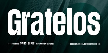 Gratelos is a modern sans serif display font. With condensed bold stroke, fun character with some of ligatures. To give you an extra creative work. Gratelos font support multilingual more than 100+ language. This font is good for logo design, Social media, Movie Titles, Books Titles, a short text even a long text letter and good for your secondary text font with script or signature typeface. Make a stunning work with Gratelos font. Cheers, MaulanaCreative
 - Pinatas Masters by Piñata,
$17.00 Original Foundry: TypeType Original name: TT Masters Pinatas Masters is a very emotional typeface. This typeface will add to your design sincerity and warmth. Pinatas Masters typeface consist of 4 different subfamilies: Pinatas Masters, Pinatas Masters Birds, Pinatas Masters Rough and Pinatas Masters Condensed. Each subfamily consists of 5 styles: Thin, Light, Regular, Bold and Black. Scope of typeface: DIY, handmade stuff, interior design, infographics, graphic design, logotypes, packaging, design of exhibitions, presentations.
 - ArgentaBobbed by Ingrimayne Type,
$5.00ArgentaBobbed is an informal, "hand-printing" font with little balls that some people, often children, like to add to the ends of strokes. Maybe it could be called a ball-serif or dot-serif font. The family has six members. Each of the two weights, plain and bold, have oblique styles. There are also two variants: ArgentaBobbed-Wig is squiggly handwriting with the dots, and ArgentaBobbed-Squish is condensed handwriting with dots. - MC Kagami by Maulana Creative,
$15.00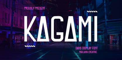 Kagami is a modern sans serif display font. With bold condensed stroke and fun character. To give you an extra creative work, Kagami font support multilingual more than 100+ language. This font is good for logo design, Social media, Movie Titles, Books Titles, a short text even a long text letter and good for your secondary text font with signature or script typeface. Make a stunning work with Kagami font. Cheers, Maulana Creative
 - MC Bigly by Maulana Creative,
$22.00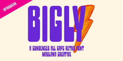 Bigly is a condensed retro font. With bold stroke, fun character with a bit of ligatures and alternates. To give you an extra creative work. Bigly font support multilingual more than 100+ language. This font is good for logo design, Social media, Movie Titles, Books Titles, a short text even a long text letter and good for your secondary text font with script or serif. Make a stunning work with Bigly font. Cheers, Maulana Creative
 - Garmint by Maulana Creative,
$13.00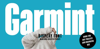 Garmint is a modern sans serif display font. With bold condensed stroke and fun character. To give you an extra creative work, Garmint font support multilingual more than 100+ language. This font is good for logo design, Social media, Movie Titles, Books Titles, a short text even a long text letter and good for your secondary text font with signature or script typeface. Make a stunning work with Garmint font. Cheers, MaulanaCreative
 - Wesna by Type Salon,
$41.90 Typeface Wesna was created as a reflection of the current state of design whose starting point is rooted in the letterings from the Slovenian posters from the interwar period. Bold strokes, condensed letterforms, sharp stroke joints and unique features are combined in the typeface. Wesna preserves the Slovenian typography heritage and establishes the connection between the past and the present through new digital formation. Available in 3 weights, italics in Latin & Cyrillic.
 - Knocky by Jehoo Creative,
$23.00 Knocky is a display typeface that is complete and versatile with a bold round condensed look with unique flexibility. We've added solid alternatives to letters, numbers, and some symbols, plus an outline style that will make the graphic look unique and stand out. With 8 styles and more than 530 glyphs in each. knocky has multi-language support, it will be perfect for many projects from editorial design to branding, advertising, publicity and digital.
 - ZT Bros Oskon 90 s by Zelow Type,
$13.00 ZT Bros Oskon 90s is a captivating typographic creation that seamlessly blends the aesthetic charm of the 1990s retro era with a modern touch. With unmatched serif elegance and a unique 90s style, this font offers 72 variations, including sharp Condensed forms, graceful Expanded, and captivating italic styles. Every character in ZT Bros Oskon 90s is meticulously crafted, creating a vintage ambiance that is truly enchanting. Featuring 6 font weights ranging from Extra Light to Bold, this font provides you with the flexibility to create a wide range of striking and memorable designs. Features of ZT Bros Oskon 90s: 72 Unique Variations Aesthetic Retro Vibes from the 1990s Elegant Serif Style Condensed, Expanded, and Italic Forms 6 Font Weights: Extra Light, Light, Regular, Medium, Semi-Bold, Bold Exceptional Creative Versatility ZT Bros Oskon 90s is the perfect choice for graphic design projects, branding, posters, and other promotional materials that require a captivating retro touch. Unleash limitless creativity with this font and infuse a nostalgic 1990s vibe into every one of your creations. ZT Bros Oskon 90s has 6 free styles, you can get them on my GUMROAD I hope you have fun using ZT Bros Oskon 90s. Thanks for using this font ~ Zelowtype
 - Belyard by Blankids,
$18.00 Introducing a new layered bold script font called Belyard .Belyard inspired by bold script logotype and retro font. Belyard came with open type features and multilingual accent good for logotype, poster, badge, book cover, tshirt design, packaging and any more. FEATURES : Uppercase Lowercase Number Punctuation Multilingual PUA Encode Opentype
 - Mozer by Fontfabric,
$29.00 Mozer is a semi-condensed neo-grotesque type family of 16 styles ranging from Thin to Black matched with true italics. With a generous x-height, economical width, moderate contrast and overall solid appearance this typeface shows an uncompromising legibility merged with a contemporary spirit that has not lost its individuality, even in the small details like the discreet ink traps. Mozer covers Extended Latin, Cyrillic and Greek and is suited with plenty of OpenType features, such as localisations, ligatures; four type of numerals including figures and tabular; case-sensitive forms; alternatives etc. Mozer comes accessible and closer to all designer’s needs. Features: • Over 790 glyphs in 16 styles (Thin to Black); • Extended Latin, Cyrillic and Greek scripts for more than 130 languages; • Tall and balanced x-height; • Semi-condensed width proportions; • Moderate contrast and vertical stress; • Neo-grotesque characteristics and terminals with humanistic flavor. Designers: Ani Petrova, Mirela Belova, Nikolay Petroussenko
 - MaryTodd by TipoType,
$15.00 MaryTodd was created for small texts with a variety of hierarchies. Is condensed to save space. It has a rich set of glyphs: small caps, old style figures, monospaced numbers, numerators and denominators for fractions, etc. It is ideal for organizing and presenting information in a clear and simple way.
 - Kaufmann LT by Linotype,
$29.99Kaufmann font was designed in 1936 for the American Type Founders by Max R. Kaufmann, a letterer, typographer, and one-time art director for McCalls magazine. Kaufmann is a connecting script typeface with a smooth, slightly whimsical look. Its monoweight is unusual in a script type but allows for a nice texture on the page when it is combined with sans serif text type. The bold Kaufmann is fine display type. - SF Change Pro by Sultan Fonts,
$19.99 Change is An Arabic and Latin text typeface for desktop applications. This Font Family development and extension of the Old sultan font "change" Here you will find a change in many letters, along with two types of regular and bold fonts, as well as a change in all Latin letters. The font includes a matching Latin design and support for Arabic, Persian, Kurdish, and Urdu. Designer: Sultan Maqtari Design date: 2020 Publisher: Sultan Fonts
 - Alphabeta - Unknown license


