10,000 search results
(0.541 seconds)
- Adobe Caslon by Adobe,
$35.00The Englishman William Caslon punchcut many roman, italic, and non-Latin typefaces from 1720 until his death in 1766. At that time most types were being imported to England from Dutch sources, so Caslon was influenced by the characteristics of Dutch types. He did, however, achieve a level of craft that enabled his recognition as the first great English punchcutter. Caslon's roman became so popular that it was known as the script of kings, although on the other side of the political spectrum (and the ocean), the Americans used it for their Declaration of Independence in 1776. The original Caslon specimen sheets and punches have long provided a fertile source for the range of types bearing his name. Identifying characteristics of most Caslons include a cap A with a scooped-out apex; a cap C with two full serifs; and in the italic, a swashed lowercase v and w. Caslon's types have achieved legendary status among printers and typographers, and are considered safe, solid, and dependable. Carol Twombly designed this Caslon revival for Adobe in 1990, after studying Caslon's own specimen sheets from the mid-eighteenth century. This elegant version is quite true to the source, and has been optimized for the demands of digital design and printing. Adobe Caslon? makes an excellent text font and includes just about everything needed by the discriminating typographer: small caps, Old style Figures, swash letters, alternates, ligatures, expert characters, central European characters, and a plethora of period ornaments. - Tyma Garamont by T4 Foundry,
$49.00The TYMA Garamont Roman was inspired by the Berner-Egenolff type sample from the 1560s. The Italic was inspired by a sample from Robert Granjon, also from the 1560s. The name TYMA is short for AB Typmatriser, a Swedish company founded 1948, because the Second World War stopped all import of matrices for Linotype and Intertype typesetting machines. It took until 1951-52 before the import was up to speed again. Until then, Sweden had to fend for itself. TYMA produced all technical equipment needed for type production, including the pantograph to cut the matrices, a complete set for each size and version. The templates for Garamont Roman were initiated by Henry Alm 1948. Bo Berndal was hired the following year, and continued the work by drawing and cutting templates for the rest of Garamont Roman, as well as for the remaining Garamont family. Bo Berndal stayed at TYMA until it went bankrupt in 1952. At that time Bo Berndal had already kick-started his career as type designer by drawing the typeface Reporter for one of the big daily newspapers, Aftonbladet, a version of Cheltenham for another daily, Dagens Nyheter, and copied several old typefaces for other customers. Librarian Sten G. Lindberg at The Royal Library of Stockholm, Kungliga Biblioteket, procured copies of original type samples. Henry Alm started the work in 1948, and Bo Berndal completed it - finally in this OpenType version. - Quickat by deFharo,
$18.00 Quickat is a handwritten font, thick, condensed calligraphic style has several sets of terminal ornaments for decoration of phrases and titles. This font is drawn by hand with a pen following proportions based on the numbers of Perrin applied completely to the capital letter H and from this letter all the proportions of the rest of the alphabet are calculated according to mathematical formulas that I have been perfecting and putting into practice in my last fonts, is ideal for designing greeting cards or weddings, posters, flashy headlines or small texts.
 - Balinese Culture by Graphicxell,
$19.00 Balinese Culture Condensed Sans Font Typeface inspired by the famous minimalist logo perfect for the purposes of designing templates, brochures, videos, advertising branding, logos, invitation, layout design, elegant crafting, beauty design and other What's Included : Standard glyphs International Accent Works on PC & Mac Simple installations Accessible in the Adobe Illustrator, Adobe Photoshop, Corel Draw. PUA Encoded Characters - Fully accessible without additional design software. Fonts include multilingual support Image used : All photographs/pictures/vector used in the preview are not included, they are intended for illustration purpose only. Thank You
 - Neumatic Gothic by Arkitype,
$20.00 Nuematic Gothic is a condensed sans-serif family. It has a tall Cap Height and an x-height to balance it. Neumatic Gothic is versatile in use as a Headline font or as a text font. Neumatic Gothic has loads of options to play around with, included in the glyph set is small caps a stylistic uppercase superscript, stylistic alternates and circled numbers to name some. The typeface was designed with the graphic designer in mind to make beautiful typographic pieces with more ease with all the options you have in Neumatic Gothic.
 - Maison Neue by Milieu Grotesque,
$99.00 Maison Neue is the completely reworked version of our original Maison typeface family. While the earlier version was constructed using rigid elements, Maison Neue has been meticulously redrawn to be less formulaic and have a stronger focus on optical criteria to create a distinct grotesque paying greater attention to harmony, rhythm and flow. In 2017, Maison Neue was further developed and expanded into a super family of 40 styles. This includes the subtly condensed original version, an extended counterpart, a mono-spaced alignment—all featuring additional weights within each family.
 - Aircrew by Vanarchiv,
$28.00 Aircrew is a neutral, humanist sans-serif family optimized for signage applications in display sizes. Its large x-height enhances readability and its letterforms help distinguish characters from each other, increasing legibility. Aircrew has vertical terminals, low contrast, and short ascenders and descenders. The weight variations between uppercase and lowercase characters provide the perfect balance and its slightly condensed proportions allow more words to fit in less space. There are two different versions of Aircrew, positive and negative. This avoids optical effects that cause uneven thickness and unsteady readability in either light or dark backgrounds.
 - Congress by Monotype,
$29.99Congress from Adrian Williams was shown for the first time at the Association Typographique International Congress, which proved to be so popular in 1980 at Kiel; designed to present a style equally appealling in European languages. Many characters are more condensed than is usual, while others have had certain elements exagerated, bringing notice to new elements of certain letters. The concept being to bring an equality of importance to the whole, producing a collection of International characters working together in harmony on the page -- a common aim that Europeans wish of any Congress. - Sortland by Tour De Force,
$30.00 Sortland is single weight font inspired with vintage serif typography. By it’s design, Sortland is condensed, contrasted and typeface with tall x-height. It radiates with distinctive charm and warmness as soft lines and rounded corners make friendly impression on words made with Sortland. Sortland recommends itself for package design, posters, outdoor and indoor graphics, logo and websites either for headlines or paragraphs. In terms of markets, it’s ideal for beverage, food and cosmetics, but also for movies, magazines and books. Comes with Small Caps and standard Ligatures.
 - Song Composer JNL by Jeff Levine,
$29.00 The sheet music for the 1939 tune "Chico's Love Song (Ma-La-Ja Fa-La Pas-Ka Lah-Ta) [Cuban Double Talk]" may have had an odd title, but the main portion of it was hand lettered in an interesting style. Condensed letters with rounded corners complemented by sharp lines and angles give the characters an almost futuristic look, despite the fact that they were designed during the Art Deco era. This became the basis for Song Composer JNL, which is available in both regular and oblique versions.
 - LeakorLeach by Ingrimayne Type,
$9.95 An early drawing tablet was largely responsible for the LeakorLeach typefaces. They resemble hand lettering using cake icing or done with an ink pen that leaves lots of ink blobs or ink blots. The family has two widths, plain and condensed, and in addition to each having an oblique style, each also has a leftward-inclined style. There may not be many uses for a leftward-inclined typeface, but for those needing one, the LeakorLeach family offers two. The LeakorLeach typefaces are unlike any other faces from IngrimayneType.
 - Tecnica Slab by Graviton,
$20.00 Tecnica Slab font family has been designed for Graviton Font Foundry by Pablo Balcells. It is a modular, geometric, slab serif typeface with a slightly condensed design and subtle rounded angles. It has been conceived to be most suitable for all sized headlines, as well as short and middle length text blocks. The standard styles give texts a classic appearence while alternate styles give texts a playfull one. Tecnica Slab consists of 4 styles, 2 weights plus alternates, each containing small caps and glyph coverage for several languages.
 - Belle Sans by Park Street Studio,
$25.00 Belle Sans is a clean, straightforward sans serif typeface family, and a very large family at that! It has seven widths, from Ultra Condensed to Extra Wide, and seven weights, ranging from Light to Black, all with Oblique companions. Belle Sans offers up great legibility for on-screen usage, and the breadth of width and weight make it very usable for text applications as well. The heavier weights, especially the Black, are exceptional for creating visual impact! Each font supports Western and Central European languages, ligatures, tabular figures, unlimited fractions, superiors & inferiors, and ordinals.
 - Evie Sans by KTStudio,
$23.99 Evie Sans was developed in 2020 by Katy Thompson as a typeface to be used for her customisable planner / diary company PLANNER.STUDIO. The fonts have geometric proportions and subtle Art Deco influences in several of the uppercase characters, including a lowered crossbar on the H, lowered middle arm on the F and deepened bowl on the P. The family includes 6 weights in regular, italic and condensed variations, each with 216 glyphs. Evie Sans is perfect for modern branding and logo design, editorial design, web design, packaging and other projects.
 - Working by Graphicxell,
$19.00 Working Condensed Sans Font Typeface inspired by the famous minimalist logo perfect for the purposes of designing templates, brochures, videos, advertising branding, logos, invitation, layout design, elegant crafting, beauty design and other What's Included : Standard glyphs International Accent Works on PC & Mac Simple installations Accessible in the Adobe Illustrator, Adobe Photoshop, Corel Draw. PUA Encoded Characters - Fully accessible without additional design software. Fonts include multilingual support Image used : All photographs/pictures/vector used in the preview are not included, they are intended for illustration purpose only. Thank You
 - Phoenica Std Mono by preussTYPE,
$29.00 Phoenica Std Mono expands the already large family of my very successful Phoenica. The motivation to develop a new mono-Phoenica family was that I was not satisfied with monospaced fonts in programming code, or simply in e-mail correspondence. The Mono Phoenica solves the problem of a typical monospaced font, a rigid, fixed width. The design gradations from Condensed monospaced to monospaced from 390em to 600em-square incurred a total of 21 fonts. Packages contain the fonts in CFF-OpenType and TrueType format, so you can use these beautiful fonts on all operating systems.
 - Borden by La Boîte Graphique,
$25.00 Borden is a rounded hand-printed caps font ideal for your graphic project. Usage recommendations : Title, short text, children’s book, poster, book cover, brochure, label, magazine. "The friendly hand-drawn charms of the Borden family […] Designed by Ewen Prigent, the Borden family is a hand rendered, all-caps design ideal for all sorts of playful settings. With its narrow condensed letterforms and rough rendering, this family is a good fit when space is limited in your design but you don’t want to compromise its friendly tone." www.fonts.com - newsletter - march 2014
 - Ehrhardt MT by Monotype,
$29.99 The Ehrhardt name indicates that this typeface is derived from the roman and italic typefaces of stout Dutch character that the Ehrhardt foundry in Leipzig showed in a late-seventeenth-century specimen book. The designer is unknown, although some historians believe it was the Hungarian Nicholas Kis. Monotype recut the typeface for modern publishers in 1937 to 1938. Ehrhardt has a clean regularity and smooth finish that promote readability, as well as a slight degree of condensation, especially in the italic, that conserves space. Ehrhardt is a fine text face, especially for books.
 - Seattle Highland by Letterhend,
$14.00 Introducing, The epitome of modernity in this extras condensed display font, Seattle Highland. With its clean and crisp appearance, it exudes a sense of modernity and sophistication . It comes with unique rough and stamp style, add a touch of ruggedness, making it a font that effortlessly bridges the gap between cool and contemporary. This font adds a unique touch to any design project. From logos to posters, Seattle Highland is the perfect choice for applications that require a fresh and contemporary look. Features : Uppercase & lowercase Numbers and punctuation Alternates & Ligatures Multilingual PUA encoded
 - Supplier Stencil JNL by Jeff Levine,
$29.00 The design idea for this condensed sans serif stencil font was inspired by a post-World War II brass stencil spotted in an online auction. The United States was assisting Europe with much-needed goods, and the text in the middle of a “stars and stripes” shield used for marking the shipping containers read “For European Recovery supplied by the United States of America”. It was the first line (“For European Recovery”) that became the working model for Supplier Stencil JNL, which is available in both regular and oblique versions.
 - Flounder Pro by Dominik Krotscheck,
$10.00 The Flounder Pro is a simple and clean condensed all-caps sans serif font. It is a close relative of the Floz, but has rounded edges. It comes with Cyrillic, Greek and Latin alphabets, the latter including loads of accented characters. It is also equipped with a bunch of ligatures, as well as alternates for the letters J, W, Q, Z, Ω and Ξ. Those features are easily accessible via opentype features. This family includes three weights with their respective italics and backslanted versions. The Flounder works well for Logos, Headlines, or short texts.
 - Display Explicit by Gerald Gallo,
$20.00 Display Explicit is a display font not intended for text use. It was designed specifically for display, headline, logotype, branding, and similar applications. Display Explicit has an uppercase alphabet located under the shift+character set keys with alternate characters for A, B, C, D, E, F, G, J, K, M, N, P, Q, R, and W located under the option+character and shift+option+character set keys. Under the character set keys are condensed uppercase characters. There are sets of numbers matching each of the uppercase sets, and punctuation.
 - Quenbach by Brenners Template,
$25.00Quenbach is a classy and geometric font family that includes 36 weights. Especially, this Font family has elaborated the Kerning Process to be useful in Editorial Design. It also supports Cyrillic Basic Charset and OpenType Features including Small Caps. Basically, the glyphs were geometrically designed, and some glyphs were customized to improve readability. Of these fonts, the thin weight font is designed to be thinner than the other products. This thinnest stroke can be useful in editorial design. And Qunbach Condensed Font Family will be used more accurately for editorial and web designer's needs. - Boldstrom by Sharkshock,
$115.00 Boldstrom is a heavy-handed, all caps, display font available in 5 versions. Emphasis was put into strong line weight, minimal contrast, and tight curves. This family is defined by very broad stems with comparatively thinner cross strokes. Spacing was condensed to ensure the characters fit snug against one another. This was done in part to minimize negative space while also creating tension. The result is a powerful looking sans serif designed to command attention and make a statement. Boldstrom will be best used in large format print, titling, books, movie posters, or company logos.
 - Bali Sunset by Kereatype,
$14.00 Bali Sunset is an Experimental and unique display font with reverse contrast. Bali Sunset font has 9 width font from Ultra Condensed to Ultra Expanded. Bali Sunset Was inspired by Aksara Java letter and Art Nouveau style, it has a unique style with stylistic, alternates, and ligatures, and supports multilingual languages. The organic feel of Bali Sunset evokes a psychedelic vibe that you can use to take your designs to a new level. The font is excellent for posters, flyers, apparel, quotes, greeting cards, product packaging, album covers, movies, and more.
 - Sys 2.0 by FSD,
$60.27Sys is a condensed font designed to work well at small sizes (i.e. phone books, maps, or the like) but it has enough personality to be used at big sizes, too. The TrueType version, thanks to its incredibly accurate hinting, may be used to replace amazingly well TrueType system fonts in every platforms, in web or other screen applications. After the succcess by the first version designed ten years ago, the version 2.0 has numerous improvements in the design of the glyphs, new Unicode ranges, useful OpenType features and enhanced readability. - Graphite by Adobe,
$29.00Graphite was designed by David Siegel, who began thinking about the typeface in 1982, looking for an architect's handwriting with a chiselled pencil" look. The handwriting of San Francisco architect Anthony Celis LaRosa became Siegel's choice. With the assistance of David Berlow and Tom Rickner, Graphite was designed and released as a multiple master typeface with weight and width axes that allow for its use in a dynamic range from light condensed to black extended. Graphite is an upright script with simple lines, and is usable in a large variety of informal copysetting situations." - Amazing Paradise by Graphicxell,
$20.00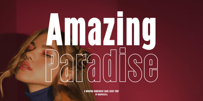 Amazing Paradise Condensed Sans Font Typeface inspired by the famous minimalist logo perfect for the purposes of designing templates, brochures, videos, advertising branding, logos, invitation, layout design, elegant crafting, beauty design and other What's Included : + Standard glyphs + International Accent + Works on PC & Mac + Simple installations Accessible in the Adobe Illustrator, Adobe Photoshop, Corel Draw. PUA Encoded Characters - Fully accessible without additional design software. Fonts include multilingual support Image used : All photographs/pictures/vector used in the preview are not included, they are intended for illustration purpose only. Thank You
 - Closeby by Papanapa,
$30.00 Closeby is friendly, cheerful, and extremely addictive! Closeby is a hand-drawn display font with more than 80 ligatures and a curious personality. Designed for big titles, its ultra-condensed style works as a unicase and fills the spaces with visually unique typographic compositions. Perfect for packaging, posters, food and drink menus, or book covers, its gravitational point varies between cases, and can be used in all uppercase, all lowercase, or mixing the two to obtain restless and sparkling results. Closeby has support for Western Europe and more than 65 languages.
 - Jughead PB by Pink Broccoli,
$16.00 Jughead PB is a classic vintage typestyle reminiscent of Archie Comics, and other retro comics and ads. Jughead PB began as a digitization of a film typeface known as Post Condensed by LetterGraphics, perfect for typesetting early children books, candy packaging, toy packaging, birthday invitations, and beyond. It's a bit like Cooper, while having a looser, more feel. Jughead is familiar, while being different, and a friendly feel without being too offbeat or eccentric. Try it out in your designs to take advantage of that deja vu connection.
 - Fuuld by That That Creative,
$20.00 Fuuld is a brutalist condensed modern display font that mixes organic and geometric, hand made, and digital production. it has a contemporary look perfect for logos, posters, branding, magazines, and avant garde social media accounts be it instagram, TikTok, or whatever. The cool thing about this font besides how cool it looks is that it uses less ink than a regular font in its weight. this makes it perfect for any environmentally conscious print projects. Try the font with no fill and a stroke for a whole new style.
 - ST Agitaciya by ShimanovTypes,
$9.00 Introducing a retro narrow grotesque called "Agitaciya" (Agitation). Bring back to the Soviet Era Agitation inspired by Soviet posters, movie titles and book covers. The letterforms are straight and condensed and come in 2 styles: uppercase and small caps alternatives. It has Extended LATIN and Extended CYRILLIC letters. "Agitaciya"created for titles, poster design, web design, branding and packaging works, illustrations, badges and other typography works. *ST Agitaciya supports 15+ languages: English, German, Spanish, Belarusian, Bosnian, Bulgarian, Croatian, Dutch, Norsk, Dannish, Macedonian, Polish, Russian, Serbian, Slovenian, Swedish, Ukrainian, Kazakh, and probably others )
 - Boot Camp JNL by Jeff Levine,
$29.00 Boot Camp JNL has the same roots as Jeff Levine's Condensed Stencil JNL, as they were both modeled from a set of vintage brass interlocking stencils made by the Stafford Manufacturing Company. The previous font was drawn from limited examples of the stencils seen in an online photograph, so a number of the basic characters had to be improvised. Since then, a nearly complete set was obtained and the alphabet and numerals are truer to the original design. Additionally, both Regular and Oblique versions of Boot Camp JNL are available.
 - Narrow Minded JNL by Jeff Levine,
$29.00 In the days of hand lettering, a common philosophy was "the problem creates the solution". Often times the layout artist would have to adapt the lettering style to fit the amount of copy on a line. A perfect example is during the early 1900s, when popular sheet music of the time almost seemed to be competing for how many words could be used within a song's a title. One such piece of sheet music offered up the tall, condensed and variable-width lettering found within Narrow Minded JNL.
 - Corso by Dominik Krotscheck,
$7.99 Corso is a clean condensed sans serif font family. It comes in upright, slanted and italic, in six weights each. It includes useful typographic features such as fractions, ligatures and case sensitive forms. Also included are double- or single-storey versions of a and g, you can switch via stylistic OpenType sets. Other letters with alternative forms accessible the same way are ß and ampersand. Corso works especially great for larger size uses such as signage, headlines or posters. But that doesn’t mean that it isn’t also useable for short texts.
 - Moncler by W Type Foundry,
$23.00 From the universe of horror fiction literature, Dracula, carrier of the undead curse, is one of the most exciting and inspiring characters. Inspired by the classic novel, Moncler sets to explore into the renaissance art movement, its shapes, and personality. The outcome is a Variable Font with big contrast and 220+ weights and widths, from Condensed to Expanded, and Light to Heavy. Moncler is a dramatic looking font, its main features are its alternative symbols and punctuation set, and small-caps as lowercase, perfect for more dramatic titles and graphic designs.
 - Centuria by Catopodis,
$35.00 Centuria is a sanserif humanistic family. Unlike many sanserif fonts, Centuria has modulated strokes and a moderate x-height. Centuria has a contemporary design with a soul of early grotesque fonts. Its slightly condensed letterforms and its short descenders allow a considerable amount of text per column. Centuria is very readable at small sizes! It is suitable for use in: newsletters, magazines, newspapers or just for any simple editorial application. Works very well in continuous text, short paragraphs or headlines. Provides a balanced and friendly texture. Match very well with Century.
 - Savior Sans by Sudtipos,
$39.00 Savior Sans is the third collaboration between Sudtipos and Vástago, this is a 9 weight typeface in 3 different widths, condensed, regular and expanded. Its simple design with open shapes offers a different texture that works in different uses, such as web design, packaging or branding. Savior Sans offers a contemporary look at traditional sans fonts, maintaining the identity in each of its weights. In its variable version, it allows multiple options when designing, adapting to different composition solutions. We hope you enjoy it and get the most out of it.
 - Europa Grotesque by Red Rooster Collection,
$49.00 Europa Grotesque is a condensed sans serif font family that was originally designed by Sam Ardell (TP) in the 1950’s for the Techni-Process Collection. Steve Jackaman (ITF) acquired the rights to the TP Collection in 1991 and produced Europa Grotesque in its digital form in 1994. Europa Grotesque has impressive impact at display and subhead sizes, and its geometric forms sustain that distinctiveness in both all-caps and lowercase. The family is flexible and freeform enough to support both a laid-back feel while still feeling tight and controlled.
 - CamingoDos by Jan Fromm,
$45.00 CamingoDos is characterised by tight shapes, elliptical curves, subtle contrast and a strong, humanistic appearance: attributes that were all applied with particular care and attention for legibility. It comes in a wide range of seven weights from ExtraLight to Black which makes it perfectly suitable for editorial and corporate design. Furthermore it now has two additional related families: CamingoDos SemiCondensed and CamingoDos Condensed. CamingoDos comes with a Pro version that offers a rich set of expert typographic features like small caps, ligatures, stylistic alternates, different figure sets, arrows, fractions and ordinals.