10,000 search results (0.043 seconds)
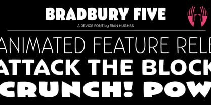
  1. Bradbury Five by Device, $39.00
    A stylish cartoon sans reminiscent of lettering by Harvey Kurtzman on early issues of Mad, or other casual mid-century types. The three widths give full versatility for expressive, customised headlines and layouts, while the lighter weights can be used for text. Conveys an approachable, light touch with style and finesse.
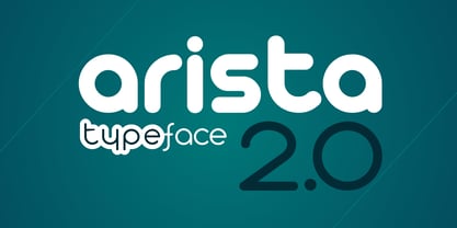
  2. Arista 2.0 by Zetafonts, $29.00
    Arista is a soft round font, perfect for 2.0 logos and contemporary headlines.
 Arista 2.0 is the definitive release of Arista, with extra characters and corrected kerning. 
It includes a light version, a extrafilled version for 2.0 style fat borders, and an Alternate version with a lot of style changes.
  3. Connectica by Tour De Force, $25.00
    Connectica, as the name itself refers, is joined monolinear script family. Comes in two weights, Light and Regular. Due to specific design, we added fake Swash OpenType feature for initial capital characters, where letters like E, F, U, V, W, Y lack joining line on the left side of the characters.
  4. Freaky Prickle by ParaType, $25.00
    Freaky Prickle script was written using ink and various wooden sticks and digitized/ Autor’s target was to create the spontaneous, light, flying script with dynamics and energy at the same time. Upright and cursive styles are available. The type was planned for use as headline in fiction and display matter.
  5. The font "Pea Bethany's Doodles" by Fonts For Peas is an embodiment of whimsy and casual artistry, captivating users with its playful and hand-drawn aesthetic. Created with a light-hearted touch, thi...
  6. Mariposa, as envisioned by its creator, Chloe, is a font that captures the essence of transformation and grace, much like its namesake - the butterfly (Mariposa in Spanish). This typeface is meticulo...
  7. Ah, the Abysmal Gaze font - a creation that seems to hail from the depths of an artist's most intriguing nightmares, or perhaps, their most whimsical dreams. Crafted by the hands and imaginative geni...
  8. As of my last update, the Damage™ Maim font by Clearlight Fonts stands as a striking example of typographic design that embodies a certain level of intensity and emotional expression rarely captured ...
  9. Orena - Personal use only
  10. Before the Rain - Personal use only
  11. Strawberry Bubblegum - Personal use only
  12. Basica v.2012 - Personal use only
  13. Djs symbols - Personal use only
  14. VIDEO PIRATE - Personal use only
  15. Drawing Blood - Personal use only
  16. Equ - Personal use only
  17. silent witness - Personal use only
  18. hooge 05_55 Cyr2 - Unknown license
  19. Same Same But Different - Personal use only
  20. Capital regular - Personal use only
  21. Lady Ice - SC - Unknown license
  22. Couldnt Be Bothered - Personal use only
  23. VTC ScreamItLoud - Unknown license
  24. VTC CoppaKroma - Unknown license
  25. Lady Ice Revisited - Unknown license
  26. VTCBadWhipit - Unknown license
  27. VTC AngoraChik - Unknown license
  28. VTC ScreamItLoudOutline - Unknown license
  29. VTCBadHangover - Unknown license
  30. VTCBadPlating - Unknown license
  31. VTC ScreamItLoudSliced - Unknown license
  32. VTC JoeleneHand - 100% free
  33. VTCBadDrip - Unknown license
  34. VTC Boseephus - Unknown license
  35. VTC Seeindubbledointriple - Unknown license
  36. VTCBadLuck - Unknown license
  37. VTC Boseephus - Unknown license
  38. Neo Contact by Linotype, $40.99
    Neo Contact is the typeface used on the packaging of Marlboro cigarettes (Marlboro “Reds,” the main line of the brand). The typeface is bold and condensed, designed in the Egyptienne style. Egyptienne types were first designed in the 1800s, as type founders - especially in the westward-expanding United States - began to dream up newer, bolder styles of letters for advertising usage. During the 1800s, it became increasingly important for businesses to set themselves, and their products, apart from competitors. This desire has remained with corporations, as well as with advertisers and designers, into the 21st century. In addition to cigarette packaging, Neo Contact (as part of Marlboro’s branding efforts) can be seen on numerous items, including Ferrari’s F1 racers, and at Formula 1 race tracks. The letters in Neo Contact are filled with personality. Their forms display two distinct weights of line, and the serifs are made up of tiny, strict slabs. Ball terminals round out the design. Neo Contact is a complete font, with a complete western character set. Typefaces in the Egyptienne style preceded the development and distribution of larger, crazier wood typefaces, but also share many similarities with these descendents. More traditional, text faces in the Egyptienne manner are also available from Linotype GmbH (e.g., Adrian Frutiger’s Egyptienne F). On the opposite end of the spectrum, we offer interesting, personality-filled wood display types, like Ponderosa as well.
  39. First Contact by SilverStag, $19.00
    I am First Contact, a super ultra condensed all caps font with support for over 90 languages and over 540 ligatures. I am a cutting-edge font that is both cool and chic, yet still personal. I am perfect for a wide range of design projects, from logos and branding to headlines and posters. I am the future of your typography. I am the font that will take your designs to the next level. I am bold, I am confident, and I am here to make a statement. I am not like other fonts. I am not afraid to be different. I am unapologetically myself. I am First Contact, and I am here to shake things up. I am the perfect font for anyone who wants to stand out from the crowd. I am the font for the bold, the brave, and the innovative. I am First Contact, and I am the font for the cool kids. I am the font for the trendsetters. I am the font for the people who want to be ahead of the curve. I am First Contact, and I am here to help you create something truly unique. I am more than just a font. I am a movement. I am a call to action. I am a challenge to be different. So what are you waiting for? Use me today!
  40. ION A by Setup, $19.95
    ION A is a part of the ION superfamily, which consists of 3 families: condensed (ION A), normal (ION B) and wide (ION C), each having a compelling range of 10 weights. Styles Thin to Black have 436 glyphs supporting more than 70 Latin-based languages and the three heaviest weights, named U1, U2 and U3 have 94 basic glyphs. ION glyphs are based on the classic 7-segment display, but for readability and aesthetic reasons, some alphabetic characters don't follow this matrix strictly. In case you like things in order, don't worry, there's a stylistic set that replaces all characters with their strict alternatives. The special characters, such as #, @ or % are composed of special segments, but are designed to fit seamlessly within the whole character set. ION was designed with the needs of contemporary graphic design in mind. There are alternative characters, discretionary ligatures, slashed zero, superior & inferior numbers, fractions, ordinals and three handy stylistic sets. The ten styles of ION A are accompanied with a special 11th style called Cells, allowing you to design a special underlying layer of black or outlined cells. This way you can create various containers and boxes for your text, highlight what's important or go wild and draw a space invader, using the cells as building blocks. Learn more about the OpenType features and Cells at www.urtd.net/ion.
Looking for more fonts? Check out our New, Sans, Script, Handwriting fonts or Categories
abstract fontscontact usprivacy policyweb font generator
Processing