10,000 search results
(0.033 seconds)
- Pelicano by Bruised Goods,
$18.00 PELICANO – A simple and friendly sans serif typeface. Handmade by Lauren Kilbane in sunny South Florida, USA. This font has a clean, organic feel that is perfect for marketing your favorite products. Use this font for: ads, album covers, apparel, cards, flyers, invitations, logos, menus, merchandise, packaging, signage, web, and more. -225 Glyphs Total: Uppercase, Lowercase, Numbers, Symbols, Punctuation, and Language Support. -Language Support: Danish, English, French, German, Irish, Italian, Portuguese, Spanish, Swedish, and Swiss German.
 - Billistone by Ergibi Studio,
$14.00 Billistone is a unique handwritten font. Its natural flow and easy signature style makes it perfect to use for logos, signatures, quotes, badges, labels, packaging design, blog headlines or any other design project. What's Included : Uppercase, Lowercase, Numerals & Punctuations, Ligature Multilingual support for the following languages : Cornish, Danish, Dutch, English, Estonian, Faroese, Filipino, Finnish, French, Galician, German, Icelandic, Indonesian, Irish, Italian, Norwegian Bokmål, Norwegian Nynorsk, Portuguese, Spanish, Swahili, Swedish, Swiss German. If you have any Question please message me.
 - Costyle by Ergibi Studio,
$19.00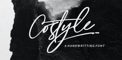 Costyle is a handwritten font. Its unique flow and easy signature style makes it perfect to use for logos, signatures, quotes, badges, labels, packaging design, blog headlines or simply use it in your next design project. multilingual support for the following languages : Cornish, Danish, Dutch, English, Estonian, Faroese, Filipino, Finnish, French, Galician, German, Icelandic, Indonesian, Irish, Italian, Norwegian Bokmål, Norwegian Nynorsk, Portuguese, Spanish, Swahili, Swedish, Swiss German. if you have any Question please Message Me. Big Thanks Ergibi Studio
 - Mano by Linotype,
$29.99Linotype Mano is a fresh new font from the Swiss designer Marco Ganz. Urgent and vital, the typeface suggests swift communication or the latest trends: spontaneous and informal, personal and individual. Ganz deliberately gave the characters a marked lean to the right, similar to that of quick handwriting. But Linotype Mano is not only nimble and quick, it also retains its legibility as a text font. Linotype Mano is as dynamic, brisk and casual as modern pop music. - Dilemma by Sudtipos,
$39.00 Dilemma is a sans/sans serif type system with 42 styles; it is inspired by the anonymous Polyphème, Cyclopéen and Extra Condensé designs from the early 1900s at the Peignot Fonderie. From these initial points of reference, Sudtipos went further and reimagined these projects for an actual use by blending them into a unique and complex type system. Dilemma is defined as ‘a situation in which a difficult choice has to be made between two or more alternatives, especially ones that are equally undesirable’ and that is exactly how we designed this font. We created a workhorse system where each style functioned well alone but would be more powerful when working as a team, pairing the sans styles with the serifs. Dilemma comes in 3 different widths and 7 weights in both the sans and the serif, ranging from the more economical yet legible condensed styles, to the opulent bold and expanded weights. Dilemma also contains 2 Variable Fonts. We imagine Dilemma being used in a limitless array of graphic projects including identity systems, digital platforms, public spaces, editorial design and beyond. Now the Dilemma is yours.
 - Config Rounded by Adam Ladd,
$25.00 Config Rounded is a condensed geometric sans with rounded corners. Config’s sibling, this typeface was influenced by geometric sans with circular forms on the tops and bottoms of characters, but the proportions have been condensed by incorporating straight sides for a design that is efficient yet friendly. Use it for a subtle softness that still looks modern and strong. With 10 weights, there are options to fit the need—black and thin for extreme uses and intermediates for more common needs.
 - Komrile by Issam Type,
$20.00 Komrile is a serif font combines a vintage look with a modern flair that give it a fancy and unique style. This awesome font is perfect for branding, logos, invitation, social media posts, photography, watermark and so much more. Komrile comes with regular, italic, Condensed and Condensed italic font styles. Uppercase & lowercase letters, numbers, punctuation, ligatures, alternates and multilingual support. OpenType Features Kerning Alternates Ligatures Stylistic Sets If you have any questions, please feel free to get in touch. Thank you
 - Lonely Cowpoke by 10four,
$20.00 Inspired by circus billboards, old west posters and torn paper constructs, "Lonely Cowpoke" is an oddity of bold graphic forms and cheerful curving lines. Revelling in its own quirky nature, this playful font lightens up any mood.
 - Station by Kimmy Design,
$15.00 Station is a bold headline typeface inspired by old Train Station type and graphics. It can be used in a modern and retro way, and its different patterns and styles give a unique look to any design.
 - Vogatron by Konstantine Studio,
$9.00 Get yourself ready to jump on into the future-verse realm with the VOGATRON. A solid-strong futuristic sans-serif display fonts with a wide range of possibilities in usage. We're not joking when we say wide. The variety of styles that comes in 15 weights, from Condensed to Expanded, will make you ask no more for another choice. Fortunately, we're living in the best moment in this era of Retro-Futurism trends, when the retro and futuristic vibes are running side-by-side in terms of visual implementation nowadays. Which makes VOGATRON are easier to play with on every occasion. Perfectly fit for futuristic branding, retro gaming vibes, posters, esport logo, visual branding, social media content, streaming overlay design, animation project, you name it.
 - Steelplate Gothic Pro by Red Rooster Collection,
$60.00 Steelplate Gothic Pro is a sans serif font family with traditional and drop shadow weights. It shares letterform similarities to conventional Copperplate Gothic families, but has no spur serif endings. Most of the original designs came from the Western Type Foundry when BB&S acquired it in 1918; all were cut by Robert Wiebking. It was recast in 1954 by American Type Founders (ATF). Steve Jackaman (ITF) designed and produced a digital version of the original single weight in 1997. In 2017, Jackaman completely redrew and expanded the family, adding entirely new condensed variants and true small caps. Steelplate Gothic Pro has a masculine, industrial feel, and works effortlessly at display and subhead sizes. It shares letterforms with its sans serif sister family, Barnsley Gothic.
 - Nockwell by Ronny Studio,
$19.00 Nockwell font - Psychedelic liquid decorative font, which works perfectly for bold titles, Festival posters, as a graphic element for bright T-shirt or hoodies, or even backgrounds! This weird and ugly font likes an experiment with spacing and different deformation. Please, don't hold back on your bold modern ideas! Features : - Lowercase & Uppercase ( All Caps ) - numbers and punctuation - Ligature - multilingual - PUA encoded Please contact us if you have any questions. Enjoy Crafting and thanks for supporting us! :) Thank you
 - Aeroport by Brownfox,
$45.00 Aeroport is a new typeface in the spirit of both German geometric sans serifs and Swiss neogrotesques. Its deliberately wide proportions and relatively short capitals account for the excellent way the type carries the line. Its short ascenders and descenders allow for very tight leading. When used in large point sizes, Aeroport reveals its industrial ancestry and its unconventional design: the somewhat unbalanced top of the lowercase a, the capital B that has deliberately not been compensated optically, the overly wide capital M. In smaller sizes the type creates a starkly different effect: its measured widths and low contrast make a text setting appear neutral and homogenous. This versatility is what makes Aeroport a multipurpose sans serif suitable for a wide variety of typographic applications. The family includes four weights with their italics and a monospased style. Character set includes an alternate lowercase a, two sets of figures and currency symbols, uppercase punctuation, and a set of arrows. Includes Latin and Cyrillic sets supporting over forty languages. Designed by Gayaneh Bagdasaryan & Vyacheslav Kirilenko, 2017.
 - DS Vanish - Unknown license

- DS SonOf - Unknown license

- Cursivo Saxonio by Intellecta Design,
$21.90 Cursivo Saxonio is a typeface inspired in the famous book The Case of Charles Dexter Ward, by H P Lovecraft. It shows better than I get with my studies the authentic "Insularis" or "Cursivo Saxonio" handlettering of the VIII and XI centuries used by some people in Britain. The text on the accompanying poster reads: “Corwinus necandus est. Cadaver aq(ua) forti dissolvendum, nec aliq(ui)d retinendum. Tace ut potes”
 - Seahawk JNL by Jeff Levine,
$29.00 The 1939 sheet music for “Sea Dreams” had its title hand lettered in an unusual Art Deco style that employed many unusual character shapes and widths within the font design. A teardrop-shaped ‘D’, a slightly off-kilter ‘S’ and a number of other interesting variations became the model for Seahawk JNL, which is available in both regular and oblique versions. The term “Seahawk” is another name for an Osprey.
 - Thorowgood Wide by Wooden Type Fonts,
$20.00 One of the original Clarendon types, an English design, here derived from a specimen taken from an American foundry, no identifying marks. With a tall x-height, wide version, unlike more traditional Clarendons, not a square serif but bracketed. Unique to this Clarendon are the rounded openings at the points where the horizontal and vertical stems meet in the capital B, D, P and R, not common in other Clarendons.
 - Bindlestiff NF by Nick's Fonts,
$10.00Schmallfette Binder-Style, designed by Joseph Binder and released by D. Stempel AG in 1959 provided the template for this upright, set-tight display face. Its rather unconventional placement of the crossbars on the f and t is a subtle attention-grabber, and true to Binder's original design. Both versions include the complete Latin 1252, Central European 1250 and Turkish 1254 character sets, as well as localization for Moldovan and Romanian. - Madjestic Comfort Script by Fauzistudio,
$40.00 Introducing Madjestic Comfort font duo, a contemporary pair of scripts and serif fonts. The term Madjestic is not a mistake, but it was an accent game of an area in asian, by adding "d" before "j". With a didot style serif font and flowing script companion, Madjestic Comfort offers beautiful typographic harmony for a variety of design projects, including logos & branding, wedding design, social posting media, advertising & product design.
 - Botanika by Suitcase Type Foundry,
$75.00The motivation behind the Botanika family was the desire to create a text version of the Magion font. Although the glyphs were originally drawn using the same proportions, they were subsequently adjusted in order to improve legibility. The font retains certain characteristics of the original, such as the top serif on the “i” and the similar bottom serif on the “l”. Lowering the x-height lent the family a new and original character. The italics are slightly more condensed than the regular weight, without losing the austere grace of the regular weight. They are distinct enough to stand out in the text. Alternative characters can be selected to spice up the setting, or conversely to subdue headlines by using more traditional letter shapes. Small caps are available as well. The monospace version is a 10 pitch font: at 10 pt type size 10 characters fit exactly into the width of one inch, meaning that individual letters Take up 60 % of an em in width. The family is provided with matching italics. The modifications made during the OpenType transition included the addition of missing glyphs to cover the Suitcase Standard set and adding relevant kerning pairs, plus redrawing the bold weight and the accents. Despite its lower x-height, the font is often used for setting medium to long texts. Its slightly archaic feel lends text set in Botanika an air of novelty, which may be the reason why it is so popular in extensive corporate identity systems. If you are looking for an alternative to the cold, neutral sans serifs which are so popular these days, Botanika is the perfect choice. - Military Scribe by Three Islands Press,
$39.00 The 10th Regiment of Foot is a British military unit raised more than three centuries ago—and perhaps most famous in the U.S. for seeing action on American soil during the Revolutionary War in the Battle of Lexington and Concord and the Battle of Bunker Hill. Military Scribe is modeled after the compact, utilitarian script on the mid- to late-1770s muster rolls of the Tenth of Foot. I incorporated the work of at least three separate scribes, merging their neat old penmanship into a legible disconnected cursive. Perhaps the most versatile of all our vintage handwriting fonts, Military Scribe might faithfully reproduce antique letters, labels, lists, or just about any document of the period. OpenType features include multiple stylistic sets, scores of historical, contextual, and discretionary ligatures (including nine terminal “d”s) lining and old-style figures, ink blots, cross-outs, and full support for Central and Eastern European alphabets—more than 1,000 glyphs in all.
 - Floki by LetterMaker,
$39.90 Floki is a contemporary condensed sans serif with sixteen styles ranging from extralight to extrabold and accompanying italics. The amount of styles, condensed proportions and large character set make Floki suitable for various uses such as infographics, packaging, branding, advertising and editorial design. Floki’s aesthetics are distinctly modern and they have a hint of softness which comes from sublty curving the diagonal strokes in letters such as A and V. This feature really shines when you set text in tightly set caps as big as possible. Stylistically Floki leans more to the humanist sans serif but it has a flavour of geometry in its shapes as well. The result of this combination of features is a highly usable typeface with a clear voice of it's own. All styles feature small caps and multiple sets on numerals including lining figures, old style figures, tabular figures, small cap figures, numerators, denominators, superiors, inferiors and fractions. Floki has latin extended character set making it well suited for multilingual typography.
 - Bia by Bykineks,
$9.00 Bia Superfamily is a new font creation designed with transitional serif classification, consisting of 100 font styles. It is supported by 85 languages of the Western/Eastern Europe and Turkish region, making it suitable for global use. In addition, Bia Superfamily has features such as numerator, denominator, inferior, modern, and old-style figures. Bia Superfamily features four different classifications in both serif Low & High (Contrast) and sans-serif Low & High (Contrast) variations, including ultra-condensed, condensed, regular, expanded, and ultra-expanded. With its diverse range of font styles, Bia Superfamily offers versatility and flexibility for use in various industries such as skincare, perfume, jewelry, stationary office, newspaper, cover book, web design, sign airport, sign hotel, wedding invitation, and text. Bia Superfamily is the perfect font choice for those who want to showcase a luxurious and elegant feel in their designs. Its professional and elegant characteristics make it stand out and attract attention to any design.
 - Creolia by Milan Pleva,
$18.00 Creolia is a bold rounded serif typeface in modern and classy style. OpenType features include old style figures and ligatures. Creolia is ideal for headlines, headers, logos, labels, packaging, postcards, presentations, magazines, invitations, etc. Features: Basic latin alphabet A-Z 56 Ligatures & Alternates 112 Accented characters Numbers, Punctuation, Currency, Symbols, Math symbols & Diacritics Old style figures Enjoy Creolia!
 - Cholens by Mevstory Studio,
$20.00 Cholens is a bold, rounded script typeface in a modern and classy style. OpenType features include old style figures and ligatures. Cholens is ideal for headlines, headers, logos, labels, packaging, postcards, presentations, magazines, invitations, and more. Features: Basic latin alphabet A-Z Ligatures & Alternates Accented characters Numbers, Punctuation, Currency, Symbols, Math symbols & Diacritics Old style figures
 - Senlot Didone by insigne,
$35.00 Senlot Didone enchants with this fresh and cutting-edge sequel. It’s a modern interpretation of Senlot that says glamor and seduction. The typeface adds to the original high contrast sans serif with it’s modern high contrast shape, and features a new beauty with the distinctive sinuosity of contrasting forms. Senlot Didone is the sleek, serifed, high contrast follow-up to Senlot, and it's low contrast sequel, Senlot Sans. A serif typeface suitable for text and display work joined in 2019. Senlot Didone includes a wide range of OpenType features, including titling capitals, superscripts and subscripts, and oldstyle figures. Senlot Didone is composed of 3 widths: Condensed, Normal, and Extended, with 9 weights and their italics for a total of 54 fonts with more than 800 glyphs. Senlot Didone is a great display typeface for logos, branding, packaging, and advertising. With its broad palate of options, the font covers over 72 Latin-based languages. Dress your text in any of nine separate styles from Thin to Bold. With Senlot Didone, there's no need to compromise on another font with fewer features. Simple, elegant, and versatile, Senlot Didone now makes perfect more possible. Take the show by storm with this high contrast serif. The seductive figure of Senlot Didone is here to entice your viewer.
 - Lankie by Gerald Gallo,
$20.00 Lankie is a clean, contemporary, geometric, condensed sans serif font. The font is ideal for headlines, titles, branding, small blocks of text or wherever a fresh font is desirable.
 - Linotype Freytag by Linotype,
$29.99Linotype Freytag is a condensed display face with simple, geometric shapes. With its highly readable and trendy letterforms, it is perfect for flyers, advertising, packaging, posters and magazine headlines. - Hand Cut Stencil JNL by Jeff Levine,
$29.00 Hand Cut Stencil JNL is a condensed Roman typeface modeled from an antique tin stencil hand cut for shipping merchandise. The design is available in regular and oblique versions.
 - Table Wood JNL by Jeff Levine,
$29.00 Concave Tuscan Extra Condensed is a classic wood type sans serif design that is the basis for Table Wood JNL, which is available in both regular and oblique versions.
 - Convicted JNL by Jeff Levine,
$29.00 Convicted JNL is a condensed, chamfered sans serif type design inspired by opening credits from the 1940 film of the same name – available in both regular and oblique versions.
 - Lucidity by DogHead Studio,
$20.00 Lucidity is a condensed, handwritten font with emphasis on texture and default wide spacing. This makes it a versatile font for display, medium amounts of text, and T-Shirts.
 - Newshawk JNL by Jeff Levine,
$29.00Jeff Levine's Newshawk JNL emulates the tall, condensed headline fonts often used years ago when an urgent story broke and a newspaper rushed an "Extra" edition to the streets. - Mediator by ParaType,
$30.00 Mediator is a balanced contemporary sans serif typeface that performs well both in display sizes and body text. The family contains 30 fonts in 3 widths: 8 romans with matching italics, of slightly extended proportions, from Thin to Black; 7 narrow and 7 condensed, from Thin to ExtraBold. The character set in normal upright faces was expanded to include small caps and all faces include old style figures. The typeface was designed by Manvel Shmavonyan with the participation of Alexander Lubovenko and released by ParaType in 2016.
 - Dez Boulder by Dezcom,
$39.00 A Bold Display Family in Three Personalities: ego, id, and alter. Dez Boulder works like a character actor, presenting the author’s lines but not with the deadpan delivery of a news reporter. Boulder develops the role, adding meaning through facial expression, gesture, and body language. The Dez Boulder family of display faces acts in a supporting role to give meaning to message and context to content. It is a very bold face, not understated. Each of its three personalities (and their sub-personalities) have a different timbre to speak the nuance of your message in a bold voice. Dez Boulder averages more than 800 glyphs per style with uppercase, lowercase, small caps, proportional lining figures, small cap figures, superiors, inferiors, fractions, stylistic sets, alternates, ordinals, case specific punctuation, and more. It has a full range of diacritics and covers all European languages using the Latin script.
 - Widy by Pasternak,
$12.00 Wide font family is a geometric sans serif font, which features 9 styles. It’s based on the Futura developed by Paul Renner and neo sans-serif fonts. At the same time, it has significant stylistic differences. Massive lengthy letters are among the unique features of this font. They will help you come up with the perfect composition. The letters have optical compensation, while a circle is the main figure of the fonts. Due to wide fonts, your project will have modern and fresh design. The composition will keep its contrast regardless of a background you’ve chosen. The Widy family includes 9 styles: Thin, Extra Light, Light, Semi Light, Regular, Medium, Semi Bold, Bold and Extra Bold. Each of them also has Italic variation. The fonts are perfect for both graphic design projects (posters, brand identities, logotypes) and simple interface design, which needs the necessary style.
 - Core Sans GS by S-Core,
$29.00 The Core Sans GS Family is a rounded version of Core Sans G and a part of the Core Sans Series such as Core Sans N, M, A, E, D. Core Sans GS is constructed of straight, circular or square shapes. These geometric shapes are inspired by classic geometric sans (Futura, Avenir, Avant Garde etc.). Every stem is a rectangle or a straight line and every letter, lowercase or uppercase, seems to be in perfect geometric form and even weighted. The small x-height makes readability clean and clear. Core Sans G can be used equally well in headings or in body copy. The Core Sans GS Family consists of 9 weights (Thin, Extra Light, Light, Regular, Medium, Bold, Extra Bold, Heavy, Black) with maching Italics. It also includes alternate characters (a,g,t) and a bunch of ligatures. The Core Sans GS provides a wide range of character sets to support (Cyrillic, Central and Eastern European characters) and advanced typographical support with features such as proportional Figures, tabular Figures, numerators, denominators, superscript, scientific Inferiors, subscript, fractions, standard ligatures, discretionary ligatures and stylistic alternates. Core Sans G is an ideal font family for use in magazines, web pages, screens, displays, and so on.
 - Gigantic by Eclectotype,
$40.00 Gigantic, as the name suggests, should be set large. The type is spaced "tight-not-touching" so you really don't want to go under 72 points. The font is intended to be used to create an impact - a chunk of text will have a graphic aesthetic while maintaining legibility. Because it's so bold, it's a great face to use with images showing through. Ideal for magazine headlines and posters, not so ideal for setting novels.
 - Expanse by Alfareaniy,
$500.00 Expanse is a retro futuristic typeface. The font has a bold and big vibe and mixes sharp and round corners, kind of like the very old sci-fi movie titles. Expanse includes uppercase multilingual letters, numbers and punctuation.

