10,000 search results
(0.288 seconds)
- Boltz by Designova,
$10.00 Boltz is a simple & cute sans-serif typeface perfect for headlines, big text, branding, logotypes & display usage. It can be excellent choice for creating outstanding logos, promotional content and marketing graphics that can bring uniqueness and freshness. Boltz comes with a highly creative handmade collection of Stylistic Alternatives for 14 uppercase letters which makes it easy to create unique monograms, logo and identities with these combinations. Please see the examples shown above to get an idea about the capability of this typeface. The typeface comes with Extended Latin character sets including Western European, Central European and South Eastern European character sets. Boltz comes with single weight but 6 variants (Regular, Italic, Outline, Outline Italic, 3D and 3D Italic).
 - Istoria by Hooper Type,
$12.00 New foundry on the block, Hooper Type, kicks off it's catalogue with a versatile, story-telling serif font. With a love of the magical and a yearning for adventure, Istoria pushes away from the static, drawing in whisps and whirls that entice and excite, without distracting. Unassuming in it's long form, with delicate strokes that draw the eye, it commands attention when used in short punchy titles, or set in caps. Istoria (meaing both history and story in Greek) delights in having unusual curves, curvy straights and twisty feet which emulate those adventures and myths from days gone by. Type shouldn't interfere with the content, but it absolutely can enhance it. Hope you enjoy it!
 - Lektorat by TypeTogether,
$35.00 Florian Fecher’s Lektorat font family is one for the books, and for the screens, and for the magazines. While an editorial’s main goals are to entertain, inform, and persuade, more should be considered. For example, clear divisions are necessary, not just from one article to the next, but in how each is positioned as op-ed or fact-based, infographic or table, vilifying or uplifting. From masthead to colophon, Lektorat has six concise text styles and 21 display styles to captivate, educate, and motivate within any editorial purpose. Magazines and related publications are notoriously difficult to brand and then to format accordingly. The research behind Lektorat focused on expression versus communication and what it takes for a great typeface to accomplish both tasks. In the changeover from the 19th to 20th century, German type foundry Schelter & Giesecke published several grotesque families that would become Lektorat’s partial inspiration. Experimentation with concepts from different exemplars gave birth to Lektorat’s manifest character traits: raised shoulders, deep incisions within highly contrasted junctions, and asymmetrical counters in a sans family. After thoroughly analysing magazine publishing and editorial designs, Florian discovered that a concise setup is sufficient for general paragraph text. So Lektorat’s text offering is concentrated into six total styles: regular, semibold, and bold with their obliques. Stylistic sets are equally minimal; an alternate ‘k, K’ and tail-less ‘a’ appear in text only. No fluff, no wasted “good intentions”, just a laser-like suite to focus the reader on the words. The display styles were another matter. They aim to attract attention in banners, as oversized type filling small spaces, photo knockouts, and in subsidiary headings like decks, callouts, sections, and more. For these reasons, three dialed-in widths — Narrow, Condensed, and Compressed — complete the display offerings in seven upright weights each, flaunting 21 headlining fonts in total. If being on font technology’s cutting edge is more your goal, the Lektorat type family is optionally available in three small variable font files for ultimate control and data savings. The Lektorat typeface was forged with a steel spine for pixel and print publishing. It unwaveringly informs, convincingly persuades, and aesthetically entertains when the tone calls for it. Its sans serif forms expand in methodical ways until the heaviest two weights close in, highlighting its irrepressible usefulness to the very end. Lektorat is an example of how much we relish entering into an agreed battle of persuasion — one which both sides actually enjoy.
 - Zombie - Unknown license

- Nuncio - Unknown license

- Comaro - Personal use only

- Inscruta - Personal use only

- Gael - Personal use only

- BeesWax - Personal use only

- St Croce Pro by Storm Type Foundry,
$29.00 Our eye is able to join missing parts of worn letters back into undisturbed shapes. We tend to see things better than they really are. Thanks to this ability we ignore faults of those close to us as we can’t accept the fact that every once in a while we convene with an impaired entity. Typography is merely a man’s invention, hence imperfection and transience, albeit overlooked, are its key features. This typeface is based on worn-out letterings on tombstones in the St. Croce basilica in Florence. For hundreds of years, microscopic particles of marble are being taken away on the soles of visitors: the embossed figures become fossilised white clouds, fragments of inscriptions are nearing the limits of legibility. First missing are thin joins and serifs, then the main strokes finally slowly diminish into nothingness over time. Unlike an archaeologist, for whom even completely featureless stele is valuable, the typographer must capture the proper moment of wear, when the type is not too “new” but also not too much decimated. Such typeface is usable for catalogue jackets, invitations and posters. Calligraphy is a natural human trait. To write is to create characters of reasonable beauty and content, according to the nature of the writer. A natural characteristic of architecture is to create an aesthetic message very similar to the alphabet. A doric column, the gabled roof, the circle of the well plan: these are the basic shapes from which all text typeface is derived.
 - Bookable Sans by Stiggy & Sands,
$24.00 A Sans Serif Family with a few unique relatives Our Bookable Sans Family was inspired by a lettering specimen from “Letters and Lettering” by Carlyle & Oring, but you'll find the inspiration has come a long way, baby. From its original reference of displaying a standard width and weight, to the two words showing a light narrow and a heavy wide, this friendly utilitarian display text face has grown to include three width families, with six weights from light to black each. The outliers of the family are Bookable Mondo: an uber heavyweight wide style exuding all brute power in an all-caps form, and Bookable Noir: a lightweight and narrow style with many unique alternate letterforms and ligatures that spoof film noir titling, but also goes off the rails having fun. Opentype features for the traditional families include: - Full set of Inferiors and Superiors for limitless fractions. - A small collection of f-based Ligatures. - Tabular & Proportional figure sets. - Ordinals. - Approx. 419 characters. Opentype features for Bookable Mondo include: - Full set of Inferiors and Superiors for limitless fractions. - Ordinals. - Approx. 391 characters. Opentype features for Bookable Noir include: - Full set of Inferiors and Superiors for limitless fractions. - Five Stylistic Alternate Sets. - Sixty-six unique ligatures. - Ordinals. - Approx. 701 characters.
 - Zephyrus Cyber by Ferry Ardana Putra,
$19.00 Introducing Zephyrus, our new condensed modern cyber font that's designed to take your designs to the next level! With its unique condensed squared feel, this font is perfect for anyone looking to add a modern and futuristic touch to their work. But we didn't stop there - we've also included a rounded version of Zephyrus, which softens the edges and provides a more approachable feel. This versatility means that you can use Zephyrus for a wide range of design projects, from logos and branding to websites and digital presentations. In addition, Zephyrus comes equipped with numerals, symbols, punctuation, and foreign language support, making it a versatile and functional font that's suitable for global projects. Whether you're creating a tech-based project or looking to add a futuristic touch to your branding, Zephyrus has you covered. Zephyrus is a great font for modern and futuristic designs. Its unique condensed squared feel and rounded version make it a versatile choice for a wide range of design applications. Here are some perfect use cases for Zephyrus font: Technology-based websites and apps: Zephyrus is an excellent choice for designing websites and apps that focus on technology and innovation. Its modern and futuristic design complements the content of these websites and apps and creates an atmosphere of innovation. Corporate branding: Zephyrus can be used to create a modern and innovative corporate branding identity for companies in the technology and innovation sectors. It is perfect for creating logos, letterheads, business cards, and other branded materials. Advertising campaigns: Zephyrus is perfect for advertising campaigns that require a futuristic or high-tech look and feel. It can be used in print ads, online ads, and other promotional materials to create a sense of innovation and modernity. Product packaging: Zephyrus can be used to create packaging designs for technology-based products. Its modern and futuristic design can help these products stand out on shelves and create an impression of innovation and quality. Presentations: Zephyrus is a great choice for creating compelling and modern presentations. Its unique design can add an element of creativity and innovation to your presentations and help you stand out from the competition. Video game design: Zephyrus can be used to create a video game design that requires a futuristic or cyberpunk style. Its unique design can help create an immersive gaming experience for players. In conclusion, Zephyrus is the perfect choice for anyone looking for a condensed modern cyber font that's both versatile and functional. With its squared feel, rounded version, and support for numerals, symbols, punctuation, and foreign languages, Zephyrus is a font that's sure to take your designs to the next level! Zephyrus features: A full set of uppercase Numbers and punctuation Multilingual language support PUA Encoded Characters OpenType Features Cyber Style +278 Total Glyphs ⚠️To enable the OpenType Stylistic alternates, you need a program that supports OpenType features such as Adobe Illustrator CS, Adobe InDesign & CorelDraw X6-X7, Microsoft Word 2010, or later versions. There are additional ways to access alternates/swashes, using Character Map (Windows), Nexus Font (Windows), Font Book (Mac) or a software program such as Pop Char (for Windows and Mac). ⚠️For more information about accessing alternatives, you can see this link: http://adobe.ly/1m1fn4Y ——— 🔑Important tutorial from the author: Tutorial for Mollusca font trio: https://lnkd.in/d984CQD6 How to use Midway | Retro Script Font on illustrator: https://lnkd.in/eusbZd7s How to use Midway | Retro Script Font on Photoshop: https://lnkd.in/evsYrwgs How to use Hellfire Flames | Death Metal Font on Photoshop: https://www.youtube.com/watch?v=Z0MSBYzl9EM&t=35s How to use Rusted Sabbath | Black Metal Font Font on Photoshop: https://www.youtube.com/watch?v=_BTTgnSszsM&t=6s How to use Black Dread | Death Metal Font on Photoshop: https://www.youtube.com/watch?v=cKoSvIEbdZ4 ——— 🔥 Thank you for purchasing our product, hope you like it and have fun with our product. If you have any queries, questions, or issues, please don't hesitate to contact us directly. If you are satisfied with our product, please give 5 stars rating. ——— Happy Designing...😊
 - Peter Schlemihl - Unknown license

- Tripper Pro by Underware,
$50.00 Tripper is a rock-hard display font family. The six styles – from Light to Black – of this robust stencil typeface will assure your text grabs all the attention it can get. Instead of settings large amount of texts, just use this font for a small amount of words. Or even better: just one word. But most importantly: make it really, really, really big. The lightest weight is pretty condensed, and slowly expands when the weight increases. The bridges – essential to a stencil font – have the same width across all styles, so you can safely apply all styles in the same size without the risk of stencils falling apart. Due to the absence of curves throughout the whole family, Tripper is suitable for more limited, industrial applications too. Tripper comes in several flavours. Next to the basic flavour, there is a stencil family which automatically creates borders around every letter, word or line. Then there is Tripper Rough, a textured version with that intelligent random, grungy look. Together with the previously released multi-colour font Tripper Tricolor, the complete family consists of 24 styles. Tripper is equipped with a bunch of OpenType features, like different figure styles, fractions, superiors, etc. But if all the OpenType ding-dong is not enough for you, just try the ornaments. The separate ornament font comes with icons, indicators, manicules, banderoles and patterns.
 - Address Sans Pro by Sudtipos,
$39.00 History is always in sight; it is constantly being reconsidered and reformulated in the context of now. We see approaches to art, fashion, textiles, homewares, furnishings … not to mention music, graphics and everything else that culturally enriches our daily lives, revisited and made anew for today. Address Sans indulges in the spirit and aesthetics of mid-century Modern – Italian industrial design, sleek coffee makers, stylish cars, seductive jazz pressed on vinyl – with a charm and charisma that defies time. It evokes history but is decisively created for today. Its design, in reality, is rooted in the condensed structure and block modulation of early 1950s German lettering intended for use in street signage, but when we started to work on the various weights and widths, the result was a set of fonts in a style similar to the typographic work developed by Butti and Novarese in the 60s. The multitude of potential applications for Address Sans then became clear. In a range of 3 widths and 8 weights each, Address Sans includes little verses, true italics, small caps and numerous alternative signs for a total of 48 fonts. The result is a functional typeface that is effortlessly seductive, with geometric features and design details that ooze cool, and take it away from mere reinterpretation towards typographic forms that adapt perfectly for contemporary use.
 - ION A by Setup,
$19.95 ION A is a part of the ION superfamily, which consists of 3 families: condensed (ION A), normal (ION B) and wide (ION C), each having a compelling range of 10 weights. Styles Thin to Black have 436 glyphs supporting more than 70 Latin-based languages and the three heaviest weights, named U1, U2 and U3 have 94 basic glyphs. ION glyphs are based on the classic 7-segment display, but for readability and aesthetic reasons, some alphabetic characters don't follow this matrix strictly. In case you like things in order, don't worry, there's a stylistic set that replaces all characters with their strict alternatives. The special characters, such as #, @ or % are composed of special segments, but are designed to fit seamlessly within the whole character set. ION was designed with the needs of contemporary graphic design in mind. There are alternative characters, discretionary ligatures, slashed zero, superior & inferior numbers, fractions, ordinals and three handy stylistic sets. The ten styles of ION A are accompanied with a special 11th style called Cells, allowing you to design a special underlying layer of black or outlined cells. This way you can create various containers and boxes for your text, highlight what's important or go wild and draw a space invader, using the cells as building blocks. Learn more about the OpenType features and Cells at www.urtd.net/ion.
 - Agatized Formal by ULGA Type,
$25.00 Agatized Formal is a chunky stencil typeface with slightly condensed letterforms and tight spacing. Designed primarily for display use, it’s ideal for posters, logos, advertising, book cover designs or small chunks of text such as pull-out quotes. It exudes authority without taking itself seriously, like a plump jolly uncle in charge of a brass band. Agatized Formal is a big, bold typeface with a charismatic presence that commands attention – in a friendly way, of course. But what really makes this typeface come alive is its arsenal of alternative characters and ligatures. There is a saying: Use sparingly. Whoa! Not here, no, no, no. Make your Glyphs palette earn its money. Flex your OpenType muscles: get stylized, contextualized, indulge in some ligaddiction. This typeface is a peacock that likes to put on a show, spread its plumage and strut around in all its blazing glory. Agatized, according to Wiktionary, means: A living thing converted into the form of agate; fossilized. I felt the name suited the solid, almost rock-like letterforms, but most of all I just wanted a typeface name that began with the letter A. Although Agatized Formal is a single-weight typeface it has a sibling, Agatized Informal, an older, more casual brother, rougher round the edges with craggy good looks and an altogether more jaunty style.
 - ION C by Setup,
$19.95 ION C is a part of the ION superfamily, which consists of 3 families: condensed (ION A), normal (ION B) and wide (ION C), each having a compelling range of 10 weights. Styles Thin to Black have 436 glyphs supporting more than 70 Latin-based languages and the three heaviest weights, named U1, U2 and U3 have 94 basic glyphs. ION glyphs are based on the classic 7-segment display, but for readability and aesthetic reasons, some alphabetic characters don't follow this matrix strictly. In case you like things in order, don't worry, there's a stylistic set that replaces all characters with their strict alternatives. The special characters, such as #, @ or % are composed of special segments, but are designed to fit seamlessly within the whole character set. ION was designed with the needs of contemporary graphic design in mind. There are alternative characters, discretionary ligatures, slashed zero, superior & inferior numbers, fractions, ordinals and three handy stylistic sets. The ten styles of ION C are accompanied with a special 11th style called Cells, allowing you to design a special underlying layer of black or outlined cells. This way you can create various containers and boxes for your text, highlight what's important or go wild and draw a space invader, using the cells as building blocks. Learn more about the OpenType features and Cells at www.urtd.net/ion.
 - Kubrick by Quadrat,
$25.00 Kubrick is an experiment in extremes. The Light font is very tall and slender, the Black font is very massive, and Kubrick's slender counters push some of its glyphs to the edge of recognition. The thin counters and negative spaces also give text set in Kubrick a definite visual sparkle, especially in all-uppercase settings. Because of its extreme letterforms, Kubrick is recommended only for large display use. The default letterspacing is set fairly wide to keep text legible. Kubrick was a double-experiment. One part of it was to see how heavy and massive a typeface I could make while still keeping it legible. The other part was to develop a Multiple Master font. Multiple Master fonts were a format developed by Adobe that allowed the user to change things like the weight and width of a typeface. Monollith started as just such a Multiple Master typeface, but when Adobe discontinued the Multiple Master format, I stopped work on the typeface. Later I decided to continue work on it, but as five separate font weights: Light, Medium, Bold, ExtraBold and Black. Very rectilinear letterforms with extremely narrow counters and negative spaces. The five fonts go from very thin and condensed to very heavy and extended. Use in large display settings where unornamented high visual impact is desired.
 - ION B by Setup,
$19.95 ION B is a part of the ION superfamily, which consists of 3 families: condensed (ION A), normal (ION B) and wide (ION C), each having a compelling range of 10 weights. Styles Thin to Black have 436 glyphs supporting more than 70 Latin-based languages and the three heaviest weights, named U1, U2 and U3 have 94 basic glyphs. ION glyphs are based on the classic 7-segment display, but for readability and aesthetic reasons, some alphabetic characters don't follow this matrix strictly. In case you like things in order, don't worry, there’s a stylistic set that replaces all characters with their strict alternatives. The special characters, such as #, @ or % are composed of special segments, but are designed to fit seamlessly within the whole character set. ION was designed with the needs of contemporary graphic design in mind. There are alternative characters, discretionary ligatures, slashed zero, superior & inferior numbers, fractions, ordinals and three handy stylistic sets. The ten styles of ION B are accompanied with a special 11th style called Cells, allowing you to design a special underlying layer of black or outlined cells. This way you can create various containers and boxes for your text, highlight what’s important or go wild and draw a space invader, using the cells as building blocks. Learn more about the OpenType features and Cells at www.urtd.net/ion.
 - Marlin by Komet & Flicker,
$15.00 NEW! Includes a set of 42 connecting word character glyphs along with 23 alternate lowercase glyphs. MARLIN is a condensed vintage style serif display font that works great for logos, packaging, branding, menus, advertising, and posters. The lowercase letter set has different letterforms allowing you to mix and match upper and lowercase for a variety of looks. In Illustrator, the custom connecting word set can easily be accessed in the "Type → Glyphs" panel and in Photoshop through "Type → Panels → Glyphs Panel".
 - Corbert Compact by The Northern Block,
$- A compact geometric sans serif typeface influenced by Bauhaus and the early modernist era. Precise shapes are optically adjusted to create a clear, natural typeface with excellent legibility across various applications. Corbert compact is part of the popular Corbert type system; other widths include Normal, Condensed and Wide. Details include over 590 characters; OpenType features consist of five variations of numerals, including inferiors, superiors, fractions, alternative lowercase a, e and g, and language support covering Western, South, and Central Europe.
 - Cover Sans by Latinotype,
$26.00 Cover Sans is a humanist geometric typeface with an orthogonal structure, which provides stability when composing a text. Open shapes and low x-height give this font balance and makes it an air-breathing typeface. Cover Sans is a stable and strong condensed font that works well for magazines and publishing. The strong personality of its alternative characters gives the font a modern and elegant style, which makes it ideal for use on annual reports as well as on business logotypes.
 - Waika by Hazztype,
$16.00 Waika is a modern sans serif font that seamlessly blends a rounded aesthetic with condensed proportions, resulting in a contemporary and versatile typeface. Its smooth curves and absence of serifs contribute to a clean and friendly appearance, making it suitable for a wide range of applications. The deep inktrap adds a touch of sophistication and uniqueness to each character, ensuring legibility and visual appeal in various design contexts. Waika is a dynamic choice for projects seeking a balance between modernity and approachability.
 - Marselind by Josstype,
$18.00 Marselid Serif. Marselid Serif.is a Serif Display Font with a modern, classy, fun, unique and versatile style. It looks amazing at display size and is easy to read in text size. This font also has lots of unique alternatives and binders that will make for stunning design projects. Marselid Serif. works well for branding projects, logos, wedding designs, social media posts, advertisements, product packaging, product designs, labels, photography, watermarks, invitations, or any project you are working on. File Includes: Regular Slant Outline Condensed
 - Royal Stencil JNL by Jeff Levine,
$29.00 An image spotted on the internet of a brass shipping stencil for the Royal Quality Brand (for the John H. Fitch Company of Youngstown, Ohio – a coffee and spice merchant). The lettering style for “Royal Quality” was a hand-cut, condensed, slightly flared sans serif with various character flourishes, giving the letters a stylish, somewhat regal look. Expanding on this idea, a full character set was developed and redrawn digitally as Royal Stencil JNL, which is available in both regular and oblique versions.
 - Gentlysoftly by Maulana Creative,
$11.00 Gentlysoftly is a characteristic signature font of Maulana creative, with clean monoline storke, slanted, condensed and fun character. It has Opentype features of ligatures character, To give you an extra creative work. Gentlysoftly signature font support multilingual more than 100+ language. This font is good for logo design, Social media, Movie Titles, Books Titles, a short text even a long text letter and good for your secondary text font with sans or serif. Make a stunning work with Gentlysoftly signature font. Cheers, MaulanaCreative
 - Mellodyst by Maulana Creative,
$16.00 Mellodyst is a signature script font, with thin condensed stroke and fun characters. It has Opentype features of ligatures and some lowercase alternates, makes it a perfect choice for branding and digital designs. Use this font for logos, social media, websites, blogs, instagram, social media, business cards, branding, and more! Mellodyst font support multilingual more than 100+ language. and good pair for your secondary text font with sans or serif. Make a stunning work with Mellodyst signature script font. Cheers, MaulanaCreative
 - Yassitf by Ingrimayne Type,
$6.00 Yet another san serif typeface, Yassitf is a generic sans, a font meant to blend in rather than stand out. It has little contrast and is almost monoline. It includes three widths: condensed, narrow, and regular. The widths have four to six weights: ultra thin, thin, light, plain, bold, and extra bold. Further, each width and weight combination has both upright and italics styles. The thirty fonts in the family contain several open-type features, including both proportional and tabular (monospaced) numbers.
 - Dexa Pro Variable by Artegra,
$79.00 Dexa Pro is now available on variable version. The family was designed by Ceyhun Birinci in 2020 with an inspiration to create a contemporary super family with inspiration from classic sans serif families. It's a workhorse family consisting of condensed, narrow, normal and expanded widths. Each width has a wide weight range from thin to black, along with their true italic counterparts. With more than 770 glyphs per font, It offers a ton of language support from all the Latin languages to Cyrillic.
 - P22 Woodtype by P22 Type Foundry,
$24.95 P22 Wood Type is a set of four fonts based on 19th Century American wooden printing types. Wood Type Regular is a condensed Tuscan styled font with a lower case and international character set. Wood Type Small Caps is a variation of the regular with small caps in place of the lower case. Wood Type Extras One & Two feature over 150 borders, stars, pointers, combination dashes, manicules & other decorative embellishments. Perfect for evoking 19th Century printing & Americana at its most genuine.
 - FF Cube by FontFont,
$62.99 Danish type designer Jan Maack created this display and sans FontFont in 2008. The family has 18 weights, ranging from Light to Bold in Condensed, Normal, Expanded, and Extra Expanded (including italics) and is ideally suited for advertising and packaging, logo, branding and creative industries, poster and billboards as well as sports. FF Cube provides advanced typographical support with features such as ligatures, alternate characters, case-sensitive forms, and stylistic alternates. It comes with tabular oldstyle and tabular lining figures.
 - Bravarya Sky by Maulana Creative,
$11.00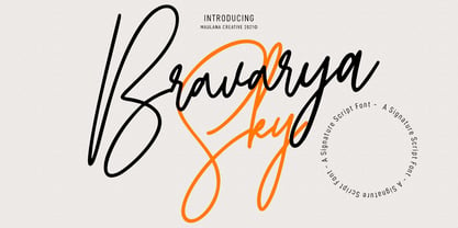 Bravarya Sky is a Casual Modern Signature font. With light mono-line stroke, Condensed, fun character with a some of natural ligatures. To give you an extra creative work. Bravarya Sky font support multilingual more than 100+ language. This font is good for logo design, Social media, Movie Titles, Books Titles, a short text even a long text letter and good for your secondary text font with sans or serif. Make a stunning work with Bravarya Sky font. Cheers, MaulanaCreative
 - Gilmore Sans by Red Rooster Collection,
$45.00 Gilmore Sans Extra Bold Extra Condensed Titling is a sans serif typeface that was inspired from early designs by the renowned English typographer Eric Gill. It was designed in 1992 by A. Pat Hickson (P&P Hickson) and Steve Jackaman (ITF) exclusively for the Red Rooster Collection. It has a clean, fresh, sturdy feel that is exceptionally powerful at display size. The typeface lends itself well to a variety of projects, including everything from packaging to signage to high-profile advertising campaigns.
 - Murqas by holyline design,
$19.00 MURQAS by Holyline is a Retro serif and width variable typeface, have 5 style condensed to expanded . It's very unique, elegant, bold and have beautiful shapes from each character . MURQAS perfect for headline, custom logo, merchandise, packaging, wedding designs, invitations, watermark,social media posts, label, and anything for your creativity and MURQAS is perfect typeface if you want something new with your project. And you can play and choose the width axis, for make your project more awesome! Happy creating!
 - Funny Papers JNL by Jeff Levine,
$29.00 Sheet music for the 1910 composition "Good-By Betty Brown" has its title hand lettered in a thick and thin, condensed sans serif design reminiscent of lettering found in later comic strips and books of the 1930s and 1940s. Transcending both the Art Nouveau and Art Deco styles, Funny Papers JNL gets its name from the slang reference Americans of the early 20th Century gave the Sunday comics pages in their local newspapers, and is available in both regular and oblique versions.
 - Partizano Serif by deFharo,
$22.00 Geometric typography with serif, extra condensed retro look and very elegant for use in publications, graphic design and advertising where you need an exclusive typography with great horizontal space saving for headlines and paragraph texts. It has a complete set of capital letters and numbers and monetary symbols in small caps, also alternative letters such as the 'A' capital letter or the lowercase 'a' type alpha. Use the following keys to write the bitcoin symbol and the partisan icon: b #, a #
 - Hello Hiltown by Good Java Studio,
$20.00 Introducing Hello Hiltown - Playfull Condensed Hello Hiltown is the perfect font for all your fun and minimalism designs. The main font file is equipped with ordinary characters. Everything is made with the funny brush. So you can be sure they will work well together! It is suitable for you to use in making t-shirt design, quote, label, packaging, logo type, or long writing. Because we have compiled kerning and matrices that are tailored to your needs. Caps Only Fonts.
 - FF Super Grotesk by FontFont,
$68.99 German type designer Svend Smital created this sans FontFont in 1999. The family has 6 weights, ranging from Regular to Bold in Condensed and Normal and is ideally suited for film and tv and editorial and publishing. FF Super Grotesk provides advanced typographical support with features such as ligatures, alternate characters, case-sensitive forms, fractions, super- and subscript characters, and stylistic alternates. It comes with a complete range of figure set options – oldstyle and lining figures, each in tabular and proportional widths.
 - Zuume Rough by Adam Ladd,
$25.00 Zuume Rough is a textured, bold, condensed sans display family. A sister to Zuume, this version features a rough printed texture for a more natural and raw look. The fonts can be tightly spaced and stacked for a visual punch or loosened for a little more breath. A distinct characteristic is the notched and extended ink traps meant for both function and aesthetic interest. The strong and sturdy design makes it ideal for eye-catching headlines, branding, packaging, sports, logos, and more.


