10,000 search results
(0.059 seconds)
- Saturday Party GT by Gartype Studio,
$10.00 Inspired by thin and condensed handwriting style, we present to you Saturday Party, a handwritten font with thin and condensed characters that was comes with alternates and multilingual glyphs to help people around world with that unique accent with this font. Saturday Party is very suitable like as sticky notes, handwritten project, signatures, and more.That way easily change the glyphs to make more unique glyphs.
 - Quebra by Vanarchiv,
$55.00 Quebra is an extend display sans-serif font family with four widths (Extra Condensed, Condensed, Normal and Expanded) and ten weights, italics versions are available. The main strokes contain small breaks simulating modulated variations on the letterforms, these details are more present on large body sizes. All font versions contain Latin and Cyrillic encoding characters and also ligatures, case-sensitive forms, fractions, oldstyle and finally tabular figures.
 - Windy Monday GT by Gartype Studio,
$10.00 Inspired by thin and condensed handwriting style, we present to you Windy Monday, a handwritten font with thin and condensed characters that was comes with alternates and multilingual glyphs to help people around world with that unique accent with this font. Windy Monday is very suitable like as text, cover book, poem, handwritten style, and more.That way easily change the glyphs to make more unique glyphs.
 - Tallings by Grontype,
$14.00 TALLINGS is a bold modern, urban-condensed font, inspired by street urban poster that combines the classic and modern style. TALLINGS will be best suited for creating logotypes, branding, headlines, corporate identities, Invitation card, and other graphic design elements. TALLINGS Features: Bold condensed font Punctuation & Characters Ligatures and alternates Glyphs included superscript & Symbol Currencies Multilingual Thankyou for picking up this font. Happy creating! Regard, Grontype
 - Bodoni FB by Font Bureau,
$40.00 Working at American Type Founders from a Bruce Foundry recutting, Morris Fuller Benton worked out the dramatics of the English Fat Face, and in 1928 produced Ultra Bodoni, a headline spectacular. Using Benton’s 1933 Ultra Bodoni Extra Condensed, Richard Lipton digitized Bodoni FB Bold Condensed, then took compression even further and designed Bodoni FB Bold Compressed, a real technical tour de force; FB 1992
 - Faubourg by Positype,
$39.00 Faubourg marks the first professional typeface release by Marie Boulanger. As much traditional as it is unconventional in its celebration of letterforms, this typeface dances on the page and screen as it moves from a more conventional appearance to monoline and back again. The flowing silk-like undulation only accentuates this distinguishing feature and produces one opportunity after the next for headline settings where the word is as important as the content supporting it.
 - Press Run JNL by Jeff Levine,
$29.00 Press Run JNL is a reinterpretation of the classic typeface Cheltenham Condensed taken from actual screen captures of vintage newspaper headlines.
 - Fervent by Gerald Gallo,
$20.00 Fervent is an all caps ultra condensed serif font. It is ideal for headlines, titles, branding, and small blocks of text.
 - American Text by Bitstream,
$29.99 A condensed American blackletter designed for ATF in 1932 by Morris Fuller Benton; the face grows out of nineteenth century roots.
 - Newsworthy JNL by Jeff Levine,
$29.00 Newsworthy JNL and its oblique counterpart are variations on the ever-popular condensed type styles used for newspaper and tabloid publications.
 - Sturdie by Gerald Gallo,
$20.00 Sturdie is an all caps condensed sans serif font. It is ideal for headlines, titles, branding, and small blocks of text.
 - Clinch by Gerald Gallo,
$20.00 Clinch is a clean, contemporary, condensed sans serif font. It is ideal for headlines, titles, branding, and small blocks of text.
 - Koysan by Pesotsky Victor,
$10.00 Koysan is made for vivid headings, but it can also be used to type small paragraphs and texts. In a text set, it gives sharp, barbed textures, but compensates with half-ovals. The font combines the linear counteraction of thin vertical and horizontal lines with sharp and rigid strokes and smooth geometric ovals. Koysan supports Basic Latin, Extended latin and Cyrillic. Font designed by Victor Pesotsky.
 - Ravenheart by Hanoded,
$15.00 I like Ravens. In fact, I like them so much that I have a tattoo of a Haida raven! Ravenheart was more or less modelled on my Qilin font, but it is completely different. It is scary and inky, but it has a certain flair as well. A bit mystical, a bit evil, but I am sure you’ll find many uses for it. Comes with a fluttering of diacritics.
 - Whatchamacallit by Comicraft,
$19.00 We popped the Doohickey into the Framistat and out popped this Whatchamacallit! Is it fat? is it thin? Is it tall? Is it short? Is it light? Is it heavy? Is it condensed?! is it expanded?! Yes, yes, yes and yes -- It’s all of the above and more! Our resident mad scientist John “Mr. Fontastic” Roshell has developed a single contraption that can handle any design emergency, from crimelords to supervillain team-ups to alien invasions. Whatchamacallit is a friendly and readable sans-serif, inspired by some of our all-time favorites -- Gill Sans, Futura, Venus and Antique Olive. But, like its machinery-contraption namesakes Doohickey and Framistat, Whatchamacallit has a lively personality -- the strokes are a little wavy, the ends a bit bulbous, and the circles are like little loaves of bread, rising in the Whatchamacallit's oven... delicious!
 - Mamute by PintassilgoPrints,
$18.00 Mamute is a block rockin' family with a cool letterpress look. Its upper- and lower-case slots hold glyphs with slightly different textures for a natural look. Numbers and punctuation marks also have alternate versions. Just trigger the Contextual Alternates feature to easily cycle the alternate glyphs, preventing double letters from displaying the same texture. Mamute is a highly decorative typeface available in 2 widths, regular and condensed, each also offered as a layered font, a handy and playful way for adding shades to your composition. There’s also a generous ornaments font and a catchwords one to spice up your designs. Mamute is based on Aldine wood type spirit (as there were many incarnations of it!), from circa 1870. Please note that this family has a limited character set and doesn't bring diacritics nor accented characters. But yet it does rock, you bet!
 - Robur by Canada Type,
$24.95 It shouldn't be a surprise to anyone that these letter shapes are familiar. They have the unmistakable color and weight of Cooper Black, Oswald Cooper's most famous typeface from 1921. What should be a surprise is that these letters are actually from George Auriol's Robur Noir (or Robur Black), published in France circa 1909 by the Peignot foundry as a bolder, solid counterpart to its popular Auriol typeface (1901). This face precedes Cooper Black by a dozen of years and a whole Great War. Cooper Black has always been a bit of a strange typographical apparition to anyone who tried to explain its original purpose, instant popularity in the 1920s, and major revival in the late 1960s. BB&S and Oswald Cooper PR aside, it is quite evident that the majority of Cooper Black's forms did not evolve from Cooper Old Style, as its originators claimed. And the claim that it collected various Art Nouveau elements is of course too ambiguous to be questioned. But when compared with Robur Noir, the "elements" in question can hardly be debated. The chronology of this "machine age" ad face in metal is amusing and stands as somewhat of a general index of post-Great War global industrial competition: - 1901: Peignot releases Auriol, based on the handwriting of George Auriol (the "quintessential Art Nouveau designer," according to Steven Heller and Louise Fili), and it becomes very popular. - 1909-1912: Peignot releases the Robur family of faces. The eight styles released are Robur Noir and its italic, a condensed version called Robur Noir Allongée (Elongated) and its italic, an outline version called Clair De Lune and its condensed/elongated, a lined/striped version called Robur Tigre, and its condensed/elongated counterpart. - 1914 to 1918: World War One uses up economies on both sides of the Atlantic, claims Georges Peignot with a bullet to the forehead, and non-war industry stalls for 4 years. - 1921: BB&S releases Cooper Black with a lot of hype to hungry publishing, manufacturing and advertising industries. - 1924: Robert Middleton releases Ludlow Black. - 1924: The Stevens Shanks foundry, the British successor to the Figgins legacy, releases its own exact copies of Robur Noir and Robur Noir Allongée, alongside a lined version called Royal Lining. - 1925: Oswald Cooper releases his Cooper Black Condensed, with similar math to Robur Noir Allongée (20% reduction in width and vectical stroke). - 1925: Monotype releases Frederick Goudy's Goudy Heavy, an "answer to Cooper Black". Type historians gravely note it as the "teacher steals from his student" scandal. Goudy Heavy Condensed follows a few years later. - 1928: Linotype releases Chauncey Griffith's Pabst Extra Bold. The condensed counterpart is released in 1931. When type production technologies changed and it was time to retool the old faces for the Typositor age, Cooper Black was a frontrunning candidate, while Robur Noir was all but erased from history. This was mostly due to its commercial revival by flourishing and media-driven music and advertising industries. By the late 1960s variations and spinoffs of Cooper Black were in every typesetting catalog. In the early- to mid-1970s, VGC, wanting to capitalize on the Art Nouveau onslaught, published an uncredited exact copy of Robur Black under the name Skylark. But that also went with the dust of history and PR when digital tech came around, and Cooper Black was once again a prime retooling candidate. The "old fellows stole all of our best ideas" indeed. So almost a hundred years after its initial fizz, Robur is here in digital form, to reclaim its rightful position as the inspiration for, and the best alternative to, Cooper Black. Given that its forms date back to the turn of the century, a time when foundry output had a closer relationship to calligraphic and humanist craft, its shapes are truer to brush strokes and much more idiosyncratic than Cooper Black in their totality's construct. Robur and Robur Italic come in all popular font formats. Language support includes Western, Central and Eastern European character sets, as well as Baltic, Esperanto, Maltese, Turkish, and Celtic/Welsh languages. A range of complementary f-ligatures and a few alternates letters are included within the fonts.
 - Boonville JNL by Jeff Levine,
$29.00Boonville JNL is a slightly condensed version of Cloverdale JNL - a "Western" style typeface based on classic wood type from the 1800s. - Concave Tuscan X by Wooden Type Fonts,
$20.00 A revival of one of the popular wooden type fonts of the 19th century, condensed, bold, a very useful design for display.
 - Gothic No.13 by Bitstream,
$29.99A dark, condensed, nineteenth century sanserif made popular by Linotype, the capitals deriving from Barnhart Brothers and Spindler, the lowercase from Farmer. - The Closed Door by IsteFonts,
$10.00 The Closed Door is a high-contrast and condensed font which can be used for letterings, posters, logotypes. Font supports cyrillic characters.
 - Mightyline by Linecreative,
$16.00 Mightyline- Ultra Condensed font and Come with ligatures collection, It's Perfect for logo, name card, magazin layout,headers, or large scale artwork.
 - Vertical Sans by S6 Foundry,
$12.00 Vertical Sans is an extremely condensed sans set in 3 weights offering a balanced, stylish font perfect for branding and communications projects.
 - Diamondwood JNL by Jeff Levine,
$29.00 Diamondwood JNL is based on examples of vintage wood type with condensed, elongated diamond shapes containing the various letters of the alphabet.
 - Long And Thin Initials JNL by Jeff Levine,
$29.00 Based on some vintage metal type initial monograms, Long and Thin Initials JNL reproduces this condensed spur serif design in digital form.
 - Rebel mind by Artisticandunique,
$25.00 Rebel mind - Sans Serif Condensed Font Family - Multilingual supports Rebel mind is a modern Sans serif condensed font family. With 6 styles and multilingual supports, you can easily use the sans serif font feature in many areas. You can enhance your projects from body text to big headlines, from classic to modern and bold styles, you can develop your projects. If you are looking for a condensed sans serif font, this font many meet your needs. Ideal for posters, newspaper, movie title and magazines, magazine covers, editorials, headlines, websites, logos, branding, advertising and more. You can create your unique designs with this font. If you have a question, please contact me. Have a good time.
 - Helado by B2302,
$39.00 Helado is an elegant, modern sans-serif font, based on the idea to work as close as possible on the geometric forms of the circle and the square. Following swiss design classics Helado comes in these weights: LIGHT, REGULAR, BOLD and EXTRABOLD. Helado might be used as a headline font, for any kind of layout, it might also be transformed into that fashion label logotype you are working on. Have fun!
 - Oho Julie by PaulaType,
$10.00 Introducing Oho Julie - A Chic Brush Stylist font perfect for high impact headlines This font is a perfect script designed for making your set of invitations, Brand, blog posts, and more completely beautiful Multilingual support for the following languages: Cornish, Danish, Dutch, English, Estonian, Faroese, Filipino, Finnish, French, Galician, German, Icelandic, Indonesian, Irish, Italian, Norwegian Bokmål, Norwegian Nynorsk, Portuguese, Spanish, Swahili, Swedish, Swiss German. Thank you Nursery Art
 - Belizio by Font Bureau,
$40.00 The eight-part Belizio series updates the first Font Bureau typeface. David Berlow’s family is based on Aldo Novarese’s Egizio, designed in 1955 for Nebiolo. It was first prompted by the popularity of Haas Clarendon, designed by Hoffmann and Eidenbenz, an impeccably Swiss revival of the traditional English letterform. Aldo Novarese was among the first to investigate a true italic designed in the Clarendon style; FB 1987–98
 - North Shore by Bruised Goods,
$18.00 NORTH SHORE – The ultimate Hawaiian surf spot typeface, both groovy and mid century inspired. Designed by Lauren Kilbane (on the other coast!) in sunny South Florida, USA. USE THIS FONT FOR: ads, album covers, apparel, cards, flyers, invitations, logos, menus, merchandise, packaging, signage, web, and more. 204 Glyphs Total: Uppercase ONLY, Numbers, Symbols, Punctuation, Emojis, & Language Support. Language Support: Danish, English, French, German, Irish, Italian, Portuguese, Spanish, Swedish, & Swiss German.
 - Malden Sans by Monotype,
$49.00 Malden Sans is a mischievous grotesque sans serif with charming details that gives designers a solid typographic voice. It was created by Michele Patanè with regular and condensed widths, as a utilitarian typeface family for print and digital environments. It was originally designed as part of a type system for cinema magazines, and embodies the devil-may care attitude of the silver screen. Designer Michele Patanè looked back to an earlier era of typography to create the typeface, embracing unusual details, rather than ironing them out. “There is a very naive way of using typography in the 30s and 40s, something not as clean as how it’s used in the late 50s and 60s when everything passed through a rationalisation of the typographic palette,” he explains. “In film magazines you can still see a bit of roughness, and I like that.” This is a design that’s desperate to be used in editorial environments, and has been created to stand up to lower quality paper. It would be equally at home on posters, packaging, and even in digital environments where designers are looking for something more expressive than another geometric sans serif. Malden Sans includes a Normal and Condensed range, with 7 weights in the normal and 6 in the Condensed, both including italics.
 - Novel Pro by Atlas Font Foundry,
$50.00 Novel Pro is the humanist Antiqua typeface family within the largely extended award winning Novel Collection, also containing Novel Sans Pro, Novel Sans Hair, Novel Sans Condensed Pro, Novel Display, Novel Display Condensed, Novel Display Extra Condensed, Novel Display Compressed, Novel Display Extra Compressed, Novel Mono Pro, Novel Sans Rounded Pro and Novel Sans Office Pro. Classic proportions of a Renaissance Antiqua combined with modern details let Novel appear as a friendly and elegant but functional typeface. The almost upright letters of the narrow Italics create a vital contrast to the generous construction of the roman. All typeface families of the Novel Collection have a carefully attuned character design and a well balanced weight contrast. The fine gradation of 12 weights enable designers to create fine legible typography and combine the design with other members of the Novel Collection to reach highest quality in typography. Novel Pro [914 glyphs] comes in 12 styles and contains small caps, an extra set of alternate glyphs, many ligatures, lining figures [proportionally spaced and monospaced], hanging figures [proportionally spaced and monospaced], small caps figures [proportionally spaced and monospaced], positive and negative circled figures for upper and lower case, superior and inferior figures, fractions, extensive language support, arrows for uppercase and lowercase and many more OpenType™ features.
 - Maryland JNL by Jeff Levine,
$29.00 The 1913 sheet music for "There's A Girl in the Heart of Maryland (with a Heart That Belongs to Me)" may have had no shortage of words in the title - fifteen to be exact, but it also offered some nice hand lettering in the Art Nouveau style. Maryland JNL is a condensed typeface with an unusual twist. The "S" and "G" both have spurs on them, which is reminiscent of the preceding Victorian period and the popular spurred Tuscan alphabets of the time.
 - MC Nun Waw by Maulana Creative,
$14.00 Nun Waw is a modern humanist condensed sans display font. Bold stroke, fun character with a bit of ligatures and alternates. To give you an extra creative work. Nun Waw font support multilingual more than 100+ language. This font is good for logo design, Social media, Movie Titles, Books Titles, a short text even a long text letter and good for your secondary text font with script or serif. Make a stunning work with Nun Waw font. Cheers, Maulana Creative
 - Morl by Typesketchbook,
$55.00 Developed from condensed san serif families of the 90’s to 00’s, Morl brings together the distinctive features of the time but presented in a simpler design. Its potential is increased with Original, Sans, and Rounded options which offer varied moods. Suitable for publications, web and product designs, Morl can fit either headlines or body. It’s also effectively supported in various devices. The family comes in 10 weights, making it available to use for your required tasks in 60 styles.
 - Magdelin by Adam Ladd,
$24.00 Magdelin is a minimal yet warm gothic sans with normal and alternate families. At its core, the design has simple forms and low contrast, yet it takes some qualities from the humanist class with its calligraphy or cursive-inspired details found in the italics and the bowl shapes of characters like b and d. The small x-height, longer ascenders and descenders, and semi-condensed proportions give it a bit of a vintage or classic feel while still appearing contemporary and modern.
 - Sangor by Grontype,
$12.00 Sangor is an unique vintage condensed font. This font designed all round corners that makes it look more soft and charm. Sangor is regular and outline all-caps font that is great for short headlines and titles, but it looks great in print design, vintage mood board, branding, logotypes, titles, editorial design and modern and vintage design. Sangor Features: Single weight Punctuation & Characters Ligatures Glyphs included superscript & Symbol Currencies Multilinguals Thankyou for picking up this font, Happy creating. Regard, Grontype
 - Kajiro by Maulana Creative,
$13.00 Kajiro is a fancy modern condensed all Caps sans serif font. With bold tall and sharp stroke, fun character with a bit of ligatures and alternates. To give you an extra creative work. Kajiro font support multilingual more than 100+ language. This font is good for logo design, Social media, Movie Titles, Books Titles, a short text even a long text letter and good for your secondary text font with sans or serif. Make a stunning work with Kajiro font. Cheers, Maulana Creative
 - Fever Coaster by Maulana Creative,
$12.00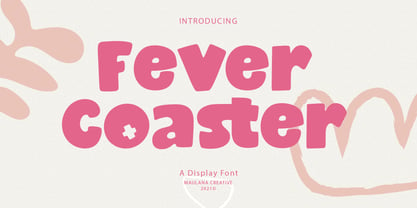 Fever Coaster Display Font is a casual handwritten font. With rough stroke, Condensed and fun character with a bit of ligatures. To give you an extra creative work. Fever Coaster font support multilingual more than 100+ language. This font is good for logo design, Social media, Movie Titles, Books Titles, a short text even a long text letter and good for your secondary text font with sans or serif. Make a stunning work with Fever Coaster font. Cheers, Maulana Creative
 - Register by Device,
$29.00 The capitals of Register share a similar construction to Morris Fuller Benton’s 1930 Bank Gothic for American Type Founders, but iron out the broader curves and add ‘ink traps’ to emphasise the machine aesthetic. Register also provides the lower case missing from Bank Gothic. Available in two main widths, each in five weights plus reweighted italics with cursively-derived letterforms, plus a bold condensed, Register has been used for the Sochi Winter Olympics, Source magazine and releases from Transient Records.