10,000 search results
(0.051 seconds)
- EXPATRIATE by UICreative,
$23.00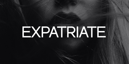 Introducing our new product the name Expatriate Sans Serif Font Family comes with 12 different weights. Modern Sans Serif font that beautiful classy, elegant, and modern. This font is perfectly suited for a wide variety of projects, such as signature, stationery, logo, wedding, typography quotes, magazine or book covers, website headers, clothing, branding, packaging design, and more. Also for fashion-related branding or editorial design and displays both masculine and feminine qualities.
 - Old Harbour by DimitriAna,
$12.00 Old Harbour is a font collection of 12 hand drawn fonts inspired by the vintage hand lettered signage, the old bottles’ labels and the aesthetic of my favourite old school tattoos. The fonts can work together in endless combinations, to create beautiful vintage designs for apparel, logos, labels, posters or any merchandise product you can imagine. All the fonts support Western European languages based on Latin script and delivered in OpenType and True Type format.
 - ITC Bailey Quad by ITC,
$29.99 ITC Bailey Quad Bold was designed by Kevin Bailey in 1994. It is a semiserif typeface in the style of slab serif faces. The unusual placement of some serifs and unconventional forms of some characters give the font a modern feel. The overall look of Baily Quad Bold is robust and strong and the font is best used in headlines and short to middle length texts in point sizes of 12 and larger.
 - Praho Pro Stencil by Picador,
$29.00 Praho Pro is a part of Warsaw Types – a project based on Warsaw’s local typographic heritage. The project, presented at the Museum of Praga, is a collaboration of 12 young Polish typographers. Praho Pro Stencil is a multilingual family inspired by the unique, historical character of Praga district of Poland's capital - Warsaw. High contrast, thin serifs, sharp terminals and large x-height are key features for distinctive headlines. Now available as a stencil version!
 - Castle by Linotype,
$29.99This family, which includes faces in light, book, bold, and ultra weights, more stroke contrast than is typical of sans serifs, making it very legible in text. Because of its large x-height, it is recommended for used in point sizes ranging from 12 point upward. Of course, it functions well in display sizes, too. The contrast between the four weights makes this family optimal for use in hierarchical advertising systems, and corporate identity uses. - Playful Runway by UICreative,
$23.00 Introducing our new product the name Playful Runway Sans Serif Font Family comes with 12 different weights. Modern Sans Serif font that beautiful classy, elegant, and modern. This font is perfectly suited for a wide variety of projects, such as signature, stationery, logo, wedding, typography quotes, magazine or book covers, website headers, clothing, branding, packaging design, and more. Also for fashion-related branding or editorial design and displays both masculine and feminine qualities.
 - Decorata by Positype,
$29.00 How many times have you seen lettering on a book cover, poster, or card and wanted to make something similar? Decorata’s eight intertwining weights finally make that possible in an intelligent way. The first major collaboration of its kind, Decorata pairs the talents of supreme lettering artist Martina Flor and masterful type designer Neil Summerour. Lettering was traditionally understood as using words in an artistic way, while type design created written language for easy reading, the one overlapping the other in several ways. For this unique project, Martina created several versions of the alphabet and its decorative layers in her eye-catching style. Neil then took those designs and created an enormous eight-style font family that respects the designer’s need for control and capitalizes on the artist’s expressiveness. Each style can work separately but, on top of the foundational styles, try placing the Lace, then Filigree in contrasting colors. Use any OpenType-capable program to turn headlines from blasé to wowza, make posters with some pow, and design your own cards with that just-right level of detail. Whatever idea you can imagine with the Decorata family, it promises to be a playful and precise wordsmith where the words themselves are the art. Decorata’s glyphs are bifurcated, have medium contrast to showcase their intricate interactions, and include Shadow, Regular, Outline, Filigree, Lace, Fancy, Intricate, and Dingbat styles — eight in all. The Regular style sets the word or phrase to begin the design, Shadow ensures it lifts off the background, and Outline attempts to restrain its ornate flair. Think of those as the foundation and use the rest of the styles for flamboyance. The Intricate and Filigree styles vary only in the thickness of the glyphs, with Filigree being thinner. Lace removes the external curls around each letter but keeps the internal negative space from those decorative lines. The Fancy style is a solid lettershape that includes its attendant elements, and the Dingbats are exactly as expected: borders, manicules, patterns, frames, and many stylized items to bring designs to life.
 - Allrounder Antiqua by Identity Letters,
$40.00 Timeless Renaissance looks, gently updated. For novels and billboards alike. Allrounder Antiqua is an old-style serif member of the Allrounder superfamily. A timeless typeface based on classical proportions, Allrounder Antiqua is perfectly suitable for advanced book and editorial design well as packaging and branding. True: its main purpose is to set flawless body copy and to generate an evenly textured page—but its refined shapes work fantastically in display applications, too. Some details, such as the small and sharp bowl of the lowercase a, are fully appreciated in large sizes only. If you need a sophisticated serif typeface for packaging, food, fashion, consumer goods, or lifestyle branding, Allrounder Antiqua is up for it. It's also apt as an outstanding corporate typeface, be it for a more conservative venture or the latest hipster start-up. This classy serif typeface comes in four weights with corresponding true italics. Just like its sans-serif counterpart, Allrounder Grotesk, Allrounder Antiqua is equipped with plenty of Opentype Features like small caps, six sets of figures, case-sensitive forms, superiors, fractions and many ligatures. You will find alternate letters with swashes within this extended character set, as well as all the accented glyphs necessary to support more than 200 Latin-based languages. Historical Background The (French) Renaissance-influenced typeface started as Moritz Kleinsorge's graduation project within the "Expert Class Type design" course of the Plantin Institute for Typography, located in the famous Museum Plantin-Moretus in Antwerp, Belgium. There, Moritz Kleinsorge decided to create a revival of Robert Granjon's "Ascendonica Romain", described as "a beautiful face; typical of Granjon's mature style" in the inventory list of available material. "To touch punches and matrices cut by Robert Granjon back in 1567 was an invaluable inspiration", Moritz explains. Over time, the typeface moved away from being a true revival. Rather, it evolved into a Granjon-inspired typeface. That typeface is now available as Allrounder Antiqua. Perfect Pairing: Allrounder Antiqua + Allrounder Grotesk Allrounder Grotesk is the ideal complement to Allrounder Antiqua. They both share common vertical metrics and a common color. This allows you to pair both typefaces within the same layout—even within the same paragraph—without creating visual disruption. Head over to the Family Page of Allrounder Grotesk to get more information about this typeface. Design Trick: Bilingual Design With the Allrounder Superfamily Combining Allrounder Grotesk with Allrounder Antiqua is an ideal approach for bilingual designs, wherein both languages get the same emphasis yet are distinguished with two different typefaces. It's also best practice to set headlines in a different typeface than the body text if they harmonize with each other. Allrounder Grotesk and Allrounder Antiqua provide you with the perfect pair for this purpose.
 - Copihue by Letritas,
$30.00 Copihue is the newest font from the foundry of Juan Pablo De Gregorio. A Sans-Serif with some humanist hints, it displays simple and subtle yet sober, vivid strokes. This font’s personality unfolds itself as long as we are reading it. The aim of Copihue is neither to be as neutral as a grotesque font nor to become as predictable as a fully geometric typeface can be. This typography wants to appeal to the likes of designers who prefer all-rounder fonts, the ones who fit well in most layouts. With this purpose in mind, Juan Pablo studied elements of different typefaces and styles to cast them into Copihue, which boasts a personality that makes it a great fit for different compositions and designs. Copihue has a slanted version with "real italics". These italics are slightly more condensed than the regular version, in order to give it a different text texture. The typeface has 9 weights, ranging from “hair” to “black”, and two versions: "regular" and "italic". Its 18 files contain 749 characters with ligatures, alternates, small caps, oldstyle and tabular numbers, fractions, and case sensitive figures. It supports 219 Latin-based languages, spanning through 212 different countries. Copihue supports this languages: Abenaki, Afaan Oromo, Afar, Afrikaans, Albanian, Alsatian, Amis, Anuta, Aragonese, Aranese, Aromanian, Arrernte, Arvanitic (Latin), Asturian, Atayal, Aymara, Bashkir (Latin), Basque, Bemba, Bikol, Bislama, Bosnian, Breton, Cape Verdean Creole, Catalan, Cebuano, Chamorro, Chavacano, Chichewa, Chickasaw, Cimbrian, Cofán, Corsican Creek,Crimean Tatar (Latin),Croatian, Czech, Dawan, Delaware, Dholuo, Drehu, Dutch, English, Estonian, Faroese, Fijian Filipino, Finnish, Folkspraak, French, Frisian, Friulian, Gagauz (Latin), Galician, Ganda, Genoese, German, Gikuyu, Gooniyandi, Greenlandic (Kalaallisut)Guadeloupean, Creole, Gwich’in, Haitian, Creole, Hän, Hawaiian, Hiligaynon, Hopi, Hotc?k (Latin), Hungarian, Icelandic, Ido, IgboI, locano, Indonesian, Interglossa, Interlingua, Irish, Istro-Romanian, Italian, Jamaican, Javanese (Latin), Jèrriais, Kala Lagaw Ya, Kapampangan (Latin), Kaqchikel, Karakalpak (Latin), Karelian (Latin), Kashubian, Kikongo, Kinyarwanda, Kiribati, Kirundi, Klingon, Ladin, Latin, Latino sine Flexione, Latvian, Lithuanian, Lojban, Lombard, Low Saxon, Luxembourgish, Maasai, Makhuwa, Malay, Maltese, Manx, M?ori, Marquesan, Megleno-Romanian, Meriam Mir, Mirandese, Mohawk, Moldovan, Montagnais, Montenegrin, Murrinh-Patha, Nagamese Creole, Ndebele, Neapolitan, Ngiyambaa, Niuean, Noongar, Norwegian, Novial, Occidental, Occitan, Old Icelandic, Old Norse, Oshiwambo, Ossetian (Latin), Palauan, Papiamento, Piedmontese, Polish, Portuguese, Potawatomi, Q’eqchi’, Quechua, Rarotongan, Romanian, Romansh, Rotokas, Sami (Inari Sami), Sami (Lule Sami), Sami (Northern Sami), Sami (Southern Sami), Samoan, Sango, Saramaccan, Sardinian, Scottish Gaelic, Serbian (Latin), Seri, Seychellois Creole, Shawnee, Shona, Sicilian, Silesian, Slovak, Slovenian, Slovio (Latin), Somali, Sorbian (Lower Sorbian), Sorbian (Upper Sorbian), Sotho (Northern), Sotho (Southern), Spanish, Sranan, Sundanese (Latin), Swahili, Swazi, Swedish, Tagalog, Tahitian, Tetum, Tok Pisin, Tokelauan, Tongan, Tshiluba, Tsonga, Tswana, Tumbuka, Turkish, Turkmen (Latin), Tuvaluan, Tzotzil, Uzbek (Latin), Venetian, Vepsian, Volapük, Võro, Wallisian, Walloon, Waray-Waray, Warlpiri, Wayuu, Welsh, Wik-Mungkan, Wiradjuri, Wolof, Xavante, Xhosa, Yapese, Yindjibarndi, Zapotec, Zulu, Zuni.
 - Blocked Off by Kimberly Geswein is a delightful meld of whimsy and structure, capturing attention with its unique charm and playful aura. The font embodies a sense of creativity that's instantly reco...
- Protura by MIX.Jpg,
$15.00 Protura Sans Serif Masculine - 9 Font Weights With Italics Introducing Protura Sans Serif Masculine, a versatile and powerful font family designed to make a bold statement in your creative projects. With nine distinct font weights and accompanying italics, Protura offers unmatched flexibility for all your design needs. Key Features: Nine Font Weights: Protura Sans Serif Masculine boasts an extensive range of weights, from Light to Ultra Bold. Whether you're crafting a subtle headline or a powerful logo, you'll find the perfect weight to convey your message. Italics Included: In addition to the standard weights, Protura also provides elegant italic versions for each weight. These italics add a touch of sophistication to your typography, making it ideal for editorial work and branding projects. Masculine Aesthetic: Protura's design exudes strength and masculinity, making it an excellent choice for projects aimed at a bold and assertive audience. Its clean lines and sharp edges give your text a contemporary and impactful look. Versatile Usage: This font family is highly adaptable, suitable for a wide range of design applications, including branding, packaging, editorial design, posters, websites, and more. It's a true workhorse font that performs well in various contexts. Legibility: Protura prioritizes legibility without compromising on style. Its well-crafted letterforms ensure that your text remains clear and readable, even at small sizes. OpenType Features: Take advantage of OpenType features such as ligatures and alternate characters to add subtle design nuances and improve overall visual appeal. Multilingual Support: Protura Sans Serif Masculine supports a multitude of languages, making it a globally accessible font choice for your projects. Applications: Branding: Create impactful logos and brand identities that leave a lasting impression. Editorial Design: Enhance the readability and visual appeal of magazines, newspapers, and books. Web Design: Craft modern and engaging websites that resonate with your target audience. Packaging: Design packaging that stands out on the shelf and communicates product quality. Posters and Flyers: Grab attention with bold and stylish promotional materials. Unleash the power of Protura Sans Serif Masculine to elevate your design projects with a masculine, contemporary, and highly versatile typographic solution. With its extensive weight range and italics, this font family empowers you to create impactful and visually stunning designs.
 - Chlorophyll by Alit Design,
$18.00 Introducing "Chlorophyll" - A Sans Serif Font with a Refreshing Natural Elegance Unveil the beauty of nature in your design projects with "Chlorophyll," a stunning sans serif font that combines modern simplicity with the organic charm of leaf illustrations. This elegant typeface is designed to infuse your creations with a sense of natural harmony, making it perfect for a wide range of applications, from branding to packaging and beyond. Key Features: Sans Serif Sophistication: "Chlorophyll" boasts a clean and versatile sans serif style, making it ideal for both display and body text. Its balanced letterforms exude a sense of modern sophistication, ensuring legibility and impact in all your design endeavors. Leafy Delight: With meticulously crafted leaf illustrations integrated into the font's characters, "Chlorophyll" embodies the spirit of the great outdoors. Each letter and symbol subtly incorporates the elegance of leaves, creating a seamless connection to the natural world. Elegance in Simplicity: "Chlorophyll" captures the essence of natural beauty through its simplicity. This font is a testament to the idea that less is more, allowing your content to shine while adding a touch of eco-friendly charm. Versatile Usage: Whether you're designing a logo for an eco-conscious brand, creating invitations for a garden wedding, or crafting a menu for a farm-to-table restaurant, "Chlorophyll" adapts effortlessly to diverse design projects. It's a versatile tool that can evoke a sense of elegance and sustainability in any context. Extensive Character Set: "Chlorophyll" includes an extensive character set, encompassing uppercase and lowercase letters, numerals, punctuation, and a wide range of special characters. This ensures compatibility with multiple languages and enables you to express your message with clarity and grace. Digital and Print Ready: "Chlorophyll" is delivered in multiple formats, making it ready for both digital and print applications. Its high-quality vectors ensure crisp and sharp rendering in any size or medium. Embrace the allure of nature and elevate your design projects with "Chlorophyll." This sans serif font, inspired by the beauty of leaves and the elegance of simplicity, brings a touch of the natural world to your creative endeavors. Elevate your designs, evoke a sense of harmony, and make a lasting impression with "Chlorophyll" today.
 - Helvetica Now Variable by Monotype,
$328.99 Helvetica Now Variable Helvetica Now 2.0 builds on the groundbreaking work of 2019’s Helvetica Now release—all of the clarity, simplicity, and neutrality of classic Helvetica with everything 21st-century designers need. In this 2021 release, we introduce Helvetica Now Variable and add condensed weights to the Helvetica Now static fonts. Helvetica Now 2.0 includes 96 fonts in three distinct optical sizes (Micro, Text, and Display), now with 48 new condensed weights. The Helvetica Now Variable fonts include even more: 144 instances—48 normal, 48 condensed, and 48 compressed. Helvetica Now Variable gives you over a million new Helvetica styles in one state-of-the-art font file (over two-and-a-half million with italics!). Use it as an extension of the Helvetica Now family or make custom-blends from its weights (Hairline to ExtraBlack), optical sizes (four point to infinity), and new Compressed and Condensed widths. Create infinite shades of expression, incredible typographic animations, and ultra-refined typography. Its single font file makes it easier to use and wickedly fast. Load one file and access a million fonts—in a fraction of the size of a traditional font family. More freedom. More expression. More power. More. Helvetica. Now. Each one of the Helvetica Now static fonts has been carefully tailored to the demands of its size. The larger Display versions are drawn to show off the subtlety of Helvetica and spaced with headlines in mind, while the Text sizes focus on legibility, using robust strokes and comfortably loose spaces. Helvetica Now's Micro designs are simplified and exaggerated to maintain the impression of Helvetica in tiny type. There's also an extensive set of alternates, which allow designers the opportunity to experiment with and adapt Helvetica's tone of voice. The new Condensed weights put more type into smaller spaces—for intense emphasis, sophisticated contrast, or just everyday space-fitting. Helvetica Now 2.0 is, quite simply, more: more versatility; more power; and more creative possibilities. “For more than six decades, Helvetica has been the essential typeface,” says Monotype Type Director Charles Nix. “The release of Helvetica Now insures that it will be a typographic force for decades to come.”
 - Posterama by Monotype,
$40.99 The Posterama™ typeface family contains 63 fonts and is a true journey through space and time. Designed by Jim Ford, each Posterama family contains 7 weights from Thin to Ultra Black, in 9 distinct families. What makes Posterama so unique and versatile are the eight alternative display families. By making use of a collection of alternative glyphs, Posterama sets an evocative flavor to visualize an entire century of futuristic reference points from art, architecture, poster design and science fiction into one family. Posterama Text is the base family. It has the most robust character set including upper and lowercase glyphs and pan-European language support (including Greek and Cyrillic). Note: all the other Posterama variants described below do not have lowercase letters or Greek and Cyrillic support. Posterama 1901 recalls the decoratively geometric style of Art Nouveau from the turn of the 20th century. Letterforms such as the slender, snaking ‘S’, the high-waisted ‘E’ and the underlined ‘O’ revive the spirit of Charles Rennie Mackintosh and the designers of the Viennese Secession. Posterama 1913 pays homage to the Armory Show, or 1913 Exhibition of Modern Art, which brought the revolutionary work of European artists such as Picasso, Duchamp and Kandinsky to the US for the first time to the shock and astonishment of press and public. Near-abstract, angular characters such as the ‘A’, ‘E’ and ‘N’ hint at cubism’s jagged and clashing planes. Posterama 1919 uses a small, but important, variation to set a tone when the Bauhaus was founded, and the surge in radical European typography that followed. The straight-sided, roundheaded ‘A’ adds a flavor of 1919 – this style of ‘A’ can still be seen in the Braun logo, designed in 1934. Posterama 1927 captures the year of Metropolis, The Jazz Singer and Paul Renner’s pioneering, geometric Futura typeface from 1927, which had a profound influence on design in the US and Europe. Posterama 1933 – With its low-waisted, sinuous designs, the Posterama 1933 typeface family echoes lettering of the Art Deco period, which in turn had its roots in Art Nouveau, the key influence on Posterama 1901. The two fonts make a great team and can be used interchangeably. Posterama 1945 features a few Cyrillic characters to conjure up an era when Russian art and political posters made their mark in cold war propaganda, espionage and also giant aliens and monsters. Posterama 1984 takes its typographic influences from George Orwell’s classic novel, publicity for the dystopian action and sci-fi movies (Blade Runner, Videodrome and Terminator) and games like Space Invaders and Pac-Man that made an impact at that time. Posterama 2001 was inspired by Stanley Kubrick’s science fiction masterpiece, which made extensive use of the Futura typeface. Posterama 2001 finds its cosmic orbit with its nosecone-style ‘A’ from NASA’s much-missed ‘worm’ logotype. There’s an echo, too, in Bauhaus designs from as early as 1920, whose minimalist, geometric lettering also featured a crossbar-less ‘A’.
 - Kapsalon by Hanoded,
$12.00 It could be you’ve never heard of Kapsalon and I will forgive you for that. Kapsalon is a Dutch word, meaning ‘hairdresser’s’. Since 2003 it is also a very popular snack food, which consists of french fries, döner kebab, lettuce, sambal, garlic sauce and melted Gouda cheese, served in an aluminium tray. I have to admit that I have never eaten a Kapsalon myself, as I am not too fond of fast food. I named this font package Kapsalon, because, like its namesake, it consists of several unrelated elements that work really well when combined.
 - TT Firs Neue by TypeType,
$39.00 TT Firs Neue useful links: Specimen | Graphic presentation | Customization options TT Firs Neue is reborn! We have rethought the font to introduce the next-generation typeface. After analyzing each contour and graphic element, we rebuilt the font, preserving its best features while making any necessary adjustments. We have created a flawless and modern sans serif using the new technical capabilities of the studio. TT Firs Neue is a Scandinavian sans serif that combines expressive graphic elements with the versatility of use. In the latest 2023 edition, the font's display elements have become even more attractive, while the overall font balance has also been improved. This is the result of the visual research we did before working on the update. Here is what has changed. The visual elements of the font are now logically coherent. We got rid of the ones that did not suit the font's concept and kept the most attractive ones. The changes affected letters with diagonal strokes "M, N, И", and figures "2, 3, 6, 9". All round characters' shapes have been standardized for all font styles. In the previous version, all glyphs looked different: more square or oval, depending on the font's weight. We made the shapes consistent for the font to feel more integral. Glyphs containing bowls have also changed. We have worked on the balance, altering the height and shape of the bowls. Like rounded ones, we aspired to make the glyphs more balanced for all font styles. The shapes of the letters "J, M, N, S, W, З, И" and Black font style characters have changed. The individuality of these glyphs was slightly different from the whole set, which became apparent in larger sizes. We have improved the shapes and made them more suitable for the font's style. Letters with diagonal strokes and triangular glyphs, such as "A, V, Y, D". We have brought the characters to a consistent logic in their shapes by refining the angles and weight of diagonals in different font styles. The glyphs' terminals follow the same logic in the new version. We have preserved and perfected the old shapes. Ligatures and stylistic sets have been updated entirely and expanded. We have researched Scandinavian languages and designed ligatures and diacritical sets that would definitely be useful for designers. We have redesigned diacritical marks, figures, and punctuation marks. Now all characters follow the same logic and contribute to a well-balanced impression of the font. The character set in each font style has been increased from 934 to 1719, and the number of OpenType features—from 24 to 40. The new font includes 23 font styles: 11 roman, 11 italic, and 1 variable font. The variable font has also become a significant technological advancement for TT Firs Neue. We retained a warm sentiment towards TT Firs Neue's previous success while redesigning the font and implementing substantial alterations. The 2023 font has been developed according to new technical standards that have become significantly higher in the past 5 years. TT Firs Neue is a font well-suited for a wide range of contexts. It can be used for headings, text fragments, visual merchandising and building decoration, and the web. The font is visually aesthetic on podcast and video covers and is an ideal choice for packaging design and brand identity. TT Firs Neue OpenType features: aalt, ccmp, locl, subs, sinf, sups, numr, dnom, frac, ordn, tnum, onum, lnum, pnum, case, dlig, liga, c2sc, smcp, ss01, ss02, ss03, ss04, ss05, ss06, ss07, ss08, ss09, ss10, ss11, ss12, ss13, ss14, ss15, ss16, ss17, ss18, ss19, ss20, calt. TT Firs Neue language support: English, Albanian, Basque, Catalan, Croatian, Czech, Danish, Dutch, Estonian, Finnish, French, German, Hungarian, Icelandic, Irish, Italian, Latvian, Lithuanian, Luxembourgish, Maltese, Moldavian (lat), Montenegrin (lat), Norwegian, Polish, Portuguese, Romanian, Serbian (lat), Slovak, Slovenian, Spanish, Swedish, Swiss German, Valencian, Azerbaijani, Kazakh (lat), Turkish, Uzbek (lat), Acehnese, Banjar, Betawi, Bislama, Boholano, Cebuano, Chamorro, Fijian, Filipino, Hiri Motu, Ilocano, Indonesian, Javanese, Khasi, Malay, Marshallese, Minangkabau, Nauruan, Nias, Palauan, Rohingya, Salar, Samoan, Sasak, Sundanese, Tagalog, Tahitian, Tetum, Tok Pisin, Tongan, Uyghur, Afar, Asu, Aymara, Bemba, Bena, Chichewa, Chiga, Embu, Gikuyu, Gusii, Jola-Fonyi, Kabuverdianu, Kalenjin, Kamba, Kikuyu, Kinyarwanda, Kirundi, Kongo, Luba-Kasai, Luganda, Luo, Luyia, Machame, Makhuwa-Meetto, Makonde, Malagasy, Mauritian Creole, Meru, Morisyen, Ndebele, Nyankole, Oromo, Rombo, Rundi, Rwa, Samburu, Sango, Sangu, Sena, Seychellois Creole, Shambala, Shona, Soga, Somali, Sotho, Swahili, Swazi, Taita, Teso, Tsonga, Tswana, Vunjo, Wolof, Xhosa, Zulu, Ganda, Maori, Alsatian, Aragonese, Arumanian, Asturian, Belarusian (lat), Bosnian (lat), Breton, Bulgarian (lat), Colognian, Cornish, Corsican, Esperanto, Faroese, Frisian, Friulian, Gaelic, Gagauz (lat), Galician, Interlingua, Judaeo-Spanish, Karaim (lat), Kashubian, Ladin, Leonese, Manx, Occitan, Rheto-Romance, Romansh, Scots, Silesian, Sorbian, Vastese, Volapük, Võro, Walloon, Walser, Welsh, Karakalpak (lat), Kurdish (lat), Talysh (lat), Tsakhur (Azerbaijan), Turkmen (lat), Zaza, Aleut (lat), Cree, Haitian Creole, Hawaiian, Innu-aimun, Lakota, Karachay-Balkar (lat), Karelian, Livvi-Karelian, Ludic, Tatar, Vepsian, Guarani, Nahuatl, Quechua, Russian, Belarusian (cyr), Bosnian (cyr), Bulgarian (cyr), Macedonian, Serbian (cyr), Ukrainian, Kazakh (cyr), Kirghiz, Tadzhik, Turkmen (cyr), Uzbek (cyr), Lezgian, Abazin, Agul, Archi, Avar, Dargwa, Ingush, Kabardian, Kabardino-Cherkess, Karachay-Balkar (cyr), Khvarshi, Kumyk, Lak, Nogai, Rutul, Tabasaran, Tsakhur, Buryat, Komi-Permyak, Komi-Zyrian, Siberian Tatar, Tofalar, Touva, Bashkir, Chechen (cyr), Chuvash, Erzya, Kryashen Tatar, Mordvin-moksha, Tatar Volgaic, Udmurt, Uighur, Rusyn, Montenegrin (cyr), Romani (cyr), Dungan, Karakalpak (cyr), Shughni, Mongolian, Adyghe, Kalmyk.
 - ATF Garamond by ATF Collection,
$59.00 The Garamond family tree has many branches. There are probably more different typefaces bearing the name Garamond than the name of any other type designer. Not only did the punchcutter Claude Garamond set a standard for elegance and excellence in type founding in 16th-century Paris, but a successor, Jean Jannon, some eighty years later, cut typefaces inspired by Garamond that later came to bear Garamond’s name. Revivals of both designs have been popular and various over the course of the last 100 years. When ATF Garamond was designed in 1917, it was one of the first revivals of a truly classic typeface. Based on Jannon’s types, which had been preserved in the French Imprimerie Nationale as the “caractères de l’Université,” ATF Garamond brought distinctive elegance and liveliness to text type for books and display type for advertising. It was both the inspiration and the model for many of the later “Garamond” revivals, notably Linotype’s very popular Garamond No. 3. ATF Garamond was released ca. 1918, first in Roman and Italic, drawn by Morris Fuller Benton, the head of the American Type Founders design department. In 1922, Thomas M. Cleland designed a set of swash italics and ornaments for the typeface. The Bold and Bold Italic were released in 1920 and 1923, respectively. The new digital ATF Garamond expands upon this legacy, while bringing back some of the robustness of metal type and letterpress printing that is sometimes lost in digital adaptations. The graceful, almost lacy form of some of the letters is complemented by a solid, sturdy outline that holds up in text even at small sizes. The 18 fonts comprise three optical sizes (Subhead, Text, Micro) and three weights, including a new Medium weight that did not exist in metal. ATF Garamond also includes unusual alternates and swash characters from the original metal typeface. The character of ATF Garamond is lively, reflecting the spirit of the French Renaissance as interpreted in the 1920s. Its Roman has more verve than later old-style faces like Caslon, and its Italic is outright sprightly, yet remarkably readable.
 - The VINTAGE COLLEGE DEPT_DEMO_worn font by Fontsandfashion is a distinctive typeface that embodies the spirit of classic collegiate and varsity aesthetics, with a distinctly retro feel that harks bac...
- Billiboldy by Gie Studio,
$10.00 Are you planning to do an amazing piece of work to make lots of people smile happily while taking your hat off every time? If so, this is the right time to give your work a little touch with a sincere and elegant writing. Introducing Billiboldy- A New Bold Script Font Billiboldy is a cursive and thick lettered handwritten bold script font, crafted to give your headlines and logotype projects a stylish touch. This font reads as strong, dynamic and can add tons of nostalgic character to your designs. This font includes Multilingual Options to make your branding globally acceptable. Features: - Ligatures - Stylistic Sets - Multilingual Support - PUA Encoded - Numerals and Punctuation - Special underscore character 7 style - Special doodles for front and back of letters or sentences Thank you for your visit and downloading premium fonts from Gie Studio
 - Linotype Puritas by Linotype,
$29.99The German designers Gerd Sebastian Jakob and Jörg Ewald Meißner developed the Linotype Puritas family in 1999. The family, which has six text styles as well as a ornament set, displays a very geometric design, which harks back to the German modernist experiments with typography and lettering from the 1920s. The letters in Linotype Puritas Light, Linotype Puritas Medium, and Linotype Puritas Bold all have a slight slant to them. Not to be confused with an italic-grade slant, which may be found in the Light, Medium, and Bold Italic styles, these acute slants add a dynamic quality to text. The Linotype Puritas Ornaments font contains several dingbats and border elements, all drawn in the same line style as the companion letters. The entire Linotype Puritas family is included in the Take Type 4 collection from Linotype GmbH." - 1534 Fraktur by GLC,
$38.00 This family was inspired by the early Fraktur style font used circa 1530 by Jacob Otther, printer in Strasbourg (Alsace-France) for German language printed books. Although it is an early Fraktur pattern, it is easy to see the characteristic differences with the Schwabacher style (look at 1538 Schwabacher), like in the small d, o or y... and the capitals (look at the H, K, T...). Frequently, Schwabacher and Fraktur were used together in the same book : Fraktur style for the main and Schwabacher for marginalia and comments. This font contains standard ligatures and German historical ligatures (German double s, long s, ts...) and diacritics (special ummlaut "e superscript" and "∞" instead of dieresis with letters a, o and u,) naturally, we have added numerous letters lacking in the original to permit a contemporary use of the font.
 - American Auto by Miller Type Foundry,
$26.99 Hot Dogs, Apple Pie, Baseball and great TYPOGRAPHY are deeply rooted in American culture. American Auto is a Type Family that embodies that culture visually. It joins a robust workhorse sans with a playful script that brings you back to 70+ years ago, while at the same time remaining as contemporary as any new 2019 design. This unique pair work together in harmony to create wonderful designs for a variety of uses. From book covers to posters, web sites to apps, American Auto is an excellent choice to create striking designs that stand out from the crowd! American Auto also features many Opentype Features such as: Alternate Characters, Initial & Final Forms, Contextual Alternates, Old Style Figures, Lining Figures, Numerators & Denominators, Fractions, and more! This typeface has really been designed to meet any challenge that a designer can throw at it!
 - Summer Ocean by Trim Studio,
$19.00 **Summer Ocean** Bring a touch of the ocean's breezy energy to your designs with this handwritting flowing script font. Named "Summer Ocean," this font captures the essence of the beach with its relaxed, carefree style. The handwritting script style is accented by a mix of hand-drawn elements, giving it a personal, natural feel. This font will bring a touch of the ocean to your designs. So sit back, relax, and let " **Summer Ocean** " transport you to the beach with its handwritting flowing script style and mix of hand-drawn elements. Its perfect for vacation-themed designs, wedding invitations, or any project that needs a touch of summery charm, and many more! even so contains All Standard glyphs and punctuations --- Thank you for let us be your design partner, If you have any questions please don't **hesitate** to drop me a message
 - VLNL Duct by VetteLetters,
$35.00 Duct tape is one of the most versatile adhesive materials known today. From fixing the bumper of your car that keeps falling off, to creating a sturdy wallet. From alternative wrapping to sticking a friend to the wall, Duct tape is there. And it will stay there. It will stick to anything and hold for a very darn long time too! The cloth-backed tape was invented some time during World War II, and also proved itself useful as a base material for lettering. VLNL Duct was originally designed by DBXL as a logo for temporary Amsterdam restaurant BAUT. DBXL imagined an owner taping the name on the window of his shop using Duct tape. The font was used for all communication of the restaurant. Duct is a sturdy, rough all-caps typeface that will stick to anything.
 - Stout Boots by Putracetol,
$24.00 Stout Boots is a bold style serif font with strong character and soft features. Stout Boots is equipped with Swash, Stylistic and Titling alternates as well as with Standard and Discretionary Ligatures And this font Stout Boots is a stylish font that is both retro and bold font. It's thick curves give a groovy vibe with the serifs bringing it slightly back to traditional. Comes with alternatives and ligatures, helps to create stunning logos, quotes, posts, blog posts. branding projects, magazine imagery, wedding invitations, and much more. The alternative characters were divided into several Open Type features such as Swash, Stylistic Sets, Stylistic Alternates, Contextual Alternates, and Ligature. The Open Type features can be accessed by using Open Type savvy programs such as Adobe Illustrator, Adobe InDesign, Adobe Photoshop Corel Draw X version, And Microsoft Word. This font is also support multi language.
 - Doobie by Canada Type,
$24.95One would think the whole hippy thing would have died out after the knighting of Mick Jagger and the selling out of the The Who. Not at Canada Type. We still occasionally read Burroughs and Ginsberg, listen to Dylan and Hendrix, and use the backyard to pretend (um, like run barefoot with the dog). And we're always happy to make another psychedelic font. This one is based on an early 1970s film type that went by the names Hoopla and Scorpio. Doobie is a typical hippy font that uses the simplest elements of the art nouveau genre. Bubbly and wavy, Doobie exudes an almost child-like innocence, the ever laid back, optimistic simplicity of flower power. It is right at home alongside the many other psychedelic fonts that make Canada Type the definite home of the groovy alphabet. Far out! - Darkness Rising by Hanoded,
$15.00 I was in a bit of a gloomy mood just before I created this font. I had no inspiration whatsoever (which always affects me in a bad way). I was trying to create a font using broken satay skewers, as using those gives the letters a unique look. I broke about 25 skewers and they all broke ‘the wrong way’. Yes, it’s pathetic, I know, but that’s how it is. I decided to go to the gym and do a little workout, hoping my dark mood would pass. When I came back, I broke one more skewer and lo and behold, it broke exactly the right way! I made this font in one go, using that fantastic skewer and lots of Chinese ink. Darkness Rising comes with all the diacritics you’ll need, plus double letter ligatures and some cool underlined alternates.
 - Contribute by Fontscafe,
$39.00 The Contribute font is one that takes you back to the days of the fountain pen. To those who are old enough to remember, fountain pens were tiresome to fill and use – but also a pleasure to own, something to cherish that became so much a part of your daily life, a symbol of etiquette and sometimes even a style statement! Our Contribute fonts will definitely remind you of that, and everything else to do with a touch of vintage class. This 30s-like font is sure to become one of your favorite cursive fonts, be it for use on a poster or a web page. This font is ideal for those situations where you need your viewer to connect on a more personal level than formal. Think ‘writing a letter rather than typing it out’, and you will know what we mean!
 - Stonetype by Kustomtype,
$20.00 Stonetype is a typeface that was used by stonemasons in the 70s & 80s of the last century. When I was starting as a stonemason, these were the first characters I had to draw, by hand, back then on grave monuments and memorial plaques. The idea was born to digitize all the material, to be saved for eternity. By digitizing all and fine tuning, plus the addition of some main characters, Stonetype has now grown into a user-friendly typeface that can, now still, be used by stonemasons, to improve their creation process times. But Stonetype can also easily be used in modern and contemporary designs. Stonetype is the perfect fit for graphic design, editorial design, magazines, posters, logotypes, brands and corporate design. Stonetype is designed by Coert De Decker in 2019 and published by Kustomtype Font Foundry.
 - PTL Attention by Primetype,
$79.00 PTL Attention a robust and contemporary sans serif type family with its very own characteristics. Made for work in text as well as display it comes with nine weights in two styles, including small caps, a set of contemporary OpenType features, all standard figure sets and a rich language support. The concept for PTL Attention goes back to the days of Viktor’s thesis Type Attack!. From the beginning there was the idea not only to have a display stencil type like PTL Attack, but also to create a more serious companion. One of the intentions while designing it was also to come to an result that shows not another feel-good, streamlined corporate typeface. A pinch of "anti" should vibrate with it. Nevertheless the main intention was to create a highly legible and useful type family.
 - Quigglesmith by Comicraft,
$19.00 It's just downed a Cortado in one gulp, it's shaved the sides of its head and its grown a magnificent beard groomed with the very best beard oils. Turn around and you'll find that it has illustrated today's specials in chalk on the wall sized blackboard behind the espresso machines it's Quigglesmith! Penned by Comicraft's very own Chattanooga Barista, Sarah Hedrick, with a foam art finale by Swell John Roshell, it's sure to dye its hair purple by the weekend. Quigglesmith is as variable in its weights as your soy/almond/oat/hazelnut milk choices at the coffee bar, and is sure to bring customers back for more. Have a Biscotti on us. Quigglesmith contains an alternate version of each upper and lowercase letter which automatically cycle for a natural, hand-drawn appearance. Each weight contains 538 glyphs and supports 220 languages.
 - SL Che by Sudtipos,
$29.00SL Che is a homage to Ernesto Guevara de la Serna, “El Che”, who lived between 1928 and 1967. El Che turned into an universal icon through a memorable photograph which was reproduced and multiplied to the infinite. It was that way he became a synonymous of resistance, revolution and change for lots of generations. That "Che" comes back today by the hand of the genial Jorge Alderete, who designed heroic, laughing and cool variations of that popular first icon. SL Che unfolds like a fan of thousands of "Che", in a development plenty of metaphors. SL Che abridges a sum of original iconographic illustrations in True Type format, which masterly synthesizes the most important themes of the grand genius of the literature. SL Che takes part of the "Icons of Icons" Gallery, developed by SinergiaLab for Sudtipos - Scissor Madness by Hanoded,
$15.00 Back in 2017, I was working on a cutout font that I originally wanted to call Scissor Madness. In the end, I named it Cut Along and it was quite a popular font for a while. This week I decided to clean up my fonts folder a bit (as I usually have tons of unfinished fonts lurking in there) and I found a file named Scissor Madness. It was the original try-out for Cut Along. It contained a couple of nice glyphs that I never used, so I started playing around with them and after a day, I had a whole new font! So, in short, Scissor Madness was partly cut out by hand, partly computer made, but it is 100% fun to use! Scissor Madness comes with a bunch of very cute discretionary ligatures.
 - Fastenating JNL by Jeff Levine,
$29.00 Since the 1800s, many patents were issued for methods to hold papers together. The two most popular and enduring tools still in use today are the stapler and the paper clip. In recent times a number of clips in novelty shapes have been available in just about every size, shape and color imaginable. Back in the beginning there were many variations as well, but the purpose of these design variants was to try and command the majority of sales in the fledgling market of bent wire clips by offering a unique and hopefully better product. Fastenating JNL contains twenty-five images based on those early clip designs as well as one classic paper fastener (on the Z and z keys). The standard gem clip has been the most enduring design and is well over one hundred years old.
 - 1543 German Deluxe by GLC,
$38.00 This family was inspired by the sets of fonts used in 1543 by Michael Isengrin, printer in Basel (Germany) to print the splendid New Kreüterbuch...(New herbal...), with numerous nice pictures, the masterpiece of Leonhart Fuchs, father of the modern botany. It is a Schwabacher pattern, with three different sets of fonts, small (± 4mm for the upper case) in the main text, larger for titles (± 8mm for the upper case) and large Initials or lettrines (five lines of main text). This font contains standard ligatures and German historical ligatures (German double s, long s, tz, ch,...) and diacritics (special umlaut "e superscript" and "∞" unstead of dieresis with letters a, o and u,) naturally, we have added numerous letters lacking in the original to permit a contemporary use of the font. It can be used in complement with 1538 Schwabacher or/and 1534 Fraktur.
 - Mono Love by Sulthan Studio,
$10.00 Mono love is a monoline font made by my own hand with lots of characters up to 481 glyph. And there is also a heart that can be connected, for uppercase letters have a heart connection in front. While lowercase letters have heart connections in front and back. Mono love - includes many alternative characters. Coded with Unicode PUA, which allows full access to all additional characters without having special design software. Mac users can use Font Book. Windows users can use the Character Map to view and copy one of the additional characters to paste into your favorite text editor. For people who have opentype-capable software: Alternatives can be accessed by turning on the "Alternative Style" and "Ligature" buttons on the Photoshop Character panel, or through any software with the glyph panel, e.g. Adobe Illustrator, Photoshop CC, Inkscape.
 - Behooved by Putracetol,
$25.00 Behooved - Ligature Serif Font. Behooved is equipped with swash, stylistic and titling alternates as well as with standard and discretionary ligatures. Behooved is a ligature serif font with strong character and soft features. Behooved is a stylish serif font that is both retro and great ligature font. It's thick curves give a groovy vibe with the serifs bringing it slightly back to traditional. Comes with alternatives and ligatures, helps to create stunning logos, quotes, posts, blog posts. branding projects, magazine imagery, wedding invitations, and much more. The alternative characters were divided into several Open Type features such as Swash, Stylistic Sets, Stylistic Alternates, Contextual Alternates, and Ligature. The Open Type features can be accessed by using Open Type savvy programs such as Adobe Illustrator, Adobe InDesign, Adobe Photoshop Corel Draw X version, And Microsoft Word. This font is also support multi language.
 - Arnel by Craft Supply Co,
$20.00 Arnel Vintage Font is a striking sans-serif typeface that effortlessly embodies the rustic charm of vintage stamps, capturing a raw and hand-drawn aesthetic. This font is tailor-made for all your vintage display needs, exuding an authentic and weathered appearance that harks back to yesteryears. With Arnel, you can effortlessly transport your audience to an era of nostalgia and authenticity. Its rough edges and irregularities in letterforms evoke the tactile feel of aged ink stamps, giving your designs a genuine vintage appeal. Whether you’re creating posters, labels, or any project that calls for a touch of vintage character, Arnel Vintage Font adds a unique and nostalgic flair. It’s like unearthing a hidden treasure in the world of typography, making it the perfect choice for projects that aim to evoke a bygone era’s timeless charm and authenticity.
 - Brinar by Hackberry Font Foundry,
$24.95 I've been working on a usable sans serif for body copy since the mid-1990s (though I certainly did not know it at the time). This one works well. It started life back in the mists of time as a scan of an old German font by Carl Fahrenwaldt. It was developed fully as a synergized serif with strong traditional roots and released as Bergsland Pro. Now it finally makes it to where I was headed all along as a sans text font. This is a well modulated humanist, sans serif font family with many OpenType features and over 600 characters: Caps, lower case, small caps, ligatures, swashes, small cap figures, old style figures, numerators, denominators, accents characters, ordinal numbers, and so on. It is designed for text use in body copy. But it also works very well for elegantly stylized display.
 - 1st Ave by Design is Culture,
$39.00 1st Ave is the most experimental of my typefaces. I took a picture of a metal and neon sign in the East Village of New York City. These signs are slowly being replaced by LED and LCD displays, but if you look hard, you can still find quite a few in the city. The signs give a mid 20th century feel to the city. To design 1st Ave, I took a picture of the sign, scanned it and increased the contrast in Photoshop so that the photographic forms became line art. There weren't enough letterforms in the sign to create the whole alphabet, so I cut up the strokes and collaged them back together to finish the entire alphabet. Important Note: 1st Ave is an experimental typeface and is not compatible with certain software such as Microsoft Word.
PreviousPage 250 of 250