10,000 search results
(0.047 seconds)
- Skammefy by Andreas Søren Johansen,
$69.00 Skammefy holds a detailed set of letters, that are intended to be both readable when small - and charismatic when large. Strong details of letters like e, a, g, f, y draws attention to headlines, signs or wherever it might be used.
 - Almatine by Arterfak Project,
$15.00 Almatine Script is a classic signature font inspired by classic handwriting that using a flat pen (or signature pen) and written in the low height of letterforms. There is Almatine Sans as the combination, a clean sans serif that you can use the sans serif for sub-headline, tagline, and body text. This font duo has elegant looks and modern that perfect for logotype, display, labels, watermarks, signatures, signage, photography, weddings, advertisements, fashion, food, magazines, and much more! Almatine Script equipped with some OpenType features such as stylistic alternates, stylistic sets, and ligatures that you can mix and match to get the natural handwriting looks!
 - La Luxes by Set Sail Studios,
$22.00 Indulge yourself in a luxurious typography pairing with La Luxes; a classic font duo consisting of an elegant Script & ligature-rich Serif. These fonts are designed to pair harmoniously, and lend themselves to high end branding, logo designs, product packaging & invitation designs. Here’s a run through the fonts in more detail; 1. La Luxes Script • A clean, elegant hand-drawn script font containing upper & lowercase characters, all punctuation and numerals. Also contains 30 ligatures to help the text flow naturally and add a custom-made feel. 2. La Luxes Serif • A stylish & modern all-caps serif containing upper & new lowercase characters, all punctuation & numerals. Also contains 38 ligatures and 11 special characters giving you a variety of layout options. Using Ligatures and Special Characters; Both fonts contain a large range of ligatures (unique double-letter pairings) to provide you with more customisation options; Most programs will automatically have Standard Ligatures switched on for you, if not you will need to enable this OpenType feature. The Serif font contains a number of raised ‘small caps’ (A, E, O, U, C) and characters with elongated tails (L, K, R,). These can be accessed by switching on ‘Stylistic Alternates’ in any OpenType capable software and typing these characters. The star icon can be accessed simply by typing the asterisk key (*) with the Serif font. All Ligatures and Special Characters can also be accessed via a Glyphs panel. This is available on most Adobe software & Affinity Designer. The stylised vertical ‘AND’ and ‘CO’ icons can only be accessed this way. Language Support; Both fonts support English, French, Italian, Spanish, Portuguese, German, Swedish, Norwegian, Danish, Dutch, Finnish, Indonesian, Malay, Hungarian, Polish, Turkish, Slovenian
 - Thorowgood by Wooden Type Fonts,
$20.00 Thorowgood is designed from an original wood font specimen sheet.
 - Circe Rounded by ParaType,
$40.00 Circe Rounded is an extension for a popular Circe typeface, with rounded terminals. Bold and ExtraBold faces have two variants with different radius of the roundings. Circe Rounded is even more friendly than the original Circe. The typeface is designed by Alexandra Korolkova and Alexander Lubovenko and released by ParaType in 2015. It is known that the Circe typeface is distinguished by mild and humanist nature being formally a geometric sans-serif. However, as an experiment we decided to make it even softer: Circe now has a version with rounded terminals — Circe Rounded. Rounding is generally regarded as a mechanical operation, but in this case a lot of manual adjustment was needed because of the humanist nature and peculiarities of type design. Moreover, the two bold styles now have two options: a basic one is slightly rounded and an alternate one is fully rounded. In Circe Rounded we decided to dismiss characters with swashes that are rather inappropriate in such a rounded font, but the stylistic sets and alternate characters are remaining. Rounded terminals make an open and friendly typeface even more childish. For example, in quite large point sizes (because the x-height is still not big) it can be used as a body type in infant books. Circe Rounded, similar to Circe, has alternative forms of lowercase characters, which are called “infant” and are used in publications for children’s reading. However, a humanist basis is preserved alongside with its softness and it does not allow it to be as “plasticine” as many other rounded fonts. Two of the most obvious areas of possible application of Circe Rounded are everything for children and everything edible, especially all that is sweet and puff. However, we believe that there are other options.
 - SparkPlug by Just Font You,
$15.00 Start from my love to vintage motorcycle culture, i am really glad living in this era when vintage motorcycle is now being such a lifestyle. People can express their self through the motorcycle, completed with the fashion and style itself to make their characters and personal branding appear stronger. It can open the new social circle, the community, to those who have the same passion to it. Based on that situation, i try to contribute to the scene with making a typeface that brings the personality of it. So please welcome, Sparkplugs. A vintage biker style font with the strong serif style and bold body. Comes up with the sans-serif too, just in case you need a pair. Handcrafted carefully for your vintage branding, rebel fashion stuff, clothing brand, as long as they're on it, get ready to rockin' all the way!
 - Verdana Pro by Microsoft,
$40.00 The Verdana typeface family was designed specifically to address the challenges of on-screen display. Verdana was originally designed by world-renowned type designer Matthew Carter, and tuned for screen display by the leading TrueType hinting expert, Tom Rickner. The Verdana fonts are unique examples of type designed specifically for the computer screen.The Verdana family received a major update in 2011 as a collaboration between The Font Bureau, Monotype Imaging and Matthew Carter. The original Verdana family included only four fonts: regular, italic, bold and bold italic. The new and expanded Verdana Pro family contains 20 fonts in total. The Verdana Pro and Verdana Pro Condensed families each contain 10 fonts: Light, Regular, Semibold, Bold and Black (each with matching italic styles).Verdana exhibits characteristics derived from the pixel rather than the pen, the brush or the chisel. The balance between straight, curve and diagonal were meticulously tuned to ensure that the pixel patterns at small sizes are pleasing, clear and legible. Commonly confused characters, such as the lowercase i j l, the uppercase I J L and the number 1, have been carefully drawn for maximum individuality - an important characteristic of fonts designed for on-screen use. Another reason for the legibility of the Verdana fonts on the screen is their generous width and spacing.Designed by David Berlow and David Johnathan Ross of the Font Bureau, with typographic consultation by Matthew Carter, the new Verdana Pro includes a variety of advanced typographic features including true small capitals, ligatures, fractions, old style figures, lining tabular figures and lining proportional figures. An OpenType-savvy application is required to access these typographic features. The expanded weights and completely new condensed range of fonts provide designers with an expanded palette of typographic options for use in print and on-screen, in both small text sizes and headlines.
 - Balneario by Sudtipos,
$39.00 Cities often have their own voice, a voice that can be read... in each location and each business, voice portraying a cultural fabric with an array of manifestations. Balneario Script is a small tribute to a coastal port and tourist city. Through the Sign Painters, in its golden age, a clear, friendly, practical, and functional way of making itself heard evolved. Far from wanting to be perfect, a typeface seeks to be close, warm, and casual. Inspired by the gestures of the brush, Balneario Script reverts to the use of “Casual Letters” so used by Sign Painters. In this adaptation, we sought to adjust its morphology to optimize its performance in small formats and extend the system to include lower case letters as part of the set. The set of fonts has two script weights in addition to an all caps version. The design emphasizes creating a harmonious morphological criterion. Friendly, rhythmic, and with a firm stroke Balneario Script is unique, ideal for headlines and short texts that need to be gestural but simple and highly functional. This typeface was designed to be used in promotional posters or for relaxed and fun Packagings. Balneario Script goes beyond constructive or functional aspects. It seeks to capture the smell of the sea, the warm summer breeze and the nostalgic feeling of a city that from its daily life, knew how to forge a unique personality. This atmosphere allows it to host millions of tourists year after year, and with them reinforce their spirit each summer.
 - ITC CuppaJoe by ITC,
$29.99 Nick Curtis's love affair with typography began when he was barely past adolescence, in a neighborhood alley of East Dallas. On a routine patrol for tossed treasures, he came across a type specimen catalog: a big, fat green binder displaying hundreds of fonts! He was hooked. Curtis's career has taken him from production art to graphic design to art direction, but type has always remained his graphic passion, especially the provocative designs produced from the late 19th through the early 20th centuries. Curtis's inspiration for ITC CuppaJoe comes from Art Deco lettering, but not from the typical sources. Depending upon your age or your interest in early twentieth-century package design ITC CuppaJoe might look familiar. Its foundation is the label art for Bokar, A&P's premium coffee during the 1930s. Curtis built on the gently sweeping curves and bold angular strokes of the original coffee-can lettering to create a distinctive typeface that commands attention. Rich, full-bodied, satisfying - now that's a ITC CuppaJoe!
 - Lillianesque by Bean & Morris,
$35.00 A new romantic serif typeface with Baroque initial caps that can be incorporated to complement the standard set or be set together. Inspired by European architecture of the seventeenth century, the decorative initials fit comfortably with today’s illustrative typographic trends. The standard set offers classic tradition with contemporary touches that can stand alone in display or text sizes.
 - Bodwars by Sarid Ezra,
$17.00 Bodwars is a sans based font with unique shape that will make your design looks hi-tech and modern. You can use this font for any purpose, especially to make logotype and sci-fi movie poster. You can mix and match the uppercase and lowercase to make your logo more stand out. This font also support multi language.
 - Stepford by Joanne Marie,
$10.00 A typographic playground Stepford is a versatile semi-serif boasting 6 styles - regular and italic, sketch and italic and outline and italic. It includes 231 glyphs, ligatures and multilingual support. These six styles make it the perfect display typeface for any kind of project. Absolutely sweet for editorial design - mainly headers and sub-headers but can also be used for body text too. This typographic trio is based on the vintage 50’s and 60’s style scripts and modernised for the present day. It’s another powerful typeface to add to your arsenal of design assets that command attention. That’s what design is all about! For regular updates and freebies follow me on Instagram at joannemarie_cm
 - PiS Creatinin Pro by PiS,
$38.00 PiS Creatinin pro is based on a vintage ABC learning game for kids found in my grandparents attic. The narrow and high hand-drawn letters combine delicacy and chunkyness in a wonderful way, so it can be used both in huge display sizes and in small text sizes. PiS Creatinin pro - Makes you want to go back to school and learn the alphabet all over again!
 - Bornholm Allinge by Trine Rask,
$25.00 Bornholm Allinge is named after a village "Allinge" on the only rocky island in Denmark "Bornholm" It is the third face in a series of rough stone cut typefaces, that shares proportions, but differs in any other aspect like different pieces of rock. It is a powerful face, but still very friendly. Good for very big sizes, but can be used for small texts, movie titles, cartoons …
 - Magalith by Samtype,
$39.95 This hebrew typeface is inspired in prayer books from the beginning of the XX century. Even in this Std version You can apply modern hebrew marks like Kamats Katan, Sheva Na, Dagesh Chazak and Cholam Chaser. It's a classic style with the most modern of a digital font technology and a easy lecture. The Caption versions is ideal for small size of texts and footnotes.
 - Schreibmeister by RMU,
$30.00 Schreibmeister is my interpretation of Arno Drescher’s design for Ludwig Wagner, Leipzig, completed in 1958. The letters X and x were improved as well as some ligatures. The letter E has an alternative, and the small d comes with two alternatives, of which one form can be reached by typing the partial different key. Generally it is recommended to activate both Standard and Discretionary ligatures.
 - Desk Drawer JNL by Jeff Levine,
$29.00Desk Drawer JNL is a collection of twenty-six images representing the kinds of small items lying around inside a desk at any given time… From a thumbtack to a spring clip… from a postage stamp to a roll of tape… even some shirt pins or some gummed labels… the center drawer of a desk can house just about anything that fits inside it! - Koysan by Pesotsky Victor,
$10.00 Koysan is made for vivid headings, but it can also be used to type small paragraphs and texts. In a text set, it gives sharp, barbed textures, but compensates with half-ovals. The font combines the linear counteraction of thin vertical and horizontal lines with sharp and rigid strokes and smooth geometric ovals. Koysan supports Basic Latin, Extended latin and Cyrillic. Font designed by Victor Pesotsky.
 - Time Breaker by Motokiwo,
$15.00 Time Breaker, a bold caps typeface crafted from a classic brush with stylish and casual gesture. It's great for branding, logo, headline, poster, title, etc. This font contains all caps characters, numeral, large range of punctuations, and also multilingual support.
 - Bygonest by Edignwn Type,
$15.00 The font is called “Bygonest”, it is inspired by a realistic old typewriter. The font comes with 2 styles (clean and rustic) and 3 weights (thin, regular and bold). This font includes 1 sets alternates with different stamp texture, so you can combine the same 2 letters and not be boring. The font is unique because it has splash rustic in detail of glyph characters. Bygonest matches apply in some designs such as the newspaper, magazine, quotes, logotype, poster, label, packaging, branding, and more custom design. Bygonest includes : 2 style typefaces (clean and rustic) 3 weights (thin, regular and bold) Uppercase, lowercase, numeral, symbol and punctuation Alternate feature Standard ligature Multilingual PUA Encoded Thank you for your support and choosing us.
 - Smile Power by Ef Studio,
$15.00 Say hello to Smile Power! You can use this font for psychedelic theme design or any purpose you want. Smile Power will fit on headline, logotype, tittle, poster, and so on. It will be nice to mix and match with simple sans serif. You also will get psychedelic graphics inside the file as alternates. The combination of psychedelic letter and psychedelic icon will make your design on point!
 - Ainslie Slab by insigne,
$- Holy Dooley! It’s a new Ainslie! Based on the inspiration from Mt. Ainslie and the Ainslie suburb outside Canberra, the original Ainslie adds geometric simplicity with a hint of aboriginal flair to the project. And now the muses of Ainslie are back at work, lending their structure as the foundation of Ainslie Slab. Like its big brothers, the new Ainslie Slab puts together a great mix of influences from Oz for a great looking typeface with some ace new shoes. Slab’s spiffy new slab serifs complement the classic frame, making the result a ripper Aussie typeface that can be used in a great number of applications. Take a look at the trendy typeface’s alternates in action, too. You can access these in any OpenType-enabled application. Alternates, swashes and alternate titling caps allow you to customize your look and feel. Capital swash alternates, old style figures, and compact caps are included to add a bit more flexibility to your work as well. OpenType enabled applications can take complete benefit of your automatic replacing ligatures and alternates, and this font also presents the glyphs to help a wide array of languages. View all of these in the PDF brochure. And then try them out. Combine it with the original Ainslie and Ainslie Sans for more flexibility. Whether you need a good slab for the copy or you want a clean, upbeat look for your headline, Ainslie Slab offers you a unique touch of the Outback that’s anything but out of touch.
 - Couturier Poster by Latinotype,
$29.00 Elegance flows through Couturier Poster soul. The new cousin of early launched Couturier, brings higher contrast and an extended family, perfect for big sizes. Inspired by the didones from the 18th century, its design its heavily influenced by contemporary ideas makes it suitable to use for almost anything you can think of. Equipped with swashes, ligatures, small caps and alternates, this typography is very versatile and allows you to set a big range of compositions with discretion or personality. Couturier Poster comes in six weights and matching true italics, from thin to black. It's a good choice to pair with Couturier for smaller sizes and Couturier Poster for the big titles. It has a set of 1248 characters that cover more than 200 languages derived from latin.
 - Javiera by Latinotype,
$29.00 Javiera is a geometric sans-serif typeface with humanist attributes. One of its main features is its small x-height, which makes ascenders and descenders look longer. The contrast gives the font a more stylised look, typical of humanist fonts. Curves and rounded terminals make Javiera a smooth, friendly and versatile typeface, well-suited for branding, magazines and publishing projects. User can take more advantage of the versatility of the font by enabling alternative characters included in the set. Javiera comes in 6 styles—from Thin to Black—plus matching italics, giving a total of 12 fonts. The font’s extreme weights are perfect for display use. Javiera family contains a set of more than 400 characters and supports over 200 different languages.
 - Masterson by Arterfak Project,
$10.00 Introducing Masterson, the strong slab serif that inspired from cowboy and western style. Masterson has three styles : Regular, Spurs and College that you can combine as a unite in your design project. Masterson is all-caps font, the good choice for your logo, logotype, badges, store front, headline, sub headline, even body text because the shapes already set to keep the readability when it's use in small size. This font is recommended for western style, vintage, retro, pop art or minimalist. 300+ Glyphs included with 27 accents : Afrikaans, Albanian, Catalan, Croatian, Czech, Danish, Dutch, English, Estonian, Finnish, French, German, Hungarian, Italian, Latvian, Lithuanian, Maltese, Norwegian, Polish, Portuguese, Romanian, Slovak, Slovenian, Spanish, Swedish, Turkish, Zulu. Masterson has catchwords to give you more variants in your design.
 - Jacky Black by DLetters Studio,
$30.00 Jacky Black, Handwritten ink style letters font that have a simple and natural shape, but still look elegant and exclusive. Jacky Black, It is suitable for use in your creative ideas, who want unique and natural-looking writing to support your beautiful design. This is a listing of all 229 glyphs contained in the font, including OpenType variants that may only be accessible via OpenType-aware applications. Each basic character (“A”) is followed by Unicode variants of the same character (Á, Ä…), then OpenType variants (small caps, alternates, ligatures…). This way you can see all the variations on a single character in one place. Thanks for your support, please kindly send us a message for any question about our product. Hope you like it.
 - Azzury Script by Akifatype,
$14.00 Azzury Script is highly legible Script typeface wit a touch of abold, classic and fun Vintage Script fonts. With glyphs and opentype features with stylistic alternates. Can be used for various purposes. such as posters, t-shirts, signage, logos, news, badges etc. To enable the OpenType Stylistic alternates, you need a program that supports OpenType features such as Adobe Illustrator CS, Adobe Indesign & CorelDraw X6-X7, Microsoft Word 2010 or later versions. Azzury Script is coded with PUA Unicode, which allows full access to all the extra characters without having special designing software. Mac users can use Font Book , and Windows users can use Character Map to view and copy any of the extra characters to paste into your favorite text editor/app.
 - Stempel Garamond LT by Linotype,
$29.99 Opinion varies regarding the role of Claude Garamond (ca. 1480–1561) in the development of the Old Face font Garamond. What is accepted is the influence this font had on other typeface developments from the time of its creation to the present. Garamond, or Garamont, is related to the alphabet of Claude Garamond (1480–1561) as well as to the work of Jean Jannon (1580–1635 or 1658), much of which was attributed to Garamond. In comparison to the earlier Italian font forms, Garamond has finer serif and a generally more elegant image. The Garamond of Jean Jannon was introduced at the Paris World’s Fair in 1900 as Original Garamond, whereafter many font foundries began to cast similar types. The famous Stempel Garamond interpretation of the 1920s remains true to the original Garamond font with its typical Old Face characteristics. The bold italic was a modern addition at the end of the 1920s and the small caps provided an alternative to the standard capital letters. In the mid 1980s, a light version was added to Stempel Garamond. Since its appearance, Stempel Garamond has been one of the most frequently used text fonts.
 - Veronika by Linotype,
$29.99Veronika is a semi-serif text face, available in three styles: Regular, Italic, and Bold. All three faces are available in OpenType format, with both lining and old-style figures. Grüger, a German artist and designer, first began the design of her typeface by writing out its letterforms with a wooden stylus. She wanted to create a new semi serif face that had uniform stroke widths, but still maintained some aspects of calligraphy. Veronika achieves this; the terminals that begin the first strokes of most letters are round and bulbous, as if the writing instrument added extra emphasis on that spot. This adds a dynamic, movement-like quality to texts designed with Veronika. Aside from some sans serif-ness, Veronika appears similar to old style typefaces from the renaissance: classical inscriptions inspired the proportions of the capital letters, and the lower case letters stem from Carolinian minuscule. These proportions allow Veronika to function very well in text and at small sizes. However, only when you design larger headlines, logos, or other elements with Veronika, will you notice all of its special qualities, like its weight distribution and stroke characteristics. - ND Gambit by NeueDeutsche,
$9.00 ND Gambit is a quirky sans serif with an unusual variation between back slant and upright glyph by glyph. It comes in 9 weights. Watch out, the regular weight is free of charge, so you can use it to your heart’s content. Each weight includes extended language support (Latin + Cyrillic + Greek), arrows, fractions, old-style figures, ligatures, and more. It is perfectly suited for graphic design and will work for web, corporate as well as for editorial design.
 - Wasabi by Positype,
$20.00 Remastered in 2019. Wasabi is the re-imagining of my very first release, Iru. Like Iru, Wasabi was heavily influenced by the monument lettering style, Vermarco. The simple, geometric forms allowed for small lettering sizes to be sandblasted cleanly and has been a monument lettering workhorse for decades… the only issue centered around the lack of a lowercase or any other letters beyond the 26 uppercase glyphs and the numerals. Wasabi solves this with the same simple, efficient line reminiscent of the old Vermarco while bringing it into the 21st century. Visual and optical incongruities of the original uppercase were replaced with new interpretations for the capital letters, a new lowercase and small caps were produced and the original single weight alphabet was replaced with six new weights. Wasabi has several ‘lighter’ weights primarily because the thin lines and simple transitions produce very elegant relationships… and I wanted to make sure those relationships could be explored regardless of the scale of letter. Stylistic Alternates show up through the upper, lowercase and small cap glyphs that attempt to simplify these shapes even more when the opportunity arises. Wasabi is as much a utilitarian typeface as it is a headline face. This realization led to the decision to produce a companion Condensed version shortly after the initial regular weights were developed and tested; so, try them all!
 - Wasabi Condensed by Positype,
$20.00 Remastered in 2019. Wasabi is the re-imagining of my very first release, Iru. Like Iru, Wasabi was heavily influenced by the monument lettering style, Vermarco. The simple, geometric forms allowed for small lettering sizes to be sandblasted cleanly and has been a monument lettering workhorse for decades… the only issue centered around the lack of a lowercase or any other letters beyond the 26 uppercase glyphs and the numerals. Wasabi solves this with the same simple, efficient line reminiscent of the old Vermarco while bringing it into the 21st century. Visual and optical incongruities of the original uppercase were replaced with new interpretations for the capital letters, a new lowercase and small caps were produced and the original single weight alphabet was replaced with six new weights. Wasabi has several ‘lighter’ weights primarily because the thin lines and simple transitions produce very elegant relationships… and I wanted to make sure those relationships could be explored regardless of the scale of letter. Stylistic Alternates show up through the upper, lowercase and small cap glyphs that attempt to simplify these shapes even more when the opportunity arises. Wasabi is as much a utilitarian typeface as it is a headline face. This realization led to the decision to produce a companion Condensed version shortly after the initial regular weights were developed and tested; so, try them all!
 - GROCHES by Surotype,
$20.00 Groches is a contemporary typeface. The typeface can span from a refined vintage feel to an industrial futuristic vibe. Forged from geometric and technical styles with wide characters, make this font type so strong and bold. Comes in two different styles, clean and rusty it brings a vintage touch to any creative project and elevates contemporary editorial layouts. Groches very suitable to use for headlines, sign, display, and logotype, or take it for a spin with short-form body copy.
 - MC Goshco by Maulana Creative,
$17.00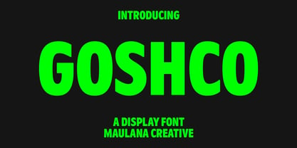 Goshco is a strong look modern display sans serif font. With all caps and bold stroke, fun character with a bit of ligatures and alternates. To give you an extra creative work. Goshco font support multilingual more than 100+ language. This font is good for logo design, Social media, Movie Titles, Books Titles, a short text even a long text letter and good for your secondary text font with script or serif. Make a stunning work with Goshco font. Cheers, Maulana Creative
 - The Mezirane by Almarkha Type,
$23.00 Hello Everyone, introduce our new product The Mezirane - Bold Sans Ligature inspired by the title of the sports poster,We make it very energetically, taking into account the thickness and density of each gliph, along with a ligature that makes this font look unique. The Mezirane font with strong and challenging nuances. very suitable for the title, typography, clothes, Poster, magazines, brochures, packaging,Websites and much more for your design needs, making your designs more modern and professional. Caps Only Fonts.
 - Riley Wow by Etewut,
$36.00 Riley Wow typeface is rounded sans serif. It includes 3 font styles that can be used together to call glowing effect. The typeface supports all European languages based on Latin alphabet.
 - Borka by Wirtu,
$8.00 Borka is sans-serif, clean and simple family that can be used for wide variety of purposes. It is well suited for web text, advertisements, designs, flyers, posters, brochures and more.
 - Threva by GlyphStyle,
$15.00 Threva is a stylish sans serif font with 2 styles, solid and outline. You can combine the two into something creative. The shape is not too stiff, looks modern and elegant
 - TradaSerif by Hoftype,
$49.00 TradaSerif is a new addition to the Trada family. Crisp and clear in appearance, it preserves the same formal spirit and the principal structural elements of TradaSans. TradaSerif offers a wide range of styles, from tenderly thin to thundering black. It also affords excellent text qualities and works brilliantly as a distinctive headline face. TradaSerif consists of 20 well-tuned weights and is well-equipped for advanced typography. It comes in OpenType format with extended support for up to 80 languages. All weights contain small caps, ligatures, superior characters, proportional lining figures, tabular lining figures, proportional old style figures, lining old style figures, matching currency symbols, fraction- and scientific numerals, matching arrows, and alternate characters.
 - Askan by Hoftype,
$49.00 Askan is a new serif face which is suitable both for a pleasant experience in reading texts as well as for striking headlines and for subtext applications with the heavier weights. Askan shows that it was designed in 2019, generally avoiding any reference to historical models. The reduced number of formal elements results in a clear and contemporary look. The Askan family consists of 18 styles and is well equipped for advanced typography. It comes in OpenType format with extended language support. All weights contain small caps, ligatures, superior characters, proportional lining figures, tabular lining figures, proportional old style figures, lining old style figures, matching currency symbols, fraction- and scientific numerals, matching arrows and alternate characters.