6,066 search results
(0.054 seconds)
- Liberace - Unknown license

- Escargots - Unknown license

- Casual Brush by Jonahfonts,
$40.00 Read John Downers' article in Typographica®: ‘Our Favorite Typefaces of 2007’ http://www.typographica.org/typeface-reviews/scriptonah-and-casual-brush/ Click the Gallery above for the .pdf. Suitable for posters, titles, book covers, greeting cards, signs, packaging, invitations, ads, headlines and captions.
 - Moon Phases by Fascination Workshop,
$10.00 Moon Phases documents the phases of the moon over time. Great for animation, signs, greeting cards, posters, etc. The phases of the moon follow the alphabetical order. Upper and lower case characters are the same. For a character map, see the gallery.
 - ABTS Gunsmoke by Albatross,
$29.00 ABTS Gunsmoke is a typeface inspired by the wild west of American History. It is a narrow typeface with a nice rhythm and balance, allowing for easy typesetting. Gunsmoke includes 447 characters, including all of the symbols seen in the gallery images.
 - Confitería by Sudtipos,
$39.00 Confitería is the Spanish word for a shop where sweets and chocolates are made and sold, which sometimes has a tea room. And now Confitería is also a font that brings to mind lettering piped on delicate cakes ... sweet but never sickly. This font captures something of that simple and innocent beauty of traditional confiterías, where good manners will never go out of fashion, menus are elegant and time comes to a standstill to make way for life’s little pleasures. A confitería is a perfect place to share sweet tidbits with a friend or date, eavesdrop on the conversation at the next table, read a book, or just people-watch from the window. I celebrated my last birthday at one. There is one iconic confitería in Buenos Aires that I love more than the rest because, some 60 years ago, it put up its marvellous sign and never took it down. Walking by it is sure to bring a smile to your face. It’s big. Very big. And the lettering in its name is written in a timelessly beautiful vertical script – the most attractive I have ever seen. I joined forces with Sol Matas – who worked with me to update the Montserrat font –to design this geometrical connected font with pleasant, even strokes. It is elegant and saccharine-free. And to top it off, it comes in several flavors. Welcome! What can we get you?
 - Helsinki - Unknown license

- Gift Wrapped - Unknown license

- CarbonType - Unknown license

- Antibiotech - Unknown license

- Inline Square JNL by Jeff Levine,
$29.00 Inline Square JNL is modeled from the hand lettered title found on the 1935 sheet music for "Cielito Lindo (Beautiful Heaven)", and is available in both regular and oblique versions.
 - Artful Nouveau JNL by Jeff Levine,
$29.00 Artful Nouveau JNL was modeled from the hand lettering on the sheet music cover for the 1910 song "Gee, But It's Great to Meet a Friend from Your Home Town".
 - Nouveau Work JNL by Jeff Levine,
$29.00 Based on the sheet music title lettering for Al Jolson's 1920 song "Grieving for You", the casual style of Nouveau Work JNL is available in both regular and oblique versions.
 - Rhineland Roman JNL by Jeff Levine,
$29.00 Rhineland Roman JNL was modeled from the hand lettered title of some 1939 German sheet music entitled "Ich Hab'Mir Fur Grinzing", and is available in both regular and oblique versions.
 - Drexel JNL by Jeff Levine,
$29.00 The bold hand lettered title on the 1940 sheet music for the band piece "Drexel Marching Song" was the inspiration for Drexel JNL; available in both regular and oblique versions.
 - Wonderful JNL by Jeff Levine,
$29.00 A little bit of thick-and-thin Art Deco hand lettering is offered up in Wonderful JNL, based on some promotional text found on an old piece of sheet music.
 - Deco Style JNL by Jeff Levine,
$29.00 The hand lettered title on the 1943 sheet music for "This Love of Mine" formed the basis for Deco Style JNL, which is available in both regular and oblique versions.
 - Literaturnaya by ParaType,
$30.00 Musician with the stage name of Pelle Piano, with an interest in irregular and informal lettering, 1950s style lettering, and a childhood influenced by Letraset sheets and a Letraset catalog.
 - Song And Dance JNL by Jeff Levine,
$29.00 The hand lettering of a piece of 1930s sheet music's title has once more yielded an interesting take on the popular "thick and thin" lettering of the Art Deco period.
 - Love Song JNL by Jeff Levine,
$29.00 Love songs are the perennials of music, outlasting all other popular fads and styles that come and go. The 1920s through the 1940s is considered by some to be the Golden Age of the American love song. Thousands upon thousands of copies of popular sheet music sold, and the cover lettering and art on many titles were from some of the finest illustrators of their time. Love Song JNL recreates the Art Deco-flavored design found on one such piece of sheet music from the 1930s.
 - Finery JNL by Jeff Levine,
$29.00 A 1949 piece of piano solo sheet music entitled "Playing Jacks" contained the title beautifully hand-lettered in a stencil-like alphabet. Finery JNL is the digital version of this design.
 - Blue Orchid JNL by Jeff Levine,
$29.00 A piece of 1940s sheet music for the song "Blue Orchids" was the inspiration for both the type design (based on the hand lettered title) as well as the font's name.
 - Words And Music JNL by Jeff Levine,
$29.00 The 1934 sheet music for "I'll String Along with You" from the Dick Powell-Ginger Rogers musical "20 Million Sweethearts" yielded the charming Deco monoline design for Words and Music JNL.
 - The GodFather - Unknown license

- Jam Pact - Unknown license

- Britney in a Blender - Unknown license

- Zona Armada - Unknown license

- Hello Stylish by Get Studio,
$15.00 Hello Stylish is a chic script font with sweet flowing and natural pressure. This font is a great choice for a watermark on photography, signature logo design, quotes, album cover, business cards, and many other design projects. Includes a full set of gorgeous uppercase and lowercase letters, numerals, a large range of punctuation, OpenType Features such as Stylistic Alternate, Contextual Alternate, and a lot of ligatures.
 - Rainy Candy by Illushvara,
$14.00 Hello, We are so excited to announce our new fonts "Rainy Candy" is unique display font. Use it to make your ideas even more realistic like a kids, sweet packaging, merchandise and create spectacular the Christmas designs! Features : Uppercase and lowercase Numbers Symbols Multilingual Accent What you get : Rainy Candy. OTF If you have any question, don’t hesitate to contact me. Happy Designing !!! Thank You, Bayu Suwirya
 - Herbal Infusion by Supfonts,
$15.00 Herbal Infusion is a sweet, modern calligraphic font with ligatures. It is perfect for branding, wedding invitations and invitation cards and many more Font includes a full set of gorgeous uppercase and lowercase letters, numbers, a large selection of punctuation marks and ligatures. Includes: Regular Script Latin languages support Uppercase and lowercase Numbers and punctuation Ligatures Check out my blog: https://www.instagram.com/di.zigner pinterest.com/dmitriychirkov7 Enjoy
 - Sullivan by Magpie Paper Works,
$36.00 Sullivan is a modern calligraphy font with a sweet and considered vibe. Handdrawn with vintage calligraphy nibs and ink, he is ready to shine in personal correspondence, scrapbooks, stationery, and illustrated reference and picture publications. (Sully adores love letters and recipes.) In addition to a complete set of capital and lowercase letters, he also includes multi-lingual support, currency figures, fractions, numerals, punctuation and more.
 - Loving me by Letterara,
$12.00 Loving me is a new, fresh, sweet, and quirky handmade font. It’s ideal for branding and decorate your projects. Loving me font has a classy, and modern look that can be used for logos, branding, invitations, poster, advertising, stationery, wedding designs, social media posts, and much more! It is PUA encoded which means you can access all of the glyphs and swashes with ease!
 - Kingfish by Fype Co,
$16.00 Kingfish is a perfectly playful display font with sweet ligatures. Inspired by hand lettering marker pen with bold, thick and strong style. The unique characteristics of kingfish make it suitable for logotype, packaging, branding, heading, poster, apparel, title, and more kids content. With a set of ligature characters make your have many choices to be creative. It brings joyful and happiness to all of us.
 - Chocoladine by Sign Studio,
$12.00 Chocoladine is inspired by the fern leaves that curl and grow at the tips. In capital letters the shape will appear. This font is also in the retro category which is still popular today. Casual, warm, sweet that's about it. It is suitable for printing t-shirts, mugs, book covers, invitation, product branding, packaging, advertising, retro logos and many more. Thank you, I hope you enjoy it.
 - Merlandio by FadeLine Studio,
$14.00 Introducing! Merlandio is a hand painted font with a style natural, sweet and simple. Made with great care to provide the natural and modern elements. This font will look great if used single even with other pairing fonts. The great thing about this font is you can find some style when you use it, examples such as natural handwriting style, unique, simple, elegant, and bold.
 - Pretty Butterfly by Letterara,
$14.00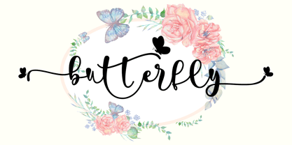 Pretty Butterfly is a sweet and beautiful handwritten font. It has a classy, elegant, and modern look which can be used for logos, branding, invitations, stationery, wedding designs, social media posts, and much more. This font is PUA encoded which means you can access all of the butterfly-themed glyphs and swashes with ease! It also features a wealth of special features including alternate glyphs and ligatures.
 - Redmarch by BaronWNM,
$12.00 Redmarch is a monoline script font that gives a natural-looking impression that is perfect for those of you who want to use a signature font. Redmarch is very suitable for branding, advertising, name cards, product labels, printing t-shirts, greeting cards, invitation cards, etc. Redmarch has several ligatures, begining and anding swashes to give a sweet touch at the beginning and end of words.
 - Be Bowtiful by One Line Design,
$19.99 Wrap it up by adding a little sweetness to your words. This is an addition to the Be Me font family, to give it a little flair and charm. Doll up announcements, posters and so much more. Letter alternates available so the placement of the bow is perfect for your word/s. Includes: Basic Latin Latin- 1 Supplement Latin extended-A Latin extended-B
 - Bocadillo by Hanoded,
$22.00 A Bocadillo is a sandwich. I guess I was craving one when I had to name this font! Bocadillo is a sweet Brush script. It is all caps, but upper and lower case are different and like to mingle. It is an ideal font for product packaging, posters, book covers, postcards and big ‘I love you’ billboards. Comes with a generous helping of diacritics.
 - Pisang Manis by Hanoded,
$16.00 Pisang Manis means ‘sweet banana’ in Bahasa Indonesia. I don’t think this particular combination is used in everyday life, but it sounds nice. Pisang Manis is based on an older font of mine, called Pisang, which I created in 2013. It looks similar, but it is a different font altogether. Pisang Manis is a ‘Tall & Thin’ display font, ideally used for product packaging, websites and book covers.


