10,000 search results
(0.052 seconds)
- Luck Flag by Maulana Creative,
$13.00 Luck Flag is a retro stamp effect sans serif font. With medium low contrast stroke, fun character with a bit of ligatures and alternates. To give you an extra creative work. Luck Flag font support multilingual more than 100+ language. This font is good for logo design, Social media, Movie Titles, Books Titles, a short text even a long text letter and good for your secondary text font with sans or serif. Make a stunning work with Luck Flag font. Cheers, Maulana Creative
 - MC Hork Beans by Maulana Creative,
$22.00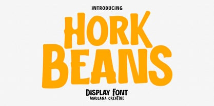 Hork Beans is a simply casual handwritten font. With medium low contrast stroke, fun character with a bit of ligatures and alternates. To give you an extra creative work. Hork Beans font support multilingual more than 100+ language. This font is good for logo design, Social media, Movie Titles, Books Titles, a short text even a long text letter and good for your secondary text font with sans or serif. Make a stunning work with Hork Beans font. Cheers, Maulana Creative
 - Pearl Jean by Maulana Creative,
$18.00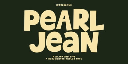 Pearl Jean is a casual handwritten display font. With medium low contrast stroke, fun character with a bit of ligatures and alternates. To give you an extra creative work. Pearl Jean font support multilingual more than 100+ language. This font is good for logo design, Social media, Movie Titles, Books Titles, a short text even a long text letter and good for your secondary text font with sans or serif. Make a stunning work with Pearl Jean font. Cheers, Maulana Creative
 - MC Rectila by Maulana Creative,
$17.00 Rectila is a simply semi-geometric sans serif font. With medium low contrast stroke, fun character with a bit of ligatures and alternates. To give you an extra creative work. Rectila font support multilingual more than 100+ language. This font is good for logo design, Social media, Movie Titles, Books Titles, a short text even a long text letter and good for your secondary text font with script or serif. Make a stunning work with Rectila font. Cheers, Maulana Creative
 - Brad Rowland by Maulana Creative,
$15.00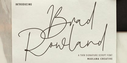 Brad Rowland is a fancy handwritten script font. With medium contrast stroke, fun character with a bit of ligatures and alternates. To give you an extra creative work. Brad Rowland font support multilingual more than 100+ language. This font is good for logo design, Social media, Movie Titles, Books Titles, a short text even a long text letter and good for your secondary text font with sans or serif. Make a stunning work with Brad Rowland font. Cheers, Maulana Creative
 - MC Forka by Maulana Creative,
$18.00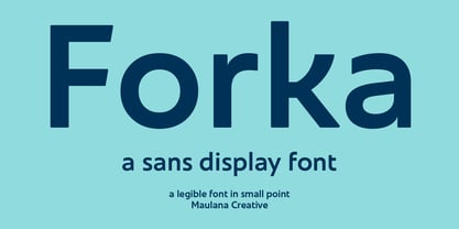 Forka is a minimal modern fun sans serif font. With medium low contrast stroke, fun character with a bit of ligatures and alternates. To give you an extra creative work. Forka font support multilingual more than 100+ language. This font is good for logo design, Social media, Movie Titles, Books Titles, a short text even a long text letter and good for your secondary text font with script or serif. Make a stunning work with Forka font. Cheers, Maulana Creative
 - Brojeria by Maulana Creative,
$14.00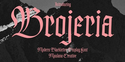 Bojeria is a Classic modern Blackletter font. With medium high contrast stroke and smooth edges, fun character with a bit of ligatures and alternates. To give you an extra creative work. Bojeria font support multilingual more than 100+ language. This font is good for logo design, Social media, Movie Titles, Books Titles, a short text even a long text letter and good for your secondary text font with sans or serif. Make a stunning work with Bojeria font. Cheers, Maulana Creative
 - Gritts Rolly by Maulana Creative,
$14.00 Gritts Rolly is a slanted expressive signature script font. With medium contrast stroke, fun character with a bit of ligatures and alternates. To give you an extra creative work. Gritts Rolly font support multilingual more than 100+ language. This font is good for logo design, Social media, Movie Titles, Books Titles, a short text even a long text letter and good for your secondary text font with sans or serif. Make a stunning work with Gritts Rolly font. Cheers, Maulana Creative
 - HONKUS - Personal use only

- Axial Caps Med - Personal use only

- Thoroughfare JNL by Jeff Levine,
$29.00 The Art Deco style of the 1930s offers many variants of the popular "streamline" look in hand lettering found on old sheet music titles. Thoroughfare JNL is one such example of a monoline design with the interesting curves and angles that was considered so modern and up to the minute for its time.
 - Good Night JNL by Jeff Levine,
$29.00 The beautiful hand lettering on the sheet music cover for Will R. Anderson's "Good Night Dear" (circa 1908) features quaint, semi-calligraphic lettering in the Art Nouveau Style. The song itself was popularized by Billie Burke [best remembered as the Good Witch in “The Wizard of Oz”] in the musical comedy "Love Watches".
 - Babes In Toyland NF by Nick's Fonts,
$10.00Handlettering on a piece of sheet music from 1903 was the inspiration for this little whimsical wonder. The font features a very sinuous S and teddy-bear bookends in the {brace} positions. This font contains the complete Latin language character set (Unicode 1252) plus support for Central European (Unicode 1250) languages as well. - Flirtation Walk JNL by Jeff Levine,
$29.00 Flirtation Walk JNL was inspired by the lettering on the covers of sheet music for songs taken from the 1934 Dick Powell-Ruby Keeler movie "Flirtation Walk". The typeface features some stylized characters as well as the more familiar Art Deco character designs, and is available in both regular and oblique versions.
 - Nouveau Nights JNL by Jeff Levine,
$29.00 The deep well of creativity that is the era of the hand lettered sheet music title page brings forth Nouveau Nights JNL. Re-drawn from a period example of the 1920s, this titling font perfectly captures the warm "human" look of pen and ink lettering, long before the advent of "perfect" digital type.
 - Nouveau Dreams JNL by Jeff Levine,
$29.00 The 1910 sheet music for “In All My Dreams I Dream of You” had the title hand lettered in an eclectic sans serif that typified the free form Art Nouveau movement of the time. The lettering was recreated digitally as Nouveau Dreams JNL, and is available in both regular and oblique versions.
 - Merry Script by Letterara,
$14.00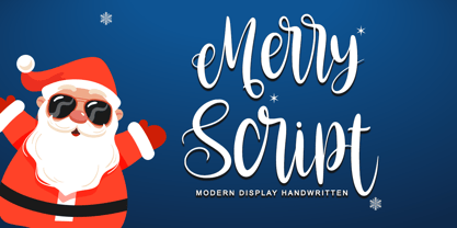 Merry script font that is simple and unique looking. Its beautiful charm makes it appear wonderfully down-to-earth, readable, and, ultimately, incredibly versatile. This will add a fun and friendly touch to any of your projects! This font is PUA encoded which means you can access all glyphs and sweeps easily.
 - Stage Production JNL by Jeff Levine,
$29.00 A 1935 piece of sheet music entitled “(There’s A) Little Picture Playhouse in My Heart” had its movie-themed title hand lettered in a condensed Art Deco style with a few interesting character variations. The resulting digital type design is Stage Production JNL, which is available in both regular and oblique versions.
 - Anglina Farmhouse by Letterara,
$14.00 A simple Anglina Farmhouse font looks unique and classy. Its beautiful charm makes it look absolutely stunning, easy to read, and, ultimately, incredibly versatile. This will add a fun and friendly touch to any of your projects. This font is PUA encoded which means you can access all the glyphs and sweeps easily.
 - Adellia Heart by Rotterlab Studio,
$15.00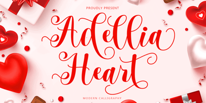 Adellia Heart is a modern calligraphy font created especially for Spring. Adellia Heart is great for unique branding, photo overlays, watermarks, greeting cards, posters, business cards, invitations, weddings, photography, fashion, clothing, letters, stationery, etc. This font is PUA encoded which means you can access all the glyphs and sweeps easily! Thank You
 - Odd Stencil JNL by Jeff Levine,
$29.00 The sheet music for "Dancing Butterfly" had the title of the 1929 composition hand lettered in what can be only described as an odd hybrid of letters with an Art Nouveau stencil influence. This quirky style became the basis for Odd Stencil JNL, which is available in both regular and oblique versions.
 - Brush Off JNL by Jeff Levine,
$29.00 Brush Off JNL is based on the hand-lettered title from the cover of the 1955 sheet music of "Love is A Many Splendored Thing". The unique, artistic and somewhat eccentric letter shapes are both reminiscent of show card lettering and calligraphy. The design is available in both regular and oblique versions.
 - Nouveau Spurred JNL by Jeff Levine,
$29.00 The hand lettered title on the 1915 sheet music for “On the Banks of the Amazon” was the design model for Nouveau Spurred JNL, which is available in both regular and oblique versions. This gently spurred Art Nouveau Roman is a beautiful choice for headlines, book titles and other retro-influenced projects.
 - Christmas Script by Letterara,
$16.00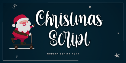 Christmas script font that is simple and unique looking. Its beautiful charm makes it appear wonderfully down-to-earth, readable, and, ultimately, incredibly versatile. This will add a fun and friendly touch to any of your projects! This font is PUA encoded which means you can access all glyphs and sweeps easily.
 - Galerie Simpson by chicken,
$17.00 An entirely strange, illogical and inconsistent font packed with inappropriate curlicues and appendages “translated and composed” from a few words on a crumbling fragment of Victorian sheet music. It was developed to form the logotype and display text of a manifesto for a creative collective working as artists, researchers, producers and agents.
 - Sign Painter JNL by Jeff Levine,
$29.00A sales catalog sheet from the American Decalcomania Company circa the late 1940s-early 1950s provided some hand lettering that served as the inspiration for Sign Painter JNL. Emulating the look of characters made with a round pen nib, this Deco-style typeface conveys nostalgia and charm seldom found in advertising of today. - Casual Tune JNL by Jeff Levine,
$29.00 Brush-style lettering has been a perennial favorite for designers and sign painters because it brings to mind casual, relaxed or friendly themes. A vintage piece of sheet music called “Pretty Butterfly” by Sunny Skylar features the titled hand lettered in a simple, informal design which became the inspiration for Casual Tune JNL.
 - Christmas Calligraphy by Letterara,
$16.00 Christmas calligraphy is a dazzling formal calligraphy font that exudes sophistication and elegance. Fall in love with its ravishing style and use it to create beautiful designs. This will make the Christmas moment more classy and glamorous. This font is PUA encoded which means you can access all the glyphs and sweeps easily!
 - Bugbear by Hanoded,
$15.00 A Bugbear is a kind of hobgoblin, comparable to the Bogeyman. No tablets or gizmos were involved in the creation of this font. It was made entirely by hand, using an old-fashioned roller ball pen and a sheet of paper. Use Bugbear for your children’s book covers, party posters and product packaging.
 - Serpentine by Image Club,
$29.99Dick Jensen (USA) designed Serpentine, is a contemporary-looking display font, for the Visual Graphics Corporation in 1972. With the rise of digital typesetting and desktop publishing, this typeface quickly became both popular and ubiquitous. This dynamic, wide, boxy design is identifiable via tiny triangular swellings at the stroke endings - what might be called semi-serifs. Serpentine is available in six different font styles: Light, Light Oblique, Medium, Medium Oblique, Bold, and Bold Oblique. Serpentine" is a greenish rock that sometimes resembles a serpent's skin, and is often used as a decorative stone in architecture. Though this font doesn't seem at all snaky or sinuous, it does have an architectural, stone-like solidity. The subtle, almost non-existent curves and semi-serifs keep it from being too stern or cold. Although the underlying strokes of each weight are similar, the six members of the Serpentine font family all present their own individual personalities. Serpentine Light lends itself well to text for onscreen displays, for instance, while the numbers from typeface's heavier weights are seen around the world on soccer jerseys! Additionally, the oblique styles convey a streamlined sense of speed, furthermore lending Serpentine well to sport and athletic applications (especially the faster, high-speed varieties). Because of its 1970s pedigree, Serpentine has come to be known as a genuine "retro" face. This makes the typeface even more appropriate for display usage, in applications such as logo design, magazine headlines, and party flyers. If you like Serpentine, check out the following similar fonts in the Linotype portfolio: Copperplate Gothic (similar serifs) Eurostile (similar width) Princetown (another "athletic" font) Insignia (similar "techno" feeling)" - Serpentine by Linotype,
$29.00Dick Jensen (USA) designed Serpentine, is a contemporary-looking display font, for the Visual Graphics Corporation in 1972. With the rise of digital typesetting and desktop publishing, this typeface quickly became both popular and ubiquitous. This dynamic, wide, boxy design is identifiable via tiny triangular swellings at the stroke endings - what might be called semi-serifs. Serpentine is available in six different font styles: Light, Light Oblique, Medium, Medium Oblique, Bold, and Bold Oblique. Serpentine" is a greenish rock that sometimes resembles a serpent's skin, and is often used as a decorative stone in architecture. Though this font doesn't seem at all snaky or sinuous, it does have an architectural, stone-like solidity. The subtle, almost non-existent curves and semi-serifs keep it from being too stern or cold. Although the underlying strokes of each weight are similar, the six members of the Serpentine font family all present their own individual personalities. Serpentine Light lends itself well to text for onscreen displays, for instance, while the numbers from typeface's heavier weights are seen around the world on soccer jerseys! Additionally, the oblique styles convey a streamlined sense of speed, furthermore lending Serpentine well to sport and athletic applications (especially the faster, high-speed varieties). Because of its 1970s pedigree, Serpentine has come to be known as a genuine "retro" face. This makes the typeface even more appropriate for display usage, in applications such as logo design, magazine headlines, and party flyers. If you like Serpentine, check out the following similar fonts in the Linotype portfolio: Copperplate Gothic (similar serifs) Eurostile (similar width) Princetown (another "athletic" font) Insignia (similar "techno" feeling)" - Rockner by Linotype,
$29.99Rockner is a family of fraktur typefaces designed by the calligrapher/designer Julius de Goede. Like all Blackletter styles, fraktur evolved out of Northern Europe's medieval manuscript tradition. Fraktur was the most used Blackletter variety between the sixteenth and twentieth centuries. Unlike many similar fraktur font families, Rockner is available in three weights: Regular, Medium, and Bold. This flexibility allows for richer design possibilities. The OT fonts contain the many alternate characters, such as the long s and historical ligatures, which are often necessary for the setting of historical documents. - Sava by Adobe,
$35.00Sava is a calligraphic capitals and small capitals design by Jovica Veljović. Available in six weights--light, regular, medium, semibold, bold and black--it includes support for most western and central European languages, as well as for Greek and many Cyrillic languages. Typographic features include a series of non-standard ligatures and a large collection of specialized Byzantine ornaments. Influenced by the forms of medieval calligraphy, Sava is named after St. Sava, the first Archbishop of Serbia, who was famous as a peacemaker, and for his educational and charitable works. - SmokeShadow - Unknown license

- Protest by Society of Fonts,
$29.00 Protest is inspired by protest posters and the power of the people! Each glyph is written by hand with a Sharpie® Magnum marker on big sheets of paper. It is designed to fit more into the poster and still be legible for the media from a block away. It's bold, slightly condensed, and neatly drawn with love and conviction, with the warm imperfection that comes from being hand drawn. Protest consists of over 1,430 glyphs. This includes 300 alphanumeric glyphs with 3 contextual alternates each, 20 stylistic alternate glyphs, and 20 protest themed dingbats. Contextual alternates will rotate through automatically when OpenType features are enabled, giving it more human irregularity. Protest supports 219 latin-based languages, using Underware’s Latin Plus glyph set.
 - HS Ali by Hiba Studio,
$59.00 HS Ali was designed in memoriam of my brother - Ali Abu Afash who was martyred during the last aggression on Gaza in summer 2014. HS Ali introduced a modern OpenType Arabic typeface, which had the characterstic, features of Kufi style with noticeable both curvy and sharp segments; beside the refinements of its letters that made it more readable. HS Ali is a display font that has been designed to be used in titles in modern graphic and publication projects. It supports Arabic, Persian, Urdu and Kurdish languages and contains four weights: Light, regular, medium and bold which can be condsiderd as and elaboration to the library of Arabic fonts contemporary models that meet the variant purposes of designs for all tastes.
 - Regency Gothic, as its name suggests, is a font that channels the architectural and decorative styles prevalent during the Regency era, which occurred in the early 19th century. This typeface manages...
- 1484 Bastarde Loudeac by GLC,
$38.00 Font designed after that used in Brehan-Loudeac (Britanny, France) by Robin Fouquet and Jean Crès in years 1480s to print a lot of texts and books. This font include “long s”, naturally, as typically medieval, and a few special characters and abreviations, also some variants, like for “d”, “r” or “v”. The small “y” is accented, just like in British alphabet of the time, though the texts were printed in French. Added, a lot of accented characters no longer existing on this time. A render sheet, in the font file, makes it more easy to identify on a keyboard. This font is used as variously as web-site titles, posters and flier designs, editing ancient texts... all you need. This font supports easily as large than small size, remaining readable, original and pretty.
 - Saussa by Linotype,
$29.99Patricia Pothin-Roesch's Saussa typeface began life as brush-lettered artwork for fruit salad packaging in France. After the key letters had been painted, Patricia Pothin-Roesch switched to digital tools to create the final font. True to its roots, Saussa is a real advertising face, perfect for point-of-purchase displays. Even its name is consistent with its intended area of application: Saussa sounds a lot like the word “sauce.” Saussa is an informal script; its outstrokes function almost like serifs, and the capitals have a lowercase structure. The feelings this typeface conveys are due to the hand of its creator, Patricia Pothin-Roesch, an experienced brush-letterer. - Strawberry Swirl by Krafted,
$10.00 Imagine a world filled with swirls of strawberry, pops of pink, and pure joy to go around for everyone... Are you trying to make an elegant, sweet, and stylish statement with your invitations, social media, website, or printed materials? Then grab some cotton candy, crack a smile, and get ready for a swirly day of wonders! Introducing Strawberry Swirl - A Modern Script Font. This gorgeous & stylish font can be used for a host of different content needs and projects. Use it for your headings, logos, business cards, printed quotes, invitations (wedding, birthday, engagement, etc.), packaging, resumes, and even your website or social media branding. Enchant & delight your audience, clients, or guests with this versatile, stylish, and elegant font. What you’ll get: - Multilingual & Ligature Support - Full sets of Punctuation and Numerals Compatible with: - Adobe Suite - Microsoft Office - KeyNote - Pages Software Requirements: The fonts that you’ll receive in the pack are widely supported by most software. In order to get the full functionality of the selection of standard ligatures (custom created letters) in the script font, any software that can read OpenType fonts will work. We hope you enjoy this font and that it makes your branding sparkle! Feel free to reach out to us if you’d like more information or if you have any concerns.


