10,000 search results
(0.029 seconds)
- Bandy - Unknown license

- Roughmarker by 38-lineart,
$16.00 Roughmarker font consists of two handwritten scripts, a slant (regular) version and upright. This Script fonts are manually handwritten with quick and rough strokes. We write them on paper until we find a very proportioned form. Then we scanned and took the selected glyphs to be processed into a font. The biggest challenge in making textures fonts are the very many node points, many node points make the font processing performance a bit slow. At first we tried raising the node parameters to 2000-4000 points in one glyph. This is a big number, but if this number is lowered it will eliminate the impression of brush and natural look. We repeatedly look for gaps to minimize points so that the font capacity is not too large and comfortable when typed. This script font is equipped with ligature as well as several alternate according to handwriting habits, very effective in the sense of not too much but often used. This font is the great choice for contemporary brands, especially for businesses in fashion, urban style, websites, trends in architecture, cosmetics, and energetic lifestyle themes. An attractive typographic layout makes it also looks more premium in writing quotes.
 - Vastago Grotesk by Sudtipos,
$39.00 We are pleased to announce the launch of Vástago Grotesk, a nine-weight sans serif font family, inspired by the traditional grotesque designs of the 20th century. The particular ink traps, result of the G drawing, create it a visual universe that is replicated throughout the system, generating personality and a functional distinctive in multiple contexts. Vástago Grotesk was born out of an interest in exploring the possibilities of Sans Serif font design, a process that is complemented by the advice of excellent typographers throughout the world thanks to the Type Crit Crew initiative. The design was carefully constructed, achieving functionality in different sizes, ranging from a subtle Thin to a Heavy weight that projects grandeur and character. Vástago Grotesk is a challenge come true. We hope you enjoy it.
 - Doyen-D by Substance,
$12.00 A distorted, broken & cracked typeface. Doyen-D.ScreenRegular uses the same letter forms as the rest of the Doyen-D family, however the letters have gone through a halftone screen print process, resulting in even further distortion of the typeface.
 - Vellvé by ITC,
$29.99For over 30 years, Tomás Vellvé created beautiful graphics and distinctive typefaces in his native homeland of Spain. First drawn as a phototype display design in 1971, Vellvé’s only typeface in digital form is an uncommon solution to the problem of creating a new sans serif design. The end result, which bears his name, is a design that stands out from the crowd of other sans serif typefaces. The phototype version was only available in a single, light weight. With the release of the digital fonts, however, three additional weights as well as a companion italic for the light weight were created.The typeface designs were originally drawn for Agfa Monotype (now Monotype Imaging) in 1996 as part of the company’s “Creative Alliance” initiative. Through an exclusive licensing arrangement, the Vellvé™ family has now been added to the ITC Typeface Library.ITC Vellvé is a wide design with strong calligraphic overtones. This is no “anonymous” design like so many modern sans. Letters like the `R, `e and `s clearly show the hand of Tomás Vellvé in the design process. Vellvé provides a fresh choice between geometric sans serifs such as Helvetica® and industrial sans serifs like Futura®. - BB Anonym (Pro) by Bold Studio,
$49.00 BB Anonym™ (Std/Pro) is based on the research and realizations of the BB Noname™ Typeface and complements the font family with a rounded version. The idea and design are based on the principle of outsourcing and encryption: an intermediate step in the design process and production is inserted: "Designer, reseller, client". The process is not visible to the end user, but it affects the visual result. Compared to the sharp version, the font looks simpler and the craft and technical requirements are more complex. ● 3 Variants: designer, retailer, client ● 20 Stylistic-sets ● 17 Styles ● 39 OpenType features ● 93 Languages support ● 16,371 Glyphs (963/style)
 - The Customs by Abo Daniel,
$23.00 Proudly Present THE CUSTOMS -Luxury Bold Signature Font- After going through a long process, finally, this stunning signature font is finished and released. This font is made with an extra careful process. THE CUSTOMS is designed for professional projects. It's great for logos, branding, business cards, flyers, posters, photography, t-shirts, watermark, and anything your projects that need elegant touch. 353 HANDWRITTEN LIGATURES I made 353 ligatures to keep this font look more natural and very user-friendly. you can see them in display pictures. FEATURES Uppercase Lowercase Number & Punctuations 353 Ligatures PUA Encoded Please enjoy this stunning signature font. I hope you love it regards, Abo Daniel Studio
 - Houseguest PB by Pink Broccoli,
$14.00 Houseguest is fun, childish, heavyweight offbeat sans serif font with an alternate caps set, and a stylistic alternates to swap in a handful of lowercase styles for a unicase mix.
 - Hermaphrodite by Volcano Type,
$29.00Hermaphrodite was developed for the Bastard Project and had its origin in the idea of applying the process of an Antiqua on a Grotesque. In other words, a Grotesque font was drawn calligraphically and then digitized. Some inconvenient corners were simply cut off. - Mozzart Rough by Posterizer KG,
$19.00 Vintage, printed look Mozzart Rough typeface from Posterizer KG Type Foundry is one of two decorative versions of Mozzart Sans font family (slightly rounded, Neo-Grotesque corporate font, created for MOZZART D.O.O. company from Belgrade, Serbia). Mozzart Rough contains: 2 Weights, 2 Condensed and 1 Oblique version of the font, complementing each other perfectly. All versions contains completely MacOS Roman and MacOS Cyrillic code pages, tabular figures, small caps... Along with all of this, you will also discover extra added unique ornaments and symbols. It will be helpful for users to create realistic letterpress pages. Enjoy! Because of its complex outlines, Eveleth may process slowly in some applications.
 - Fun Trace by FunFont,
$17.00 FunTrace is font prepared to make it easier to teach children to recognize letters, numbers and practice writing. Designed to consist of 6 sub-families of fonts (Regular, Bold, Dashes, Directions, Outlines, and Guide Lines) supports the child's learning process in a fun way.
 - FG Typical by YOFF,
$14.95FG Typical is inspired by typewriting. But the letters got skewed in processing making it look a bit corny, but it looks great at small sizes as well as large. the characters all have the same height except for the i, å, ä etc. - Grimm by The Type Fetish,
$25.00 The origin of Grimm was to create a typeface in the spirit of Elliott Peter Earls' Subluxation, but somewhere in the process things shifted to a blackletter influenced uppercase while the lowercase became more roman. The end result is a quirky little blackletter display typeface.
 - OCR B by Linotype,
$40.99OCR A and OCR B are standardized, monospaced fonts designed for Optical Character Recognition" on electronic devices. OCR A was developed to meet the standards set by the American National Standards Institute in 1966 for the processing of documents by banks, credit card companies and similar businesses. This font was intended to be "read" by scanning devices, and not necessarily by humans. However, because of its "techno" look, it has been re-discovered for advertising and display graphics. OCR B was designed in 1968 by Adrian Frutiger to meet the standards of the European Computer Manufacturer's Association. It was intended for use on products that were to be scanned by electronic devices as well as read by humans. OCR B was made a world standard in 1973, and is more legible to human eyes than most other OCR fonts. Though less appealingly geeky than OCR A, the OCR B version also has a distinctive technical appearance that makes it a hit with graphic designers. - OCR A Extended by Monotype,
$40.99OCR A and OCR B are standardized, monospaced fonts designed for Optical Character Recognition" on electronic devices. OCR A was developed to meet the standards set by the American National Standards Institute in 1966 for the processing of documents by banks, credit card companies and similar businesses. This font was intended to be "read" by scanning devices, and not necessarily by humans. However, because of its "techno" look, it has been re-discovered for advertising and display graphics. OCR B was designed in 1968 by Adrian Frutiger to meet the standards of the European Computer Manufacturer's Association. It was intended for use on products that were to be scanned by electronic devices as well as read by humans. OCR B was made a world standard in 1973, and is more legible to human eyes than most other OCR fonts. Though less appealingly geeky than OCR A, the OCR B version also has a distinctive technical appearance that makes it a hit with graphic designers. - Song Merchant JNL by Jeff Levine,
$29.00 Although the early 1900s through the 1920s seemed to be the "Golden Age" of ridiculously long novelty song titles, it appears that even the decade of the 1940s had its fair share as well. Song Merchant JNL was modeled from the hand lettered [but exhausting] title of the sheet music for "Princess Poo-Poo-Ly Has Plenty Pa-Pa-Ya (and she Loves to Give it Away)". Despite the obvious double-entendre inferences of the title, the square block letters with rounded corners make for a useful headline font (even if the source material it was drawn from is quite forgettable). Available in regular and oblique versions.
 - Salernomi J - Unknown license

- Londoner by Motokiwo,
$10.00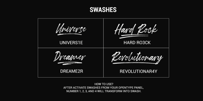 Londoner is a handwritten font with a dry brush texture. It was created directly with my marker vector brush, the whole process is digitalized. Londoner is suitable for logo, product branding, or for text overlay to any background image. Londoner comes with ligatures, swashes, multilingual support, and PUA Encoded.
 - Otis Condensed by Australian Type Foundry,
$30.00The name Otis arose from an incident in a shopping mall in which, realising my shoelace was undone while on an escalator, I bent down to tie it, became aware of the approaching end, panicked, fell over, and in the process happened to notice the escalator's brand name. - Alt Hiroshi by ALT,
$10.00 Hiroshi is a 6 weight decorative typeface and is one of the best fonts I ever created for many reasons. I really enjoyed the all the design process (yes even the kerning) and I’m very very proud with the results you can check out the whole presentation at www.behance.net.
 - Bondoluo by Álvaro Thomáz Fonts,
$35.00 Bondoluo is a geometric font family developed by Álvaro Thomáz in 2012, The creation process was inspired by 3 geometric forms - triangle, circles and squares - and 2 amazing fonts - Futura® and URW Gothic. The Bondoluo Display font was inspired by Diamonds by HVD. Be fashionable with Bondoluo fonts!
 - Fontanella by Latinotype,
$29.00 Fontanella is a typeface designed by Coto Mendoza, which emerged from calligraphy and manual drawing exploring the skeleton and classic proportions of Roman capital letters. This initial process later gave rise to a sans serif family composed of 8 pesos and its italic variants. It also includes small caps, old numbers and width variants in the set of alternates. The slightly enlarged x-height makes it perfect for composing short texts in editorial, fashion, branding, magazine, television, window display and other media projects. Fontanella a classic spirit reinterpreted in a contemporary language. We especially thank Alfonso García for his impeccable work on the digital edition and Nicolás Tobar for the art direction on the specimens.
 - Nulato by Stefan Stoychev,
$29.88 NULATO is a sans serif font inspired by the great Alaskan outdoors and the clean shapes of the horizon. The font represents a modern and slick approach to a minimalist trend behind the core of great brand identity practices. Nulato took a year to develop, from the first sketches to the final 700+ glyphs the process took a significant amount of research and variables. The letters, specific ligatures, and symbols are a full stack. It was specifically designed with the classic approach to balance and appearance, but with a strongly advocated contemporary characteristic of font design and marks. NULATO evokes the perception of something familiar, but with that extra, needed for inspiring the new.
 - Eina by Extratype,
$40.00 Eina was designed as a corporate typeface for the design school “EINA, University Centre of Design and Art.” It’s not just a font to be used — Eina embodies an educational concept that transcends simple typographical use. Eina is a typeface to be explained and used to teach typography. The whole process of design and development is reflected in the publication “Four nuances of a typographical standard: A typeface for EINA.” Eina is a versatile and multipurpose sans-serif typeface, consisting of 32 original styles, organized into four categories: rational, humanist, geometric & industrial. Each category contains four weights with their corresponding italics. You can purchase the full family, each individual weights, or four packages with each categories.
 - Plau Redonda by Plau,
$249.00 Humanist on one hand, geometric wannabe on the other Born from the need of having a custom font for our own branding, Redonda became too big to keep just for us. Like that, came to light Plau's 10th retail font, the first one designed by Carlos Mignot. The font's personality is a result of a search for extreme impact. Having started out as a exclusively Black geometric face, it became a full, versatile humanist sans. While it maintains the impact that inspired it, it also offers performance for both UI and body copy. This balance reflects the font's creative process: at first it referenced historic examples, but we also made sure it worked as a contemporary face.
 - Simple by Winnie Tan,
$69.00 Simple - The Bilingual Font. The process of Simple began with the usual alphabets followed by a series of icons and soon it was an avalanche of Chinese characters. The pool of proposed Chinese characters were loosely determined by the needs of a lunar calender. In a nutshell, Simple is a single-weight, minimal, grid-based Sans-serif display. Prudent with details and sturdy in form, the geometrically-driven structure marks the foundation of a cross-cultural assortment of Latin alphabets, Chinese characters and thematic icons. After months of extensive typesetting, Simple is also realized to be well-catered for use in graphical information design in games and tournaments, logotypes, advertisements and headlines. http://www.behance.net/gallery/Simple/847905
 - Susanna by K-Type,
$20.00 A light sans serif designed for Susanna Lakner’s 22 Days mail art project. The characters were drawn on each of 22 evenings throughout November 2004. In December the drawings were scanned to create the Susanna font.
 - Erwin by Sun Young Oh,
$54.00 Inspired by an Austrian artist Erwin Wurm's Fat series, Erwin is a typeface that evokes visual associations of overeating letters, giving the impression of letters on the brink of bursting. This design seamlessly combines an analog sensibility with a bold touch. Erwin is a typeface with a sense of fragility and vulnerability, deeply rooted in analog emotions. Each character is not derived from a model but crafted through a hand-drawing process, making every letter a unique and independent form. This approach reduces regularity between characters while preserving their artistic qualities, resulting in an unconventional letter flow. Erwin underwent a handwriting process but doesn't exhibit an overtly hand-drawn style. Instead, it is a unique display typeface, featuring artistic, comic-style, and humorous elements.
 - D44 Caps by FSD,
$40.00D^44 Caps represents a sort of inverted creative process: start from the printed element to create the font to print. The esthetic analysis of pression's missprint is the origin of D^44 design. The redesign of this misprint has created 3 versions differentiated by optical weight: Bold, Only and Light. - Double Tracker by Hanzel Space,
$25.00 Double Tracker is an inspiration for a font with paint strokes so that it has a texture that seems natural, done with an original ink stroke process.. The strong and sturdy design makes it ideal for eye-catching headlines, branding, packaging, magazines, sports, logos, and more. Happy Creating! Hanzel Studio
 - Karnchang by Jipatype,
$17.00 Karnchang is a versatile sans-serif typeface that offers a range of 90 styles, spanning from thin to black in weight and condensed to expanded in width. Its adaptability makes it well-suited for a variety of purposes.
 - Woodmark JNL by Jeff Levine,
$29.00 Woodmark JNL is a rough and somewhat irregular in letter form wood type based on some examples of William H. Page's "New Process No. 507". The eccentricity of the letters is reminiscent of many of the 1800's wood type designs, and is perfect for a rustic look within any retro project.
 - Hagane by Saiffont,
$20.00 This typeface was created during the process of logo making. Simple and stylish design which can be used in pretty much any projects, especially in action themed projects. The sharp terminals in this typeface resemble the tip of "Katana", a Japanese weapon. Hagane means "steel" in Japanese, which is used to make Katana.
 - Fun Trace Arabic by FunFont,
$17.00 Fun Trace Arabic is a font designed to make writing and recognizing Arabic letters, numbers easier for children. This is the sibling of Fun Trace Designed to consist of 6 sub-families of fonts; Regular, Bold, Dashes, Directions, Outlines, and Guide Lines. It supports the child's learning process in a fun way.
 - Roseblue by Sign Studio,
$15.00 Roseblue is a font that was built in a modern style. Has a smooth appearance on each side. The opentype feature is very helpful in the design process. Equipped with adequate alternative characters and ligatures will provide choices for designers. It is suitable for product branding, logotype, quote, and various other printed products.
 - Anantason Reno by Jipatype,
$17.00 Anantason Reno is a versatile sans-serif typeface that offers a range of 162 styles, spanning from thin to black in weight and ultra-condensed to ultra-expanded in width. Its adaptability makes it well-suited for a variety of purposes.
 - Kinetika by Kastelov,
$40.00 Kinetika is a geometric sans serif family that comes in 20 weights, including uprights and matching italics. The idea behind Kinetika was to create a very impactful display type family that would be perfect for branding — to do so it needed to have large x-height, distinctive and legible letterforms as well as friendly characters. In summary the font family is ideal for a variety of cases including advertising, branding, motion design, editorial, packaging and most importantly websites. Each font features 800+ finely crafted glyphs, smart quotes, tabular figures, beautiful old-style figures, over 20 stylistic sets made to ease your typesetting process as well as subscripts, superscripts, fractions, and more. Language support is quite extensive, including Cyrillic and extended Latin alphabets, with over 125+ languages supported.
 - Sketching by Graphicfresh,
$16.00 This time we designed a font of ink streaks on paper and named it Sketching. We loved creating it because this is a work of art in itself, making it through a long process. Every letter we made has always maintained its distinctive style. We hope you are all happy with our latest font.
 - Soleil by TypeTogether,
$49.00 Soleil, designed by Wolfgang Homola, is a geometric sans serif typeface. Unlike most existing geometric sans serif typefaces, it has asymmetrical counters, making it look fresher, more dynamic and more contemporary. Simple geometric forms – such as the circle or the square – played a certain role in the design of the letterforms, but in order to introduce more fluidity into the rather stiff and rigid concept of geometric sans serif typefaces, a lot of optical corrections were necessary. Soleil is based on the modernist ideas of simplicity, clarity and reduction to essential forms. Yet its letter shapes are not the result of geometric construction, but of a design process that brings together simplicity and fluidity, clarity and rhythm. Soleil has a rather large x-height, making it legible also in small sizes or from a bigger distance. The typeface family consists of six weights. The Opentype version also allows for the implementation of typographic features such as Small Caps, lining and old-style figures, both tabular and proportional, ligatures, alternate characters, case-sensitive variants and fractions. Soleil offers a wide range of potential applications: signage and wayfinding systems, book and magazine design, branding and corporate publications.
 - Ingomar JNL by Jeff Levine,
$29.00The perfect companion to Twelve Oaks JNL is this condensed sans serif font created by Jeff Levine from scans of actual wooden type blocks. Ingomar JNL [named after a town in Montana] continues the charm and nostalgia associated with this type of lettering.

