10,000 search results
(0.014 seconds)
- Lucid Type A Outline (BRK) - Unknown license

- KR A Time For Peace - Unknown license

- Lucid Type A Outline BRK - Unknown license

- KR A Hunting We Go - Unknown license

- Exit font (for a film) - Unknown license

- KR Along Came A Spider - Unknown license

- Ms to try a bon? - Unknown license

- D3 DigiBitMapism type A wide - Unknown license

- A Drink For All Ages - Unknown license

- KG Always A Good Time by Kimberly Geswein,
$5.00 Happily-lettered handwriting full of optimism. This handwriting was drawn with a chunky round marker and is bold enough for drawing attention yet still completely legible.
 - Birth Of A Hero Pro by CheapProFonts,
$10.00 A grunged-up variant of a classic font – with ultra-tight spacing (uppercase letters are mostly overlapping). Perfect for that worn but stylish look, now with hugely extended language support. ALL fonts from CheapProFonts have very extensive language support: They contain some unusual diacritic letters (some of which are contained in the Latin Extended-B Unicode block) supporting: Cornish, Filipino (Tagalog), Guarani, Luxembourgian, Malagasy, Romanian, Ulithian and Welsh. They also contain all glyphs in the Latin Extended-A Unicode block (which among others cover the Central European and Baltic areas) supporting: Afrikaans, Belarusian (Lacinka), Bosnian, Catalan, Chichewa, Croatian, Czech, Dutch, Esperanto, Greenlandic, Hungarian, Kashubian, Kurdish (Kurmanji), Latvian, Lithuanian, Maltese, Maori, Polish, Saami (Inari), Saami (North), Serbian (latin), Slovak(ian), Slovene, Sorbian (Lower), Sorbian (Upper), Turkish and Turkmen. And they of course contain all the usual “western” glyphs supporting: Albanian, Basque, Breton, Chamorro, Danish, Estonian, Faroese, Finnish, French, Frisian, Galican, German, Icelandic, Indonesian, Irish (Gaelic), Italian, Northern Sotho, Norwegian, Occitan, Portuguese, Rhaeto-Romance, Sami (Lule), Sami (South), Scots (Gaelic), Spanish, Swedish, Tswana, Walloon and Yapese.
 - OL Raleigh Gothic A Display by Dennis Ortiz-Lopez,
$40.00 - I am not a robot by PizzaDude.dk,
$15.00 The other day I had to login to a page several times, and as security I had to check the "I am not a robot" box. Actually, I think I did a login at that particular page like 30 times that day...and in the end I was thinking "Come on, you should know by now that I am not a robot" And even though I thought it was a repetitious hassle I figured that I needed to name a font "I am not a robot" - and not a robotic-like one, but a sweet and funny cartoonish one! :)
 - DB Once Upon A Time by Illustration Ink,
$3.00The classic story of princes and princesses is represented here in DoodleBat Once Upon A Time. - KG A Teeny Tiny Font by Kimberly Geswein,
$5.00 The handwriting of A Teeny Tiny Teacher, Kristin Oldham.
 - CA Moskow has a plan by Cape Arcona Type Foundry,
$20.00 Inspired by an old Russian book about Moscow’s plan to take over the world, this font was designed to give digital prints the taste of hand lettering. It’s vivid outlines and slight differences in boldness between characters give it an accurate and realistic imperfect letterpress look. It works amazingly well as a text font in small sizes and shows it’s crippled outlines only at larger sizes. »CA Moskow has a plan« has got an extensive character-set including Russian Cyrillic, the Russian Rubel and the Turkish Lira sign. Although it includes kerning, for a full simulation of letterpress print and cold-war feeling we recommend to turn it off.
 - A Day That Feels Better by Clevus,
$14.00 Proudly present A Day That Feels Better Typeface, created by ClevUs, A nostalgic serif & calligraphic italic that has own unique style & modern look. This typeface is perfect for an elegant & luxury logo, book or movie title design, fashion brand, magazine, clothes, lettering, quotes, and so much more. Font Features : Letters, numbers, symbols, and punctuation 101 alternates and ligatures No special software required they may be used even in Canva, any basic program /website apps that allows standard fonts That's it folks! Multilingual Support Language Support: Danish, English, Estonian, Filipino, Finnish, French, Friulian, Galician, German, Gusii, Indonesian, Irish, Italian, Luxembourgish, Norwegian Bokmål, Norwegian Nynorsk, Nyankole, Oromo, Portuguese, Romansh, Rombo, Spanish, Swedish, Swiss-German, Uzbek (Latin) Follow My Shop For Upcoming Updates Including Additional Glyphs And Language Support. And Please Message Me If You Want Your Language Included or If There Are Any Features or Glyph Requests, Feel Free to Send me A Message. Have a Good Day !
 - Is Not A Brazilian Font by Intellecta Design,
$17.95 an art deco font based on brazilian Rio's lettering old publish lettering style
 - GP I Am A Worm! by Intellecta Design,
$18.90
- Recipe for a lovely day by PizzaDude.dk,
$16.00 Originally I planned to call this font “pegefinger” which is index finger in danish. Due to the obvious reason that I drew the letters using my “pegefinger” :) Most letters mimic a loose (perhaps even childish) handwriting, but the legibility is never out of hand. I’ve added 5 different versions of each lowercase letter, and they automatically changes as you type!
 - KG I Need A Font by Kimberly Geswein,
$5.00 A neat handwritten font in 2 styles- one with hearts and one without hearts.
 - ASTYPE Ornaments Wine Grape A by astype,
$28.00 WineGrape uses the following OpenType features to set up to three different color layers: - Small Caps / changing direction - Superscript/Superior (Grapes) - Subscript/Inferior (Leafs)
 - VTC Lo-Down - Unknown license

- Los Lana Niu by Latinotype,
$45.00 Los Lana Niu was designed by Bruno Jara and Luciano Vergara. The typeface is based on Los Lana (2007). Along with the redesign, the font has increased from 1 to 24 different styles. This new version preserves the rustic aesthetics of the original typeface, but it lacks of curves and it visually looks as if it was a nirregular font. Los Lana Niu comes with a wide range of ligatures included in every weight: from Thin to Black. In order to offer a wide array of uses, the typeface has been structured by adding acomplete family of small caps, which makes this font well-suited for headlines, posters, branding and publishing design. Los Lana Niu comprises 3 subfamilies: Los Lana Niu Essential (392 glyphs) – including both regular and alt versions, Los Lana Niu Small Caps (392 glyphs) and Los Lana Niu (820 glyphs), which includes a variety of OpenType features such as stylistic ligatures, contextual alternates and small caps.
 - Lo Fi Copy by 2D Typo,
$24.00 Lo-Fi Copy is a good way to add an analog look to your design. Brutal pixels have chaotic errors, like a damaged signal.
 - Los Lana Pro by Latinotype,
$39.00 Los Lana Pro is a handmade display typeface. Unlike other font families, this type has not a modular structure, that is, each character has been individually designed. The coherence of structure elements across different characters is given by irregular strokes. This curveless typeface is perceived as being curved because of its straight lines, which form different-size angles. Los Lana Pro is a rustic typeface that captures the stereotypical “Andean hippie” handmade aesthetics. Irregular shapes and broken lines give it a distinct personality. Los Lana Pro looks better in larger sizes. Includes many ligatures, two groups of alternate characters, and titling caps characters. Languages include: Basic Latin, Western European, Euro, Catalan, Baltic, Turkish, Central European, Romanian and Pan Africa Latin. Photos by Sergio Recabarren.
 - Kis Antiqua Now TB Pro by Elsner+Flake,
$99.00 In the course of the re-vitalization of its Typoart typeface inventory, Elsner+Flake decided in 2006 to offer the “Kis Antiqua” by Hildegard Korger, in a re-worked form and with an extended sortiment, as an OpenType Pro-version. After consultation with Hildegard Korger, Elsner+Flake tasked the Leipzig type designer Erhard Kaiser with the execution of the re-design and expansion of the sortiment. Detlef Schäfer writes in “Fotosatzschriften Type-Design+Schrifthersteller”, VEB Fachbuchverlag Leipzig, 1989: No other printing type has ever generated as far-reaching a controversy as this typeface which Jan Tschichold called the most beautiful of all the old Antiqua types. For a long time, it was thought to have been designed by Anton Janson. In 1720 a large number of the original types were displayed in the catalog of the „Ehrhardische Gycery“ (Ehrhardt Typefoundry) in Leipzig. Recently, thanks to the research performed by Beatrice Warde and especially György Haimann, it has been proven unambiguously that the originator of this typeface was Miklós (Nicholas) Tótfalusi Kis (pronounced „Kisch“) who was born in 1650 in the Hungarian town of Tótfal. His calvinistic church had sent him to the Netherlands to oversee the printing of a Hungarian language bible. He studied printing and punch cutting and earned special recognition for his Armenian and Hebrew types. Upon his return to Hungary, an emergency situation forced him to sell several of his matrice sets to the Ehrhardt Typefoundry in Leipzig. In Hungary he printed from his own typefaces, but religious tensions arose between him and one of his church elders. He died at an early age in 1702. The significant characteristics of the “Dutch Antiqua” by Kis are the larger body size, relatively small lower case letters and strong upper case letters, which show clearly defined contrasts in the stroke widths. The “Kis Antiqua” is less elegant than the Garamond, rather somewhat austere in a calvinistic way, but its expression is unique and full of tension. The upper and lower case serifs are only slightly concave, and the upper case O as well as the lower case o have, for the first time, a vertical axis. In the replica, sensitively and respectfully (responsibly) drawn by Hildegard Korger, these characteristics of this pleasantly readable and beautiful face have been well met. For Typoart it was clear that this typeface has to appear under its only true name “Kis Antiqua.” It will be used primarily in book design. Elsner+Flake added two headline weights, which are available as a separate font family Kis Antiqua Now TH Pro Designer: Miklós (Nicholas) Tótfalusi Kis, 1686 Hildegard Korger, 1986-1988 Erhard Kaiser, 2008
 - Kis Antiqua Now TH Pro by Elsner+Flake,
$99.00 In the course of the re-vitalization of its Typoart typeface inventory, Elsner+Flake decided in 2006 to offer the “Kis Antiqua” by Hildegard Korger, in a re-worked form and with an extended sortiment, as an OpenType Pro-version. After consultation with Hildegard Korger, Elsner+Flake tasked the Leipzig type designer Erhard Kaiser with the execution of the re-design and expansion of the sortiment. Detlef Schäfer writes in “Fotosatzschriften Type-Design+Schrifthersteller”, VEB Fachbuchverlag Leipzig, 1989: No other printing type has ever generated as far-reaching a controversy as this typeface which Jan Tschichold called the most beautiful of all the old Antiqua types. For a long time, it was thought to have been designed by Anton Janson. In 1720 a large number of the original types were displayed in the catalog of the „Ehrhardische Gycery“ (Ehrhardt Typefoundry) in Leipzig. Recently, thanks to the research performed by Beatrice Warde and especially György Haimann, it has been proven unambiguously that the originator of this typeface was Miklós (Nicholas) Tótfalusi Kis (pronounced Kisch) who was born in 1650 in the Hungarian town of Tótfal. His calvinistic church had sent him to the Netherlands to oversee the printing of a Hungarian language bible. He studied printing and punch cutting and earned special recognition for his Armenian and Hebrew types. Upon his return to Hungary, an emergency situation forced him to sell several of his matrice sets to the Ehrhardt Typefoundry in Leipzig. In Hungary he printed from his own typefaces, but religious tensions arose between him and one of his church elders. He died at an early age in 1702. The significant characteristics of the “Dutch Antiqua” by Kis are the larger body size, relatively small lower case letters and strong upper case letters, which show clearly defined contrasts in the stroke widths. The “Kis Antiqua” is less elegant than the Garamond, rather somewhat austere in a calvinistic way, but its expression is unique and full of tension. The upper and lower case serifs are only slightly concave, and the upper case O as well as the lower case o have, for the first time, a vertical axis. In the replica, sensitively and respectfully (responsibly) drawn by Hildegard Korger, these characteristics of this pleasantly readable and beautiful face have been well met. For Typoart it was clear that this typeface has to appear under its only true name “Kis Antiqua.” It will be used primarily in book design. Elsner+Flake added these two headline weights, which are available besides a separate font family Kis Antiqua Now TB Pro. Designer: Miklós (Nicholas) Tótfalusi Kis, 1686 Hildegard Korger, 1986-1988 Erhard Kaiser, 2008
 - You Wish You Were a Shirley - Unknown license

- Eat your face with a fork - Unknown license

- Eat your face with a spoon - Unknown license

- KR A Day At The Zoo - Unknown license

- KG Just Give Me A Reason by Kimberly Geswein,
$5.00 Messily scrawled handwriting.
 - Dia De Los Muertos by Intellecta Design,
$21.90 Dia de los Muertos is a colorful collection of skulls based on the lively Mexican fiesta celebration where skulls are used as humorous epitaphs of people still alive, besides being a symbol of celebration. A work of Iza W that can be used for children in arts, arts crafts, among other applications. Buying "Dia de los Muertos" you get FREE a amazing set of eps vectors : 39 naive, intrincated and colored funny skulls, ready to use."
 - Fiesta De Los Muertos by Mvmet,
$10.00 Fiesta De Los Muertos is a fun and festive display font! Not only can be used for Halloween theme needs, you can use it too for other things for daily needs. Use it on t-shirts and clothing, book designs, greeting cards, stickers, posters, banners, or anything that needs a fun touch. Try it to create fabulous designs and feel the fun and cool vibes with it!
 - H74 Viva Los Vatos by Hydro74,
$25.00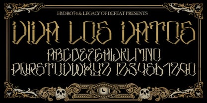
- Garota Serif - Personal use only

- OXIDO ExtBd ExtCond - Personal use only

- Solitas Contrast by insigne,
$39.00 This sleek, high contrast typeface means business, but it looks great on any project, no matter how big or small. Solitas Contrast was developed because existing high contrast sans options were neither modern nor crisp. This design challenge was solved through a series of typefaces: the original low-contrast Solitas, its serifed cousins, and now a high contrast sans—each carefully considered for an organic and free flowing look. It evokes a Dutch or european feel. Solitas Contrast is a modern, clean sans-serif with a distinctive style and impact.
 - Brothest by Maulana Creative,
$12.00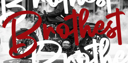 Brothest Street Swag Font Give your designs an authentic handcrafted feel. Brothest Street Swag Font is perfectly suited to logo, stationery, branding, typography quotes, magazine or book cover, website header, clothing, branding, packaging design, restaurant and more.


